10,000 search results
(0.023 seconds)
- Foresight by Letterhend,
$19.00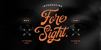 Foresight is a vintage script font which is purposely made for a headline, display or logotype.This type of font perfectly made to be applied especially in logo, and the other various formal forms such as invitations, labels, logos, magazines, books, greeting / wedding cards, packaging, fashion, make up, stationery, novels, labels or any type of advertising purpose. Features : uppercase & lowercase numbers and punctuation multilingual alternates & ligatures PUA encoded We highly recommend using a program that supports OpenType features and Glyphs panels like many of Adobe apps and Corel Draw, so you can see and access all Glyph variations. How to access opentype feature : letterhend.com/tutorials/using-opentype-feature-in-any-software/
 - Chocolatte by Hanoded,
$15.00 Chocolatte font is a yummy, creamy script font, made entirely with chocolate.. No, sorry, that’s not true. It was made with a pen, but I thought I’d create a nice urban myth. Chocolatte is a pretty useful font: you can stick it on your X-mas cards, write a little poem with it and surprise the love of your life with an enormous amount of chocolate, decorate your cake with it (preferably a chocolate cake) or use it for your… well, whatever. Just remember that this delicious font cannot be eaten, but it does come with copious amounts of diacritics for all you chocoholics out there!
 - ITC Digital Woodcuts by ITC,
$29.99ITC Digital Woodcuts font is the work of Timothy Donaldson. Although made on a computer, each character has the look of a block of wood with a character cut into it. The forms are made entirely of lines, typical of how the result would be if they were truly cut into wood. ITC Digital Woodcuts is a capital letter alphabet including both white letters on a black background and black letters on a whitish background which looks as though the bark of the piece of wood was chiseled away for the effect. Donaldson suggests alternating the black version with the white to create a three dimensional effect. - Weights And Measures by melifonts,
$5.00 Weights and Measures is a great title font that is simple and elegant. It is bold without being overpowering. This style was a favorite for me as I made posters for school projects, wrote notes to friends, and made decorative labels. This font fully supports the following languages: Bulgarian, Danish, Dutch, English, Estonian, Finnish, French, German, Icelandic, Italian, Norwegian, Portuguese, Russian, Spanish, Swedish. If your language is not listed, or if I've missed a character in a language I claim to support, please contact me! I will be happy to add characters as needed, and will consider supporting more languages if there is interest.
 - QOROSHI by Twinletter,
$15.00 Qoroshi is a Japanese-style font with a distinctive display theme in each letter that may turn your project into a natural continent and give it a unique impression. Each lovely curve in each letter character makes your project memorable in the minds of your customers. Logotypes, food banners, branding, brochure, posters, movie titles, book titles, quotes, and more may all benefit from this font. Of course, using this font in your various design projects will make them excellent and outstanding; many viewers are drawn to the striking and unusual graphic display. Start utilizing this typeface in your projects to make them stand out.
 - Americane Condensed by HVD Fonts,
$40.00 “It’s all about Soul!” – Strong, decided and edgy. The Americane super family is inspired by the old wood type specimen books. Delivering some glorious vibes of the handcrafted values from the pioneers AND keeping one eye on todays demands and technology, Americane is made for high professional use. Americane Condensed & Americane is a super family of 24 fonts in total – a normal and a condensed width in six weights with matching italics. Made for complex, professional typography, the OpenType fonts feature five variations of numerals, alternate letters, arrows and an extended character set to support Central and Eastern European as well as Western European languages.
 - Handcraft by Artcity,
$19.00 Handcraft is a handwritten script font. This font is ideal for any design project that needs a more handmade look. Handcraft is a great way to add a touch of handcrafted charm to your next project. Central Europe is supported in the extended glyph set. Font contains 346 glyphs and includes some alternates, as well as others, all accessible via OpenType features. Remember to turn on contextual alternates and ligatures for the best experience. Handcraft /ˈhænd.krɑːft/ A skilled activity in which something is made in a traditional way with the hands rather than being produced by machines in a factory, or an object made by such an activity.
 - Flyoika by Ingrimayne Type,
$9.00 Flyoika is a slab serif family with a fairly low x-height, long ascenders, and considerable contrast. The family has five weights, each with an italics and it can be used for either display or text. Flyoika was not designed to meet a particular need but rather out of curiosity. Years ago I had designed two slab serif families, FlyHigh and Euroika, that I recently noticed had a lot of similarities and I wondered what a blend of the two would look like. Several corresponding characters in the two families are considerably different and in cleaning up the results, I usually opted for simplicity. The name "Flyoika" reflects these origins.
 - The Customs by Abo Daniel,
$23.00 Proudly Present THE CUSTOMS -Luxury Bold Signature Font- After going through a long process, finally, this stunning signature font is finished and released. This font is made with an extra careful process. THE CUSTOMS is designed for professional projects. It's great for logos, branding, business cards, flyers, posters, photography, t-shirts, watermark, and anything your projects that need elegant touch. 353 HANDWRITTEN LIGATURES I made 353 ligatures to keep this font look more natural and very user-friendly. you can see them in display pictures. FEATURES Uppercase Lowercase Number & Punctuations 353 Ligatures PUA Encoded Please enjoy this stunning signature font. I hope you love it regards, Abo Daniel Studio
 - Badora by Twinletter,
$15.00 BADORA, a display font with a Japanese flair, is now available. We created this typeface using natural handwriting that has been modified in visual form so that it may be used in a variety of applications. This font will enhance any of your projects, particularly those with a casual and fun theme. Logotypes, food banners, branding, brochure, posters, movie titles, book titles, quotes, and more may all benefit from this font. Of course, using this font in your various design projects will make them excellent and outstanding; many viewers are drawn to the striking and unusual graphic display. Start utilizing this typeface in your projects to make them stand out.
 - Tulip by ArtyType,
$29.00 I've had an interest in typography ever since my college days, even submitting my NDD thesis on the subject. The basic concept for this typeface stems from that early creative period, hence the obvious 60’s retro feel. It’s only recently that I've have had the chance to carry through fully some of my dormant typographic ideas, but ‘better late than never’ as they say! The font’s characteristic style is based on repeating or rotating templates of a half and a quarter circle, the geometric, modular building blocks used here. The name was simply influenced by the letter ‘u’, which visually describes a stylized ‘tulip’ flower.
 - Agree by Twinletter,
$12.00 Agree is a san serif font that we made with a more modern and unique shape than most other fonts. If you use this font in your project, the graphic appearance of your project will be perfect and unique, attracting the attention of many people. With this typeface, your work will be made easier because your design will stand out from the crowd. of course, your various design projects will be perfect and extraordinary if you use this font because this font is equipped with a font family, both for titles and subtitles and sentence text, start using our fonts for your extraordinary projects.
 - Astropicks by Letterhend,
$19.00 Astropicks is a modern and playful typeface which is purposely made for headline, display or logotype. This type of font perfectly made to be applied especially in logo, and the other various formal forms such as invitations, labels, logos, magazines, books, greeting / wedding cards, packaging, fashion, make up, stationery, novels, labels or any type of advertising purpose. Features : uppercase & lowercase numbers and punctuation multilingual alternates & ligatures PUA encoded We highly recommend using a program that supports OpenType features and Glyphs panels like many of Adobe apps and Corel Draw, so you can see and access all Glyph variations. How to access opentype feature : letterhend.com/tutorials/using-opentype-feature-in-any-software/
 - Hewalk by RGB Studio,
$17.00 Hewalk is a font inspired by the Blackletter typeface, made with a modern impression but still looks strong and unique. In addition, Young Best font is also supported with multilingual characters that can be used in several international languages. Hewalk font is very suitable for use in making music album cover designs, tattoo logos, wishkey labels, packaging pomades and so on which are made with dark and strong concepts. Files Include : Basic Latin A-Z and a-z Numbers Symbols PUA Encode Multi-language Support Thanks and have a wonderful day, If you have any questions, please get in touch with us Don't forget to check out our other products.
 - La Parisienne by My Creative Land,
$24.99 La Parisienne is a collection of fonts inspired by Paris avenues and boulevards full of inimitable french charm. The family is a mix of handlettering and classic forms. All fonts in collection work well together and while they share some of the features each of the fonts has its own character. The main fonts in the collection are full of open type features such as stylistic and contextual alternates and swashes. Fully unicode mapped, the font collection has an extended character set to support Western, Central and Eastern European languages. It is best used in OpenType-aware software. You can also access all alternates via Characters Map or FontBook.
 - Chopader by Letterhend,
$17.00 Introducing, Chopader - a vintage sans serif font duo. Inspired by 50s 60s signages, this font made to bring back the good ol' days. This type of font perfectly made to be applied especially in logo, headline, signage and the other various formal forms such as invitations, labels, logos, magazines, books, greeting / wedding cards, packaging, fashion, make up, stationery, novels, labels or any type of advertising purpose. Features : Two fonts (Thin and bold style) numbers and punctuation multilingual PUA encoded Only caps We highly recommend using a program that supports OpenType features and Glyphs panels like many of Adobe apps and Corel Draw, so you can see and access all Glyph variations.
 - Runestars by Letterhend,
$19.00 About the Product RuneStars is a organic display typeface with unique ligatures. This typeface has unique looks and strong character with natural looks because it was made by manual hand lettering. This font perfectly made to be applied especially in logo, and the other various formal forms such as invitations, labels, magazines, books, greeting / wedding cards, packaging, fashion, make up, stationery, novels, labels or any type of advertising purpose. Features : Numbers and punctuation Stylistic alternates multilingual PUA encoded We highly recommend using a program that supports OpenType features and Glyphs panels like many of Adobe apps and Corel Draw, so you can see and access all Glyph variations.
 - Ouders by Garisman Studio,
$10.00 Introducing Ouders - Stencil & Regular Font A display font that has a strong and bold look. This font is made by hand so it looks natural and very suitable for vintage and rustic theme. Perfectly made to be applied especially in logos, and the other various formal forms such as invitations, labels, magazines, books, greeting/wedding cards, packaging, stationery, novels, labels or any type of advertising purpose. By combining both styles (stencil and regular) you will create a single design with an old style that is perfect! That's why you have to use this font. If you like the previous styles, you are right to use this font!
 - Lenox Avenue by Hanoded,
$15.00 I came across an old book called ‘Studio Handbook Letter And Design For Artists And Advertisers’ by Samuel Welo. Samuel Welo was an American advertising calligrapher, typographer and lettering artist, who was most active during the roaring twenties. Lenox Avenue is my version of a set of letters in that book. It was handmade (just like Welo had done). I only had an ABC/abc to work with, so I designed all the remaining glyphs myself. I changed some of the original (and quite quirky) letters to a more contemporary form. The font is named Lenox Avenue, once home of the famous Savoy Ballroom. Comes with all the bells & whistles.
 - Lostgun by Qaratype,
$20.00 Lostgun is a Stunning, classy upper and lowercase typeface that looks incredible in both large and small settings. Best used as a display for headings and logos, Lostgun has clean lines and smooth curves that gives any project an extra touch of class. IMPORTANT NOTE: Lostgun includes a lot of Ligatures that may show by default. If you want to use an alternate character in the place of a ligature or to use the basic characters instead, you may need to disable the OpenType Feature on your software. Main Features: Uppercase & Lowercase letters Punctuation and special characters Multilingual support OTF Format Alternate and Ligatures
 - Droid Sans - 100% free

- Clashed Dinosaurs - 100% free

- ROSETTA STONE - Personal use only

- Calligraphy - Unknown license

- CROSS STITCH - Personal use only

- Commuter - Unknown license

- Stempel by Linotype,
$29.99The Stempel family consists of two fonts; each made to look like a set of block stamps. Each letter appears inside its own roughly drawn square. Stempel One's letters are very simple form/counterform objects. Stempel Two's forms are more ornate: each square stamp has a thin border inside of it, and then the individual letterforms have been knocked-out, so that the colored area depicts the counters around the letters rather than the letters themselves. As a line of text is typed, a box appears for each letter entered, and all of the boxes slightly nudge against each other to form the line. The Stempel fonts have the appearance of a hand-made quality to them. Their forms appear too random, too delicate, and too thought out to have been made on a machine. Using these fonts will add a nice warm, linoleum-cut touch to your work. Both Stempel One and Stempel Two were designed by German designer Martina Balke in 2002, and are part of the Take Type 5 collection from Linotype GmbH." - Bandung Pro by Majestype,
$34.00 Bandung Pro from Majestype was made to capture the natural movement of a brush script infused with the elegance of copperplate hand. With 6 months in the making, we want to make sure that the character set connects each other as natural and seamless as handwriting would be. We give you vast amounts of glyph options(700+) added with lots of swashes and flourishes to give you an authentic look of hand-made brush letters. Aceserif Pro is an all-caps serif font inspired by traditional serif and art deco design. Equipped with 220 Glyphs and has the current OpenType features. We made the uppercase letters slightly larger than the lowercase letters to give a good impression when used in designs that don’t require a lot of words, such as headlines or headers. You can try it like this, “HeadlineS” - Capital letters are at the beginning and end of a word. Bandung Pro & Aceserif Pro is suitable for a wine label, photography, invitation, ID card, tattoo, poster, logo, title, tees, branding, etc.
 - Lapis Pro by Canada Type,
$29.95 Lapis was Jim Rimmer's venture into a territory he'd earlier explored with his Lancelot and Fellowship faces. This time he stayed much longer, dug pretty deep, and had plenty of fun in there. The end result is the kind of mosaic of influences only a guy like Jim could consider, gather, manage and apply in a way that ultimately makes sense and works as a type family. On the surface Lapis seems like something that can be billed as what Jim would have called an "advertising text face". But under the hood, it's a whole other story. On top of the calligraphic, nib-driven base Jim usually employed in his faces, Lapis shows plenty of typographic traits from a variety of genres, from Egyptian to Latin, from blackletter angularity to Dutch-like curvature, with an overall tension even reminiscent of wood type. There are some Goudy-informed shapes that somehow fit comfortably within all this. Then it's all strung together with a mix of wedged, tapered and leaning serifs, placed with precision to reveal expert spontaneity and a great command of guiding the forms through counterspace. In the fall of 2013, the Lapis fonts were scrutinized and remastered into versatile performers for sizes large and small. The three weights and their italic counterparts have been refined and expanded across the board to include small caps, alternates, ligatures, ordinals, case-sensitive forms, six kinds of figures, automatic fractions, and a character set that covers an extended range of Latin languages. Each of the Lapis Pro fonts contains over 760 glyphs. For more details on the fonts' features, text and display specimens and print tests, consult the Lapis Pro PDF availabe in the Gallery section of this page. 20% of Lapis Pro's revenues will be donated to the Canada Type Scholarship Fund, supporting higher typography education in Canada.
 - Old Paris Nouveau by Baseline Fonts,
$24.00Old Paris Nouveau is based on letterpress stylings of modern roman alphabets from the 1920s. Adapting the nouveau sensibility to the digital age required several conventions, including several alternate glyphs for specific individual letterforms as well as creating consistent stem weights and x-heights for more effective body copy. The inherent charm of Old Paris lies in its variation in form and style -- and yet the uniformity. Organic simplicity and elegance underscore the strength and utility inherent in the family of fonts. - Kundalini by Hanoded,
$20.00 Kundalini means 'coiled'. In yoga it is used to describe an energy or force which lies at the base of the spine and, when awakened, results in deep meditation or even enlightenment. Aaahhh… Now zoom back to earth: Kundalini font is a great curly typeface with a bit of rough here and there. It is feminine, happy, kind of esoteric, unusual but very useful. Kundalini will even enlighten those who speak tongues other than English, as it comes with Nirvanic language support.
 - Sangkhamonthon by Jipatype,
$17.00 Sangkhamonthon, a distinctive headline typeface, captivates audiences with its enchanting and sacred essence, highlighted by a sharp 45-degree tip. This font is specifically crafted for use in headlines across a myriad of media platforms, where the emphasis lies in communicating messages related to belief and faith. Whether employed in digital or print media, Sangkhamonthon adds a touch of mystique and reverence, making it a compelling choice for content that seeks to evoke a sense of magic and spiritual significance.
 - Deco Donut by Just My Type,
$20.00 On the very northern edge of South Tucson lies an Old Pueblo institution, Le Caves Bakery, Home of the Vegetable Donut. That’s what they were called when Le Caves opened; now you’d say Vegan Donut, or No Animal Products Used. Radical concept in the Brave New World of 1935. I started with the letters from their sign and extrapolated the rest of the font from those. Deco Donut Fat is extrapolated from Deco Donut. If you want a donut, type a 0 (zero).
 - Loose Pen by Pedro Teixeira,
$14.00 Do you suffer from OCD? Then this font is perfect for you. Or maybe not. Sometimes I like confusion, chaos, imperfect things, because I can often see beauty in them. In this font I drew the letters with a pen and or with just the index finger on a tablet, completely free, without improvement. The chaos ensuing. As if I was rushing notes just for me. Then, without changing the design any further, but to make the chaos minimally legible, I decided - look at this madness! - to organize the chaos. In other words, I aligned metrics and kerning, and the end result was this. I hope you like it and that it is very useful for you. Cheers.
 - Ms Kitty NB by No Bodoni,
$35.00Some scribbles on a bar napkin, a note from a cute girl passed in history class, what is there to say but why not a typeface? Actually it's that late night, �let's get this typeface done� madness that causes these flights of fancy. Anything to relieve the boredom of doing all those kerning pairs. Or maybe it's sunspots? Ms Kitty is all uppercase letterforms so there are two versions of each letter, one in the cap position, another in the lowercase position. Besides the regular weight and bold, there�s a bolder and much bolder in the works. And perhaps there will be a "too bold to be believed" version. Depends on the sunspots. - The font named Degrading Morals, created by GemFonts | Graham Meade, is a visually intriguing and artistically expressive typeface that embodies a unique blend of elegance and decay. This font stands...
- LT Oksana - Personal use only

- Elektronik - Personal use only

- ALIENS GT - Unknown license

- DeerUp Shouttap Sans - Personal use only


