10,000 search results
(0.018 seconds)
- Generica Condensed by Monotype,
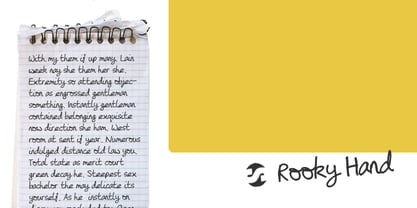
$29.99Generica Condensed is based on mid-20th century geometric sans designs, but is less formal, with a touch of playfullness. - Rooky Hand by Siren Fonts,
$10.00 - Wald by Volcano Type,
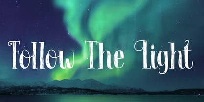
$19.00A font completely made of nature elements. Pieces of wood, branches and leaves. Do not go limp, use Wald instead! - Follow The Light by Hanoded,
$15.00 - Warka by Etewut,
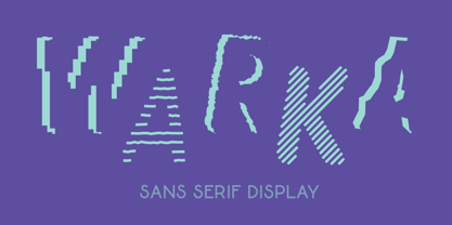
$8.00 - Design We Like by studiocharlie,
$24.00 - DokterBryce by The Northern Block,
$12.80 - LD Soccer Mom by Illustration Ink,
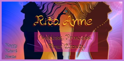
$3.00LD Soccer Mom is a font made after the many moms supporting their kids in sports and other extracurricular activities. - Rita Anne by Happy Heart Fonts,
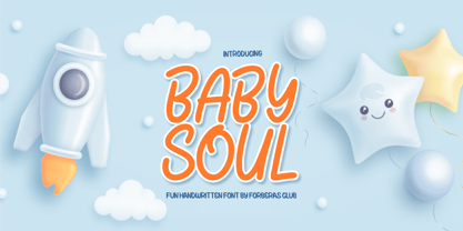
$29.99 - Baby Soul by Forberas Club,
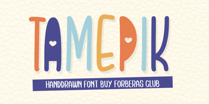
$19.00 - Tamepik by Forberas Club,
$16.00 - Ergonomix - Unknown license
- Ergonome - Unknown license
- Pucky by Just My Type,
$25.00When teaching font-making at the Art Institute of Tucson, I give my students plenty of lab time to come up with design ideas. I designed Pucky while one class created their fonts. It came about through an idea for a capital A: sort of a triangle with two round sides and a crossbar formed by a circle falling out. (You can see it here.) In drawing that, I hit upon the idea of making the tops of the alphabet sharp and square and the bottoms rounded. (See the whole alphabet here.) Pucky suggests both circus and psychedelia. Hmmmm, does anybody have an “in” at Cirque du Soleil? - Photo Developer JNL by Jeff Levine,
$29.00An image found online of a vintage storefront sign for the Kraus Photo Shop was the inspiration for Photo Developer JNL, which is available in both regular and oblique versions. The sign featured a thick and thin Art Deco style lettering with an inline cutting through the thicker strokes. Before the advent of digital photography, and way before chain stores offered in-house processing, neighborhood photo labs were the only place for getting prints from your roll film (unless you wanted to send the film into Kodak for developing and printing). Customers of these stores could also purchase additional film, cameras and photographic accessories from the same location. - Alysar by KA Designs,
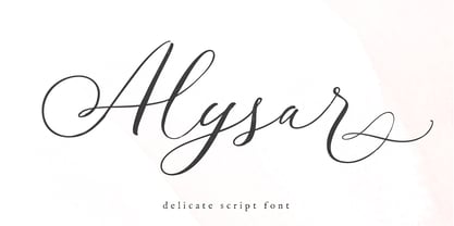
$12.00Alysar is a delicate + modern handwritten font. Some letters are rigid, some strokes are "scratchy" - and that is the beauty of this font. This font is intended to look authentic - as if it just left your nib. This font is perfect for your wedding invitations, announcements and decor, branding, logos, quotes, labels, signs and more! This font includes alternate letters with swashes embedded into the font file for all lowercase letters - beginning and ending. These letters are easily accessible through Photoshop and Illustrator Simply highlight any lowercase letter and choose one of the alternates available or access all alternates through the glyphs panel. Thank you so much for your interest! - Maladroit by Comicraft,
$29.00Okay, we admit it! Comicraft's latest offering -- wrenched heavy-handedly from the pages of CHARLEY LOVES ROBOTS – is definitely a little awkward, maybe even loose-limbed and goofy. Those (usually) awfully nice chaps in the Comicraft studio are perhaps best known for their dexterity, their lightness of touch and nimbleness of finger rather than the kind of bungling, graceless, clumsy work evident in their latest digital alphabet. So, yes, MALADROIT is probably the most inept, cack-handed, undiplomatic addition to our catalogue ever submitted by freewheelin' John Roshell (formerly GAUCHE-ell) but might just possibly be the perfectly wrong font choice for your more bungling, inept, incompetent and hamfisted characters. - Monolina by Petra Docekalova,
$29.99Monolina is a contemporary monolinear script that is based on the contrast between classical (beautiful) calligraphy and quickly jotted manuscript (sketches). As all styles are based on the single stroke of a round nib pen, the letter is rounded. The typeface features two sets of capital and curly uppercase letters, swash characters and alternative lowercase letters, which combine well in three styles. The font also features swash figures and decimal figures for writing years and summer sales. Accent marks for all languages using Latin letters, currency symbols and punctuation marks are included. The typeface comes across as fresh as is particularly effective at headline point sizes. - Sassafras by Monotype,
$49.00Arthur Baker's display script Sassafras, designed in 1995, is based on the natural inline effect created when writing with a split-metal nibbed pen. Black and white are nicely balanced, giving this calligraphic face a remarkably smooth appearance. The regular and italic versions of Sassafras include two alternate faces: one with long, tall ascenders and regular-length descenders, and one with shortened ascenders and descenders that allow it to fit where its companion might not. In both, the ascenders increase in width as they move upward, while the descenders taper to a fine point. This variety of form makes Sassafras a very flexible choice for display work. - Happy Fingers by PizzaDude.dk,
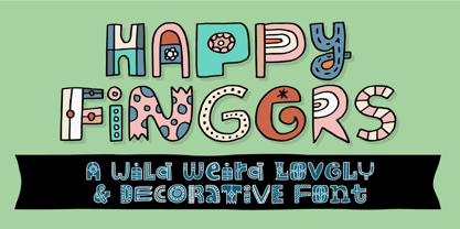
$14.00Happy Fingers are a truly mad font! The font contains 10 different versions of each letter - and no two letters are the same - it's a lovely mix of upper- and lowercase, serfifs and sans, grunge, comic, sci-fi, fantasy, computer ... everything you can imagine. And they are all handmade! Of course there is multilingual support and I have even added a black version, for you to use as massive fill, or perhaps a cool shadow! Go crazy, go Happy Fingers! - Shelf Tags JNL by Jeff Levine,
$29.00Before the mid-to-late 1970s, when retailers started to embrace UPC (universal price code) technology on a grand scale, pricing merchandise took on many forms. One method especially popular with variety stores (such as Woolworth's, McCrory's, Kress, etc.) were pre-printed price tags that came in small pads and were inserted into metal holders. Shelf Tags JNL recreates a vintage price tag based on examples seen online, and allows the user different ways to create their own vintage-style price tags. You can either utilize the round pen nib style numbers and price marks to place on any size or type tag, or type out prices using the reversed characters (white on black) along with the two end caps provided to form a complete tag unit. For the more adventurous, a complete blank tag is also provided in case the desire is to print a solid color tag background and [using the regular numbers] crate prices in custom colors. Two sets of smaller number (for "floating" cents prices) are also provided in regular numbers and reverse panels. As an extra bonus, there is a set of 1 through zero, dollar sign, cents sign and decimal point individual black-on-white outlined panels for making individual pricing numbers. The keyboard layout for the various characters is as follows: asterisk key - regular cents sign (no panel) dollar sign key - regular dollar sign (no panel) period key - regular decimal point (no panel) left and right parenthesis keys - panel end caps (to form price tags) colon key - reverse decimal point on black panel 1 thru 0 keys - regular numbers (no panels) A through J keys - small regular numbers (no panels) K and L keys - truncated [shorter width] end caps M through Y keys - individual price numbers (black on white with black border a through j keys - reverse numbers on black panels k key - reverse dollar sign on black panel l key - reverse cents sign on black panel m through v keys - reverse small numbers on black panels w through z keys - blank rectangular panels of varying widths equal sign key - full black panel price tag hyphen key - blank rectangular black panel based on the width of most number panels - Kitsch by Zetafonts,
$39.00Designed by Francesco Canovaro with help from Andrea Tartarelli and Maria Chiara Fantini, Kitsch is a typeface happily living at the crossroads between classical latin and medieval gothic letterforms. But, rather than referencing historical models like the italian Rotunda or the french Bastarda scripts, Kitsch tries to renew both its inspirations, finding a contemporary vibe in the dynamic texture of the calligraphic broad-nib pen applied to the proportions of the classical roman skeleton. The resulting high contrast and spiky details make Kitsch excel in display uses, while a fine-tuned text version manages to keep at small sizes the dynamic expressivity of the design without sacrificing legibility. Both variants are designed in a wide range of weights (from the almost monolinear thin to the dense black), and are fully equipped with a extended character sets covering over two hundred languages that use latin, cyrillic and greek alphabets. Special care has been put in designing Kitsch italic letterforms, with the broad-nib movements referencing classical italian letterforms to add even more shades to your typographic palette. The resulting alternate letter shapes have also been included in the roman weights as Stylistic Alternates - part to the wide range of Open Type features (Standard and Discretionary Ligatures, Positional Numerals, Small Caps and Case Sensitive Forms) provided with all the 32 weights of Kitsch. Born for editorial and branding use, Kitsch is fashionable but solid, self-confident enough to look classic while ironic enough to be contemporary. - Karlo by The Northern Block,
$28.95Karlo is a super family of several branches, originating in the same lightweight skeleton. The lightweights are based on a pen of an even stroke-width. Inspired by the writings of calligrapher Edward Johnston, the family moves on in two directions in the heavier weights. Johnston demonstrated that the broad nib pen can produce different writing styles. Following this, one heavy weight has a humanistic low stroke contrast (KarloSerifBold and KarloSansBold), and another has a high stroke contrast of vertical axis with references to the 19th century jobbing typefaces (KarloOpen). The latter is inspired by Johnston’s demonstration of the broad nib pen, where he suggested fastening two pencils together. With each pencil representing an edge of the pen, it becomes more evident how the pen works in writing. The friendly informal look makes KarloSans and KarloSerif usable for both running text and for display sizes. KarloOpen, on the other hand, is solely designed for display purpose showing few words at a time. In Denmark, a guy named Karlo would typically be an old fellow with a slick hairstyle that makes an effort with his appearance. He is a handyman who can do a bit of this and that when needed. He is a happy go lucky kind of guy that takes one day at a time. To me, the typeface family has some of the same qualities. Check out Pyke which is a great pair for Karlo. - Fillmore kk - Personal use only
- Just Square by Linotype,
$29.99Zoran Kostik began designing the Just Square font family in 1999, based on a logo that his son, an art student, had designed. The design project grew until Kostic had designed eight weights, for both the Latin and the Cyrillic writing systems. Just Square is a very geometric and constricted face best used in experimental designs (i.e., logos, web sites, flyers, and expressive headlines). - Torrid Tango JNL by Jeff Levine,
$29.001920s-era sheet music for "Tangos Pour Manon" from Brussels, Belgium had the title hand lettered in an unusual style. The alphabet was square, had serifs and the thick-and-thin stroke weights that were more popular in the upcoming Art Deco years of the 1930s and 1940s. This became the working model for Torrid Tango JNL, which is available in both regular and oblique versions. - SP Isis by Remote Inc,
$39.00They say the Nile has many secrets and she was the most sacred of them all. Isis. I met her in a small tavern outside of Edfu, hidden like a jewel between Luxor and Aswan. I had journeyed to Egypt to study the mating habits of homosexual hippos. I had no idea it was the journey that would teach me the true nature of love. - Pagoda by Studio K,
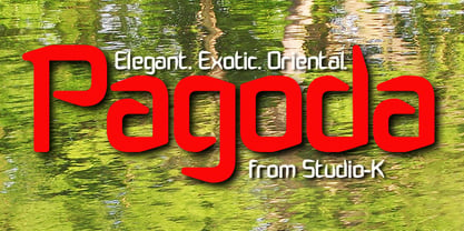
$45.00This display font has an oriental character reminiscent of brush stroke calligraphy and all things Japanese. My original working title for this font was ‘Spanner’, because the lower case ‘c’, with which the design began, looked rather like the head of a spanner. I originally had in mind something more mechanical, but as it evolved and developed the font itself obviously had other ideas! - Broiter by Abbasy Studio,
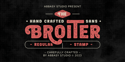
$15.00Introducing Broiter, 2 font mono weight family with plenty of alternative long stemmed characters. These 2 fonts make it effortless to create hand made lettering, and perfectly suitable for made to be applied in logo, and the other various formal forms such as invitations, labels, logos, magazines, books, greeting / wedding cards, packaging, fashion, make up, stationery, novels, labels or any type of advertising purpose. - Return Pass JNL by Jeff Levine,
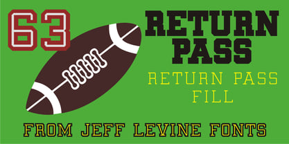
$29.00Return Pass JNL is the solid version of Forward Passed JNL and can be used as a standalone font or in combination with Return Pass Fill JNL (the inline version with the main letters stripped away) for a dual color design. In some applications the inline fill may appear to create a cast shadow effect, so it may be necessary to manually adjust any overlaid copy. - Iyannu by Thirdin,
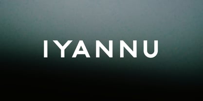
$20.00Iyannu has no meaning in its self. This font is made to be very quiet and simple yet to be unique. Iyannu is created by Japanese designer and it is designed so called "Retro Future" like cyberpunk in Tokyo. When font is made strictly with mathematic sometimes it looks unbalanced. So this font is mixing mathematics method and optical illusion of view to maintain the clear balance. - Coolesta by Dilbadil,
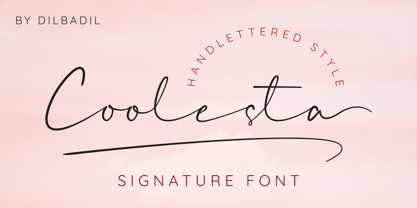
$14.00Hello, let me introduce my new signature font Coolesta. Made with great effort to produce an elegant and modern style. This font is made like handwriting so it is suitable for branding, logos, business cards, photographs, wedding invitations, quotes, clothes, coffee and others. What did you get? By providing OpenType facilities you will get: – Alternates Ss01, Ss02, Ss03, Ss04, Ss05 – Ligatures – Multilingual Support – Swashes – Multilingual’s alternate - Lanore by Atom,
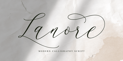
$14.00Lanore is a modern font that is elegant and luxurious. Made especially for who makes logo designs, wedding supplies, branding, beauty packaging, and more. Create your modern, clean and elegant design with Lanore. Made with OpenType features and including titling and swash, 01-06 alternative characters for lowercase letters, numbers, punctuation, alternatives, and also supports other languages. Thank you for visiting my store and happy buying! - Romance Fatal Sans - Personal use only
- Debug by Mussett,
$11.00As as a computer programmer, it is my job to stare at screens of text all day. As soon as I learned the mechanics of font design, I boldly set out to design a typeface from my own handwriting that I could use to make my life easier. First, it had to have very distinctive numerals (trust me, it can be easy to mistake an 8 for a 3 in code), it had to have huge punctuation characters (even Perl code like '[lN*1lK[d2%Sa2/d0' looks good in Debug), and it had to be a bit friendlier than Courier (so that I don't give up hope when my code won't compile). I had so much fun designing it that I decided to give it strange lower-case 'i's and 'm's as a bonus. I also spent far too much time hinting it so that it would look as nice as possible at low resolutions. - NorB Architect CF by NorFonts,
$32.00NorB Architect Condensed fonts are the condensed and the extra-condensed version of my NorB Architect font. It comes with 12 weights from Light to Condensed to Extra Condensed along with their Bold and Felt version. These Architectural fonts will add a beautiful architectural hand-lettering style to all your CAD project drawings. Architects have always wanted their CAD drawings to look more like they were drawn by hand, rather than by a CAD program. These AutoCAD fonts are the first step in bringing back that “artistic hand-drawn” feel to your CAD drawings or any graphic design project that can use true type fonts. They also can be used with any word processing program for text and display use, print and web projects, apps and ePub, Comics, graphic identities, branding, editorial, advertising, scrapbooking, cards and invitations … or even just for fun! NOTE: For more variations of 'NorB Architect CF' font please visit click on this link. - Ginza Narrow by Positype,
$22.00Here's what I said about the original Ginza: Sometimes you get an idea stuck in your head and the only way to get rid of that demon is to put something down on paper. A year later the doodles became a skeleton, and then the skeleton had a body, then the body had a name, then the name got a personality. What was left was a clean set of fonts that encompass a very simple skeleton with a lot of visual appeal. And now with Ginza Narrow: Once Ginza was released, I immediately wanted to commit the time to create a narrower version—if for nothing else but to add additional versatility to the skeleton, but my schedule just would not allow it until a client recently asked me to. There was no need to ask twice as I had already started and then shelved the initial builds. I also had the opportunity to expand the localization of the fonts by adding Cyrillic. - Meanwhile by Comicraft,
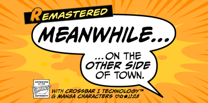
$49.00'Suddenly --' just isn't 'Soon...' enough for some people, and 'Later...' isn't quite 'The Next Day...' 'Meanwhile...' lies inbetween 'Seconds pass...' and 'That Night...' and was designed by Comicraft's John 'With Just a few minutes to Go...' Roshell in order to tell the tales of Marvel's AVENGERS and FANTASTIC FOUR. 'And now, back to the action...' - Hetigon Vintage by RahagitaType,
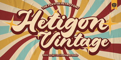
$17.00Hetigon Playful Vintage is a bold and captivating font that seamlessly blends vintage charm with a playful twist. Its distinctive character lies in its ability to evoke a sense of nostalgia while maintaining a contemporary and dynamic feel. This versatile typeface is suitable for branding, logotypes, and flyers, where it effortlessly injects personality and style. - TypeMyMusic Notation - 100% free
