10,000 search results
(0.257 seconds)
- Coffee Bar JNL by Jeff Levine,
$29.00 An image of the wide, Art Deco influenced lettering of a sign over a coffee bar inside a Jacksonville, Florida Lovett’s Supermarket (a predecessor to Winn-Dixie) inspired the namesake font Coffee Bar JNL – available in both regular and oblique versions.
 - Magefin by Muksal Creatives,
$10.00 Magefin is a unique and modern family of serif fonts. Simply Conception has 9 families Regular font, starting from the small thin to the largest Black. This typeface is versatile and can be used successfully in magazines, posters, branding, websites.
 - Nouveau Song JNL by Jeff Levine,
$29.00 The Art Nouveau free-form, hand lettered title on the cover of the 1912 sheet music for Irving Berlin’s “Wait Until Your Daddy Comes Home” formed the basis for Nouveau Song JNL, which is available in both regular and oblique versions.
 - Indoxine by PizzaDude.dk,
$20.00Indoxine is a scribbled font, simulating hasty written letters with occasional inkblobs. Comes with ligatures for both double upper/lower letters and numbers, in regular and black versions! You will need to use OpenType supporting applications to use the autoligatures. - Sunday by Cocodesign,
$10.00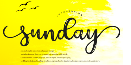 sunday Script is a modern calligraphy design, including Regular. This font is casual and beautiful with swash. Can be used for various purposes. such as logos, product packaging, wedding invitations, branding, headlines, signage, labels, signatures, book covers, posters, quotes, and more.
 - Hanabie by Cocodesign,
$12.00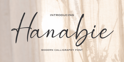 Hanabie Script is a modern calligraphy design, including Regular. This font is casual and beautiful with swash. Can be used for various purposes. such as logos, product packaging, wedding invitations, branding, headlines, signage, labels, signatures, book covers, posters, quotes, and more.
 - Paradizo by Surplus Type Co,
$9.00 Paradizo is an elegant serif font that features regular & oblique versions. This font features a large number of alternates & ligatures which will help you create unique luxurious designs with ease. Great for editorial design, branding, web design, product design & much more!
 - TF Wasted Growth by Teenage Foundry,
$19.00 Wasted Growth is a display font with a strong style is back. There are 2 styles, Regular & Blur. Suitable for merchandise designs, covers, posters and others. Features: Uppercase, Lowercase, Numeral, Punctuation & Multilingual. For any questions please contact me 🙂 Thanks!
 - Bakehouse by Vozzy,
$10.00 Introducing a curly label font named "Bakehouse". This family includes three styles - Regular, Light and Thin. Samples you can find on the preview. This font will look great on any retro design like poster, t-shirt, label, logo and more.
 - Government Stencil JNL by Jeff Levine,
$29.00 A poster for the 1952 film “Diplomatic Courier” featured the title hand lettered in a bold serif stencil design. With some modifications, this served as the model for Government Stencil JNL, which is available in both regular and oblique versions.
 - Domek by Kulturrrno,
$7.00 Domek is a tall modern typeface. Includes 3 styles (Regular, Shadow, Halftone shadow), you can combine layers to make effects. Some stylistic alternates Extended latin glyph set This fonts are perfect for : logo design, headers, posters, packaging designs and more.
 - Inlet JNL by Jeff Levine,
$29.00 An interesting bit of Art Deco influenced serif hand lettering was found on the cover of the sheet music for 1938's "Boatman's Serenade". This became the model for the digital font Inlet JNL; available in both regular and oblique versions.
 - Wine Vat Stencil JNL by Jeff Levine,
$29.00 An image of a vintage metal stencil for the French wine region Côteaux du Tricastin [now Grignan-Les Adhemar] served as the inspiration for Wine Vat Stencil JNL. This condensed sans serif design is available in both regular and oblique versions.
 - County Clerk JNL by Jeff Levine,
$29.00 County Clerk JNL was modeled after the vintage Hamilton wood type design Gothic Special, and is available in both regular and oblique versions. An early grotesk font, this condensed sans serif lends itself well to short headlines and brief body copy.
 - Emirose by Ergibi Studio,
$16.00 Emirose consists of 4 weights: Thin, Light, Regular and Bold, all equipped with many ligatures and alternative letters that look cute and classy. They work very well for your work such as logos, brands, packaging, posters, invitations, headlines, posters, and more.
 - Mantika Sans Paneuropean by Linotype,
$67.99With its well-defined characters that are readily legible even in the small font sizes, Mantika Sans by Jürgen Weltin is ideal for typesetting. The elaborately designed and highly individual set of italics enhances the attractiveness of the font.Jürgen Weltin developed the Mantika™ Sans sans serif font using older designs for an serif font as his inspiration. Nothing more than the merest suggestion of the original serifs has survived. Bevelled line endings and the slight variation in thickness of verticals, in particular, provide Mantika Sans with a very dynamic character that evokes manuscript. Short ascenders and descenders give the font a compact appearance that is also underscored by its condensed proportions. Weltin has achieved his aim of producing a typeface with excellent legibility even in small sizes not just by means of the x-height, which is tall in comparison with the capital letters, but also by using clearly defined and well differentiated designs for critical letters, such as i", "I" and "l". Lower case "i", for example, has a serif while the "l" has a curved base.In addition to uppercase numerals, Mantika Sans also has lowercase or old style numerals that have been designed so that they can be used in both tabular and proportional settings. The uppercase numerals are slightly shorter than the uppercase letters, ensuring that the latter can be sympathetically incorporated within continuous text.The Mantika Sans italics are very unusual. They are inclined at only 4.5° (the usual angle for italics is 10 - 12°) and so appear to be almost upright. In addition, they also have quite distinctive forms. The overall effect calls attention to their curvilinear, manuscript character, enhances contrasts and further emphasizes the terminals. Weltin explains: "Within the variety of forms of the italics there are many contrasting terminal elements that create dynamism. The result is a diversity of interaction between the rounded and angular forms". Mantika Sans Italic thus has all the features of a display typeface, but can also be happily used on its own to set longer text passages. Mantika Sans is available in two weights; Regular and Bold, both of which have corresponding italics sets. Mantika Sans has been designed so that the widths of the four related cuts are identical, meaning that a change of font within a single layout will have no effect on justification. In addition, the members of the Mantika Informal font family, designed by Jürgen Weltin in 2010, also have the same thickness. Other font families having weights with equal thickness can be found in the "Linotype Office Alliance series".The Mantika Sans character sets are paneuropean. There are characters for setting texts in Eastern European languages, Greek and Cyrillic. There is also a range of special symbols, including right-angled brackets, subscript and superscript lower case letters, together with numerals, arrows and many different bullet points.As a vibrant and highly legible text font, Mantika Sans has a broad spectrum of potential applications. Its unusual italics are not just perfect for use in display text. The fact that it has only four cuts means that Mantika Sans is particularly suitable for office use or for the setting of business reports. Its excellent legibility even in the small font sizes also makes it ideal as a text for electronic reading devices; this also applies to Mantika Informal.At the 3rd International Eastern Type Design Competition Granshan 2010, Mantika Sans was awarded in the category Greek text typefaces." - Mantika Sans by Linotype,
$50.99 With its well-defined characters that are readily legible even in the small font sizes, Mantika Sans by Jürgen Weltin is ideal for typesetting. The elaborately designed and highly individual set of italics enhances the attractiveness of the font.Jürgen Weltin developed the Mantika™ Sans sans serif font using older designs for an serif font as his inspiration. Nothing more than the merest suggestion of the original serifs has survived. Bevelled line endings and the slight variation in thickness of verticals, in particular, provide Mantika Sans with a very dynamic character that evokes manuscript. Short ascenders and descenders give the font a compact appearance that is also underscored by its condensed proportions. Weltin has achieved his aim of producing a typeface with excellent legibility even in small sizes not just by means of the x-height, which is tall in comparison with the capital letters, but also by using clearly defined and well differentiated designs for critical letters, such as i", "I" and "l". Lower case "i", for example, has a serif while the "l" has a curved base.In addition to uppercase numerals, Mantika Sans also has lowercase or old style numerals that have been designed so that they can be used in both tabular and proportional settings. The uppercase numerals are slightly shorter than the uppercase letters, ensuring that the latter can be sympathetically incorporated within continuous text.The Mantika Sans italics are very unusual. They are inclined at only 4.5° (the usual angle for italics is 10 - 12°) and so appear to be almost upright. In addition, they also have quite distinctive forms. The overall effect calls attention to their curvilinear, manuscript character, enhances contrasts and further emphasizes the terminals. Weltin explains: "Within the variety of forms of the italics there are many contrasting terminal elements that create dynamism. The result is a diversity of interaction between the rounded and angular forms". Mantika Sans Italic thus has all the features of a display typeface, but can also be happily used on its own to set longer text passages. Mantika Sans is available in two weights; Regular and Bold, both of which have corresponding italics sets. Mantika Sans has been designed so that the widths of the four related cuts are identical, meaning that a change of font within a single layout will have no effect on justification. In addition, the members of the Mantika Informal font family, designed by Jürgen Weltin in 2010, also have the same thickness. Other font families having weights with equal thickness can be found in the "Linotype Office Alliance series".The Mantika Sans character sets are paneuropean. There are characters for setting texts in Eastern European languages, Greek and Cyrillic. There is also a range of special symbols, including right-angled brackets, subscript and superscript lower case letters, together with numerals, arrows and many different bullet points.As a vibrant and highly legible text font, Mantika Sans has a broad spectrum of potential applications. Its unusual italics are not just perfect for use in display text. The fact that it has only four cuts means that Mantika Sans is particularly suitable for office use or for the setting of business reports. Its excellent legibility even in the small font sizes also makes it ideal as a text for electronic reading devices; this also applies to Mantika Informal.At the 3rd International Eastern Type Design Competition Granshan 2010, Mantika Sans was awarded in the category Greek text typefaces."
 - Enchanted Love by VP Creative Shop,
$20.00 Introducing Enchanted Love - Elegant Sans Serif Typeface - 8 weights Enchanted Love is classic yet creative typeface loaded with 8 fonts, alternate and ligature glyphs to make you typography truly unique! Language Support : Belarusian, Bosnian, Bulgarian, Chechen, Macedonian, Russian, Serbian, Afrikaans, Albanian, Asu, Basque, Bemba, Bena, Breton, Chiga, Colognian, Cornish, Czech, Danish, Dutch, Embu, English, Estronian, Faroese, Filipino, Finnish, French, Friulian, Galician, Ganda, German, Gusii, Hungarian, Indonesian, Irish, Italian, Jola-Fonyi, Kabuverdianu, Kalenjin, Kamba, Kikuyu, Kinyarwadna, Litvian, Lithuanian, Lower Sorbian, Luo, Luxembourish, Luyia, Machame, Makhuwa-Meetoo, Makonde, Malagasy, Maltese, Manx, Meru, Morisyen, North Ndebele, Norwegian Bokm ål, Norwegian Nynorsk, Nyankole, Ormo, Polish, Portuguese, Quechua, Romanian, Romansh, Rombo, Rundi, Rwa, Samburu, Sango, Sangu, Scottish Gaelic, Sena, Shambala, Shona, Slovak, Soga, Somali, Spanish, Swahili, Swedish, Swiss German, Taita, Teso, Turkish, Ukrainian, Upper Sorbian, Uzbek (Latin), Volap ük, Vunjo, Walser, Welsh, Western Frisian, Zulu FEATURES Uppercase, lowercase, numeral, punctuation & Symbol -Hairline, Extra light, Light, Regular, Bold, Extra Bold, Black and Heavy versions Cyrillic support ligature glyphs alternates Multilingual support - 95 languages No special software is required to type out the standard characters of the Typeface. How to access alternate glyphs? To access alternate glyphs in Adobe InDesign or Illustrator, choose Window Type & Tables Glyphs In Photoshop, choose Window Glyphs. In the panel that opens, click the Show menu and choose Alternates for Selection. Double-click an alternate's thumbnail to swap them out. Feel free to contact me if you have any questions! Mock ups and backgrounds used are not included. Thank you! Enjoy!
 - LT Sweet Nothings - Personal use only

- BigNoodleTitling - 100% free

- Digi Antiqua by Linotype,
$39.00DigiAntiqua was designed by the Hell Design Studio in 1968. Its basic forms were influenced by the slab serif fonts produced at the beginning of the industrial era in England around 1820. Its clear and timeless forms are extremely legible even in small point sizes. - Surreal PostIndian by Type-Ø-Tones,
$40.00 Surreal PostIndian by Laura Klamburg. OpenType, 2 styles According to its creator, Surreal Post Indian was inspired by the performance of an American Indian artist, but this typeface seems more connected with pop neon signs. Anyway, here is an amusing Laura Klamburg font. Enjoy it.
 - Pallada by ParaType,
$25.00 A decorative face of freestyle flowing letterforms, it is stylized a little under wide brush calligraphy. Its letterforms are characterized with one-side serifs. For use in book heading, advertising and display matter. The face designed by Natalya Vasilyeva and licensed by ParaType in 2007.
 - Diplomatic by Sudtipos,
$59.00 Diplomatic is another script from the Koziupa and Paul duo. It relies on calligraphic simplicity to reach its artistic sophistication. Prominent ascenders and descenders work alongside calculated but casual strokes to produce an unmistakably elegant typesetting. Designed by Koziupa and digitized by Ale Paul.
 - Hellbound - Unknown license

- Sortie Super by Lewis McGuffie Type,
$40.00 Sortie Super is a take on one of the kings of display lettering - Caslon's high-contrast, reversed stress 'Italian' style. It looks great at big sizes and in short flurries... and shouldn't be used in confined spaces. When compared with the original face, the weight and contrast of Sortie Super has been exaggerated. To add gravity to the letters I've increased their width overall and reduced the spacing to a hair-line fracture for added visual impact. Characters like 'S', 'E','O' and 'Z' are relatively close to their historical precedents - however the terminals on the 'C-G-S-З-Є', which have been drawn so to be more consistent. Other aspects, such as the leg of the 'R' and 'Я', the apex of the 'A' and the spur of the 'G' are revised and simplified, to help spacing and optical weight across the alphabet. Also, to reduce visual noise terminals in characters like 'C', 'J' and 'R'' are horizontally aligned. Meanwhile, the central horizontal strokes in the 'B', 'P' and 'R' etc are reduced to a hairline, so as to create a more simplified system of thick-to-thin. The temptation when drawing this kind of esoteric display alphabet is to start to rely on modular components. Which, while copy-paste-repeat is a sure-fire way to make the face more visually consistent, it's a lazy method that risks allowing the font become soulless and mechanical. An early experiment I made was making a monospaced version, which was useful in headlines, but it lost that loving feeling. So, by maintaining a handful of flourishes – the tail of the '?', the inky drop of the '!', the bulbous gloop of arms of the 'Ж' and 'К', the swirling legs in the 'R', 'Я' and 'Л', the big-bowling weight of the 'J' and 'U' – plus a few in-built inconsistencies and a bit of its own silliness, Sortie Super retains some of the organic warmth of its ancestor. Conversely, the counters, apertures and negative space are largely rigidly geometric, which helps give the revival font a bit of a modern touch. Sortie Super is an uppercase-only display font that comes with Western, Central and East European Latin, extended Cyrillic, Pinyin, as well as a set of hairline graphic features and symbols.
 - FS Split Sans by Fontsmith,
$80.00 Quirky and irregular FS Split is no ordinary typeface. Its irregular proportions make it unique, with round letters appearing wide, and straight letters narrow. Other quirks include its eclectic crossbars – the uppercase ‘A’ has an unusually low bar, while the bar on ‘G’ is particularly long. The uppercase has many interesting features in fact, including large counters, closed terminals on certain letters like ‘J’, and a cap-height that lines up with ascenders. The lowercase also holds surprises – the dots on ‘i’ and ‘j’ are unusually large, and some characters, such as ‘g’, feature double-storey counters. An extreme but stylish italic The italic versions of FS Split Sans and Serif are particularly striking. While similar in style to their upright, Roman versions, they take on a larger-than-usual 18-degree angle, making the forward-slant more dramatic. Although the main purpose of any italic is to help words and phrases stand out, this unique execution helps to make the italic variants of FS Split stylish fonts in their own right – they would work brilliantly on magazine covers, in titles and headlines, pull quotes, and even used commercially in logos and corporate branding. Serif and sans: a split personality FS Split Sans and Serif have their differences but also their similarities, contrasting and complementing each other perfectly. This ‘love hate’ relationship inspired the name of the typeface family, and means the two variants provide a versatile, typographic palette for use in graphics and branding. While its proportions are similar to the sans, the serif has a bigger contrast between its weights of bold, regular and light, bracketed serifs, and different styles of terminals, some being straight and others ball-shaped. FS Split Sans has more subtlety and simplicity, with a smaller weight contrast, less flamboyant terminals, and more consistent counter sizes. The two variants are distinct yet alike, so can be used successfully either in isolation or together.
 - FS Split Serif by Fontsmith,
$80.00 Quirky and irregular FS Split is no ordinary typeface. Its irregular proportions make it unique, with round letters appearing wide, and straight letters narrow. Other quirks include its eclectic crossbars – the uppercase ‘A’ has an unusually low bar, while the bar on ‘G’ is particularly long. The uppercase has many interesting features in fact, including large counters, closed terminals on certain letters like ‘J’, and a cap-height that lines up with ascenders. The lowercase also holds surprises – the dots on ‘i’ and ‘j’ are unusually large, and some characters, such as ‘g’, feature double-storey counters. An extreme but stylish italic The italic versions of FS Split Sans and Serif are particularly striking. While similar in style to their upright, Roman versions, they take on a larger-than-usual 18-degree angle, making the forward-slant more dramatic. Although the main purpose of any italic is to help words and phrases stand out, this unique execution helps to make the italic variants of FS Split stylish fonts in their own right – they would work brilliantly on magazine covers, in titles and headlines, pull quotes, and even used commercially in logos and corporate branding. Serif and sans: a split personality FS Split Sans and Serif have their differences but also their similarities, contrasting and complementing each other perfectly. This ‘love hate’ relationship inspired the name of the typeface family, and means the two variants provide a versatile, typographic palette for use in graphics and branding. While its proportions are similar to the sans, the serif has a bigger contrast between its weights of bold, regular and light, bracketed serifs, and different styles of terminals, some being straight and others ball-shaped. FS Split Sans has more subtlety and simplicity, with a smaller weight contrast, less flamboyant terminals, and more consistent counter sizes. The two variants are distinct yet alike, so can be used successfully either in isolation or together.
 - Quirky by Scholtz Fonts,
$19.95 The idea for Quirky was born while I was looking at a book of etchings by British artist Graham Clarke. His signature, crawling spider-like across the page, fascinated me with its casual, almost messy, inky dark and light drama. I started scribbling the alphabet as I imagined he would write it, based on his signature, then continued, adding curls, making the characters more angular, and refining the dramatic play between dark and light. Finally, Quirky appeared. Apparently casual, Quirky is, in fact, a true connected script. Quirky is characteristic of contemporary handwriting: It appears loose, angular, unstructured, and free, while maintaining good form and legibility. Its baseline is varied, creating an impression of impatient handwriting, without losing legibility. Quirky comes in five styles: condensed -- the most dramatic form, with great drama between thick and thin condensed black -- as with condensed but allows the user to provide exceptional emphasis wide -- increased readability wide black -- increased readability and emphasis splat -- messy and ink-blotted -- a hint of grunge Use Quirky for advertising, for humorous greeting cards, for a funky fashion look or tongue-in-cheek spooky media. Quirky is a fully professional font with extensive use of OpenType Ligatures. For example: most common double letter combinations such as "ee" are rendered as two, slightly different shaped "e"s. This variation in letter shapes removes the cues by which the reader identifies that he is viewing a FONT and thus conveys a strong sense of hand-lettered text. Language support includes all European character sets and has been designed to be used with the following languages: Afrikaans, Albanian, Basque, Bemba, Cornish, Danish, Dutch, English, Estonian, Faroese, Filipino, Finnish, French, Galician, Ganda, German, Icelandic, Indonesian, Irish, Italian, Kinyarwanda, Luo, Malagasy, Malay, Manx, Morisyen, North Ndebele, Norwegian Bokmål, Norwegian Nynorsk, Nyankole, Oromo, Portuguese, Romansh, Sango, Shona, Somali, Spanish, Swahili, Swedish, Swiss German and Zulu.
 - Al Bavistage Norm by Aluyeah Studio,
$150.00 Hallo Aluyeaholic! Introducing Bavistage, a broken smile typeface. Inspired by the vintage vibe of a girl's broken smile. It gives you past memories, disappointments and happiness at the same time. Coming with 3 styles, and each style has stunning 130+ alternatives, 30+ ligatures and it's super easy to use. Very suitable for magazine, headline, website, ads, product package and all type of design project you have. Features: OpenType support Multilingual support (15 languages) PUA Encoded Super Easy to Use alternates - It's OpenType support but you can easily call alternates character using special combination like A.2 R.3 h.5 etc. so you don't need special software. To get results like the preview just type B.4av.3is.2.tag.2e.3 You will receive: Al_Bavistage_Normal Al_Bavistage_Stamp Al_Bavistage_Vintage Thanks for checking out my font. I really hope you enjoy using it! If you have any questions I'd be more than happy to answer them, just send me a message!
 - Joanne Script BH by BluHead Studio,
$25.00 Joanne Script BH is based on the handwriting of a BluHead friend. This fun design has a sharp, angular feel which lends itself to casual messages, greeting cards, post its, journals, you name it! Plus, a large complement of characters allows you to send your thoughts in multiple languages.
 - Elizabeth ND by Neufville Digital,
$45.25 Elizabeth ND is known for being the first typeface designed by a woman: Elizabeth Friedlander. It was engraved in 1938 by the Bauersche Gießerei. It has two styles: roman and italic. Its grace, delicacy and beauty allow many compositional possibilities, making it an ideal choice for use as a display and headline typeface. Elizabeth is a Trademark of BauerTypes SL
 - Sincerity by Océane Moutot,
$32.90 Sincerity is an elegant and strong typeface identified by its high contrast, its sharp shapes and triangular serifs. Inspired by the Didone style, Sincerity adds modernity and some unique features to it. It offers a large choice of uses, from titles of magazines to newspapers, logotypes and so on. Sincerity is available in 16 styles, from thin to black in roman and italic.
 - Jan by Linotype,
$29.99Jan Regular combines an experimental, bold, mono-weight geometric sans serif with the Arabic writing system's means of joining letters. Adding in script-like letter connections, a feature that is found in both western cursive and Arabic type, as well as distinctly Arabic-like accents above and below certain letters, Michael Parsons has created a cross cultural typographic statement. Jan Regular is best used for headlines, and small strings of text, in sizes large enough to view and appreciate the unique counter forms within the letters. This font is one of 10 creations from the young Swiss designer Michael Parson included in the Take Type 5 collection, from Linotype GmbH." - Venice Serif by Unio Creative Solutions,
$5.00 Introducing “Venice Serif - Font Family” – a functional serif type system with a sleek structure which gives a strong personality while still maintaining high readability. Developed in three weights with matching obliques. The full set of weights (Light, Regular and Bold) counts more than 350 glyphs. The end result is a family with full multilingual capabilities and a coverage of several languages based on the Latin alphabet. This fashionable font family is the ideal choice for advertising, corporate design, packaging, editorial and branding. Specifications: - Files included: Venice Light, Venice Regular, Venice Bold with corresponding obliques - Multi-language support (Central, Eastern, Western European languages) - OpenType features
 - Celtic Nova by Kaer,
$18.00 Hi! Celtic Nova font is available. The font is presented in regular and color versions. This is a new classic Celtic font with spirals and knots. Celtic Nova font is perfect for printing of graphic arts, posters, packaging and t-shirts. The font is given in regular and colored versions. *You can use color fonts in PS since CC 2017, AI since CC 2018, ID since CC 2019, QuarkXPress since 2018, Pixelmator, Sketch, Affinity Designer Since macOS 10.14 Mojave, Paint.NET Windows only.* *Please note that the Canva doesn't support color fonts!* You'll get: * A-Z letters * Numbers If you have any questions or issues, please contact me: kaer.pro@gmail.com Best, Roman.
 - Comical by Scholtz Fonts,
$12.00 Comical is an offshoot of Scholtz Fonts 2007 Comic SCF. The font has been reworked and updated, and is presented in three weights, Black, Regular & Lite. Comical is legible and infinitely versatile: Black works wonderfully for display purposes, posters, headlines, branding, signage, ads and comic covers. Regular is great for body text or subheadings, for hang tags and branding, for greeting cards, magazines and comics. Lite works best as a body font in children's books and comics, and in combination with the bolder options. The family is vigorous, lively, casual and, above all, fun! Comical supports extensive languages such as Western European, Central and Eastern European languages.
 - Adoret Loves by Say Studio,
$12.00 About the Product Adoret Loves is a beautiful a Fabulous hybrid font from modern serif with elegant script . come with 2 versions regular & italic. Adoret Loves is made mainly for headlines, titles, and other short texts and is well-suited for advertising, vintage mood board, branding, logotypes, packaging, titles, editorial design, modern logos, websites, social media quotes, wedding branding, modern and vintage design. What you get: - Adoret Loves Regular - Adoret Loves Italic - Accessible in the Adobe Illustrator, Adobe Photoshop, Coreldraw, even work on Microsoft Word. PUA Encoded Characters – Fully accessible without additional design software. - Fonts include multilingual support. Thanks, Have a wonderful Day Say Studio
 - Hilmar by Graptail,
$15.00 Hilmar Sans is a neo-grotrsque typeface family in 7 weights, support most European Languages and features. The typeface is versatile to blend in your design- with 7 weight, ranging from thin, extra light, light, regular, medium, semi bold, bold variable type. Perfect anywhere you need a right finas touches for branding, publishing, titles, book, magazine , and use on UI/UX design.The typeface is versatile to blend in your design- with 7 weight, ranging from thin, extra light, light, regular, medium, semi bold, bold variable type. Perfect anywhere you need a right finas touches for branding, publishing, titles, book, magazine , and use on UI/UX design.
 - SF Pastel by Sultan Fonts,
$10.00 About Pastel font family: Pastel font is a simplified Arabic digital Ruqah font, which adopts horizontal formatting characters, The font is available in two styles: Pastel Regular and Pastel Bold. The difference between the two fonts: The Pastel regular font has short ends, The Pastel bold has extended and extended characters. Pastel font for desktop applications Pastel is suitable for large display sizes, especially in the area of advertising, while still functioning well as a text face. The font includes a matching Latin design and support for Arabic, Persian, Kurdish and Urdu. Language families: Arabic, Persian, Urdu, Latin, Kurdish Designer: Sultan Maqtari Design date: 2020


