10,000 search results
(0.051 seconds)
- DIN Next Devanagari by Monotype,
$103.99DIN Next is a typeface family inspired by the classic industrial German engineering designs, DIN 1451 Engschrift and Mittelschrift. Akira Kobayashi began by revising these two faces-who names just mean ""condensed"" and ""regular"" before expanding them into a new family with seven weights (Light to Black). Each weight ships in three varieties: Regular, Italic, and Condensed, bringing the total number of fonts in the DIN Next family to 21. DIN Next is part of Linotype's Platinum Collection. Linotype has been supplying its customers with the two DIN 1451 fonts since 1980. Recently, they have become more popular than ever, with designers regularly asking for additional weights. The abbreviation ""DIN"" stands for ""Deutsches Institut für Normung e.V."", which is the German Institute for Industrial Standardization. In 1936 the German Standard Committee settled upon DIN 1451 as the standard font for the areas of technology, traffic, administration and business. The design was to be used on German street signs and house numbers. The committee wanted a sans serif, thinking it would be more legible, straightforward, and easy to reproduce. They did not intend for the design to be used for advertisements and other artistically oriented purposes. Nevertheless, because DIN 1451 was seen all over Germany on signs for town names and traffic directions, it became familiar enough to make its way onto the palettes of graphic designers and advertising art directors. The digital version of DIN 1451 would go on to be adopted and used by designers in other countries as well, solidifying its worldwide design reputation. There are many subtle differences in DIN Next's letters when compared with DIN 1451 original. These were added by Kobayashi to make the new family even more versatile in 21st-century media. For instance, although DIN 1451's corners are all pointed angles, DIN Next has rounded them all slightly. Even this softening is a nod to part of DIN 1451's past, however. Many of the signs that use DIN 1451 are cut with routers, which cannot make perfect corners; their rounded heads cut rounded corners best. Linotype's DIN 1451 Engschrift and Mittelschrift are certified by the German DIN Institute for use on official signage projects. Since DIN Next is a new design, these applications within Germany are not possible with it. However, DIN Next may be used for any other project, and it may be used for industrial signage in any other country! DIN Next has been tailored especially for graphic designers, but its industrial heritage makes it surprisingly functional in just about any application. The DIN Next family has been extended with seven Arabic weights and five Devanagari weights. The display of the Devanagari fonts on the website does not show all features of the font and therefore not all language features may be displayed correctly. - DIN Next Cyrillic by Monotype,
$65.00DIN Next is a typeface family inspired by the classic industrial German engineering designs, DIN 1451 Engschrift and Mittelschrift. Akira Kobayashi began by revising these two faces-who names just mean ""condensed"" and ""regular"" before expanding them into a new family with seven weights (Light to Black). Each weight ships in three varieties: Regular, Italic, and Condensed, bringing the total number of fonts in the DIN Next family to 21. DIN Next is part of Linotype's Platinum Collection. Linotype has been supplying its customers with the two DIN 1451 fonts since 1980. Recently, they have become more popular than ever, with designers regularly asking for additional weights. The abbreviation ""DIN"" stands for ""Deutsches Institut für Normung e.V."", which is the German Institute for Industrial Standardization. In 1936 the German Standard Committee settled upon DIN 1451 as the standard font for the areas of technology, traffic, administration and business. The design was to be used on German street signs and house numbers. The committee wanted a sans serif, thinking it would be more legible, straightforward, and easy to reproduce. They did not intend for the design to be used for advertisements and other artistically oriented purposes. Nevertheless, because DIN 1451 was seen all over Germany on signs for town names and traffic directions, it became familiar enough to make its way onto the palettes of graphic designers and advertising art directors. The digital version of DIN 1451 would go on to be adopted and used by designers in other countries as well, solidifying its worldwide design reputation. There are many subtle differences in DIN Next's letters when compared with DIN 1451 original. These were added by Kobayashi to make the new family even more versatile in 21st-century media. For instance, although DIN 1451's corners are all pointed angles, DIN Next has rounded them all slightly. Even this softening is a nod to part of DIN 1451's past, however. Many of the signs that use DIN 1451 are cut with routers, which cannot make perfect corners; their rounded heads cut rounded corners best. Linotype's DIN 1451 Engschrift and Mittelschrift are certified by the German DIN Institute for use on official signage projects. Since DIN Next is a new design, these applications within Germany are not possible with it. However, DIN Next may be used for any other project, and it may be used for industrial signage in any other country! DIN Next has been tailored especially for graphic designers, but its industrial heritage makes it surprisingly functional in just about any application. The DIN Next family has been extended with seven Arabic weights and five Devanagari weights. The display of the Devanagari fonts on the website does not show all features of the font and therefore not all language features may be displayed correctly. - DIN Next Paneuropean by Monotype,
$92.99DIN Next is a typeface family inspired by the classic industrial German engineering designs, DIN 1451 Engschrift and Mittelschrift. Akira Kobayashi began by revising these two faces-who names just mean ""condensed"" and ""regular"" before expanding them into a new family with seven weights (Light to Black). Each weight ships in three varieties: Regular, Italic, and Condensed, bringing the total number of fonts in the DIN Next family to 21. DIN Next is part of Linotype's Platinum Collection. Linotype has been supplying its customers with the two DIN 1451 fonts since 1980. Recently, they have become more popular than ever, with designers regularly asking for additional weights. The abbreviation ""DIN"" stands for ""Deutsches Institut für Normung e.V."", which is the German Institute for Industrial Standardization. In 1936 the German Standard Committee settled upon DIN 1451 as the standard font for the areas of technology, traffic, administration and business. The design was to be used on German street signs and house numbers. The committee wanted a sans serif, thinking it would be more legible, straightforward, and easy to reproduce. They did not intend for the design to be used for advertisements and other artistically oriented purposes. Nevertheless, because DIN 1451 was seen all over Germany on signs for town names and traffic directions, it became familiar enough to make its way onto the palettes of graphic designers and advertising art directors. The digital version of DIN 1451 would go on to be adopted and used by designers in other countries as well, solidifying its worldwide design reputation. There are many subtle differences in DIN Next's letters when compared with DIN 1451 original. These were added by Kobayashi to make the new family even more versatile in 21st-century media. For instance, although DIN 1451's corners are all pointed angles, DIN Next has rounded them all slightly. Even this softening is a nod to part of DIN 1451's past, however. Many of the signs that use DIN 1451 are cut with routers, which cannot make perfect corners; their rounded heads cut rounded corners best. Linotype's DIN 1451 Engschrift and Mittelschrift are certified by the German DIN Institute for use on official signage projects. Since DIN Next is a new design, these applications within Germany are not possible with it. However, DIN Next may be used for any other project, and it may be used for industrial signage in any other country! DIN Next has been tailored especially for graphic designers, but its industrial heritage makes it surprisingly functional in just about any application. The DIN Next family has been extended with seven Arabic weights and five Devanagari weights. The display of the Devanagari fonts on the website does not show all features of the font and therefore not all language features may be displayed correctly. - Lightmoon by Sakha Design,
$12.00 Lightmoon is an elegant and sleek script font, perfect for exquisite projects that need an authentic look! Add it to your most creative ideas, and notice how it makes them come alive!
 - Endellia by Sealoung,
$12.00 Endellia is a bold and thick lettered display font, created with the help of a brush pen. Add it to your most creative ideas and notice how it makes them come alive!
 - Nyctophobia by Hanoded,
$10.00 Nyctophobia - a pathological fear of the dark. Hopefully no fear for this font, as it will add that bit of horror to your projects. Comes with kerning and the most used accents.
 - TheSans by LucasFonts,
$59.00 TheSans is a modern classic. A favourite for corporate design, editorial design and new media, it comes in an astounding range of widths and weights, including a large set of hairline fonts.
 - Babysitter by Hanoded,
$15.00 Babysitter is a nice, feminine font. It can be used for a variety of purposes. Very unobtrusive in nature, yet with a big impact! Comes with all the accents, bells and whistles.
 - Gillray Pro by RMU,
$40.00 Based upon H. Broedel's Hogarth Script, Gillray Pro, an RMU design, comes with two weights: Light and Medium. This formal script font is ideal for invitations, diplomas, certificates, book titles, ads etc.
 - Tobi Next by RodrigoTypo,
$35.00 Tobi Next is the improved version of Tobi pro, which in the extended version contains 213 ligatures, contains Greek and Cyrillic, as well as contains its basic version at a lower cost
 - Facebuster by TypeTrust,
$30.00Facebuster is a no-nonsense block serif display typeface with hard geometry and minimal negative space. It's ideal for making a strong yet playful statement. It comes equipped with OpenType Small Caps. - Zanoix by PizzaDude.dk,
$20.00 Zanoix is based on text from an old horror poster. Comes with ligatures for both double letters and numbers. You will need to use OpenType supporting applications to use the auto-ligatures
 - Sabina by HandletterYean,
$14.00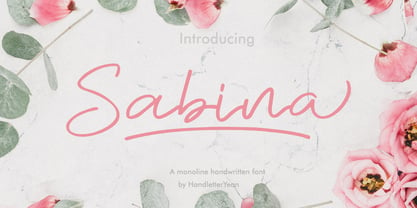 Sabina is a handwritten monoline font, with an elegant and beautiful look. This font also comes with ligatures, alternates, swooshes, and underlines. It will make your design look stand out and unique.
 - Notebook Scribble by Mariess,
$7.00 A hand drawn font thats perfect for kids cards, scrap-booking and photo annotation etc.. Full set of alternative characters included. Comes with CSS and HTML code plus all web compatible formats.
 - Roadway by PintassilgoPrints,
$24.90 Roadway is an original typeface with an antique accent, inspired by Clarendon woodtypes from late 19th century. It comes in three matching varieties, with extended character sets and a lot of personality.
 - Lactosa by Nasir Udin,
$18.00 Lactosa is a sweet script font that is bold, full of energy, and curvaceous! The font comes with alternates for you to play with, and can amplify the uniqueness of your designs.
 - Halbrein by Mr. Typeman,
$14.00 Meet my new font Halbrein – a romantic delicate script font with its poetic flow, which simulates natural handwriting. Halbrein comes with uppercase, lowercase, standard punctuation and special letters for most European languages.
 - FF Mode01 by FontFont,
$30.99 Italian type designer Fabrizio Schiavi created this pi and symbols FontFont in 1995. The font is ideally suited for music and nightlife and software and gaming. It comes with proportional lining figures.
 - Harrumph by Hanoded,
$20.00 Harrumph is a fat poster style font with a retro look. It comes with contextual and stylistic alternates for every letter and has more diacritics than you can poke a stick at.
 - Neo Strada by Differentialtype,
$10.00 Neo Strada is a bold geometric sans serif font that comes in many weights and several alternates. It's perfect for documents, font logos, blogs, social media, marketing campaigns and many other projects!
 - Paperboy by Ayca Atalay,
$14.00 Paperboy is a hand drawn serif with a whimsical look. With its playful attitude, Paperboy takes out the seriousness that comes with serif fonts, even though it follows the same typographic principles.
 - TrueLove by Autographis,
$39.50 TrueLove is my script for those occasions when you want to show someone that you really love him or her, when what you have to say really comes deeply from your heart.
 - Amulet by G-Type,
$39.00 Amulet evolved after a trip to Dublin, Ireland. It has a Celtic calligraphic influence which must have subconsciously come from looking at ancient manuscripts and the Book of Kells in Trinity College.
 - Amoba by Linecreative,
$16.00 Amoba is a very thick slab-serif font type. This font has supported supporting languages: Latin Western Europe and also comes with uppercase, lowercase, and ligature, So it gives design without limits
 - Narrow Nouveau JNL by Jeff Levine,
$29.00 Narrow Nouveau JNL come from the hand lettered title on a 1907 song folio for George M. Cohan's "The Talk of New York", and is available in both regular and oblique versions.
 - Maya Month Glyphs by Deniart Systems,
$15.00 Contains the 19 months of the Maya solar year (in outline and silhouette mode) as well as the 19 Maya numerals. NOTE: this font comes with an interpretation guide in pdf format.
 - Orange Leaves by Crumphand,
$9.50 Orange Leaves Fresh Fonts. This font is very unique shape. Comes with some ligature make your graphic looks fresh. Perfect Contour, Easy to read. What's Included ? Uppercase Lowercase Symbols Numerals Multilingual Support
 - Overnight JNL by Jeff Levine,
$29.00 Hand lettering on the cover of the 1932 sheet music for "Sleep, Come On and Take Me" was the basis for Overnight JNL, which is available in both regular and oblique versions.
 - Amateur Lettering JNL by Jeff Levine,
$29.00 From a vintage textbook on "modern" lettering circa the 1930s or 1940s comes a simple chamfered sans with oddly irregular shapes. Amateur Lettering JNL is available in both regular and oblique versions.
 - As of my last update in early 2023, the font Mops, designed by Uwe Borchert, may not be widely recognized in mainstream font inventories or among the popular choices for graphic designers and typogra...
- Mid Century Sans by Dharma Type,
$19.99 Mid Century Sans (MCS) is composed of high-geometric shapes. László Moholy-Nagy —professor in the Bauhaus— said “Typography is a tool of communication. It has to be communication in its most intense form. The emphasis must be on absolute clarity since this distinguishes the character of our own writing from that of ancient pictographic forms.” As same as you can see in modern typefaces in the early twentieth century, MCS has very efficient, clear and minima letterforms. There are not any decorative parts in the skeleton of letters. At the same time, Mid Century Sans has one more feature. In the middle of the twentieth century, one big movement which was called Mid-century modern had occurred. The Mid-century modern movement in the U.S. was an American reflection of the International and Bauhaus movements and it was slightly more organic in form and less formal than the International Bauhaus-style. In other words, it was friendly and stylish. We added Mid-century-spices to the Bauhaus-modernism. The basic letter form is geometric yet it has very friendly strokes and human touch. Mid Century Sans consists of 8 weights and their matching Italics for a wide range of usages. Farther, Mid Century Sans is supporting international Latin languages and basic Cyrillic languages including Basic Latin, Western Europe, Central and South-Eastern Europe. Also MCS covers Mac Roman, Windows1252, Adobe1 to 3. This wide range of international characters expands the capability of your works. Lowercase "a" has OpenType stylistic alternates for advanced typography.
 - Big Dreams by Twinletter,
$12.00 Introducing the Big Dreams font. As the name implies, this font will give an extraordinary impression and an experience that will never be forgotten, if you use this font in your design. We designed this font with thorough attention to each letter so that it has the right portion if it is arranged in a word or title and if it is made into a sentence it will be easy to remember and pleasing to the eye. Not limited to that, the bold calligraphy font is designed to keep paying attention to the beauty of each letter, there are alternate options for the letters which are certainly easy for you to access, so you can automatically customize the letters you want to enhance the visual appearance of your design project. This charming font also offers the beauty of abstract typography harmony for a wide variety of design projects, including digital natural handwriting for designs, quote designs, for social media business designs, advertisements, trademarks, food and beverage promotion banners, text, posters, a signature, and all designs require handwriting or whatever design you want. ============================================================================================================ What’s Included : File font Web Fonts Standard glyphs Ligature Works on PC & Mac Simple installations Accessible in Adobe Illustrator, Adobe Photoshop, Adobe InDesign, even work on Microsoft Word. PUA Encoded Characters – Fully accessible without additional design software. Fonts include multilingual support for; Afrikaans, Albanian, Croatian, Czech, Danish, Dutch, English, Estonian, Finnish, French, German, Hungarian, Italian, Norwegian, Polish, Portuguese, Slovak, Slovenian, Spanish, Swedish Thank you for your purchase! Hope you enjoy our font!
 - As of my last update, MW BISHOP by milkwort is a font that embodies a unique blend of traditional elegance and contemporary creativity, a reflection of milkwort's innovative approach to typography. M...
- Public Secret DEMO, created by David Kerkhoff, reflects an intriguing blend of mystery and openness, as its name intriguingly suggests. This typeface navigates the delicate balance between revealing ...
- The font !CRASS ROOTS OFL by !Exclamachine is an intriguing and captivating typeface that stands out for its raw energy and unapologetic boldness. It's a creation that embodies a fusion of graffiti-i...
- Heylova Script by Atasi Studio,
$16.00 HEYLOVA SCRIPT is a vintage script typeface with a groovy retro look. HEYLOVA SCRIPT is ready and Perfectly fit for your logo designs, music projects & social media posts, event poster, brand imagery, product packaging, handwritten quotes, merchandise, etc. More importantly, please don't hesitate to drop me a message if you have any issues or queries. Feel free to comment & contact me at atasistudio@gmail.com for more information. Thanks for purchasing and have fun! I really hope you enjoy it !
 - Carpe Noctem by Hanoded,
$20.00 Carpe Noctem (Latin for ‘Seize The Night’), was a bit of a surprise. Someone asked me if I could create a lower case for my Closet Skeleton font. I began working on it and lo and behold, a beautiful font started taking shape. So, if you’re in need of a slightly scary fairytale font, complete with angled edges, swirly bits, a couple of alternate - even more curly - glyphs and an alternate medieval ampersand, then Carpe Noctem is your typeface!
 - Metch Bright by Zeenesia Studio,
$16.00 Bright Diamond - Handwritten Font Bright Diamond is a script and regular handwritten font with a simple and classy style, this font is great for your next creative projects such as watermark on photography, logo design, wedding, invitation, quotes, book cover, business card, and many other design project. From business cards to photo watermarks. We hope you enjoy the font, please feel free to comment if you have any thoughts or feedback. Thanks for purchasing and glad to help you!
 - Melting Candle by Balpirick,
$15.00 Introducing by Balpirick Studio Melting Candle is a Note & Quotable Font - a delightful and endearing typeface that combines the charm of handwritten style with captivating outlines. This cute and lovable font is perfect for adding a touch of whimsy and playfulness to your designs. Melting Candle font is a versatile option for various design projects, such as greeting cards, invitations, children's books, and more. - also multilingual support Enjoy the font! Feel free to comment or feedback! Thank you!
 - Civons by Genetype,
$23.00 Introducing Civons Serif Display Font A perfect fusion of classic charm and modern allure. Ideal for branding and editorial projects, it effortlessly combines traditional serifs with a contemporary touch, radiating sophistication and uniqueness. So why stop at classic and boring serif fonts when you can add fun and uniqueness with this serif display font? give it a try and you'll love it! Enjoy the font, feel free to comment or feedback, send me PM or email. Thank you!