10,000 search results
(0.047 seconds)
- Anderlacht by Typehand Studio,
$12.00 Anderlacht is a vintage serif font with a stamp texture that is perfect for quotes, logos, designs, digital art and more. Also accompanied by several illustrations that make it possible to make designs very easily, and there is also a multilingual language. Anderlacht Regular & Italic Anderlacht Stamp Regular & Italic 12 illustrations in lines, solids and textures PUA Encoded Multilingual Language Support
 - Fecktor by limitype,
$17.00 FECKTOR - MODULAR TYPEFACE Fecktor is a decorative typeface made for display needs, headlines, logos etc. Made with minimalism inspired by the shape of butterfly wings combined with modular to produce a modern Art deco impression and style. Fecktor has 8 variations ( light, regular, bold, solid, extended light, extended regular, extended bold and extended solid ) equipped with uppercase, lowercase, numbers and some symbols
 - Impacted - Unknown license

- Scarious by Rillatype,
$15.00 Scarious is perfectly made to be applied for logos, logotype, magazines, book, branding, packaging, fashion, stationary, novel, display use and more. if you have any other question feel free to hit us on rillatype@gmail.com
 - Daimaru by Arendxstudio,
$16.00 Introducing Daimaru Modern Signature font, hand made with brushing. Beautiful for wedding card design, logotype, website header, fashion design and any more. Features : • Character Set A-Z • Numerals & Punctuations (OpenType Standard) • Accents (Multilingual characters) • Ligature
 - Display Squares Two by Gerald Gallo,
$20.00 Display Squares Two is a display font not intended for text use. It was designed specifically for display, headline, logotype, branding, and similar applications. Display Squares Two has upper and lowercase alphabets, numbers, and punctuation.
 - Display Dots One by Gerald Gallo,
$20.00 Display Dots One is a display font not intended for text use. It was designed specifically for display, headline, logotype, branding, and similar applications. Display Dots One has upper and lowercase alphabets, numbers, and punctuation.
 - Candy Lovely by Good Java Studio,
$25.00 Candy Lovely - Cute Handwritten Font make from handlettering ideas in typeface. This font includes full of Alphabetical glyphs, Numerals, and punctuation. This is so perfect for invitations, monograms, wedding, fashion, branding, label, handlettering or logotype.
 - Display Dots Seven by Gerald Gallo,
$20.00 Display Dots Seven is a display font not intended for text use. It was designed specifically for display, headline, logotype, branding, and similar applications. Display Dots Seven has upper and lowercase alphabets, numbers, and punctuation.
 - October Quirky by Good Java Studio,
$20.00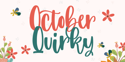 October Quirky - Cute Quirky font make from handlettering ideas in typeface. This font includes full of Alphabetical glyphs, Numerals, and punctuation. This is so perfect for invitations, monograms, wedding, fashion, branding, label, handlettering or logotype.
 - Mooncake by RA Studio,
$10.00 He is round. He is funny. He is Mooncake font. It is perfect for eye-catching signs, posters, headers, product packaging, book cover, logotype, apparel design and etc. Display font Extended latin & cyrillic 600 glifs
 - Julmeme-Kun by Julmeme,
$25.00 Julmeme-Kun is a fully italic font. This unique characteristic added to its tall and elegant proportions makes it a very dynamic typeface. Applicable for any type of graphic design, especially for posters and logotypes.
 - Display Squares One by Gerald Gallo,
$20.00 Display Squares One is a display font not intended for text use. It was designed specifically for display, headline, logotype, branding, and similar applications. Display Squares One has upper and lowercase alphabets, numbers, and punctuation.
 - Basely Bagel by RA Studio,
$12.00 He is round. He is funny. He is Bagel font. It is perfect for eye-catching signs, posters, headers, product packaging, book cover, logotype, apparel design and etc. Display font Extended latin & Cyrillic 605 glifs
 - Tasci Kufi by Abdullah Tasci,
$50.00Tasci Kufi is the today’s commentary of the minimalist comprehension of the geometric balance in the epigraphs of the Seljuk period. The typeface offers innumerable alternatives for the balance component needed for headlines and logotypes. - Times New Roman PS Cyrillic by Monotype,
$67.99In 1931, The Times of London commissioned a new text type design from Stanley Morison and the Monotype Corporation, after Morison had written an article criticizing The Times for being badly printed and typographically behind the times. The new design was supervised by Stanley Morison and drawn by Victor Lardent, an artist from the advertising department of The Times. Morison used an older typeface, Plantin, as the basis for his design, but made revisions for legibility and economy of space (always important concerns for newspapers). As the old type used by the newspaper had been called Times Old Roman," Morison's revision became "Times New Roman." The Times of London debuted the new typeface in October 1932, and after one year the design was released for commercial sale. The Linotype version, called simply "Times," was optimized for line-casting technology, though the differences in the basic design are subtle. The typeface was very successful for the Times of London, which used a higher grade of newsprint than most newspapers. The better, whiter paper enhanced the new typeface's high degree of contrast and sharp serifs, and created a sparkling, modern look. In 1972, Walter Tracy designed Times Europa for The Times of London. This was a sturdier version, and it was needed to hold up to the newest demands of newspaper printing: faster presses and cheaper paper. In the United States, the Times font family has enjoyed popularity as a magazine and book type since the 1940s. Times continues to be very popular around the world because of its versatility and readability. And because it is a standard font on most computers and digital printers, it has become universally familiar as the office workhorse. Times?, Times? Europa, and Times New Roman? are sure bets for proposals, annual reports, office correspondence, magazines, and newspapers. Linotype offers many versions of this font: Times? is the universal version of Times, used formerly as the matrices for the Linotype hot metal line-casting machines. The basic four weights of roman, italic, bold and bold italic are standard fonts on most printers. There are also small caps, Old style Figures, phonetic characters, and Central European characters. Times? Ten is the version specially designed for smaller text (12 point and below); its characters are wider and the hairlines are a little stronger. Times Ten has many weights for Latin typography, as well as several weights for Central European, Cyrillic, and Greek typesetting. Times? Eighteen is the headline version, ideal for point sizes of 18 and larger. The characters are subtly condensed and the hairlines are finer." - Times New Roman Seven by Monotype,
$67.99In 1931, The Times of London commissioned a new text type design from Stanley Morison and the Monotype Corporation, after Morison had written an article criticizing The Times for being badly printed and typographically behind the times. The new design was supervised by Stanley Morison and drawn by Victor Lardent, an artist from the advertising department of The Times. Morison used an older typeface, Plantin, as the basis for his design, but made revisions for legibility and economy of space (always important concerns for newspapers). As the old type used by the newspaper had been called Times Old Roman," Morison's revision became "Times New Roman." The Times of London debuted the new typeface in October 1932, and after one year the design was released for commercial sale. The Linotype version, called simply "Times," was optimized for line-casting technology, though the differences in the basic design are subtle. The typeface was very successful for the Times of London, which used a higher grade of newsprint than most newspapers. The better, whiter paper enhanced the new typeface's high degree of contrast and sharp serifs, and created a sparkling, modern look. In 1972, Walter Tracy designed Times Europa for The Times of London. This was a sturdier version, and it was needed to hold up to the newest demands of newspaper printing: faster presses and cheaper paper. In the United States, the Times font family has enjoyed popularity as a magazine and book type since the 1940s. Times continues to be very popular around the world because of its versatility and readability. And because it is a standard font on most computers and digital printers, it has become universally familiar as the office workhorse. Times?, Times? Europa, and Times New Roman? are sure bets for proposals, annual reports, office correspondence, magazines, and newspapers. Linotype offers many versions of this font: Times? is the universal version of Times, used formerly as the matrices for the Linotype hot metal line-casting machines. The basic four weights of roman, italic, bold and bold italic are standard fonts on most printers. There are also small caps, Old style Figures, phonetic characters, and Central European characters. Times? Ten is the version specially designed for smaller text (12 point and below); its characters are wider and the hairlines are a little stronger. Times Ten has many weights for Latin typography, as well as several weights for Central European, Cyrillic, and Greek typesetting. Times? Eighteen is the headline version, ideal for point sizes of 18 and larger. The characters are subtly condensed and the hairlines are finer." - Times New Roman WGL by Monotype,
$67.99 In 1931, The Times of London commissioned a new text type design from Stanley Morison and the Monotype Corporation, after Morison had written an article criticizing The Times for being badly printed and typographically behind the times. The new design was supervised by Stanley Morison and drawn by Victor Lardent, an artist from the advertising department of The Times. Morison used an older typeface, Plantin, as the basis for his design, but made revisions for legibility and economy of space (always important concerns for newspapers). As the old type used by the newspaper had been called Times Old Roman," Morison's revision became "Times New Roman." The Times of London debuted the new typeface in October 1932, and after one year the design was released for commercial sale. The Linotype version, called simply "Times," was optimized for line-casting technology, though the differences in the basic design are subtle. The typeface was very successful for the Times of London, which used a higher grade of newsprint than most newspapers. The better, whiter paper enhanced the new typeface's high degree of contrast and sharp serifs, and created a sparkling, modern look. In 1972, Walter Tracy designed Times Europa for The Times of London. This was a sturdier version, and it was needed to hold up to the newest demands of newspaper printing: faster presses and cheaper paper. In the United States, the Times font family has enjoyed popularity as a magazine and book type since the 1940s. Times continues to be very popular around the world because of its versatility and readability. And because it is a standard font on most computers and digital printers, it has become universally familiar as the office workhorse. Times?, Times? Europa, and Times New Roman? are sure bets for proposals, annual reports, office correspondence, magazines, and newspapers. Linotype offers many versions of this font: Times? is the universal version of Times, used formerly as the matrices for the Linotype hot metal line-casting machines. The basic four weights of roman, italic, bold and bold italic are standard fonts on most printers. There are also small caps, Old style Figures, phonetic characters, and Central European characters. Times? Ten is the version specially designed for smaller text (12 point and below); its characters are wider and the hairlines are a little stronger. Times Ten has many weights for Latin typography, as well as several weights for Central European, Cyrillic, and Greek typesetting. Times? Eighteen is the headline version, ideal for point sizes of 18 and larger. The characters are subtly condensed and the hairlines are finer."
 - Times New Roman by Monotype,
$67.99 In 1931, The Times of London commissioned a new text type design from Stanley Morison and the Monotype Corporation, after Morison had written an article criticizing The Times for being badly printed and typographically behind the times. The new design was supervised by Stanley Morison and drawn by Victor Lardent, an artist from the advertising department of The Times. Morison used an older typeface, Plantin, as the basis for his design, but made revisions for legibility and economy of space (always important concerns for newspapers). As the old type used by the newspaper had been called Times Old Roman," Morison's revision became "Times New Roman." The Times of London debuted the new typeface in October 1932, and after one year the design was released for commercial sale. The Linotype version, called simply "Times," was optimized for line-casting technology, though the differences in the basic design are subtle. The typeface was very successful for the Times of London, which used a higher grade of newsprint than most newspapers. The better, whiter paper enhanced the new typeface's high degree of contrast and sharp serifs, and created a sparkling, modern look. In 1972, Walter Tracy designed Times Europa for The Times of London. This was a sturdier version, and it was needed to hold up to the newest demands of newspaper printing: faster presses and cheaper paper. In the United States, the Times font family has enjoyed popularity as a magazine and book type since the 1940s. Times continues to be very popular around the world because of its versatility and readability. And because it is a standard font on most computers and digital printers, it has become universally familiar as the office workhorse. Times?, Times? Europa, and Times New Roman? are sure bets for proposals, annual reports, office correspondence, magazines, and newspapers. Linotype offers many versions of this font: Times? is the universal version of Times, used formerly as the matrices for the Linotype hot metal line-casting machines. The basic four weights of roman, italic, bold and bold italic are standard fonts on most printers. There are also small caps, Old style Figures, phonetic characters, and Central European characters. Times? Ten is the version specially designed for smaller text (12 point and below); its characters are wider and the hairlines are a little stronger. Times Ten has many weights for Latin typography, as well as several weights for Central European, Cyrillic, and Greek typesetting. Times? Eighteen is the headline version, ideal for point sizes of 18 and larger. The characters are subtly condensed and the hairlines are finer."
 - Times New Roman Small Text by Monotype,
$67.99In 1931, The Times of London commissioned a new text type design from Stanley Morison and the Monotype Corporation, after Morison had written an article criticizing The Times for being badly printed and typographically behind the times. The new design was supervised by Stanley Morison and drawn by Victor Lardent, an artist from the advertising department of The Times. Morison used an older typeface, Plantin, as the basis for his design, but made revisions for legibility and economy of space (always important concerns for newspapers). As the old type used by the newspaper had been called Times Old Roman," Morison's revision became "Times New Roman." The Times of London debuted the new typeface in October 1932, and after one year the design was released for commercial sale. The Linotype version, called simply "Times," was optimized for line-casting technology, though the differences in the basic design are subtle. The typeface was very successful for the Times of London, which used a higher grade of newsprint than most newspapers. The better, whiter paper enhanced the new typeface's high degree of contrast and sharp serifs, and created a sparkling, modern look. In 1972, Walter Tracy designed Times Europa for The Times of London. This was a sturdier version, and it was needed to hold up to the newest demands of newspaper printing: faster presses and cheaper paper. In the United States, the Times font family has enjoyed popularity as a magazine and book type since the 1940s. Times continues to be very popular around the world because of its versatility and readability. And because it is a standard font on most computers and digital printers, it has become universally familiar as the office workhorse. Times?, Times? Europa, and Times New Roman? are sure bets for proposals, annual reports, office correspondence, magazines, and newspapers. Linotype offers many versions of this font: Times? is the universal version of Times, used formerly as the matrices for the Linotype hot metal line-casting machines. The basic four weights of roman, italic, bold and bold italic are standard fonts on most printers. There are also small caps, Old style Figures, phonetic characters, and Central European characters. Times? Ten is the version specially designed for smaller text (12 point and below); its characters are wider and the hairlines are a little stronger. Times Ten has many weights for Latin typography, as well as several weights for Central European, Cyrillic, and Greek typesetting. Times? Eighteen is the headline version, ideal for point sizes of 18 and larger. The characters are subtly condensed and the hairlines are finer." - Times New Roman PS Greek by Monotype,
$67.99In 1931, The Times of London commissioned a new text type design from Stanley Morison and the Monotype Corporation, after Morison had written an article criticizing The Times for being badly printed and typographically behind the times. The new design was supervised by Stanley Morison and drawn by Victor Lardent, an artist from the advertising department of The Times. Morison used an older typeface, Plantin, as the basis for his design, but made revisions for legibility and economy of space (always important concerns for newspapers). As the old type used by the newspaper had been called Times Old Roman," Morison's revision became "Times New Roman." The Times of London debuted the new typeface in October 1932, and after one year the design was released for commercial sale. The Linotype version, called simply "Times," was optimized for line-casting technology, though the differences in the basic design are subtle. The typeface was very successful for the Times of London, which used a higher grade of newsprint than most newspapers. The better, whiter paper enhanced the new typeface's high degree of contrast and sharp serifs, and created a sparkling, modern look. In 1972, Walter Tracy designed Times Europa for The Times of London. This was a sturdier version, and it was needed to hold up to the newest demands of newspaper printing: faster presses and cheaper paper. In the United States, the Times font family has enjoyed popularity as a magazine and book type since the 1940s. Times continues to be very popular around the world because of its versatility and readability. And because it is a standard font on most computers and digital printers, it has become universally familiar as the office workhorse. Times?, Times? Europa, and Times New Roman? are sure bets for proposals, annual reports, office correspondence, magazines, and newspapers. Linotype offers many versions of this font: Times? is the universal version of Times, used formerly as the matrices for the Linotype hot metal line-casting machines. The basic four weights of roman, italic, bold and bold italic are standard fonts on most printers. There are also small caps, Old style Figures, phonetic characters, and Central European characters. Times? Ten is the version specially designed for smaller text (12 point and below); its characters are wider and the hairlines are a little stronger. Times Ten has many weights for Latin typography, as well as several weights for Central European, Cyrillic, and Greek typesetting. Times? Eighteen is the headline version, ideal for point sizes of 18 and larger. The characters are subtly condensed and the hairlines are finer." - Times New Roman PS by Monotype,
$67.99In 1931, The Times of London commissioned a new text type design from Stanley Morison and the Monotype Corporation, after Morison had written an article criticizing The Times for being badly printed and typographically behind the times. The new design was supervised by Stanley Morison and drawn by Victor Lardent, an artist from the advertising department of The Times. Morison used an older typeface, Plantin, as the basis for his design, but made revisions for legibility and economy of space (always important concerns for newspapers). As the old type used by the newspaper had been called Times Old Roman," Morison's revision became "Times New Roman." The Times of London debuted the new typeface in October 1932, and after one year the design was released for commercial sale. The Linotype version, called simply "Times," was optimized for line-casting technology, though the differences in the basic design are subtle. The typeface was very successful for the Times of London, which used a higher grade of newsprint than most newspapers. The better, whiter paper enhanced the new typeface's high degree of contrast and sharp serifs, and created a sparkling, modern look. In 1972, Walter Tracy designed Times Europa for The Times of London. This was a sturdier version, and it was needed to hold up to the newest demands of newspaper printing: faster presses and cheaper paper. In the United States, the Times font family has enjoyed popularity as a magazine and book type since the 1940s. Times continues to be very popular around the world because of its versatility and readability. And because it is a standard font on most computers and digital printers, it has become universally familiar as the office workhorse. Times?, Times? Europa, and Times New Roman? are sure bets for proposals, annual reports, office correspondence, magazines, and newspapers. Linotype offers many versions of this font: Times? is the universal version of Times, used formerly as the matrices for the Linotype hot metal line-casting machines. The basic four weights of roman, italic, bold and bold italic are standard fonts on most printers. There are also small caps, Old style Figures, phonetic characters, and Central European characters. Times? Ten is the version specially designed for smaller text (12 point and below); its characters are wider and the hairlines are a little stronger. Times Ten has many weights for Latin typography, as well as several weights for Central European, Cyrillic, and Greek typesetting. Times? Eighteen is the headline version, ideal for point sizes of 18 and larger. The characters are subtly condensed and the hairlines are finer." - Bologna by David Turner,
$35.00 Inspired by pointed pen calligraphy and modulated sans serif typefaces used for advertising in the 1920´s, Bologna is a high contrasted sans serif with a modern and fashionable look. Bologna comes in three weights: Regular, Bold and Black. The Regular and Bold weights are, despite of their high contrast, also build for body texts. Whereas Bologna Black, with a more expressive look and sharp angles, is specially designed for large and striking headlines, packaging or identities. Overview: 3 weights - Regular, Bold, Black Regular/Bold: 657 Glyphs Black: 871 Glyphs Lining, tabular and old style figures Ligatures: fl, fi, ff, ffi ffl, Unicase Letters: a, e, m, n, r Alternative Guillemets Case Sensitive Arrows Bologna Black: hairline accents and interpunctations Fractions Extended Language Support Stylistic Sets: ss01 = Alternative Guillemets / Alternative y ss02 = Unicase glyphs ss03 = Numerals in circle ss04 = Numerals in black circle ss05 = Hairline Accents and Interpunctations (Bologna Black)
 - Lustra by Grype,
$16.00 Since the early 1980's, the automotive industry has been developing geometric/technical style logotypes for car chrome labels. The styles are ripe with inspiration for great font families, but surprisingly, many of these sleek logotypes are lacking an expansive family to enhance and express their brand in a richer sense, becoming true brand workhorses. The Lustra family finds its origin of inspiration in the HYUNDAI automotive company logo, and from there expands to an 8 font family of weights. Lustra celebrates the techno display styling of the inspiration logotype, transcending its brand inspired origin to give birth to a font family that pulls on modern and historical styles. It inherits a sturdy yet approachable style with its uniform stroke forms and curves, and goes on to include a lowercase, numerals, and a comprehensive range of weights, creating a straightforward, uncompromising collection of typefaces that lend a solid foundation and a broad range of expression for designers.
 - Ellington MT by Monotype,
$29.99 Ellington was designed by jazz lover, Michael Harvey for Monotype in 1990, and named after the great band leader, Duke Ellington. From experience gained carving letters in stone and drawing them for book jacket designs, Michael Harvey has created a condensed typeface combining the clear-cut sparkle of a modern face with some of the lively features of the broad-edged pen. Ellington has a fresh elegance that is particularly effective in display, while its compressed forms will prove economical in text settings. The Ellington font family has narrow characters with strong vertical strokes and angular calligraphic traits. Ellington is a lively face and an appropriate font choice for advertising and book work. Ellington has a sans serif companion family, Strayhorn.
 - SpiroFace - 100% free

- Tektrron - 100% free

- BN-67.9010-03 - Unknown license

- SpongeFont SquareType - Unknown license

- WhisperWrite - Unknown license

- OregonDry - Unknown license

- Immortal - Unknown license

- Grotesk Remix by bb-bureau,
$65.00 GroteskRemix — remix of a Grotesk typeface in 6 styles (thin - light - regular - medium - bold - black) language: all latin glyphs
 - Ergonomix - Unknown license

- Ergonome - Unknown license

- Mode by Daggertypo,
$24.00 Mode is a typographic experiment exploring how same sans serif form adapts to different circumstances and what are the possibilities in variations of Thin / Black, Contrast / Negative contrast. Two main groups are Mode 0 (with rounded shapes) and Mode 1 (with angular shapes). Each of them varies from Thin to Black in six cuts, in the same manner it varies from contrast shapes to negative contrast. Mode comes in total of 72 cuts regular and italic, it speaks majority of Latin based languages and is equipped with smcp, c2sc, Old style and all caps numerals. Mode is made by DAGGERtypo during a period of 2019/2020
 - Starkey by Mans Greback,
$59.00 Starkey is a bold, handwritten script typeface. It is modern, quirky and clean, with a natural brush style that can be used for all your projects and needs. Each glyph is carefully drawn, and all of them have their own uniqueness. When connecting with each other, they will provide dynamic and pleasing proximity and a beautiful flow. The high-quality logotype lettering works perfectly for branding and in any joyful context, such as product designs, labels, invitations and much more. Use characters { } < > _ to create swashes. Write multiple characters to get longer swashes. Example: Eter{{{nal The font is full of ligatures, alternates and other OpenType functions. It has extensive language support, allowing you to write in all European Latin based scripts, as well as containing numbers and all characters and symbols you'll ever need.
 - Monvar by Flavortype,
$15.00 Monvar, A new Cooper with layered typefaces. It’s Simple, Bold, Versatile, and Friendly feel that you get in Monvar Typefaces. Monvar comes with 5 Layers : (that you can mix and match the looks as you like) Base Inset Outline Shadow 1 Shadow 2 Monvar Created with an All Caps that the uppercase are using an initial swashes. Perfect fitted layer to give you a more contrast, more bold look of the title. Every glyphs including the alternate characters are curated for the best and possible without eliminate characteristic of this fonts. Our creation on the display to give you a reference what it looks like on your project. such as Branding, Header, Logotype, Poster, Magazine, Packaging, Food Menus, and etc. It shows that Monvar clearly can accommodate various design style.
 - Rigoletto by Sabrcreative,
$15.00 Introducing Rigoletto Font Duo, a stunning combination of a monoline script and Sans Serif fonts. This font duo offers a neat and clean monoline style, complemented by the versatility of the Sans Serif fonts, resulting in designs that are sophisticated, expensive, and elegant. With 70 alternates included, Rigoletto allows you to add decorative elements to your designs effortlessly. It supports a wide range of languages, including English, Danish, Dutch, Estonian, Faroese, Filipino, Finnish, French, German, Hungarian, Icelandic, Irish, Italian, Norwegian, Polish, Portuguese, Spanish, Swedish, and more. Unleash your creativity with Rigoletto Font Duo! It is perfect for various applications such as logotypes, wedding invitations, vintage labels, romantic cards, and much more. Its unique combination of monoline script and Sans Serif fonts adds a touch of elegance to any project.
 - Hanleth by great19,
$14.00 Hanleth family is a combination of script and all cap sans. This duo font was made and inspired by old vintage script and simple sans, polished with a little bit of modern style. This font family is a vintage, authentic and hand crafted piece of typeface. 1. Hanleth script : comes with clean and rough version. with some swash and alternates that make it looks unique and elegant. 2. Hanleth sans : comes with clean and vintage rustic version. a simple sans that generally good for tittle and body text. 3. Hanleth icon : comes with 52 vintage rustic icons is perfect to boost the vintage feel of this family. Hanleth family is perfect to make logotype, product packaging, tittle for poster or greeting card, promotional message, branding project and more.


