10,000 search results (0.039 seconds)
  1. OldgateLaneOutline - Unknown license
  2. Materhorn - Unknown license
  3. FeteAccompli - Unknown license
  4. FullTiltBoogie - Unknown license
  5. DoctorJekyll - 100% free
  6. PopularCafeAA - 100% free
  7. CongaLine - Unknown license
  8. Sarsaparilla - Unknown license
  9. Brokenbaby - Unknown license
  10. EastMarket - 100% free
  11. SouciSans - 100% free
  12. DecoDingbats1 - 100% free
  13. HOLE 3 - Unknown license
  14. EmpireState - 100% free
  15. Lizzard - Unknown license
  16. Nightcap - 100% free
  17. Studebaker - Unknown license
  18. Love Parade - Unknown license
  19. JungleFever - Unknown license
  20. RitzyNormal - 100% free
  21. OurGang - Unknown license
  22. Chinese Firedrill - Unknown license
  23. Flatiron - Unknown license
  24. AnAkronism - 100% free
  25. FungFoo - Unknown license
  26. TaraBulbous - Unknown license
  27. Sesquipedalian - 100% free
  28. bubba - Unknown license
  29. Square Unique - Unknown license
  30. DancingDonuts - Unknown license
  31. Bittersweet - 100% free
  32. Dreamspeak - Unknown license
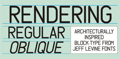
  33. Rendering JNL by Jeff Levine, $29.00
    Rendering JNL was inspired by European-style plastic stencils which emulate the block lettering with rounded ends used for years by architectural draftspersons.
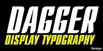
  34. Dagger by ParaType, $30.00
    Developed at ParaType in 1996 by Alexander Tarbeev, based on PT Compact, 1991, by Vladimir Yefimov. For use in advertising and display typography.
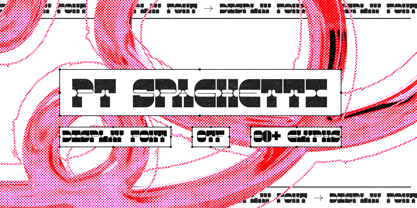
  35. PT Spaghetti by Paupe Type, $10.00
    PT Spaghetti is a display font inspired by Spaghetti Western films but with a playful twist given by big serif and high contrast.
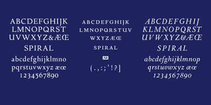
  36. Spiral by ARTypes, $35.00
    Spiral is a digital transcription of a design by Joseph Blumenthal (1897-1990) which was hand-cut by Louis Hoell and cast by the Bauer foundry in 1930. The design with an italic added was later cut for Monotype and issued in 1936 as Emerson 320.
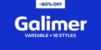
  37. Galimer by OneSevenPointFive, $25.00
    Galimer is a humanist variable sans serif family. It comes in 18 styles, 9 weights and their corresponding italics. It supports two axis variability - weight and italic. Each of the weights includes support for 80+ languages worldwide. It is packed with powerful opentype features - linked characters, kerning pairs, fractions, superiors, inferiors, etc. Galimer is perfectly suitable for all platforms (desktop, webfont, printing, etc.) Contact - https://forms.gle/VHM7b8FHQiqK8zx9A
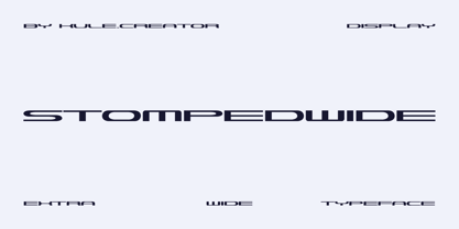
  38. Stompedwide by KuleType, $5.00
    Stompedwide is a modern/futuristic and minimal looking typeface that surely will give your designs unique look and catch the eye of the reader. It works very well in projects such as logos, banners, magazine headlines. Since It's a display font It works best at big scale and It's not suitable for longer texts. It pairs nicely with modern, geometric fonts such as Montserrat. 2 weights available
  39. Bradley Type by ITC, $40.99
    The details that work for ITC Bradley Hand™ at smaller sizes, might be a little too distracting for some at larger, display sizes. Bradley Type™, is a little softer, more refined, and a touch more condensed - especially useful if space is an issue. It can be used as a compliment or counterpart to Bradley Hand, or on its own for short bursts of text or headlines. Richard Bradley explains, I designed the family for casual home computer users as well as professional graphic communicators. For anyone who's looking for a handwriting typeface, Bradley Type can be used at a variety of sizes for diverse projects." For added versatility, it's available in three weights, from the lean Regular, through Bold, and Heavy; and a number of ligatures and alternates for variety, and that little added flair."
  40. AZN Knuckles Varsity by AthayaDZN, $10.00
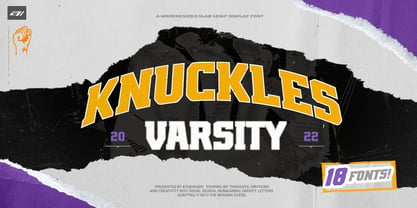
    Introducing "AZN Knuckles Varsity" font by AthayaDZN. Revolutionizing a varsity slab serif, combining sharp and rounded edges, angled serif, and a variety of weights, fitting it into the modern scene. Equipped with 3 styles ( Defined, Regular, Stencil ) Use the Defined version if you are aiming for that slab serif look, just like the name suggested, it defines the modernized slab serif on each letter, giving it that retro look yet still in the modern scene. Especially on the light weight of this version, the slab serif is really prominent. Use the Regular Version if you are aiming for any type of design that you see this font fits especially the modern scene, just like how it's advertised. Use the Stencil version if you are aiming to make a statement, my favorite one is the Bold and Italic version of the Stencil if I was to make a statement, just like the preview where it says "Anarchy", the separated shapes of the letter combined with it's bold and slanted shape is perfect to make a strong statement. Language Support : Afrikaans, Albanian, Danish, Dutch, English, Estonian, Filipino, Finnish, French, Galician, Indonesian, Irish, Italian, Luxembourgish, Norwegian, Portuguese, Romansh, Scottish Gaelic, Spanish, Swedish, Swiss German, Uzbek (Latin). And that's it for this font, thank you for purchasing the product, I wish you success on your projects. Please enjoy the font and let me know if you needed any help or if you have any questions -Athaya twitter.com/Athaya_DZN behance.net/athayadzn
Looking for more fonts? Check out our New, Sans, Script, Handwriting fonts or Categories
abstract fontscontact usprivacy policyweb font generator
Processing