10,000 search results
(0.044 seconds)
- Absurdies by Typephases,
$25.00 Absurdies is a trilogy of pictorial typefaces with lots of mischief, fun, weirdness, black humour and amusement. It includes 143 digitized illustrations. You will find many inexplicable behaviours, madmen, strange occupations, absurd and chaos-loving characters, and general whimsy. This little crowd can be used in many ways, from spot illustration to big illustration work or graphic designs, taking advantage of the vectorial format of the font file. The characters in Absurdies (together with their kin, the Illustries, Whimsies, Ombres, Bizarries and Genteta dingbats) are drawings from the sketchpad of Joan M. Mas, drawn from imagination and with no reference, except in a handful of cases pulled from historical photography. He wanted an easy-to-use format to collect his hundreds of imaginary ink drawings and he realized a digital typeface was an ideal solution. Having the illustrations gathered in a font file means you can use them instantly in any program you like. You may choose to use the images out of the box, or further customize them with colours and textures. The possibilities are endless.
 - Isabel Condensed by Letritas,
$30.00 Isabel Condensed and Isabel were made out of necessity to create a new font for children and teenagers, that could be enough friendly and versatile for text in words or even easy-to-read long texts. The purpose of Isabel is to combine all the nice and friendly features of the simple letters that the teachers teach to the pupils at primary school, as they starting to learn to read, together with the normal editorial fonts we read every day. In this way it generates a very joyful serif font, or even friendly font, with some conservative aspects. In other words, Isabel is a font that, despite of being a “classic features” typography, is proud to show its innocent and ingenuous elements, this gives to the font a new point of view. The family is composed of 3 parts: the regular version, the italic version and the unicase version. Each one of them has 5 weights. The italic version has 825 characters; the regular and unicase have 739 and are composed for 220 latin languages, plus cyrilic.
 - Isabel SemiCondensed by Letritas,
$30.00 Isabel SemiCondensed, together with Isabel condensed and Isabel were made out of necessity to create a new font for children and teenagers, that could be enough friendly and versatile for text in words or even easy-to- read long texts. The purpose of Isabel is to combine all the nice and friendly features of the simple letters that the teachers teach to the pupils at primary school, as they starting to learn to read, together with the normal editorial fonts we read every day. In this way it generates a very joyful serif font, or even friendly font, with some conservative aspects. In other words, Isabel is a font that, despite of being a “classic features” typography, is proud to show its innocent and ingenuous elements, this gives to the font a new point of view. The family is composed of 3 parts: the regular version, the italic version and the unicase version. Each one of them has 5 weights. The italic version has 825 characters; the regular and unicase have 739 and are composed for 220 latin languages, plus cyrilic.
 - Goudy Text by Monotype,
$29.99The word Text" in Goudy Text™ is short for Textura, and textura is the style of blackletter or gothic writing developed in Northern Europe in the middle ages. The use of space in blackletter is quite different from what we know about Roman letterforms. Lowercase forms in blackletter writing and typefaces must be evenly textured with black and white elements, like the texture of weaving or fabric. Capital letters can provide either an integration of the even texture (by the use of decoration in their construction) or, if they are wide and open and filled with white, they provide bright spots of visual emphasis. Goudy, despite being an American in the twentieth century, understood well the fundamental texture of medieval blackletter and the importance of both density and light. He designed Goudy Text in 1928 for Lanston Monotype after studying the type in Gutenberg's 42-line bible; still one of the best models for designers of blackletter typefaces. The lowercase of Goudy Text has impact and medieval authenticity. The standard caps have some Victorian eccentricities but are mostly well drawn. The alternate, or "Lombardic" caps are spectacular - they set beautifully with the lowercase letters, providing the proverbial shafts of light through the Gothic cathedral's stained glass windows. Use this potent font in sizes 14 point or larger, for Christmas greetings, certificates, wedding invitations, advertising, or music collateral pieces." - ITC Franklin by ITC,
$40.99 The ITC Franklin™ typeface design marks the next phase in the evolution of one of the most important American gothic typefaces. Morris Fuller Benton drew the original design in 1902 for American Type Founders (ATF); it was the first significant modernization of a nineteenth-century grotesque. Named in honor of Benjamin Franklin, the design not only became a best seller, it also served as a model for several other sans serif typefaces that followed it. Originally issued in just one weight, the ATF Franklin Gothic family was expanded over several years to include an italic, a condensed, a condensed shaded, an extra condensed and, finally, a wide. No light or intermediate weights were ever created for the metal type family. In 1980, under license from American Type Founders, ITC commissioned Victor Caruso to create four new weights in roman and italic - book, medium, demi and heavy - while preserving the characteristics of the original ATF design. This series was followed in 1991 by a suite of twelve condensed and compressed designs drawn by David Berlow. ITC Franklin Gothic was originally released as two designs: one for display type and one for text. However, in early digital interpretations, a combined text and display solution meant the same fonts were used to set type in any size, from tiny six-point text to billboard-size letters. The problem was that the typeface design was almost always compromised and this hampered its performance at any size. David Berlow, president of Font Bureau, approached ITC with a proposal to solve this problem that would be mutually beneficial. Font Bureau would rework the ITC Franklin Gothic family, enlarge and separate it into distinct text and display designs, then offer it as part of its library as well. ITC saw the obvious value in the collaboration, and work began in early 2004. The project was supposed to end with the release of new text and display designs the following year. But, like so many design projects, the ITC Franklin venture became more extensive, more complicated and more time consuming than originally intended. The 22-font ITC Franklin Gothic family has now grown to 48 designs and is called simply ITC Franklin. The new designs range from the very willowy Thin to the robust Ultra -- with Light, Medium, Bold and Black weights in between. Each weight is also available in Narrow, Condensed and Compressed variants, and each design has a complementary Italic. In addition to a suite of new biform characters (lowercase characters drawn with the height and weight of capitals), the new ITC Franklin Pro fonts also offer an extended character set that supports most Central European and many Eastern European languages. ITC Franklin Text is currently under development.
 - Antique by Storm Type Foundry,
$26.00The concept of the Baroque Roman type face is something which is remote from us. Ungrateful theorists gave Baroque type faces the ill-sounding attribute "Transitional", as if the Baroque Roman type face wilfully diverted from the tradition and at the same time did not manage to mature. This "transition" was originally meant as an intermediate stage between the Aldine/Garamond Roman face of the Renaissance, and its modern counterpart, as represented by Bodoni or Didot. Otherwise there was also a "transition" from a slanted axis of the shadow to a perpendicular one. What a petty detail led to the pejorative designation of Baroque type faces! If a bookseller were to tell his customers that they are about to choose a book which is set in some sort of transitional type face, he would probably go bust. After all, a reader, for his money, would not put up with some typographical experimentation. He wants to read a book without losing his eyesight while doing so. Nevertheless, it was Baroque typography which gave the world the most legible type faces. In those days the craft of punch-cutting was gradually separating itself from that of book-printing, but also from publishing and bookselling. Previously all these activities could be performed by a single person. The punch-cutter, who at that time was already fully occupied with the production of letters, achieved better results than he would have achieved if his creative talents were to be diffused in a printing office or a bookseller's shop. Thus it was possible that for example the printer John Baskerville did not cut a single letter in his entire lifetime, for he used the services of the accomplished punch-cutter John Handy. It became the custom that one type founder supplied type to multiple printing offices, so that the same type faces appeared in various parts of the world. The type face was losing its national character. In the Renaissance period it is still quite easy to distinguish for example a French Roman type face from a Venetian one; in the Baroque period this could be achieved only with great difficulties. Imagination and variety of shapes, which so far have been reserved only to the fine arts, now come into play. Thanks to technological progress, book printers are now able to reproduce hairstrokes and imitate calligraphic type faces. Scripts and elaborate ornaments are no longer the privilege of copper-engravers. Also the appearance of the basic, body design is slowly undergoing a change. The Renaissance canonical stiffness is now replaced with colour and contrast. The page of the book is suddenly darker, its lay-out more varied and its lines more compact. For Baroque type designers made a simple, yet ingenious discovery - they enlarged the x-height and reduced the ascenders to the cap-height. The type face thus became seemingly larger, and hence more legible, but at the same time more economical in composition; the type area was increasing to the detriment of the margins. Paper was expensive, and the aim of all the publishers was, therefore, to sell as many ideas in as small a book block as possible. A narrowed, bold majuscule, designed for use on the title page, appeared for the first time in the Late Baroque period. Also the title page was laid out with the highest possible economy. It comprised as a rule the brief contents of the book and the address of the bookseller, i.e. roughly that which is now placed on the flaps and in the imprint lines. Bold upper-case letters in the first line dramatically give way to the more subtle italics, the third line is highlighted with vermilion; a few words set in lower-case letters are scattered in-between, and then vermilion appears again. Somewhere in the middle there is an ornament, a monogram or an engraving as a kind of climax of the drama, while at the foot of the title-page all this din is quietened by a line with the name of the printer and the year expressed in Roman numerals, set in 8-point body size. Every Baroque title-page could well pass muster as a striking poster. The pride of every book printer was the publication of a type specimen book - a typographical manual. Among these manuals the one published by Fournier stands out - also as regards the selection of the texts for the specimen type matter. It reveals the scope of knowledge and education of the master typographers of that period. The same Fournier established a system of typographical measurement which, revised by Didot, is still used today. Baskerville introduced the smoothing of paper by a hot steel roller, in order that he could print astonishingly sharp letters, etc. ... In other words - Baroque typography deserves anything else but the attribute "transitional". In the first half of the 18th century, besides persons whose names are prominent and well-known up to the present, as was Caslon, there were many type founders who did not manage to publish their manuals or forgot to become famous in some other way. They often imitated the type faces of their more experienced contemporaries, but many of them arrived at a quite strange, even weird originality, which ran completely outside the mainstream of typographical art. The prints from which we have drawn inspiration for these six digital designs come from Paris, Vienna and Prague, from the period around 1750. The transcription of letters in their intact form is our firm principle. Does it mean, therefore, that the task of the digital restorer is to copy meticulously the outline of the letter with all inadequacies of the particular imprint? No. The type face should not to evoke the rustic atmosphere of letterpress after printing, but to analyze the appearance of the punches before they are imprinted. It is also necessary to take account of the size of the type face and to avoid excessive enlargement or reduction. Let us keep in mind that every size requires its own design. The longer we work on the computer where a change in size is child's play, the more we are convinced that the appearance of a letter is tied to its proportions, and therefore, to a fixed size. We are also aware of the fact that the computer is a straightjacket of the type face and that the dictate of mathematical vectors effectively kills any hint of naturalness. That is why we strive to preserve in these six alphabets the numerous anomalies to which later no type designer ever returned due to their obvious eccentricity. Please accept this PostScript study as an attempt (possibly futile, possibly inspirational) to brush up the warm magic of Baroque prints. Hopefully it will give pleasure in today's modern type designer's nihilism. - Minnak by Esintype,
$18.00 Minnak, as a whole geometric display type is our take on Square Kufic (Makili) style Latin script fonts, comes in eleven weights with linear progression. It is an Uniwidth typeface at the core. From Hairline to Black, all multiplexed weights take up the same space in width and can be used interchangeably. Supports wide range of Open Type features, with many stylistic alternates in 12 context. Minnak is also have a close relation with pixel fonts, because in spite of its based on Makili forms, it all started as a pixel font in the drawing stage before further steps came into play. The key difference between Minnak and Makili style is that the latter must have the exact square counters with no diagonal strokes, and any other components of a letterform must conform to be proportional. Such style-specific requirements determine the overall dimensions of the glyphs and therefore, there can be only minor differences between the typefaces. In Minnak, counters are rectangular because of its narrow and condensed proportions, but the Makili form influence is still manifest. This impression is best confirmed with Medium weight where negative spaces and stem thickness are equal. Contrast and virtually no optical correction were presented, as characteristic of its genre had to have equal horizontal and vertical line thicknesses. As per the minimal and authentic look of the type, all glyphs are drawn as straight or only as 45-degree diagonal strokes. The representation of the ‘diagonalless’ approach is preserved by stylistic alternatives, making its similarity in visual aesthetics clearly visible. Marks and punctuation is another feature that doesn’t follow the strict rules of the origin style. Although not a pixel font, all building parts of the glyphs in Minnak share the same unit precision as they are designed with pixel equivalents in mind. Even space characters are designed to match glyph widths, meeting the demands of certain typesetting or multi-line lettering compositions. With its Pseudo Ancient and Runic alternates, extention parts and ornaments included in all weights, Minnak is suitable for branding, logo and monogram designs, the screen titles and headlines, packaging, posters, book covers and more, where it shines at big sizes. Its pixel font-like appearance makes it a significant choice for the modern compositions. Thanks to mostly uniform width design, it is possible to use Minnak also as a system for lettering. This feature can be used as vertical fitting of the letters between the lines. As a casual expression in Turkish, “Minnak” is one of the seven typeface designs in Esintype's ancient scripts of Anatolia project, Tituli Anatolian series — representing Seljuk period in the medieval Anatolia and their tradition of architectural stone ornamentation.
 - Mellow Morning by Set Sail Studios,
$18.00 Inject some irresistible fun into your designs with the Mellow Morning Font Duo! This playful font duo consists of a fast flowing signature script, and a charming small caps font as the perfect companion. But that's not all - also included is a bonus doodle font containing 45 hand-drawn doodles - designed to add an eye catching, hand-made appeal to your Mellow Morning fonts. The Mellow Morning Family includes; Mellow Morning Script • A clean, free-flowing handwritten signature font containing upper & lowercase characters, numerals, and a large range of punctuation. Mellow Morning Script Alt • This is a second version of Mellow Morning Script, with a completely new set of both upper and lowercase characters. If you wanted to avoid letters looking the same each time to recreate a custom-made style, or try a different word shape, simply switch to this font for an additional layout option. Mellow Morning Small Caps • A clean, charming handwritten all-caps font. Contains 2 sets of a-z letters, simply switch between upper and lowercase to toggle between both sets. Also includes 8 stylised letters for extra flair, accessible via a Glyphs panel or by switching on Stylistic Alternates. Mellow Morning Small Caps Italic • An italicised version of Mellow Morning Small Caps, which can be used for a more fast-hand flow to your text. Mellow Morning Doodles • A set of 45 doodles designed to pair with the Script & Small Caps fonts. Simply install this as it's own font, and type any A-Z or a-s character to generate each doodle. Language Support • All Mellow Morning fonts support the following languages; English, French, Italian, Spanish, Portuguese, German, Swedish, Norwegian, Danish, Dutch, Finnish, Indonesian, Malay, Hungarian, Polish, Croatian, Turkish, Romanian, Czech, Latvian, Lithuanian, Slovak, Slovenian
 - Susan Classic by ParaType,
$30.00 An original text and display type family was designed for ParaType in 2008 by Manvel Shmavonyan to be used together with Susan, earlier released sans by the same author. This is a low-contrast slabserif font with open letterforms. Its shape is distinguished by one- and two-sided rounded serifs. Susan Classic is well suited for short and middle range text composing as well as for use in advertising and display typography.
 - Amarela Stencil by Latinotype,
$29.00 Amarela Stencil is a contemporary typeface, specially designed for titles, packaging and branding. Sharp serifs and an extreme stroke contrast give the font a classy look and a strong personality. Amarela Stencil comes in 5 weights, ranging from Ultralight to Black, plus two decorative styles- One and Two. As you would expect from Latinotype, this font comes with a standard character set that supports over 200 languages. Alternates and OpenType features are also included.
 - Mayence by Isaco Type,
$39.00 Mayence is the French name of Mainz, German city where Johannes Gutenberg was born. It's a manuscript font inspired in the author's calligraphy, with an angular structure, marked by a certain impulsiveness. Besides being a continuous-line font, Mayence explores some deviations and imperfections in the calligraphy practice, as accumulations of paint and anomalies in the thickness variation, characteristics which gives it more naturality. Its main difference is the set of over 430 ligatures (Premium version), based on the research and selection of important character sequences, rather frequent in several languages. For this, a study was done about the diphthongs, triphthongs and di-tri-tetra-pentagraphs more common in languages such as English, Spanish, French, German, Italian, Portuguese, Dutch, Hungarian, Croatian, among others. Ligatures with up to 2 characters are enabled by default and with more than 2 characters are enabled by the Discretionary Ligatures option. Mayence also contains several ligatures based on common words in English and Spanish, exclusive ligatures with numbers and another standard, discretionary, historic and Unicode ligatures. It has 9 different ampersands (&), which can be chosen by the user according to the application context. When you enable the Titling Alternates (in OpenType-savvy programs), these 9 ampersand styles are converted to their forms of seal, with different purposes of use. To enrich your graphic applications, Mayence brings the Ornaments Version, for construction of impressive lines, borders, textures and the geometric shapes that you want, according to your creativity! To see the features available in each version, open or download the User Guide pdf, in the Gallery section. All text fonts are available in OpenType PS format and have extended character set to support CE, Baltic, Turkish, as well as Western European languages and additional Celtic characters.
 - Baedar by Craft Supply Co,
$20.00 Introducing Baedar – Bold Rounded Sans Serif Font Baedar – Bold Rounded Sans Serif, a font designed to captivate your attention, is both inviting and approachable. Its rounded corners create a warm and friendly vibe that instantly draws in readers. Eye-Catching Appeal Baedar’s boldness immediately grabs your eye, making it perfect for headlines and attention-grabbing text. Whether it’s a poster, website, or marketing material, this font ensures your message unequivocally stands out. Versatile Usage Furthermore, with its rounded edges, Baedar exudes friendliness. Consequently, it suits a wide range of projects, from branding to social media posts, adding a touch of approachability to your content. Readability and Impact Moreover, Baedar combines readability with visual impact, making it ideal for conveying important messages with flair. Its boldness ensures crystal-clear clarity, while the rounded corners gently soften the overall look. In Conclusion Baedar – Bold Rounded Sans Serif Font strikes the perfect balance between eye-catching design and friendliness, making it an excellent choice for various creative endeavors. Therefore, seize your audience’s attention and convey your message effectively with this versatile font.
 - Yanyont by Jipatype,
$27.00 Yanyont แบบอักษรซานเซอริฟอเนกประสงค์และแห่งอนาคตที่สมบูรณ์แบบสำหรับอุตสาหกรรมยานยนต์ ด้วยฐานและ x-height ที่แบนราบ Yanyont มีรูปลักษณ์แห่งเทคโนโลยีอันโฉบเฉี่ยวที่ช่วยดึงดูดสายตาได้อย่างแน่นอน แบบอักษรได้รับการออกแบบด้วยรูปลักษณ์แห่งอนาคตแบบไซไฟที่เพิ่มความไฮเทคให้กับทุกโปรเจ็คของคุณ Yanyont มีน้ำหนักให้เลือกถึง 9 น้ำหนัก ทั้งแบบตัวตรงและแบบตัวเอียง รวมเป็น 18 ลักษณะให้ได้เลือกใช้ ซึ่งการมีตัวเลือกที่หลากหลายช่วยสร้างความเป็นอันหนึ่งอันเดียวกันในการสื่อทั้งหมดของคุณ ตั้งแต่โบรชัวร์และโปสเตอร์ไปจนถึงเว็บไซต์และแคมเปญโฆษณา นอกจากนี้ Yanyont ยังรองรับหลายภาษาและมาพร้อมกับคุณสมบัติ opentype เช่น Small cap หรือ tabular แบบอักษรนี้เหมาะสำหรับบริษัทที่มีการเข้าถึงระหว่างประเทศ ให้แบรนด์ยานยนต์ของคุณดูล้ำสมัยกับ Yanyont Introducing Yanyont, a versatile and futuristic sans-serif typeface that is perfect for the automotive industry. With its flat baseline and x-height, Yanyont has a sleek and technical look that is sure to catch the eye. The typeface is designed with a sci-fi futuristic look that adds a high-tech edge to any project. Yanyont offers 9 weight options in both upright and italic styles, for a total of 18 unique styles to choose from. This provides a wide range of options for creating a cohesive look across all your branding materials, from brochures and posters to websites and advertising campaigns. Additionally, Yanyont supports multiple languages and come with opentype features such as small cap or tabular. This typeface is perfect for companies with international reach. Give your automotive brand a cutting-edge look with Yanyont.
 - Mordis by HansCo,
$15.00 Mordis Font is a lettering retro vintage font. You will get alternate characters such as swash on some characters. Equipped with all complete characters ranging from uppercase letters, lowercase letters, numbers, punctuation marks and multi-lingual support, this font is ready to be used in any project. Very suitable for logotype, Stickers, Packaging design, Cricut Project, Headlines, Brand identity, T shirt or Apparel industry, Posters, Magazines, Books, YouTube, Instagram, Websites, Canva, Corjl or any of your creative design projects. Use this Mordis font to add that special modern retro touch to any design idea you can think of! Enjoy!
 - Hocklyn by HansCo,
$15.00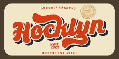 Hocklyn Font is a lettering retro vintage font. You will get alternate characters such as swash on some characters. Equipped with all complete characters ranging from uppercase letters, lowercase letters, numbers, punctuation marks and multi-lingual support, this font is ready to be used in any project. Very suitable for logotype, Stickers, Packaging design, Cricut Project, Headlines, Brand identity, T shirt or Apparel industry, Posters, Magazines, Books, YouTube, Instagram, Websites, Canva, Corjl or any of your creative design projects. Use this Hocklyn Font to add that special modern retro touch to any design idea you can think of! Enjoy!
 - Handy Typewriter by Ana's Fonts,
$14.00 Handy Typewriter is a handwritten typewriter font in 4 handmade weights, with extras. Handy Typewriter has a more casual look than classic typewriter fonts, but can still be used in any designs that need a vintage touch. This font is very legible at a wide range of sizes and looks great in both long or short texts, in digital collages, branding and packaging, social media posts, logotypes, etc. Included in this font family: - Handy Typewriter font in 4 weights: Thin, Regular, Bold and Black, hand drawn from scratch - Handy Typewriter Extras is a set of 62 hand drawn doodles, to decorate your text
 - Rushton by HansCo,
$15.00 Rushton is a lettering retro vintage font. You will get alternate characters such as swash on some characters. Equipped with all complete characters ranging from uppercase letters, lowercase letters, numbers, punctuation marks and multi-lingual support, this font is ready to be used in any project. Very suitable for logotype, Stickers, Packaging design, Cricut Project, Headlines, Brand identity, T shirt or Apparel industry, Posters, Magazines, Books, YouTube, Instagram, Websites, Canva, Corjl or any of your creative design projects. Use this Rushton font to add that special modern retro touch to any design idea you can think of! Enjoy!
 - Hadenut by HansCo,
$15.00 Hadenut Font is a lettering retro vintage font. You will get alternate characters such as swash on some characters. Equipped with all complete characters ranging from uppercase letters, lowercase letters, numbers, punctuation marks and multi-lingual support, this font is ready to be used in any project. Very suitable for logotype, Stickers, Packaging design, Cricut Project, Headlines, Brand identity, T shirt or Apparel industry, Posters, Magazines, Books, YouTube, Instagram, Websites, Canva, Corjl or any of your creative design projects. Use this Hadenut font to add that special modern retro touch to any design idea you can think of! Enjoy!
 - Tadashi Faux by Twinletter,
$15.00 TADASHI is our newest display font, which was created with the goal of enhancing the appearance of your project in terms of theme harmony, distinctiveness, and differentiation, in order to produce an appealing and targeted look. This typeface is the solution to everything you’ve been searching for and needing. Logotypes, food banners, branding, brochure, posters, movie titles, book titles, quotes, and more may all benefit from this font. Of course, using this font in your various design projects will make them excellent and outstanding; many viewers are drawn to the striking and unusual graphic display. Start utilizing this typeface in your projects to make them stand out.
 - Prillwitz Pro by preussTYPE,
$49.00 Johann Carl Ludwig Prillwitz, the German punch cutter and type founder, cut the first classic Didot letters even earlier than Walbaum. The earliest proof of so-called Prillwitz letters is dated 12 April 1790. Inspired by the big discoveries of archaeology and through the translations of classical authors, the bourgeoisie was enthused about the Greek and Roman ideal of aesthetics. The enthusiasm for the Greek and Roman experienced a revival and was also shared by Goethe and contemporaries. »Seeking the country of Greece with one’s soul«. All Literates who are considered nowadays as German Classics of that time kept coming back to the Greek topics, thinking of Schiller and Wieland. The works of Wieland were published in Leipzig by Göschen. Göschen used typefaces which had been produced by until then unknown punch cutter. This punch cutter from Jena created with these typefaces master works of classicist German typography. They can stand without any exaggeration on the same level as that of Didot and Bodoni. This unknown gentleman was known as Johann Carl Ludwig Prillwitz. Prillwitz published his typefaces on 12th April 1790 for the first time. This date is significant because this happened ten years before Walbaum. Prillwitz was an owner of a very successful foundry. When the last of his 7 children died shortly before reaching adulthood his hope of his works was destroyed, Prillwitz lost his will to live. He died six months later. His wife followed him shortly after. The typeface Prillwitz as a digital font was created in three optical styles (Normal, Book and Display). The typeface Prillwitz Press was created especially for a printing in small sizes for newspapers. »Prillwitz Press« combines aesthetic and functional attributes which make written text highly readable. It was originally designed for a newspaper with medium contrast to withstand harsh printing conditions. Its structure is quite narrow which makes this typeface ideal for body text and headlines where space is at premium. For the Normal – even more for the Book – a soft and reader-friendly outline was created through a so-called »Schmitz« and optimized in numerous test prints. The arris character and the common maximal stroke width contrast of the known classicist typefaces (Didot/Bodoni) were edited by the study of the original prints. This was also done in order to reach a very good readability in small type sizes. This typeface is perfectly suited to scientific and belletristic works. Accordingly it has three styles: Regular, Bold and Italic as Highlighting (1). The typeface Prillwitz is a complete new interpretation and continuing development of the conservated originals from 1790. They have been kept in the German Library in Leipzig. It was always given the priority to keep the strong roughness and at the same time optimizing the readability of this striking font. The type family has all important characters for an efficient and typographic high quality work. ----------- (1) Accentuation of particular words or word orders (e.g. proper names, terms etc.). Typographic means for Highlighting could be Italic, SmallCaps or semi-bold.
 - Leipziger Antiqua by profonts,
$41.99 The original typeface was designed by Albert Kapr between 1971 and 1973 for Typoart in Dresden. Kapr was the font designer and teacher as well as book author on type design of former East Germany. He also was an expert on this kind of type design, and thus, it is no surprise that he created Leipziger Antiqua, a design combining features of both Latin and broken scripts. The result is a stunning and unique gem from earlier times although it does not come along too distinguished or artsy. The digital version of Leipziger Antiqua was developed by Ralph M. Unger exclusively for profonts in 2005. During the work, Unger fell so deeply in love with this typeface that he couldn't help but add an expert font with small caps etc.
 - Al Stagen by Aluyeah Studio,
$120.00 Stagen is a cloth with a length ranging from 5-10 meters and a width of about 15 cm which is usually used by traditional Javanese women as part of the traditional kebaya dress. The stagen is wrapped around the stomach to help maintain posture and "lock" the jarik cloth on the kebaya. Stagen existed before World War II in Indonesia and became an elegance in the harsh world at that time. Inspired by the rich culture, Stagen is a modern sans serif typeface that has an upright and sturdy impression, with unique curves in it. A simple, yet distinctive, elegant font that can be applied to many areas of design. Coming with 130+ stunning and super easy to use alternates and ligatures. Very suitable for magazine, headline, website, ads, product package and all type of design project you have. Features: OpenType support Multilingual support (15 languages) PUA Encoded Super Easy to Use alternates - It's OpenType support but you can easly call alternates character using special combination like A.2 R.3 L.A L.a etc so you don't need special software. To get results like the preview just type Sta.gen.
 - Jigger Statz by Poole,
$32.00During the spring of 2006, while creating this typeface, I was reading Praying For Gil Hodges, by Tom Oliphant, who grew up a Brooklyn Dodgers fan. I grew up a Los Angeles Dodgers fan. My mother worked as secretary to the president of the old Triple A LA Angels Baseball Team. In 1952 when she was pregnant with me, she left the team. They gave her an autographed baseball and a puppy named Angel. That's the dog I grew up with. Toward the end of the book the author talks about Gil Hodges' favorite ballplayer, a slugger for the LA Angels, Jigger Statz. I thought, could it be? My mother died two years ago and I got the team baseball. Sure enough, the first name after the dedication to my mother was Jigger Statz. - Sancoale Slab Soft by insigne,
$24.75 Ready for the designs of today, the Sancoale superfamily takes a softer turn with a rounded slab serif. Crafted from Sancoale’s simple geometry, new softened slab serifs provide a lively typeface that conveniently enhances its cousins: Sancoale Softened--a sans with blunted terminals; Sancoale Slab; and, certainly, the first Sancoale. The weights of each and every member are balanced diligently to be compatible with one another. When used alongside one another, the combination makes for robust and tight design. With weights starting with the slender thin ranging to the juicy black, Slab Soft opens the doorway to the vary of uses. Its design is legible and neutral enough for bodies of copy--both in print and on your website. The web font also stands out perfectly as a headline or a display face. Slab Soft carefully places a foot ahead, and doesn't overpower like many slabs. This font’s the choice to seize the day and get the job done. All insigne™ fonts are absolutely loaded with OpenType options. Sancoale Slab is geared up for pro typography, together with alternates with stems, compact caps and lots of alts, together with “normalized” capitals and lowercase letters. The font features many numeral sets, with fractions, old-style and lining figures with superiors and inferiors. OpenType-capable programs like Quark or the Adobe suite allow you to quickly change ligatures and alternates. You can see these options shown in the .pdf brochure. Bundled are compact caps, fractions, old-style and lining quantities, scientific superior/inferior figures, entire ordinal and inferior alphabet. The Sancoale superfamily also features the glyphs to aid a variety of languages, together with Central, Eastern and Western European languages. In all, Sancoale Slab supports around forty languages that utilize the Latin script, earning Sancoale the pick for for multi-lingual publications and packaging.
 - Dream Script by Lián Types,
$49.00 One of my dreams as a type-designer was making a good looking chancery cursive. Full of life, like some of the best calligraphers around the world do on their artworks. With Julian Waters, John Stevens and Denis Brown (just to name a few of them) (1) chancery, or italic script, was transformed into a new, exciting and very fresh style of calligraphy mainly at the end of 20th Century. Dream Script may be that dream named above made true. I have been practicing chancery in the way I learnt from those calligraphers for many years now. Making a font out of my ink-sketches was a tough work, since they were closer of -being art- than of -being type-. However, this font rescues many aspects of handmade calligraphy: You have to look at it really close to notice it is actually a font, and that was one of my goals. The secret of a good looking chancery is on its subtle details: pen angle is constantly changing, even on the strokes which seem straight. Capitals and swashes have to be done a little faster than lowercase letters. The rhythm has to be even, in spite of its playful look. The fact that makes Dream look alive is that it has many alternates per glyph. This makes each word look unique like it happens in calligraphy: you will find alternates for the beginning/ending of a word/phrase, some for the middle of it, some interchangeable. Also, to accompany the script, you will find Dream Caps, which was inspired in the eternally beautiful trajan capitals. Place them like I did on the posters and you will have great results for sure. The font works great in small, middle and big sizes and can be a great selection for magazines, wedding invitations, perfumes, and posters. Close your eyes, and Dream with me... TECHNICAL Dream Script Pro is the most complete style, it contains all the alternates and ligatures (OT programmed, better if you use Adobe applications) If you plan to use the font for text, be sure to activate the less decorative capitals, which are placed in the “salt” group of alternates. Dream Script Standard has less glyphs than the Pro one, it contains just some ligatures for a better legibility. (OT programmed, better if you use Adobe applications) NOTES (1) Not only are they great artists, but also good people, who are always willing to share with their students all what they know. I would also like to thank Ricardo Rousselot, whose work inspired me this time to make “The Dream Script” exlibris; and to Alisara Tareekes, a very talented friend which international calligraphy conferences gave me: She kindly helped me with some tips to make this font better.
 - Naked Power by Typodermic,
$11.95 Introducing Naked Power, a stunning sans-serif typeface inspired by the iconic geometric fonts of the early 1900s. In a world where minimalism reigns supreme, Naked Power brings a much-needed touch of retro charm to the modern design landscape. With its clean lines and distinctive shapes, Naked Power adds a unique personality and character to any project. Whether you’re creating a logo, designing a website, or crafting a poster, this font is sure to make a lasting impression. Available in eight weights, Naked Power offers incredible versatility and flexibility. From delicate lightweights to bold and powerful heavyweights, this font has everything you need to make a statement. And with its appealing italics, you can add even more emphasis and style to your work. Don’t settle for ordinary design. Bring your projects to life with Naked Power, the retro-inspired typeface that’s sure to turn heads and capture hearts. Most Latin-based European writing systems are supported, including the following languages. Afaan Oromo, Afar, Afrikaans, Albanian, Alsatian, Aromanian, Aymara, Bashkir (Latin), Basque, Belarusian (Latin), Bemba, Bikol, Bosnian, Breton, Cape Verdean, Creole, Catalan, Cebuano, Chamorro, Chavacano, Chichewa, Crimean Tatar (Latin), Croatian, Czech, Danish, Dawan, Dholuo, Dutch, English, Estonian, Faroese, Fijian, Filipino, Finnish, French, Frisian, Friulian, Gagauz (Latin), Galician, Ganda, Genoese, German, Greenlandic, Guadeloupean Creole, Haitian Creole, Hawaiian, Hiligaynon, Hungarian, Icelandic, Ilocano, Indonesian, Irish, Italian, Jamaican, Kaqchikel, Karakalpak (Latin), Kashubian, Kikongo, Kinyarwanda, Kirundi, Kurdish (Latin), Latvian, Lithuanian, Lombard, Low Saxon, Luxembourgish, Maasai, Makhuwa, Malay, Maltese, Māori, Moldovan, Montenegrin, Ndebele, Neapolitan, Norwegian, Novial, Occitan, Ossetian (Latin), Papiamento, Piedmontese, Polish, Portuguese, Quechua, Rarotongan, Romanian, Romansh, Sami, Sango, Saramaccan, Sardinian, Scottish Gaelic, Serbian (Latin), Shona, Sicilian, Silesian, Slovak, Slovenian, Somali, Sorbian, Sotho, Spanish, Swahili, Swazi, Swedish, Tagalog, Tahitian, Tetum, Tongan, Tshiluba, Tsonga, Tswana, Tumbuka, Turkish, Turkmen (Latin), Tuvaluan, Uzbek (Latin), Venetian, Vepsian, Võro, Walloon, Waray-Waray, Wayuu, Welsh, Wolof, Xhosa, Yapese, Zapotec Zulu and Zuni.
 - Snobbish by Create Big Supply,
$15.00 Designed with an organic brush style, this font adds a touch of uniqueness to your projects. Although Snobbish is an all-uppercase font, its distinctive character sets it apart, allowing you to explore endless possibilities. With Snobbish, you have access to both uppercase and lowercase letters, numbers, and punctuations, providing flexibility in your designs. Express yourself in various languages, as Snobbish offers multilingual support, enabling you to reach a global audience. This purchase includes TTF, OTF, and WOFF font files, ensuring compatibility across different platforms and software. The font is PUA encoded, allowing easy access to all its features and ensuring a seamless design experience. Character Sets: Snobbish encompasses a wide range of characters, including symbols, accents, and special characters. Let your imagination run wild and create visually stunning compositions that leave a lasting impression. Unleash your creativity with Snobbish and elevate your designs to new heights. Whether you're working on branding, logos, invitations, or any other artistic project, Snobbish is the perfect choice for adding a touch of organic charm.
 - Kit Cloudkicker by Anastasia Kuznetsova,
$19.00 I present to you the universal everyday font 'Kit Cloudkicker'!! This font is very versatile and can be used in various styles of projects where a fast relaxed handwritten font is required. Filled with fun and energetic brush strokes, this font will undoubtedly add a touch of playfulness to your text - perfect for greeting cards, branding, merchandise, invitations and handmade quotes! The 'Kit Cloudkicker' font is so easy to use and create completely unique, hand-made words every time. It looks so great!! Font Features A-Z; a-z character set; 1 language (English); numbers and punctuation marks, symbols. A font containing uppercase and lowercase letters, numbers, and a wide range of punctuation marks. Fonts can be opened and used in any software that can read standard fonts, even in MS Word. No special software is required, and to get started. It is recommended to use it in Adobe Illustrator or Adobe Photoshop Made with love and magic ♡ Thanks for checking it out, and feel free to drop me a message if you had any queries! ~ Anastasia
 - TXT Antique Italic by Illustration Ink,
$3.00Bring your scrapbook page to life with unique journaling and titles made possible with this cool italic font. It'll add instant flavor to posters, signs, bulletin boards, and word art that call for an old-fashioned, antiqued flair. - Monkton Aged by Club Type,
$36.99 This antique-aged version of Monkton can be used to imitate old letterpress printed documents such as old English text. The rough edges resemble ink spread on paper to give an old look. The inspiration for this typeface family came from my childhood experiences at Monkton, amidst an historic part of the South West of England. Studies of the original incised capitals of the Trajan column in Rome were analysed and polished for this modern version. The lower case letterforms and numerals were then created in sympathy, taking their proportions from the incised letters of local gravestones. Its name honours not only the area where the original alphabet was conceived and drawn, but also the people responsible for fostering my initial interest in letters.
 - Kate Greenaway's Alphabet by Wiescher Design,
$49.50 Some time ago I bought my smallest book ever: Kate Greenaway’s Alphabet* 57 x 72 mm. I thought it was the sweetest little book I had ever seen. Not knowing about the fame of the designer Kate Greenaway (1846-1901), I put it in some dark drawer and looked at it from time to time. Kate’s books were all outstanding successes in English publishing history; she was an icon of the Victorian era. Some of those books are still being reprinted today. This little gem I had accidentally acquired has become very rare and I have not found any reprints yet. So I thought maybe I could adapt her drawings for use on today’s computers. I ventured to redraw her delicate illustrations, blowing them up 300 percent, being forced to simplify them without losing her touch. It took quite some time! While redrawing them, I discovered that she most certainly drew them in at least three different sessions as well. Then I scanned my drawings and put them in a font. To make the font more usable, I added the ten numerals in Kate’s style; the original does not have those. I hope she would have liked my adaptations. Yours in a very preserving mood, Gert Wiescher. * Kate Greenaway’s Alphabet, edited by George Rutledge & Sons, London and New York, ca. 1885.
 - Apex Pro by Artyway,
$18.00 Unleash the Power of Motion and Speed with the ApexPro font – a dynamic, sporty font designed for those who crave action, speed, and innovation. This typeface is meticulously crafted to embody the essence of the automotive world, fitness, and cutting-edge technology. Key Features: Style: The ApexPro boasts a rounded and soft appearance with bold, italic, and slashed elements, giving it a sporty and energetic vibe. The letters are carefully crafted, providing a clean and sharp visual for maximum impact. Design Elements: Inspired by the sleek lines of high-speed vehicles, the font carries a rounded, beveled, and cutout aesthetic, adding a touch of modernity and innovation. The use of military and stencil elements infuses a sense of power and dynamism. Versatility: The ApexPro is not just a font; it's a statement. Perfect for automotive enthusiasts, gym-goers, and tech aficionados, it seamlessly blends into various contexts such as sports events, gaming interfaces, and futuristic designs. Target Audience: The ApexPro is tailored for individuals who appreciate the fusion of technology, speed, and style. The target audience includes: Age: 18-35, seeking dynamic and trendy design elements. Gender: Unisex, appealing to both males and females. Needs: Graphic designers, gamers, fitness brands, and automotive enthusiasts looking for a font that embodies speed and action. Why the ApexPro font? For Speed Enthusiasts: The ApexPro brings the thrill of high-speed action to your designs. For Fitness Brands: Reflect the energy and dynamism of your fitness brand with the ApexPro. For Gaming Interfaces: Elevate your gaming experience with a font that resonates with movement and power. File Inclusions: Languages Covered: Multilingual support for a global audience. Numbers, Symbols, and Punctuation: A comprehensive set for versatile use. Lowercase Letters: Lowercase letters for a balanced and cohesive look. Fuel your creativity with the ApexPro – the font that doesn't just communicate, but accelerates your message. Download now for an experience that goes beyond the ordinary.
 - Jack Stanislav by deFharo,
$22.00 Very condensed typography, thick line and fun look for headlines and advertising where you are looking for saving space and originality at the same time. The upper inclination of the letters, the combination of horizontal with inclined forms, the ascending and descending short, and the lower elongation of some antlers will allow you to print varied styles with a lot of movement according to the context of the design. I started drawing this font with the intention of creating a new decorative typeface Blackletter style but modernizing the strokes, after drawing several letters imitating the ductus of this type of fonts trying to simplify them, emerged all the DNA of the current Jack Stanislav, finally a retro typography without Serif of linear strokes that mimic the angle of a thick pen. Use the following keys to write the bitcoin symbol and the Jack icon: b #, a #
 - Zig Zag ML - Personal use only

- Collogue by Heyfonts,
$25.00 Collogue - Variable Font is a cutting-edge and versatile typeface that brings a new level of adaptability to display typography. Unlike traditional fonts with fixed styles, a variable font allows designers to manipulate various aspects of the typeface, such as weight, width, and slant, along a continuous spectrum. Here's a comprehensive explanation of the features and functions of the Display Variable Font: Key Features: -Adaptive Design Elements: The primary feature of the Display Variable Font is its adaptability. -Designers can seamlessly vary specific attributes of the font, including weight, width, slant, and more. -This flexibility empowers designers to fine-tune the typography to suit the visual aesthetics of their projects. -Single Font File, Multiple Styles: Display Variable Fonts consolidate multiple styles into a single font file. This eliminates the need for separate files for different styles, providing a streamlined and efficient solution for designers. -Smooth Transitions: Changes in the font attributes occur smoothly and continuously. Unlike traditional fonts that switch abruptly between styles, a Display Variable Font ensures a fluid transition, allowing for a more harmonious and visually pleasing typographic experience. -Precision Control: Designers have precise control over the variation axis, enabling them to adjust the font's appearance with granular precision. This level of control enhances the typographic customization possibilities and allows for fine-tuning based on specific design requirements. -Responsive Typography: Display Variable Fonts excel in responsive design. They adapt gracefully to various screen sizes and resolutions, ensuring optimal readability and aesthetics across different devices. Functions: -Dynamic Branding: For brands looking to establish a dynamic and adaptable visual identity, Display Variable Fonts offer the perfect solution. The font's ability to adjust seamlessly allows for a versatile and cohesive branding experience across diverse applications. -Editorial Freedom: In editorial design, Display Variable Fonts provide editorial teams with the freedom to experiment with typography. The font can be adjusted to suit different sections or emphasis points within publications, enhancing the overall visual appeal. -Web Design Innovation: Display Variable Fonts are at the forefront of innovation in web design. They enable designers to create dynamic and interactive typographic elements that respond to user interactions, contributing to a modern and engaging web experience. -Attention-Grabbing Displays: Whether used in signage, banners, or large-scale displays, Display Variable Fonts stand out with their adaptability. Designers can experiment with different styles within a single font to create attention-grabbing and visually dynamic displays. -Customizable Interfaces: In digital interfaces, Display Variable Fonts provide a customizable typographic experience. Designers can optimize text elements for different device sizes and orientations, ensuring a seamless and visually pleasing user interface. -Innovative Advertising: Display Variable Fonts offer a fresh approach to advertising typography. Brands and advertisers can leverage the font's adaptability to create visually striking and memorable campaigns across various media channels. In summary, Display Variable Fonts represent a groundbreaking evolution in typographic design, providing designers with unprecedented flexibility and control
 - Excelsior by Linotype,
$29.99Before designing this font, C.H. Griffith consulted the results of a survey of optometrists regarding optimal legibility. Excelsior font was then presented by Mergenthaler Linotype in 1931 and remains one of the most legible and popular fonts worldwide. - Guadalupana by JVB Fonts,
$30.00 On October 12th 1976 a new basilica was inaugurated in honor and in gratitude to the Patron Saint, the Virgin of Guadalupe, loved by the Mexican people. This basilica was designed by the Mexican architect Pedro Ramírez Vázquez (died on April 16th 2012). It stands out by its hug spacious interior, generously decorated with bronze elements. The aesthetic value of these items even includes many signs and text inscriptions in a particular typeface and style, of which this font is a reinterpretation. The purpose of this project is to revival this eclesiastical written letter forms in bronze and taking them to digital format. I was inspired to this on my last trip to Mexico in September of 2012.
 - Dosca by Ardyanatypes,
$10.00 Dosca is a unique and elegant display font with a unique Sans serif style. This font offers nine different thickness options, ranging from Thin to Black, providing a variety of options for a variety of applications. Each Dosca thickness has its own unique characteristics, so you can choose the one that best suits your design aesthetic. For example, Thin may be suitable for a light and elegant design, while Black may be used for a more dramatic and bold appearance. Additionally, Dosca comes with various OpenType features. These include features such as ligatures, which allow certain characters to be combined beautifully, and alternative letterforms that provide more design options. With this feature, you can create more interesting and unique text elements in your designs. Dosca is designed to support multiple languages so it is suitable for use in many countries. This makes it very versatile and suitable for a variety of multilingual design projects. So, if you're looking for a font that combines the beauty of Sans serif with a variety of thickness options, useful OpenType features, and multilingual support, Dosca is the perfect choice to meet your design needs. A guide to accessing all alternatives can be read at http://adobe.ly/1m1fn4Y Adobe Photoshop go to Window - glyphs Adobe Illustrator go to Type - glyphs Features: A – Z Character Set a – z Characters set Numerals & Punctuations Ligatures & Alternates Multilingual
 - Hard Rain by Scholtz Fonts,
$19.00 Hard Rain is named after the torrential thunderstorms that occur in the subtropical regions on the east coast of southern Africa -- the land of the Zulu. During the two-month long rainy season the steamy downpour usually lasts for a few days, and is then followed by the welcoming sun. The diagonal stripes represent the heavy drops of water that drench everything they touch. The resulting font has something of a grunge look to it. As with other grunge fonts, Hard Rain is best used for posters and display work. However, the crisp edges mean that it can be very readable even if used at a small size. Unlike most grunge fonts, Hard Rain has a full character set and this greatly extends its usability.
 - Foxcroft NF by Nick's Fonts,
$10.00The inspiration for this proto-Art Nouveau typeface showed up in the 1887 type specimen book of Farmer, Little & Co. under the name Vassar. Its bold, sinuous curves, which take unexpected turns now and then, make it the perfect choice when you want to command attention...in a dignified, Ivy League kind of way, of course. All versions of this font include the complete Latin 1252 and CE 1250 character sets, with localization for Romanian and Moldovan.
