10,000 search results
(0.035 seconds)
- Cry Wolf by Hanoded,
$20.00 When I was a kid, I loved the story of The Boy Who Cried Wolf. I thought it was pretty stupid of the boy to trick the villagers into believing wolves are attacking his flock of sheep. But I also thought it was a bit sad that the sheep are eaten by a wolf in the end. I didn’t really feel sorry for the boy (he really was stupid), nor the wolf (he just does what he is supposed to do in life), but I did feel sorry for those poor sheep. I guess this is what disinformation leads to in the end. Cry Wolf is a bit of a scary font: it was made with a really old and battered brush, using Chinese ink and some quality French paper. It has a slight tilt to the right and I added some inky splatter for dramatic effect. Use Cry Wolf for your book covers, product packaging and headlines; use if to spice up you invitations and your halloween posters. Comes in a slightly tilted Regular style and an outright Italic style.
 - Winterfalls by Joanne Marie,
$30.00 I always like to make a heart swash font and this is my 7th. Winterfalls is a high quality, smooth, simple script font which is easy to read and ideal for anything romantic and loving. Use it on cards and notes for baby announcements, wedding stationery, birthday and thank you cards but most of all, anything for your Valentine. Winterfalls includes left and right end swashes and connecting swashes on the lowercase letters, and a set of alternate uppercase letters with heart swashes. There are a few alternate lowercase letters, such as the ‘i’ and the ‘j’ dotted with a cute little heart and many, many ligatures. As usual, this font also comes with a good set of international characters, which will come in handy when you want you entice your valentine with a little french, haha. If you use a program which doesn’t have a glyphs panel then it’s super easy to copy and paste the alternates and ligatures from Font Book (Mac) or Character Map (Windows).
 - Mestora by Skinny Type,
$18.00 Mestora is a classic and elegant retro serif with a modern twist. With its decent readability, Mestora is perfect for both display as well as body text. Inspired by all the retro aesthetics making a comeback, Mestora is perfectly suitable for creating nostalgic yet still clean and elegant designs such as logos, packaging, editorial, and more. Mestora FEATURE: Europeans languages Alternates Uppercase & Lowercase Ligatures SOFTWARE REQUIREMENTS: The regular fonts in the pack are widely supported by most software - To get the full functionality of the large selection of standard ligatures (custom connected letters) in the script font, any software that can read OpenType fonts will do. To generate all ligatures, please open Adobe Ilustrator - Type - Glyphs. Please drop me a message if you have trouble regarding either installing or using this font. 🌟While using this product, if you encounter any problem or spot something we may have missed, please don't hesitate to drop us a message. We'd love to hear your feedback in order to further fine-tune our products. Thank you! Skinny Type
 - Glorisa by Black Studio,
$18.00 Glorisa is a new elegant serif font that will add a touch of luxury and style to your projects. This is a very versatile font that works well in large and small sizes. Perfect for editorial projects, magazine headers, Logo designs, Clothing Branding, product packaging, and showcasing masculine and feminine qualities. Glorisa is equipped with uppercase, lowercase, numbers and full punctuation + Multi language support and PUA-encode. To activate the OpenType Stylistic alternative, you need a program that supports OpenType features such as Adobe Illustrator CS, Adobe Indesign & CorelDraw X6-X7, Microsoft Word 2010 or a later version. Features: 3 Font weight Uppercase & lowercase letters Alternative & Ligature Styles Numbers & Punctuation Characters with accents Supports Multiple Languages This type of family has become a work of true love, making it as easy and enjoyable as possible. I really hope you enjoy it! I can't wait to see what you do with Glorisa! Feel free to use #Black Studio tags and #Glorisa Serif fonts to show what you've been up to.
 - Aalama by Gassstype,
$22.00 Here comes a New font,Introducing AALAMA It's Rough Display Font is a Authentic Style and classy style, this font is great for your creative projects such as watermark on photography, and perfect for logos & branding, invitation,advertisements,product designs, stationery, wedding designs,label ,product packaging, special events or anything that need handwritting taste. AALAMA is a natural Hand Drawn feel. This handmade font will make your design has a beautiful natural touch for each details. It is perfect for any design project as Invitation,logo, book cover, craft or any design purposes,photos, photography overlays, signs, window art, scrapbooking, tags and so much more! That is AALAMA has charming, authentic and relaxed characteristic more natural look to your text.
 - Unfollow by Gassstype,
$23.00 Here comes a New font,Introducing Unfollow is Rough Display Font is a Authentic Style and classy style, this font is great for your creative projects such as watermark on photography, and perfect for logos & branding, invitation,advertisements,product designs, stationery, wedding designs,label ,product packaging, special events or anything that need handwritting taste. Unfollow a natural Hand Drawn feel. This handmade font will make your design has a beautiful natural touch for each details. It is perfect for any design project as Invitation,logo, bo ok cover, craft or any design purposes,photos, photography overlays, signs, window art, scrapbooking, tags and so much more! This font is PUA encoded which means you can access all of ligatures and Alternate glypsh.
 - Somersault by Fontforecast,
$15.00 Somersault is a nonchalant, rough edged, hand painted, brush font, with a spontaneous personality. With its natural charm it brings cheer and lightness to any design. Alternate characters for upper and lowercase letters and lots of ligatures enable you to avoid repetition of identical glyphs.They are managed by Opentype features such as stylistic alternates, swashes and discretionary ligatures. Somersault also comes with some fun extra's like strokes, hearts and splatters to play with. Somersault is PUA encoded, so no special design software is needed to access all glyphs. You can easily access all of them in Fontbook (Mac) or Character map (Windows). Somersault is paired with Somersault Tall, a complementary all caps font. The result is a versatile font duo. A perfect match.
 - Aspen by Ludwig Type,
$39.00 Aspen is a refreshing and resilient typeface for text of any kind. Functional but not faceless, Aspen derives a very distinctive character from an unusual pedigree. It is loosely influenced by early American and European grotesques, but with more warmth and improved legibility. And where these historical models were rigid and bulky, Aspen’s curves have a gentle sway that makes for very comfortable reading. Relatively generous ascenders and descenders allow the typeface to feel spacious even when set with tight leading. These amiable qualities are matched with a lively italic based on cursive writing. The family consists of nine weights, and is intended for both text and display usage. Visit this minisite to see Aspen in action.
 - Balega by Linotype,
$29.99 Balega is stencil-like display font, created by German designer Jürgen Weltin in 2002. Balega's letters are very bold, and have a slight italic slant. While some of the uppercase forms appear somewhat sharp, the lowercase is definitively round and friendly. Text set in Balega has a very forward moving motion, as the slant makes all of the letters seem to be lunging toward the right. This gives the typeface a very dynamic feel. Because the counterforms in and between the letters are very narrow, we recommend using Balega in posters and other larger displays, where its design may be truly appreciated. Balega is part of the Take Type 5 collection, from Linotype GmbH."
 - BD Micron Font by Typedifferent,
$10.00 The BD Micron Font is the first typedifferent variable font. It is a very technical looking typeface great for use in sci-fi, science and electronic music related projects. The BD Micron Font alphabet designed together with H1reber was initially created as the display typeface for the communication and visual identity of the TechnoCulture 2 festival in Fribourg, Switzerland summer 2019. The technologic yet playful looking font shall break boundaries between technology, science, fiction and art. Creating characters, hence little robots out of the shapes found in the BD Micron Font glyphs and the variable font technology helped breathing live into the BD Micron Robots which is also availabe here at MyFonts
 - Rebus Script by Ascender,
$29.99 Rebus Script is a fun, lively font that lets you create rebus puzzles by automatically replacing certain words or syllables with pictures. This font is an advanced OpenType font that requires an application that supports Contextual Alternates. The font was created by Terrance Weinzierl and is based on the Louisville Script handwriting font designed by Steve Matteson. To use the font you simply type a word like 'sun' or 'son' and those letters will automatically be replaced by a picture of the sun. There are over 70 pictorial symbols in Rebus Script that make up the 'vocabulary' for automatic substitution based on over 300 different syllable/word combinations in various cases (lower, upper, titling) in the English language.
 - Bumpy Ride by Hanoded,
$16.00 I live in a small hamlet near the Rhine river. It is a sleepy little town and it doesn’t have any facilities. For groceries I need to go to the next town. The only road leading to that town has been closed for half a year, because of ‘maintenance’, so doing groceries got a lot trickier. The fastest way to travel is through yet another hamlet in the forest, on a very narrow road with extremely bumpy shoulders. Yes, you’ve guessed it: it is a Bumpy Ride. Bumpy Ride was made using a so called Brush Pen. It comes with all the accents and a sweet set of alternates for the lower case letters.
 - Bikini by Volcano Type,
$19.00 Bikini is a display-font that offers designers a variety of opportunities to create a lively and sophisticated typography. The font contains swash-capitals and roman capitals as well as two different forms of lowercase letters for endless combinations. Furthermore, a set of more than 60 ligatures is included. Bikini gets its charm by mixing up constructivist and handmade origination concepts. Although the letters show partially very expressive and overhanging details, the creation is strictly based on a matrix of circles and arcs (see drawing). In spite of its static and geometric basic elements Bikini seems to come to life and to break the rules of the grid, thus it looks somewhat psychedelic.
 - SK Synonym Grotesk by Shriftovik,
$48.00 SK Synonym Grotesk is a geometric neo-grotesk typeface, which was developed under the influence of Swiss type design and adapt to modern realities. Its sturdy and simple structure is characterized by angular joints that accent details of the letters. The font design uses a strict geometric and stable construction it's combining with organic and lively forms, it creates an unusual attractive aesthetic of the character set. SK Synonym Grotesk consist of a variety of tools for various design needs, including OpenType alternatives and a wide range of styles from Thin to Black. This typeface is multilingual, supports more than 40 languages including Extended Latin and Cyrillic sets and contains more than 450 characters.
 - Chieezy Burger by Arterfak Project,
$15.00 Say hello to Chieezy Burger! Yes, this font is tasty, created especially for food branding and food advertising. Inspired by visualization of tasty burgers, crunchy chips, and cheerful emotion of the people who enjoy foods, drawn become the playful alphabet, with natural strokes. Chieezy Burger is available in 4 styles: Regular, Distressed, Outline, and Shadow. You can make a playful typographic design without losing a delicious impression from the whole design. You can use the font individually or combine them as well. This layered font is also complete with OpenType features and multilingual support. PUA Encoded, so you can access the special characters without special application. Thank you for visiting, stay healthy!
 - Regent Pro by Storm Type Foundry,
$39.00 This modernized rustic Baroque Roman face paraphrases freely its model from the first half of the 18th century. The shape of the letters has been cleared from all unevenness and softness, but has retained its lively expression. It is deliberately rather cooler than the reverently digitized Baroque Roman type faces, since it was necessary to adjust it with regard to the visual experience of the contemporary reader. In addition, it has bold designs and aligning figures, which also considerably extends the range of its application. It is an entirely reliable text type face for the most demanding extensive works. Thanks to its calm expression and excellent legibility it is widely used when printing series of professional literature.
 - Ford's Folly by Ascender,
$50.99Ford's Folly is a lively yet sophisticated handwriting font designed by Ascender's Jim Ford. It captures the look and spirit of the designer's handwriting using a using a Sharpie™ Extra Fine felt pen. This casual script font evokes an energetic feeling, and has very legible letterforms without quirky distractions. Jim Ford took his hand global by creating a massive multilingual character set. The font features the WGL Pan-European character set (Eastern Europe, Cyrillic, Greek and Turkish) and advanced typographic features for use with OpenType-savvy applications. The font is a fun and attractive handwriting font that is great for greeting cards, menus, advertisements, scrapbooking and many other projects that can benefit a personal appearance. - Sutro Shaded by Parkinson,
$25.00 My affection for Slab Serifs began in the early 1960s in Kansas City when Rob Roy Kelly was at the Kansas City Art Institute, teaching and writing his book on American Wood Type. I got to know him just well enough to gain access to his fabulous collection of wood type and wood type catalogs. Later, in the1970s, I tried to re-create a Nebiolo Egiziano for Roger Black at New West magazine. And again for Roger, in the 1980s, I designed a Slab Serif logo for Newsweek Magazine. Finally, in 2003, designed the Sutro Family. There were things I didn't like about it, so, over time, I’ve been adding some things and dressing it up a little. Sutro Shaded has existed for a few years as a one color, outlined, drop-shadowed display font. It seemed like it was just dying for a little color. I added five more fonts: Fill, Gradient, Hatching, Rules and HiLite. These fonts can be used in different combinations to achieve various effects. There is a downloadable SUTRO SHADED USER MANUAL PDF in the Gallery section for this family.
 - Daiquiri by Wiescher Design,
$39.50 Daiquiri is a revival of a handlettered font in two weights, from an ad for Puerto Rico Rum dating back to the forties or fifties. I found the ad on a French antique market on my last visit for Mardi Gras in Nice. The ad read "Breeze through the heat, be a Daiquiri fan". That's why they had this "fan" in the illustration! Did they want you to rotate like a fan when you had enough Daiquiris? Or did they just do it for that little "Jeu des mots"? Anyway I found the handlettering very pretty, so I took those few letters and made a whole font out of them. I think Daiquiri has that touch that brings those happy and uncomplicated times back when advertising was still fun. I started something like 20 years later in advertising and things had gotten more stringent. We already had to satisfy those marketing guys with their scholarly attitude. They have taken all the fun out of the job, for the creators as well as for the consumers. I would like to see more uncomplicated ads like this again, yours Gert Wiescher
 - Sienna by Monotype,
$40.00 Sienna is a soft serif typeface designed for both text and display purposes. Its soft and sharp structure creates an unusual, yet pleasing appearance. This leads to a comfortable reading experience with enough personality to create impactful titles and headlines, and Sienna will really shine in your branding projects. Variable versions of the fonts are available allowing you to fine tune the weight to your exact liking. Small Caps are included (along with their matching diacritics) – adding another layer of versatility to this typeface. Proportional Lining figures are an option if you prefer them to the default Old Style figures. A number of swash alternates enhance Sienna, giving you the opportunity to add more flair and personality to your title and branding designs. Simply activate Stylistic Sets to start adding flourishes to your typography. There are 14 fonts altogether, with 7 weights in roman and italic from Thin to Black styles. Sienna has an extensive character set (800+ glyphs) that covers every Latin European language. Key features: 7 weights in both roman and italic Variable fonts included with full family 59 Alternates 8 Ligatures Small Caps Full European character set (Latin only) 800+ glyphs per font.
 - Camp by Pelavin Fonts,
$25.00 Camp is a rough-hewn, woodsy font that gives new meaning to logging on to your computer. With engraving-like, hand-rendered details, it harkens back to frontier days and simpler times. Whether gliding across a placid lake or trekking through untarnished nature, Camp will let you see the forest among the trees. A family of 5 fonts gives you the option of printing a single color outline w/drop shadow or up to four different colors using the shadow, fill, ends and outline variants.
 - Goldshift by Maulana Creative,
$10.00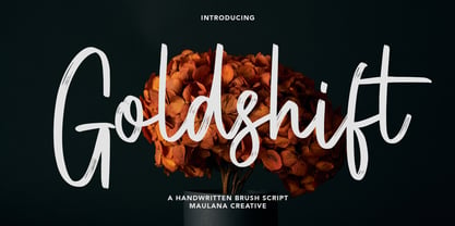 Goldshift is a modern handwritten brush script font, With a rough brush stroke and fun characters. It has Opentype features of ligatures and extra swash, makes it a perfect choice for branding and digital designs. Use this font for logos, social media, websites, blogs, instagram, social media, business cards, branding, and more! Goldshift font support multilingual more than 100+ language. and good pair for your secondary text font with sans or serif. Make a stunning work with Goldshift handwritten brush script font. Cheers, MaulanaCreative
 - Drive Eddie by Ingrimayne Type,
$4.95 DrivEddie was an attempt to create a rough, hand-drawn typeface that was quirky but easily readable. It has a few serifs so it is almost but not quite san serif. All vertical stems are curved. For almost 25 years DrivEddie was a one-font family and one-font families often have limited applications. In 2020 I returned to this typeface to increase its possible uses by adding five new styles: italic, semibold, semibold-italic, bold, and bold-italic. I also corrected mistakes and added characters.
 - Ryno Slab by Philatype,
$32.00 Ryno Slab is a superslab that was born out of a need for an aggressive, heavy, geometric display face that did not appear clunky. Its serifs are so thick, you could create reasonably legible word shapes by using all caps and masking the words out. Ryno Slab’s tough geometric exterior and squarish forms make it suitable for tight setting in posters, t-shirts, and artwork. Also, an extended character set with support for European languages make Ryno Slab a good fit for magazine headlines.
 - Siren Song by Ana's Fonts,
$15.00 Siren Song is a textured marker font with rough edges and dozens of ligatures that give it a true handwritten feel. It includes both regular and slanted versions of the font, with bonus swashes that complement it nicely to achieve eye-catching designs. This handwritten font includes: A-Z, a-z, 0-9, accents, punctuation and symbols Tons of ligatures, for a more natural handwritten feel Contextual Alternates (for b, f, k and s) An extra set of 26 swashes (a-z) and 10 symbols (0-9)
 - Gallardo by Motokiwo,
$23.00 Gallardo is custom brush lettering font with tons of alternates. It's clean, strong, and elegant script that very useful for various projects. It's great for urban style and also for vintage. You can easily customize your words with Gallardo because this font has been PUA Encoded and also support special characters for multilingual. You will also get the Prototype Version, a rough version of Gallardo. Features: Stylistic Alternates Stylistic Sets (ss01, ss02, ss03, ss04, ss05, ss06, ss07, ss08, ss09, ss10) Swash Access All Alternates PUA Encoded
 - MVB Calliope by MVB,
$39.00Gayle Sato, longtime friend of MVB Fonts, has amazing handwriting. It’s a natural, simple hand, with perfect rhythm. Devoid of flourishes, it doesn’t try to be beautiful. It’s just genuine, quick, and clean — the handwriting we all wish we had. The digitization by Mark van Bronkhorst captures these qualities. Retaining the roughness of a felt pen, MVB Calliope is a handwriting typeface that feels much more authentic than most, highly legible but still raw. The Regular was released in 2005, with the other weights shortly thereafter. - Marginal by Sensatype Studio,
$15.00 Marginal is a Humanist Vintage Sans Serif. A New Vintage font that we created special for Unique branding needs, with extra rough style that ready to add value of your brand. It's so nice to leverage designer or product owner that need solutions to make their design look more unique and vintage. Marginal Vintage Sans Serif font ready with: Lowercase and Uppercase characters Numbers and Punctuations Preview as a inspirations that you can do with Marginal font Available for PC and Mac Wish you enjoy our font. :)
 - Naofumi by Allouse Studio,
$16.00 Proudly Present, Naoufumi a Rough Brush Font. Naofumi come along with Multi-Lingual Support to fulfill your need. We highly recommend using a program that supports OpenType features and Glyphs panels like many of Adobe apps and Corel Draw, so you can see and access all Glyph variations. Naoufumi is perfect for any tittle, product packaging, branding project, megazine, social media, wedding, or just used to express words above the background. Enjoy the font, feel free to comment or feedback, send me PM or email. Thank You!
 - Tritura by estudioCrop,
$19.90 Tritura is my personal take on textura fonts. Several methods of drawing were used, both analog and digital, to bring its overall rough feel. Each and every character was designed not from historical references, but from my view on this very peculiar typographic style. Instead of following established rules of character construction, I preferred to just keep in mind the mechanics of the pens used in textura drawings, as well as the little I already knew from the style, to create my own characters from there.
 - Etruscan by ITC,
$29.00British designer Tim Donaldson created the lively typeface Etruscan in 1995. Based on Etruscan letters from ancient Italy, this unusual and condensed sans serif face whimsically mixes soft lowercase characters with more angular capitals. Etruscan brings light and airy classical form into contemporary documents, and a sunny Mediterranean flair and jollity into your projects. - Hand Writing of Janina by TypoGraphicDesign,
$19.00 The typeface Hand Writing of Janina is designed from 2021 for the font foundry Typo Graphic Design by Janina Fels & Manuel Viergutz. The character of the handwritten script typeface is rough, ruggend and raw. With state-of-the-art OpenType-Feature (like Contextual Alternates (calt) and Stylistic Alternates (salt)). Each uppercase and each lowercase letter has automatically alternated two variations to bring humanly-random characteristics of handwriting to life. 4 font-styles (Book, Bold, Dark & Icons) with 786 glyphs (Latin 3) incl. 100+ decorative extras like icons, arrows, catch words, dingbats, emojis, symbols, geometric shapes (type the word #LOVE for ♥︎ or #SMILE for ☺ as OpenType-Feature dlig) and stylistic alternates. For use in logos, magazines, posters, advertisement plus as webfont for decorative headlines. The font works best for display size. Have fun with this font & use the DEMO-FONT (with reduced glyph-set) FOR FREE! Font Specifications ■ Font Name: Hand Writing of Janina ■ Font Styles: 4 font-styles (Book, Bold, Dark, Icon) + DEMO (with reduced glyph-set) ■ Font Category: Display Script for headline size ■ Font Format:.otf (Mac + Win, for Print) + .woff (for Web) ■ Glyph Set: 786 glyphs (Latin 3 incl. decorative extras like icons) ■ Language Support: 93 languages: Afrikaans, Albanian, Asu, Basque, Bemba, Bena, Breton, Catalan, Chiga, Colognian, Cornish, Croatian, Czech, Danish, Dutch, Embu, English, Esperanto, Estonian, Faroese, Filipino, Finnish, French, Friulian, Galician, Ganda, German, Gusii, Hungarian, Inari Sami, Indonesian, Irish, Italian, Jola-Fonyi, Kabuverdianu, Kalenjin, Kamba, Kikuyu, Kinyarwanda, Latvian, Lithuanian, Lower Sorbian, Luo, Luxembourgish, Luyia, Machame, Makhuwa-Meetto, Makonde, Malagasy, Maltese, Manx, Meru, Morisyen, Northern Sami, North Ndebele, Norwegian Bokmål, NorwegianNynorsk, Nyankole, Oromo, Polish, Portuguese, Quechua, Romanian, Romansh, Rombo, Rundi, Rwa, Samburu, Sango, Sangu, Scottish Gaelic, Sena, Serbian, Shambala, Shona, Slovak, Soga, Somali, Spanish, Swahili, Swedish, Swiss German, Taita, Teso, Turkish, Upper Sorbian, Uzbek (Latin), Volapük, Vunjo, Walser, Welsh, Western Frisian, Zulu ■ Design Date: 2021 ■ Type Designer: Janina Fels, Manuel Viergutz
 - Posh by Lián Types,
$49.00 I've always been in love with fat didones. That’s the reason of Posh. In search of something unique, I started this family back in 2013 with the aim of creating the fattest yet readable bodonian typeface in the market: It was a challenge, because roman fonts need generous counters (or what some call white spaces) and taking them to the extreme of inexistence attempted against the construction of many glyphs. Ears, dots, terminals and serifs always need some extra space so I had to find the exact point of boldness to make characters which have those attributes work well in the middle of those which haven't. (1) After a while, I felt I was again ‘in my element’: Big contrasted letters, sexy and elegant curves, and that Lubalinesque feeling that characterise my fonts. (2) Words written with Posh are a explosion of elegance and sensuality due to the fact that its didone attributes were exaggerated. Since it’s full of alternate glyphs, one can change and choose them until a nice block of ‘‘black’’ is achieved. (3) To accompany the regular style, I designed Posh Inline, a font with the same quantity of glyphs than the regular one; an all caps style called Posh Capitals, and also a really playful Italic version. I hope you find this one delicious like I do! This font is dedicated to all who understand letters are not just meant to be read, but also to be appreciated in group and individually. Enjoy it. NOTES (1) In example, it can be easy to design a fat letter ‘n’ with almost no counter, but really tough to make a satisfactory letter ‘s’ with serifs to match that ‘n’. (2) Also, it wasn't my first attempt in fat didones. Take a look at my font Reina, made in 2012. (3) Posters above show many words with ball terminals that seem to dance above and below the words in order to fill those “undesired” blank spaces.
 - Goodrich by Hendra Pratama,
$15.00 WARNING! Roughed version is quite heavy to open. Highly recommended to install the font without previewing it first. GOODRICH come in 2 different styles, with same character; Bold & Strong, and can evoke a different emotions. It comes in both clean and rough styles in only Uppercase Latin characters. When choosing a font, it’s important to consider the visual theme of your design. A clean bold fonts can lend a more stronger tone to your design, making it a great choice for Logo or Title. On the other hand, a textured fonts can lend a more natural printed-looks, making them perfect for designing 70s-80s themed parties. It can be used for various design purposes ; Posters, Logos, Packaging, Books or Movie Titles. In summary, these fonts are versatile and can add a unique look to any design project. If you want to add a touch of nostalgia and elegance to your designs, these fonts were timeless asset. With plenty of vintage and retro design resources available, it’s easy to find the perfect ideas for your next project.
 - Sgt Peppers by K-Type,
$20.00 SGT PEPPERS LONELY HEARTS CLUB is a typeface inspired by the capital letters on the bass drum in the Beatles' Sgt Pepper album cover. The original lettering was hand painted by fairground artist Joe Ephgrave during March 1967 in an art deco style he called 'futuristic'. The font completes the uppercase, adds a lowercase, and includes a full complement of over 400 characters. SGT PEPPERS OUTLINE and SGT PEPPERS OUTLINE FILL are two fonts with matching spacing and kerning that can be overlapped for creating bicolor/multicolor effects and faux drums. The Outline and Outline Fill fonts do not contain lowercase characters, instead they comprise two weights of outline capitals as painted on the Sgt Pepper drum. The uppercase letters are in the wider style from around the outer edge of the drum, and the lowercase keys deliver the more condensed 'Lonely Hearts' inline style from the middle of the drum. The uppercase Y has been flipped to produce a more conventionally acceptable character with the thicker diagonal arm on the left. However, Joe Ephgrave's reverse Y (with inline) is included in the Outline fonts at the Section keystroke § (Alt-0167 on Windows). A simplified vector image (mono) of the bass drum without lettering is also included within the Outline fonts at the PlusMinus keystroke ± (Alt-0177 on Windows).
 - Bisco Condensed by Galapagos,
$39.00Bisco Condensed is a small capital design inspired by hand lettered memorial wall art from the Harlem section of New York City. As a memorial, this design is dedicated to a type design colleague who lost his long battle with cancer. This font is a tribute to his strength and his liveliness. The original idea for Bisco Condensed was to capture the energy of those unique "streetforms" in a text/display design and encapsulate them into a lively & fluid type design with a high level of readability at all point sizes. Bisco Condensed is an excellent type for expressive display layouts. It works well as an independent design or a long with contemporary sans serifs that complement Bisco's irregular contours, weighting and bounce. - Castle On The Hill by Hanoded,
$15.00 When I started working on this font, I had the radio on. Ed Sheeran was singing his song ‘Castle On The Hill’ and when I looked at this new font of mine, I couldn’t help but notice it had a bit of a medieval look. So I named it Castle On The Hill. COTH is a very lively, messy handpainted serif. It was made with a Japanese brush pen. I actually had a different look in mind, but this is what came out of the pen and I quite liked its looks. It is especially useful for children’s book covers, apps and posters, but be my guest and use it as you like. All it needs is a designers’ touch, a nice tune and a sunset.
 - Stu by StuArt,
$9.00 Stu is based on the penmanship of the late Raoul "Stu" Stuart. Raoul's penmanship was always admired by those who saw it; it was a first glimpse into the artistic and creative side of an otherwise easy-going, funny guy. The print variants exude a soft yet masculine feel, while the scripts evoke a sense of sentimentality and romance. Stu features dingbats which say something about Raoul: affectionate and romantic (heart), a big coffee drinker (coffee cup), a great cook (spoon and fork), a music lover (musical note), and a prankster (winking smiley). (The winking smiley is available in all the font styles, while each of the other four dingbats is unique to one font style.) Stu is a tribute to the coolest dad in the world.
 - Zt Qiske by Khaiuns,
$14.00 Qiske is a serif display font with strong characteristics and Qiske is full of modern vibes, with its binders, special alternate glyphs and soft Curves. The high contrast between thick and thin strokes gives Qiske a very stylish look and is ideal for headlines, headers, logos, labels, packaging, postcards, presentations, magazines, invitations, etc. For ligature lovers, Qiske is made to be Soft and intertwined to create a stunning display of its subtle hypnotic curves, making it the perfect choice for impactful editorial layouts and strong feminine creations. FEATURES — 510 Glyphs — Uppercase & lowercase, numbers — Old-style figures — 37 Discretionary Ligatures & Standard ligatures, — 53 Alternates (Uppercase & lowercase) — Symbols, punctuation I hope you have fun using ZT Qiske Thanks for using this font ~ Khaiuns X zelowtype
 - Covergirl by Trine Rask,
$25.00 Warning: works with contextual alternate-feature, which is not showing here. Covergirl is a script typeface that works all by itself. It has a very high contrast, but works also in smaller sizes. It is a display typeface. Covergirl is based on handwriting. The basic shapes are transformed to a very high contrast strict form and the hairline runs through the words in an amusing lively way that simulates the writing by hand. Its scandinavian designed handwriting, decorated, but also very minimalistic. While writing the letters will be substituted by one of the variations of the letter, that will make sure that the letters connect well. When writing in only UPPERCASE a much more simple letter shape will substitute the default.