10,000 search results
(0.022 seconds)
- Nagham by Arabetics,
$45.00 Nagham was designed using uniform glyph thickness throughout and exaggerated letter heights to offer a vertical look and feel. It supports all Arabetic scripts covered by Unicode 6.1, and the latest Arabic Supplement and Extended-A Unicode blocks, including support for Quranic texts. This font family includes two letter spacing flavors: isolated for small text and overlapped for large or display text. The two flavors come with two weights, regular and bold, each of which has normal and left-slanted Italic versions. The script design of this font family follows the Arabetics Mutamathil Taqlidi style utilizing varying x-heights. The Mutamathil Taqlidi type style uses one glyph per every basic Arabic Unicode character or letter, as defined by the Unicode Standards, and one additional final form glyph, for each freely-connecting letter of the Arabic cursive text. Nagham includes the required Lam-Alif ligatures in addition to all vowel diacritic ligatures. Soft-vowel diacritic marks (harakat) are selectively positioned with most of them appearing on similar high and low levels—top left corner—, to clearly distinguish them from the letters. Tatweel is a zero-width glyph.
 - Heirloom Artcraft by Baseline Fonts,
$29.00 Presenting Heirloom Artcraft-- by Baseline Fonts within the Grit History B series. Like an auntie who insists on baking cookies from scratch every time you visit, Heirloom Artcraft is a beacon of tradition and consistent delight with every letterform. Gentleness and subtlety keep this font far away from kitsch. This font sincerely says "ma'am" and "sir" and is perfect for business cards, custom stamps, coffeetable books, letterhead, invitations and anywhere you or your client wish to make an extremely well mannered and charming statement. There are many alternate ligatures available within the font including capital alternates for T, A, P, B, D, and N. It also boasts a full symbol set and the most darling little swashes scattered tastefully throughout the character map you ever did key. Heirloom Artcraft is available in Thin, Thin Italic, Book, Book Italic, Demi Italic, Black, and Black Italic. It also features Metrics and Optical kerning - metrics displays characters with letterpress-traditional spacing that is pleasantly askew, or more rigid optical kerning which displays characters at identical distances for times when the importance of readability exceeds that of stylistic merit.
 - Halis Grotesque by Ahmet Altun,
$19.00 The Halis Grotesque font family comes in eight weights of Normal and Italic. In addition, all weights contain small caps in both italic and normal. The name of the font means “pure, clean.” The Halis Grotesque Font Family has the new Turkish Lira Sign as well as an alternative ampersand created by Prof. Halis Biçer, renowned in Turkey for his expertise in typography, calligraphy, and graphic design. That’s why this font’s name is inscribed with a dedication to the venerable Halis Biçer. The spaces between characters are wide enough to be legible even at very small sizes. With the HALIS GROTESQUE FONT FAMILY, you can create beautiful works for the web, including logos, banners, body copy, and presentations. Halis Grotesque also works nicely in print formats such as posters, T-shirts, magazines, and affiches. Because of its eye-pleasing style, this font is both effective and versatile.
 - TwentyFourNinetyOne by steve mehallo,
$19.91 TwentyFourNinetyOne [2491] is a reinterpretation of the alphabet of 1919 by Theo van Doesburg; the original a true rendering of the thinking of the Dutch-based art movement “de Stijl.” Jump forward to 1980 and prop lettering used on the Buck Rogers in the 25th Century television series; a vernacular typeface that was a utilitarian mix of geometry and pixel-based forms, used to symbolize the futuristic universe of 2491. At times it would appear on spaceships, laser guns, signage at space ports or in one episode, a Spandex tapestry. It only seemed logical to combine and rethink the letterforms, add ligatures + other extras, and see what the results would be. Futuristic, fun and bold to read! 2491: In the future, all type will look like this.
 - Harond by Arterfak Project,
$29.00 Introducing Harond font, a bold serif font with a retro touch. Inspired by the dynamic and chubby typography style of the 70s, this font exudes a delightful, playful, yet elegant impression, making it ideal for various design themes, especially in the realm of food-related design. Harond is a display font best suited for larger sizes. Its plump form and tight spacing offer a delightful design experience and captivate attention. It's the perfect choice for use in posters, decals, logos, branding, flyers, promotional materials, motion graphics, packaging, and much more! But that's not all you get with this font. In addition to the standard alphabet, Harond also comes with multilingual support and numerous special characters, making it easier to enhance your designs.
 - PM Doorbuster Plug by Paper Moon Type & Graphic Supply,
$17.00 A new font inspired by vintage hand-painted paper signs. The Doorbuster Collection is based on retro hand-painted paper signs primarily seen in grocery stores from the 1920s through the 1970s. We meticulously hand-drew each font, modeling the spacing and uneven baseline found in vintage sign painting. The purposely organic ascenders and descenders, along with a huge set of ligatures/contextual alternates to avoid the same letters repeating when paired, give it a real hand-lettered look. Doorbuster Plug is perfect for both vintage-inspired and contemporary marketing, branding, and packaging designs. It's a classic workhorse font from the 1950s thru 1970s. Check out a few of the samples included in the thumbnails to see what can be done with it.
 - Decorate The Tree by Ingrimayne Type,
$9.00 DecorateTheTree is a festive novelty font family containing two styles designed to be used in layers. Each style has letters on Christmas-tree lights. The regular style has clear bulbs and the bold style has filled bulbs. Some characters are on standing bulbs and others on hanging bulbs and these two sets are made to alternate with the OpenType contextual alternatives (calt) feature. To use only one set of bulbs, this feature must be turned off and character spacing adjusted, though why anyone would want to use only one set is a mystery. These fonts are monospaced. They are useful to display a holiday message not just in words but in the lettering itself. (The characters on the bulbs are derived from the font SansduskiMono.)
 - Isle Body by Mans Greback,
$19.00 Isle Body is a high-quality serif typeface family, drawn by Måns Grebäck during 2018 and 2019. It is a sweet font with a casual and calm look, with generous spacing and an even weight, adapted for body texts and small sized type settings. It comes in four weights, each one as italic, totaling in eight styles: Light and Light Italic, Medium and Medium Italic, Bold and Bold Italic, Black and Black Italic. The font family can be used in a combination with a font of a different style, or together with its sister font Isle Headline, also a serif font, which has the same basic structure but more distinct weights and a sharper look. Each style contains ligatures and support for a wide range of languages.
 - Ciutadella Rounded by Emtype Foundry,
$69.00 Ciutadella Rounded is not only a font with soft corners, it has a real rounded terminal across all the weights. It was a challenge to achieve a rounded effect in close counters characters, especially in the heaviest weights where there is less space available to accommodate the round ending. Suitable to be used across a wide range of applications, from identity systems to publications. It is available in Open Type format and includes Alternate Characters (‘a’, ‘t’ and ‘&’), Ligatures, Tabular Figures, Fractions, Numerators, Denominators, Superiors and Inferiors. It supports Central and Eastern European languages. The type family consists of 10 styles, 5 weights (Light, Regular, Medium, SemiBold and Bold) plus italics. For more details see the PDF. See also Ciutadella and Ciutadella Slab.
 - Heltar by The Northern Block,
$19.30 A modern neo-grotesque typeface. Having grown up in Sheffield and been completely immersed in the work of The Designers Republic I became very drawn to their treatment of Helvetica, especially the close tracking of the letter space. This visual investigation led me to the study of the font Hass Unica, a so called improvement to Helvetica. In order not to replicate and become a clone of Unica I redrew all the characters from scratch improving optical appearance, developing subtle corrections and reshaping individual letterforms. The result is a remixed neo-grotesque font that has strong general optical balance with great rhythm under close tracking. Details include 10 weights, an extended European character set, true italic, manually edited kerning and Euro symbol.
 - Seferis by Sudtipos,
$39.00 «Seferis» is an uppercase typeface with a wide repertoire of ligatures, stylistic alternatives, and some swashes. It also has an important language coverage based on Latin. Although the «Seferis» family is mainly influenced by the classical imprint of the incised typefaces, its structure, proportions and aesthetic proposal show modern features, which give it elegance, sophistication, inner strength and an epic character. Designed by Edwin Moreira, with the invaluable support of Ale Paul in the expansion and production of the family. Seferis works perfectly in spaces as diverse as posters, logos, magazine headlines, album and book covers, packaging and many other environments where it can highlight its qualities. Available in 5 weights and a variable file that is included with the full package.
 - Face Front by Comicraft,
$49.00 FACE FRONT, True Believers, This is The Issue You’ve Been Waiting For! In response to requests from our Hawkeyed customers, we’re making this Super Team of fonts -- which our fontmeister Assembled for the pages of THE AVENGERS -- available for the first time! A handsome collection of characters that would put a Norse God to shame, FACE FRONT is composed of Earth’s Mightiest regular, italic, bold and bold italic faces -- in UPPER and lower case. And now, these Living Legends can now be yours! Rick Jones not included! Remastered Face Front includes improved spacing and kerning, an upright Bold weight, Central European & Cyrillic characters,Crossbar I Technology™ to place it in exactly the right spots, plus hearts, stars & music notes for Manga lettering.
 - Stripated by Aah Yes,
$6.95 Stripated is an informal funky font mainly for distinctive headlines and posters, or similar display work. There's still all the features you'd expect like Class Kerning and accented characters, ligatures for ffi, ffl and so on, and a few other extras. The four versions are set up as follows: Plain has all the letters and black stripes in the normal vertical alignment; Jumbled One has the lower case letters all jiggled about but the boxes still square and vertical; Jumbled Two has ALL letters, numbers, and virtually all punctuation jumbled up; and Wild has all that and the black boxes going slightly off square as well. There's 3 different Space characters and a few other character variations in Stylistic Alternates (fuller details in the zip).
 - Cantiga by Isaco Type,
$19.00 Cantiga is a monophonic song or melody, sometimes repetitive, often with unpretentious themes. In the same simplicity, this font family combines robustness with some very fine details, with 44 versions for various purposes. Choose thinner (or thicker) versions for titles, and intermediate versions (normal, medium, etc.) to small sizes. Explore the condensed versions when you need to save space. Use the light versions for special cases in huge sizes. Cantiga intended to be your new "Swiss army knife" sans typeface. The Cantiga family consists of 2 widths (normal and condensed) with 11 weights each, plus their respective italic versions. The fonts are available in OpenType PS format and have extended character set to support CE, Baltic, Turkish as well as Western European languages.
 - Friendly Yellow by PizzaDude.dk,
$16.00 Friendly Yellow is my sketchy/scratchy handmade sans font. I've made several layers for you to play around with, in order to get that feel-good handmade-sketch-font-look! I've also added ligature substitution for the most common double letters
 - Belisha by Nissa Nana,
$20.00 Belisha is a beautiful script with a modern vibe. It has a classy, elegant, and modern look which can be used for logos, branding, invitations, stationary, wedding designs, social media posts, and any other design in need of a handwritten touch.
 - Avolus by Kaidosan,
$15.00 Avolus is a cool display font, comprised of a modern and unique style. Fall in love with its incredibly versatile style and use it to create gorgeous wedding invitations, beautiful stationary art, eye-catching social media posts, and much more
 - Anita Honey by Rezastudio,
$9.00 Anita Honey is an adorable quirky handwritten font. It will add an incredibly joyful touch to your designs. Fall in love with its playful style and use it to create beautiful stationary art, eye-catching social media posts, and much more!
 - Kaaos Pro by The Type Fetish,
$25.00 Kaaos Pro is based on the logo of the Finnish hardcore band of the same name. It was expanded to include extended Latin, extended Cyrillic and Greek alphabets so it will work with most languages in Europe and the Americas.
 - PL Trophy by Monotype,
$29.99Frank Bartuska designed Trophy Oblique in 1950. It is a freestyle script face, good for packaging and titles. The PL Trophy Oblique font is more like contemporary handwriting than most script faces making it a perfect choice for personal messages. - Delichan by Prioritype,
$19.00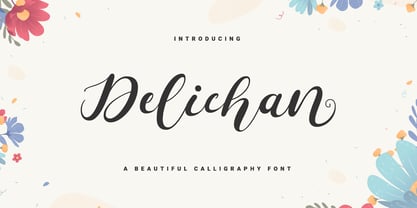 Introducing. Delichan: Beautiful and modern fonts that are so special to use in your projects. It is suitable for wedding invitation designs, social media posts, blogs, crafts, quotes etc. Features: Uppercase, Lowercase, Numeral, Punctuation, Multilingual, Ligature, Alternates & PUA Encoded. Thanks!
 - Sign And Poster JNL by Jeff Levine,
$29.00Sign and Poster JNL is modeled after a popular style of die-cut letters and numbers that was used for making signage and show cards. A strong Deco influence is seen in these letterforms and blends well into most design projects. - Flomic by Sergey Melnikov,
$24.00 Ukrainian type designer Melnikov Sergey created Flomic font between 2015 and 2016. Flomic is a geometric sans built from a folded lines. Most effective when used in short words or phrases at larger sizes, where the details can be appreciated.
 - Otomo by The Northern Block,
$18.00 A super wide san serif typeface inspired by event graphics for Sheffield music venues in the 1990s. Most influential work by The Designers Republic (TDR). Details include four unique styles, extended European character set, manually edited kerning and Euro symbol.
 - Best Signature by Nirmalagraphics,
$14.00 Best Signature is a font in modelled after my own signature style. This font also works well when used for magazines, brochures, flyers, Instagram posts, as well as themes for women. Best Signature includes ligatures and expanded multi-lingual support.
 - Baguette by Balpirick,
$15.00 Baguette is a natural hand-brushed font. It’s perfect for logos, greeting cards, invitations, stationery, social media posts and much more! Baguette will look outstanding in any context, whether it’s being used on busy backgrounds or as a standalone headline!
 - Huntsman by Solotype,
$19.95Issued from the Haddon Foundry in England. Most of their original faces had names beginning with H, like their own name. Some of their types were designed by Phil May, but we cannot guarantee that this is one of them. - Quirk Chick by Four Lines Std,
$15.00 Designed with graphic designers in mind, Quirk Chick font offers versatility and flexibility making it perfect for logos, branding, invitations, packaging, and so much more. Let your imagination run wild as you create eye-catching designs that leave a lasting impression.
 - April Rain by Scrowleyfonts,
$16.00 April rain is a delicate, elegant font with teardrop line endings. It is designed to be interesting and a little unusual while remaining robust enough to be used in a variety of contexts from titling and lists to short paragraphs.
 - Blapuhy by Sealoung,
$10.00 Blapuhy is a lovely handwritten font, designed with the help of a brush pen. Fall in love with its authentic feel and use it to create gorgeous wedding invitations, beautiful stationary art, eye-catching social media posts, and cute greeting cards.
 - Dinalee by Arendxstudio,
$12.00 Introducing our newest Dinalee Stylish Signature Font. Dinalee Signature font is made as elegant as possible for the use in a variety of design projects, including logos & amps, branding, wedding designs, social media posts, advertisements, product designs, magazines and more.
 - Instamood by Resistenza,
$29.00 Instamood is a new signwriting script full of ligatures. Perfect for your Instagram post and for casual posts.
 - Postea by TypeTogether,
$47.00 The Postea font family is Veronika Burian and José Scaglione’s take on German geometric typefaces, reshaped with the right attributes for setting paragraphs and headings, and perfect for branding and text use. Some typefaces are a rough tool, like a pumice rock: abrasive to the senses, unforgiving, and unhelpful for most reading situations. Postea is an obsidian: smooth and classy, with attractive nuances in any light. The classic curves and purposeful details keep its individuality intact while allowing it to fit an incredible range of geometric font needs. Because of these qualities, Postea makes normal reading in paragraphs a cinch and your branding memorable. Compared to midcentury attributes of restraint and a sparse appearance, Postea’s deliberate play between character widths injects life and distinctiveness into its personality. The default ‘t, f’ have lyrical doses akin to a robust evening drink and are rounded out with a serpentine ‘s’ and rotund ‘o, g, b’. Another nice surprise awaits: spacing for the Hairline weight is tighter for optimal use in large headings and titles, while the regular weights have the expected, slightly looser spacing for text. Setting the test word ‘bogarts’ brings all this together nicely, invoking a balance between a constructed and human feel while brushing away the dust from a century of derivatives. Postea is opinionated and its modern stylistic sets allow it to be accommodating with softer, specially-designed alternative characters. SS01 replaces ‘b, f, M, m, t’, while SS02 changes only the lowercase ‘a’ to the round style, and SS03 swaps out the angled ‘y’ for a straight version. The fourth and sixth stylistic sets are packed with wallpaper-worthy geometric patterns, ornaments, arrows, and symbols aplenty. Postea’s 14 styles (seven upright and italic) and two variable fonts are accompanied by an all-new family of icons in three weights, which we developed a new, easy way to activate. Simply bookend the desired icon name with colons (:arrowUp: :chargingStation: :aid: :firstAid:), making sure to capitalise each word after the first word, then highlight and activate SS05. Icons include wayfinding, social interface, sanitary precautions like face masks, thermometers, and hand washing, and much more. Postea is resilient in the number of ways the family can be used, and its recognisable characters make it a prime selection for branding, signage, corporate typefaces, and magazines. Beginning with midcentury virtues, Postea is the rational response for text — a lyrical take on geometric sans serifs.
 - Huskeseddel by Bogstav,
$17.00 Huskeseddel is to-do list or memo in English. If you not already guessed it, the font is based upon my own handwriting. Actually not my everyday handwriting, but the kind I use when I make my to-do lists. But it wouldn't look right with a simple font with the same letters repeating all the time, and that's why I added 12 different hastily written versions of each letter. These 12 different versions cycle as you type, making your text look...well, like hastily written letters...you'll have to take a real close look to find out that you are looking at a font, and not a genuine hastily written to-do list! :)
 - Cardo - Personal use only

- Ahimsa by Satori TF,
$12.00 Ahimsa is a dynamic humanist sans serif family. It comes in 6 weights with matching italics. It contains a lot of contrast in the connection to the stems in order to give it a more dynamic feel, and also has low descenders and a large x-height and great legibility.
 - URW Geometric by URW Type Foundry,
$35.99 URW Geometric® is a sans serif typeface inspired by the German geometric typefaces of the 1920s but designed for modern usability. The character shapes have optimized proportions and an improved balance, the x-height is increased, ascenders and descenders are decreased. Special glyphs, which are often designed afterwards for the original geometric typefaces from the 1920s, are perfectly integrated in the URW Geometric® . These design characteristics increase the usability and legibility tremendously. With its 10 weights ranging from Thin to Black, plus 10 additional oblique styles, it has a great versatility in mind. The extreme light styles shine bright in large sizes, the middle weights are perfect for body copy and the bolder variants for the use of emphasis information or bring a strong impact to headlines and information. The optically balanced styles are designed to work in perfect harmony together. URW Geometric® is functional, strong, simple and harmonized in form, and at a glance appears as a modern variant of its predecessors. Apart from the basic characters the design has an extra focus on the special glyphs. These are designed for todays needs. For example: the email glyph looks modern and unique, including a perfectly balanced spacing. The numero sign, in modern use called “hashtag”, is space saving and optically balanced for body text. Additionally, various extra and alternate glyphs are designed to provide a friendly usability. Including a wide Latin language support and character sets, URW Geometric® is perfectly designed for today’s requirements. Please have a look at the URW Geometric® Type Specimen (PDF) for further information.
 - Blacker Pro by Zetafonts,
$39.00 Blacker Pro is the revised and extended version of the original wedge serif type family designed by Cosimo Lorenzo Pancini and Andrea Tartarelli in 2017. Blacker was developed as a take on the style that Jeremiah Shoaf has defined as the "evil serif" genre: typefaces with high contrast, oldstyle or modern serif proportions and sharp, blade-like triangular serifs. Due to the high contrast in the design - slightly reminescent of didone typefaces - Blacker has been developed in two optical subfamilies. The display version offers tighter tracking, higher contrast and sharper corners for maximum effect at big sizes, while the text variant offers better readability and screen rendering at smaller sizes, with lower contrast and looser spacing. In the pro version, two additional condensed variant families have been added (condensed display and condensed text) allowing for more freedom and versatility in typesetting where space constraints are present. Also, three titling uppercase-only variants have been added, with a slightly extended feel, and two decorative subfamilies (inline and diamond). Each of these seven variants has been developed in six weights from light to heavy, with matching italics, for a total of 69 styles covering a wide range of editorial and advertising uses. All Blacker Pro feature a revised and extended character set covering over two hundred languages using the latin, cyrillic and greek alphabets. Open type features include small caps, positional numerals, fractions, superior & inferior figures, alternate forms, and an extended set of standard and discretionary ligatures. With its bold personality, Blacker aims to be a modern classic used for bold statements and self-conscious brands, making your text look great both on paper and on the screens.
 - Fangs ALot by Ingrimayne Type,
$9.00 FangsALot is a bizarre typeface family that was designed to alternate two character sets. These sets are alternated automatically in applications that support the OpenType feature Contextual Alternatives (calt). The template used to design characters is a distorted triangle that resembles a curved tooth or a fang. This shape can be flipped horizontally, vertically, and both horizontally and vertically to give four orientations. Two of these orientations are used in the regular style and two in what is called the italic style. I thought the fang motif did not come through clearly in the regular and italic styles. Rather the impression they give is more like graffiti lettering. To emphasize the fang motif I added two more members to the family by filling fang outlines with unadorned sans-serif characters. Then to allow more color in lettering, I added two more styles with letters on black. I then had six styles based on triangles skewed left and right. Why not fill the family out with three more styles based on an isosceles triangle? The end result is a family of nine. All members of the family are monospaced and are hard to read. The three graffiti-like styles have some alternative letters that can be accessed with the OpenType feature Stylistic Sets. Also, for each style it is possible to use only one set of characters by adding a space after each letter and then adjusting the character spacing. The graffiti-like styles can be useful in situations where the hard-to-read property is not important but where a menacing and vicious touch is needed, such as topics of sharks, teeth, biting, and vampires.
 - Gridlite PE Variable by Rosetta,
$290.00 The two great technical constraints a type designer can tackle are low resolution, which limits detail and dictates proportions between negative and positive shapes, and uniform width, which restricts each letter to a fixed horizontal space. Wrestle with both at once, and each letter becomes a black-and-white chessboard that challenges every design decision. Sometimes battling these constraints gets in the way of a good idea, but other times, tinkering with fewer options can make the job irresistibly easy and lead straight to a grid addiction. Gridlite, an experiment with a modular negative space, is the side effect of such an addiction. It’s simplified, monospaced, and variable: foreground and background alike are ready to be animated, typed, scaled up, scaled down, rounded, or otherwise deformed. Gridlite is primarily a variable font with axes that control the size of the elements, their shape, and the background (one for the rectangular field and one for the compact envelope around the letters). The fonts cover Cyrillic, Greek, and Latin scripts. Small caps are included, for no apparent reason ... and there is a monospaced elephant, too.
