10,000 search results
(0.028 seconds)
- Leky Calgria by Hishand Studio,
$15.00 Leky Calgria is elegant serif font with beautiful and luxury touch good for gorgeous wedding invitations, beautiful stationary art, eye-catching social media posts, logo, branding and much more. Complete with ligatures alternates regular italic icon kerning multilingual support
 - Dalychious by Good Java Studio,
$20.00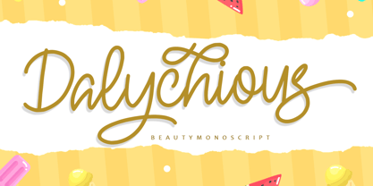 Dalychious - Beauty Monoscript Font is a monoscript font. I'ts Perfect for logo, invitation, stationery, wedding designs, social media posts, advertisements, product packaging, product designs, label, photography, watermark, special events or anything. This font include Ligatures and also Multilingual support.
 - Second Impression JNL by Jeff Levine,
$29.00Second Impression JNL is the solid version of Lasting Impression JNL by Jeff Levine. It emulates the look of ink-stamped letters and numerals. Based on a 1930s-era set of rubber stamps, there is a limited character set. - Delight Cookies by Sronstudio,
$15.00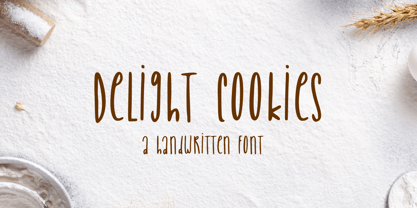 Delight Cookies is a handwritten font, this font Is perfect for logo, social media posts, advertisements, product packaging, product designs, label, photography, watermark, special events or anything. Delight Cookies comes with uppercase and lowercase letters, multilingual symbols, numerals, punctuation.
 - Bella Donna by Canada Type,
$24.95The famous Italian type designer and Nebiolo director Alessandro Butti designed Rondine in 1948. Not so surprisingly - given its beauty - it quickly became quite a commonly copied metal type. But for some reason Rondine was spared during the massive “phototyping” that happened with the introduction of film type. Perhaps this is why no digital version of it ever existed until now. Bella Donna is an upright round script that can be used both formally and informally, in almost any design where an elegant script completes the equation. The almost dramatic grandeur of the majuscules is very nicely complemented by pouty low-x-height minuscules that sprout graceful and very visible ascender and descender loops. Titles, sentences and paragraphs set in Bella Donna are meant to delightfully tease the reader and make hearts skip a beat. Bella Donna can deliver a subtle promise of joyful playfulness, inviting elegance, memorable romance, sensuality, or sincere understanding. Bella Donna was redrawn and digitized from original specimen by Rebecca Alaccari, who also extended the character set with plenty of alternates and some add-on swashes built within the font. - Hope Sans by Monotype,
$50.99 Hope Sans™ takes the jaunty style of 1950s and 60s lettering and melds it with the jubilant 1970s swashes of Bookman. The result is a sans serif family that is lively, inviting and deeply customizable. Its basic sans serif forms create engaging text, while a roaring collection of swash designs, alternate characters and ligatures make it a natural for attention-grabbing display typography. Hope Sans has been selected by the judges of the 22nd Annual TDC Typeface Design Competition to receive the Certificate of Typographic Excellence. The middle weights of the family are easy on the eyes and shine at smaller sizes and in blocks of text copy. Their friendly vibe also translates well to web and interactive design projects. Spacing is open, counters are large and Hope Sans’ range of six weights can provide just the right design for virtually any need. Headlines, subheads, banners and navigational links are naturals for its lightest and boldest weights – either with, or without, the swash letters. “Hope Sans is a paint box,” says its designer, Charles Nix. “In its basic form, it’s a sturdy grotesque, capable of setting text in a cool and relaxed way. But a bit of accenting with the alternate forms easily creates an entirely different mood and meaning. And for those that are willing to really mix with it, the variety of alternate characters can build truly unique typographic statements.”
 - Megaverse VF by jpFonts,
$249.00 Megaverse VF Design 2023, Volker Schnebel JP-Fonts GmbH, Hamburg, Germany Megaverse VF opens up a universe that is beyond others. Not only its style is mega and the scope of the supported languages is beyond others, but the variety of variants opens up a design space that is unique. The complete family includes at least 90 fonts in 5 width levels from UltraCondensed to ExtraExpanded, each in 9 weights from Thin to Black, both upright and italic. It is a universal font that can be used for almost anything. From the official announcement or the informal letter to the letterpress and to the screen display as a corporate font: Megaverse is always convincing. Her character is quite graceful, but also neutral. She seems likeable, but also serious. She impresses with sharpness and precision and yet remains down-to-earth. Her wide range of variants is unique, both in terms of boldness and width. The very different forms of appearance fit together harmoniously as a whole, which gives the user an enormous freedom of design. Megaverse VF is a must-have for anyone who wants to keep adapting a typeface to different circumstances and who enjoys using variants that make the layout more colorful and perfect. All the advantages of the new variable font technology can be optimally applied with Megaverse VF, including optical scaling. Kerning, hinting and other technical requirements are carefully implemented so that the fonts work perfectly under any condition.
 - Caltic by Ingrimayne Type,
$12.95 Caltic-Holiday, Caltic-Festival, and Caltic-Straight are three eye-catching, very bold typefaces that are suitable for posters and signage. Caltic-Holiday and Caltic-Festival base letter shapes on trapezoids with curved sides but with curves that are reversed going from one to the other. Caltic-Straight has letters based on trapezoids with straight sides. None are suited for text and with their built-in spacing will not work as all upper-case or all lower-case. All three come in two widths, regular and wide, giving the Caltic family six members. Caltic has nothing to do with Celts. The Calt refers to the calt or contextual alternative OpenType feature that makes this typeface work. When the letters on the upper-case keys alternate with the letters on the lower-case keys, they fit snuggly together. As long as the user has a word processor that supports the contextual alternatives feature, there is no need for the user to alternate letters; the calt feature does it automatically. Although the fonts seem similar to hand-drawn lettering that was done on posters and signs during the hippie era of the 1960s and 1970s, I can find nothing quite like them. My inspiration for them is older, in a newspaper from 1932 that led to the typeface family PoultySign. Caltic (and Lentzers) are the result of seeing what else I could do with the inspiration that sprang from that 1932 newspaper.
 - Hedwig Pro by Ingo,
$42.00 A modern sans serif with open round forms. The ”round“ letters emphasize the condensed open oval; the light counter forms provide the rhythm of the typeface, causing the typeface to appear gentle and pleasing. The ”modern“ design of a and g being especially contributive here. All of the letters are recognizably narrow, almost ”condensed,“ the forms being very functionally shaped. The construction of the ”triangular“ upper case letters A M N V W as well as v and w, especially catches the eye with the shafts joined together as beams are stacked upon each other. With this construction Hedwig displays a down-to-earth touch. Contrary to the classical sans serifs, a few letters were given light echoes of serifs which promote fluency: a d l are displayed below the line in a reading direction and end in a compressed but also very short serif style; on m n p r the upstroke is gently displayed and on u the downstroke. For all the typo-maniacs among you designers there are alternative forms for a number of letters in Hedwig: A B D G I M R W and a d f g j l ß u. Even an antiquated ”long“ s and an upper case ß is available. Plus, Hedwig includes numerous ligatures which can save that little bit of space where required and which allow the typeface to appear more variable: ch, ck, ct, fi, fj, fl, ff, ffi, ffl, ft, mm, ti, tt, tz.
 - P22 Glaser Houdini by P22 Type Foundry,
$24.95 Milton Glaser commented about this type family: “The typeface is called Houdini after the famous American magician. I wanted to produce a letterform that would gradually disappear as one line after another was removed.” The various versions of Houdini presented by P22 include those originally offered as phototypesetting fonts, plus a solid and an outline version—a variation of which was used for Sesame Place children’s park in 1980. These Houdini variations can all be layered on top of each other for a range of chromatic effects. Each of the Houdini fonts contains over 375 characters for full European language coverage. The family is taken to its logical conclusion with the bonus font “P22 Glaser Houdini Vanished.” This font shares the same spacing and kerning as all of the Houdini font but lacks all visible outlines. Over the years there have been many typefaces that borrowed heavily from the Glaser designs, but these are the only official fonts approved by Milton Glaser Studio and the Estate of Milton Glaser.
 - De Fonte Plus by Ingo,
$39.00 A variation of ”Helvetica according to the blur principle.“ The underlying typeface is ”Helvetica“, the only true ”run-of-the-mill“ typeface of the twentieth century. The distortion principle used simulates the photographic effect of halation and/or overexposure. The light weight, »DeFonte Léger«, nearly breaks on the thin points, whereas on those points where the lines meet or cross, dark spots remain. The characters are ”nibbled at“ from the inner and outer brightness. On the normal and semibold typestyles, »DeFonte Normale« and »DeFonte Demi Gras«, the effect is limited almost exclusively to the end strokes and corners, which appears to be strongly rounded off. The bold version »DeFonte Gros« is especially attractive. As a result of ”overexposure“, counters (internal spaces) are closed in, while characters become blurred and turn into spots; new characteristic forms are created which are astoundingly legible. The fat version »DeFonte Gros« is particularly appealing. “Overexposure” leads to drifted counters, letters blur into spots; new characteristic forms emerge, which are surprisingly easy to read.
 - Grabnika Unix by DePlictis Types,
$46.00 Grabnika Unix is a unicase style typeface with a straight and a bit tall look and it has a residual influence of monospaced fonts. One of the major characteristics of this typeface are those sharp cuted ears and joints that appears repeating at some of the letters and gives him a distinctive personality and a minimalist design approach on other group of letters that creates an alternative interesting fill of the spaces. It is suitable for signage purpose and headlines or relatively short body texts and also for logo design and branding. It is a loud and fresh display that could give a certain distinctive and young personality to your designs. As a fun fact, the name of this font comes from the romanian word “grabnic” that means “fast” and I developed this font by chance as a custom lettering for a logo design project, so I saw it proper as an alternative in the actual wide font markets and I decide to finishing it as a multilingual support typeface. Enjoy!
 - Serene Orchid by Prestige Artsy Studio,
$19.99 Introducing Serene Orchid a revolutionary new sans serif font! This modern and evolutionary font combines sleek, minimalistic design with the latest technological advancements to create a font that is truly one-of-a-kind. Serene Orchid font offers a wide range of stylistic sets, giving designers and creatives ample options to choose from. From elegant to edgy styles, this font can be used to bring any project to life. The design of this font is inspired by the natural evolution of design and typography. It embraces the latest trends while staying true to the fundamental principles of typography, resulting in a font that is both timeless and contemporary. The unique spacing and letter formation of Serene Orchid font ensures perfect readability and legibility for any project, and its compatibility with all major design software ensures ease of use. Whether you are using this font for brand identity, packaging, editorial design or anything else, this modern and evolutionary sans serif font is sure to make your projects stand out. Try it out today and see the difference for yourself!
 - Entendre by Wordshape,
$30.00 Entendre is a stately, commanding and handsome sans serif typeface family that pulls reference from Trajan capitals, the history of English calligraphy, and a variety of other sources to summon a sense of warmth, consideration, trust and authority. Entendre spans 22 weights and styles including Regular and Condensed versions. The large x-height and refined characteristics of the family lend the family a sober and sophisticated appearance that is suitable for both print design and on-screen use. Entendre includes Central and Eastern European language support as well as Western European language support, including Greek and Cyrillic. Entendre’s generous x-height and medium-length ascenders and descenders offer pronounced readability, making the family useful for text typesetting both in print and on screen. Within, humanist elements are tempered with monumental construction, making the heavier weights go-tos for display design work. All of the Entendre family of typefaces feature Western, Eastern and Central European language support alongside nuanced Greek and Cyrillic. Entendre pairs well with our rounded sans serif family Elpy, sharing similar proportions and spacing.
 - Ways by Fontfabric,
$30.00 Born at a crossroads, the collaborative sans family of 18 styles Ways is the latest arrival in our portfolio. The name is no coincidence, as Ways pulls out all the stops to bring you excellent legibility. Combined with brutal and elegant details for a distinct humanist flair, this sans offers perfect functionality across all weights. Visual compensations, extra white space, wider apexes, subtle tweaks, and moderate inktraps distinguish Ways among similar typefaces. Use over 690 glyphs, extended Latin and Cyrillic support, extensive OT features set, icon set of more than 60 navigation pictograms, and one variable style, to design full-fledged signage systems that get you from point A to point B without relying on G-Maps. Family overview: 9 weights (from Thin to Black) + italics Extended Latin Cyrillic 690+ glyphs languages 1 variable font (2 axes) 1 free font - Ways SemiBold OpenType Features: Localized Forms Standard Ligatures Contextual Alternates Lining Figures Tabular Figures Subscript Scientific inferiors Superscript (Superiors) Numerators Case-Sensitive Forms Standard and Discretionary Ligatures Stylistic Alternates Contextual Alternates
 - Core Sans DS by S-Core,
$20.00 Core Sans DS is a rounded version of Core Sans D and a modern interpretation of condensed sans-serif typeface designed by S-Core and the whole family consists of 2 widths (Condensed, Normal), 7 weights (Thin, Light, Regular, Medium, Bold, Heavy, Black) with their corresponding italics. Core Sans DS features a condensed geometric construction and has a large x-height which enhances legibility. The family is ideal for signage, headline as well as body text. Core Sans DS is a part of the Core Sans Series such as Core Sans N SC, Core Sans N, Core Sans NR, Core Sans M, Core Sans G,Core Sans A, Core Sans GS and Core Sans ES. Letterform in this type family is simple, clean and highly readable. The spaces between individual letter forms are precisely adjusted to create the perfect typesetting. Core Sans DS supports complete Basic Latin, Cyrillic, Central European, Turkish, Baltic character sets. Each font includes proportional figures, tabular figures, numerators, denominators, superscript, scientific inferiors, subscript, fractions and case features.
 - Bellwood Gothic by Breauhare,
$19.99 Bellwood Gothic™ is an unorthodox but happy pairing of upper and lowercases that breaks typographic rules: its capitals evoke traditional early 20th century styling and strength. Lowercase displays a softer, more warm and friendly flavor that points to a Bauhaus aesthetic. But for some strange reason they work so well together! Therein lies the mystique of this font. Overall it isn’t strictly uniform in stroke but shows some variation of color. The sofa poster includes a cameo appearance by breauhare’s own popular Daddy’s Hand™ font. Bellwood Gothic’s nostalgic flavor of the 1960s & 1970s still conveys a modern look that lends itself to sports, fashion, lifestyle and more. The wide track of the lettering helps short words easily fill spaces. Includes stylistic alternates for the lowercase a, e, & l (L), plus 13 uppercase letters! Among OpenType features are Stylistic Alternates, Stylistic Sets, Ligatures, Fractions, & Case-sensitive forms. Extended support for Western, Central, and Eastern European languages is included. Use it for headlines, subheads, branding, editorial, packaging, and logos!
 - Garota Sans SC - Personal use only

- View Roman Black - Personal use only

- Jasna by Naghi Naghachian,
$95.00 Jasna is designed by Naghi Naghashian. This Font is developed on the basis of specific research and analysis on Arabic characters and definition of their structure. This innovation is a contribution to modernisation of Arabic typography, gives the font design of Arabic letters real typographic arrangement and provides more typographic flexibility. This step was necessary after more than two hundred years of relative stagnation in Arabic font design. Jasna supports Arabic, Persian, and Urdu. It also includes proportional and tabular numerals for the supported languages. Jasna Font is available in two weights, Jasna Regular and Jasna Bold. Jasna design fulfills the following needs: A Explicitly crafted for use in electronic media fulfills the demands of electronic communication. Jasna is not based on any pre-digital typefaces. It is not a revival. Rather, its forms were created with today's technology in mind. B Suitability for multiple applications. Gives the widest potential acceptability. C Extreme legibility not only in small sizes, but also when the type is filtered or skewed, e.g., in Photoshop or Illustrator. Jasna's simplified forms may be artificial obliqued in InDesign or Illustrator, without any loss in quality for the effected text. D An attractive typographic image. Jasna was developed for multiple languages and writing conventions. E The highest degree of geometric clarity and the necessary amount of calligraphic references. This typeface offers a fine balance between calligraphic tradition and the contemporary sans serif aesthetic now common in Latin typography.
 - Jazayeri Kufic Shoushtar by Arabetics,
$79.00 The Jazayeri Kufic Shoushtar font is a beautiful typographic implementation of the decorative Kufic calligraphy inscribed on the walls of the historic Grand Mosque of Shoushtar in southwestern Iran. This mosque contains many other inscriptions added over time for documentary purposes but its four monumental Kufic inscriptions which are revived in this font are the most essential ones to understand its design and meaning. Built in the ninth century CE, this mosque is one of the earliest hypostyle mosques in Iran. It was built in “the city of scholars” when its residents included two great Sufis, Sahl Ibn Abdullah Tostari and Mansur Hallaj. The designer and producer of the font is Seyed Mohammad Vahid Mousavi Jazayeri, a well-known Iranian master calligrapher, designer, scholar, and author. Mousavi Jazayeri has taken a personal interest in the Kufic script and devoted years to independent research, visiting archaeological locations, historic buildings and cemeteries, mosques, libraries and museums to study the script through direct contact. He has developed a systematic research methodology and published his findings in several books. His professional interest in script and calligraphy stimulated his discovery of the historic method for cutting the Kufic pen, which has had a direct impact on his own work, as seen in several well-received exhibitions and workshops. The historical research and achievements of Mousavi Jazayeri brought together the first international group dedicated to the study and revival of the historic Kufic script operation through kuficpedia.com.
 - Parsi by Naghi Naghachian,
$105.00 Parsi Font family is designed by Naghi Naghashian. This Font is developed on the basis of specific research and analysis on Arabic characters and definition of their structure. This innovation is a contribution to modernization of Arabic typography, gives the font design of Arabic letters real typographic arrangement and provides more typographic flexibility. This step was necessary after more than two hundred years of relative stagnation in Arabic font design. Parsi supports Arabic, Persian, and Urdu. It also includes proportional and tabular numerals for the supported languages. Parsi Font is available in Light, Regular and Bold. Parsi design fulfills the following needs: A Explicitly crafted for use in electronic media fulfills the demands of electronic communication. Parsi is not based on any pre-digital typefaces. It is not a revival. Rather, its forms were created with today’s technology in mind. B Suitability for multiple applications. Gives the widest potential acceptability. C Extreme legibility not only in small sizes, but also when the type is filtered or skewed, e.g., in Photoshop or Illustrator. Parsi's simplified forms may be artificial obliqued in InDesign or Illustrator, without any loss in quality for the effected text. D An attractive typographic image. Parsi was developed for multiple languages and writing conventions. E The highest degree of geometric clarity and the necessary amount of calligraphic references. This typeface offers a fine balance between calligraphic tradition and the contemporary sans serif aesthetic now common in Latin typography.
 - LeDrôle Lettering Pro by Ingo,
$40.00 The Comic-Script by ingoFonts In the past cartoons used to be lettered by hand. Hardly anyone does this today. The reason is, because hardly anyone has nice handwriting these days, so there are practical advantages in having a special font. However the font should still look like it’s been written by hand. Well, most script fonts don’t meet this requirement. The LeDrôle Lettering is a computer font, but closely resembles genuine handwriting. The model for the LeDrôle Lettering is my personal handwriting, as can be seen on the example of the Biró Script, which is also an ingoFont. The habit of capitalization comes from the Romanic and Anglo-Saxon countries. Depending on the purpose they are designed in three significantly bolder weights. In order for the typeface to actually look handwritten, it needs to have clearly visible irregularities. These are not found only in the shapes of the individual letters. Even though LeDrôle Lettering is all in capital letters, the characters of uppercase and lowercase letters are clearly different. Additionally, many alternative shapes are used, which are automatically applied when the OpenType “Ligatures” feature is activated. Thus, there are no identical double letters or numerals, and many character combinations are defined as ligatures with alternative forms.
 - Retro Games by Hexa,
$0.80 Introducing HEXA’s second family-font, Retro Games Font. The RetroGames font is a witty reinterpretation of the fonts found in 90s 16-bit games that we enjoyed when we were young, presented as bitmap imaged fonts. It offers superior legibility and aesthetic sensibility compared to many other existing bitmap fonts. For instance, while most bitmap fonts create one stroke with 1 pixel or have various thicknesses in pixels, we have standardized it to a maximum of one stroke with 1-3 pixels, enhancing both legibility and aesthetic appeal. Since there are many similar bitmap fonts, we wanted to reinterpret it as a genre of its own. Our latest designed fonts HEXA, we noticed some shortcomings in legibility, and we aim to address those shortcomings in this bitmap font, Retro Games. Our RetroGames font, which brings back memories of our analog past, can be a valuable design element in many design works." ※ RetroGames is Latin-based and a completely crafted font that consists of 2 typefaces. Each typeface contains 195 sets of characters. This font family is in all-caps fonts. ※The font family includes 'Dropline' and 'Black.' 'Dropline' comes with a shadow effect, while 'Black' is designed without a shadow for simplicity." ※RetroGames is a monospaced fonts. So kerning is not applied.
 - Waltari by HiH,
$12.00 Designed by Heinz Konig, Waltari was released by the Rudhard'schen Giesserei of Offenbach A.M., Germany in 1900, and reflects all the flamboyant exuberance of that period. Waltari is a Jugendstil rotunda, combining its blackletter roots with a strong Roman influence in an effort to achieve a broader appeal than the traditional forms. As a rotunda, Waltari is easily read by readers who are not comfortable with the schwabachers and frakturs in common use in German printing. Waltari, with its decorative flourishes, has the amazing ability to be both traditional and youthful at the same time. Especially useful for for scrapbooks and invitations. The Waltari ML package includes: 1. Glyphs for ANSI 1250 Central European, 1252 Western Europe, 1254 Turkish and 1257 Baltic code pages. Total 319 glyphs. 2. Total of 472 kerning pairs. 3. OpenType GSUB features: Salt, dlig, hist and ornm. 4. Proportional Numbers 5. Alternate w and z. 6. Original design decorative ornaments The zip package includes two versions of the font at no extra charge. There is an OTF version which is in Open PS (Post Script Type 1) format and a TTF version which is in Open TT (True Type)format. Use whichever works best for your applications.
 - Golden Dust by Gleb Guralnyk,
$12.00 Introducing a "Golden dust" font. Fully handcrafted with vintage points effect. Hundreds of dots brings a lot of fun :) I hope you'll enjoy it!
 - Rolphie by Aah Yes,
$9.95 Rolphie can be your go-to sans-serif, with 16 easy-to-read weights and 10 versions for each weight, and the subtlety of choice that represents. The versions contained in each weight are: Regular; Condensed; Half-Condensed; Expanded; Small Capitals: and their italic counterparts. (At heavier weights particularly it seemed to be justified to have two Condensed versions). Plus there's 20 funky versions with the letters all shook up (that would make a good title for a song), or jumbled around, plus some Shadow, Doubled-Up, College, and other FX versions. In total there's 180 variations, giving a comprehensive selection of both standard and funky fonts, and that subtle degree of choice of weight. To make things easier, the weights are put in ascending numerical order from 01 to 16, and the FX versions have been stuck in the 80s and 90s, (like two musicians I know). There are grouped packages available for certain weights (which have 10 fonts in them) and the complete family package (180 fonts) which represent better value than the individual fonts, and there's a basic package containing the Normal and Italic versions of all 16 weights (32 fonts). A limit of 5 sub-family packages has been imposed, unfortunately, which precludes a more comprehensive selection. To let you know what's in the font that you might otherwise never know about . . . With Discretionary Ligatures on, you get special characters if you type Mc St. Rd. Bd. Ave. c/o No. (p) (P) - include the full-stop/period. With Stylistic Alternates switched on, you get plenty of extra characters - including a WiFi symbol (type Wifi or WiFi) / bullet numbers instead of ordinary numbers / that different U-dieresis / special characters for c/o No. Mc / an upside down ~ / a huge bullet, and different forms for cent, dollar, percent, per-thousand. As you'd expect, there's all the accented characters for all Western European scripts using Latin letters, and standard ligatures, plus other Open Type features including Class Kerning, Slashed-Zero, Historical Forms, Sub- and Superscript numbers, fractions for halves, thirds and quarters, Ornamental forms giving bullet numbers, etc. There's also the main mathematical operators, symbols like card-suits and male/female signs and so on, and some more obscure stuff like schwa and O-horn, U-horn - and there's lots more if you can Access All Alternates. Much will depend on what your software recognises. The Small Caps versions have (intentionally) lost the ligatures for lower case ff, fi, fj, fl, fr, fu, ffi, ffj, ffl, ffr, ffu. The names for the weights are not absolute - we had to make up some names to make them stretch out to sixteen - so rather - see them as relative to each other, being in ascending numerical order by weight.
 - Naked Power by Typodermic,
$11.95 Introducing Naked Power, a stunning sans-serif typeface inspired by the iconic geometric fonts of the early 1900s. In a world where minimalism reigns supreme, Naked Power brings a much-needed touch of retro charm to the modern design landscape. With its clean lines and distinctive shapes, Naked Power adds a unique personality and character to any project. Whether you’re creating a logo, designing a website, or crafting a poster, this font is sure to make a lasting impression. Available in eight weights, Naked Power offers incredible versatility and flexibility. From delicate lightweights to bold and powerful heavyweights, this font has everything you need to make a statement. And with its appealing italics, you can add even more emphasis and style to your work. Don’t settle for ordinary design. Bring your projects to life with Naked Power, the retro-inspired typeface that’s sure to turn heads and capture hearts. Most Latin-based European writing systems are supported, including the following languages. Afaan Oromo, Afar, Afrikaans, Albanian, Alsatian, Aromanian, Aymara, Bashkir (Latin), Basque, Belarusian (Latin), Bemba, Bikol, Bosnian, Breton, Cape Verdean, Creole, Catalan, Cebuano, Chamorro, Chavacano, Chichewa, Crimean Tatar (Latin), Croatian, Czech, Danish, Dawan, Dholuo, Dutch, English, Estonian, Faroese, Fijian, Filipino, Finnish, French, Frisian, Friulian, Gagauz (Latin), Galician, Ganda, Genoese, German, Greenlandic, Guadeloupean Creole, Haitian Creole, Hawaiian, Hiligaynon, Hungarian, Icelandic, Ilocano, Indonesian, Irish, Italian, Jamaican, Kaqchikel, Karakalpak (Latin), Kashubian, Kikongo, Kinyarwanda, Kirundi, Kurdish (Latin), Latvian, Lithuanian, Lombard, Low Saxon, Luxembourgish, Maasai, Makhuwa, Malay, Maltese, Māori, Moldovan, Montenegrin, Ndebele, Neapolitan, Norwegian, Novial, Occitan, Ossetian (Latin), Papiamento, Piedmontese, Polish, Portuguese, Quechua, Rarotongan, Romanian, Romansh, Sami, Sango, Saramaccan, Sardinian, Scottish Gaelic, Serbian (Latin), Shona, Sicilian, Silesian, Slovak, Slovenian, Somali, Sorbian, Sotho, Spanish, Swahili, Swazi, Swedish, Tagalog, Tahitian, Tetum, Tongan, Tshiluba, Tsonga, Tswana, Tumbuka, Turkish, Turkmen (Latin), Tuvaluan, Uzbek (Latin), Venetian, Vepsian, Võro, Walloon, Waray-Waray, Wayuu, Welsh, Wolof, Xhosa, Yapese, Zapotec Zulu and Zuni.
 - Nutcake CatchWords by Andinistas,
$49.00 INSPIRED BY THE LOVERS OF LETTERS AND ANCIENT ANIMATED DRAWINGS: We present one of our most desired typographical tools of 2019: NUTCAKE CATCH-WORDS! Designed and produced by #carlosfabiancg and #a_freitez at different times and places in Venezuela and Colombia. Each word design was like “travel to the old school of hand lettering of 1930” due to the number of options and alternatives we discarded to solidify meticulous researches and Bezier drawings, based on analysis and synthesis of empty and full calligraphy, first done with a round brush and then perfected with pencil and paper. For this reason, each NUTCAKE CATCH-WORDS design contains a high dose of cursive expressiveness, apparently handwritten, and that is why our customers can take advantage of more than 160 words compiled in a single OTF file. NOTE: if you need any new word with the NUTCAKE CATCH-WORDS style, please write us and we will gladly design it to include it in your file. Below the list of 160 catch words: and, An, All, As, After, Ante, Avec, Break, Bright, Big, Back, Both, Best, Body, Butter, Breakfast, By, Bajo, Coffe, Café, Closet, Can, Cocktail, Cookies, Custom, Cabe, Con, Contra, Could, Crisp, Candy, City, Chocolate, Chocolat, Come, Del, Don't, Deliver, Desde, Di, Durante, Enjoy, Eat, Example, El, En, Entre, Front, Fire, Free, Fashion, For, Fresh, Friday, Family, Going, Great, Go, Heres, Here, Hand, Hacia, Hasta, Have, I'm, It’s, Imagine, It, Join, Just, Jam, Kitchen, Kiss, Know, Keep, Like, Life, Lady, La, Las, Les, Los, Le, Love, Money, More, Master, My, Mediante, Now, now, New, new, next, nuevo, nueva, Off, out, ofertas, oferta, offer, offers, Please, Para, Per, Page, Quality, Queen, Question, Valley, Queso, Right, Road, Save, See, Show, Something, So, Según, Sin, So, Sobre, Sale, Shop, Style, Styles, Sweet, Special, To, the, The, Theres, There, To, This, Three, They, That, Tras, Think, Time, Take, Transfer, Until, Vacation, Value, Vote, What, Hats, With, Welcome, Which, You, Y, You're, you, Zip, Zoom, Zombie.
 - Doradani by Typodermic,
$11.95 Introducing Doradani, a modern sans-serif typeface that draws inspiration from the timeless classic, Franklin Gothic by Morris Fuller Benton, originally designed in 1903. At the heart of Doradani’s design is a perfect balance between Benton’s iconic proportions and contemporary open aperture shapes, resulting in a truly unique and distinctive typeface that is both traditional and current at the same time. With five distinct weights and accompanying italics, Doradani offers unparalleled versatility for any project, whether it’s for headlines, body text, or anything in between. Each weight is carefully crafted to maintain the integrity of the design, making it the perfect choice for designers and typographers who demand the highest quality. From sleek and sophisticated to bold and impactful, Doradani has the ability to elevate any design project. Whether you’re creating a logo, a magazine spread, or a website, this stunning typeface is sure to make a lasting impression. So why settle for a basic typeface when you can choose the one that combines the best of both worlds? Try Doradani today and take your designs to the next level. Most Latin-based European writing systems are supported, including the following languages. Afaan Oromo, Afar, Afrikaans, Albanian, Alsatian, Aromanian, Aymara, Bashkir (Latin), Basque, Belarusian (Latin), Bemba, Bikol, Bosnian, Breton, Cape Verdean, Creole, Catalan, Cebuano, Chamorro, Chavacano, Chichewa, Crimean Tatar (Latin), Croatian, Czech, Danish, Dawan, Dholuo, Dutch, English, Estonian, Faroese, Fijian, Filipino, Finnish, French, Frisian, Friulian, Gagauz (Latin), Galician, Ganda, Genoese, German, Greenlandic, Guadeloupean Creole, Haitian Creole, Hawaiian, Hiligaynon, Hungarian, Icelandic, Ilocano, Indonesian, Irish, Italian, Jamaican, Kaqchikel, Karakalpak (Latin), Kashubian, Kikongo, Kinyarwanda, Kirundi, Kurdish (Latin), Latvian, Lithuanian, Lombard, Low Saxon, Luxembourgish, Maasai, Makhuwa, Malay, Maltese, Māori, Moldovan, Montenegrin, Ndebele, Neapolitan, Norwegian, Novial, Occitan, Ossetian (Latin), Papiamento, Piedmontese, Polish, Portuguese, Quechua, Rarotongan, Romanian, Romansh, Sami, Sango, Saramaccan, Sardinian, Scottish Gaelic, Serbian (Latin), Shona, Sicilian, Silesian, Slovak, Slovenian, Somali, Sorbian, Sotho, Spanish, Swahili, Swazi, Swedish, Tagalog, Tahitian, Tetum, Tongan, Tshiluba, Tsonga, Tswana, Tumbuka, Turkish, Turkmen (Latin), Tuvaluan, Uzbek (Latin), Venetian, Vepsian, Võro, Walloon, Waray-Waray, Wayuu, Welsh, Wolof, Xhosa, Yapese, Zapotec Zulu and Zuni.
 - Sathseed by Zamjump,
$17.00 Sathseed is a fun, lively, handwritten brush script created with the utmost care, love, and attention to detail. It's ideal for logos, titles, product packaging, merchandise, quotes... Try it for yourself in the preview section - what you see is what you get! To achieve an authentic handwritten feel, Sathseed comes with a full set of lowercase substitutions and ligatures to play with, giving you lots of variety. If you use software that supports OpenType, they are included in the main font that will be active as you type. If not, I've also included Alternate and Ligature as separate fonts for you to use. Your download will include the following files in TTF & OTF format. Litagure as well as alternate and extra swash. For web font use, a web font kit consisting of Awesomespill Regular fonts in WOFF, WOFF2 formats is also provided. Any question? Drop me a line and I'll be happy to answer!
 - Smashed Display by Raquel Fernandes,
$17.49 Smashed Typeface is a reversed-contrast, slab serif, display font. Was inspired by the old west days that we can often see in printing, circus posters and wanted notices in western movies, even tho the style was really used in many parts of the world during that period. This style is sometimes called as "circus letter" too. Was designed to have a modern look, using straighter lines and an extended style, can be used on various situations like posters, logos for restaurants, alternative business like an old washing station (as you can see on the next images), music bands etc. I believe that is a promising typography that can be used by various designers in a lot of diverse project. It counts with 226 multi language characters, one weight on version 1.0, on a next version I hope to take this project to another level, creating a variable typeface from condensed to really extended weights. It would complete this typography and eliminate the limits of use.
 - Librum Sans by Hackberry Font Foundry,
$24.95 This is the companion sans family to make the Librum serif families work as well as they do. By companion, I do mean stylistically compatible. But mainly, they have the same vertical metrics. So they work very well for run-in heads, inline character styles, and all the rest of the needs in large books with complex formatting. They are designed for use in InDesign, and they work very well in that environment. The fonts use the same OpenType feature files as the rest of the Librum families. The feature files for the italic and bold are more limited—as I have rarely used things like that [over the past 20+ years]. The character shapes are a bit whimsical. The original ancestor of this book design sans was a very playful font I released as Aerle. It’s been calmed down a lot but is still loose and friendly. For a great deal, see Librum Book Design Group , for a package containing all fifteen fonts!
 - Katsudon by Hanoded,
$15.00 Katsudon is a Japanese crumbed and deep fried pork cutlet, typically served on rice with egg drizzled over it. There is also a chicken variety. I have been to Japan numerous times (it is my favourite country) and each time I revelled in the great variety of foods being served in street stalls and hole-in-the-wall eateries. I especially love the grandma-and-grandpa eateries that are tucked away in alleys behind the major shopping streets. They never speak English and my Japanese is shaky (to say the least), but the food is always good and we always seem to understand each other. This year, I couldn’t travel to Japan, because of the Covid outbreak, but I can tell you that I miss Japan a lot! Katsudon is a crumbed and deep fried font. It comes with a splash of authenticity, a sprinkling of cheekiness and a generous dose of oomph. Oh, yeah, and double letter ligatures, plus a few alternates as well.
 - 1885 Germinal by GLC,
$38.00 This script font was inspired by a lot of manuscripts, notes and drafts, written by the famous french novelist Émile Zola (1840-1902). Specially, letters and notes from the period he was writting "Germinal" one of his very famous novel (published in 1884-1885) depicting the french minor's life in the past middle of eighteens. It is an elegant pen written type, sometimes connected, sometimes disrupted, but always regular and legible, with many variants, ligatures and contextual alternate glyphs specialy numerous in the OTF version. It is used as variously as web-site titles, posters and fliers design or greeting cards, all various sorts of presentations, menus, certificates, letters. This font, in spite of its small size, supports very strong enlargements as well as small sizes ( the original size was about 22 to 30 pts ). When printed, it remain perfectly legible and elegant from 12/14 pts even if using an ordinary inkjet printer.
 - Colotus by Ditatype,
$29.00 Colotus is a striking sans-serif display font that immediately captures the eye. The characters in Colotus is made in bold and solid square forms, imparting a sense of reliability and authority. However, what truly sets Colotus apart is its subtle brush detail that adds a touch of handcrafted charm. This brush detail infuses the font with a sense of artistry, creating a captivating blend of contemporary design and organic creativity. In addition, you can also enjoy the features here. Features: Alternates Ligatures Multilingual Supports PUA Encoded Numerals and Punctuations Colotus fits in headlines, logos, posters, flyers, branding materials, print media, editorial layouts, and many more designs. Find out more ways to use this font by taking a look at the font preview. Thanks for purchasing our fonts. Hopefully, you have a great time using our font. Feel free to contact us anytime for further information or when you have trouble with the font. Thanks a lot and happy designing.
 - Arsenica by Zetafonts,
$39.00 Arsenica is a serif typeface designed by Francesco Canovaro for Zetafonts, and developed by a design team including Mario De Libero, Andrea Tartarelli and Cosimo Lorenzo Pancini. The design of Arsenica takes its inspiration from Italian poster design at the beginning of the century, a time where typography, lettering and illustration where closely interwoven. Dawning nationalist movements, rather than using the modernist language, pushed on traditional Old Style letterforms often imbued with Art Nouveau and Deco sensibility. Artists like Giorgio Muggiani not only illustrated posters for Cinzano, Pirelli and Rinascente, but also provided logo design for newspapers, like "Il Popolo d'Italia". Starting from this mix of eclectic influences, Canovaro first developed the Arsenica Antiqua family, designed as display typeface that keeps the original Old Style low-contrast, wide proportions and quirky stylistic inventions. These where then distilled in a high contrast, Arsenica Display family, expanding the weight range to include both poster, ultra-bold weights and lighter weights that give the design a distinct calligraphic flavour. Bringing the letterforms into contemporary taste meant also developing alternate letterforms that were included in the Arsenica Alternate family, that drops the art nouveau details in favour of a more controlled modern serif aesthetic. Finally, Arsenica Text was developed by expanding the design space in the optical size axis, creating a low contrast, strongly readable old style typeface family, with a reduced weight set, oriented for long body copy typesetting. The final result is a superfamily of 41 weights, covering the design space with an expanded charset of over 900 glyphs, with full coverage of over 200 languages using latin and Cyrillic alphabets. All the weights of Arsenica come with a full set of open type features allowing to explore its vintage-inspired visual inventions thanks to stylistic sets, discretionary ligatures, contextual alternates and positional numbers. Two variable typefaces are included in the full family, allowing you to explore the design space and precisely control not only the weight but also the optical size design variations. • Suggested uses: perfect for elegant modern branding and logo design, fascinating editorial design, expressive packaging and countless other projects. • 43 styles: 7 weights + 7 italics, 4 different styles + 2 variable fonts. • 942 glyphs in each weight. • Useful OpenType features: Access All Alternates, Contextual Alternates, Case-Sensitive Forms, Glyph Composition / Decomposition, Discretionary Ligatures, Kerning, Lining Figures, Localized Forms, Mark Positioning, Mark to Mark Positioning, Oldstyle Figures, Ordinals, Stylistic Alternates, Stylistic Set 1, Stylistic Set 2, Stylistic Set 3, Stylistic Set 4, Stylistic Set 5, Stylistic Set 6, Stylistic Set 7, Stylistic Set 8, Stylistic Set 9, Slashed Zero. • 216 languages supported (extended Latin and Cyrillic alphabets): English, Spanish, Portuguese, French, Russian, German, Javanese (Latin), Turkish, Italian, Polish, Afaan Oromo, Azeri, Tagalog, Sundanese (Latin), Filipino, Moldovan, Romanian, Indonesian, Dutch, Cebuano, Igbo, Malay, Uzbek (Latin), Kurdish (Latin), Swahili, Hungarian, Czech, Haitian Creole, Hiligaynon, Afrikaans, Somali, Zulu, Serbian, Swedish, Bulgarian, Shona, Quechua, Albanian, Catalan, Chichewa, Ilocano, Kikongo, Kinyarwanda, Neapolitan, Xhosa, Tshiluba, Slovak, Danish, Gikuyu, Finnish, Norwegian, Sicilian, Sotho (Southern), Kirundi, Tswana, Sotho (Northern), Belarusian (Latin), Turkmen (Latin), Bemba, Lombard, Lithuanian, Tsonga, Wolof, Jamaican, Dholuo, Galician, Ganda, Low Saxon, Waray-Waray, Makhuwa, Bikol, Kapampangan (Latin), Aymara, Zarma, Ndebele, Slovenian, Tumbuka, Venetian, Genoese, Piedmontese, Swazi, Zazaki, Latvian, Nahuatl, Silesian, Bashkir (Latin), Sardinian, Estonian, Afar, Cape Verdean Creole, Maasai, Occitan, Tetum, Oshiwambo, Basque, Welsh, Chavacano, Dawan, Montenegrin, Walloon, Asturian, Kaqchikel, Ossetian (Latin), Zapotec, Frisian, Guadeloupean Creole, Q’eqchi’, Karakalpak (Latin), Crimean Tatar (Latin), Sango, Luxembourgish, Samoan, Maltese, Tzotzil, Fijian, Friulian, Icelandic, Sranan, Wayuu, Papiamento, Aromanian, Corsican, Breton, Amis, Gagauz (Latin), Māori, Tok Pisin, Tongan, Alsatian, Atayal, Kiribati, Seychellois Creole, Võro, Tahitian, Scottish Gaelic, Chamorro, Greenlandic (Kalaallisut), Kashubian, Faroese, Rarotongan, Sorbian (Upper Sorbian), Karelian (Latin), Romansh, Chickasaw, Arvanitic (Latin), Nagamese Creole, Saramaccan, Ladin, Palauan, Sami (Northern Sami), Sorbian (Lower Sorbian), Drehu, Wallisian, Aragonese, Mirandese, Tuvaluan, Xavante, Zuni, Montagnais, Hawaiian, Marquesan, Niuean, Yapese, Vepsian, Bislama, Hopi, Megleno-Romanian, Creek, Aranese, Rotokas, Tokelauan, Mohawk, Onĕipŏt, Warlpiri, Cimbrian, Sami (Lule Sami), Jèrriais, Arrernte, Murrinh-Patha, Kala Lagaw Ya, Cofán, Gwich’in, Seri, Sami (Southern Sami), Istro-Romanian, Wik-Mungkan, Anuta, Cornish, Sami (Inari Sami), Yindjibarndi, Noongar, Hotcąk (Latin), Meriam Mir, Manx, Shawnee, Gooniyandi, Ido, Wiradjuri, Hän, Ngiyambaa, Delaware, Potawatomi, Abenaki, Esperanto, Folkspraak, Interglossa, Interlingua, Latin, Latino sine Flexione, Lojban, Novial, Occidental, Old Icelandic, Old Norse, Slovio (Latin), Volapük.
 - BIRTH OF A HERO - Unknown license

- BIRTH OF A HERO - Unknown license

- Shpinoza MF by Masterfont,
$59.00 A practical font family with 5 weights for all your day by day design needs: headlines, body text, signage etc. High legibility at small sizes. An extended sans serif typeface with rounded endings that provides unique softness appearance without losing legibility.


