6,433 search results (0.018 seconds)
  1. Beam Rider Laser - Unknown license
  2. Spylord Laser Italic - Unknown license
  3. 4 my lover - Unknown license
  4. Lower Metal Shadow by Intellecta Design, $14.95
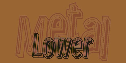
  5. Dave Gibbons Lower by Comicraft, $49.00
    Other guys may imitate him, but the original is still the greatest! Get in with the In Crowd and check out the font created by Mister Fontastic for Dave Gibbons Original Graphic Novel, The, ah, The Originals. Yes, Dave Gibbons now comes in lower case, it's not just what he does when he gets back from the off license. Be sure and pick up The Originals from Amazon -- now available in paperback, and probably still available as a hard case, much like Dave. After the crack about the case of beer above, I'm guessing you'll find me with a broken spine in the remainder pile. See the family related to Dave Gibbons Lower: Dave Gibbons Journal & Dave Gibbons .
  6. Victory Speech Lower by Comicraft, $49.00
    Speak quietly but carry a big stick' as President Theodore Roosevelt once said... so, with so much heated rhetoric in the air this -- let's face it, EVERY -- Election season, we felt that it was important to put together a more dignified and sedate lower case edition of our popular Victory Speech font. Bad Hair and Big Sticks not included. See related font: Victory Speech
  7. Art Lover JNL by Jeff Levine, $29.00
    While browsing through a Dan Solo type reference book, Jeff Levine fell in love with the multiline stylings of one particular typeface, then sat down and re-drew from scratch his own interpretation of the design. Jeff's version is called Art Lover JNL - offering kudos to art in general, the Art Deco movement and (of course) type design.
  8. Lilla Letter Lover by Letterground Foundry, $11.99
    "Lilla Letter Lover" is a captivating font designed specifically for children's books. This delightful typeface brings an element of playfulness to reading, while also enhancing phonemic awareness. The font's remarkable strength lies in bridging the gap between handwritten and printed letters. For early readers, this transition can be challenging, but "Lilla Letter Lover" simplifies the process. It merges the familiar aspects of handwritten letterforms with the clarity of printed text, providing a seamless reading experience. This feature ensures that children can comfortably navigate both forms of writing, enhancing their overall literacy skills. The whimsical charm of "Lilla Letter Lover" instantly captures young readers' imaginations. Each letter is thoughtfully designed with basic shapes and simplicity in mind, for an experience where letters come to life, fostering a love for reading and storytelling. Additionally, "Lilla Letter Lover" offers a unique opportunity for sight-based spelling learning. The visually distinctive presentation of words helps young readers to develop a strong visual memory of spelling patterns. This visual association enables them to recognize and recall words with ease, strengthening their reading and writing proficiency. In summary, "Lilla Letter Lover" is not just a font; it is an enchanting gateway to make reading a joyous adventure for children of all ages.
  9. Resistance Is Lowered by Comicraft, $19.00
    Lower your shields and surrender your ships. You will talk to your central world authority in upper AND lower case, and order global surrender. Your culture will adapt to serve us in sentence case. You will not shout in UPPER CASE as before. You will be upgraded. You will become like us. Upgrading RESISTANCE IS FUTILE to RESISTANCE IS LOWERED is compulsory. There is no escape. Artwork from Monster Truck by Shaky Kane
  10. Samaritan Tall Lower by Comicraft, $49.00
    Fifteen hundred years from now, a man will be selected to go back in time to prevent a catastrophic event which turned his world into a dystopia. Sent back in time, he was enveloped in empyrean fire, the strands of energy that make up time itself. Crash-landing near Astro City in late 1985, he learned how to master and channel the empyrean forces that had suffused his body -- finally learning to control his powers in time to prevent the destruction of the Space Shuttle Challenger, the event he had been sent to avert. He described himself to journalists as nothing more than "a Good Samaritan", and has continued to help his fellow man in Astro City ever since. John JG Roshell has also been struggling with the empyrean challenge of fitting all of Kurt Busiek's ASTRO CITY dialogue into balloons with the regular Samaritan font, so he created the Samaritan Tall font to help his fellow comic book letterers! It's kinda the same thing, really.
  11. Bi Bi by Naghi Naghachian, $78.00
    BiBi font family is designed by Naghi Naghashian. This font family is developed on the basis of specific research and analysis on Arabic characters and definition of their structure. This innovation is a contribution to modernisation of Arabic typography, gives the font design of Arabic letters real typographic arrangement and provides more typographic flexibility. This step was necessary after more than two hundred years of relative stagnation in Arabic font design. BiBi supports Arabic, Persian, and Urdu. It also includes proportional and tabular numerals for the supported languages. BiBi Font family is available in five weights: Light, Regular, Demi, Bold and Heavy; each of them in two diferent styles including normal and extended. BiBi designs fulfill the following needs: A Explicitly crafted for use in electronic media fulfils the demands of electronic communication. BiBi is not based on any pre-digital typefaces. It is not a revival. Rather, its forms were created with today’s technology in mind. B Suitability for multiple applications. Gives the widest potential acceptability. C Extreme legibility not only in small sizes, but also when the type is filtered or skewed, e.g., in Photoshop or Illustrator. BiBi's simplified forms may be artificial obliqued in InDesign or Illustrator, without any loss in quality for the effected text. D An attractive typographic image. BiBi was developed for multiple languages and writing conventions. E The highest degree of geometric clarity and the necessary amount of calligraphic references. This typeface offers a fine balance between calligraphic tradition and the contemporary sans serif aesthetic now common in Latin typography.
  12. Pip Boy Weapons Dingbats - Unknown license
  13. Pip Boy Weapons Dingbats - Unknown license
  14. Black boys on mopeds - Unknown license
  15. Yankee Doodle Boy JNL by Jeff Levine, $29.00
    In the early years of the 20th Century, singer-dancer-actor-composer-playwright George M. Cohan was known as "The Man Who Owned Broadway". In 1904, Cohan was enjoying success with his latest creation, "Little Johnny Jones". Cohan gave America what would become a number of iconic songs, and both he and his compositions were immortalized in the 1942 biographical film "Yankee Doodle Dandy" starring James Cagney. The Art Nouveau-influenced hand lettering of the title on the cover of the sheet music for "The Yankee Doodle Boy" was the model for its namesake digital typeface design and is available in both regular and oblique versions.
  16. LOVE-BOX - Personal use only
  17. Bou College - Personal use only
  18. Easter Joy - Personal use only
  19. Broken Toys - Unknown license
  20. Regal box - Unknown license
  21. BON ViVER - Unknown license
  22. Bodie MF - Unknown license
  23. KR Boo! - Unknown license
  24. Praise 'Bob' - Unknown license
  25. LC Body - Unknown license
  26. Monster boxes - Personal use only
  27. Staggering Bob - Unknown license
  28. Taco Box - Unknown license
  29. Royal box - Unknown license
  30. Joy Circuit - Unknown license
  31. Futurex - Bob - Unknown license
  32. Rustproof Body - Unknown license
  33. Bio-disc - Unknown license
  34. Box Clever - Unknown license
  35. Boxing Brophius - Unknown license
  36. Black Box - Unknown license
  37. KR Boxy - Unknown license
  38. Toy Train - Unknown license
  39. Bog Standard - Personal use only
  40. Boxy Code by Just My Type, $15.00
    In the late 60’s, one of the best art publications in the country was Motive magazine, published (amazingly) by the United Methodist Church. Filled to the brim with poetry, essays, line drawing and woodcuts, it also featured some cutting-edge typography. Boxy/Code is based upon my memories of woodcut typography from that great magazine. Since Boxy/Code ’s lowercase consists of the uppercase’s negative spaces, it’s easy to combine the two with Layer Styles in Photoshop in order to achieve the effect I used in one poster above. It also works great if you use a well-known text as a background. This new version is totally redrawn and features all the Latin-accented letters. Uppercase consists of black capitals in boxes; lowercase features the negative spaces of those boxed capitals. Uppercase and lowercase line up exactly for 2-color effects.
Looking for more fonts? Check out our New, Sans, Script, Handwriting fonts or Categories
abstract fontscontact usprivacy policyweb font generator
Processing