10,000 search results
(0.156 seconds)
- Simplesky by Timurtype,
$14.00 Introducing by Timur type Proudly Present, Simplesky Simplesky A Handwritten Script Font, which was created with great care and specially created for you ✨ Simplesky is perfect for product packaging, branding project, megazine, social media, wedding, or just used to express words above the background. Simplesky also multilingual support. Embelish your designs with our original fonts. Enjoy the font 😉 Thank you!
 - Rocksoldier by Timurtype,
$14.00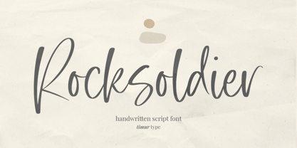 Introducing by Timur type Proudly Present, Rocksoldier ✨ Rocksoldier A Handwritten Script Font, which was created with great care and specially created for you 😊 Rocksoldier is perfect for product packaging, branding project, megazine, social media, wedding, or just used to express words above the background. Simplesky also multilingual support. Embelish your designs with our original fonts. Enjoy the font 😉 Thank you!
 - Coffee & Tea Doodles by Outside the Line,
$19.00 Coffee and Tea Doodles are a font of coffee and tea things-- beans, cups, drinks, tea bag, iced tea, tea sets etc. Perfect set of clip art for coffee or tea shop menus, ads, invitations, etc. Includes scripted words that include coffee, tea, coffee break and tea for 2.
 - Sys 2.0 by FSD,
$60.27Sys is a condensed font designed to work well at small sizes (i.e. phone books, maps, or the like) but it has enough personality to be used at big sizes, too. The TrueType version, thanks to its incredibly accurate hinting, may be used to replace amazingly well TrueType system fonts in every platforms, in web or other screen applications. After the succcess by the first version designed ten years ago, the version 2.0 has numerous improvements in the design of the glyphs, new Unicode ranges, useful OpenType features and enhanced readability. - Evander by Punchform,
$29.00 Evander allows graphic designers to create advanced typographical layouts by offering 64 alternative glyphs and 3 stylistic sets. The family has 18 weights — 9 uprights and 9 italics — ranging from Thin to Black.
 - Stackyard by Mans Greback,
$59.00 An original, high-quality, handwritten typeface. Brings thoughts to a traditional and classy storefront. The font is filled with stylistic and contextual alternates, which give it both variation and a naturally handwritten look.
 - Kapra Neue Pro by Typoforge Studio,
$39.00 Kapra Neue Pro is a younger sister of Kapra Neue – he was the #1 bestselling Grotesque Sans released in 2017 on MyFonts and grandson of Kapra. Now you really have a lot of options to choose! New family is full of everything – 96 weights contain a wide range of instances, from Condensed to Expanded, everything with rounded corners or with sharp ones. Now, font has also: small caps, cyrillic script, and old-style figures. Kapra Neue Pro is inspired by a “You And Me Monthly” magazine, published by National Magazines Publisher RSW "Prasa” in Poland, from May 1960 till December 1973.
 - Spillsbury by Greater Albion Typefounders,
$9.50 Spillsbury was inspired by some examples of 1920s signwriting (principally seen on the side of some vintage vans-good thing they were in a photograph and not on the move!). Spillsbury draws inspiration from these sources to provide a unique combination of legibility and flair, which echoes the charm of advertising and publicity material from the halcyon days of the 1920s. A basic range of four display faces os offered - Regular, Plain (not all that plain really!), Shaded and Shadowed. In a new departure for Greater Albion, three pairs of 'Duo' faces are also offered. These are designed to be used in pairs-and only sold on that basis for little more than the cost of a single face-to provide for two-coloured typographic design, enabling the recreation of those evokative two coloured blocked lettering styles that were used to such good effect in the past. Take a trip back to more colourful times today with Spillsbury!
 - Poeta by Tarallo Design,
$18.99 Poeta is an ornamental font for making patterns and text decoration. It contains floral and nature motifs. The symbols are versatile enough for simple decoration or festive holiday moods. Designers can use Poeta to make unique lines, fields, borders, or ornamentation within or around text. Try replacing a simple straight line with repeated symbols. Make a background to add visual interest to a design. Use the forms to decorate a chapter title or to mark the end of a magazine article. Replace a letter in a word with a symbol to create a memorable statement. Poeta will add visual poetry to any design project. This font began with sketches of patterns seen in ceramic tiles around Sicily. It is named Poeta because Sicily is an island rich in poetry traditions. Using this font is simple. Install it and type. Symbols will appear instead of letters. Choose the precise symbols through a software’s glyph palette. Use the type/character menu controls to vary the spacing and density of patterns.
 - Moire by Microsoft Corporation,
$39.00Moire™ Regular is a block-style sans serif font designed by Jim Ford in the spirit of typefaces popular during the 1950's. The Moire Regular font is slightly more streamlined for a more contemporary voice than its predecessors. Moire Regular is useful for all modern display settings in signs, publications, reports and presentations. The Moire Regular font will also reproduce well in on-screen uses from User Interfaces to web graphics. Character set: Latin 1. - Milayu by Twinletter,
$17.00 Introducing our newest font called Milayu, a Groovy Display font that will turn your every project into a bold and vibrant masterpiece. If you are looking for a way to give a strong, bold, and classic touch to your designs, Milayu is the perfect choice. Milayu comes in three different variants: Regular, Outline, and Shadow. This means you have the flexibility to bring different styles to each of your projects. Whether you want a strong, bold message, or a lighter look with an outline effect, Milayu has everything you need. What makes Milayu truly special are its abundant character ligatures and alternatives. This gives you the freedom to be creative and create unique and stylish designs. With multilingual support, Milayu is also ready to bring your message to the world. Milayu is the perfect choice for projects that require a bold, vibrant look. Let Milayu inspire your creativity and deliver your message in an unforgettable style.
 - Neo Tech by Monotype,
$29.00 Neo Sans began as an intriguing assignment from a branding agency. The agency’s client wanted an “ultra modern” type family that was "futuristic without being gimmicky or ephemeral.” When a bureaucratic decision cancelled the project, Monotype staff designer Sebastian Lester decided to finish the design on his own. “I was left with a sketchbook full of ideas,” he said, “and thought it would be a shame not to see what came of them.” Lester decided that the principal ingredient of an "ultra modern" typeface was simplicity of character structure: a carefully drawn, monoline form, open letter shapes and smooth, strong curves. By further amplifying these qualities, he crossed the line from modern to futuristic. Two highly functional and versatile typefaces emerged. These are Neo Sans and Neo Tech, designs Lester describes as "legible without being neutral, nuanced without being fussy, and expressive without being distracting." Both the Neo Sans and the more minimalist Neo Tech families are available in six weights, ranging from Light to Ultra, with companion italics. Neo Tech offers a suite of alternate characters.
 - Mallorca Dirty Numbers by TypoGraphicDesign,
$25.00 The typeface “Mallorca Dirty Numbers Vol 1” is designed for the Typo Graphic Design font foundry in 2017 by Manuel Viergutz. The playful display font is designed on holiday photos of different numbers (house numbers, graffitis, handwritten menu cards …) from Mallorca. An alphabet built with numbers. 524 glyphs with A–Z, a–z, 0–9 and 99+ decorative extras like ornaments, arrows, dingbats, emojis, symbols, geomatric shapes, catchwords, decorative ligatures (type the word “LOVE” for ❤ or “SMILE” for ☺as OpenType-Feature dlig ) and of course many many numbers (20+ stylistic sets). For use in logos, magazines, posters, advertisement plus as webfont for decorative headlines. The font works best for display size. Have fun with this font & use the DEMO-FONT (with reduced glyph-set) FOR FREE!
 - MEORU GEND by Twinletter,
$17.00 Meoru Gend is a display font that presents superhero strength, courage, and modernity in every action. With a strong, bold, and futuristic style, this font is the perfect solution for creating action-packed and epic gaming experiences. In every letter, Meoru Gend brings life to your display with electrifying energy. From bold, sharply contoured typefaces to seamlessly blended modern elements, this font will bring immense visual power to your game projects. Meoru Gend offers not only impressive styles but also creative features that enrich your work. With the available ligatures and alternates, you can create unique and interesting variations of your style. Also, with multilingual support, this font can be used in multiple languages to reach a global audience. If you’re looking for a strong, bold, modern, and action-packed font for your game projects, Meoru Gend is the right choice. With benefits that include an impressive look, futuristic style, and creative features such as ligatures and alternates, this font will quickly catch the attention of your potential customers and bring you an extraordinary gaming experience in no time. What’s Included : File font All glyphs Iso Latin 1 Alternate, Ligature Simple installations We highly recommend using a program that supports OpenType features and Glyphs panels like many Adobe apps and Corel Draw so that you can see and access all Glyph variations. PUA Encoded Characters – Fully accessible without additional design software. Fonts include Multilingual support
 - Optima Nova by Linotype,
$57.99 With the clear, simple elegance of its sans serif forms and the warmly human touches of its tapering stems, the Optima family has proved popular around the world. In 2002, when it was finally possible to produce digital alphabets without technical limitations and compromises, and more than fifty years after the first sketches, an expansion and redesign of the Optima family was completed and released as Optima nova. Hermann Zapf and Japanese type designer, Akira Kobayashi, collaborated on the project, which included re-working of the existing weights and the addition of several new weights: small caps, old style figures, light, heavy, and condensed. The original Optima was never manufactured with a real italic, only an oblique version of the roman. Optima nova has a complete range of beautifully designed real italics; the new italic forms, of the e, f and g are especially notable. The titling face includes capital letters with special and unusual letter combinations and ligatures, making it an excellent choice for headlines, logos and advertising purposes. Optima continues to be an all-purpose typeface; and Optima nova works for just about anything from book text to signage. Optima Nova® font field guide including best practices, font pairings and alternatives.
 - Ubuvila by Scholtz Fonts,
$19.00African fonts are characterised by design considerations that differ from those of Europe and the Americas. At one extreme we have a relaxed and casual approach to life that values the quality of each moment in life far more than people do in the west. In this approach each element of the font, while being part of a community, nevertheless stands on its own and has its own "character". An African font that characterises this approach is Ubuvila (the word means relaxedness or relaxation in Zulu). There is no strict adherence to a design format in Ubuvila nor are the characters constrained by resting on the same baseline. They wander up and down in the sentence and find a comfortable resting place. - Kunjani by Scholtz Fonts,
$21.00Kunjani, (the Zulu word for "How are you?") is a feisty, contemporary "African Renaissance" font, vibrant and richly decorative, embodying the spirit of modern Africa. The characters are full of movement and excitement, combining a hand-carved look with contemporary elegance. Traditional and contemporary designs are used to make the upper-case alphabet essentially African, while lending variety to the already interesting structure. The font is a must for creators of the contemporary look of Africa. It is perfect for music media & promotions, film media & promotions, clothing hang tags & promotions, posters for "Support Africa" events, and indeed, any project that has its focus on Africa. The font has been carefully letterspaced and kerned. All upper and lower case characters, punctuation, numerals and accented characters are present. - Postal JNL by Jeff Levine,
$29.00Postal JNL lets you print out initials, words or phrases emulating postage stamps. Although there's a limited character set, it can be used along with Printing Set JNL to match any additional word copy. - P22 Underground by P22 Type Foundry,
$24.95 Underground Pro expands on the historical design by Edward Johnston, licensed exclusively to P22 from the London Transport Museum. The overall design of Underground Pro is kept as intended by Johnston and remains within his system of proportions. Additional OpenType features, such as Small Caps and Petite Caps, are included in all 6 weights. A Titling option that mimics London Transport signage is offered in the medium weight. The addition of many Unicode ranges for unprecedented language support makes this the most expansive P22 font family ever. Each Pro font weight collectively contains over 5000 glyphs, covering most Latin based languages, with separate Greek (polytonic) and Cyrillic versions. The outlines of the original Regular and Bold have been subtly redrawn and expanded, they are now available as Medium and Heavy respectively.
 - Qonora by Charles Casimiro Design,
$22.50 Qonora is an innovative new sans-serif text face that combines flowing, almost calligraphic strokes with a post-modern sensibility for a look that works as well on the printed page as it does on screen. Its comfortable proportions and no-nonsense streamlining (note the lack of spurs, serifs or any unnecessary ornamentation) make it an excellent choice for legibility even at very small point sizes. Qonora includes a true italic, drawn independently from the Roman. Strokes for the italic have been re-weighted to complement the Roman, and idiosyncratic italic glyphs have been substituted where appropriate. The typeface’s extensive Hebrew implementation (including diacritics and cantillation marks) is an important part of its character. The Latin, Cyrillic and Greek ranges of the face maintain a consistent ethic of form and function.
 - Doriss Girls by Open Window,
$- Dorriss girls were the dancing troop at the Moulin Rouge. I had the idea for this font while trying to come up with an alternative to beveling. I thought it would be interesting to create this sort of stepped effect as I've never really seen this treatment on a font before. Then my need to create chaos shows up again with Doriss Girls informal. A hand drawn take on the forms. This seemed like it would appear on an old art nouveau poster by the great Toulouse Lautrec, so there you have the genesis of this font. I've been somewhat compelled by the letterforms so I may expand and create a more normal version of this font someday with a range of weights. That would be the bees knees.
 - Grange Text by Device,
$39.00 Grange Text is optimised for smaller text sizes, having more open character shapes and spacing. Use the non-text version of Grange for larger sizes and headlines, which has tighter spacing and detailing. Grange is the Device interpretation of the classic “Grot” thick/thin sans style. Unlike the traditional models on which it is based, Grange takes a rational, consistent approach across wide range of weights and widths for contemporary use. The font includes alternative curved and straighter versions of key characters, most obviously the lower-case ‘g' and capital ‘R', allowing the font to take on either a sharper or warmer, more playful appearance. These can be toggled on or off using the ‘Alts' feature in Illustrator, or ‘Stylistc Sets’ in Indesign. Contains proportional, lining and tabular numerals.
 - Caerphilly by Hanoded,
$15.00 I really like Wales; I like the culture, the people and the language. I also like the Welsh legends, especially the ones about King Arthur and Merlin. I am reading a book about Arthur right now, so when I was working on this font, I wanted to give it a Welsh name. Caerphilly is a town in Southern Wales and is home to an immense 13th century castle (Castell Caerffili). Caerphilly font is based on a 16th century manuscript. I kept the glyphs rough, to give it ‘ye olde’ look. Comes with a hoard of diacritics, a bunch of double letter ligatures and some alternate glyphs as well.
 - Foundry Gridnik by The Foundry,
$96.00 The new Foundry Gridnik typeface family features an expressive range of 10 weights – from Light to Extra Bold, each with accompanying Italics. Foundry Gridnik was developed from the single weight monospaced 'typewriter’ face, originally created by Dutch designer Wim Crouwel in the 1960s. Crouwel's devotion to grids and systems led to his affectionate nickname of ‘Mr Gridnik’, and this inspired the new typeface family name. Foundry Gridnik’s distinct geometric design has been described as ‘the thinking man’s Courier’. Crouwel said, ‘I am a functionalist troubled by aesthetics’, and although Gridnik is based on logic, rationality and strict adherence to the grid, it also has a human dimension that sets it apart.
 - Sketchnote by Delve Fonts,
$29.00 The Sketchnote typeface was born of necessity: designer Mike Rhode needed a series of hand-drawn fonts to illustrate and produce his book, “The Sketchnote Handbook.” Because of its origin, this typeface was designed to be practical and convey the human character and quirks of his normal handwriting and hand-drawn lettering. The family is comprised of five fonts: Sketchnote Text in Regular, Bold, and Italic, the somewhat compressed and bold Sketchnote Square for headlines, and the playful Sketchnote Dingbats. Sketchnote Text is a casual script with a slightly bouncy baseline. In order to mimic the differences present in natural handwriting, OpenType features are built-in that automatically switch between multiple versions of each letter or number. In total, over 240 alternates in each of the text fonts are employed, making for a more authentic appearance. The warm texture of Sketchnote is the result of actual ink-spread on paper captured in the scans of written letterforms and was intentionally left intact during the digitization process to preserve that feeling. Rhode created Sketchnote Square as a display type to complement Sketchnote Text. Drawn instead of written, the letters often have neat little happenstance voids within the strokes. Sketchnote Dingbats features a selection of icons, rules, and arrows to provide some functional and fun tidbits, handy for bringing additional life to any design.
 - ATF Garamond by ATF Collection,
$59.00 The Garamond family tree has many branches. There are probably more different typefaces bearing the name Garamond than the name of any other type designer. Not only did the punchcutter Claude Garamond set a standard for elegance and excellence in type founding in 16th-century Paris, but a successor, Jean Jannon, some eighty years later, cut typefaces inspired by Garamond that later came to bear Garamond’s name. Revivals of both designs have been popular and various over the course of the last 100 years. When ATF Garamond was designed in 1917, it was one of the first revivals of a truly classic typeface. Based on Jannon’s types, which had been preserved in the French Imprimerie Nationale as the “caractères de l’Université,” ATF Garamond brought distinctive elegance and liveliness to text type for books and display type for advertising. It was both the inspiration and the model for many of the later “Garamond” revivals, notably Linotype’s very popular Garamond No. 3. ATF Garamond was released ca. 1918, first in Roman and Italic, drawn by Morris Fuller Benton, the head of the American Type Founders design department. In 1922, Thomas M. Cleland designed a set of swash italics and ornaments for the typeface. The Bold and Bold Italic were released in 1920 and 1923, respectively. The new digital ATF Garamond expands upon this legacy, while bringing back some of the robustness of metal type and letterpress printing that is sometimes lost in digital adaptations. The graceful, almost lacy form of some of the letters is complemented by a solid, sturdy outline that holds up in text even at small sizes. The 18 fonts comprise three optical sizes (Subhead, Text, Micro) and three weights, including a new Medium weight that did not exist in metal. ATF Garamond also includes unusual alternates and swash characters from the original metal typeface. The character of ATF Garamond is lively, reflecting the spirit of the French Renaissance as interpreted in the 1920s. Its Roman has more verve than later old-style faces like Caslon, and its Italic is outright sprightly, yet remarkably readable.
 - PiS Konzert by PiS,
$36.00 PiS Konzert is a bulky quirky all caps headline sans, inspired by letters found on a hand drawn polish poster from the 1960s. Its slightly shaky mid-century style makes it perfect for concert posters, movie intros or any other applications that need to evoke that bold, loud and still a little classy feeling of staggering inebriatedly through a murky jazz club.
 - Bellinzo by Zealab Fonts Division,
$9.00 Bellinzo sans serif font is a set of 3 weights and it is good for making creative displays and it has urban / street wear touch. It’s a lovely and unique sans serif font, allowing you to make each word look completely stylish! Bellinzo is the unique typeface for creating elegant headlines, fashion magazine covers, book covers, templates and creative displays and logo designs.
 - Kaleidos by Melvastype,
$32.00 Kaleidos is a lining and clean brush script with soft and round letterforms. It is sketched and drawn with a pointed brush pen. Kaleidos has plenty of alternates, ligatures and swashes so you can build interesting-looking words and headlines. Although Kaleidos is condensed and quite tightly spaced it is clear and legible. Check out also the Rough version: Kaleidos Rough
 - Anthanista by Madhaline Studio,
$15.00 Anthanista would perfect for photography, watermark, social media posts, advertisements, logos & branding, invitation, product designs, label, stationery, wedding designs, product packaging, special events or anything that need handwriting taste. What's Included : Ton of glyphs (include Uppercase, Lowercase, Numerals & Punctuations, 113 Ligatures) Works on PC & Mac Simple installations Accessible in the Adobe Illustrator, Adobe Photoshop, Adobe InDesign, even works on Microsoft Word
 - Strike Brush by Rockboys Studio,
$29.00 Strike Brush is a new modern brush font, incredibly adaptable to all sorts of designs. It is suitable for any branding, product packaging, invitation, quote, t-shirt, label, poster, logo that you wish to create. PUA encoded = Accessible in the Adobe Illustrator, Adobe Photoshop, Adobe InDesign, even work on Microsoft Word. PUA Encoded Characters - Fully accessible without additional design software.
 - Spika by Little Fonts,
$15.00 Spika is a geometric, monospaced sans serif font. This tall, condensed typeface is simple in its structure yet strong in its design. Informed by basic geometry and inspired by simplistic, clean design principles. Spika has an almost retro style but its no nonsense design would fit well within any contemporary design applications. The font contains over 400 glyphs including loads of accented characters.
 - Brushtter by Rockboys Studio,
$15.00 Brushtter is a modern brushed display font, incredibly adaptable to all sorts of urban or street related designs. It is suitable for any branding, product packaging, invitation, quote, label, poster, logo that you wish to create. PUA encoded = Accessible in the Adobe Illustrator, Adobe Photoshop, Adobe InDesign, even work on Microsoft Word. PUA Encoded Characters - Fully accessible without additional design software.
 - Yin Yang Messages by Ingrimayne Type,
$9.00 YinYangMessages contains two sets of letters, those on the upper-case keys that fit on the left side of a yin-yang symbol and those on the lower-case keys that fit on the left side of a yin-yang symbol. One can alternate the two sets manually but the OpenType contextual alternatives feature does this automatically in any program that supports this feature. The family contains two fonts. In one the filled half is on the left and in the other the filled half is on the right. The slash and backspace keys contain blank halves of the symbol, which are useful for completing words with an odd number of letters. The two styles can be used in layers. YinYangMessages is a fun and playful family that every once in a while may be the ideal typeface for some unusual situation.
 - Libertinas-co. - Personal use only

- Bouba Round by HVD Fonts,
$40.00 Bouba Round is more than it seems on first sight. It combines the best of two worlds, having an expressive character with its round and friendly shapes and performing great in every typographic aspect. The type family is a true workhorse, ready for serious typography. Creating a round typeface with a great reading experience has been our guiding principle throughout the design process — Bouba Round needed to work in small sizes and long text as well as in Headlines. To ensure a great reading experience in most languages, Bouba Round has a huge language support including nearly all latin based languages, Greek and Cyrillic. On top of an extensive language support, Bouba Round is loaded with a lot of icons, arrows and graphic elements for modern UI/UX design.
 - Makonde by Scholtz Fonts,
$19.00I have named the font “Makonde” after an tribal group in southeast Tanzania and northern Mozambique that is well known for their intricate and semi-realistic wood carvings. The patterns that decorate the Makonde font remind me of the Makonde wood carvings. The Makonde font is a useful resource for anyone creating designs or producing text that has African look. Typified by a stark African angularity the characters reflect the ethos of Africa. Each Makonde font contains the full range of upper and lower case characters, all punctuation and special characters as well as the accented characters used in the major European languages. The Makonde tribal group is of historical interest because FRELIMO, the resistance movement which ended Portugese colonialism in East Africa, originated in the homeland of the Makonde. The character shapes in the Makonde font are very similar to those in a style of Umkhonto called Umkhonto Wide. Using Umkhonto together with Makonde gives the designer enormous flexibility. - EFCO Osbert by Ilham Herry,
$19.00 Meet Osbert, the font that effortlessly marries vintage charm with a contemporary flair. Imagine the nostalgic allure of old tin labels, now reimagined with a fresh twist. With its playful flared serifs and diagonal bars, Osbert brings a touch of modern to classic aesthetics. Boasting a whopping 15 static styles and a variable font, Osbert offers a playground of possibilities for designers. And with three distinct sub-families - text, regular, and display - finding that perfect balance in your designs has never been easier, whether you're crafting some typographic badges, editorial, logo, branding, poster, print, signage, etc. So go ahead, let Osbert add a touch of timeless coolness to your next project!
 - Debraht by IbraCreative,
$17.00 Debraht is a striking example of a stylish modern sans-serif typeface, seamlessly blending contemporary design elements with timeless simplicity. With clean lines and a distinct geometric structure, Debraht exudes a sense of sophistication and versatility. Its balanced proportions and well-crafted letterforms make it an ideal choice for a wide range of applications, from elegant branding to sleek editorial layouts. The typeface’s attention to detail is evident in its subtle curves and thoughtful spacing, ensuring a harmonious and legible appearance across various platforms. Debraht effortlessly captures the essence of modern aesthetics, making it a go-to choice for those seeking a refined and chic typographic solution.
 - Le Havre Sketch by insigne,
$22.00 Le Havre Rough, a letterpress variant of Le Havre is 72% off for a limited time! Le Havre Sketch is a hand-sketched geometric sans serif. The family contains three weights. All members of the family include Sixty-four OpenType ligatures that add a realistic, natural effect and ensure that no two letters in a word repeat, oldstyle figures and small caps. Please see the sample brochure to see these features in action. Le Havre Sketch is an excellent choice when you need a fun and interesting sans-serif.
