10,000 search results
(0.032 seconds)
- BD Mother by Typedifferent,
$25.00 BD Mothers’s main characteristic is the humorous blend of fat serifs, knobby curves and the thin square inner shapes. Perfect for use on posters, CD-jackets, titles in the range of cartoon, games and music.
 - Jesus Saves by Breauhare,
$13.94 Jesus Saves is a font based on the familiar old logo that has “JESUS” hidden within a maze-like set of multi-branched vertical bars. The characters appear to be an alien, cryptic language at first sight, perhaps even a Japanese, Chinese, or Korean language, thanks to the unusual figures created by the combinations of various letters. It is a teaser for the eyes, as well as a visual feast of De Stijl-type art. It is an attention-getting font that is cool to look at, an eye puzzle that is enticing to decipher. It’s a great font to use for striking logos (see Gallery Images) by the judicious use of ligatures, where in word settings ligatures may be used at the beginnings of words, the middle or the endings of words. Jesus Heals is the missing spaces from the Jesus Saves font, sort of like a doughnut hole font! If you use this font to fill in the spaces in the Jesus Saves font, it becomes whole, or healed, thus the name. Jesus Lives is a raised block/3D or three dimensional version of Jesus Heals. For color combinations in apps that support layering, Jesus Lives synchs and has perfect kerning register with Jesus Heals, as Jesus Heals has with Jesus Saves. The digitization was done by fontmeister John Bomparte.
 - Drawing Tablet JNL by Jeff Levine,
$29.00 Drawing Tablet JNL was created based on those two words hand-lettered on the cover of a sketch pad from the late 40s - early 50s. It is reminiscent of the popular Deco typefaces of the time.
 - Ex Kata Damaged - Unknown license

- Obvia Wide by Typefolio,
$29.00 'Obvia' appeared as a result of direct observation on typefaces classified as geometric and the plan to explore for the first time width axes Condensed, Narrow (soon), Normal and new Wide and Expanded. The idea behind 'Obvia's design was to create a distancing from geometrically pure shapes, in this case, square shapes. Then some details were added, such as subtle inktraps, concave endings of the stems and carefully drawn alternate characters, giving a 'geohumanist' tone to the font. This first family of 'Obvia' has 9 weights ranging from Thin to Black, delivering a strong typographic identity, from the paper to the pixel.
 - Obvia Expanded by Typefolio,
$29.00 'Obvia' appeared as a result of direct observation on typefaces classified as geometric and the plan to explore for the first time width axes Condensed, Narrow (soon), Normal and new Wide and Expanded. The idea behind 'Obvia's design was to create a distancing from geometrically pure shapes, in this case, square shapes. Then some details were added, such as subtle inktraps, concave endings of the stems and carefully drawn alternate characters, giving a 'geohumanist' tone to the font. This first family of 'Obvia' has 9 weights ranging from Thin to Black, delivering a strong typographic identity, from the paper to the pixel.
 - Obvia Condensed by Typefolio,
$29.00 'Obvia' appeared as a result of direct observation on typefaces classified as geometric and the plan to explore for the first time width axes Expanded, Wide, Normal, Narrow and Condensed The idea behind 'Obvia's design was to create a distancing from geometrically pure shapes, in this case, square shapes. Then some details were added, such as subtle inktraps, concave endings of the stems and carefully drawn alternate characters, giving a 'geohumanist' tone to the font. This first family of 'Obvia' has 9 weights ranging from Thin to Black, delivering a strong typographic identity, from the paper to the pixel.
 - Obvia Narrow by Typefolio,
$29.00 'Obvia' appeared as a result of direct observation on typefaces classified as geometric and the plan to explore for the first time width axes Condensed, Narrow, Normal, Wide and Expanded. The idea behind 'Obvia's design was to create a distancing from geometrically pure shapes, in this case, square shapes. Then some details were added, such as subtle inktraps, concave endings of the stems and carefully drawn alternate characters, giving a 'geohumanist' tone to the font. This first family of 'Obvia' has 9 weights ranging from Thin to Black, delivering a strong typographic identity, from the paper to the pixel.
 - ITC Tyke by ITC,
$29.99Tomi Haaparanta got the idea for the Tyke typeface family after using Cooper Black for a design project. He liked Cooper's chubby design, but longed for a wider range of weights. “I wanted a typeface that was cuddly and friendly,” recalls Haaparanta, “but also one that was readable at text sizes.” He started tinkering with the idea, and Tyke began to emerge. Even though Haaparanta knew his boldest weight would equal the heft of Cooper Black, he began drawing the Tyke family with the medium. His goal was to refine the characteristics of the design at this moderate weight, and then build on it to create the light and bold extremes. Haaparanta got the spark to design type in 1990, when he attended a workshop held by Phil Baines at the National College of Art and Design in Dublin. “I've been working and playing with type ever since,” Haaparanta recalls. He released his first commercial font in 1996, while working as an Art Director in Helsinki. After about two dozen more releases, he founded his own type studio, Suomi Type Foundry, early in 2004. At five weights plus corresponding italics, Tyke easily fulfills Haaparanta's goal of creating a wide range of distinctive, completely usable designs. The light through bold weights perform well at both large and small sizes, while the Black is an outstanding alternative to Cooper for display copy. - Mayblossom by Hanoded,
$15.00 Mayblossom was named after an old French fairytale (The Princess Mayblossom),which is quite similar to the tale of Sleeping Beauty. Mayblossom font is a fairytale font. It was made with a magic wand (with a Unicorn hair core) onto centuries old parchment. The font was then blessed by 12 lovely fairies. Of course, I had the evil thirteenth one kidnapped before she could cast her spell. In other words, if your work requires a certain lightness, a pinch of fairy dust and a sprinkling of magic, then Mayblossom is your best pick.
 - Gloomie Saturday by Timurtype,
$14.00 Introduced by Timurtype Studio! Gloomie Saturday is a Bubbly Handwritten Font this font captures the charm of handcrafted elegance with our cheerful handwritten font collection – where every word dances with personality. Enhance your designs and captivate your audience with custom lettering art. Let your words sparkle with the magic of authenticity. Explore our cheerful fonts and make your message stand out! Gloomie Saturday Font also supports multilingualism. Enhance your designs with our original fonts, feel free to comment or provide feedback, Enjoy the fonts 😊 Thank You
 - Nefarious by Hanoded,
$15.00 A few fonts ago I mentioned the fact that I like posh English words; words you don’t really use in conversation. As I am busy expanding my ‘halloween’ font collection, I came across the beautiful word Nefarious. It means wicked or evil and when you say the word, it even sounds evil! Fantastic! Nefarious is a halloween/witches font. It looks like my Griezelig font, but it is rougher and spikier. Use Nefarious for your halloween invitations, posters and books about evil geniuses. Comes with all diacritics and a bunch of swashes as well.
 - Etrusco Now by Italiantype,
$39.00 Etrusco Now is the revival of a lead typeface originally cast in lead by Italian foundry Nebiolo in the early 1920s. Heavily inspired by the design of the Medium weight of Schelter & Giesecke's Grotesk, Etrusco was, like Cairoli, an early precursor of the modernist grotesque superfamilies: a solid, multi-purpose "work-horse" typeface family that could solve a wide range of design problems with its range of widths and weights. When designing the new incarnation of Nebiolo's Etrusco, the Italiantype team directed by Cosimo Lorenzo Pancini and Mario de Libero decided to extend the original weight and width range to keep this "superfamily" approach. Etrusco Now has twenty-one styles widths in three widths of seven weights each, with matching italics; the original weights for the typeface have been collected in the Etrusco Classic subfamily. Etrusco Now new widths allowed the team to include in the design many nods and homages to other vintage classics of Nebiolo. The lighter weights of the normal width have been heavily influenced by the modernist look of Recta, while the heavy condensed and compressed widths refer to the black vertical texture of Aldo Novarese's Metropol. This infuses the typeface with a slightly vintage mood, making Etrusco at the same time warmly familiar and unexpected to eyes accustomed to the formal and cold look of late modernist grotesques like Helvetica. Contemporary but rich in slight historical quirks, Etrusco Now is perfect for any editorial and branding project that aims to be different in a subtle way. Etrusco Now's deviations from the norm are small enough to give it personality without affecting readability, while its wide range of open type features (alternates, stylistic sets, positional numbers) and language coverage make it a problem solver for any situation. Like its cousin Cairoli, Etrusco is born out of love for lost letterforms and stands like its lead ancestor from a century ago, at the crossroads between artsy craftsmanship and industrial needs.
 - Janek by Pawel Fonts,
$35.00 Janek is a semi-serif typeface inspired by old Polish signage. Rather then mimic specific style, it synthesises various inspirations. It is named after an Author of a classic Polish manual, that kickstarted this project, „Techniques of Lettering“ by Jan Wojeński. Large character set and style selection allows for richness of expression. Pointy upright and slightly decorative italic bring unique blend of aesthetics. It works well in rich text and as a striking display. Janek consists of seven italic and seven upright styles ranging from Light, to Black. With extensive language support and wide selection of features, it is suited for range of latin use cases. Janek is a contemporary throwback to the past.
 - Tamba Sans by Dharma Type,
$19.99 Tamba Sans has strong geometric frames. Somewhat condensed and somewhat squarish letterforms can create a powerful atmosphere. At the same time, the very clear, neutral and distinguishable letterforms make it legible and readable. With the spread of the internet, the digital world is overflowing with “designed” stuff. To survive this chaotic world as a designer, you should use a strong typeface to catch the eyes of an unspecified large number of visitors/customers. This is why it is so important to be strong and powerful. One more important thing is the legibility, but the eye-catching design has a tendency to be unusual. Those two things conflict with each other. Tamba Sans solved this problem with an exquisite balance. Tamba Sans consists of 7 weights and their matching Italics for a wide range of usages. Farther, Tamba Sans is supporting international Latin languages and basic Cyrillic languages including Basic Latin, Western Europe, Central and South-Eastern Europe. Also CSS covers Mac Roman, Windows1252, Adobe1 to 3. This wide range of international characters expands the capability of your works.
 - Natthalie Signature by Pointlab,
$15.00 Natthalie Signature is a new fresh & modern script with a handmade calligraphy style, decorative characters and a dancing baseline! So beautiful on invitation like greeting cards, branding materials, business cards, quotes, posters, and more!! Natthalie Signature come with 300 glyphs+. The alternative characters were divided into several Open Type features such as Stylistic Alternates, and Ligature. The Open Type features can be accessed by using Open Type savvy programs such as Adobe Illustrator, Adobe InDesign, Adobe Photoshop Corel Draw X version, And Microsoft Word. And this Font has given PUA unicode (specially coded fonts). so that all the alternate characters can easily be accessed in full by a craftsman or designer. Natthalie Signature Features : Uppercase & Lowercase International Languange & Symbols Support Punctuation & Number PUA Unicode Range Standard Ligatures Discretionary Ligatures Stylistic Alternates Stylistic Set 01 Character Natthalie Signature.OTF For use in office word, you all can read the following article. http://www.magpiepaperworks.com/blog/using-opentype-fonts-in-microsoft-word/ To Access Alternate Characters Click The Link Below: If you have any question, don't hesitate to contact me by email pointlab23@gmail.com. Thanks and happy designing :-)
 - Vaccine Sans by ParaType,
$30.00 Vaccine Sans is a humanist sans-serif font family with soft terminals, but stem junctions on the contrary use hard constructions. Such combination of basic design features makes the font distinct and strong in setting and delicate and soft in appearance. This design peculiarity, together with very low contrast, produces a range of qualities needed for small sizes, low quality print and bad reading conditions. Vaccine Sans has a modern stylish design and takes its rightful place among popular faces. The family consists of 10 members — five weights with the corresponding italics. It can be used in a wide range of applications — magazines, advertising, corporate identity, urban navigation, packaging, children books, etc. Designed by Manvel Shmavonyan with the participation of Alexandra Korolkova and Gayaneh Bagdasaryan.
 - Stagnan by ArimaType,
$15.00 Stagnan is a font with a subtle blend of passion and calculation. each glyph is made with great care in order to get results that do not disappoint. This gives the designer various options for typesetting A variable version is included with the full family, allowing maximum flexibility and control for the designer over the wide range of expression capabilities of the Stagnan superfamily.
 - Unusually Deco JNL by Jeff Levine,
$29.00 The hand lettered words “Pere Noel” under a vintage French magazine’s photo of Santa with two bikini-clad beauties inspired the digital version of this quirky, condensed type style. Unusually Deco JNL is available in both regular and oblique versions From Wikipedia: “Père Noël “Papi Christmas”, sometimes called ‘Papa Noël’ (“Daddy Christmas”), is a legendary gift-bringer at Christmas in France and other French-speaking areas, identified with the Father Christmas and/or Santa Claus of English-speaking territories. Though they were traditionally different, all of them are now the same character, with different names, and the shared characteristics of a red outfit, workshop at the North Pole/Lapland, and a team of reindeer.”
 - Market Written by Arterfak Project,
$17.00 Market Written is a handwriting font, created by the natural handwriting and casual-minimalist design. Crafted with the natural looks of the letterform and dynamic strokes, this font has a bouncy feel that makes it looks more playfully! Market Written is perfect for something with simple words, like menus, cards, quotes, labels, chats, short body text, books, and more. Equipped with stylistic alternates and ligatures. Write your words with Market Written! Thank you.
 - Bruce 532 Blackletter by Intellecta Design,
$23.90 A classic font design remastered by the type foundry Intellecta Design, from the extra-rare Bruce's New York typefoundry from 1882. Distressed and antique, use this font in display purposes for a stylized type design. Great display face for headers and antique-like projects. Contains a limited amount of letter designs. Using the "0" and "2" keys you get two different fleurons to start words. Use "1" or "3" keys to close words with fleurons.
 - Humblest Pro by Gleb Guralnyk,
$15.00 Hi. Introducing a new version of my one of the most popular fonts. Now Humblest Pro includes much more characters and has west european multilingual support. This font has a smooth and clean shape without any grain unlike the original one. Almost all of the capital leters has two version, for the begining and for the ending of the word. The final alternative letter will be automatically replaced if you type a big last letter in the word (check out if the "contextual alternates" opentype feature is activated). Decorative swashes are now a part of the font. To use this decorative lines just type an underscore character and the corresponding number from _00 to _39 (make sure that “standard ligatures” opentype feature is activated). Also a lot of ligatures for small letters are available, please check out the previews with all available glyphs. Thank you and have fun!
 - Screenplay JNL by Jeff Levine,
$29.00Screenplay JNL was modeled from the signage seen in an old photo of the RKO movie studios building circa the 1930s. This multi-line lettering is so classic of the Art Deco period. For best effect and readability, use wider spacing between letters. For single words or initials, regular spacing should do fine. - Art Materials JNL by Jeff Levine,
$29.00 The cover of the 1930s-era “Catalog of Artists’ Materials” from Ernst H. Friedrichs, Inc. (New York) has the words “Artists’ Materials” hand lettered in a stylized Art Deco sans serif type style. This unique design is now the digital font Art Materials JNL, which is available in both regular and oblique versions.
 - Summering by Letterara,
$12.00 Summering is a fresh, sweet, and friendly handwritten font. Its friendly feel makes this font incredibly versatile, fitting a wide range of contexts. Its distinct and well-rounded letters make this font a masterpiece. Add it to your creative ideas and notice how it makes them stand out! This font is PUA encoded which means you can access all of the awesome glyphs with ease! It also features a wealth of special features including ligatures.
 - Fruitos by Fenotype,
$25.00 Fruitos is a funky font family with loads of interlocking ligatures. Fruitos is great for packaging, posters or any display use. Fruitos is divided into two families: Fruitos R (regular) is bouncy and has wider “serifs” whereas Fruitos S (straight) makes clear blocks and has straight forms. Both versions have a standard fill version, an Inline version and a Line version that can be used together with the standard version for colourful inline. Fruitos also has an underlined Titling Alternates for every basic character. Try Titling Alternates to spice up your words!
 - Signature Mango by Shakira Studio,
$19.00 Introducing Signature Mango - The Epitome of Modern Retro Serif Elegance! Signature Mango is the font that's redefining modern retro serif typography and setting the design world on fire. This font is the epitome of sophistication, seamlessly blending timeless retro aesthetics with the contemporary chic that's all the rage in today's design trends. With its versatility and wide range of stylistic options, Signature Mango is your passport to creating stunning designs that stand out in today's competitive landscape. Whether you're designing a high-end fashion brand's logo, an upscale menu, or a luxurious wedding invitation, this font adds a touch of refined glamour that's in high demand right now. Here's what you get: Regular and Italic All Multilingual symbol Opentype features ( ligature, alternate ) Accessible in the Adobe Illustrator, Adobe Photoshop, Adobe InDesign, even work on Microsoft Word. PUA Encoded Characters - Fully accessible without additional design software. Multilingual character supports : (Afrikaans, Albanian, Catalan, Croatian, Czech, Danish, Dutch, English, Estonian, Finnish, French, German, Hungarian, Icelandic, Italian, Lithuanian, Maltese, Norwegian, Polish, Portuguese, Slovenian, Spanish, Swedish, Turkish, Zulu) Follow my shop for upcoming updates, and for more of my work, Thank you!
 - Moonlit Walk JNL by Jeff Levine,
$29.00 Another variant to the ever-popular Art Deco sans lettering with solid centers (no counters) was found in the hand-lettered title on the cover of the 1933 song "There's A Ring around the Moon". This became the basis for the digital typeface Moonlit Walk JNL, available in both regular and oblique versions.
 - Whitehaven by Greater Albion Typefounders,
$8.95 Whitehaven is the spirit of the Art Deco movement made into a very solid and blocky Sans Serif font. The name owes its inspiration to Whitehaven Mansions, a block of flats where that greatest of 1930s detectives, Hercule Poirot lived. Use this to make bold statements, to give posters and designs a taste of thee 30s, and wherever you want to be clear and definitive. Whitehaven is offered in two widths and a range of embossed and engraved styles for flexibility in design work.
 - Hello Miracle by Letterafandi Studio,
$16.00 Hello Miracle is a cool and interestingly designed display font. It will elevate a wide range of crafting ideas, from cards, to branding, labels and much more. This font is PUA encoded which means you can access all of the glyphs with ease!
 - Montesla Diamond by Letterena Studios,
$9.00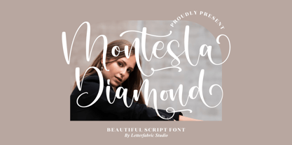 Montesla Diamond is an enchanting handwritten font. This versatile script font has a wide spectrum of applications ranging from greeting cards to headlines. Montesla Diamond is PUA encoded which means you can access all of the amazing glyphs and ligatures with ease!
 - Kevong Gabion by Product Type,
$13.00 Kevong Gabion Serif font is the epitome of timeless elegance and classic style. The font boasts a sleek and sophisticated design that is perfect for a range of projects, from branding to editorial design. Its classic serif form is perfect for adding a touch of sophistication to your work. In addition to its timeless design, Kevong Gabion Serif font is also incredibly versatile. It comes with a wide range of language support, making it the ideal choice for projects with a global audience. Whether you’re designing a website or creating a marketing campaign, this font is sure to impress. Overall, Kevong Gabion Serif font is a must-have for any designer who values classic design and versatility. Its timeless elegance and wide range of language support make it the perfect choice for a range of projects. So why not add it to your font library today and take your designs to the next level? What’s Included : - File font - All glyphs Iso Latin 1 - We highly recommend using a program that supports OpenType features and Glyphs panels like many Adobe apps and Corel Draw, so you can see and access all Glyph variations. - PUA Encoded Characters – Fully accessible without additional design software. - Fonts include Multilingual support
 - Vintage Comics JNL by Jeff Levine,
$29.00 Vintage Comics JNL was inspired by the way the word “comics” was hand lettered on many of the comic book covers of the 1940s, and is available in both regular and oblique versions.
 - ITC Weidemann by ITC,
$29.99 The Weidemann typeface's original name was Biblica, which was designed for the collaborative publication of a Bible by the German Catholic and Protestant Churches. The mass of text which the face was intended to set required that the design allow many characters to fit onto one line without rendering the words illegible. Thus, narrow spacing does not compromise the legibility or the elegance of Weidemann.
 - President by Linotype,
$29.99In 1952, Charles Peignot made a bold and fortuitous move: he invited a young Swiss designer to Paris to be the art director of the Deberny & Peignot type foundry. This started the professional type design career of Adrian Frutiger; and since then he has designed an astonishing range of masterful typefaces. One of the earliest for Deberny & Peignot was Président, a sharp-seriffed Latin titling face. Latin" is a typographic designation for roman typefaces with wedge or triangular-shaped serifs, a stylistic form that Frutiger would return to later with his beautiful typeface Méridien. Président™ has wide, solid shapes; very little contrast between thick and thin strokes; and an air of assurance. Use this titling font for business cards, announcements, or artistic signage." - Deco Banner JNL by Jeff Levine,
$29.00 Deco Banner JNL is composed of reverse lettering on a black background with Art Deco end caps. To create a banner, first type the plus sign for the left end cap, then your text. To add a space between words, use the bar on the shift position of the backslash key then continue on. To add the right end cap, type the equal sign.
 - Felt-Tip Futhark by Thomas Käding,
$1.00The vikings searched in vain for hundreds of years over much of the northern hemisphere, but their dreams of writing with felt-tip pens went unfulfilled--until now! This is a novelty font containing the 24 runes of the Futhark, but with a modern bent. In addition to regular, bold, oblique, and bold oblique, we have included two outline styles. Also included is a PDF page identifying the characters. - Equinox by ITC,
$29.99Equinox is the work of British designer Vince Whitlock. This lighthearted typeface is extremely versatile due in part to its array of alternative characters. Equinox should be set with tight letter and word spacing for maximum visual impact. - Vivala Old by Johannes Hoffmann,
$11.00 The Vivala old black letter font family is characterized by its hard-cut lines. This gives the typeface a special woodcut-like character. The typeface family offers a wide range of possibilities for design. It works well for posters, packaging, and corporate design for restaurants or breweries.
 - Presence by Présence Typo,
$36.00Présence is a modern sans serif with a light stroke contrast. The capitals are a bit narrow for a titling use which makes them space-economical without lack of legibility. The lower cases have a normal width for a fluid reading. Its wide range of weights allows it many uses.
