10,000 search results
(0.047 seconds)
- Sathya Script by Gian Studio,
$14.00 Introduce Sathya Script in beautiful handwritten style. Equipped with 600 glyphs. Sathya Script is perfect for branding projects, home appliance design, product packaging, use in business cards, invitation cards, etc. Just as a stylish text overlay onto a background image or anything else that needs a touch of elegance. Available in the Satya. To enable the OpenType Stylistic alternative, you need a program that supports OpenType features such as Adobe Illustrator CS, Adobe Indesign & CorelDraw X6-X7, Microsoft Word 2010 or a later version. There are additional ways to alternate/swash, using the Character Map (Windows), Nexus Font (Windows), Font Book (Mac) or a software program such as PopChar (for Windows and Mac). How to access all alternative characters, using Windows Character Map with Photoshop: https://www.youtube.com/watch?v=Go9vacoYmBw How to access all alternative characters using Adobe Illustrator: http://youtu.be/iptSFA7feQ0 How to use the font style set in Microsoft Word 2010 or later versions: https://youtu.be/x1A_ilsBsGs Thanks for checking! I really hope you enjoy it. Regards Designers: Afri Giani Publisher: Gian Studio
 - Secession by HiH,
$14.00 Secession is a very readable typeface, suitable for short blocks of text. If you have grown weary of the standard sans-serif faces one sees all the time, you may want to use Secession as a fresh and distinctive substitute. Like Kunstler Grotesk, Secession is one of a number of typeface designs that attempts to reconcile Germany’s blackletter tradition with the international familiarity of roman letterforms in a simple, robust design suitable for meeting the demands of a modern industrial economy, while rejecting the extraneous ornamentation of the departing Victorian era. Unlike Kunstler Grotesk, Secession was designed with a lower case. Secession Bold was originally jointly released as Halbfette Secession by Bauer & Company of Stuttgart and H. Berthold AG of Berlin around 1898. The rest of the family was designed by HiH. The basic family of four: Text, Oblique, Bold and BoldOblique are available in two versions: one set with the standard contemporary lining or ranging numerals for spreadsheets and tables and one set of old-style figures (with OSF in font name) for use with text. The two versions of the basic family, Secession and Secession OSF were released in July 2006. Cousins include ExtraBold, SCOSF Text, and two multi-lingual versions of the text weight. Secession ML includes the Latin Extended-A character set in unicode format plus 17 ligatures and a few strays. Secession GreekML has all the characters of the ML version plus the unicode Greek set and 17 Greek ligatures. Release of the cousins took place in August and October of 2006. Click on BUYING CHOICES. Click on GLYPHS and use drop-down menus and slider to see the all the glyphs for the various fonts. Similar: Birmingham (Ref 100 Ornamental Alphabets, Solo); Spartana (Art Nouveau Display Alphabets, Solo)
 - Arable by Heyfonts,
$18.00 Arable Font Is "Unique Display Font" refers to a specific type of typography that is characterized by its distinctive, one-of-a-kind design, and it is typically used for eye-catching and decorative purposes. Here's a detailed explanation of what a unique display font is: -Distinctive Design: Unique display fonts stand out because of their distinct and unconventional design. They often deviate from traditional letterforms and can take on a wide range of creative and artistic shapes. Unlike standard, legible fonts used for body text, display fonts prioritize aesthetics over readability. -Specialized Use: Display fonts are not intended for extended reading. Instead, they are used in small quantities for headlines, titles, logos, posters, banners, invitations, and other design elements where visual impact is essential. Their unique and attention-grabbing design makes them ideal for drawing attention to specific text. -Creative Freedom: Designers have creative freedom when creating unique display fonts. This allows for a wide array of styles, from whimsical and ornate to futuristic and abstract. Some display fonts may be inspired by art movements, cultures, historical periods, or nature, leading to highly original and thematic designs. -Limited Character Set: Display fonts often have a limited character set compared to standard fonts. They typically include uppercase letters, numbers, and basic punctuation marks, but may lack lowercase letters or extended characters. This limitation is due to their specialized use and focus on visual impact. -Customization: Some unique display fonts are custom-designed for specific projects or brands. Designers work closely with clients to create a font that aligns with the brand's identity or the project's theme, ensuring a truly unique and tailored result. -Combination with Other Fonts: In many design projects, unique display fonts are paired with more standard, legible fonts to achieve a balance between visual impact and readability. This combination allows for a harmonious and effective overall design.
 - Typer Pro by (v) design,
$25.00 Typer Pro (formerly Consul Typewriter Pro) is a modern OpenType font family reviving the look of old typewriters. Its carefully converted forms are detailed enough even for high pointsizes while keeping a reasonable number of outline points. Typer Pro comes in two variants: Typer Pro Mono is strictly monospaced (all characters occupy the same amount of horizontal space – this way old typewriters usually operated). However, sometimes a more even appearance may be desirable. Therefore, Typer Pro Text has been proportionally altered for a more pleasant and balanced look. Moreover, it is possible to achieve both proportional and monospaced look in both families via Stylistic Sets. You can choose from four different weights in each family and pick characters from its extensive glyph set. Typer also contains a number of Stylistic alternates, randomly replaced alternative letters to avoid the repetition of letters in a word. Typer Pro is a versatile typeface and is perfectly legible even at small sizes and on-screen. When printed, it looks best at its original size around 11–12 pt. Typer supports many OpenType features and offers great multilingual support for most of Latin-based languages. Feel free to download the detailed PDF Specimen.
 - Dellena by DM Studio,
$20.00 The Dellena Handwritten Font is a captivating and versatile typeface that combines the charm of natural handwriting with a contemporary aesthetic. With its flowing letterforms and clean, legible design, this font offers a wide range of creative possibilities for your projects, from branding and invitations to social media graphics and more. Features: Handwritten Elegance: Dellena Handwritten Font exudes the elegance and authenticity of a handwritten script. Its graceful letterforms offer a personal and human touch to your designs, making it ideal for projects that require a blend of elegance and approachability. Clean and Legible Design: Despite its handwritten style, this font maintains excellent legibility. Each character is carefully crafted to ensure readability at various sizes. Whether it's in print or on a digital screen, your text will remain clear and accessible. Versatile Application: This font is incredibly versatile and well-suited for a variety of design projects. Use it for branding, invitations, social media posts, blog headlines, and more. Its adaptability makes it suitable for both personal and professional use. Uppercase and Lowercase Letters: The font includes both uppercase and lowercase letters, providing creative flexibility for your designs. You can mix and match cases to create visually appealing typography that suits your project's needs. Punctuation and Symbols: In addition to the alphabet, Dellena Handwritten Font includes a comprehensive set of punctuation marks, numerals, and common symbols. This ensures consistency and ease of use when incorporating the font into your design projects. Easy to Install and Use: Installing and utilizing the Dellena Handwritten Font is straightforward. It is compatible with both Windows and Mac operating systems and can be easily integrated into popular design software, including Adobe Photoshop, Illustrator, and InDesign. Elevate your designs with the elegance and versatility of the Dellena Handwritten Font. Let its flowing letterforms and clean design add a touch of personal and human connection to your projects. Whether you're crafting branding materials, invitations, or digital content, this font offers a stylish and readable solution for your typographic needs.
 - Melt by Flavortype,
$24.00 Introducing "Melt," a captivating and versatile font that seamlessly blends boldness with soft, rounded curves, exuding an irresistible charm. This font is a harmonious fusion of cursive elegance, bold confidence, and modern trends, making it perfect for eye-catching headlines that demand attention. The Melt font family is thoughtfully crafted with three distinct selection font files, ensuring a range of creative possibilities: Melt Italic (Full Features): The italic variation of Melt boasts full features, providing a dynamic and playful touch to your designs. With its stylish slant and graceful curves, Melt Italic is ideal for adding a touch of sophistication to headlines, posters, and other creative projects. Melt Swashes: Elevate your designs with the Melt Swashes font file, where uppercase letters are replaced with delightful swashes. These swashes add a whimsical and artistic flair to your text, creating a unique and expressive visual impact. Perfect for adding a touch of creativity to logos, branding, and more. Melt Swashes Alt: For those seeking alternative swashes for uppercase letters, Melt Swashes Alt offers a distinct set of alternative swash designs. This variation provides even more versatility and customization options, allowing you to tailor your typography to suit the specific aesthetic of your project. Whether you're designing for a trendy website, playful branding, or vibrant marketing materials, Melt's bold, cursive, and rounded style, coupled with its three font file options, ensures that you have the perfect tool to make a lasting impression. Embrace the charm of Melt and let your headlines stand out with a delightful blend of modernity and cuteness.
 - Kingsroads by Essentials Studio,
$18.00 Introducing by Essentials Studio Proudly Present, Kingsroad Kingsroad Is a A Modern Retro Script Font With 100+ Alternate Kingsroad is perfect for product packaging, branding project, megazine, social media, wedding, or just used to express words above the background.
 - Gomuno by Essentials Studio,
$10.00 Introducing by Essentials Studio Proudly Present, GOMUNO GOMUNO Is a A Cute Handwritten Font With 3 Style Font GOMUNO is perfect for product packaging, branding project, megazine, social media, wedding, or just used to express words above the background.
 - Monstra Guthen by Essentials Studio,
$16.00 Introducing by Essentials Studio Proudly Present, Monstra Guthen Monstra Guthen Is a A Modern Groovy Display Font Monstra Guthen is perfect for product packaging, branding project, megazine, social media, wedding, or just used to express words above the background.
 - UNY by TEKNIKE,
$45.00 UNY is a display slab serif font. UNY is a distinct all caps geometric typeface inspired by varsity, college and university sports as well as the military. The UNY name was derived as a new styled acronym from the word university. UNY is great for sports, sports teams, schools, fantasy, display work, invitations, writing, quotes, posters, acronyms and headings.
 - Kasuga Brush by insigne,
$21.99 Kasuga Brush is a contemporary script with eastern influence and authentic brush drawn character. The script offers two variants. One is slightly distressed along the character's edges while the other is painted with a dry brush for interesting texture. Sixty-four optional ligatures add a realistic, hand-drawn effect and ensure that no two letters in a word repeat.
 - Flatline Serif by Up Up Creative,
$15.00 Introducing Flatline Serif, a warm, friendly, and sensual serif font family. Meticulously drawn with high contrast between thick and thin strokes, it’s perfect for headlines, editorial uses, and advertising projects. Makes beautiful luxe logos and wedding invitations, too. Flatline Serif is an expansion of our existing bestseller, Flatline Sans. Flatline includes sixteen styles (eight weights each in both roman and italic), each of which includes nearly 500 glyphs. OpenType features include standard and discretionary ligatures, a small number of character variants, three figure sets, four ampersand styles, and multilingual support (including multiple currency symbols). The OpenType features can be very easily accessed by using OpenType-savvy programs such as Adobe Illustrator and Adobe InDesign. (You can also access most most of these features in Microsoft Word and other similar programs, but you'll need to get comfortable with the advanced tab of Word's font menu. If you need help with this, just ask!)
 - Modern Vision - 100% free

- Leal by VP Creative Shop,
$14.00 Introducing Leal serif typeface - regular and italic fonts Leal is long and retro typeface loaded with 2 fonts, alternate glyphs and multilingual support. It's a very versatile font that works great in large and small sizes. This font is perfect for branding projects, home-ware designs, product packaging, magazine headers - or simply as a stylish text overlay to any background image. FEATURES Uppercase, lowercase, numeral, punctuation & Symbol regular italic alternate glyphs Multilingual support No special software is required to type out the standard characters of the Typeface. Canva friendly How to access alternate glyphs? To access alternate glyphs in Adobe InDesign or Illustrator, choose Window Type & Tables Glyphs In Photoshop, choose Window Glyphs. In the panel that opens, click the Show menu and choose Alternates for Selection. Double-click an alternate's thumbnail to swap them out. Feel free to contact me if you have any questions! Mock ups and backgrounds used are not included. Thank you! Enjoy!
 - American Revolution by Celebrity Fontz,
$24.99American Revolution is a unique collection of signatures of 84 key personalities from both sides of the American Revolutionary War, one of the supreme dramas in history. A must-have for autograph collectors, desktop publishers, history buffs, or anyone who has ever dreamed of sending a letter, card, or e-mail “signed” as if by one of these famous Revolionary War figures. This font includes signatures from the following American Revolutionary War personalities, from both sides: Ethan Allen, Charles T. Armand, John Armstrong, Benedict Arnold, Pudhomme de Borre, John Cadwalader, George Rogers Clark, George Clinton, James Clinton, Thomas Conway, William Davidson, Philippe du Coudray, The Chevalier Louis Lebegue dePresle Duportail, Chistopher Gadsden, Horatio Gates, Moses Hazen, John Glover, Mordecai Gist, Nathaniel Greene, William Heath, Edward Hand, John E. Howard, Robert Howe, Isaac Huger, William Irvine, Henry Knox, Baron Johann de Kalb, Tadeusz Kosciuszko, Marquis de Lafayette, Charles Lee, Henry Lee, Andrew Lewis, William Maxwell, Benjamin Lincoln, Francis Marion, James Moore, Daniel Morgan, William Moultrie, Peter Muhlenberg, Alexander McDougall, Lewis Nicola, Lachlan McIntosh, John Nixon, Hugh Mercer, Samuel H. Parsons, Thomas Mifflin, John Paterson, Richard Montgomery, Andrew Pickens, Charles Cotesworth Pinckney, Enoch Poor, Count Casimir Pulaski, Israel Putnam, Joseph Reed, Elisha Sheldon, Arthur St. Clair, William Smallwood, Philip Schuyler, John Stark, Charles Scott, Adam Stephen, John Sullivan, Jethro Sumner, Thomas Sumter, James Varnum, Baron Friedrich Wilhelm August Heinrich Ferdinand von Steuben, Lord Stirling, Artemas Ward, Joseph Warren, George Washington, Anthony Wayne, James Wilkinson, Otho H. Williams, John Paul Jones, William Woodford, David Wooster, John Burgoyne, Sir Guy Carleton, Charles Cornwallis, Sir Henry Clinton, Sir Thomas Gage, Richard, Earl Howe, Sir William Howe, Sir Banastre Tarleton. This font behaves exactly like any other font. Each signature is mapped to a regular character on your keyboard. Open any Windows application, select the installed font, and type a letter, and the signature will appear at that point on the page. Painstaking craftsmanship and an incredible collection of hard-to-find signatures go into this one-of-a-kind font. Comes with a character map. - Biwa by Wordshape,
$20.00 Biwa is a new straight-sided family of formally nuanced grotesk typefaces. Biwa’s lighter weights feel subdued, cool in tone, and neutral, while the heavier weights are more robust and full of personality. Developed over the past few years by Ian Lynam and James Todd, the 14-member Biwa family and the accompanying 14-member Biwa Display family are paeans to the immediate moment when phototype arrived on the global scene — partially smooth and partially machined. Biwa and Biwa Display are neutral in tone, have enlarged x-heights, and look amazing on-screen and in print. Each weight is designed to be highly readable in print and on-screen. The italic variations are true italics, having a single-storied italic a and have been designed for smooth, fluid reading and text-setting. Lovingly spaced and kerned, the Biwa family works equally well for text typesetting and for display design work. Languages supported include Western European, Central, and South European as well as Vietnamese. The entire family is comprised of a range of weights and a matching display family that features rounded terminals for large-scale display work. An agate version of Biwa Black is provided for free.
 - Hassan by Linotype,
$187.99Hassan is a traditional-style Arabic text face designed by Hassan Sobhi Mourad, an experienced calligrapher and teacher of the art and first produced by the Linotype Design Studio (U.K.) as a PostScript font in 1993. An individual Naskh style, Hassan cleverly combines elegant proportions, echoing an inscriptional Thuluth in its tall vertical stems and deeply rounded final jim and ain. The effect of verticality is enhanced by the tense, reined-in kerning strokes of ra and waw, the well-poised lam-alif, and the compactly drawn ligatures. The broad-band strokes of Hassan Bold smooth some of the angularity and relax the tension apparent in the Light. The traditional-style ligatures are rendered with an easy flow. Because of the economical character count, Hassan Light and Bold text may be headed by the compact titling styles (Hisham, Mariam) as well as designs like Ahmed or Kufi which answer to the inscriptional qualities of Hassan. In addition to other uses, Hassan would be particularly suited to document text-setting. Hassan’s two OpenType weights include Latin glyphs from Janson Text Roman, and Janson Text Bold, respectively, inside the font files, allowing a single font to set text in both most Western European and Arabic languages. The OpenType glyph ranges incorporate Basic Latin and the Arabic character set, which supports Arabic, Persian, and Urdu. The fonts include tabular and proportional Arabic, Persian, and Urdu numerals, as well as a set of tabular European (Latin) numerals. - Taca by Rúben R Dias,
$42.00 Taca is a typeface built around a shape that Portuguese designer Rúben R Dias calls a “squircle” — neither square nor circle. We usually associate the rounded, convex box with the television screens of the 1960s and Aldo Novarese’s classic typeface, Eurostile. But whereas Eurostile is cold and machined, Taca is warm and rugged, as if it was molded from clay or carved from stone. Taca’s organic nature is also derived from another unique feature: rounded crotches at the right angles where perpendicular strokes meet. This subtle finish, along with blunt stroke endings, softens the otherwise rigid skeleton. With such a strong conceptual vision, Taca could be relegated to the bin of experimental designs, severely limited in their application. But that fate is usually born of a less experienced maker. As a teacher, designer, and letterpress printer, Dias is a type user, keenly aware of the functional requirements of good type. Taca is therefore not a slave to its concept, but a working font family, effective in various sizes and environments. Its lettershapes break away from the base shape whenever it makes sense for legibility, while still maintaining the flavor of the design as a whole. That said, a set of squircle-shaped alternates give the user the flexibility to get more stylized if the situation calls for it. Fitting to its functional aims, Taca has many of the features one expects of a proper text font: upper and lowercase figures, case-sensitive punctuation, and Extended Latin language support. The simplicity, openness, and squareness of Taca’s forms also make it an ideal design for the pixel grid of screen displays.
 - Raimes by Craft Supply Co,
$20.00 Introducing Raimes – Script Typeface Charming and Playful Script Meet Raimes, the Script Typeface that effortlessly infuses charm and playfulness into your designs. Whimsical Elegance Raimes boasts a whimsical elegance that’s perfect for a wide range of creative projects, adding a delightful touch of fun to your content. Versatile for Creative Projects Raimes’ versatility shines through, making it an ideal choice for various creative endeavors, including branding, invitations, and more. A Script Typeface That Delights Raimes ensures that your content is not only visually pleasing but also engaging. It leaves a memorable and delightful impression on your audience. In Conclusion In summary, Raimes – Script Typeface is the font that will bring charm and playfulness to your design projects. Its versatility makes it a great choice for branding, invitations, and a variety of creative endeavors. Raimes captivates your audience, leaving them with a delightful and memorable experience, ensuring accessibility to a broad readership.
 - DIN Next Slab by Monotype,
$56.99 Now even more design possibilities with the popular DIN Next. With its technical and neutral character, DIN Next has earned a permanent place in contemporary typography. Now, DIN Next Slab expands the font family further, offering new design potential. Now comes the next step, DIN Next Slab, also produced under the direction of Akira Kobayashi. On a team with Sandra Winter and Tom Grace, Kobayashi is creating the new font variant based on the optimized shapes of DIN Next. The expansion will make the popular font all the more flexible and versatile. Apart from that, the geometric slab serifs underline the technical and formal nature of the font and emphasize a central design element of DIN Next. However, the team did have some challenges to overcome. While it is relatively easy to imagine DIN Next Light with slab serifs, the amount of available space quickly disappears when it comes to the Black styles. Winter explains that many tests and trials were necessary to find a compromise between space, letters and the serif shapes. Experiments with modified contrast in the weight or only one-sided serifs were quickly abandoned. The central, technical and powerful character of the font changed too much. Nevertheless, it was necessary to simplify slightly the shape of some letters, such as the ‘k’ or ‘x’, for example. These changes, first developed in the Black styles, were applied to all weights in order to lend the font a consistent appearance. Like DIN Next, DIN Next Slab also has seven weights, which cover the range from Ultralight to Black, each with matching italic. There are various character sets in all of the styles and the four middle weights have small capitals available. DIN Next Slab harmonizes perfectly with the styles of DIN Next: the basic letterforms and weights are identical. Both versions of the font can work together perfectly, not just in headlines and body text, but also within a text; they complement each other very well as design variations. With the new DIN Next Slab, Monotype expands the DIN Next super family consistently. With DIN Next Slab, you can underscore the technical and formal nature of the understated font not only in headlines, but in texts, as well. In this way, you have new and diverse potential for application, thanks to the way the different styles of DIN Next combine perfectly.
 - Sumergible Script by Andinistas,
$39.95 Sumergible Script is a striking font that simulates it has been written with a dry pointed brush on textured paper. Its purpose is to decorate and accompany photos, illustrations and textures by letters designed with a generous horizontal spacing between lowercase which reinforces the idea of hurriedly and interrupted cursive calligraphy. In that sense it is spontaneous and useful to form vibrant words and sentences, shining short messages on book covers, posters and other graphic design media. Sumergible Script has new alternative letter forms that are activated with OpenType features creating hierarchy changes in writing. With Swash for example, you can change the character case with metric and similar proportions. With Titling it becomes even more expressive capitalization. Other OpenType features are: Fractions and Superscript. In short, Sumergible Script is designed to mix and match words and short phrases with a vital and expressive handwritten feel.
 - Hollywood 69 by Fonts of Chaos,
$10.00 This is not Hollywood. You may be surprised but I am not inspired by the famous Hollywood sign for this type but a grid on a roof of Barcelona. I walked down the street observing the architecture of buildings in the area of the Marina when I saw a grid on a roof. One of the workers put a board on them and the magic happen. Hollywood 69 is now free with 99 !
 - Neue Frutiger Paneuropean by Linotype,
$79.00During planning for the new Roissy Charles de Gaulle airport in Paris at the beginning of the 1970s, it was determined that the airport's signage system had to include the clearest and most legible lettering possible. The development of all signage was put into the hands of Adrian Frutiger and his studio. The team carried out their task so effectively that a huge demand for their typeface soon arose from customers who wanted to employ it in other signage systems, and in printed materials as well. The Frutiger® typeface not only established new standards for signage, but also for a range of other areas in which a clear and legible design would be required, especially for small point sizes and bread-and-butter type. The typeface family that which emerged as a result of this demand was added into the Linotype library as "Frutiger" in 1977. Frutiger Next, created in 1999, is a further development of Frutiger, not necessarily a rethinking of the design itself. It was based on a new concept, the most obvious visual characteristics of which is the larger x-height, as well as a more pronounced ascender height and descender depth for lower case letters in relation to capitals. This new design created a balanced image and included considerably narrower letterspacing. Frutiger Next meets the demand for a space-saving, modern humanist sans. 2009's Neue Frutiger is a rethink of the 1977 Frutiger family, now revised and improved by Akira Kobayashi in close collaboration with Adrian Frutiger. Despite the various changes, this "New Frutiger" still fits perfectly with the original Frutiger family, and serves to harmoniously enhance the weights and styles already in existence. The perfect mix, guaranteed Neue Frutiger has the same character height as Frutiger. As a result of this, already existing Frutiger styles can be mixed with Neue Frutiger where necessary. Likewise, Neue Frutiger is perfect for use alongside Frutiger Serif. Newly added are the "Neue Frutiger 1450" weights. Especially for the requirements of the newly released German DIN 1450 norm we have built together with Adrian Frutiger specific weights of the Neue Frutiger. The lowercase l" is curved at the baseline to better differentiate between the cap "I", additionally the number "0" has a dot inside to better differentiate between the cap "O", and the number "1" is now a serifed 1. The font contains additionally the origin letterforms from the regular Neue Frutiger font which can be accessed through an Opentype feature." - Neue Frutiger Cyrillic by Linotype,
$89.00During planning for the new Roissy Charles de Gaulle airport in Paris at the beginning of the 1970s, it was determined that the airport's signage system had to include the clearest and most legible lettering possible. The development of all signage was put into the hands of Adrian Frutiger and his studio. The team carried out their task so effectively that a huge demand for their typeface soon arose from customers who wanted to employ it in other signage systems, and in printed materials as well. The Frutiger® typeface not only established new standards for signage, but also for a range of other areas in which a clear and legible design would be required, especially for small point sizes and bread-and-butter type. The typeface family that which emerged as a result of this demand was added into the Linotype library as "Frutiger" in 1977. Frutiger Next, created in 1999, is a further development of Frutiger, not necessarily a rethinking of the design itself. It was based on a new concept, the most obvious visual characteristics of which is the larger x-height, as well as a more pronounced ascender height and descender depth for lower case letters in relation to capitals. This new design created a balanced image and included considerably narrower letterspacing. Frutiger Next meets the demand for a space-saving, modern humanist sans. 2009's Neue Frutiger is a rethink of the 1977 Frutiger family, now revised and improved by Akira Kobayashi in close collaboration with Adrian Frutiger. Despite the various changes, this "New Frutiger" still fits perfectly with the original Frutiger family, and serves to harmoniously enhance the weights and styles already in existence. The perfect mix, guaranteed Neue Frutiger has the same character height as Frutiger. As a result of this, already existing Frutiger styles can be mixed with Neue Frutiger where necessary. Likewise, Neue Frutiger is perfect for use alongside Frutiger Serif. Newly added are the "Neue Frutiger 1450" weights. Especially for the requirements of the newly released German DIN 1450 norm we have built together with Adrian Frutiger specific weights of the Neue Frutiger. The lowercase l" is curved at the baseline to better differentiate between the cap "I", additionally the number "0" has a dot inside to better differentiate between the cap "O", and the number "1" is now a serifed 1. The font contains additionally the origin letterforms from the regular Neue Frutiger font which can be accessed through an Opentype feature." - Neue Frutiger 1450 by Linotype,
$71.99 During planning for the new Roissy Charles de Gaulle airport in Paris at the beginning of the 1970s, it was determined that the airport's signage system had to include the clearest and most legible lettering possible. The development of all signage was put into the hands of Adrian Frutiger and his studio. The team carried out their task so effectively that a huge demand for their typeface soon arose from customers who wanted to employ it in other signage systems, and in printed materials as well. The Frutiger® typeface not only established new standards for signage, but also for a range of other areas in which a clear and legible design would be required, especially for small point sizes and bread-and-butter type. The typeface family that which emerged as a result of this demand was added into the Linotype library as "Frutiger" in 1977. Frutiger Next, created in 1999, is a further development of Frutiger, not necessarily a rethinking of the design itself. It was based on a new concept, the most obvious visual characteristics of which is the larger x-height, as well as a more pronounced ascender height and descender depth for lower case letters in relation to capitals. This new design created a balanced image and included considerably narrower letterspacing. Frutiger Next meets the demand for a space-saving, modern humanist sans. 2009's Neue Frutiger is a rethink of the 1977 Frutiger family, now revised and improved by Akira Kobayashi in close collaboration with Adrian Frutiger. Despite the various changes, this "New Frutiger" still fits perfectly with the original Frutiger family, and serves to harmoniously enhance the weights and styles already in existence. The perfect mix, guaranteed Neue Frutiger has the same character height as Frutiger. As a result of this, already existing Frutiger styles can be mixed with Neue Frutiger where necessary. Likewise, Neue Frutiger is perfect for use alongside Frutiger Serif. Newly added are the "Neue Frutiger 1450" weights. Especially for the requirements of the newly released German DIN 1450 norm we have built together with Adrian Frutiger specific weights of the Neue Frutiger. The lowercase l" is curved at the baseline to better differentiate between the cap "I", additionally the number "0" has a dot inside to better differentiate between the cap "O", and the number "1" is now a serifed 1. The font contains additionally the origin letterforms from the regular Neue Frutiger font which can be accessed through an Opentype feature."
 - Dusky Pub by Gleb Guralnyk,
$14.00 Introducing a vintage typeface named Dusky Pub. It's a layered font set made in classic western style. Bold shape with slab serifs makes it perfect for various labels and product designs. Wide range of languages support is available, including west european and cyrillic characters.
 - Carl Brown by Muntab Art,
$18.00 Carl Brown fonts includes uppercase letters, numerals, a large range of punctuation. Serif font with modern style. Created for poster, web design, branding, illustrations, badges and some other works. Please contact us if you have any question, we are happy to help you! Thank you!
 - Korowai by ErlosDesign,
$19.00 KOROWAI - DISPLAY MODERN SERIF FONT by erlosDESIGN KOROWAI is a display serif font with modern style. It includes uppercase letters, numeral, ligatures, a large range of punctuation and also multilingual support. Perfects for poster, web design, magazine cover, album cover , branding and many more.
 - Max Stitch by Aboutype,
$24.99Similar to Erasurehead. Redrawn as in line, outline font for embroidery application. Works well with layers, colors, gradients and filters. Max was designed for all media and can be used in a wide range of point sizes. Max requires subjective display kerning and compensation. - Nameplate JNL by Jeff Levine,
$29.00 Two attractive cast metal door signs reading "Men" and "Ladies" from back in the Art Deco era inspired the idea for Nameplate JNL. The left parenthesis key starts the border decoration, and the right parenthesis key closes it off. Nameplate JNL has just a basic A-Z and numeral set; the letters "floating" within the parallel lines of the border to form complete nameplates, apartment numbers or any similarly encased words. A period, comma, apostrophe and dash are on their respective keys. A small blank space is on the left bracket key, a medium space is on the right bracket key and a large space is on the left brace key. There is a small, complete frame on the right brace key. For names such as "MacDonald" or "McIntyre", the small "ac" is on the colon key and the small "c" is on the semicolon key. No kerning has been applied in order to give the type more of an antique, "mechanically assembled" look.
 - Ambassador Script by Canada Type,
$69.95 When Aldo Novarese designed his “tipo inglese” Juliet typeface, he had a simple objective in mind: Reduce the inclination angle of the traditional 18th and 19th centuries English script in order to make the punchcutter’s job easier and the resulting metal type more durable. But when Juliet was released by Nebiolo in 1955, it was a big surprise to both typesetters and calligraphers all over Europe. Novarese’s idea of working the standard copperplate script within the limited technology of the time proved to be a marvel in optical metal sizing (Juliet was available in sizes ranging from 12 to 60 pt), but also opened the door to new calligraphic possibilities. Easier readability and a very friendly color were obvious side effects of the reduced angle. So soon after its release, calligraphers worldwide began emulating the angle reduction and experimenting with the application of the same concept to other calligraphic genres. Today, more than 50 years later, many professional calligraphers point to Novarese’s Juliet as an opening to fresh ideas and new directions in 20th century elegant calligraphy. Ambassador Script, this digital version of Aldo Novarese’s surprising masterpiece, is the result of more than a thousand hours of work. Going above and beyond its duty as a revival, it was expanded by a great number of alternates, swashes, beginning and ending forms, as well as accompanying flourishes and snap-on strokes for even more ending forms. Ambassador Script also supports almost every known Latin-based language, which makes its name all the more fitting. Ambassador Script is available in all popular font formats. The True Type and Postscript Type 1 versions come in 12 fonts, available in different piecemeal configurations or a full volume. The OpenType version collects more than 2300 characters in a single feature-rich font that can sing mightily in OpenType-supporting applications. Ambassador Script is ideal for weddings, invitations, greeting cards, book and magazine covers, or anywhere a touch of calligraphic elegance is desired.
 - Brekgu by Twinletter,
$17.00 Brekgu is ideal for projects that require a futuristic, sci-fi, or high-tech atmosphere. This typeface has a unique, modern appearance and includes features such as ligature, alternative, and multilingual support. Brekgu allows you to give your designs a bold, dynamic, and attractive style. The letters’ unusual and futuristic shape will make your project stand out from the crowd. Brekgu, when combined with ligatures and alternates, will aid in the creation of incredibly unique and eye-catching designs. Brekgu is bilingual and adaptable to different languages, allowing you to utilize it for a wide range of worldwide design projects. Don’t pass up the opportunity to use this powerful and stylish font for your creations! What’s Included : - File font - All glyphs Iso Latin 1 - Alternate, Ligature - Simple installations - We highly recommend using a program that supports OpenType features and Glyphs panels like many Adobe apps and Corel Draw so that you can see and access all Glyph variations. - PUA Encoded Characters – Fully accessible without additional design software. - Fonts include Multilingual support
 - Sophima by insigne,
$10.00 What's Included : • Ligatures • Works for PC and Mac • Simple installation • 7 styles: 1 undistressed, 6 distressed • 500+ glyphs in each type • More than 75 languages are supported, including extended Latin. • Each style includes 12 OpenType features, including stylistic alternatives, ligatures, old-fashioned figures, and other helpful elements. • Two different swash ending varieties. • Non connected forms • All connected forms, including caps • Randomly selected character forms for organic looking textures. Sophima exudes languorous luxury. The writing glides around, changing elevation above and below the standard x-height, giving it a lively and raucous vibe. Sophima is designed for 3D printing. I required a contemporary script with technical elements that could be printed using a 3D printer. This necessitates the use of quite thick linking characters. Another result of this technology was the need that all letters, including caps, be linked. Such letters are included in optional Opentype style sets. The unusual technological limitation gave the design a new and distinct vibe. Sophima may be used for a variety of purposes, including headlines, weddings, social media, logos, posters, packaging, T-shirts, coffee shops, restaurants, magazine headers, signage, gift/post cards, cafés, and weddings. Designers have a plethora of alternatives from which to pick, giving them greater variety, power, and creative flexibility. Automatic ligatures for best character connections are supplied, as are alternate ending characters that appear at the end of words that lack connectors or have lengthy swash endings. Sophima is made up of five fonts: one standard and five texture variants that change the tone of the typeface. Each design has 500 characters and is available in more than 75 languages. The typeface has 15 OpenType features, such as stylistic alternates that change the look of characters, ligatures, and more. Constraints and a desire to solve challenges breed the finest creativity. And there's no question that Sophima came up with a solution to the situation. Now use Sophima to create your own designs.
 - Sanserata by TypeTogether,
$49.00 Dr. Gerard Unger expands the concept of Sanserata to a sans type family with Sanserata, adding specific characteristics which improve reading. Sanserata’s originality does not overtly present itself at text sizes. Rather, at those sizes, it draws upon its enormous x-height, short extenders, and articulated terminals to improve readability, especially on screens. Having articulated terminals means characters flare as they near their end, but readers likely won’t notice. What they would notice is that their ability to take in more content in a line of text is improved because the lettershapes are more defined. Articulation also makes clearer text from digital sources, where rectangular endings tend to get rounded by the emission of light from the screen. Lately there seems a whispered discontent with the lack of progress in the sans serif category. Designs can either stretch too far beyond what is accepted or be too bland to be considered new. Sanserata’s strength is in being vivid and unique without being off-putting. This bodes well for designers of paragraphs and of branding schemes since, with Sanserata’s two flavors, it is well able to capture attention or simply set the tone. Sanserata’s first voice is a generous, friendly, and even cheerful sans serif. But when using the alternate letterforms its voice becomes more businesslike, though still with nice curves, generous proportions, and a pleasant character. Sanserata comes in seven weights with matching italics, covers the Latin Extended character set, and is loaded with extras. Its OpenType features allow for the implementation of typographic niceties such as small caps, both tabular and proportional lining and oldstyle figures, ligatures, alternate characters, case-sensitive variants, and fractions. The complete Sanserata family, along with our entire catalogue, has been optimised for today’s varied screen uses. Dr Unger worked with Tom Grace on the production of Sanserata. For extended branding use with Sanserata, check out Sanserata, the contemporary, eclectic typeface drawn from roots in Romanesque Europe.
 - Superb by Resistenza,
$49.00 Superb is a new typeface based on real brush pen script and also influenced by lettering shapes from the sixties and seventies. The font includes various swashes with volume and curls.. Superb’s letters got high contrast and some psychedelic curves. This font includes negative figures and a full alphabet set with cut out shapes. Take a look at the Superb Video https://vimeo.com/94062611 It’s designed with high contrast and enhanced legibility regardless its artistic look. Superb’s original letterforms are a beautiful piece of art and elegance no matter you observe them as separate symbols or as words, text paragraphs etc. Their appropriate use could be found therefore in many different aspects – from decorative greeting card, fresh packaging or expressive headline, to artistic t-shirt design, poster or distinguished brand name. Superb has a lot more to show when you access its OpenType features.
 - Hookshot by Callout,
$19.00 Hookshot is a quirky serif font font with a retro touch, inspired by an old Canon Word-mark. Hookshot works great for headlines, callouts, and illustrations. It is perfect for short words and even sentences!
 - Norseman 2 by Alphabet Agency,
$21.00 Forged to be as imposing as a Norse horde ready to stampede into battle, Works great in all caps which it was initially designed to. I designed the lowercase characters to match really well with each other and the uppercase, so it works well in title case. Designed by Jon Swinn.
 - Mariogalo by Balpirick,
$15.00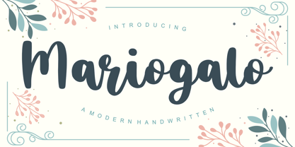 Proudly Present, Mariogalo Font. Mariogalo is a Modern Handwritten font. Mariogalo is perfect for product packaging, branding project, megazine, social media, wedding, or just used to express words above the background. Mariogalo also multilingual support. Enjoy the font, feel free to comment or feedback, send me PM or email. Thank you!
 - Kidsland Avenue by Essentials Studio,
$16.00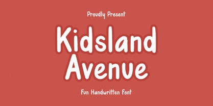 Introducing by Essentials Studio Proudly Present, Mysthiqa kidsland avenue Is a Modern Script Font kidsland avenue is perfect for product packaging, branding project, megazine, social media, wedding, or just used to express words above the background. Enjoy the font, feel free to comment or feedback, send me PM or email
 - Bloomilife by Timurtype,
$14.00 Introducing by Timur type Proudly Present, Bloomilife Bloomilife A Handwritten Script Font Bloomilife is perfect for product packaging, branding project, megazine, social media, wedding, or just used to express words above the background. Bloomilife also multilingual support. Embelish your designs with our original fonts. Enjoy the font 😉 Thank you!
