10,000 search results
(0.049 seconds)
- Open TECH Neue by TypoGraphicDesign,
$9.00 The typeface Open TECH Neue is designed from 2018—2021 for the font foundry Typo Graphic Design by Manuel Viergutz. 6 font-styles (Sans Serif, Invert, Outline, Slab Serif, Stretch, Box Puzzle) + 1 icon-style with 1097 glyphs (Adobe Latin 3) incl. 400+ decorative extras like icons, arrows, dingbats, emojis, symbols, geometric shapes, catchwords, decorative ligatures (type the word #LOVE for ♥︎ or #SMILE for ☺ as OpenType-Feature dlig) and stylistic alternates (6 stylistic sets). For use in logos, magazines, posters, advertisement plus as webfont for decorative headlines. The font works best for display size. Have fun with this font & use the DEMO-FONT (with reduced glyph-set) FOR FREE! ■ Font Name: Open TECH Neue ■ Font Styles: 6 (Sans Serif, Invert, Outline, Slab Serif, Stretch, Box Puzzle) + Icons + DEMO (with reduced glyph-set) ■ Font Category: Display for headline size ■ Glyph Set: 1097 glyphs (Adobe Latin 3) incl. 400+ icons (decorative extras like arrows, catch words, dingbats, emojis, symbols) ■ Design Date: 2018—2021
 - Pompeian Cursive by Wordshape,
$30.00 Pompeian Cursive is a calligraphically-inspired display typeface featuring a limited number of alternate characters and a handful of graceful ligatures. A lively set of non-lining numerals accompanies, as well as a few calligraphically-inspired flourishes for ornament. The history of this typeface: Oswald Cooper’s relationship with the Barnhart Brothers & Spindler foundry was one instigated under the auspices of creating new styles of type in lieu of following stylistic trends. In 1927, BB&S requested that Cooper create a script-like cursive typeface design in step with Lucien Bernhard’s Schoenschrift and ATF’s similarly-styled Liberty typeface. In response to BB&S’s desire to emulate instead of innovate, Cooper wrote to Mcarthur, “I am desolated to see Barnhart’s hoist the black flag. Your own efforts through the years to boost the foundry into a place in the sun as an originator seem wasted.” Still, Cooper took up the task at hand, creating a delicate, sophisticated type design which he named Pompeian Cursive. The typeface featured a limited number of alternate characters and a handful of graceful ligatures. A lively set of non-lining numerals accompanied, as well as a few calligraphically-inspired flourishes for ornamenting the end of lines of type accompanied the typeface, as well. By reviewing the few remaining original drawings for the type, as well as copious samples of Pompeian Cursive from both Cooper & BB&S' proofing process and period-specific type specimens, Wordshape presents the first digital version of this classic hybrid script/sans typeface, complete with all original alternate characters and ornaments. Pompeian Cursive has been intensively spaced and kerned for the finest setting for weddings, announcements, and general display work. - What was the inspiration for designing the font? While researching a biographic essay for Japan’s IDEA Magazine, I came across the original proofs and drawings for Pompeian Cursive. While a number of foundries have released interpretations of Cooper’s assorted typefaces, they stray from the original rather dramatically in parts. Cooper is without a doubt my favorite type and lettering designer, and to bring a refined return to his original intentions is an immense gift. - What are its main characteristics and features? Pompeian Cursive is a typeface which functions as both a display face and a limited text face. It features classy, thoughtful, and delicate swash capitals and rugged lowercase characters with a low x-height and gracefully long ascenders and descenders. - Usage recommendations: Display type or text-setting. Perfect for newspaper work, editorial design, materials intended to invoke an "old-timey" flavor, or just about anything in need of personality.
 - HS Sondos by Hiba Studio,
$40.00 HS Sondos is an Arabic display typeface designed specifically for titles and graphic projects. Drawing inspiration from Modern Kufi calligraphy, the font features a harmonious fusion of sharp and curved lines, resulting in a visually captivating and innovative take on square shapes and geometric structures. The distinctive sharp endings at the bottom of each character add an extra touch of aesthetic appeal. With three available weights -regular, bold, and black- HS Sondos offers versatility and variety. The black weight introduces a novel concept by maintaining the same horizontal dimensions as the regular weight but expanding the vertical dimensions, creating a uniquely bold appearance. Supporting Arabic, Persian, and English languages, HS Sondos opens up a world of possibilities for designers looking to enhance their Arabic typography. Its visually striking and flexible nature makes it an excellent choice for projects that demand attention and creativity. Overall, HS Sondos stands as a testament to the beauty and adaptability of Arabic typography, empowering designers to bring their visions to life with a captivating and versatile typeface.
 - Antica by Sudtipos,
$39.00 Antica has sharp triangular serifs, and in 8 weights with true italics, it forms a family that stylistically finds its origins in Latin styles of the nineteenth century. The font incorporates additional swashes, small caps and stylish alternates that advance the aesthetic from its roots and make it appropriate for modern design. Commonly named ‘Latin types’ did not vary in weight, but we decided to create Antica with a range that goes from thin to black and we also added extra curlicues to the letterforms. Antica borrows from the versatility and freedom granted to type founders of the nineteenth century – a time when the meteoric growth of mass-produced consumer goods led to an increased demand for publicity that needed fresh, attention grabbing typefaces. And as an homage to these Latin types we designed Antica to function well with an array of projects from stylized labels and formal editorial design requiring small type sizes to large-scale posters and billboards. The Antica family supports a wide variety of Latin alphabet-based languages.
 - Japura by Putracetol,
$28.00 Japura - Modern Display Typeface for Versatile Designs Japura is a unique and modern display typeface that will give your designs a classic, fun, and trendy impression. This font is perfect for display purposes such as album covers, posters, labels, t-shirts, signage, quotes, logos, and much more. With its elegant design inspired by vintage typefaces and posters, Japura comes with several variations such as ligatures, making it stand out from other fonts. Japura supports multiple languages, and its alternative characters are divided into several Open Type features, including Swash, Stylistic Sets, Stylistic Alternates, Contextual Alternates, and Ligatures. You can access these features using Open Type savvy programs such as Adobe Illustrator, Adobe InDesign, Adobe Photoshop Corel Draw X version, and Microsoft Word. In the Zip package, you will find Japura in otf, ttf, and woff formats. It comes with uppercase and lowercase letters, OpenType Alternates and Ligatures, numbers, punctuation, and symbols. With its multilingual support, Japura is perfect for any design project that requires a unique and modern display typeface. Upgrade your design game with Japura, the perfect font for a wide range of businesses and projects. Meta Description: Introducing Japura, a unique and modern display typeface perfect for album covers, posters, labels, t-shirts, signage, quotes, logos, and more. With multilingual support and Open Type features, upgrade your designs with Japura today.
 - Sutter Camp by Garisman Studio,
$20.00 Sutter Camp was born from a light stroke with a special brush in an atmosphere of adventure and the nature! With a touch of rough brush and thick lines, Sutter Camp is here for font users who like adventure style and a hand drawn look. Sutter Camp is very good for use in branding, logo, packaging, quote, hand-lettering look, t-shirt design, banners, posters and many other great jobs. Other features of Sutter Camp: - Simple installation - Support for MAC or PC - Very simple for Adobe Illustrator, Adobe In Design, Photoshop, or other design software. including for Ms. Word. - PUA encoded open (get by opening the Character Map) - Ligature - Multilingual Support
 - Alna by Skrr,
$35.00 Alna is an All Caps Display typeface born with a daily calligraphic sketch exploration focused on recurrent diagonal stroke and reverse contrast inspired by Bastarda and 16th century French Caractères de Civilités forebears St Augustine Civilité. The customised retail typeface offers a stable but full of life feeling. Equiped with a bag full of ligatures for reading optimisation, Alna owns whimsical personality and rhythmic shines at large sizes. Technical use: For optimised readibility, Alna uses ligatures features (liga) to replace (by default) sequences of characters with a single ligature glyph. The longest ligature sequence is three letters. Some combinations can induce problems, especially with long words.
 - Ten Pounds by Up Up Creative,
$29.00 Introducing Ten Pounds, a fun, hand-drawn serif font with tons of character (and tons of characters!). Ten Pounds is perfect for branding, poster design, t-shirts, invitations, design for children, and editorial design. It comes with more than 1300 glyphs, including more than 100 ligatures. OpenType features include stylistic sets, character variants, initial and final forms, and multilingual support (including multiple currency symbols). The OpenType features can be very easily accessed by using OpenType-savvy programs such as Adobe Illustrator and Adobe InDesign. (To access these awesome features in Microsoft Word, you'll need to get comfortable with the advanced tab of Word's font menu.)
 - Sybilla by Karandash,
$19.95 Sybilla is a robust, but friendly, humanist slab serif well suitable for broad range of design projects. A true workhorse and superb text type family, Sybilla was especially designed with legibility in mind. Its soft almost cursive shapes and generous internal spaces define a slab serif that is easier on the reader’s eye and help establish a feeling of warmth and friendliness. The type family consists of eight weights with complimentary italics. While the Light, Book, Regular and Medium weights are great performers for body text, the Thin, Bold and Heavy weights make an excellent choice for headlines. Also there is the specially designed Ultra weight if extra punch is needed. Sybilla has extensive multilingual support and specially designed Cyrillic that works harmoniously with its Latin counterparts - a perfect choice for design projects that need both writing systems running side by side.
 - Price Tags JNL by Jeff Levine,
$29.00 Price Tags JNL is a multi-use dingbat font. Along with over twenty nostalgic price tags, there is a set of individual numbers [1 thru 0 keys] and number pairs [A-T and a-i keys] for creating old-style white-on-black price tags. Blank end caps are available on the parenthesis keys, the decimal point is on the period key, catch words FOR, DOZEN and EACH are on the left and right arrows and right brace respectively, and the dollars and cents marks are on the dollar and hyphen keys. You'll even find a few extras placed upon the bracket and left brace keys.
 - Christmas Peachy by Yoga Letter,
$20.00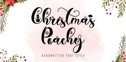 Christmas Peachy is a charming and festive handwritten font adorned with delightful Christmas ornaments. Its elegant strokes and decorative accents bring a touch of holiday magic to your design projects, making it perfect for creating warm and inviting Christmas-themed materials.
 - Protonema by Tigade Std,
$25.00 Protonema is inspired by a strong and sharp motivational spirit to always look positively for achieving goals. It is suitable for any sports and related theme for widely range of usage. Such as logos, branding, magazine, label and many more
 - Bluesy Rain by Epiclinez,
$18.00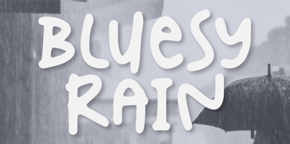 Introducing Bluesy Rain –a cute and fun typeface suitable for creating eye-catching posters, logos, and crafting projects. From its bouncy letterforms to its playful style, hopefully, Bluesy Rain can bring a touch of joy to your design. Thank You
 - Ravenda by Typehand Studio,
$14.00 Ravenda is a modern, all caps display font. Made for giving titles an extra punch, ravenda packs a full set of capitals, number and punctuation. Be it gigs, sport events, logo design or etc. Ravenda was made to bring impact.
 - Linotype Compendio by Linotype,
$40.99Linotype Compendio is a part of the Take Type Library, chosen from the contestants of the International Digital Type Design Contests from 1994 and 1997. Christian Bauer designed this font based on the basic forms of Transitional faces of the 17th century. The outer contours of the letters are purposely raw and irregular, much like alphabets printed on low-quality paper. The legibility of the font is thus reduced, making it necessary to use this font only for shorter texts or headlines, but it is exactly this characteristic which lends Linotype Compendio its distinctiveness. - Funta by Gatype,
$12.00 Funta Script is a typeface or font design that can be used to style text. It is characterized by tails and is slightly cursive, often giving the appearance of playful or relaxed text. Funta Script is widely used for design projects such as invitations, greeting cards, posters, headers or just used to express words over the background. Displayed fonts: Uppercase, Lowercase, Numbers, Symbols, Accents, Styles, Swashes and Ligatures also Multilingual Support Enjoy the font, feel free to comment or feedback, send me a PM or email. Thank You!
 - InstaLove Smooth by Nicky Laatz,
$18.00 With smooth curves and a deliciously bold personality, InstaLove Smooth leaves good vibes wherever it goes. The InstaLove Smooth Brush font is loaded with opentype features including character alternates and a large selection of natural looking ligatures. Scroll through the previews to get a good feel for what it can do. Included in the glyphs are 8 super handy swashes , and a few extra doodles, to add some extra punch to your designs. Perfect for making a bold statement, and getting second glances - InstaLove won’t let you down.
 - Virtus Sans by Andrew Footit,
$20.00 This clean sans-serif typeface brings your designs and layouts together in one great looking typeface, uncomplicated and legible large or small. VIRTUS SANS has 4 weights each with italics.
 - Miraikato Script by Mans Greback,
$49.00 Miraikato Script is a rustic handwriting typeface. As a cute brush writing, its naive and happy movements brings out the optimism and genuineness in any project. It has the flow and elegance of a formal font, while maintaining the youthful enjoyment of a real handwritten text. The Miraikato Script family is provided in six styles: The weights Thin, Regular and Bold, plus each weight as Italic. The font is built with advanced OpenType functionality and has a guaranteed top-notch quality, containing stylistic and contextual alternates, ligatures and more features; all to give you full control and customizability. It has extensive lingual support, covering all Latin-based languages, from North Europe to South Africa, from America to South-East Asia. It contains all characters and symbols you'll ever need, including all punctuation and numbers.
 - Mondany by Prestigetype Studio,
$15.00 The beauty of visual brand identity can direct people's perspective and shows the value of the brand. Hence we try to bring beauty to our font that one may forge harmony for the audience. Introducing, Mondany, the (grand, divine, elegant, beautiful, etc.) monoline script font. With the neat curve glyph, Mondany is perfect for branding purposes such as logo, label, title, headline, social media, business card, quotes, and others. Mondany includes: numbers and punctuation multilingual ligatures alternates swash opentype features We highly recommend using a program that supports OpenType features and Glyphs panels like many Adobe apps and Corel Draw so you can see and access all Glyph variations. We hope you enjoy our font - please do let us know by emailing us at info@prestigetype.com or prestigetypestudio@gmail.com if you need something!
 - Urban Barbarian by Comicraft,
$19.00 He’s been mixing one part artist and one part barbarian since 2005. Brutal, ruthless, cutthroat, he moves through the concrete jungle, unsheathing his, um, sword, taking what he wants without care or remorse. He follows no rules. He is the URBAN BARBARIAN. The Spoils of Battle Await Him! Is he Conan? Roger ‘Mad Men’ Sterling? No, he’s Dan Panosian. Artist. Author. Lover of fine women, drinker of fine scotch, drawer of fine pictures. This is his fine font. Well, one of them. See the families related to Urban Barbarian: Dan Panosian Features: Two fonts: all-uppercase GIANT and upper/lowercase DWARF.
 - FranklinGothicHandLight by Wiescher Design,
$39.50 FranklinGothicHandLight is part of a series of hand-drawn fonts from way back in time – before computers changed the way we worked. When I was in advertising – before computers – a very time consuming part of my daily work was sketching headlines. I used to be able to sketch headlines in Franklin Gothic, Times, Futura, Helvetica and several scripts. We had a kind of huge inverted camera – which we called Lucy. We projected the alphabet onto a sheet of transparent paper, outlined the letters with a fineliner and then filled them in. It was very tedious work, but the resulting headline had its own charm and we had a permanent race going on who was best and fastest. I won most of the time! They used to call me the fastest "Magic Marker" this side of the Atlantic. Great days, just like today! Your sentimental type designer from the past Gert Wiescher
 - FranklinGothicHandDemi by Wiescher Design,
$39.50 FranklinGothicHandDemi is part of a series of hand-drawn fonts from way back in time – before computers changed the way we worked. When I was in advertising – before computers – a very time consuming part of my daily work was sketching headlines. I used to be able to sketch headlines in Franklin Gothic, Times, Futura, Helvetica and several scripts. We had a kind of huge inverted camera – which we called Lucy. We projected the alphabet onto a sheet of transparent paper, outlined the letters with a fineliner and then filled them in. It was very tedious work, but the resulting headline had its own charm and we had a permanent race going on who was best and fastest. I won most of the time! They used to call me the fastest "Magic Marker" this side of the Atlantic. Great days, just like today! Your sentimental type designer from the past Gert Wiescher
 - Leuk by Wilton Foundry,
$29.00 The Dutch word “leuk" translates loosely to English as pleasant, jolly, funny, witty, clever, nice, sweet, kind, nice, amusing, entertaining, and funny. Leuk, the font, is a small, highly legible font with a witty, sociable personality that engages it’s readers. My challenge in designing Leuk was to find a unique feature to set apart the font without losing the fundamentals of type design. In the process of doing so, I created a virtual font “smile and wink” in the “o” upper and lowercase with integrated stencil-connecting strokes within the “a,e, k, z, o, ß” to reveal Leuk’s calligraphic roots. Legible and friendly, Leuk is designed for use in advertising, brochures, promotion, book cover design, packaging, and the like. The Leuk family consists of Leuk Light, Leuk Light Italic, Leuk Regular, Leuk Italic, Leuk Bold, Leuk Bold Italic, Leuk Black, Leuk Black Italic in Opentype format.
 - Big Stripes Mono by Ingrimayne Type,
$9.00 BigStripesMono is another typeface family from IngrimayneType that explores the possibilities of alternating letters sets. The family is monospaced with four fonts: a base or solid style, an outlined style, and two styles in which each character is cut diagonally and the halves are separated to form two characters. These split styles are not designed to be used alone but layered with the base style, outlined style, or both to form colorful lettering with an unusual striped appearance. The stripe is not apparent in single letters but only in words or lines of text. For best results use an application that supports the OpenType feature Contextual Alternatives (calt) to alternate the letters of the split styles. The four styles can be combined in several ways to create unusual lettering appropriate for titles, headlines, and similar uses. And if one wants a bold, monospaced, sans-serif face, BigStripesMono has that too.
 - Shedaytia by Josstype,
$12.00 Shedaytia is a handwritten typeface with classic root. a beautiful formal script and elegant touch. It works perfect in the world of weddings, logos, greeting cards, branding, print ads, quotes, signage, magazines etc. Shedaytia features 312+ glyphs and 147 alternate characters, including initial and terminal letters, alternates, swashes, ligatures and multiple language support. To enable the OpenType Stylistic alternates, you need a program that supports OpenType features such as Adobe Illustrator CS, Adobe Indesign & CorelDraw X6-X7, Microsoft Word 2010 or later versions.
 - Liner Notes by AdultHumanMale,
$20.00 Liner Notes is a fun scrawly, marker felt, ALL CAPS display font. I wanted it to look fun, loud, and to have hints of School graffiti, so it can wail from Posters and Headlines. It has over 260 glyphs and several variations on the standard alphabet and all those extra pésk¥ foreign features. It also has various letters with extra ligatures and flourishes available through OpenType or your Glyphs palette. OMG, LOL I also added some web slang to the glyphs.
 - Gilter by Shakira Studio,
$23.00 Start good day for new font! present to you, Gilter! Gilter is a font created specifically to give your designs a modern, stylish, and unique feel. With a combination of fun retro serif shapes and an elegant appearance, this font is the right choice for designs that want to display a creative impression and be different from the others. Gilter presents strong and tough-looking letter characters, but still maintains a friendly and welcoming impression. This makes this font very suitable for various types of projects, from branding, packaging, posters, to website design. What's you get? Gilter Regular Gilter Italic Unique letterforms Works on PC & Mac Simple Installations Accessible in the Adobe Illustrator, Adobe Photoshop, Microsoft Word even work on Canva! PUA Encoded Characters Fully accessible without additional design software. I really hope you'll get pleasure using Gilter font and it will be perfect addition to your font collection! If you have some questions, please write me a letter! Shakira Studio
 - Vuelta by Dora Typefoundry,
$19.00 Vuelta display is a modern random style font that combines serifs and sans in one font file. With serif as uppercase and sans as lowercase. You can use both uppercase and lowercase in the same word which will make your text more distinct too plus some alternatives so this font really stands out. This font is perfectly made to be applied especially in logos, and other various formal forms such as display, header, headline, poster, logos, etc on a big typography. **Features:** - All Caps Font with different uppercase and lowercase - Number & Symbol - Supported Languages - Alternates and Ligatures - PUA Encoded **What is included:** - Vuelta Display Regular We highly recommend using a program that supports OpenType features and Glyphs panels like Adobe apps and Corel Draw, so you can see and access all Glyph variations. This type of family has become the work of true love, making it as easy and fun as possible.I really hope you enjoy it! Thank you Enjoy the font and go get creative :)
 - Flink Neue by Identity Letters,
$45.00 Geometric typefaces are a staple in every typographer’s toolbox since the 1920s. It was a time when iconic faces such as Futura, Erbar, and Kabel appeared on the scene and turned the world of type upside-down. Inspired by those early giants as well as later epigones with a legacy of their own (such as 1970’s Avant Garde Gothic), Flink Neue is the Identity Letters take on this genre, characterized by a clean and focused appearance. With neat shapes and the look of pure geometry, Flink Neue adapts to a vast range of applications and topics, from the fine print in contract to website body copy to logo design to billboard-size slogans. Its x-height is considerably larger than in classic geometric sans-serif fonts; its proportions are harmonized as opposed to strictly constructed. This makes for a more contemporary look, setting it apart from the classics. With three different widths, Flink is a true all-rounder. Geometric fonts are usually quite wide, which often leads to text-settings problems with headlines or small print. The Condensed and Compressed variants of Flink Neue solve this problem easily. This font family comes along in 18 weights from Thin to Black with matching Italics. There are almost 1400 characters per style, including nine stylistic sets that offer variations to the look and feel of Flink Neue, making it even more versatile. Besides the default mood of Flink Neue, there is also a Text and Bauhaus variant, where different letters have been changed to create a new mood. In theory, you just need one single font file to change between all three moods, but to make it easier for you, we also exported each mood within a separate file. Plenty of additional Open Type Features like ligatures, small caps, case sensitive forms, old-style figures, tabular figures and symbols make Flink Neue a valuable tool for the discerning typographer. Flink Neue is the reimagination of a classic genre, designed to suit the needs of our time.
 - Marlina Melvin by Silverdav,
$15.00 Marlina Melvin is a modern calligraphy font with handwritten, sophisticated flows. It is full of hearts and glyphs. It is perfect for branding, wedding invites, and cards. Marlina Melvin includes a full set of lovely uppercase and lowercase letters, multilingual symbols, numerals, punctuation and ligatures. Also it includes: -short lowercase beginning and ending swashes -lowercase ending heart swashes, which serve to connect two words or letters (This is so perfect for invitations, monograms) -long lowercase beginning and ending heart swashes. The font has a smooth texture, so it would be perfect for all types of printing techniques you can do embroidery, laser-cut, gold foil, and is ideal for cutting. Marlin Melvin supports 162 languages.
 - Rival Slab by Mostardesign,
$25.00 A touch of modernism for all kinds of projects Like the rest of the family (Rival Sans and Rival Serif), Rival slab has round shapes with bevelled endings on certain letters such as G, Q or Z. These are the characteristics that make Rival Slab a contemporary cast iron for all kinds of projects. It provides advanced typographical support with features such as case sensitive forms, small caps, ligatures, alternate characters, fractions, slashed zero, circled, pro kerning…It comes also with a complete range of figure set options It comes in 16 weights with corresponding italics and it’s suited for multiple purposes including editorial use, web font, apps, digital ads, ebook, and also for advertising, long text, packaging and branding. As a modern sans serif font family, Rival Sans has true italics to give more style in long texts.
 - FS Ostro by Fontsmith,
$80.00 Cosmopolitan Elegance Named after a southerly wind that blows over the Mediterranean Sea, FS Ostro breathes warmth into letterforms with their roots in colder, stark Modern typefaces. FS Ostro is a typeface imbued with balanced and sophisticated elegance. It’s discerning and sensitive, self-assured but understated. One for the well-travelled reader. Thoughtful contrast FS Ostro draws inspiration from a wide range of sources, such as 19th century British Scotch Roman designs, Italian modern style typefaces and highly contrasted display Spanish examples. Its text version offers a consistent rhythm and robust texture that is easy on the eye. This elegant, cosmopolitan typeface is characterised by its thoughtfully modulated contrasts between thick and thin, sharp angles, and sophisticated curves. Exaggerated touches in display “What is more restrained and sober in text, becomes purposefully prominent and more detailed in display,” says Fontsmith designer Alessia Mazzarella. These exaggerated details for the display version can be seen in the letter terminals, such as those in the ‘a’ and ‘g’ and the tail of the ‘Q’, as well as in the set of numerals, fractions, arrows, borders and ornaments, which can be used to build decorative framing elements. Fluid italics The less rigid and curvaceous italics of modern style typefaces were the inspiration for FS Ostro’s own subtle, flowing italic styles. The letterforms are confident and fluid, creating an overall sense of refinement and modernity.
 - FS Ostro Variable by Fontsmith,
$119.99Cosmopolitan Elegance Named after a southerly wind that blows over the Mediterranean Sea, FS Ostro breathes warmth into letterforms with their roots in colder, stark Modern typefaces. FS Ostro is a typeface imbued with balanced and sophisticated elegance. It’s discerning and sensitive, self-assured but understated. One for the well-travelled reader. Thoughtful contrast FS Ostro draws inspiration from a wide range of sources, such as 19th century British Scotch Roman designs, Italian modern style typefaces and highly contrasted display Spanish examples. Its text version offers a consistent rhythm and robust texture that is easy on the eye. This elegant, cosmopolitan typeface is characterised by its thoughtfully modulated contrasts between thick and thin, sharp angles, and sophisticated curves. Exaggerated touches in display “What is more restrained and sober in text, becomes purposefully prominent and more detailed in display,” says Fontsmith designer Alessia Mazzarella. These exaggerated details for the display version can be seen in the letter terminals, such as those in the ‘a’ and ‘g’ and the tail of the ‘Q’, as well as in the set of numerals, fractions, arrows, borders and ornaments, which can be used to build decorative framing elements. Fluid italics The less rigid and curvaceous italics of modern style typefaces were the inspiration for FS Ostro’s own subtle, flowing italic styles. The letterforms are confident and fluid, creating an overall sense of refinement and modernity. - Drafbink by Twinletter,
$17.00 Say hello to classic elegance with the Draftbink font. With a compelling classic serif theme, this font is the perfect choice for creating projects with an elegant touch of classic modernism. Draftbink brings powerful features to give you unlimited flexibility and creativity. The ligature and alternate features allow you to combine interesting characters and create unique and attractive typography compositions. Not only that, Draftbink also supports multilingualism, so you can easily adapt this font to various languages. This opens up the opportunity to reach a wider audience and increase the attractiveness of your project. With its distinctive classic serif characteristics, Draftbink gives your design an elegant and bold impression. Each letter is carefully designed to display stunning beauty and sharpness. Make Draftbink your best choice to present an unforgettable classic modernism feel. Get this font now and show elegance in every detail of your project. What’s Included : File font All glyphs Iso Latin 1 Alternate, Ligature Simple installations We highly recommend using a program that supports OpenType features and Glyphs panels like many Adobe apps and Corel Draw so that you can see and access all Glyph variations. PUA Encoded Characters – Fully accessible without additional design software. Fonts include Multilingual support
 - Fadetho by Twinletter,
$17.00 Introducing Fadetho, a display font that captivates and brings elegance to each of your projects. With a relaxed and elegant theme, Fadetho is the perfect solution for creating charming and creative looks. Fadetho’s excellent features make it an attractive choice. With the available ligatures and alternates, you can combine beautiful characters and create unique and classy typography designs. Not only that, Fadetho is also multilingual, allowing you to reach an international audience and adapt this font to multiple languages. This gives you flexibility and expands the potential of your project. The elegant style and touch of elegance in every Fadetho lettering make it the perfect choice for projects that require a special feel. Let this font add an exclusive touch to your designs. Choose Fadetho as your loyal partner in creating stunning and classy looks. Get this font now and let its beauty and elegance inspire your creations. What’s Included : File font All glyphs Iso Latin 1 Alternate, Ligature Simple installations We highly recommend using a program that supports OpenType features and Glyphs panels like many Adobe apps and Corel Draw so that you can see and access all Glyph variations. PUA Encoded Characters – Fully accessible without additional design software. Fonts include Multilingual support
 - Soerina by IbraCreative,
$17.00 Soerina, a versatile serif typeface, embodies a harmonious blend of classic elegance and contemporary functionality. With its meticulously crafted letterforms, Soerina strikes a balance between sophistication and readability, making it suitable for a diverse range of design applications. The typeface exhibits a timeless aesthetic, featuring subtly modulated serifs that lend a touch of refinement to each character. Whether used for editorial design, branding, or digital interfaces, Soerina exudes a versatile charm, adapting seamlessly to various contexts while maintaining a distinct personality. Its balanced proportions and thoughtful details make it an excellent choice for conveying a sense of professionalism and aesthetic nuance across a spectrum of visual communication projects.
 - Troubled PB by Pink Broccoli,
$16.00 Loaded with various auto-ligatures (primarily for ALL-CAPS typesettings), Troubled has all of the rebellious custom lettered attitude of a vintage pulp paperback. Troubled PB began as a digitization of a film typeface known as Toronado by LetterGraphics, perfect for typesetting early children books, candy packaging, toy packaging, birthday invitations, or any other playful design need. It's lowercase typesetting is straightforward and casual, with a light animated feel, while the all-caps typesetting goes wild with auto-ligatures galore to create wonderful and interesting interwoven letterform combinations. This typestyle has such an offbeat appeal to it that it just draws your attention. Great for headlines (especially in all caps settings), but also great for small bodies of text in mixed case setting. So whether child-friendly design pursuits, or reminiscing of vintage pulp paperbacks novels, Troubled PB has a little something for everyone.
 - Sella Sionisa by Gatype,
$12.00 Sella Sionisa is an elegant smooth script font. With bold contrasting strokes, a playful character with a bit of binder and alternatives. To give you extra creative work. This font is great for logo esigns, Social Media, Movie Titles, Book Titles, short text even long text fonts and is great for your secondary text fonts. Create stunning masterpieces with the Sella Sionisa font. contains a full set of lowercase and uppercase letters, a wide variety of punctuation marks, numbers, and multilingual support. Alternative characters are divided into several Open Type features such as ,Alternative Style. The Open Type feature can be accessed using intelligent Open Type programs such as Adobe Illustrator, Adobe InDesign, Adobe Photoshop version of Corel Draw X, and Microsoft Word. And this Font has provided PUA unicode (custom coded font). so that all alternative characters can be easily accessed in full by a craftsman or designer. Thank you for your purchase.
 - Melisenda Script by Stripes Studio,
$13.00 Melisenda Script with the kind of modern hand writing, I hope you are interested in this font. This font can be used easily and simply because there are a lot of features in it and therefore contain a complete set of letters lower and uppercase letters, assorted punctuation, numbers, and multilingual support. It also contains several ligatures and alternate style stylistic characters. To enable the OpenType Stylistic alternates, you need a program that supports OpenType features such as Adobe Illustrator CS, Adobe Indesign & CorelDraw X6-X7, Microsoft Word 2010 or later versions. And there are additional ways to access alternates/swashes, using Character Map (Windows), Nexus Font (Windows), Font Book (Mac) or a software program such as PopChar (for Windows and Mac). How to access all alternative characters using Adobe Illustrator: https://www.youtube.com/watch?v=XzwjMkbB-wQ How to access all alternative characters, using Windows Character Map with Photoshop: https://www.youtube.com/watch?v=Go9vacoYmBw This Font has given PUA unicode Thank you for your purchase!