10,000 search results
(0.064 seconds)
- Requista by Timurtype,
$14.00 Introducing by Timur type Proudly Present, Requista Requista A Handwritten Script Font Requista is perfect for product packaging, branding project, megazine, social media, wedding, or just used to express words above the background. This Claritty font includes: -Full Set of standard alphabet and punctuation & symbol -Extra set Ligature -multilingual support. Embelish your designs with our original fonts.Enjoy the font,Thank you!
 - Roundwell by Javanice Studio,
$16.00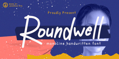 Introducing Roundwell by Javanice Studio Roundwell is A Moniline Handwritten Font Roundwell is perfect for branding project, apparel, labels, magazines, books, greeting / wedding cards, packaging, fashion, make up, stationery, and any type of advertising purpose or just used to express words above the background. This font includes multilingual support. Enjoy the font, feel free to comment or feedback, send me PM or email.
 - Kempoka by Hanoded,
$15.00 Kempoka is a Japanese word describing someone who practices Kempo. Kempo, or Chuan Fa in Chinese, is a martial art with roots in China and Japan. I thought of this brush font just before my weekly kempo-training and I figured the name suited the font style. Kempoka comes with alternates and ligatures, and has a black belt in diacritics!
 - Baileyone by Timurtype,
$14.00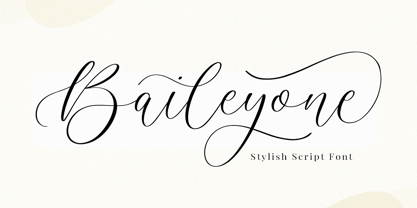 Introducing by Timur type Baileyone, a handwritten script font Baileyone is perfect for product packaging, branding project, magazines, social media, wedding, or just used to express words above the background. This Baileyone font includes: -Full Set of standard alphabet and punctuation & symbol -Extra set Alternate ending lowercase -multilingual support. Embelish your designs with our original fonts. Enjoy the font, thank you!
 - Elephunky NF by Nick's Fonts,
$10.00This hefty little number is an amalgam of two typefaces from the Flower Power era, Dave West’s Elephant Gothic and Wayne Stettler’s Neil Bold. It’s an extrabold, sassy headline face that will get your message across, loud and clear. Both versions include the complete Latin 1252, Central European 1250 and Turkish 1254 character sets, as well as localization for Moldovan and Romanian. - Speakons by Alex Schnaible,
$20.00 The Speakons are made out of 500 icons in three different styles. They change automatically into icons by typing the right words through its OpenType feature. It was specially designed to break down our language barriers. To be understood internationally. It’s also perfect if you just need a huge icon family. Give it a try! You don’t want to miss it.
 - Roseglow by Timurtype,
$14.00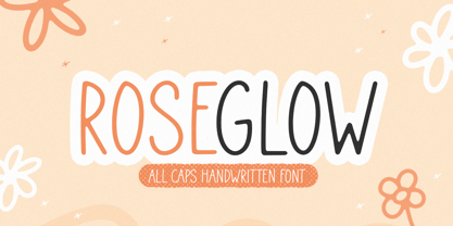 Introducing by Timur type Proudly Present, Roseglow Roseglow A fun Handwritten Font Roseglow is perfect for product packaging, branding project, megazine, social media, wedding, or just used to express words above the background. This Roseglow font includes: -Full Set of standard alphabet and punctuation & symbol -Extra set doodles -multilingual support. Embelish your designs with our original fonts.Enjoy the font,Thank you!
 - Ashley Bergamote by Letterday Studio,
$19.00 Ashley Bergamote is a superb handwritten font that will make your work stand out through its elegant and curvy lines. It is perfect for product packaging, branding project, magazine covers, social media, wedding, or just used to express words above the background. This font is PUA encoded which means you can access all of the glyphs and swashes with ease!
 - Ballistone by Timurtype,
$14.00 Introducing by Timur type Proudly Present, Ballistone Ballistone A Handwritten Script Font Ballistone is perfect for product packaging, branding project, megazine, social media, wedding, or just used to express words above the background. This Ballistone font includes: -Full Set of standard alphabet and punctuation & symbol -Extra set ligature & underline -multilingual support. Embelish your designs with our original fonts.Enjoy the font,Thank you!
 - Bold Marker by Timurtype,
$14.00 Introducing by Timur type Proudly Present, Bold Marker Bold Marker A Handwritten Font Bold Marker is perfect for product packaging, branding project, megazine, social media, wedding, or just used to express words above the background. This Bold Marker font includes: -Full Set of standard alphabet and punctuation & symbol -multilingual support. Embelish your designs with our original fonts.Enjoy the font,Thank you!
 - Halloween Party by Yoga Letter,
$14.00 This font is named "Halloween Party". This font was intentionally made to add to the excitement of the Hallowen event that will soon arrive. This "Halloween Party" font is very scary because there is blood on it. This font is perfect for adding to the excitement and mysticism of your Halloween event. In addition to Halloween events, this font can also be used as a movie title, book title or something else that is horror, can also be used to write quote words, tell mystical things, or as a horror and mystical pickle invitation card, and others.
 - Publica Play by FaceType,
$- Publica Play is Publica Sans’ and Publica Slab’s playful sister. It comes with loads of subtle open type features, tabular options, rare currencies signs and symbols and arrows – ‘Publica Play’ has everything you need for playful design tasks. Take a close look at our gallery (especially ‘OpenType Features 1–7’) to discover the versatility of Publica Play. Alternates and Stylistic Sets Give your typography a certain spin with the variety of alternate letters provided. Explore the Stylistic Sets provided. Currency You need to set prices in exotic countries? No problem: Publica Play gives you loads of rare currency symbols. Case Sensitive Forms Sometimes you write in all caps and there are some symbols (e.g. brackets) that need some extra treatment to make it look perfect – that’s what case sensitive forms are for. Figures Publica Play provides 6 sets of figures, like lining, tabular, oldstyle, numerators ... Discretionary Ligatures Ligatures can make your logo or headline look spicy. So there are plenty of them.
 - Fargo Tuscan by Greater Albion Typefounders,
$20.00 Fargo Tuscan is the first of seven typefaces exploring the decorative possibilities of the Tuscan letter form, all of which are releasing in 2017. It’s the most European of the seven- it’s a Mid-Victorian inspired display face which would have been (and is) at home on either side of the Atlantic, unlike some of the others in this batch of Tuscan faces which are distinctly ‘trans-Atlantic’ (we know, that depends on your point of view but we are Greater ALBION Typefounders after all) in flavour. Fargo Tuscan is replete with decorative features, including Swash Capitals, alternate numeric forms and stylistic alternates ideal for the beginning and ending of words. Have some mid-Victorian mid-Atlantic fun with your next design project!
 - Tokoloshe by Scholtz Fonts,
$17.95Tokoloshe is a name in African mythology for a mischievous leprechaun-like figure that loves practical jokes and tricking people. There are many books of such African stories, for example Tales of the Tokoloshe by Pieter Scholtz. The letter shapes that I used in the Tokoloshe font have inspiration from two sources: -- the spiky character of the font was derived from the wonderfully imaginative, wooden carvings of the Makonde people of beings called "shetani". The word "tokoloshe" is used by other tribes, but from his behaviour, he is certainly a type of shetani. -- some of the letter shapes were informed by Art Deco styles of fonts, for example: Kunjani, Black Tie SF, Selznick Normal, Zaire SF, Binner Gothic and ITC Anna. But the Tokoloshe font, like its namesake, is much more freespirited. Use this font whenever you want to suggest the rich artistic, cultural and spiritual heritage of Africa. The font is fully professional in terms of its character set. It contains over 235 characters - (upper and lower case characters, punctuation, numerals, symbols and accented characters are present). In fact, it has all the accented characters used in the major European languages. - Point Made JNL by Jeff Levine,
$29.00 Point Made JNL is a varied assortment of pointing hands and arrows used for embellishing word copy, drawing attention to key points or simply adding some retro flair to your print or web project. Twenty six designs in varying styles offer a wide range of visual diversity. The images point to the right on the capital keys and to the left on the lower case keys. This font is a companion to Point Taken JNL, which offers twenty-six more pointing hands and arrows.
 - Top Speed - Unknown license

- Top Speed Outline - Unknown license

- Top Speed Heavy - Unknown license

- Payload by Device,
$29.00 Payload began as an early concept for Loaded magazine, and here is developed into a clean outline and rough splattery spraycan version. In this font, the upper and lower case characters are subtly different enabling a more realistic appearance to be achieved by ßipping between cases whenever characters occur together in pairs. Wide and Narrow styles of this popular font have been subsequently been added. This font is reminicent of military stencilling, urban graffiti and freight packaging. The "Outline" version, as before, is a carefully weighted addition where the thickness of the stroke is identical to the stencil gap. It has also been respaced and rekerned to allow for the additional character spread.
 - WildWords by Comicraft,
$49.00 Created for Jim Lee's Wildstorm books, WildWords has proved to be one of our most popular fonts and has been featured in TIME magazine and the LEGO catalog, as well as used to letter thousands of Manga pages. Comicraft fonts are created BY comic book letterers FOR lettering comic books. Accept no substitutes! See this family related to WildWords: Wild Words Lower
 - Loudine by PintassilgoPrints,
$19.00 Loudine is a striking decorative display typeface, great for posters, book covers and magazine headlines. It comes in two widths, each of them packed with a set of stylistic alternates: just turn on the feature in an OpenType savvy program to instantly get into a new mood, with filled counters and slightly different lettershapes. Be sure to play it loud!
 - Somersette by The Styled Script,
$21.00 Introducing the elegant new Somersette Monoline Script Font! If you are needing a touch of casual chic calligraphy for your designs, this font was created for you! Somersette was built with OpenType features and includes beginning and ending swashes, alternate characters for both lowercase and uppercase letters, loads of different swash alternates for lowercase letters, numbers, punctuation, alternates, and ligatures. Over 500 glyphs!
 - DIN Next Decorative by Monotype,
$40.99 This four-piece family is the DIN design, but not as you know it. The famously, crisp, clean and precise typeface has been given a textured update that's reminiscent of rusted metal, or rubber stamps. Underneath this lies the same sturdy, geometric shapes that have allowed DIN to stand the test of time, but with a new sense of tangibility. “This kind of treatment is more about creating a feeling or a mood that goes beyond the communication of the words themselves,” explains Monotype Studio director Tom Rickner. “I think it expands the repertoire of what DIN Next can express.” Designed for display, these four typefaces – DIN Next Rust, DIN Next Shadow, DIN Next Slab Rust and DIN Next Stencil Rust – show a new side of DIN Next's personality, as if the surface of each letterform has been gradually worn away over the years.
 - Scene by Monotype,
$29.99 Work on Scene began some time after designer Sebastian Lester joined Monotype Imaging in 2000. Clean, calm, and highly legible — thus the design brief Lester set for himself. With Scene, he wanted to provide graphic designers and creative directors with a suite of fonts that would serve as a strong foundation for identity projects, incorporating what he had learned about on-screen and print legibility. Scene was developed during two years of after-hours and weekend work. The family comes in six weights with matching italics, there is a set of “semi-sans” characters to introduce more expressive word rhythms into headlines and blocks of copy.
 - Mr Palker by Letterhead Studio-YG,
$35.00 A slab serif Mr Palker and grotesque Mr Palkerson build one superfamily together. These are blank types. In a way even the display ones. Typefaces for newspapers, announcements, cheap advertising and police posters. Mr Palker and Mr Palkerson will turn every language into a fence. And due to six types of faces one can choose what material should the fence be made from — from Thin steel rods to the Black stone blocks. In their simplest appearance Mrs P&P are intended for the solid blank composition in victorian or industrial style. They are quite decent, a bit old-fashioned slab serif and grotesque with closed aperture. All my types have layers. Walker and Palkerson also do. Besides the standard set of symbols, they have 4 add-ons. 1. Alternate glyphs, including unicase ones. 2. Ligatures with A letter. 3. Extra tall small caps. 4. Two-storey ligatures. All this options are intended for the complex composition. The additional letters are rather eccentric as their main function here is to imitate the victorian oddities. Imitate, parody, just not repeat. There are lower-case As and Es in the set in height of small caps and uppercases. They can turn every writing into the unicase. The lower-case A (as well as uppercase and small caps version of it) has deliberately by my taste grown a ludicrous tail. To compensate it I’ve built all the possible ligatures - ад, ал, ая. There are 35 of this ligatures all together. Take a closer look at the Russian letters D, L, K, Ya from the main set as well as their alternates. The additional glyphs are one more comic than the other — on purpose to imitate (not to repeat!) the victorian set. This sets have lowercase numbers. And small caps numbers as well. What a modern typeface without them. They also have an У-letter with a generously curvy tail. As if before the WWI. The Latin of course has alternates as well. It has letters to make the perfect French sound more like the russian provincial version of it. The tails of Js and Ts can be made a little bit more open — or a little bit closed. My favorite feature here, an invention of a kind - extra tall small caps. It allows to compose logos with the small caped uppercases directly from the keyboard. The small caps of this typefaces are usually much taller than the customary ones. This is the kind of small caps that Palker and Palkerson have. More to that, the strokes’ weight and the letters width are corresponded to the uppercases. Just a ready set for making a logo a la 1913 style. With a unicase, one has to mind! One more trick with the tall small caps is a possibility to make them work like lower uppercases. Their height is just in between of lower- and uppercases. Isn’t it great to have an additional set of uppercase working ponies in stock for the case of emergency. And finally — the trademark of Palkers family, two-storey ligatures. They are made in the height of uppercases and turn every writing into an ornament or a puzzle of a kind, while at the same time making them much shorter. Each face has 90 of them. Mainly those are twins: CC, BB, DD and so on. ll this things are for the unhasty compositing, even for lettering. Which means that for the things which are not there you always should have Command+Option+O and some patience. Also — among the two storey ligatures one also can find some belvedere villas. All my types are glasses from the one kaleidoscope. The P&Ps family was preliminary part of the victorian set, which already has 1 Cents and Clarendorf - optionally one can add Costro, Gordoni, Handy, Guardy, Surplus, Red Ring, Red Square, Babaev to the list. And also Sklad, Odessa, Dreamland, Romb, Platinum - here, at Letterhead’s, every second one is victorian. All together our typefaces can allow one to set advertisement of any kind, even the trickiest one, and compose everything, from the coffee place’s menu to the antiquarian magazine.
 - Mr Palkerson by Letterhead Studio-YG,
$35.00 A grotesque Mr Palkerson and slab serif Mr Palker build one superfamily together. These are blank types. In a way even the display ones. Typefaces for newspapers, announcements, cheap advertising and police posters. Mr Palker and Mr Palkerson will turn every language into a fence. And due to six types of faces one can choose what material should the fence be made from — from Thin steel rods to the Black stone blocks. In their simplest appearance Mrs P&P are intended for the solid blank composition in victorian or industrial style. They are quite decent, a bit old-fashioned slab serif and grotesque with closed aperture. All my types have layers. Walker and Palkerson also do. Besides the standard set of symbols, they have 4 add-ons. 1. Alternate glyphs, including unicase ones. 2. Ligatures with A letter. 3. Extra tall small caps. 4. Two-storey ligatures. All this options are intended for the complex composition. The additional letters are rather eccentric as their main function here is to imitate the victorian oddities. Imitate, parody, just not repeat. There are lower-case As and Es in the set in height of small caps and uppercases. They can turn every writing into the unicase. The lower-case A (as well as uppercase and small caps version of it) has deliberately by my taste grown a ludicrous tail. To compensate it I’ve built all the possible ligatures - ад, ал, ая. There are 35 of this ligatures all together. Take a closer look at the Russian letters D, L, K, Ya from the main set as well as their alternates. The additional glyphs are one more comic than the other — on purpose to imitate (not to repeat!) the victorian set. This sets have lowercase numbers. And small caps numbers as well. What a modern typeface without them. They also have an У-letter with a generously curvy tail. As if before the WWI. The Latin of course has alternates as well. It has letters to make the perfect French sound more like the russian provincial version of it. The tails of Js and Ts can be made a little bit more open — or a little bit closed. My favorite feature here, an invention of a kind - extra tall small caps. It allows to compose logos with the small caped uppercases directly from the keyboard. The small caps of this typefaces are usually much taller than the customary ones. This is the kind of small caps that Palker and Palkerson have. More to that, the strokes’ weight and the letters width are corresponded to the uppercases. Just a ready set for making a logo a la 1913 style. With a unicase, one has to mind! One more trick with the tall small caps is a possibility to make them work like lower uppercases. Their height is just in between of lower- and uppercases. Isn’t it great to have an additional set of uppercase working ponies in stock for the case of emergency. And finally — the trademark of Palkerson family, two-storey ligatures. They are made in the height of uppercases and turn every writing into an ornament or a puzzle of a kind, while at the same time making them much shorter. Each face has 90 of them. Mainly those are twins: CC, BB, DD and so on. ll this things are for the unhasty compositing, even for lettering. Which means that for the things which are not there you always should have Command+Option+O and some patience. Also — among the two storey ligatures one also can find some belvedere villas. All my types are glasses from the one kaleidoscope. The P&Ps family was preliminary part of the victorian set, which already has 21 Cents and Clarendorf - optionally one can add Costro, Gordoni, Handy, Guardy, Surplus, Red Ring, Red Square, Babaev to the list. And also Sklad, Odessa, Dreamland, Romb, Platinum - here, at Letterhead’s, every second one is victorian. All together our typefaces can allow one to set advertisement of any kind, even the trickiest one, and compose everything, from the coffee place’s menu to the antiquarian magazine.
 - Toughton by 99TyppeFoundry,
$12.00 Introducing Toughton Handwritten Font Unveil the beauty of handwritten elegance with Toughton, a font that breathes life into your creative projects. Designed to capture the essence of human touch, Toughton transforms words into a poetic dance of strokes and curves. The Art of Personalization Toughton isn't just a font; it's a journey through the art of personalization. Whether you're crafting wedding invitations, designing branding materials, or adding a human touch to your digital creations, Toughton's unique character will infuse your work with warmth and authenticity. Timeless Appeal With a timeless appeal that transcends trends, Toughton embraces the charm of handwritten script. Its fluid strokes and carefully crafted ligatures ensure that every word flows effortlessly, making it the perfect choice for projects that demand elegance and readability. Versatile Application From logos to social media graphics, packaging to editorial designs, Toughton adapts seamlessly to a variety of design contexts. Let your imagination run wild as you explore the versatility of this handwritten gem. Features and Functionality OpenType Features: Toughton comes with a set of OpenType features, including ligatures and alternates, to add depth and character to your text. Multilingual Support: Express yourself in various languages with Toughton's extensive multilingual support. Web and Print Ready: Whether it's for web design or print publications, Toughton is optimized for both digital and physical mediums. Elevate Your Creations Elevate your design game with Toughton Handwritten Font. It's not just a font; it's an artistic tool that allows you to tell your story with flair, grace, and a touch of humanity. Unlock the potential of your creative projects and make your message resonate with the world. Experience the magic of handwritten authenticity. Get Toughton today and let your words dance with elegance.
 - CarlMarx by Adobe,
$29.00This typeface is based on lettering by Carl Marx (1911?1991), designed during his first semester at the Bauhaus in Joost Schmidt?s class, in 1932. Although the letter proportions are based on Schmidt?s teachings, the forms are not constructed from compass and ruler, but drawn with brush and marker, lending the words a warm and lively touch. Hidetaka Yamasaki redrew the letters from scratch and added all missing characters for today?s needs. A set of hanging figures, alternates for some critical letterforms (such as f, r, and t) as well as several ligatures make CarlMarx especially suitable for use in body text. As suggested by Marx, Yamasaki captured two weights from the original drawing and perfectly adjusted light and bold to highlight words and create hierarchy in headlines ? without losing or adding space. True to the original, Yamasaki captured the wobbly contour in CarlMarx, preserving warmth in the condensed geometric style of the early 1930s. - Rumba by Type-Ø-Tones,
$60.00 This family typeface consists of three fonts which have the same weight and style, but have been designed to work best at different sizes and in slightly different contexts. It is based on handwriting and calligraphy and consists of three typefaces: Rumba Small (for texts), Rumba Large (for headlines) and Rumba Extra (for words). The family is based on the idea of fonts that are interrelated depending on the differences in contrast, expressiveness and use, not on the classic range of weights. This type has been designed specifically but not exclusively for use in the languages spoken in Spain, hence special attention has been paid to the design of accents, special characters and ligatures. In a later development it was extended to CE Character Set.
 - Serid by Samuel Vicente Types,
$22.00 SERID is a display font condensed and regular designed for editorial applications. Inverted contrast, features a serif hybrid that gives a decorative character and personality to the font. Being a display type, intended for use in titles or in small blocks of text, from 24pt. The name SERID comes from the combination of words “SERif” and “hybrID”, resulting SERID.
 - So Prolix by Sudtipos,
$29.00 A tribute to calligraphy, with the thinness of modern times. So Prolix is presented as a calligraphic typography with uniform sketches and very particular features. Its harmonious and soft rhythm will impregnate every word with a great personality. Elegant, strong and harmonious, So Prolix irradiate its own style on every character. Rescuing particular features, So Prolix is even a modern typography and useful, giving distinction to words.
 - Tendria by Linotype,
$29.99Patricia Pothin-Roesch's Tendria typeface bases its letterforms on the logo for the French “Tendriade” mark. Clearly inspired by writing and hand lettering, Patricia Pothin-Roesch began her work on Tendria in Adobe Illustrator. After a few letters, she went back to designing the old-fashioned way: drawing by hand on layers of tracing paper. Tendria is a sturdy upright script face with a warm, childlike feeling. Its letters are like the typefaces often used in primary schools; the counterforms are large and open. The name Tendria is reminiscent of the French word for tender, “tendre.” Designers who set Tendria lovingly will reap rewards; this is an excellent addition to a display heading toolkit. - Shopping Script by Roland Hüse Design,
$15.00 Shopping Script is designed after and inspired by my handwritten shopping list that was originally a lot less stylish, I have written each words multiple times to achieve the organic and natural flow with a bit spaced out style. This font is an existing work of mine that came in only one weight. Now I added multiple weights I as well as expanded and condensed instances, along with a weight and width variable font file that can be set to anything in between Thin Condensed to Heavy expanded. There are standard ligatures for it, jt, ll and tt, stylistic alternates for uppercase "A" and lowercase "e". For lowercase r and s there are contextual/initial variants when they are first letter of a word. A guide of open type features and how to activate them is available at https://drive.google.com/file/d/1q4j4X8ZntqgEUB8gUmflUNtmlX4IVQBq/view?usp=sharing Most latin based languages are covered from Western European to Eastern.
 - Goldtext by Attractype,
$10.00 f you like being creative with bold serif fonts, then the BOLDTEXT font could be your choice. The thick and sharp shape will direct the eye to your special design. A legible letter style will form words that are easy to read. You can use this font to design logos, titles, magazines, comics, text effects, banners and more. Feel free to contact me about this font.
 - Diva Doodles Too by Outside the Line,
$19.00Diva Doodles Too is more of Outside the Line's top selling font Diva Doodles. More girl things in a line drawn, playful style. Font includes clothes, purses, shoes, jewelry, glove, high heel, bikinis, hats, perfume, flowers and cocktails and the scripted word Diva. - Newcastle by FaceType,
$9.00 Newcastle gives you great opportunities for spicy typography. If you find some similarities to one of our fonts, ‘Blitzplakat’, you are right. We took it to the next level and made it even better: We extended the range of letters, added optional catchwords, extra shapes, shadows, dust and arrows. Here is a lead to get the most out of Newcastle: Use ‘Discretionary Ligatures’ in the OpenType section of your layout program of choice to turn frequent short words like ‘and’, ‘of’ or ‘from’ into catchwords. Choose ‘Styleformat 01’ to make them vertical. Keep ‘Contextual Alternates’ activated to make consecutive letters look more realistic (the second letter will be replaced automatically by a slightly different looking version). Want to roughen the look of your design even more? Add the dust hidden in the ‘Extras’ style by typing underscore, emdash, endash or hyphen. This font is vintage fun - let’s party!
 - Milonguita by Sudtipos,
$49.00 Milonga is one of the most characteristic dances of Argentina and it is usually compared to Tango. However, couples perform shorter and more energetic movements when dancing to the beat of Milonga. In addition, while Tango evokes the idea of nostalgia and reminiscence, Milonga conjures up more light-hearted memories in people's minds. Milonguita was designed so that readers can experience the passion and spontaneity of this dancing style through words. Users can play with the upwards and downwards patterns of the letters creating different images and textures and thus, making texts flow smoothly and naturally, just as a warm piece of Milonga would. The irregularity of the strokes conveys emotions and establishes a bond between the font and the sensitivity of the writer. The result will be a typographic combination of elegance, energy and rhythm which will surely reach the heart of the reader. Milonguita comes in all font formats, including a Opentype version plenty of built-in alternates and a simulated random code. Digitized by Alejandro Paul.
 - Bock by Latinotype,
$35.00 Is a recreational typography. Created from experimentation of the Slab Serif style with asymmetric lines. Bock is compact and stable, although having the quality of breaking the typographic rhythm, to benefit its use in short words as logotypes and lowering of text in editorials and publicity. The Fat variable was devised as an extension of the Bock concept, deleting the inner and outer space that surrounds a letter, creating a font with much weight and attitude.
 - Kroist by Just Font You,
$16.00 Kroist was born from the rebellious mindset to break the rules of perfection of typographic hierarchy. Pushing to the very edge of possibilities to craft something different yet remarkable in the industry. Combining the reference of classic band posters, old records, and a spirit to be loud in sending the message. Kroist will be your perfect choice for your logo, branding, music project, cover artwork, merchandise, apparel, clothing, fashion, movie title, serial project, and many more.
 - Manito LP by LetterPerfect,
$39.00 Manito was designed by Garrett Boge in 1989. He employed a wide pen and angular, sturdy forms to simulate rough-hewn woodcut letters. The font, consisting of both capitals and small caps, provides an ideal graphic complement to collateral of a natural or environmental character. It is named after a native American word for 'Great Spirit'.


