6,414 search results
(0.015 seconds)
- Nouveau Days JNL by Jeff Levine,
$29.00 The basic design style for Nouveau Days JNL was inspired by the hand lettering on the sheet music cover for "Linger Longer Letty". This tongue-twisting song title comes from the 1919 musical comedy of the same name. Some of the characters originally had tiny spur serifs, but they were omitted in the digital version to keep the overall design consistent. The font is available in both regular and oblique versions.
 - XXII Centar by Doubletwo Studios,
$19.00 Centar Sans is a simple, modern, universal, powerful, invisible but not characterless, sans serif family. The family is designed for identities & corporate projects. Its wide range of styles covers lots of possibilities of use, from headlines to texts. It supports a lot of languages including cyrillic and comes along with 19 OpenType features - Small Caps, ligatures, alternates and many more. Regular styles are FREE! Extended detail here. or here.
 - Curves by Just My Type,
$15.00Be it a blessing or a curse, when a type designer sees a shape that could be interpreted as a letter, his/her mind is off and running. My parents loved to travel; Dad drove to Florida seven different years, winding on (barely) two-lane “highways” clinging to the hills of Kentucky and Tennessee. My brothers and I saw many of these letters along the way. Watch those Curves . - Deliver by PizzaDude.dk,
$20.00 I am here to deliver! I used a semi dry brush for this font, and when views at large sizes you can really enjoy the brush traces. The font keeps the authentic feeling of something hastily written with a brush. Along with he very tight spacing and kerning, it does it job! Quite good for headlines that needs that extra punk, or T-shirts design, posters, Instagram photos or interactive designs!
 - Harlonia by Meutuwah,
$20.00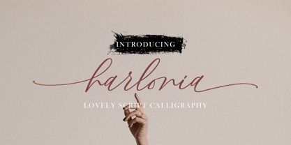 INTRO Harlonia Script, is a modern calligraphy font, with characters dance along the baseline and elegant touch. With almost 375 glyphs. Opentype features with stylistic alternates, ligatures and multiple language support. Can be used for various purposes such as logos, wedding invitation, letterhead, signage,news, t-shirt, heading lable, posters, badges etc. Thank you very much for purchasing and please let me know if you have any questions?
 - Allura by TypeSETit,
$24.95 The casual characters of Allura Regular are simple and clean and very legible, with an almost handwritten calligraphic appeal. The script and formal sets offer a softer, more formal look. This exceptionally diverse font was designed with advertising, display and package design in mind. The OpenType Pro version of Allura combines all three styles along with extra alternate glyphs and flourished graphics to give the professional designer maximum flexibility.
 - Millard by Artegra,
$29.00 When you need a classic serif typeface that is up to the modern standards, Millard comes to your rescue with its alluring beauty and legibility. You have a contemporary serif family that offers great variety with regular and bold weights in both normal and condensed widths, along with their true italics. Over 500 glyphs in each font offers you the language support you need for all the Latin languages.
 - Valley by Illushvara,
$10.00 Valley is a lovely script font featuring charming, playful characters that seem to dance along the baseline. Add this font to your most creative ideas, and notice how it makes them stand out! Have a Regular & Italic style can be used various purposes such as magazine, logos, wedding invitations, headings, and so much more. If you have any question, don’t hesitate to contact me. Happy Designing !!! Thank You, Bayu Suwirya
 - Dance Partner JNL by Jeff Levine,
$29.00 The unusual mix of Art Deco lettering with a smattering of Art Nouveau characters found within Dance Partner JNL comes from a movie poster for the 1935 RKO picture "Roberta" starring Fred Astaire and Ginger Rogers. The musical was based on the hit 1933 stage play that introduced the song "Smoke Gets in Your Eyes". The play itself was based on the Alice Duer Miller novel "Gowns by Roberta".
 - Splash by TypeSETit,
$24.00 Inspired by the splatters that come from a heavily inked architectural ruling pen gliding along the surface of a highly textured watercolor page—Splash. Just as droplets of water splash the ocean’s shore, little control can be predicted and no two splashes are exactly alike. The result is wonderfully organic and natural surprises. This display font touts flowing design potential. All glyphs are PUA encoded for ease of use.
 - Tulippia by SRS Type,
$30.00 Tulippia is a super contrast font that was inspired by the beautiful shape of tulips. It has very thick strokes, but also has the elegance of curves. Using this font can give you a unique contrast effect along with visual impact. Tulippia is suitable for various types of design work such as branding, poster design, and editorial design, and comes in two weights: Regular and Heavy as display fonts.
 - Polyline by Mårten Nettelbladt,
$- Polyline is based on a small 3x5 grid giving it a rather crude and technical look, further emphasized by the monospacing. ‘Polyline’ is a command often found in CAD-software that is used to create a series of connected lines. The typeface can also be installed as an AutoCAD .shx font, included in the download along with the .shp source file and the stroke shapes for all characters as .pdf
 - Incarceration JNL by Jeff Levine,
$29.00 The hand lettered Art Deco title on the cover of the sheet music for “There Must be A Bright Tomorrow (for Each Yesterday of Tears)” inspired the font Incarceration JNL, which is available in both regular and oblique versions. Incarceration JNL earns its dubious name from the fact the song was written by Prisoner No. 3223 (Wallace Wysocki) who was held in the Marquette State Prison, Marquette, Michigan (1931)
 - Hagalind by T4 Foundry,
$21.00 Hagalind is a beautiful new script with a natural flow from Swedish type designer Bo Berndal and the T4 font foundry. Hagalind is elegant and friendly with ligature style capital letters, inspired by 18th century writing. The name comes from Swedish national poet Carl Michael Bellman and his songs about the Haga castle in Stockholm and its beautiful surroundings. It is an OpenType creation, for both PC and Mac.
 - Guadalajara JNL by Jeff Levine,
$29.00 Hand lettered, the title on the sheet music for a 1940s hit song "Ti-Pi-Tin" inspired Guadalajara JNL. The melody and original Spanish lyrics were written by Maria Grever, one of Mexico's first successful female composers, with English lyrics supplied by Raymond Leveen. This decorative and fun type face brings to mind fiestas South of the border, and emanates the charm of Mexico's music, dance and colorful costumes.
 - PH Font by Fontfabric,
$29.00 PH from Fontfabric Type Foundry is a multifaceted font system consisting of different font weights and type of condensation. Every one of these font weights contains a number of extension types - Condensed, Narrow, Regular, Extended and Wide. Along with all of this, you will also discover added groups of extras which could serve as a foundation or add that extra "cherry on the cake" to each unique design.
 - Zahar by Apostrof,
$30.00 Zahar type family is based on the lettering developed by the famous Ukrainian graphic artist Georgi Yakutovich and designed for Ivan Franko's book Zakhar Berkut. It is good for the design of children's books, folk tales, songs, etc. Zahar is easy to read in short texts. It supports Extended Latin and Cyrillic (including Old Church Slavonic). A special OT-feature is added to support the Old Church Slavonic alphabetic numeral system.
 - Nature Stencils JNL by Jeff Levine,
$29.00 Nature Stencils JNL brings together a number of vintage decorator stencils with bird and flower motifs (along with individualized elements from the original designs). These home decor stencils were manufactured by the Huntington Oil Cured Stencil Company somewhere around the early 1950s. Originally located in Huntington, New York, the company later relocated to the South Florida area, but there is no additional information found about the company's background.
 - Suffolk by Hemphill Type,
$30.00 Suffolk is a traditional yet modern font family that takes inspiration from the county of Suffolk and its rich coastal history. This handwritten style font is a modern rustic take on a traditional script font and comes with a joined up 'script' style and an individual 'print' style. Along with a 'serif' style that evokes a similar feeling of old meets new that works well alongside the two handwritten styles.
 - Nouveau Square JNL by Jeff Levine,
$29.00 Sheet music for the 1915 song "Is There Still Room for Me Neath the Old Apple Tree" had the title hand-lettered in a condensed, square sans serif. Although far from the more decorative lettering styles of the Art Nouveau period, this type of simple understatement was also a popular choice for the illustrators of the day. It is presented digitally as Nouveau Square JNL in both regular and oblique versions.
 - Ferguson Hunter by Balpirick,
$15.00 Ferguson Hunter is a Modern Calligraphy Font. Ferguson Hunter is a lovely script font featuring charming, playful characters that seem to dance along the baseline. Whatever the topic, this font will be a wonderful asset to your font library, as it has the potential to enhance any creation. Ferguson Hunter also multilingual support. Enjoy the font, feel free to comment or feedback, send me PM or email. Thank you!
 - Harvest Script by DonyaDesign,
$14.00 Harvest Script is a soft and sweet calligraphic typeface, with characters dancing along the baseline. It has a casual and elegant touch. Can be used for various purposes such as logos, wedding invitations, headings, t-shirts, letterheads, signage, labels, news, posters, badges etc. OpenType features with alternative styles, ligatures, and multiple language support. Need help? If you need help or advice, please contact me by email. Thank you!
 - Tinman Pro by No Bodoni,
$35.00 TinmanPro is a mildly stressed humanist sans serif type based on the University of California Oldstyle type designed by Frederick Goudy. The design captures the warmth and friendly character of Goudy�s original in a monotone sans. Broad Latin support along with small caps, fraction support and other typographic niceties are included in the ten font family. Weight range includes Regular, Medium, DemiBold, Bold and ExtraBold with matching italics for each.
 - Luckiest Guy Pro by Stiggy & Sands,
$29.00 Our Luckiest Guy Pro was inspired by hand-lettering by vintage 1950’s advertisements. The uber-bold unicase letterforms exude charm and light-heartedness, while the SmallCaps and extensive figure sets expand the range of usability and appeal. Opentype features include: - SmallCaps. - Full set of Inferiors and Superiors for limitless fractions. - Tabular, Proportional, and Oldstyle figure sets (along with SmallCaps versions of the figures). - Stylistic Alternates for Caps to SmallCaps conversion.
 - Angro by Linotype,
$29.99 The sans serif Angro was designed in the weights light and bold by Erwin Koch. The figures are based on the form of a rectangle which along with the high xheight and short ascenders and descenders gives the forms a static character. Lines of text in Angro are very compact and close set. Due to the reserved ascenders and descenders Angro can be set with very close line spacing.
 - Hebron Hebrew by Jonahfonts,
$42.00 Hebron Hebrew is a font that contains 22 Hebrew letters along with five word ending letters that are automatically activated when used in Applications such as Apple-Pages and MicroSoft-Word. The Hebrew letters do not contain "Niqquds" (Hebrew Vowels) except with the added alternates, if desired. You may also be interested in my NEWMARK Hebrew, YOM TOV Hebrew PAGEANTRY Hebrew, HANAH Hebrew and KOMUNIDAD Hebrew Script FONTS.
 - Modern Vision - 100% free

- Hiruko by Thinkdust,
$10.00 With 15 different styles and support for all sorts of languages, Hiruko is the open and easy sort of font that can be used in almost any situation, as long as you want your message to be readable. Smooth, simple and clear, Hiruko takes inspiration from both Swiss and Japanese styles, focusing on minimalism and function within its form, the idea that less is more and the careful, exquisite craftsmanship that makes such minor changes have a big impact. From extra-light to thick, black weights, in italics or in outlines, Hiruko can be used to convey messages in such a variety of styles that you’ll never be disappointed. Alternatively if you're looking for something a little more comprehensive, why not check out the follow up to this family Hiruko Pro.
 - Sprout by The Northern Block,
$25.99 Sprout is a low-contrast sans serif, slightly condensed for economy of space, and complete with 6 weights in Roman and Italic. It has open apertures and a generous x-height for clarity of reading. It also comes with a weight balanced italic, which can be used for differentiation or as a standalone typeface in itself. The defining feature of the family is the taut curve, where the inner counter pushes out toward the outer contour, creating a feeling of tension in the curve. In the italic this shape language is pushed further, with a playful looped g and cursive form of the f. Sprout also comes with Old Style figures. Its range of weights makes for a versatile family suitable for branding, on-screen publishing and long-form reading.
 - EF Casanova Script Pro by Elsner+Flake,
$85.00 The handwritten cursive by the famous Italian Casanova has inspired Petra Beiße to design a new script, the “Casanova Script Pro”, with a complement of over 1400 characters and symbols. “Petras Script”, the first digital script font created by the calligrapher Petra Beiße, has, for many years, met with worldwide success. Petra Beiße has resided for a long time in Wiesbaden, Germany, where she is working as a renowned calligrapher. It is rare that any of her scripts are transferred into digital format and sold worldwide as fonts. Because “Petras Script” became such a huge success, she decided to release this new design for digitization. Under the guidance of Günther Flake, Jessica Franke enlarged this font to contain over 1400 characters. Further information about Petra Beiße and her present workshops can be found under www.handlettering.de.
 - Samplex by Tipo Pèpel,
$22.00 Neutral and universal are two words that could describe a kind of perfection. The search for neutrality and universality is part of history in type design; it was specially important in the so-called Swiss Style. Samplex is a typeface that joins this particular search. The design gets rid of unnecessary elements and stays away from style conflicts. The large and slightly condensed body of lowercase letters makes Samplex a good choice for long paragraphs, and especially appropriate for screen devices. Letters with a blocky appearance give shape to a text in perfect order, ideal for grid lovers and layouts with a strict structure. The design of Samplex is clean and efficient. The diagonal cuts are reserved to the italic letterforms, setting some distance between the solid upright characters and the dynamic oblique forms.
 - Panforte Pro by Zetafonts,
$39.00Panforte Pro is the basic ingredient for any tasty visual feast: a prime-cut font family, deliciously readable online and offline, space-saving and organic, appealing to hipster consumers and seasoned gluttons. Hand drawn in easy big strokes, its a very condensed typeface that allows you to typeset easily long texts. Lovers of world cuisine will be delighted to discover that it supports over forty languages using the latin alphabet, spiced with hand-picked diacritics and comes also with a tasty side dish of greek and cyrillic characters. For all the nouvelle cuisine open type chefs, it features a set of proper small case character set and alternate oldstyle numerals, as well as a set of repeating letter ligatures to avoid that metallic taste of repeating double characters. - Acid Green by The Flying Type,
$26.00 Acid Green has quite a psychedelic flair, but its origins are from long before the sixties psychedelia. Its roots date back to 1914, from an unnamed alphabet by J.M. Bergling, the amazing jewelry engraver and 'letterform inventor'—as he considered himself—whose books of art alphabets and lettering influenced countless artists, including, not surprisingly, those involved with the genesis of Art Nouveau and Art Deco movements. Perfect for multiple display uses, including retro designs and trippy letterings, Acid Green has an extensive character set, with multilingual support covering 208 languages. There are yet some handy stylistic alternatives for some extra grooviness. Acid Green is somewhat retro looking, for sure, but it can sound perfectly contemporary too. Tune in and enjoy a creative trip! [Pizza illustration on the first graphic by our neighbor @pedrocorrea84]
 - Verse Sans by Hubert Jocham Type,
$39.00 In 2006 the art director of Emotion, a women’s psychology magazine, asked me to design a copy typeface for them. Before I actually got the job I started to work on a serif. I wanted it to be feminine but still clear and modern. On one hand there are the floral round elements and on the other hand the angular serifs. In the composition I wanted the two extremes to work together. All the other elements had to be harmonized. The proportions needed to match the magazine’s requirements. The ascenders and descenders are short enough to work in narrow columns but long enough to work in small sizes. As you can imagine, the emotion-job never happened. In copy you should not get heavier than Heavy. Extrabold and Ultrabold work best in display.
 - Chistodella by Keristyper Studio,
$14.00 Chistodella is a calligraphy handwriting with classic style and elegant touch, inspired by lettering on the vintage. Which was created to meet the needs of your next design project. Carefully designed to work together in harmony for creating awesome typographic designs in a flash. This font is good for logo design, Social media, Movie Titles, Books Titles, short text even long text letters, and good for your secondary text font with sans or serif. Make a stunning work with Roselites font. Featured: -Standard Uppercase & Lowercase -Numeral & Punctuation -Multilingual : ä ö ü Ä Ö Ü ß ¿ ¡ -Alternate & Ligature -PUA encoded We recommend programs that support the OpenType feature and the Glyphs panel such as Adobe applications or Corel Draw. so you can use all the variations of the glyphs. Hope you enjoy our fonts!
 - Ongunkan Radloff Viking by Runic World Tamgacı,
$100.00 Vasili Vasilyevich Radlof or Wilhelm Radloff (Russian: Василий Васильевич Радлов; German: Wilhelm Radloff; 17 January 1837 - 12 May 1918) was a German-born Russian orientalist and founder of Turcology. Radloff is a Russian Turkologist of German origin, who researches the Turkish world from different aspects, opens a new era in the history of Turkology by bringing them to light, and has devoted 60 years of his 81-year long life to these studies. In his work known as Radloff Atlas, it was published with a runic font that he developed specifically for the Old Turkish Runic Alphabet. I made the Turkish Runic Font using Radloff's Atlas. I developed this viking font based on this font and adapted it to Viking writing. I will adapt other runic versions when I have the opportunity.
 - Magnify by XdCreative,
$29.00 Geometric sans serif is one of my favorite fonts because it's so, simple, clean and modern, and a long time I've been dreaming of making this type, inspired by many media and especially "Futura, 1927" ( by Early Bauer) I created "Magnify" Geometric sans. The structure and element shape of Magnify is not really perfectly circle, but slightly oval it can be seen in the uppercase letters O, G, C, Q and in the lowercase letters o, a, c, e. Magnify has 8 weights, - from Hairline to Bold and Matching Oblique. Magnify also has special alternate characters in letters a, g, y and o. it is to give a different look to a paragraph, headline or your display design. thanks, hope you would like and accept "Magnify" as part of your family. thank you in advance
 - Mastro by Ndiscover,
$49.00 Mastro is a contemporary design comprising 72 styles. With 9 weights and 4 optical sizes: Caption, Text, Sub-head and Display. A super versatile font family ideal for editorial, graphic design, branding and web. Filled with iconic unusual shapes, yet with a super rigorous professional look this design will stand out and work efficiently. Caption styles are meant for very small text like footnotes; Text styles are meant for long strings of text; Subhead styles are meant for sub-headlines; Display styles are meant for large size type setting. Mastro has many OpenType features such as Small Caps, Standard and Discretionary Ligatures, Superscript Letters, Case Sensitive Forms, Lining Figures, Old Style Figures, Tabular and Proportional Numbers, and more. If you want to enlarge this font family make sure you get its sans counterpart: Mastro Sans.
 - Andaluz by Storm Type Foundry,
$38.00 The land of beauteous angels, Andalucia, connects different cultures with a curved arch. Almond trees bloom there in February, and orange trees grow in the heavenly courtyards of Gothic churches. A Catholic cathedral stands in a mosque, Moorish fountains gush with water, and ornate arcades are reflected in the mirrors of the Alhambra pools. Fishing villages have long been busy with tourism, but there are remote pubs where only locals go for fresh fish. Beer is served in wine glasses, and with each one you get a piece of cheese, shrimp, or a few slices of specially smoked ham, sitting on the bar counter. Here, in the off-season, it is possible to gaze into the distance towards the African shores and sketch watercolors for the diary completely undisturbed.
 - Excelsor Script by Storm Type Foundry,
$32.00Excelsor Script is inspired by lithographically produced scripts. It is softer and simpler than, for example, engraved Splendid Script, because its designer used pens and lithographic needles. The graver for steel is held in a quite different way and this has an influence on the shape of the letter. Similar type faces were in use from Neo-Classicism until the beginning of Art Nouveau, when they were pushed aside by a completely different view of festive typography. It has, in contradistinction to other scripts, slightly narrowed letters, which signifies a distinctive elegance without wasting space on the line. For practical reasons it was not possible to encircle the bottle with too long a label. It is, therefore, a suitable type face for labels. Its two optical grades cover a wide range of sizes.
