8,675 search results
(0.017 seconds)
- Theater Lights JNL by Jeff Levine,
$29.00 Vintage sheet music for the title song from the film "Forty Second Street" was the inspiration for Theater Lights JNL. While the idea of letters comprised of circles (to simulate bulbs) can be both vintage [as in marquee lights] or modern [simulating dot matrix printers], it is always a fun approach to a tried-and-true style.
 - Alywita Love by Letterafandi Studio,
$14.00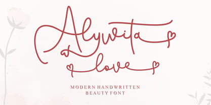 Alywita Love is a lovely Handwritten font with characters that dance along the baseline. It can be used for various purposes such as logos, wedding invitations, headings, t-shirts, letterhead, signage, labels, news, posters, badges and so much more. Alywita Love is PUA encoded which means you can access all of the glyphs and swashes with ease!
 - Royal Kevino by Hanzel Space,
$25.00 This modern serif typeface features serifs. Perfect for gorgeous logos & titles, Royal Kevino will pair beautifully with many fonts and work well with whatever project you're working on. That's it! If you have any questions at all , feel free to pop me a private message , I'm always more than happy to help you along :) Happy creating! Hanzel Studio
 - Chocolate Peaches by PeachCreme,
$12.00 Hey guys! So happy to introduce you our new font “Chocolate Peaches”! It is great for projects that have a playful or cute theme, whether for labels, signage, packages, stickers, etc. Along with being legible due to its bold letters, this typeface can make a lovely addition to boho designs that incorporate natural elements, patterns, texture and many colors.
 - Runaround Kid by Hanoded,
$15.00 I was listening to some old Smashing Pumpkins albums when I created this font. The name comes from a song called *** You (An Ode To No One). Runaround Kid is a hand painted typeface. I used Chinese ink and a cheap Chinese brush to create the inky look. Comes with double-letter ligatures and a whole bunch of diacritics.
 - Pen Lettering Sans JNL by Jeff Levine,
$29.00 A 1935 song with the unusual title of "Dinner for One Please, James" had its title hand lettered on the cover of the sheet music with simple, condensed letters made by a round point dip pen. This has been reproduced in a digital font as Pen Lettering Sans JNL, and is available in both regular and oblique versions.
 - Waiting For My Girl by Hanoded,
$15.00 Waiting For My Girl comes from a System of a Down song (Hypnotize). I was listening to it when I created this font and I liked the name! Waiting For My Girl is a script font - it’s quite loose and uneven, just like proper hand writing. It comes with double letter ligatures and a lot of character!
 - Switnesa Script by Seniors Studio,
$17.00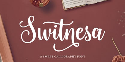 Switnesa Script is a soft and sweet calligraphy font with characters that dance along the baseline. It has a casual and yet elegant touch. It can be used for various purposes such as logos, wedding invitations, headings, t-shirts, letterhead, signage, lables, news, posters, badges etc. The fonts include OpenType features with stylistic alternates, ligatures and multiple language support.
 - Parkson by Rook Supply,
$18.00 Inspired by the grotesque fonts of the 19th century, Parkson is a tall sans serif typeface of 7 weights along with italic and several outline versions. The contemporary typeface aims to be one of the world's best condensed collection of fonts. Designed for optimum legibility, its clean, geometric look is perfect for logotypes, headers, titles and brochures.
 - Keith by Talbot Type,
$19.50 Keith is a striking and playful display font. Mix and match the different shadow styles, to create a variety of different looks and effects. There are four different shadow effects, along with a fill and an outline variation. Keith features a full upper and lower case character set and an extended set of accented characters for Central European languages.
 - Summer Goodbyes by Demi Michele,
$9.00 Summer Goodbyes is a fun, warm, and playful font that welcomes the fall as the season changes. All characters are the same height to add a quirky and clean feeling to any project. It includes English capital and lowercase glyphs along with multilingual characters. It also includes minimal stylistic alternatives and discretionary ligatures and numbers as well.
 - Turismo CF by Connary Fagen,
$25.00 Inspired by midcentury motorsports, technology, and business, Turismo CF is designed for stunning logotypes and gripping headlines. Constructed from strong rectangles with sloping, elongated curves and a confident, affable stance. Turismo CF is a display typeface pairs well with mellow, text-friendly serifs that won't compete visually, like Artifex CF, or humanist typefaces like Artifex Hand CF.
 - Romantic Garden by ErlosDesign,
$19.00 Romantic Garden - Handwritting Font by erlosDESIGN Romantic Garden is a romantic and sweet calligraphy typeface with characters that dance along the baseline. It will add a luxury spark to any design project that you wish to create! This font is PUA encoded which means you can access all of the amazing glyphs and ligatures with ease!
 - Firstlove by Letterafandi Studio,
$10.00 Firstlove is a romantic and graceful calligraphy typeface with characters that dance along the baseline. It can be used for various purposes such as logos, wedding invitations, headings, t-shirts, letterhead, signage, labels, news, posters, badges and so much more. Firstlove is PUA encoded which means you can access all of the glyphs and swashes with ease!
 - Cabrito Semi by insigne,
$24.00 Relax. Deep breath. And step away to font nirvana with Cabrito Semi. Like its Cabrito relatives, Semi’s handwriting-inspired feel is mellow and care-free. But don’t misunderstand us. Even with its fun-loving peculiarities, this free spirit will command whatever party you invite it to. It’s a perfect blend of unique and functional. So what’s the secret of this little one’s strength? It’s pure balance. Cabrito Semi’s energy surges from deep within the relaxed, balanced tones of its humanist structure and calligraphic crafting. The 36 fonts of this well-crafted semi serif originate from the popular Cabrito, an insigne design slab serif developed for the kid’s book, The Clothes Letters Wear. Along with its other amigos, Inverto and Sans, Cabrito Semi rounds out this easy-going household of fonts. The four fonts play well together on anything from meals and candy to toys and cars. With the support of the other three, Semi makes a great choice for titles and moderately long text like you would use for websites, flyers, and packaging. Semi’s complete pack of alternates is accessible in any OpenType-enabled system. This kiddo has loads of alternates, swashes, and alternate titling caps to add a bit of sweetener to the balance. Also bundled are swash alternates, old style figures, and compact caps. Preview any and all of these features in the interactive PDF brochure. This font members of the family also consists of your glyphs for 72 languages. So who says you can’t love quirky? Take a look at Cabrito Semi--and any of the other members of the Cabrito family. You’re bound to find yourself loving fun all over again.
 - Envelove by Sudtipos,
$39.00 «Envelove» is the brand new typographic challenge handwritten by Yani Arabena and designed along with Guille Vizzari and Ale Paul, for Sudtipos. It all started as a game for Yani. A carefree and spontaneous calligraphy, making use of the pointed nib with black ink, exploring its expressive possibilities pressing against paper. With time that nib turned into her dearest tool to flow through her writing, breeding this particular style of hers that let her trespass the barrier that kept personal and professional passions apart. All that inspiration is present in «Envelove», a play on words that reflects the love of letters. An expressive free-and-easy typeface that follows no formal calligraphic model and lets itself go with the meaning of words, rhythm and sensations. «Envelove» successfully joins three different fonts, «Envelove Script»—free, spontaneous and unique of its kind—going together with «Envelove Caps»—an uppercase style that builds controlled but dynamic words thanks to its alternates and ligatures, and to its own true Small Caps set as well—and «Envelove Icons», ideal to decorate and bring to life any written message. «Envelove» encourages you to write as if you have a nib, ink and an envelope. It invites you to take part in other worlds like a magic cocktail, a summer night, a long-awaited reunion, a first dance, a dish cooked with your own hands. The fashion world, gourmet, stationery, scrapbooking and everyone where a Handmade or Handcrafted feel is craved for, save a special place for «Envelove». (The illustration series that are shown with «Envelove» were made by the incredible Argentine illustrator Eugenia Mello.)
 - JT Collect by OGJ Type Design,
$35.00 JT Collect is a hybrid sans-serif typeface for the 21st century that takes a playful approach to the type design heritages of Germany and Switzerland. Confidently built on a geometric structure and infused with elements from traditional grotesque typefaces, it hits the sweet spot between geo and grot. I developed JT Collect purely digitally, drawing from years of experience with analog type design. The letters aren’t based on one particular source but seek to merge different type genres from the first half of the 20th century and lift them to a contemporary quality level. JT Collect is less reserved than strictly geometric designs and brings some industrial workmanship and honesty into the game. The six weights plus three optical sizes of JT Collect offer what you need to make an impact. While cool and elegant in the Light weight, the fonts show more presence on the page as they grow bolder. To this end, I drew the letterforms with a slightly unrefined, brawny air in the bolder weights. This sets them apart from the perceived purity of more geometric designs. The Book weight is ideal for short texts and medium-length copy, and the forceful Bold makes wordmarks look crisp and lets headlines radiate cosmopolitan self-confidence. JT Collect is suitable as a primary typeface for branding, advertising, packaging, stationery, posters, documents, and websites from trades and industries as diverse as food & fashion, media & makers, culture & creators, games & gems, sports & startups. Use JT Collect for film titles or watch faces, for leaflets or store signs, for business cards or billboards: this font family is as adaptable as a chameleon (and like a chameleon, it’s never boring). Try it in different contexts. You won’t be disappointed. Its adaptability also makes JT Collect a great starting point for poised and persuasive font combinations. Even a sans/sans pairing is possible due to hybrid nature of JT Collect—something that’d be hard to achieve with most other sans-serif typefaces on the market. You can add to it a heavy slab from the OGJ library, like Temper Wide. You might go for a geometric or a grotesque typeface as secondary (text) typeface. Or you could set your body copy in a classic serif typeface such as Caslon, Sabon, or Plantin. That’s right: JT Collect is a true team player. Whether you need a grotesque or a geometric sans: try JT Collect. You can get the best of both worlds.
 - Carlton by ITC,
$29.99Carlton is based on a typeface designed by Prof. F. H. Ehmcke. In 1908, Ehmcke released his Ehmcke-Antiqua design through the Flinsch typefoundry in Germany. Ehmcke-Antiqua was later distributed by the Bauer typefoundry in Frankfurt am Main. The Caslon Letter Foundry in England discovered the design and released their own typeface based upon the model, which they named Carlton. Carlton entered the Stephenson Blake program after they acquired the Caslon Letter Foundry in the late 1930s. As hot and cold metal typesetting became outdated technologies, Carlton and Ehmcke-Antiqua fell out of general use. In the 1990s, Letraset revived this classic design, distributing it under its English name, Carlton. Carlton's clean and generous capitals, as well as its understated yet detailed lower case, have found popularity again in recent years. The elegance of Carlton is best used for displays with large letter and word spacing. Carlton shows all of the hallmarks of a delicate serif typeface design; its forms capture a distinct moment that was common within Central European type design during the first third of the 20th Century. Carlton is similar to several other expressive typefaces from the early 1900s, including Bernhard Modern, Koch Antiqua, Locarno, and Nicolas Cochin." - Seibi Socho by Nihon Literal,
$169.00 The Socho (Song Dynasty-style) typeface is based on a style used for woodblock printing in Song-period China. The SEIBI Socho typeface updates the Song style by making it simpler and sharper. With minimized size variations between kanji and kana, the design is readable both in vertical and horizontal typesetting. 宋朝体の起源は中国の宋の時代に木版印刷に使われた書体です。セイビ宋朝体は、さらにシンプルでシャープなイメージを目指しました。かな、漢字の大小があまりない、タテ組でもヨコ組でも組みやすくデザインしました。本来の宋朝体は骨が細く、右上がりの斜体がかった長体ですが、セイビ宋朝体はそのシャープな特徴を生かしたまま正体に近く、タテでもヨコでも組みやすい書体に仕上げています。毛筆とは違う、木版用書体の彫刻的な堅いエレメントも特徴です。
 - NOH Squadra by OhType!,
$30.00 SQUADRA is a serif typeface with more than 220 characters, framing a perfect union between typefaces of his style and unconventional shots from the calligraphic pen; Its strong and imposing appearance, the pronounced contrast between his strokes and changes in traditional aesthetics provide you with elegance and distinction to differentiate over other types of the same class. Easy modifiable and great graphic content to small and large format SQUADRA is able of generating a clear and direct message, suit almost any topic and perfect for use in posters, logos and editorial headlines. Infinitely versatile typeface that evokes both the beauty and finesse of the plants as power its thorns and its deadly poison.
 - Chicago Moonshine by Roland Hüse Design,
$15.00 CHICAGO MOONSHINE is an Art Deco serif All Caps display font. Please note that this is primarily for headlines, logos posters in large size. The character set contains Western and Eastern European latin languages, basic symbols and punctuation. The Capital letters has geometric patterns and in place of lowercase letters there are filled in Capitals. Inquiries, feedback, customisation requests and/or extra characters please contact@rolandhusedesign.com or via rolandhuse.com * * * Background image (taken from Unsplash) credits: Chicago at night : Prafulla Chandra https://unsplash.com/@prafulla90 Moon I photoshopped onto the night skyline: Jason Darrell https://unsplash.com/@zebedeerox Moonshine Enjoy & Cheers : bartender holding a shot of liquor by Joel Herzog from unsplash https://unsplash.com/@joel_herzog Street Sign: Bruno Martins https://unsplash.com/@brunus
 - Silent Brush by Ditatype,
$29.00 Silent Brush is a very lovely, elegant script font in capital letters bigger than ordinary ones to express such dramatic, attractive visual effects. To be consistently legible and harmonious in the whole context, every letter has its own proportions. One of the font’s main features is the brush scratch on every letter to show that the writing is made up of a paint brush producing a lot of rough textures. You can see the brush scratches along the letters’ edges and the letters’ sides to express dynamic moving flows. Despite being inspired by handwritings, this script font has gone through various adjustments making it more consistent and legible. Furthermore, it is much better to use this font for big text sizes to be more legible. In addition, you may enjoy the available features here as well. Features: Multilingual Supports PUA Encoded Numerals and Punctuations Silent Brush fits best for any design projects requiring artistic touches such as brands’ logos, posters, merchandise designs, and other promoting media. Find out more ways to use this font by taking a look at the font preview. Thanks for purchasing our fonts. Hopefully, you have a great time using our font. Feel free to contact us anytime for further information or when you have trouble with the font. Thanks a lot and happy designing.
 - Hierophant by Monotype,
$40.00 Hierophant is a humanist serif type family that has the heritage of classic Old Style and Transitional type while having the crisp lines and functionality of contemporary fonts. Its defining features include a high-contrast combined with diagonal stress, along with pinched stems and horizontals. This gives Hierophant a distinctive hand-drawn feel which also reflects the strong influence of the work of 16th century calligrapher Giovanni Francesco Cresci upon this family. OpenType features include stylistic sets of alternate glyphs – the first of which contains ornate teardrop serifs and ball terminals (ss01). This style dramatically changes the look of your typography and is ideally suited for short runs of text, headlines and branding purposes. Swash alternates for certain glyphs are available via Stylistic Sets 2 and 3. Other useful features include Small Caps at the click of a button, and Old Style Figures are an option to the default proportional figure style. There are 14 fonts altogether over 7 weights in roman and italic, you can also avail of two variable fonts which allow you to fine tune the weight to your exact liking. Hierophant has an extensive character set (1000+ glyphs) that covers every Latin European language. Key features: 7 weights in both roman and italic 112 Alternates Small Caps Variable fonts included with full family Full European character set (Latin only) 1000+ glyphs per font.
 - Cabrito Contrast by insigne,
$29.99 The Cabrito family is back again to make a statement. Released as a complement to the children's book, The Clothes Letters Wear, the original Cabrito is light-hearted, fun, and easy to read. Now, balancing this friendliness with a new elegance, Cabrito Contrast steps forward--a handsome typeface with an extra-sophisticated sensibility injected into the design. Still bright and playful in its Cabrito ancestry, this new Cabrito member approaches the field with a cleaner, more reductionist form, ensuring that its polished look retains the readability. Regular features and Italic forms of the 54 fonts include upright alternates, ligatures, and old figures. A range of weights include extended and condensed variants. To preview any of these interactive features, see the PDF manual. The family also includes language support for 72 Latin-based languages, and there are over 600 glyphs for further refining your work. Cabrito Contrast is best used for logos and packaging as well as flyers and websites, though its readability makes it a great option across a wide variety of works. In short, it’s well-designed just for you. Take a stroll with Cabrito Contrast, and see how much fun refinement can be. Along the way, take a look at a few other members of Cabrito, too and see how well the likes of Original, Inverto or Didone can pair with the new Contrast.
 - Maffa Latte by Yumna Type,
$15.00 Sometimes it is a boring, tiring process to find a proper font for your project, and what is worse is that the font type you find has no specific character preventing you from delivering messages effectively. For that reason, we have the best solution to your problems. Maffa Latte is a perfect display font for delivering your messages on every design you are working on. Such a display font generally shows you a unique, funny, fun impression for any necessities, increases the nuances of professionalism and attractiveness to the product or brand promoted. The right use of this font makes the design more interesting and fun to cheer up customers. This font, with a clipart as an extra bonus, is legible due to its simple forms and proportions along with high contrasts. You can enjoy the available features here as well. Features: Multilingual Supports PUA Encoded Numerals and Punctuations Maffa Latte fits best for various design projects, such as brandings, posters, banners, headings, magazine covers, quotes, invitations, name cards, printed products, merchandise, social media, etc. Find out more ways to use this font by taking a look at the font preview. Thanks for purchasing our fonts. Hopefully, you have a great time using our font. Feel free to contact us anytime for further information or when you have trouble with the font. Thanks a lot and happy designing.
 - Sweet Tea PW by Patty Whack Fonts,
$24.00 Sweet Tea is a thin, handwritten and simplistic font reminds me of the simple, yet serene days on the front porch swing with a Summer breeze. Sipping an ice cold glass of sweet tea on a hot, sunny day -- there's nothing better.
 - Orangina by TypeThis!Studio,
$45.00 What can be better than releasing a hot summer font in winter time! Honestly - all the images are ice blue or white. Christmas stuff is everywhere and 'Jingle Bells' torment your ears! But here it comes to catch you: Bold and orange! www.typethis.studio
 - Reactor A1 - Personal use only

- A Fire Inside The Walls - 100% free

- Citaro Voor (Dubbele hoogte, breed) - 100% free

- JD Gina - 100% free

- Ghastly Panic - Unknown license

- Mount Hills by Ergibi Studio,
$20.00 Mount Hills, this typeface has been made carefully to make sure its premium quality and luxury feel. The many alternate character on serif makes this typeface unique and stands out rather than the regular sans font, perfectly for headlines, logos, posters, packaging, T-shirts, coffee shops, restaurants, magazine's headers, signs or gift/post cards, cafe's and weddings or any type of advertising purpose.
 - Wood Type Grotesk JNL by Jeff Levine,
$29.00 Wood Type Grotesk JNL was re-drawn from a set of vintage wood type purchased from a closed rubber stamp shop. Although the style of lettering is referred to in old type catalogs as a "grotesk" face, in truth the lettering has charm and effectively gets the printed point across to the reader. This typeface is available in both regular and oblique versions.
 - Great Sage NF by Nick's Fonts,
$10.00This pseudo-Egyptian fantasy originally was named Karnac, and was unearthed in the pages of the 1888 American Type Founders Specimen Book. This version derives it name from a continuing character from Johnny Carson's stint on the Tonight show. Both versions of this font include the Unicode Latin 1252 and 1250 Central European character sets, with localization for Moldovan and Romanian. - Blackbarry NF by Nick's Fonts,
$10.00Deutsch Black, designed by Barry Deutsch for VGC in 1966, provided the inspiration for this extrabold exercise in heavy ink coverage. A number of variants, in lowercase slots, were added to offer flexibility to your headline designs. Both versions include the complete Latin 1252, Central European 1250 and Turkish 1254 character sets, as well as localization for Moldovan and Romanian. - BookCover by Tipo Pèpel,
$32.00 BookCover is a typeface designed with extreme spot to hit when used in headlines. The contrast of the outer curved shapes with internal rectangular counterforms that bring freshness to the results and a contemporary look. Contains an extensive character map for use in most Latin-based languages. BookCover will help you create eye-catching headlines, posters or book covers to name a few.
 - Delvon Family by madeDeduk,
$15.00 Delvon is a modern sans serif font family. It is suitable to create text for branding, product packaging, invitations, quotes, t-shirts, labels, poster, logos and more. Features: Uppercase Lowercase Numbers & Symbols International Glyphs Ligatures If you need anything else just shoot me on email at: dedukvic@gmail.com or find more previews on my Instagram here : https://www.instagram.com/acekelgondolayu/ Hope you enjoy it.
 - Groove Thang NF by Nick's Fonts,
$10.00An interesting, unusual and righteously funky variation on the classic “Barnum” style of lettering, this typeface was originally named "Dado". As any woodworker knows, dado is also the name of a slot ploughed, chiseled or cut in wood: in other words, a groove thang. Both versions of the font include 1252 Latin and 1250 CE (with localization for Romanian and Moldovan) character sets. - Jesterday by Jelloween,
$19.00 Jesterday is a four weight - light, regular, medium and bold - type family that’s suitable for headlines but works great in informal body-copy as well. Even at a very small size it’s still very much legible. For added fun, Jesterday has been subtly enhanced with OpenType ligatures. Can you spot them? Download the demo version to try Jesterday for free.


