8,675 search results
(0.027 seconds)
- WL Circuits Circuits by Writ Large,
$12.00 This decorative tech typeface is inspired by the printed circuits boards of the twentieth century. Its default character set suggests commercially manufactured circuits while the OpenType alternates give more of a home-brew feel. The font is ideal for technical decorative titles in subjects as diverse as computers, techno music, ham radio, or “maker”-culture communications. It works well in large-type posters, logotypes, video games, album covers, or advertising. The OpenType font contains nearly 100 discretionary ligatures to give a varied appearance, along with several alternate cuts of common characters and ten electrical components (accessible as OpenType stylistic alternates).
 - Air Circus JNL by Jeff Levine,
$29.00 A 1930s advertising poster for the Inman Brothers Flying Circus offered up an interesting hand lettered Art Deco design that’s a cross between both squared and rounded character shapes. Because of it's 'futuristic look', the resulting type style can also lend itself to 1970s and 1980s retro projects as well as those from the 1930s and 1940s. Now a digital font, Air Circus JNL is available in both regular and oblique versions. A “Flying Circus” is a troupe of ‘barnstormers’ (stunt pilots) who performed aerial tricks either individually or as a team along with selling airplane rides to the general public.
 - NS Yorkest Poster by Novi Souldado,
$25.00 Experience the around-the-world traveling vibes from the past with Yorkest Poster. It was inspired by the vintage retro national travel arts and printings from the 60s and 70s eras back in the day. Comes along with 2 styles (Serif and Script) that would never go wrong to be paired. A pack of Stylistic Alternates features to give a personal touch to your design, and also Swashes to cover your visual needs to be stronger in every appearance. Perfectly fit for logo design, headliner, signage, poster, postcard, title, postage stamp, and a lot of other printing works and stuff.
 - Special Elite Pro by Stiggy & Sands,
$29.00 Our Special Elite Pro brings the unique individuality of the Special Elite Type No. NR6 vintage typewriter keyset to the digital age. Antique typewriters would type with a warmth and appeal to them, primarily because of their unpredictable “grunge” results from force of keystrokes to ribbon and paper. The SmallCaps and extensive figure sets add a more serious note to the nature of the typeface. OpenType features include: - SmallCaps. - Full set of Inferiors and Superiors for limitless fractions. - Tabular, Proportional, and Oldstyle figure sets (along with SmallCaps versions of the figures). - Stylistic Alternates for Caps to SmallCaps conversion.
 - Jazz Guitar JNL by Jeff Levine,
$29.00 Latin music was all the rage in the United States from the 1930s through the 1950s and songs with a “South of the Border” or “Old Mexico” theme were plentiful. The 1940 sheet music for “Make Love with a Guitar” evoked the idea of serenading one’s lovely lady on horseback while strumming the guitar. ..at least if you went by the by the illustration under the song’s name. As the hand lettered title was rendered in an Art Deco design, it became the basis for Jazz Guitar JNL [which seemed a more befitting name], and is available in both regular and oblique versions.
 - Risque Pro by Stiggy & Sands,
$29.00 Our Risque Pro draws inspiration from the title screen of the 1962 Looney Toons cartoon, "Martian through Georgia". Originally an all Capitals reference, Risque includes Capitals, lowercase, and SmallCaps sets as festive and irregular in its bounce as the cartoon reference. This frolicking fun typeface has retro roots, but also an all around offbeat personality that opens it up to a wide gamut of uses. Opentype features include: - SmallCaps. - Full set of Inferiors and Superiors for limitless fractions. - Tabular, Proportional, and Oldstyle figure sets (along with SmallCaps versions of the figures). - Stylistic Alternates for Caps to SmallCaps conversion.
 - Sign Painter by House Industries,
$33.00 For decades, the handletterer’s craft has been indispensable to the advertising and design trades. As prevailing tastes changed and new technologies emerged, commercial art saw the fateful demise of this lost skill. Now, House Industries is proud to offer the Sign Painter font kit, a collection of six timeless display typefaces along with an assortment of eye-catching advertising type treatments in font format. Like all good subversives, House Industries hides in plain sight while amplifying the look, feel and style of the world’s most interesting brands, products and people. Based in Delaware, visually influencing the world.
 - Mynaruse by insigne,
$22.00 Mynaruse is an elegant and regal roman inscriptional titling family. It has sharp and elongated serifs that give the face extra punch. The face shines in settings that call for elegance and splendor. Mynaruse’s six weights range from a fine, delicate thin to a powerful and solid heavy weight. Mynaruse includes many useful OpenType features, including a set of swash alternates, alternate titling forms, ligatures and miscellaneous alternates. OpenType-capable applications such as Quark or the Adobe suite can take full advantage of the automatically replacing ligatures and alternates. This family also includes the glyphs to support a wide range of languages.
 - Qunka by Allouse Studio,
$16.00 Proudly Present, Qunka a Handwritten Typeface Font. Qunka come along with Stylistic-Alternate and Multi-Lingual Support which will give you many choices to play around. We highly recommend using a program that supports OpenType features and Glyphs panels like many of Adobe apps and Corel Draw, so you can see and access all Glyph variations. Qunka is perfect for any tittle, logo, product packaging, branding project, megazine, social media, wedding, or just used to express words above the background. Enjoy the font, feel free to comment or feedback, send me PM or email. Thank You!
 - Swing Vote JNL by Jeff Levine,
$29.00 A 1964 piece of sheet music entitled “Old Soldiers Never Die (They Just Fade Away)” was based on the farewell speech General Douglas MacArthur gave to Congress on April 19, 1951. This particular edition of the song sheet had part of his speech (as well as its title) hand lettered in a free-form sans serif reminiscent of the lettering done by such noted lettering artists as Paul Coker and Saul Bass. The casual and playful style of this type design became the inspiration for Swing Vote JNL, which is available in both regular and oblique versions.
 - Ned by Linotype,
$29.99Ned Std. is part of a series of typographic experiments from the young Swiss designer Michael Parson. Using a wide, horizontal hexagonal grid, Parson created the system of letters that make up this font. Text set in Ned Regular takes on a modular, honeycomb-like appearance. For an interesting effect, try overlapping individual letters, or use a few letters together as elements in a logo. A great companion face to Ned Std. is Linotype's Hexatype Bold. Both Ned Std. and Hexatype Bold have been included in the Take Type 5 collection, along with eight further constructions from Parson." - Hapsary by Allouse Studio,
$16.00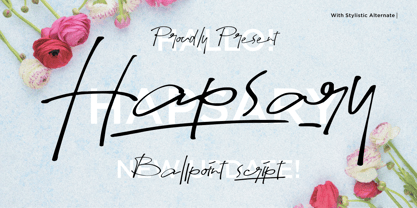 Proudly Presenting, Hapsary a Ballpoint Script Font. Hapsary come along with Ligatures, Underline Styles, and Multilingual-Support which will fulfill your need and give cool impression for you. We highly recommend using a program that supports OpenType features and Glyphs panels like many of Adobe apps and Corel Draw, so you can see and access all Glyph variations. Hapsary is perfect for any tittle, product packaging, branding project, megazine, social media, wedding, or just used to express words above the background. Enjoy the font, feel free to comment or feedback, send me PM or email. Thank You!
 - Magnolia Rainflower by Mevstory Studio,
$30.00 Magnolia Rainflower Font This modern serif typeface features serif. The name of this font is taken from one type of tulip. Perfect for gorgeous logos & titles, Magnolia Rainflower will pair beautifully with many fonts and work well with whatever project you're working on. A full set of punctuation and numerals Some instructions consist of NOTE about using alternative style fonts and glyphs after you download it Include Alternate, Swash & stylistic set Typeface. That's it! If you have any questions at all, feel free to pop me a private message, I'm always more than happy to help you along :) Happy creating!
 - Bokena by IbraCreative,
$17.00 Bokena is a remarkably elegant serif font that exudes timeless sophistication and grace. Its beautifully crafted letterforms feature delicate, elongated serifs that effortlessly convey a sense of refinement and luxury. With a perfect balance between thin and thick strokes, Bokena achieves a harmonious and legible appearance, making it an ideal choice for conveying a sense of sophistication and tradition in various design projects, from high-end branding to elegant invitations and editorial layouts. This typeface’s inherent grace and versatility make it a standout choice for those seeking to add a touch of timeless elegance to their visual creations.
 - Kagomechan by Allouse Studio,
$14.00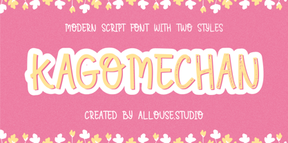 Proudly Presenting, Kagomechan a Modern Script Font With Two Styles Regular and Textured which will you give an a stamp effect. Kagomechan come along with multi-Lingual Support to fulfill your need. We highly recommend using a program that supports OpenType features and Glyphs panels like many of Adobe apps and Corel Draw, so you can see and access all Glyph variations. Kagomechan is perfect for any title, logo, product packaging, branding project, megazine, social media, wedding, or just used to express words above the background. Enjoy the font, feel free to comment or feedback, send me PM or email. Thank You!
 - Butterfly Ball by Hanoded,
$15.00 The Butterfly Ball and the Grasshopper's Feast is a 70's concept album/rock opera by Deep Purple's Roger Glover. The music video to Love Is All, featuring a lute playing frog in a cape, must be one of the best videos ever made. At least, I believe so. When working on this font, the song popped up in my head (it is still there), so I decided to name this cute, cartoonish font after the album. Butterfly Ball is a fun and happy typeface with rounded glyphs and an uneven baseline. Of course it comes with a hallucinatory range of diacritics.
 - MVB Cafe Mimi by MVB,
$39.00Kanna Aoki was designing fabrics and dishware for several major manufacturers when she designed MVB Cafe Mimi. The design came from a few words Aoki painted as decoration for a set of cappuccino cups. Aoki created the Regular weight for MVB Fonts using a brush. The Bold was adapted after digitization. Using several double-letter ligatures, the fonts can feel as natural and spontaneous as the original hand-painted lettering. Despite its curlicues and free-flowing forms, great care was taken to keep this script balanced and legible. It skips and hops along the baseline but doesn't lose its step. - Work Crew Stencil JNL by Jeff Levine,
$29.00 In the 1949 Paramount comedy "My Friend Irma" (a film based on the popular radio series that introduced America to Dean Martin and Jerry Lewis), an opening gag set-up involving excavation work utilizes street barricades which inspired Work Crew Stencil JNL. Placed along the site, different advisories are stenciled upon barricades warning of the work in progress. The scatterbrained Irma (Marie Wilson) walks straight through the construction, oblivious as to what's going on around her and steps right into the open hole dug into the sidewalk (a scene she reprises in 1950's "My Friend Irma Goes West").
 - ITC Jiggery Pokery by ITC,
$29.99ITC Jiggery Pokery is the work of British freelance designer Carol Kemp. ITC Jiggery Pokery evolved from lettering for a project which needed to be quirky, wacky and fun," says Kemp. "The name came to me as the letters appear to jig along - it just seemed to fit. 'Jiggery Pokery' is London Cockney slang which has a variety of meanings. It's used to describe behavior such as 'ducking and diving', trickery, juggling (especially of financial matters!), or 'hanky panky'. My grandparents were Cockneys, and my uncle would use colourful rhyming slang which I loved to hear as a child."" - Ritz Slab Serif JNL by Jeff Levine,
$29.00 Ritz Slab Serif JNL is a bold display face which shares a lot of similar design traits to Stymie and other similar metal type of the 1930s and 1940s, but in actuality was modeled from only four letters. On the sheet music for the 1937 song "Sweet Varsity Sue" [from the 20th Century Fox Film "Life Begins in College"], there is a picture of the Ritz Brothers - a popular comedy team from 1925 through the late 1960s. The hand lettered name "Ritz" became the basis for Ritz Slab Serif JNL, which is available in both regular and oblique versions.
 - Meguro Sans by GT&CANARY,
$27.00 Meguro Sans has a modern-styled boxy shape that achieves clean, industrial yet friendly style lends itself well to brand building. Its mono-line oriented and very high X-height ensure that it is extremely legible and creates a strong impression. Meguro Sans is Sans serif version of Meguro Serif. The Meguro sans font family is comprised of 10 styles with 5 different weights from light to black, along with matching italics offering possibilities for use in web, print, package and sign design, all with the goal of building an established look for brands in wide range of industries.
 - Mramor Pro by Storm Type Foundry,
$52.00 The Mramor family first appeared in the Stormtype catalogue in 1994. The first sketch arose in 1988 through the narrowing of Roman capitals. It has uniform width proportions and, above all, original lower-case letters, unprecedented with Roman Capitals. The text designs are discontinued since they were replaced by the related Amor Serif family (along with its -sans version). Now, Mramor has “only” 10 designs that each include true small caps, Cyrillics and a rich variety of figures, ligatures and alternates. Mramor excels in corporate identity or bottle-label design, also whenever there is a need for a “classic” looking face.
 - Anavio by Greater Albion Typefounders,
$14.95 Anavio is named in honor of the ancient Roman name of an English Derbyshire town. Anavio is a classically inspired family of Roman faces, emphasizing simplicity of form and elegance. Regular and Bold weights are offered, along with condensed forms. Anavio is offered in both upper and lower case and small capitals faces. Its simple lines are immediately legible, lending it to both text and display uses. A range of ligatures, both standard and discretionary, are included as are stylistic alternates and two styles of numerals. Use Anavio to lend that indefinable air of elegance to your next project.
 - Publicity Headline by HiH,
$8.00 Publicity Headline is an allcaps advertising font. Its heavy weight and robust strength allows it to be used against complex backgrounds or reversed out on dark backgrounds without getting lost. It also has a warm, friendly feeling for the conventional headlines indicated by the name. Publicity Headline is a distinctive and appealing font for creating bold and unusual headlines. This font includes the alternate R & S and the CO, LY & ST ligatures that were part of Gaunt’s original design. In addition, the ligatures AV, AW, WA, WO & YO are provided; along with AT, OF, AND & THE in the form of underlined small caps.
 - Ribeye Pro by Stiggy & Sands,
$29.00 The Ribeye Pro Family is reminiscent of a cartoon tattoo style of lettering, but exhibits a playfulness that breaks traditional weight distribution across its letterforms. An edgy attitude, friendly syncopation, and highly legible letterforms makes these fonts a real pair of charmers. The SmallCaps and extensive figure sets give the Ribeye Pro Family a more diverse design voice, ranging from slightly serious to downright ludicrous. Opentype features include: - SmallCaps. - Full set of Inferiors and Superiors for limitless fractions. - Tabular, Proportional, and Oldstyle figure sets (along with SmallCaps versions of the figures). - Stylistic Alternates for Caps to SmallCaps conversion.
 - Rattani by Allmo Studio,
$22.00 Rattani the graceful nature of the typeface, along with carefully designed details, allows to use it in large point sizes, for example in magazine layouts, packaging design and in many other ways. Rattani was unapologetically conceived as a display typeface meant to be used large as in magazine openings, drop caps or everywhere there’s a need for elegant impact. Rattani is perfect choice for people looking for clean, modern, minimalist, elegant, beauty design styles. Suitable for almost any graphic designs such as logo, business cards, t-shirt, cover, branding materials, poster, print, photography, thumbnail, gift cards.etc
 - Nexa Rust by Fontfabric,
$35.00 Nexa Rust from Fontfabric Type Foundry is a multifaceted font system consisting of font sub-families Sans, Slab, Script, Handmade and Extras. Each of these sub-families contains a number of font weights which have a characteristic warm, rough look and display a few degrees of saturation. Nexa Rust is a rough version of the already popular Nexa and Nexa Slab families with added new matching Nexa Script and Nexa Handmade fonts. Along with all of this, you will also discover added groups of extras which could serve as a foundation or add that extra “cherry on the cake” to each unique design.
 - Keyboard by Red Rooster Collection,
$45.00 Keyboard is a condensed and elongated Egyptian font family with thin serifs and a large x-height. Its original design was created in 1951 by Stephenson Blake. International TypeFounders, Inc. gained exclusive licensing rights to the Stephenson Blake Collection, and then Paul Hickson (P&P Hickson) and Steve Jackaman (ITF) created its digital form in 1994. Keyboard excels in display and subhead sizes, and brings a formal feel to any project. Its condensed nature gives it great visual density in the bolder weights, and the lighter weights allow it to retain legibility at both small and massive sizes.
 - Theadzan by Almarkha Type,
$29.00 Hello everyone, we introduce our new product, Thadzan - Super Bold Condensed inspired by the title of the sports poster, We make it very energetically, so it has very strong characteristics, taking into account the thickness and density of each gliph, along with a ligature that makes this font look unique. Thadzan font with strong and challenging nuances. It is also equipped with 10 glyph ligatures, which make the characteristics of this font even more extraordinary. very suitable for the title, typography, clothes, Poster, magazines, brochures, packaging,Websites and much more for your design needs, making your designs more modern and professional.
 - Metalsmith by Burntilldead,
$13.00 Say hi to “Metalsmith” font family, a stylish custom culture typeface. Started from the enthusiasm of custom motorcycles, artsy looks of hand made typefaces & illustrations, along with the freedom vibes that came with it, become the first motivation in making this Metalsmith typeface. Packed up with three styles font; regular Clean, Ink Paint & Vintage textured. Italic version on each styles are included. There are 655 glyphs on each styles font including Stylistic sets, Discretionary Ligatures, Standard Ligatures, Contextual Alternates etc. Powered with OpenType features that allows you to mix and match pairs of letters to fit into your design.
 - Orbita by Resistenza,
$39.00 Orbita is a new playful display font. Based on our popular ‘Stencil Creek’ skeleton and keeping its freshness and grace. The aim was to create a new version, dynamic and full of movement, so we came along with this idea of adding a pop up effect which creates a visual illusion of strokes moving in different directions. The family includes 4 versions of this font. It’s perfect to create headlines, posters, book covers, cards, wrapping paper, invitations, T-shirts, labels, packaging and an endless array of options for your projects. In these flags is also featured one of our popular font, ‘Nautica’
 - Peralta Pro by Stiggy & Sands,
$29.00 Our Peralta Pro was inspired by egyptian slab serif letterforms, yet have a haywire disregard for classic balance. You'll find that Capitals and Lowercase have opposite weight distributions, as well as an all-around offbeat nature, and yet it all works to create a delightfully comic typeface. The SmallCaps and extensive figure sets help to offer a little more serious of a persona to this otherwise wild child typestyle. Opentype features include: - SmallCaps. - Full set of Inferiors and Superiors for limitless fractions. - Tabular, Proportional, and Oldstyle figure sets (along with SmallCaps versions of the figures). - Stylistic Alternates for Caps to SmallCaps conversion.
 - Concierge JNL by Jeff Levine,
$29.00 On occasion, one type design's influence can result in a completely different end result. Take the hand lettering found on a 1920s piece of sheet music for the song "Let Me Call You Sweetheart". The simple sans with a few Art Nouveau-inspired characters started out as the basic design of Concierge JNL, but shortly after beginning the project, the lettering took on more of an Art Deco flavor. Add to this the many rounded-edge characters that have a bit of a techno look to it and the typeface takes on many different design characteristics.
 - Fake Nice by Allouse Studio,
$16.00 Proudly Present, Fake Nice a Handwritten Font which will give you an abstract impression with rough detailed brush. Fake Nice come along with Multi-Lingual Support to fulfill your need. We highly recommend using a program that supports OpenType features and Glyphs panels like many of Adobe apps and Corel Draw, so you can see and access all Glyph variations. Fake Nice is perfect for any tittle, logo, product packaging, branding project, megazine, social media, wedding, or just used to express words above the background. Enjoy the font, feel free to comment or feedback, send me PM or email. Thank You!
 - Bloxen by Schaub Design,
$12.00 Hand-hewn along the banks of the mighty River Raisin in Southeast Michigan, this heavy block typeface is the perfect addition to any design project in need of a stout, yet fun typographical treatment. Before this font made its journey into the outside world, it began its life as a 4B pencil sketch on cheap inkjet printer paper, as many of my projects do. This typeface, not unlike me, doesn't waste its time with finesse, or convention, and truly doesn't mind being a little bit on the thick side. There is a time for refinement and propriety, but this ain't it.
 - Portello by Greater Albion Typefounders,
$14.50 Portello is a display family in the tradition of Tuscan advertising and display faces. It's a family of three 'all capital' faces. A perpendicular regular form is offered, along with an italic form (a true italic - with purpose designed glyphs-NOT merely an oblique) and a basic form for small text - which dispenses with the family's characteristic outlined look. It offers the spirit of the Victorian era with ready and distinctive legibility. It's ideal for poster work, especially at large sizes, and for signage with a period flair. Why not give your work the flair of colorful 19th century commercial design today?
 - Nouveau Years JNL by Jeff Levine,
$29.00 Sheet music at the beginning of the 20th Century reflects both the musical and artistic tastes of the times in often colorful ways. It seemed to be a favorite thing amongst songwriters of that era to come up with very wordy song titles. The cover of the sheet music for 1907’s “Every Little Bit Added to What You’ve Got Makes Just A Little Bit More” checks in at fourteen words, but the hand lettered title (done in an Art Nouveau style) made it worthy of transposition into a digital type face. Nouveau Years JNL is available in both regular and oblique versions.
 - VLNL Bonen by VetteLetters,
$30.00 While sketching for a music project logo, Donald DBXL Beekman looked at several wood type alphabets as a starting poing. One of these was No.120, patented in 1880 by William Hamilton Page. With its distinct diagonally cut serifs and round shapes cut off at top and bottom, it bore just the right feel for the project. DBXL digitized the alphabet, adding all characters needed for a full set. During this process all shapes were widened, tweaked and streamlined to enhance consistency and rhythm along the whole font. VLNL Bonen is an all-caps display font with a very specific western cowboy or circus look. For instance burger or barbecue grill restaurants would do well with this one. We can easily see it shine on a festival flyer or poster as well, and not just country & western festivals. VLNL Bonen is suitable for any ‘big’ use that needs to stand out of the crowd. Bonen is the Dutch word for beans, a world wide source of nutrition and proteins it comes in a multitude of shapes, colours and sizes. Beans are also the most eaten foods in a cowboy’s diet along the trail. Available in abundance and easily preserved and transported, many recipes on the cattle drives in the American Wild West used beans. Think of chili, mashed beans with biscuits and bean soups. “Keep them doggies movin’, cowboy!”
 - Sgt Peppers by K-Type,
$20.00 SGT PEPPERS LONELY HEARTS CLUB is a typeface inspired by the capital letters on the bass drum in the Beatles' Sgt Pepper album cover. The original lettering was hand painted by fairground artist Joe Ephgrave during March 1967 in an art deco style he called 'futuristic'. The font completes the uppercase, adds a lowercase, and includes a full complement of over 400 characters. SGT PEPPERS OUTLINE and SGT PEPPERS OUTLINE FILL are two fonts with matching spacing and kerning that can be overlapped for creating bicolor/multicolor effects and faux drums. The Outline and Outline Fill fonts do not contain lowercase characters, instead they comprise two weights of outline capitals as painted on the Sgt Pepper drum. The uppercase letters are in the wider style from around the outer edge of the drum, and the lowercase keys deliver the more condensed 'Lonely Hearts' inline style from the middle of the drum. The uppercase Y has been flipped to produce a more conventionally acceptable character with the thicker diagonal arm on the left. However, Joe Ephgrave's reverse Y (with inline) is included in the Outline fonts at the Section keystroke § (Alt-0167 on Windows). A simplified vector image (mono) of the bass drum without lettering is also included within the Outline fonts at the PlusMinus keystroke ± (Alt-0177 on Windows).
 - Ah, "rockdafonkybit" by Grafik Industries - a font that sounds like it was named during a groovy jam session in the basement of a 1970s disco-tech, where the walls were painted in psychedelic pattern...