10,000 search results
(0.032 seconds)
- Stage - Unknown license

- BoomBox - Unknown license

- Inhuman BB - Personal use only

- Kari Display by Positype,
$49.00 Kari Display is the product of a long standing idea I had to give the well-received Positype typeface, Kari, plastic surgery. Just referring to giving a typeface plastic surgery, or letter lipo, stuck in the back of my head until I was able to pick the project up. The ultimate objective was to refine Kari Display to a point where each glyph was expressed as simple as possible... and in that simplicity a sexiness would appear. Kari is a beautiful script, but it is very 'controlled' and orderly and I wanted Kari Display to break that mold with much more movement, curviness, greater modulation and a more elegant feel on the page. I did not want to take it too far, limiting the use of the typeface, but rather opted for a delicate balance of thick and thin against the added movement of the glyphs. The wealth of sketches and proposed variants during the concepting phase was encouraging and I really pushed to add as many alternate characters, ligatures, swashes (and more) as I possibly could. Just about every character has at least one or more alternates AND the complete offering of alternates completely covers a wide range of Latin-based language groups including Central European diacritics. If you are using any type of OpenType enabled application, then the Kari Display Pro typefaces are the way to go. They include everything found in the 3 separate variants for each style as well as entirely expanding offering of additional swash and ligature sets.
 - Schism One by Alias,
$55.00 Schism is a modulated sans-serif, originally developed from our Alias Didot typeface, as a serif-less version of the same design. It was expanded to three sub-families, with the thin stroke getting progressively heavier from Schism One to Schism Three. The different versions explore how this change in contrast between thick and thin strokes changes the character of the letterforms. The shape is maintained, but the emphasis shifts from rounded to angular, elegant to incised. Schism One has high contrast, and the same weight of thin stroke from Light to Black. Letter endings are at horizontal or vertical, giving a pinched, constricted shape for characters such as a, c, e and s. The h, m, n and u have a sharp connection between curve and vertical, and are high shouldered, giving a slightly square shape. The r and y have a thick stress at their horizontal endings, which makes them impactful and striking at bolder weights. Though derived from an elegant, classic form, Schism feels austere rather than flowery. It doesn’t have the flourishes of other modulated sans typefaces, its aesthetic more a kind of graphic-tinged utility. While in Schism Two and Three the thin stroke gets progressively heavier, the connections between vertical and curves — in a, b, n etc — remain cut to an incised point throughout. The effect is that Schism looks chiselled and textural across all weights. Forms maintain a clear, defined shape even in Bold and Black, and don’t have the bloated, wide and heavy appearance heavy weights can have. The change in the thickness of the thin stroke in different versions of the same weight of a typeface is called grading. This is often used when the types are to used in problematic print surfaces such as newsprint, or at small sizes — where thin strokes might bleed, and counters fill in and lose clarity, or detail might be lost or be too thin to register. The different gradings are incremental and can be quite subtle. In Schism it is extreme, and used as a design device, giving three connected but separate styles, from Sans-Didot to almost-Grotesk. The name Schism suggests the differences in shape and style in Schism One, Two and Three. Three styles with distinct differences, from the same start point.
 - Schism Three by Alias,
$55.00 Schism is a modulated sans-serif, originally developed from our Alias Didot typeface, as a serif-less version of the same design. It was expanded to three sub-families, with the thin stroke getting progressively heavier from Schism One to Schism Three. The different versions explore how this change in contrast between thick and thin strokes changes the character of the letterforms. The shape is maintained, but the emphasis shifts from rounded to angular, elegant to incised. Schism One has high contrast, and the same weight of thin stroke from Light to Black. Letter endings are at horizontal or vertical, giving a pinched, constricted shape for characters such as a, c, e and s. The h, m, n and u have a sharp connection between curve and vertical, and are high shouldered, giving a slightly square shape. The r and y have a thick stress at their horizontal endings, which makes them impactful and striking at bolder weights. Though derived from an elegant, classic form, Schism feels austere rather than flowery. It doesn’t have the flourishes of other modulated sans typefaces, its aesthetic more a kind of graphic-tinged utility. While in Schism Two and Three the thin stroke gets progressively heavier, the connections between vertical and curves — in a, b, n etc — remain cut to an incised point throughout. The effect is that Schism looks chiselled and textural across all weights. Forms maintain a clear, defined shape even in Bold and Black, and don’t have the bloated, wide and heavy appearance heavy weights can have. The change in the thickness of the thin stroke in different versions of the same weight of a typeface is called grading. This is often used when the types are to used in problematic print surfaces such as newsprint, or at small sizes — where thin strokes might bleed, and counters fill in and lose clarity, or detail might be lost or be too thin to register. The different gradings are incremental and can be quite subtle. In Schism it is extreme, and used as a design device, giving three connected but separate styles, from Sans-Didot to almost-Grotesk. The name Schism suggests the differences in shape and style in Schism One, Two and Three. Three styles with distinct differences, from the same start point.
 - Schism Two by Alias,
$55.00 Schism is a modulated sans-serif, originally developed from our Alias Didot typeface, as a serif-less version of the same design. It was expanded to three sub-families, with the thin stroke getting progressively heavier from Schism One to Schism Three. The different versions explore how this change in contrast between thick and thin strokes changes the character of the letterforms. The shape is maintained, but the emphasis shifts from rounded to angular, elegant to incised. Schism One has high contrast, and the same weight of thin stroke from Light to Black. Letter endings are at horizontal or vertical, giving a pinched, constricted shape for characters such as a, c, e and s. The h, m, n and u have a sharp connection between curve and vertical, and are high shouldered, giving a slightly square shape. The r and y have a thick stress at their horizontal endings, which makes them impactful and striking at bolder weights. Though derived from an elegant, classic form, Schism feels austere rather than flowery. It doesn’t have the flourishes of other modulated sans typefaces, its aesthetic more a kind of graphic-tinged utility. While in Schism Two and Three the thin stroke gets progressively heavier, the connections between vertical and curves — in a, b, n etc — remain cut to an incised point throughout. The effect is that Schism looks chiselled and textural across all weights. Forms maintain a clear, defined shape even in Bold and Black, and don’t have the bloated, wide and heavy appearance heavy weights can have. The change in the thickness of the thin stroke in different versions of the same weight of a typeface is called grading. This is often used when the types are to used in problematic print surfaces such as newsprint, or at small sizes — where thin strokes might bleed, and counters fill in and lose clarity, or detail might be lost or be too thin to register. The different gradings are incremental and can be quite subtle. In Schism it is extreme, and used as a design device, giving three connected but separate styles, from Sans-Didot to almost-Grotesk. The name Schism suggests the differences in shape and style in Schism One, Two and Three. Three styles with distinct differences, from the same start point.
 - 486 - Unknown license

- Victim - Unknown license

- Novantico by Typofactura,
$14.00 Novantico is an all capitals typeface, influenced mainly by roman inscriptional capitals and renaissance typefaces. Classicly designed forms give text a noble and elegant feel. It is intended to be used for relatively short and important texts, titles, headings, quotes, etc.
 - Jungoat by BonjourType,
$12.00 Give your designs an authentic handmade feel. The Jungoat font is perfect for stationery, logos, social media or just using the word background above. Featured fonts: Uppercase, Lowercase, Numbers, Symbols, Accents, Alternative Styles, Swash, and also supports multilingual Thank you!
 - TXT Tough Love by Illustration Ink,
$3.00Add character to your paper crafts and publications. Download this cool Tough Love font to create lettering with a scratched or brush-stroke look. Design titles, captions, journaling and more, or simply give your publication an off-beat, handwritten appeal. - Gilgamesh by ITC,
$29.99Gilgamesh is the work of British designer Michael Gills, based largely on his calligraphic experiments and named after a poem from Middle Eastern mythology, The Epic of Gilgamesh". Gilgamesh offers functionality with style and will give emphasis to any typographic design." - Dyane by Wiescher Design,
$39.50 Dyane is based on monolinear scripts from the Bauhaus time. But it is very special for ist counterstrokes in the lowercase letters a, h, m and n that gives the script a very distinct rhythm. Your rhythmic type-designer Gert Wiescher
 - Emma Goulding by Maulana Creative,
$14.00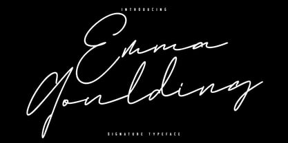 Give your designs an authentic handcrafted feel. Emma Goulding is perfectly suited to signature, stationery, logo, typography quotes, magazine or book cover, website header, clothing, branding, packaging design and more. Includes an Alternate style. Thanks for use this font ~ Maulana
 - Ordionally by Maulana Creative,
$15.00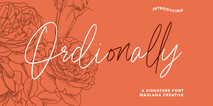 Ordionally Signature Font Give your designs an authentic handcrafted feel. "Ordionally Signature Font" is perfectly suited to signature, stationery, logo, typography quotes, magazine or book cover, website header, clothing, branding, packaging design and more. Thanks for use this font ~ Maulana
 - Estonia Nouveau Pro by TypeSETit,
$39.95 Estonia Nouveau is based on the calligraphic style found in the East European country of Estonia. The traditional lowercase forms are combined with the more non-traditional script uppercase alternates to give a truly up-to-date, yet traditional look.
 - Hola Delight by Jafar07,
$15.00 Hola Delight serif font was a very unique retro style-obsessed in the past, but now we are giving this font a unique touch by providing 100+ alternative characters, which can be combined at your command for your best designs.
 - MC Zhow Badu by Maulana Creative,
$15.00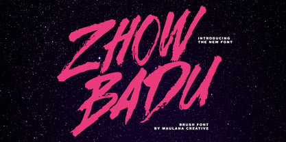 Give your designs an authentic handcrafted feel. “Zhow Badu Handmade Brush Font” is perfectly suited to signature, stationery, logo, typography quotes, magazine or book cover, website header, clothing, branding, packaging design and more. Thanks for use this font, Maulana Creative
 - Fayte by That That Creative,
$15.00 Fayte is a modern blackletter font that gives focus on contemporary display type. This vintage-made new typeface is unmistakably blackletter, However, it is accessible enough to be used across many projects, for branding, Instagram, print posters, magazines, Fashion, whatever.
 - Grunges by Maulana Creative,
$16.00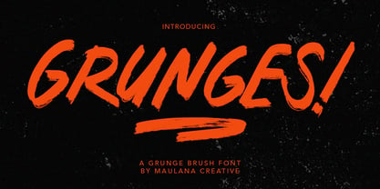 Give your designs an authentic brush handcrafted feel. "Grunges Brush Font" is perfectly suited to signature, stationery, logo, typography quotes, magazine or book cover, website header, flyer, clothing, branding, packaging design and more. Thanks for use this font. Maulana Creative
 - Treadstone by Rook Supply,
$14.00 Treadstone gives a modern twist on the athletic, college style font. This font family includes versions with rounded edges, rough edges and grunge effects, each of which has its own character and charm. Treadstone works great for headlines, titles and logos.
 - Raberly by Aisyah,
$12.00 Introducing "Raberly Handwritten" font, a unique and stylish typeface that blends elegance with a touch of playfulness. Crafted with care and precision, Raberly Handwritten captures the essence of free-flowing ink strokes on paper, giving your projects an artistic flair.
 - Schwitz Signature by Maulana Creative,
$14.00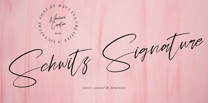 Schwitz Signature Sweet Casual Script Font Give your designs an authentic handcrafted feel. Schwitz Signature Sweet Casual Script Font is perfectly suited to logo, stationery, branding, typography quotes, magazine or book cover, website header, clothing, branding, packaging design, restaurant and more.
 - Shape Bit by ahweproject,
$12.00 This font is inspired by ancient games that still use pixel displays. This font can be used for various designs as needed, especially pixel-themed designs. In addition, the Shape Bit font can also give a retro feel to your designs.
 - Anthroops by Maulana Creative,
$10.00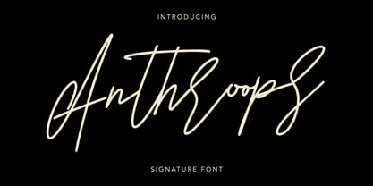 Anthroops Signature Typeface Extra Swash Give your designs an authentic handcrafted feel. "Anthroops" is perfectly suited to signature, stationery, logo, typography quotes, magazine or book cover, website header, clothing, branding, packaging design and more. Thanks for use this font ~ Maulana
 - Seleniak by Crestaco,
$19.00 Seleniak's outlines are based on the logo of the eponymous MSX video game, also created by its designer. Thus, all ratios are multiples of the typical 8x8 px video character unit, giving the typeface a characteristic appearance and interesting fitting properties.
 - Super Monogram by MonogramBros,
$10.00 Super Monogram is a perfect shaped monogram font consisting of 26 letters. With just a single font file you will be able to create beautiful monograms in just a matter of minutes after the purchase! Numbers and special characters not included.
 - Pasture by Ryan Keightley,
$19.00 Pasture is a display serif in a range of weights. Rounded interior and exterior corners, curvaceous details, and rotund terminals give it a warm, handmade quality. Classic style that is, at the same time, right at home in modern spaces.
 - Stencilvania JNL by Jeff Levine,
$29.00Stencilvania JNL is one of the growing number of stencil fonts based on original source material by Jeff Levine. In this case, a "solid letter" stencil from years ago was modified to give it the classic stencil look of broken lines. - Miniver Air Raid Pro by Open Window,
$19.95 Miniver Air Raid Pro is a close relative of Miniver which was inspired by the titling from the classic movie Miniver. This font packs significantly more punch then its cousin. Give your designs a vintage blast with Miniver Air Raid Pro.
 - Deloissta by Maulana Creative,
$15.00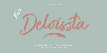 Deloissta Script Font Give your designs an authentic handcrafted feel. "Deloissta Script Font" is perfectly suited to poster, stationery, logo, typography quotes, magazine or book cover, website header, clothing, branding, packaging design and more. Thanks for use this font ~ Maulana
 - Wanderlust Letters by Cultivated Mind,
$29.00 Wanderlust letters is a beautiful hand painted script that comes with a set of extras. All letters have been carefully painted giving your words a wonderful flow. Wanderlust can be used for fashion, apparel, stationery, magazines, film, books and marketing.
 - Wire Mesh JNL by Jeff Levine,
$29.00Wire Mesh JNL is an outline variation of the same design that produced Shady Characters JNL (lettering printed over a simulated halftone). This time around, the end effect gives the impression of looking at lettering cut out of a mesh screen. - Hasta by Maulana Creative,
$14.00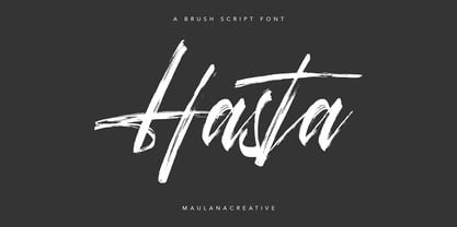 Hasta Brush Script Font Give your designs an authentic handcrafted feel. "Hasta Brush" is perfectly suited to signature, stationery, logo, typography quotes, magazine or book cover, website header, clothing, branding, packaging design and more. Thanks for use this font ~ Maulana
 - Carina Pro by RMU,
$35.00 Like Phenix out of the ashes the former Schriftguss hot-metal font „Rautendelein“ has come to live again. Carina Pro was carefully extended for multilingual use, and contains a few alternates which can be activated via the swash OpenType feature.
 - Unstable by A New Machine,
$25.00 This almost-all-caps display font features a variable baseline to give it an unstable look. Also, the upper and lower cases differ slightly and can be used to add some alternates in words with letters next to each other.
 - TXT Scribbletti by Illustration Ink,
$3.00Add character to your paper crafts. Download this unique "Scribbletti" font to create lettering with a scratchy, handwritten look. Design titles, captions, and journaling for scrapbook pages and greeting cards, or simply give your publication an off-beat, handwritten appeal. - Propeller by Gleb Guralnyk,
$15.00 Introducing a script font named "Propeller". This font has a trendy look inspired by vintage aircraft ads. It has connected letters with smooth shape and round endings. Intersecting lines are made with a small overlay that gives a tiny volume effect.
 - Viesta by Maulana Creative,
$15.00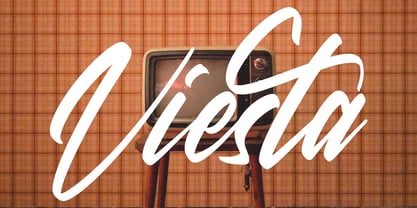 Give your designs an authentic handcrafted feel. Viesta is a brush script that is perfectly suited for signatures, stationery, logo, typography quotes, magazine or book covers, website headers, clothing, branding, packaging design and more. This font includes: - Ligatures - Multi-lingual Support


