10,000 search results
(0.039 seconds)
- JHRoy by JH Fonts,
$70.00 JH Roy is an Arabic handwriting Naskh typeface, including two weights; it is typical for long running text, headlines, branding & signage... The diacritic positioning is fine tuned per the publishers requirements.
 - Print Illustrations JNL by Jeff Levine,
$29.00 Print Illustrations JNL gathers a number of charming and functional designs redrawn from vintage sources. There are attention getters, spot illustrations, catch words and decorative embellishments all in one digital file.
 - Findastone by ahweproject,
$14.00 Findastone is a delicate and fine script font. It can be applied to a variety of design ideas, from invitations, to cards and pretty much anything that requires a lovely touch.
 - Supertanker by Bogstav,
$11.00 Here's my tall and thin sans handmade font! It's lively, rough and quite organic looking - and to boost the natural organic look, I have added 6 different versions of each letter!
 - Shining Night by Gleb Guralnyk,
$15.00 Hi! Introducing a vintage style font Shining Night. This font has additional font file with round dots over the base glyphs, that immitates a lamp lights of a real cabaret signboard.
 - Arturia by Maulana Creative,
$16.00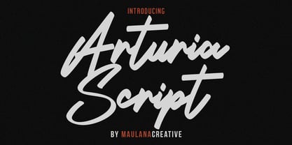 Give your designs an authentic handcrafted feel. Arturia Font is perfectly suited to signature, stationery, logo, typography quotes, magazine or book cover, website header, clothing, branding, packaging design and more. MaulanaCreative
 - MC Costino Macko by Maulana Creative,
$15.00 Costino Macko a display font, fun character with a bit of ligatures. To give you an extra creative work. Costino Macko font support multilingual more than 100+ language. Cheers, Maulana Creative
 - Fibula by Hurufatfont,
$19.00 "Fibula" has a surprising and lively effect? The design is based on the form of a safety-pin. Fibula display font offers designers creative alternatives to create brands, packaging and titles.
 - Trolltunga by High Peak,
$25.00 A unique slab serif with strong shapes give it an unmistakable character and charm. Every letter has been designed with passion and the family comes with lots of opentype features. Enjoy!
 - Sylfane by Maulana Creative,
$14.00 Sylfane graffiti display font, fun character with a bit of ligatures. To give you an extra creative work. Sylfane graffiti display font support multilingual more than 100+ language. Uppercase. Maulana Creative
 - Arbor Brush by GroupType,
$29.00 Arbor Brush is a fresh and lively brush script from the FontHaus design studio. The design is organic, strong, painterly, and anything but tentative. Great for advertising, menus, signage, or display.
 - Gastronomes by Maulana Creative,
$12.00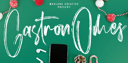 Give your designs an authentic brush handcrafted feel. "Gastronomes" is perfectly suited to signature, stationery, logo, typography quotes, magazine or book cover, website header, flyer, clothing, branding, packaging design and more.
 - Penmanship Print - Unknown license

- Syndra by Typodermic,
$11.95 Introducing Syndra, a typeface that’s as timeless as it is modern. With its unique Y2K style, this typeface boasts letterforms that seem to have come straight from a machine. You can almost feel the hum of technology when you look at it. But don’t let its cold, emotionless shapes fool you. Syndra’s tireless character set works hard to make your message sound authoritative and technical. With OpenType fractions, numeric ordinals, and plenty of currency symbols included, you’ll have everything you need to create a professional and polished look. It’s the perfect font for anything related to plastics, medications, technology, and renewable energy. And with seven weights to choose from—Thin, Extra-Light, Light, Regular, Semi-Bold, Bold, and Extra-Bold—you’ll have the flexibility to create the look and feel you want. So if you’re looking for a typeface that’s both unusual and tech-savvy, look no further than Syndra. It’s a font that’s sure to turn heads and make your message stand out in all the right ways. Most Latin-based European, Vietnamese, Greek, and most Cyrillic-based writing systems are supported, including the following languages. Afaan Oromo, Afar, Afrikaans, Albanian, Alsatian, Aromanian, Aymara, Azerbaijani, Bashkir, Bashkir (Latin), Basque, Belarusian, Belarusian (Latin), Bemba, Bikol, Bosnian, Breton, Bulgarian, Buryat, Cape Verdean, Creole, Catalan, Cebuano, Chamorro, Chavacano, Chichewa, Crimean Tatar (Latin), Croatian, Czech, Danish, Dawan, Dholuo, Dungan, Dutch, English, Estonian, Faroese, Fijian, Filipino, Finnish, French, Frisian, Friulian, Gagauz (Latin), Galician, Ganda, Genoese, German, Gikuyu, Greenlandic, Guadeloupean Creole, Haitian Creole, Hawaiian, Hiligaynon, Hungarian, Icelandic, Igbo, Ilocano, Indonesian, Irish, Italian, Jamaican, Kaingang, Khalkha, Kalmyk, Kanuri, Kaqchikel, Karakalpak (Latin), Kashubian, Kazakh, Kikongo, Kinyarwanda, Kirundi, Komi-Permyak, Kurdish, Kurdish (Latin), Kyrgyz, Latvian, Lithuanian, Lombard, Low Saxon, Luxembourgish, Maasai, Macedonian, Makhuwa, Malay, Maltese, Māori, Moldovan, Montenegrin, Nahuatl, Ndebele, Neapolitan, Norwegian, Novial, Occitan, Ossetian, Ossetian (Latin), Papiamento, Piedmontese, Polish, Portuguese, Quechua, Rarotongan, Romanian, Romansh, Russian, Rusyn, Sami, Sango, Saramaccan, Sardinian, Scottish Gaelic, Serbian, Serbian (Latin), Shona, Sicilian, Silesian, Slovak, Slovenian, Somali, Sorbian, Sotho, Spanish, Swahili, Swazi, Swedish, Tagalog, Tahitian, Tajik, Tatar, Tetum, Tongan, Tshiluba, Tsonga, Tswana, Tumbuka, Turkish, Turkmen (Latin), Tuvaluan, Ukrainian, Uzbek, Uzbek (Latin), Venda, Venetian, Vepsian, Vietnamese, Võro, Walloon, Waray-Waray, Wayuu, Welsh, Wolof, Xavante, Xhosa, Yapese, Zapotec, Zarma, Zazaki, Zulu and Zuni.
 - Generis Slab by Linotype,
$29.00The idea for the Generis type system came to Erik Faulhaber while he was traveling in the USA. Seeing typefaces mixed together in a business district motivated him to create a new type system with interrelated forms. The first design scheme came about in 1997, following the space saving model of these American Gothics. Faulhaber then examined the demands of legibility and various communications media before finally developing the plan behind this type system. Generis’s design includes two individually designed styles; each of with is available with and without serifs, giving the type system four separate families. Each includes at least four basic weights: Light, Regular, Medium, and Bold. Further weights, small caps, old style figures, and true italics were added to each family where needed. The Generis type system is designed to meet both optical criteria and the highest possible measure of technical precision. Harmony, rhythm, legibility, and formal restraint make up the foreground. Generis combines aesthetic, technical, and economic advantages, which purposefully and efficiently cover the whole range of corporate communication needs. The unified basic form and the individual peculiarity of the styles lead to Generis’ systematic, total-package concept. The clear formal language of the Generis type system resides beneath the information, bringing appropriate typographic expression to high-level corporate identity systems, both in print and on screen. The condensed and aspiring nature of the letterforms allows for the efficient setting of body copy, and the economic use of the page. A range of accented characters allows text to be set in 48 Latin-based languages, offering maximal typographic free range. This previously unknown level of technical and design execution helps create higher quality typography in all areas of corporate communication. Optimal combinations within the type system: Generis Serif or Generis Slab with Generis Sans or Generis Simple. - Expline Variable by Formatype Foundry,
$140.00 Expline typeface finds its roots in modernist design but subtly pays homage to early Modern Industrial Grotesks. This fusion creates a font that encapsulates the essence of tradition while embracing the contemporary. The font incorporates sharp details in select characters and curves, imparting a delicate sweetness while preserving the robust character associated with Grotesk fonts. This unique blend allows Expline to strike a perfect balance between display and text usage, making it a versatile choice for a variety of design projects. Expline's flexibility shines through its extensive weight options. The font family offers eight distinct weights, each thoughtfully crafted to establish a clear typographic hierarchy. Designers can easily choose the right weight to suit the specific needs of their projects, whether it's a bold headline or a refined body text. This variety ensures that your typography will always make the right visual impact. Expline typeface doesn't stop at weights. It provides expansive character sets across each weight, encompassing all Western European diacritics, Punctuation, Mathematics, and Numerics. This ensures that your typography will seamlessly support various languages and punctuation marks, making it a global choice. In addition, the font boasts OpenType features, granting the flexibility to explore multiple subsets. This includes alternate capital letterforms, tabular and lining numerals (both proportional and old-style), enabling endless typographic possibilities. Whether you're designing for print or web, these features allow you to fine-tune your typography for a perfect fit. Expline is a font that bridges the gap between modernist design principles and early industrial influences, resulting in a Neo-Grotesk font with a contemporary twist. Its comprehensive weight options, expansive character sets, and OpenType features make it a versatile choice for any medium between print and screen.
 - Expline by Formatype Foundry,
$39.00 Expline typeface finds its roots in modernist design but subtly pays homage to early Modern Industrial Grotesks. This fusion creates a font that encapsulates the essence of tradition while embracing the contemporary. The font incorporates sharp details in select characters and curves, imparting a delicate sweetness while preserving the robust character associated with grotesk fonts. This unique blend allows Expline to strike a perfect balance between display and text usage, making it a versatile choice for a variety of design projects. Expline's flexibility shines through its extensive weight options. The font family offers eight distinct weights, each thoughtfully crafted to establish a clear typographic hierarchy. Designers can easily choose the right weight to suit the specific needs of their projects, whether it's a bold headline or a refined body text. This variety ensures that your typography will always make the right visual impact. Expline typeface doesn't stop at weights. It provides expansive character sets across each weight, encompassing all Western European diacritics, Punctuation, Mathematics, and Numerics. This ensures that your typography will seamlessly support various languages and punctuation marks, making it a global choice. In addition, the font boasts OpenType features, granting the flexibility to explore multiple subsets. This includes alternate capital letterforms, tabular and lining numerals (both proportional and old-style), enabling endless typographic possibilities. Whether you're designing for print or web, these features allow you to fine-tune your typography for a perfect fit. Expline is a font that bridges the gap between modernist design principles and early industrial influences, resulting in a Neo-Grotesk font with a contemporary twist. Its comprehensive weight options, expansive character sets, and OpenType features make it a versatile choice for any medium between print and screen.
 - Generis Serif by Linotype,
$29.00The idea for the Generis type system came to Erik Faulhaber while he was traveling in the USA. Seeing typefaces mixed together in a business district motivated him to create a new type system with interrelated forms. The first design scheme came about in 1997, following the space saving model of these American Gothics. Faulhaber then examined the demands of legibility and various communications media before finally developing the plan behind this type system. Generis’s design includes two individually designed styles; each of with is available with and without serifs, giving the type system four separate families. Each includes at least four basic weights: Light, Regular, Medium, and Bold. Further weights, small caps, old style figures, and true italics were added to each family where needed. The Generis type system is designed to meet both optical criteria and the highest possible measure of technical precision. Harmony, rhythm, legibility, and formal restraint make up the foreground. Generis combines aesthetic, technical, and economic advantages, which purposefully and efficiently cover the whole range of corporate communication needs. The unified basic form and the individual peculiarity of the styles lead to Generis’ systematic, total-package concept. The clear formal language of the Generis type system resides beneath the information, bringing appropriate typographic expression to high-level corporate identity systems, both in print and on screen. The condensed and aspiring nature of the letterforms allows for the efficient setting of body copy, and the economic use of the page. A range of accented characters allows text to be set in 48 Latin-based languages, offering maximal typographic free range. This previously unknown level of technical and design execution helps create higher quality typography in all areas of corporate communication. Optimal combinations within the type system: Generis Serif or Generis Slab with Generis Sans or Generis Simple. - Generis Simple by Linotype,
$39.00The idea for the Generis type system came to Erik Faulhaber while he was traveling in the USA. Seeing typefaces mixed together in a business district motivated him to create a new type system with interrelated forms. The first design scheme came about in 1997, following the space saving model of these American Gothics. Faulhaber then examined the demands of legibility and various communications media before finally developing the plan behind this type system. Generis’s design includes two individually designed styles; each of with is available with and without serifs, giving the type system four separate families. Each includes at least four basic weights: Light, Regular, Medium, and Bold. Further weights, small caps, old style figures, and true italics were added to each family where needed. The Generis type system is designed to meet both optical criteria and the highest possible measure of technical precision. Harmony, rhythm, legibility, and formal restraint make up the foreground. Generis combines aesthetic, technical, and economic advantages, which purposefully and efficiently cover the whole range of corporate communication needs. The unified basic form and the individual peculiarity of the styles lead to Generis’ systematic, total-package concept. The clear formal language of the Generis type system resides beneath the information, bringing appropriate typographic expression to high-level corporate identity systems, both in print and on screen. The condensed and aspiring nature of the letterforms allows for the efficient setting of body copy, and the economic use of the page. A range of accented characters allows text to be set in 48 Latin-based languages, offering maximal typographic free range. This previously unknown level of technical and design execution helps create higher quality typography in all areas of corporate communication. Optimal combinations within the type system: Generis Serif or Generis Slab with Generis Sans or Generis Simple. - Generis Sans by Linotype,
$29.00The idea for the Generis type system came to Erik Faulhaber while he was traveling in the USA. Seeing typefaces mixed together in a business district motivated him to create a new type system with interrelated forms. The first design scheme came about in 1997, following the space saving model of these American Gothics. Faulhaber then examined the demands of legibility and various communications media before finally developing the plan behind this type system. Generis’s design includes two individually designed styles; each of with is available with and without serifs, giving the type system four separate families. Each includes at least four basic weights: Light, Regular, Medium, and Bold. Further weights, small caps, old style figures, and true italics were added to each family where needed. The Generis type system is designed to meet both optical criteria and the highest possible measure of technical precision. Harmony, rhythm, legibility, and formal restraint make up the foreground. Generis combines aesthetic, technical, and economic advantages, which purposefully and efficiently cover the whole range of corporate communication needs. The unified basic form and the individual peculiarity of the styles lead to Generis’ systematic, total-package concept. The clear formal language of the Generis type system resides beneath the information, bringing appropriate typographic expression to high-level corporate identity systems, both in print and on screen. The condensed and aspiring nature of the letterforms allows for the efficient setting of body copy, and the economic use of the page. A range of accented characters allows text to be set in 48 Latin-based languages, offering maximal typographic free range. This previously unknown level of technical and design execution helps create higher quality typography in all areas of corporate communication. Optimal combinations within the type system: Generis Serif or Generis Slab with Generis Sans or Generis Simple. - Cabrito Sans by insigne,
$24.99 It's time to kick off your shoes and feel the "sans" between your toes. Like Cabrito Inverto , its stress-reversing cousin, the new Cabrito Sans serves up something nice and cool in the heat of the project. A quick recap: the original Cabrito is an insigne Design slab serif produced for the kid's book The Clothes Letters Wear. It's been pretty well-received--even more than I expected. I promised to grow the family with a free-standing inverted style that could pair well with Cabrito. (See Cabrito Inverto.) Now, I'm rounding out the family with this well-crafted sans. And so now, Sans is where it's at. Strip away the serifs of Cabrito, and you have a laid back, rounded sans serif alternative served up over easy. This handwriting-inspired creation--like its relatives--is definitely not uptight about its forms (though not afraid to show them off a little). Cabrito Sans' whole pack of alternates is accessible in any OpenType-enabled program. This kiddo consists of a workforce of alternates, swashes, and alternate titling caps to give the font a little extra sweetener to its flavor. Also bundled are swash alternates, old style figures, and compact caps. Check out the interactive PDF brochure to test out each these options. This font family members also consists of the glyphs for 72 various languages. Cabrito Inverto and Cabrito do pair nicely with Cabrito Sans (in case you doubted). Use Sans--or all three of these amigos--to express friendliness on just about anything: food, candy, toys, cars (if you're feeling bold). Don't wait, though. Purchase Cabrito Sans today, and bring a one-of-a-kind look to whatever your computer's next design party is.
 - Drum Komputer - 100% free

- Kyboshed - 100% free

- Mottek - Personal use only

- Last Ninja - Unknown license

- Duralith - Unknown license

- Iron Lung - Personal use only

- Drive-Thru - 100% free

- Special K - 100% free

- Veto Sans by Monotype,
$50.99 Veto® Sans is both highly legible and handsomely distinctive – a rare blend in a typeface. It’s a design that stands out and fits in. Veto Sans is equally competent on screen and in print. It’s four carefully determined weights in both normal and condensed proportions, each with an italic complement, give the family an exceptionally deep range of applications. All the designs in the family are valuable design tools. None are superfluous. Advertising, brand, corporate, editorial and interactive design are all in Veto Sans’ wheelhouse. It also shines in wayfinding and other signage projects. And to all these, it brings a warmth and personality. An ample x-height, open counters, vertical stroke endings and subtly condensed capital letters enable Veto Sans fonts to perform with grace in print and digital environments while being space efficient. An added benefit is that all-capital typography set in Veto Sans is not only space saving, it’s also easy to read. Drawn as a complete reimaging of his earlier Veto design, Swiss designer Marco Ganz worked to create character shapes distilled to their purest forms while maintaining a relaxed and natural demeanor. Ganz, who is also a three-dimensional artist, is acutely aware that the negative space between letters and the internal space within letters is as important as the positive shape of the letters themselves. This dynamic balance between the negative and positive aspects of character forms gives Veto Sans a sense of immediacy without looking hurried. Ganz also took great care to draw a suite of italic designs that not only complement the roman weights perfectly, but also give the family a dynamic verve. A large international character set also ensures ease of localization. “Veto Sans,” says Ganz, “is a typeface for designers that search for a new and different solution to age-old typographic challenges.”
 - Miss Donna by Scholtz Fonts,
$15.00 Miss Donna - contemporary, powerful, versatile and casual. Curvy, sassy, fast-talking, and utterly useable, she takes you into the world of movie posters, decor ads, fashion posters and tags, greeting cards and invitations. Her lines are bold, clean and legible. The Miss Donna family comes in four styles: - REGULAR - clean good lines and generous curves - for decor ads, greeting cards, copy - NARROW - slim (more compact), and elegant with contained curves - for greeting cards, invitations, copy - BLACK - bold statement, round, generous curves - for movie posters, fashion posters - BLACK CAPS - especially designed for "all-caps" printed text. Use for headings & subheads. Miss Donna Black Caps contains capitals in two sizes and this gives you the ability to generate text of two types: - a correctly spaced and kerned upper case, OR - a TRUE Small Caps -- as opposed to the false Small Caps produced by a well-known word processing application. In a correctly proportioned Small Caps the stroke width should not be reduced in the same proportion as the letter height is reduced. The stroke width of the small capitals should rather be equal or close to the stroke width of the corresponding upper case characters. Note: When using script fonts it is NOT usually advisable to use text in ALL caps. The best effects for headings and subheads are obtained with an initial upper case letter followed by lower case characters. BUT, Miss Donna will still produce excellent results with all caps if you are using an application that supports kerning. If you are using upper and lower case then it is not necessary to use kerning, although it may make a slight difference on occasion. Miss Donna contains over 235 characters - (upper and lower case characters, punctuation, numerals, symbols and accented characters are present). It has all the accented characters used in the major European languages.
 - Midnight Diner by Roland Hüse Design,
$30.00 Did your client just say ‘can you make it pop’? Then you already know you got it on lock. Introducing: Midnight Diner! A multi-layered dimensional script font family featuring thin, bold, outline and shadow capabilities, with a left-leaning slant to boot. You can experiment with various layer combinations and colour! How fun is that? Being effortlessly casual, retro and elegant all in one, you can play it up or down to your liking – perfect for display graphics, logos, signages, packaging, lifestyle imagery, invitations and more. It features a diverse range of stylistic alternates, contextual alternates, and standard ligatures, ensuring that you’ve countless options to choose from for your design work. This font family is delicately crafted and well thought out with every little detail in mind, to ensure its ease and versatility when used! Midnight Diner is a collaboration between lettering artist and calligrapher, Leah Chong (www.leahdesign.sg) and typeface designer, Roland Huse (www.rolandhuse.com). Product Content: Midnight Diner Layered Font - Thin (TTF) Midnight Diner Layered Font - Bold (TTF) Midnight Diner Layered Font - Outline (TTF) Midnight Diner Layered Font - Shadow (TTF) Font Guide PDF https://drive.google.com/file/d/1KPSf-gGrhX3wyaImEAmlJICERNbxu2IN/view?usp=sharing Font Guide Youtube Video https://youtu.be/GtZ8E7Y7wnQ 6 Bonus SVGs (TTF): Midnight Diner SVG - Red Yellow Midnight Diner SVG - Black Pink Midnight Diner SVG - Blue Green Midnight Diner SVG - Orange Yellow Midnight Diner SVG - Purple Pink Midnight Diner SVG - Black White Font Features: Latin character set: Uppercase & Lowercase A - Z Stylistic Alternates Contextual Alternates Standard Ligatures Numerals, Currency Symbols & Punctuation Accented Characters To access all features of Midnight Diner such as stylistic alternates etc., it's highly recommended to use professional design software such as Adobe Illustrator, Adobe Photoshop, Adobe InDesign or Procreate (via the ‘add text' feature).
 - Lerku by Typodermic,
$11.95 Looking for a typeface that embodies both grit and grandeur? Look no further than Lerku. This crispy font takes its inspiration from the timeless classic Bold Antique by Morris Fuller Benton, but it adds a grungy edge that’s perfect for today’s contemporary designs. With letter pair ligatures that help break up the monotony of repeating characters, Lerku is perfect for OpenType-savvy applications that demand a bit of variation. Whether you’re designing a website, a logo, or a marketing campaign, Lerku will give your message a bold, authoritative voice that’s sure to make an impact. So if you want to add a touch of vintage charm to your design, while still keeping it fresh and modern, Lerku is the perfect choice. Most Latin-based European writing systems are supported, including the following languages. Afaan Oromo, Afar, Afrikaans, Albanian, Alsatian, Aromanian, Aymara, Bashkir (Latin), Basque, Belarusian (Latin), Bemba, Bikol, Bosnian, Breton, Cape Verdean, Creole, Catalan, Cebuano, Chamorro, Chavacano, Chichewa, Crimean Tatar (Latin), Croatian, Czech, Danish, Dawan, Dholuo, Dutch, English, Estonian, Faroese, Fijian, Filipino, Finnish, French, Frisian, Friulian, Gagauz (Latin), Galician, Ganda, Genoese, German, Greenlandic, Guadeloupean Creole, Haitian Creole, Hawaiian, Hiligaynon, Hungarian, Icelandic, Ilocano, Indonesian, Irish, Italian, Jamaican, Kaqchikel, Karakalpak (Latin), Kashubian, Kikongo, Kinyarwanda, Kirundi, Kurdish (Latin), Latvian, Lithuanian, Lombard, Low Saxon, Luxembourgish, Maasai, Makhuwa, Malay, Maltese, Māori, Moldovan, Montenegrin, Ndebele, Neapolitan, Norwegian, Novial, Occitan, Ossetian (Latin), Papiamento, Piedmontese, Polish, Portuguese, Quechua, Rarotongan, Romanian, Romansh, Sami, Sango, Saramaccan, Sardinian, Scottish Gaelic, Serbian (Latin), Shona, Sicilian, Silesian, Slovak, Slovenian, Somali, Sorbian, Sotho, Spanish, Swahili, Swazi, Swedish, Tagalog, Tahitian, Tetum, Tongan, Tshiluba, Tsonga, Tswana, Tumbuka, Turkish, Turkmen (Latin), Tuvaluan, Uzbek (Latin), Venetian, Vepsian, Võro, Walloon, Waray-Waray, Wayuu, Welsh, Wolof, Xhosa, Yapese, Zapotec Zulu and Zuni.
 - Aure Declare by Aure Font Design,
$23.00 Aure Declare officiates with dignity and dispassion. These traditional serif forms engage the reader with a no-nonsense subtext of reliability. Declare’s capacity to showcase the message rather than the medium brings a welcome legibility to extended text and a formal assertion to astrological expressions and chartwheels. Declare is an original design developed by Aurora Isaac. After more than a decade in development, 2018 marks the first release of the CJ and KB glyphsets in regular, italic, bold, and bold-italic. The CJ glyphset is a full text font supporting a variety of European languages. A matching set of small-caps complements the extended lowercase and uppercase glyphsets. Supporting glyphs include standard ligatures, four variations of the ampersand, and check-mark and happy-face with their companions x-mark and grumpy-face. Numbers are available in lining, oldstyle, and small versions, with numerators and denominators for forming fractions. Companion glyphs include Roman numerals, specialized glyphs for indicating ordinals, and a variety of mathematical symbols and operators. The CJ glyphset also includes an extended set of glyphs for typesetting Western Astrology. These glyphs are also available separately in the KB glyphset: a symbol font re-coded to allow easy keyboard access for the most commonly used glyphs. In addition to Aure Declare’s versatility as a text font, Declare pairs well as a no-nonsense foil to any decorative design. Aure Sable, for example, will shine all the more beside Declare’s practicality. Aure Declare pairs especially well with its close cousin, Aure Wye. Wye’s decorative forms provide elegant titles and drop-caps for Declare’s extended text. Give Aure Declare a trial run! You may discover a permanent place for this font family in your typographic palette. AureFontDesign.com
 - Enamel Brush by Typodermic,
$11.95 Introducing Enamel Brush—the perfect typeface for adding a touch of vintage charm to your design projects. With its bold and expressive brush strokes, Enamel Brush takes inspiration from Emil Klumpp’s Catalina typeface from 1955, a classic typeface that embodies the spirit of post-war optimism and creativity. Enamel Brush has been designed with the modern designer in mind. Thanks to its OpenType features, certain letter pairings are automatically replaced with ligatures, ensuring that your text has a more natural and authentic feel. Whether you’re creating a logo, poster, or website, Enamel Brush is the ideal choice for adding personality and style to your messages. Its bold, confident strokes are perfect for grabbing attention and making a statement. So why not give your next project a touch of vintage flair with Enamel Brush? Get your copy today and start creating something truly special. Most Latin-based European writing systems are supported, including the following languages. Afaan Oromo, Afar, Afrikaans, Albanian, Alsatian, Aromanian, Aymara, Bashkir (Latin), Basque, Belarusian (Latin), Bemba, Bikol, Bosnian, Breton, Cape Verdean, Creole, Catalan, Cebuano, Chamorro, Chavacano, Chichewa, Crimean Tatar (Latin), Croatian, Czech, Danish, Dawan, Dholuo, Dutch, English, Estonian, Faroese, Fijian, Filipino, Finnish, French, Frisian, Friulian, Gagauz (Latin), Galician, Ganda, Genoese, German, Greenlandic, Guadeloupean Creole, Haitian Creole, Hawaiian, Hiligaynon, Hungarian, Icelandic, Ilocano, Indonesian, Irish, Italian, Jamaican, Kaqchikel, Karakalpak (Latin), Kashubian, Kikongo, Kinyarwanda, Kirundi, Kurdish (Latin), Latvian, Lithuanian, Lombard, Low Saxon, Luxembourgish, Maasai, Makhuwa, Malay, Maltese, Māori, Moldovan, Montenegrin, Ndebele, Neapolitan, Norwegian, Novial, Occitan, Ossetian (Latin), Papiamento, Piedmontese, Polish, Portuguese, Quechua, Rarotongan, Romanian, Romansh, Sami, Sango, Saramaccan, Sardinian, Scottish Gaelic, Serbian (Latin), Shona, Sicilian, Silesian, Slovak, Slovenian, Somali, Sorbian, Sotho, Spanish, Swahili, Swazi, Swedish, Tagalog, Tahitian, Tetum, Tongan, Tshiluba, Tsonga, Tswana, Tumbuka, Turkish, Turkmen (Latin), Tuvaluan, Uzbek (Latin), Venetian, Vepsian, Võro, Walloon, Waray-Waray, Wayuu, Welsh, Wolof, Xhosa, Yapese, Zapotec Zulu and Zuni.
 - PF Nuyork Arabic by Parachute,
$79.00 Nuyork Arabic was designed to emphasize on the individual Arabic letter visual traditional characteristics. Including 5 weights, it was designed with both text and display applications in mind. This font is intended to produce virtually cursive texts without eliminating the clarity or look-and-feel of the individual Arabic letters. Offering glyphs for the full Extended Arabic Unicode Standards 6.1, including the latest Arabic Supplement and Extended-A Unicode blocks, Nuyork Arabic incorporates comprehensive support for Quranic texts and other Arabetic scripts, including African sub-Saharan scripts. Careful design considerations were given to make sure that composed Arabetic text is visually prominent and stands well next to Latin. To insure legibility in all sizes, vertical strokes are emphasized when possible, while utilizing multiple x-heights to give a traditional Arabic feel. The design of this font follows the general guidelines of the Mutamathil type style developed by the designer, a decade ago, to enrich and diversify user typographic options, and to address the Arabetic scripts challenges of literacy, education, economics, and technology. Based on this style, it uses one glyph for every basic Arabic Unicode character or letter, as defined by the latest Unicode Standards, and one additional final form glyph, for each freely-connecting letter in the traditional Arabic cursive text. Nuyork Arabic includes the required Lam-Alif ligatures in addition to all vowel diacritic ligatures. Soft-vowel diacritic marks (harakat) are selectively positioned, with most of them appearing on similar high and low levels to clearly distinguish them from the letters. Tatweel, or Kashidah, is a zero-width glyph. Arabetics Latte includes both Arabic and Arabic-Indic numerals. Available in Open Type format, the Nuyork Arabic font family includes regular, light, bold, extra bold, and black.
 - El Fonte Angelia by Gilar Studio,
$16.00 Hello Everyone.. Introducing a new Font " El Fonte Angelia " Beautiful Serif Type Family is inspired by the serif typefaces used in editorial media in the 70s and 80s.such as the soft and gentle shapes found in Cooper or the fluid, angled strokes in Windsor— mixed into one single design that features familiar, fresh, modern flavors. Designed to reflect nature, it creates a sense of natural softness and expressiveness. We pushed the concept into a usability focused direction, to work as a bold tool and beautiful communicator. El Fonte Angelia variable allows fluid design across 5 weights The font broadens its use by supplying weights all the way from Light to Bold. The natural curves, swells and sloping trunks, grow in character as the font gains weight. Whilst the thinner weights have lowered contrast and optical corrections to create a warm and gentle appearance. El Fonte Angelia character set incorporates additional symbols, stylistic alternates, unique ligatures and case sensitive punctuation - producing a stable workhorse family ready to tackle projects of any size.The type family melds organic curves and gentle repetition into powerful and harmonious type. At large point sizes you can appreciate the letter shapes, whilst the same restraint and focus creates an even texture for small point sizes and long reading. Its variety of weights provide a range of choices that will help you find the best typographic color for your project. Lighter weights are well-suited for body text while heavier ones are ideal for high impact headlines. The available stylistic alternates offer a number of different characters that give your logo or business card a unique look. Check my other Font here : https://gilarstudio.com/ Thank you Regards, Gilar Studio
 - Aure Teddy by Aure Font Design,
$23.00 Aure Teddy emanates the trusting tenderness of a favorite teddy bear. The hand-penned look of these forms engages the reader with a subtext of comfort. Teddy is delightfully legible as a text font and works well where a more organic look is wanted. It brings an unassuming charm to text and titles and a welcome empathy to astrological expressions and chartwheels. Its engaging charcter serves well in labeling diagrams and personalizing nametags. Teddy is an original design developed by Aurora Isaac. After more than a decade in development, 2018 marks the first release of the CJ and KB glyphsets in regular, italic, bold, and bold-italic. The CJ glyphset is a full text font supporting a variety of European languages. A matching set of small-caps complements the extended lowercase and uppercase glyphsets. Supporting glyphs include standard ligatures, four variations of the ampersand, and check-mark and happy-face with their companions x-mark and grumpy-face. Numbers are available in lining, oldstyle, and small versions, with numerators and denominators for forming fractions. Companion glyphs include Roman numerals, specialized glyphs for indicating ordinals, and a variety of mathematical symbols and operators. The CJ glyphset also includes an extended set of glyphs for typesetting Western Astrology. These glyphs are also available separately in the KB glyphset: a symbol font re-coded to allow easy keyboard access for the most commonly used glyphs. Aure Teddy fills a unique niche, being a modestly decorative font as well as a competant text font. Like Aure Jane, Aure Teddy serves well paired with the decorative touches of Aure Brash and Aure Sable. Give Aure Teddy a trial run! You may discover a permanent place for this font family in your typographic palette. AureFontDesign.com
 - Apex Pro by Artyway,
$18.00 Unleash the Power of Motion and Speed with the ApexPro font – a dynamic, sporty font designed for those who crave action, speed, and innovation. This typeface is meticulously crafted to embody the essence of the automotive world, fitness, and cutting-edge technology. Key Features: Style: The ApexPro boasts a rounded and soft appearance with bold, italic, and slashed elements, giving it a sporty and energetic vibe. The letters are carefully crafted, providing a clean and sharp visual for maximum impact. Design Elements: Inspired by the sleek lines of high-speed vehicles, the font carries a rounded, beveled, and cutout aesthetic, adding a touch of modernity and innovation. The use of military and stencil elements infuses a sense of power and dynamism. Versatility: The ApexPro is not just a font; it's a statement. Perfect for automotive enthusiasts, gym-goers, and tech aficionados, it seamlessly blends into various contexts such as sports events, gaming interfaces, and futuristic designs. Target Audience: The ApexPro is tailored for individuals who appreciate the fusion of technology, speed, and style. The target audience includes: Age: 18-35, seeking dynamic and trendy design elements. Gender: Unisex, appealing to both males and females. Needs: Graphic designers, gamers, fitness brands, and automotive enthusiasts looking for a font that embodies speed and action. Why the ApexPro font? For Speed Enthusiasts: The ApexPro brings the thrill of high-speed action to your designs. For Fitness Brands: Reflect the energy and dynamism of your fitness brand with the ApexPro. For Gaming Interfaces: Elevate your gaming experience with a font that resonates with movement and power. File Inclusions: Languages Covered: Multilingual support for a global audience. Numbers, Symbols, and Punctuation: A comprehensive set for versatile use. Lowercase Letters: Lowercase letters for a balanced and cohesive look. Fuel your creativity with the ApexPro – the font that doesn't just communicate, but accelerates your message. Download now for an experience that goes beyond the ordinary.
 - Rahere Informal by ULGA Type,
$18.99 Rahere Informal is a slab semi-serif typeface that has a seriously charming personality and a little spring in its step. Serifs bend and flick, giving the characters a spirited, almost calligraphic feel. It's lively and friendly without being whimsical, great for messages that need a casual but credible tone with a bit of zing in the mix. Rahere Informal is suitable for a wide range of applications such as information signage, packaging, advertising, brochures, catalogues, screen text, visual identities and opera festivals. Want an annual report that pleases the board, shareholders and investors? Set it in Rahere Informal - that’ll put a smile on everyone’s face. The family comes in six weights from light to extra bold with corresponding italics. The lighter weights are more delicate, an evenly-spaced flamboyance of flamingos basking in the sun. As the weights get heavier, characters transform into a tight-knit group of line dancing rhinos. All styles contain a set of swash caps, a few ligatures and alternatives. Nice. The character set covers most European languages plus Vietnamese. Each weight contains lining & non-aligning numerals in both proportional & tabular spacing. The tabular numerals share the same width across all weights and styles (matching Rahere Sans and Rahere Slab). If a companion sans serif is needed, Rahere Sans is the ideal partner. They are both part of the extended Rahere typeface family and have been designed to complement each other. Seriously charming, charmingly serious. Seriously, what more do you want from a typeface? Rahere, founder of St Barts in London The typeface is named after Rahere, a 12th-century Anglo-Norman priest, who founded the Priory of the Hospital of St Bartholomew, London in 1123. In 2007 I was successfully treated at Barts for relapsed testicular cancer so I’m indebted to all the doctors, nurses and support staff who work there. A special shout out to Orchid Cancer – a UK charity that helps men affected by cancer – who funded the research for my treatment.


