10,000 search results
(0.044 seconds)
- As of my last update, there isn't a specific font publicly known as "Tekken 6 2." However, I can provide information that interprets this request in a way that might be helpful. "Tekken 6" refers to ...
- Trick Or Treating by Graphicxell,
$19.00 inspired by the famous minimalist logo perfect for the purposes of designing templates, brochures, videos, advertising branding, logos, invitation, layout design, elegant crafting, beauty design and other
 - Plans by Graphicxell,
$19.00 inspired by the famous minimalist logo perfect for the purposes of designing templates, brochures, videos, advertising branding, logos, invitation, layout design, elegant crafting, beauty design and other
 - Gorgeous Cultural by Graphicxell,
$19.00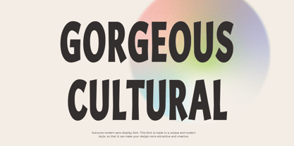 inspired by the famous minimalist logo perfect for the purposes of designing templates, brochures, videos, advertising branding, logos, invitation, layout design, elegant crafting, beauty design and more.
 - Brolachess by Almarkha Type,
$35.00 Hello Introducing, Brolachess - Luxury Ligatures Serif is an elegant, unique font that uses 30 ligatures to smoothly link letters. inspired by the famous minimalist logo, perfect for the purposes of designing templates, brochures, videos, advertising branding, logos and more. Perfect for adding a unique twist to word-mark logos, monograms or pull quotes.
 - VLNL Bint by VetteLetters,
$35.00 Kornelis de Vries, a headmaster from the Dutch province of Friesland, cultivated new potato breeds that he named after pupils in his school. In the early 1900s he came up with the tasty Bintje (a Frisian girl’s name) and it became a big success – in Belgium and France it has remained the most popular potato for french fries to this day, more than a century since its introduction. Donald Roos took 10 kilos of fresh Bintje potatoes and cut the Bint typeface by hand with a short, sharp knife. He then inked each character once and printed it twice; the second, lighter printing is accommodated in the lower case alphabet. The Bint family offers a script to make the letters bounce up and down the baseline; with OpenType functionality the font randomly chooses each character from the upper- or lowercase alphabet. ‘Tabular lining figures’ will activate a series of negative numerals in boxes; ‘Discretionary ligatures’ activates specially designed letter combinations like ‘www’ as well as arrows and stars. Bint has a distinct, slightly rough handmade appearance, making it useful for a wide range of designs.
 - TA Typefire by Tural Alisoy,
$- Typefire font will be known as TA Typefire from now on. Additionally, Cyrillic, Caucasian Albanian scripts and some glyphs were added. I made some slight modifications to letters. I hope you like it. Much love! TA Typefire is perfectly suited for editorial design, branding, magazines, logos, headings and more. TA Typefire OT Features: aalt, calt, case, dlig, dnom, frac, kern, liga, locl, numr, ordn, salt, sinf, ss01, ss02, ss03, subs, sups Supported Languages: Western Europe, Central/Eastern Europe, Baltic, Turkish, Romanian, Cyrillic, Caucasian Albanian Amount of glyphs included 456 Latin Plus languages supported 94% Latin Plus diacritics included 88% source: underware TA Typefire graphic presentation at Behance
 - PictiFont by PictiFont,
$100.00 PictiFont is an exciting new hybrid typeface that provides both graphic and written communication at a glance. Simply drop your graphic file - logo, symbol, photograph, drawing, whatever - into the open spaces integrated into the font characters themselves and you have created a unique visual. The sans serif font includes both open and closed typefaces. Alternative characters are reversed, allowing your graphic to “lock” them together. Each Buying Choice includes PictiFont - Plain , which features a complete character set (including lower case) for use with the decorative elements or on its own. PictiFont is easy to use and limitless in its versatility: Inventors: Howard & Melinda Boyle. US Patents No. D643,872 & D643,873
 - Hardipe by Sarid Ezra,
$15.00 Hardipe is logo fonts with unique side that will make your logo and design looks more simple and stylish. With the unique characteristic lowercase, this font can make your logo even more stunning. You can use this font for any purpose, especially to make logotype. You can mix and match the uppercase and lowercase to make your logo more stand out. Hardipe also comes with italic version that have different vibes. This font also comes with number, symbol, and multilingual support!
 - Punkstoric - Personal use only

- Legendum - 100% free

- Spoonge Punk - Personal use only

- Black Audio - Personal use only

- Straight Ahead by Ronny Studio,
$19.00 Straight Ahead is a dazzling handwritten font. With a modern style, this versatile script font has a wide spectrum of applications such as for branding, logotype, and more. Straight Ahead is PUA coded which means you can access all the glyphs and sweeps easily! It is suitable for branding, Poster Design, Event, logotype, product packaging, decoration, t-shirts, poster labels, etc. 2 Style Font : Regular Italic Straight Ahead Features : Uppercase Lowercase Numbers & Punctuation Ligature Alternative Wash Multilingual Support Simple installation All of features and special characters of this font are included in one file. So it is easy to accessed by using program or software that support the opentype like Adobe Illustrator, Adobe Photosop, and Adobe Indesign). This font also very easy to use because compatible for all software even for non-opentype supported. Please comment us if you have any questions Thank you and have a nice day. thank you
 - Debugger by Dharma Type,
$9.99 Debugger is a futuristic, sicentific, digital family of next-generation monospaced fonts for developing, programming, coding, and table layout. Some desirable features in monospaced fonts are listed below. 1.Easy to distinguish 2.Easy to identify 3.Easy to read Debugger has very distinguishing letterforms for confusable letters such as Zero&Oh, One&I, and Two&Z. A lot of ingenuity makes this family very distinguishable. Italics have somewhat large inclination angle to be distinguished from their Roman. For the same reason, Italics are slightly lighter than Romans. Italic is not cursive Italic. It is near the slanted Roman. This is an intentional design to identify Italic letters. Cursive is not suitable for programming font. Octagonal and diagonal letterform is good for sci-fi, digital projects. Common elements for each letterform makes harmony and a sense of unity. Debugger supports almost all Latin languages. Try this all-new experiment.
 - Vtg Stencil US No. 4 by astype,
$18.00 The Vtg Stencil fonts from astype are based on real world stencils from several countries. The US No. 4 design was derived from a typical antique US-American stencil-plate. This revolving stencil-plate was invented by Eugene L. Tarbox and patented in 1868. It was a mass factored product and a very common tool in the United States until the success of the interlocking stencils. In case of US No. 4 an original early stencil plate from New York Stencil Works was used. The Regular font style is a clean font design featuring an extended Latin glyph set including some typical stencil ornaments and tabular figures. The Paint font style is made from true stenciled letters and features all the letters of the stencil-plate only. If you like the later interlocking design have a look to my Vtg Stencil US No.2 font. More info: pdf specimen
 - Duckie by Eclectotype,
$40.00 Eclectotype's continuing battle against whitespace continues full cream ahead with Duckie, and fat-bottomed script that packs a whole lotta weight into the softest of punches. The forms feel familiar, like they're straight from funky disco album covers, but this is a 100% original face. Don't let its retro charm dissuade you from taking it for a spin in more contemporary settings; it might just surprise you! Now for the features bit: OpenType features include ligatures, swashes, contextual alternates and stylistic sets. The stylistic sets are 1. swap the script r swap to a normal r, 2. swap the script upper case i to a more familiar seriffed version, 3. the number four changes to an open form, and lastly, 4. loopy ascenders in the lower case close in and lose the hole. You should not use this in all caps settings. Pretty please.
 - Black Tie by Scholtz Fonts,
$19.00 Black Tie is an art-deco font with the smooth sophistication of retro design. It is very readable and can be used at all sizes. It functions well as a display font and creates attention-attracting headers and subheaders. Black Tie comes in two styles: 1. Black Tie Regular: in which the caps and lower case have different baselines. Black Tie Regular is better for sub-heads and display. 2. Black Tie Baseline: in which all characters share a common baseline. This style is better for body text and smaller sizes. Fully professional, Black Tie contains a full character set Ñ Upper and Lower case, all numerals, punctuation, symbols and accented characters. It is suitable for layout work in all major European languages Ñ Spanish, Portuguese, German, French, Swedish and Italian (to name a few). The characters are spaced for readability and have been carefully kerned.
 - Beautiful Kisses by Letterara,
$12.00 Beautiful Kisses surely is an extraordinary script and perfect to express your love. “Love must always be worthy of happiness”. It has an amazingly beautiful and elegant style. What’s included: 1. Works both on Mac & PC 2. Simple installations 3. With Extras 4. Alternates (A-Z, a-z), Swash (A-Z, a-z), Titling (a-z), and Ligature 5. Accessible in the Adobe Illustrator, Adobe Photoshop, Adobe InDesign, CorelDraw, even work on Microsoft Word. 6. Support multilingual; ä ö ü Ä Ö Ü ß ¿ ¡ 7. To access the alternate glyphs, you need a program that supports OpenType features such as Adobe Illustrator CS, Adobe Photoshop CC, Adobe Indesign, and CorelDraw. More information about how to access alternate glyphs, check out this link (http://goo.gl/ZT7PqK) To stay up to date for my latest work, follow me and let’s be friends because there will be many promos.
 - Funky Yard by Prioritype,
$19.00 Funky Yard - SVG Groovy Font + Extras. Presenting this latest hand drawn font. Funky Yard is a groovy display font with 2 styles, namely: Solid and Brush. There is an additional hand-drawn in the font file to further vary your design. Great for merchandise design, posters, branding, covers etc. *Note: To access extras, just type: underscore + underscore + numeral (1-15). Standard ligatures activated. Features: Uppercase, Lowercase, Numeral, Punctuation, Multilingual & Ligatures. Multilingual contained: Afrikaans, Albanian, Asu, Basque, Bemba, Bena, Breton, Catalan, Chiga, Cornish, Danish, Dutch, English, Estonian, Filipino, Finnish, French, Friulian, Galician, German, Gusii, Indonesian, Irish, Italian, Kabuverdianu, Kalenjin, Kinyarwanda, Luo, Luxembourgish, Luyia, Machame, Makhuwa-Meetto, Makonde, Malagasy, Manx, Morisyen, North Ndebele, Norwegian Bokmål, Norwegian Nynorsk, Nyankole, Oromo, Portuguese, Quechua, Romansh, Rombo, Rundi, Rwa, Samburu, Sango, Sangu, Scottish Gaelic, Sena, Shambala, Shona, Soga, Somali, Spanish, Swahili, Swedish, Swiss German, Taita, Teso, Uzbek (Latin), Volapük, Vunjo, Zulu. Thanks :)
 - Nourishe by Arterfak Project,
$12.00 Nourishe is our our brand new minimalist font, made with the combination of duo-line. A sans serif font which is suitable for branding and editorial design. As we know, sans-serif nowadays becomes a part of the new trending of graphic design in typography. Nourishe is a great choice to make your design more elegant with minimalist strokes and feminine curves. This font family has OpenType features like some alternates to gives you an option. Also complete with some swashes that you can apply to get more beautiful looks. Nourishe has 2 styles : - Inline: Suitable for headline in a poster, flyer or label. the empty space in every stroke give the attractive-typographic taste - Normal: Recommended for an editorial like sub-headline, quotes, and body text. Nourishe includes : - Uppercase - Lowercase - Symbols - Numerals - Punctuation - Multilingual accents - Stylistic Alternates - Swashes Well, thank you for visiting and hope you like it!
 - Athena Rustic by Tigade Std,
$25.00 Athena is a handdrawn rustic sans serif font yet still looks elegant. It offers a professional look in one way and you serve in a retro look in another occasion. It is beautifully handdrawn on a paper to give the natural feeling to the shape for each characters. The texturized rustic effect give a retro and vintage style to your design. Athena Rustic features upper cases only at the moment but will have the lowercase update in the roadmap. It also standard International Characters. Of course it comes with bunch of alternates, numeral as well as the punctuations. The font family includes 2 styles: Athena Rustic Regular Athena Rustic Italic Athena Regular Athena Italic That's a wrap! I do really hope you like this font, and please don't hesitate to contact me if you have any questions. Also, drop by to our instagram! www.instagram.com/tigadestd Tigadestd | Doli Harahap
 - ST Gaidar by ShimanovTypes,
$9.00 The font "Gaidar" named in the honour of Arkady Gaidar. He was a Soviet writer, whose stories were very popular among Soviet children, and a Red Army commander. He died in combat fighting with German nazis in 1941. Few generations of Soviet kids are raised on his books and a number of films were made based on his stories. This font inspired by posters, movie titles and book covers of this writer. The letterforms are bold and gnarly and comes in 2 styles: uppercase and small caps. It has LATIN and Extended Eastern Europe CYRILLIC letters. "ST-Gaidar" created for titles, poster design, web design, branding and packaging works, illustrations, badges and other typography works. Pls, don't use it for for typing large arrays of text. ST Gaidar supports 15+ languages: Belarusian, Bosnian, Bulgarian, Croatian, Dutch, English, German, Macedonian, Norwegian, Russian, Serbian, Swedish, Spanish, Slovenian, Ukrainian and probably others
 - ABC Basisschrift by Elsner+Flake,
$35.00 During the last ten years of his life, Hans Eduard Meier (dec. July 17, 2014), together with Max Schläpfer, developed an innovative concept of a new Swiss Schulschrift (handwriting script for schools) called ABC Basisschrift®. His life’s work is crowned by the fact that now, since the fall of 2014, and beginning in Lucerne, this new didactic will replace the old Schnürlischrift in Switzerland. In contrast with the Schnürlischrift, the idea is to guide a child in three steps to learning a personal handwriting. ABC Schule 1 is for the first grade, ABC 2 starts to introduce the first connections and ABC 4 Ligaturen is designed with many ligatures to serve as a good example for handwriting. ABC Schule is also available with ruling and for visually impaired students.This version of the Basisschrift®, available from here, is the original version by Hans Meier.
 - Bourton Hand by Kimmy Design,
$10.00 Bourton Hand is a new typeface by Kimmy Design. It’s the hand drawn version of Bourton and a sans-serif cousin to Burford. In addition to a new look, it boasts more layering options, stylistic alternatives, graphic extras and even comes with its own script font! Okay...so here’s everything you get with Bourton Hand: • 6 Base Layer Fonts (Base, Inline, Marquee, Stripes A, Stripes B, Stripes C, Sketch A, Sketch B) • 6 Top Layer Fonts (Base Drop, Dots, Line Light/Medium/Bold, Outline Light/Medium/Bold) • 6 Extrude Fonts (Extrude, Outline, Shadow, Extrude Outline) • 5 Drop Shadow Fonts + 5 solo styles (Drop Shadow, Drop Extrude, Drop Line, Drop Stripes A, Drop Stripes B) • 2 Line Fonts for secondary text (Line Medium, Line Bold) • Bourton Hand Script Light • Bourton Hand Script Bold • Bourton Hand Extras - Ornaments, banners, frames, borders, flags and line break • Bourton Hand Extras - Flourishes Happy Creating!
 - All Is Quiet by Kitchen Table Type Foundry,
$15.00 The year 2022 went and 2023 came. I can honestly say that last year was a horrible year and I am happy it ended a couple of days ago. The first week after New Year’s Eve always fills my head with the U2 song ‘New Year’s Day’ - so I named this font after a line from the lyrics. I also happened to watch a fantastic movie called ‘Im Westen Nights Neues’, directed by Edward Berger, but based on a book by Erich Maria Remarque, which, in English, was published as ‘All Quiet On The Western Front’. So there you have it: naming a font in 2 easy steps! ;-) All Is Quiet is a lovely brush font, which I created using my father in law’s Chinese pencil and ink. I can suggest some uses here, but I am convinced you can come up with that yourself.
 - Blanc Groove by Godbless Studio,
$28.00 BLANC GROOVE, a font with a futuristic and experimental concept created with a strong and charismatic character. following the current trend design style. BLANC GROOVE is made experimentally following a futuristic style recipe with alternate characters made with outstanding alternate and display that makes this font more stylish and varied. BLANC GROOVE is a variable font that has 18 Font, 9 weights with 2 Variable from thin to black & Italic. also includes alternates that are more varied with variables. BLANC GROOVE is a versatile font system, designed primarily for display uses with a need of visual impact. Variable : Thin & Italic Light & Italic ExtraLight & Italic Regular & Italic Medium & Italic SemiBold & Italic Bold & Italic ExtraBold & Italic Black & Italic Feature : Alternate Character Ligature Discretionary Ligature Multilingual Support Numeral & Punctuation Symbol etc alihbWish you enjoy our font and if you have a question, don't hesitate to drop message & I'm happy to help.
 - ABTS Crestwing by Albatross,
$19.95 ABTS Crestwing is a unique initial font with extraordinary flexibility and beauty. There are 5 wing styles to choose from. The wings are accessed through typing numbers. The 5 pairs are: [1, 2] [3, 4] [5, 6] [7, 8] & [9, 0]. The odd numbers in the pairs will give you a left wing, and the even numbers will give you a right wing. The letters are separated into upper and lowercase. Uppercase has a crest point, the lowercase does not, giving you the ability to string letters together to form words and phrases, and place the tip of the crest above the letter of your choosing. Optional endcaps are available using the brackets on your keyboard "[, ]." This allows you to cap off a word if you wish not to use a wing to do so. Crestwing is both beautiful and unique, and works best at large sizes.
 - Quantificat by ROHH,
$39.00 Quantificat™ is a modern geo-humanist sans-serif typeface offering excellent legibility and strong personality. It is a fully featured text type family, well proportioned and uniform in color. It is designed to serve as a characterful display typeface, too, as it includes beautifully carved, flowing, calligraphy-inspired true italics, subtle, precise hairlines as well as modern, powerful and friendly heavy styles with emphasized ink traps. Quantificat family introduces advanced typographic OpenType features, such as stylistic alternates, swashes, small capitals, case sensitive forms, standard and discretionary ligatures, contextual alternates, lining, old style, tabular and small cap figures, slashed zero, fractions, superscript and subscript, ordinals, currencies and symbols. The complete family consists of 20 styles - 10 weights with corresponding true italics as well as 2 variable fonts. It supports extended latin languages. Quantificat is a part of one type system together with Qualion, Qualion Round and Bozon.
 - Hebden by Lewis McGuffie Type,
$34.99 Hebden is a ‘Northern’ font. Inspired by the town Hebden Bridge in Yorkshire, the family is a mix of a grotesque and an incised serif. The grot is based on Victorian train station signage and the serif is style that can be spotted in and around the Yorkshire Dales region. Hebden has a nostalgic twist and is ideal for labelling, signage and memorable messages. The grotesque face with its robust angles and warm circular curves recalls the style of traditional English sans-serifs like Caslon’s 2-Line Egyptian. The incised face has strong but sophisticated and natural forms and is based on a wood carved style popular in the early 20th century. The weight of the two faces are are drawn to complement each other creating an evenly balanced combination. Both faces come with caps, lower caps across letters and numerals, and have Western, Central and Eastern European language support.
 - Senpai Coder by Dharma Type,
$9.99 Senpai Coder is a family of typewrighter-style monospaced font for developing, programming, coding, and table layout. Some desirable features in monospaced fonts are listed below. 1.Easy to distinguish 2.Easy to identify 3.Easy to read Senpai Coder has very distinguishing letterforms for confusable letters such as Zero&Oh, One&I, and Two&Z. A lot of ingenuity makes this family very distinguishable. Italics have somewhat large inclination angle to be distinguished from their Roman. For the same reason, Italics are slightly lighter than Romans. Italic is not cursive Italic. It is near the slanted Roman. This is an intentional design to identify Italic letters. Cursive is not suitable for programming font. Typewriter letterform (serif) is good for reading. Common elements for each letterform makes harmony and a sense of unity. Senpai Coder supports almost all Latin languages. Try this all-new experiment.
 - Something Exquisite by Ana's Fonts,
$12.00 Something Exquisite is a cute but elegant font family which includes: - a script font with accents, numbers, symbols, punctuation, and ligatures for the double letters - an all caps font with different uppercase and lowercase letters - a small caps font based on the all caps - two sets of swashes, including 1 swash for each uppercase letter and 2 swashes for each lowercase - a set of ornaments and frames you can access easily through A-Z, a-z, and 0-9 (0b-9b for textured frames) keys respectively Something Exquisite is perfect for both short and longer texts, and can be used for making postcards and notes, creating logotypes, social media posts, branding and packaging. Please note: No special software is needed in order to access the small caps and swashes, as they are in different font files. You simply access them directly in your font bar.
 - Kongfusher by Java Pep,
$15.00 Kongfusher is the layered font that comes up with 2 styles engraved layer. You can save your time to mix and match the styles you need. Kongfusher font has 4 fonts including: regular, full engraved, half engraved, and extruded. This font is perfect for logotype, flyers, posters, branding and identity, or application in mobile. OpenType features can be utilized to let you choose and mix of alternates. For many applications this will be automatic. But otherwise, if your application does not support OpenType you must install an application to access the character map for access to these features. For the step to use character map you must choose "private use area" at "Unicode" options. How to use character map for access OpenType features https://youtu.be/ARD2cqZ2rdM If you have any questions or technical support don't hesitate to comment, message or contact java.indonesian@yahoo.com. Have a nice day.
 - Glyphstream - 100% free

- Northwell by Set Sail Studios,
$16.00 Introducing: Northwell! A rustic, dapper handwritten font with a personal charm. With quick dry strokes and a signature style, Northwell is perfect for branding projects, homeware designs, product packaging - or simply as a stylish text overlay to any background image. ★ New Update • Northwell Clean! Northwell has now been updated to include 2 styles; a rustic textured version, and a totally clean & smooth version. This gives you the option to completely switch the style of your font at the click of a mouse, whether you’re looking for a more rustic, hand-made style, or a silky smooth finish. The Northwell Family includes 6 font files; 1. Northwell • A handwritten script font containing upper & lowercase characters, numerals and a large range of punctuation. 2. Northwell Alt • This is a second version of Northwell, with a completely new set of both lower and uppercase characters. If you wanted to avoid letters looking the same each time to recreate a custom-made style, or try a different word shape, simply switch to this font for an additional layout option. 3. Northwell Swash • A set of 20 hand-drawn swashes, the perfect finishing touch to underline your Northwell text. Simply install this as a separate font, select it from your font menu and type any A-U character to create a swash. 4. Northwell Clean, Northwell Clean Alt & Northwell Clean Swash • Clean versions of the above 3 fonts, with the rough brush texture removed and replaced with a completely smooth edge. Ideal for specialist printing (e.g. Cricut/Silhouette Studio), or simply for a smoother finish to your designs. Fonts include multilingual support for English, French, German, Spanish, Italian, Portuguese, Czech, Danish, Dutch, Estonian, Finnish, Hungarian, Norwegian, Polish, Slovak, Slovenian, Swedish, & Turkish. Standard Ligatures • Are also available for several lowercase characters (double-letters which flow more naturally). Ligatures will automatically replace the standard letter pairs whenever available, when using any OpenType capable software.
 - Birthday by Canada Type,
$34.95What do you imagine the ideal casual invitation font would look like? It has to be cheerful, inviting, legible, creative, and loads of fun. But first and foremost, it has to look like real handwriting. Fonts seeming like real handwriting are always a major task, and although Canada Type already has plenty of fonts that solve the “looks like handwriting” issue in a variety of ways, we're once again raising the bar a little higher with this one. Birthday is a massive package that crosses the traditional font/handwriting solution of 2-letter ligatures and waltzes into the land of 3-letter combinations. Plenty of them, too! The complete Postscript and True Type versions of Birthday ship with no less than five separate fonts full of nothing but ligatures. And for even more realism, an alternates font is also included in the package, for a total of seven fonts of happy handwriting that can be used anywhere and everywhere personalization is of importance to a layout. For layout artists with advanced typography tools that take advantage of the power of OpenType, Birthday Pro is a wunderkind. All the individual letter alternates are accessible through the Stylistic Alternates feature, the 2-letter ligatures through the standard Ligatures feature, and the 3-letter ligatures via the Discretionary Ligatures feature (for the technically inclined: this includes a nice liga-to-dlig crossover, where the maximum number of possible ligated letters is automatically chosen at the push of a button). If you enjoy using OpenType, Birthday Pro is definitely for you. If on the other hand you like your fonts in Postsript or True Type, it is advisable to keep a character map handy while using Birthday. You will need it to take advantage of the many, many alternates and ligatures distributed over the fonts. The next time someone asks you for the perfect casual invitation font is, look no further. And as usually is with Canada Type, quality fonts are more affordable than ever. - Combine by Andinistas,
$49.00 Combine, designed by Carlos Fabian Camargo G, is powerful and attractive, multi-layered chromatic type family that consists of 12 fonts, typographically grouped in two logics: “Script and Caps”, so that they could be colored separately or in group. Both designed with contrasting optical techniques and combinable at the same time. The unforgettable central idea of Combine was inspired by unique types of speedball letters designed by ancient artists in Canadian posters of shows and fairs in 1930. This is why its Typographical tools work independently or in group, resulting in highly polished designs that need fonts with coupled effusiveness. Their combined resources offer guaranteed distinguishing letters with shadow effects and worn, in order to help enhance their expressiveness. Combine is excellent in any project on paper or screen as it has more than 2100 glyphs and features of OpenType distributed strategically in fonts easy to use. SEE BELOW THE MAIN ADVANTAGES: • Combine Script & Shadow: It offers incredible case sensitive fluency and eloquence drawn with vertical cursive letters with ornamental non-stop excitement and complementation. It also has a variety of significant upward and downward, alternative strokes combined with its vintage ties that also give authenticity to their designs. • Combine Caps 1,2,3 & Shadow1,2: Guarantees you a colorful horizontal area of narrow case with 2 types of shadows, sound and other shade with diagonal stripes. Its geometric uniformity gives a friendly, open and subtle character by Typographic and special resources and visual properties coloring layers separately or in groups. In addition, its 2 layers of skeletal illuminations, adding internal lines and simultaneously contributing to play perfect confrontation and contrast with their geometric ideas and aesthetics for special attention. • Combine Words & Shadow: It can be used to design a perfect tone in each one of the 50 slogans written diagonally, making a brilliant feeling suggestive seductive style. Compatibility and flexibility works by monoline thin cursive strokes ideal for featured items with and without shade. Combine was selected at the Bienal Tipos Latinos 2016
 - Posh by Lián Types,
$49.00 I've always been in love with fat didones. That’s the reason of Posh. In search of something unique, I started this family back in 2013 with the aim of creating the fattest yet readable bodonian typeface in the market: It was a challenge, because roman fonts need generous counters (or what some call white spaces) and taking them to the extreme of inexistence attempted against the construction of many glyphs. Ears, dots, terminals and serifs always need some extra space so I had to find the exact point of boldness to make characters which have those attributes work well in the middle of those which haven't. (1) After a while, I felt I was again ‘in my element’: Big contrasted letters, sexy and elegant curves, and that Lubalinesque feeling that characterise my fonts. (2) Words written with Posh are a explosion of elegance and sensuality due to the fact that its didone attributes were exaggerated. Since it’s full of alternate glyphs, one can change and choose them until a nice block of ‘‘black’’ is achieved. (3) To accompany the regular style, I designed Posh Inline, a font with the same quantity of glyphs than the regular one; an all caps style called Posh Capitals, and also a really playful Italic version. I hope you find this one delicious like I do! This font is dedicated to all who understand letters are not just meant to be read, but also to be appreciated in group and individually. Enjoy it. NOTES (1) In example, it can be easy to design a fat letter ‘n’ with almost no counter, but really tough to make a satisfactory letter ‘s’ with serifs to match that ‘n’. (2) Also, it wasn't my first attempt in fat didones. Take a look at my font Reina, made in 2012. (3) Posters above show many words with ball terminals that seem to dance above and below the words in order to fill those “undesired” blank spaces.
 - TT Severs by TypeType,
$29.00 TT Severs useful links: Specimen | Graphic presentation | Customization options TT Severs is a geometric grotesque with emphasized elements of internal brackets. A distinctive feature of TT Severs is the unusual form of internal ovals, which refers us to the style of traditional Arabic writing. TT Severs has a strong character and is great for use in high tech (IT), the web, in robotics, computer games, and sports. TT Severs is a 2-in-1 font family. In a large body size, it works great as a display font, creating a distinctive character for logos and headings. At the same time, when TT Severs is used in a small body size or in large text arrays, the font’s peculiarities of bracket construction fade, and it perfectly functions as a text font, thanks to both the low contrast between vertical and horizontal strokes and the detailed logic of interaction of black and white letter elements. The font family TT Severs includes 18 fonts, each of which consists of 558 glyphs. The family has standard and discrete ligatures, which include experimental ligatures for the Cyrillic alphabet. In addition, TT Severs can be made a little more humanist—it is enough to turn on stylistic alternates, and due to them the font takes the form of a humanist grotesque, which refers us to traditional broad nib writing. As part of the font family, you will also find old-style figures and a large number of OT features such as case, ordn, sups, sinf, dnom, numr, onum, tnum, pnum, liga, dlig, salt (ss01), frac.
 - Cinnamon Peach by Abbasy Studio,
$8.50 Let me introduce my first ever product on my shop. Cinnamon Peach - Layered Font After 2 years of learning how to create a fonts, learn about the anatomy of typography, features of the OpenType fonts, and all of the experience on my collaborations with many friends, Finally I just launched my first personal product with the name Cinnamon Peach. Cinnamon Peach is beauty combinations of layered font. It has a Serif and Script style inside. Both of them are layered font, which is you can express the style on both of it. You can add shadow, inline or hatch on Serif style. Changing the color of the other layer as just easy as change standard color of the fonts but it’s more deep in detail. On the Script style, I give you more freedom of choosing which style do you want, if you want a deep style of layer, you can choose regular and inside with different color. but if you want the outline style, it also available as a single fonts. Looks like on the display that I Created, You can see the most of combinations font in there are perfectly matched even on script version doesn’t include the Uppercase character. Because of the strong characteristic of this fonts you can see the combinations are great with or without layer, monochrome or multi color, pastel or watercolour. It’s great for posters, display, logos, header website, magazine, animation text, etc. Thank You very much, hope you enjoy this fonts !


