10,000 search results
(0.036 seconds)
- skeemat - Unknown license

- Bridie - Unknown license

- Dovshan by Michael Browers,
$25.00 - Berengard Caps Two by Intellecta Design,
$12.00
- Sophiazoya by Michael Browers,
$15.00 - Ellaroza by Michael Browers,
$15.00 - MBF Modern Rebel by Moonbandit,
$15.00
- Gloriosus NF by Nick's Fonts,
$10.00
- Hi Ho Steverino NF by Nick's Fonts,
$10.00
- Intruder Alert - Unknown license

- MoxyRoxie - Unknown license

- Verily Serif Mono - Unknown license

- Coaction by Oui Studio,
$17.00
- LHF Retro Ricky Doohickies by Letterhead Fonts,
$29.00
- Concert Series JNL by Jeff Levine,
$29.00
- P22 Kingsclere by IHOF,
$29.95
- Cover Art JNL by Jeff Levine,
$29.00
- Herbie by The Infamous Foundry,
$49.00
- ABTS Aviator by Albatross,
$19.95
- Flavery by Invasi Studio,
$19.00
- Knuckleball by Bebop Font Foundry,
$25.00
- Gingerline by Hanoded,
$15.00
- Majordomo by J. DeAngelis Design,
$24.00
- Madjestic Comfort Script by Fauzistudio,
$40.00
- Grotesca by GroupType,
$19.00
- Falfurrias NF by Nick's Fonts,
$10.00 - San Marcos NF by Nick's Fonts,
$10.00 - Shockfest by Arendxstudio,
$15.00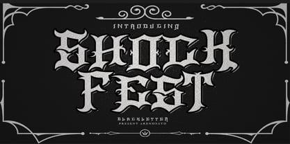
- Junebug Stomp NF by Nick's Fonts,
$10.00 - Political Graft Outline - Unknown license

- Piano Solo JNL by Jeff Levine,
$29.00
- Semarang Kolonial by Hanoded,
$15.00
- Brazos NF by Nick's Fonts,
$10.00 - Dime Box NF by Nick's Fonts,
$10.00 - Wickedelic by Oui Studio,
$17.00
- Dustismo Roman - 100% free

- Dustismo - Unknown license

- Schweimann Moderne NF by Nick's Fonts,
$10.00
- Semarang by Hanoded,
$15.00
- Ensemble Inline JNL by Jeff Levine,
$29.00


