4,531 search results
(0.014 seconds)
- Ampmosphere by Joey Maul,
$22.00 Ampmosphere, a picture font, contains instruments and components from a 60's rock and roll band. After a friend's request to create a guitar graphic, I decided to start a set. Over time, more instruments were added along with amps, tubes, lights, etc. The glyphs are great to use individually or combined. 65 detailed glyphs in all... A - Z upper and lower case; 0 - 9; comma, period and forward slash. Upper case A, B, C and D are the separate strings for the stringed instruments a, b, c and d.
 - Gristwood JNL by Jeff Levine,
$29.00 The rustic lettering which also served as the model for Grist Mill JNL is the basis for Gristwood JNL. Another set of vintage wood type has the letters reversed out of blocks, making for a specialty titling font. Decorative end caps are located on the greater and less than keys and also on the plus and equal keys. A blank block for regular word spacing is on the underscore key, along with a wider blank box on the backslash key. This typeface has a somewhat limited character set.
 - Cologics by Allouse Studio,
$16.00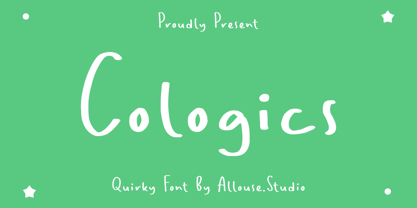 Cologics a Quirky Font which will give you mood impression.. Cologics wome along with Multi-Lingual Support to fulfill your need. We highly recommend using a program that supports OpenType features and Glyphs panels like many of Adobe apps and Corel Draw, so you can see and access all Glyph variations. Cologics is perfect for any tittle, lyrical video music, logo, product packaging, branding project, megazine, social media, wedding, or just used to express words above the background. Enjoy the font, feel free to comment or feedback, send me PM or email. Thank You!
 - Retro Nouveau JNL by Jeff Levine,
$29.00 Because of the large influx of Irish immigrants during the late 1800s and early 1900s, it was not unusual for songwriters of the day to craft songs around Irish themes, offering a nostalgic link to their homeland. One such 1917 piece entitled "You Brought Ireland Right Over to Me" had the title hand lettered on the sheet music cover in a sans serif design reflecting the popular Art Nouveau movement of the day. This design is now available digitally as Retro Nouveau JNL, in both regular and oblique versions.
 - VLNL Kimchi by VetteLetters,
$35.00 The Kimchi font had its starting point in the making of the film "Cloud Atlas", based on the novel by David Mitchell and directed by Lana & Andy Wachowski and Tom Tykwer. A first version of Kimchi was created for "Papa Song" – an underground fast food restaurant in a futuristic Neo Seoul in the year 2144. It was used for the menus, advertisement and packaging. Kimchi was later further developed to become a useable typeface: it works for headlines, street art stencils and of course as logo font for korean fast food restaurants.
 - Techno Charm by Nirmana Visual,
$24.00 Introducing our cutting-edge techno font, designed to add a futuristic and sleek aesthetic to your designs. With its sharp lines, geometric forms, and high-tech vibe, this font is perfect for projects that require a modern and forward-looking visual identity. Inspired by the sleek designs of technology and the digital age, this font captures the essence of innovation and progress. Its clean and precise letterforms, along with its distinct futuristic style, make it an excellent choice for technology-based branding, gaming graphics, sci-fi posters, and digital interfaces.
 - Rough Riders by FontMesa,
$35.00Rough Riders, along with our Rough Riders Redux font, got its start from a small sample of letters used in the logo for the Beach Creek Railroad Co. dating back to the early 1860’s. I studied the design for one year before drawing the letters. Rough Riders and the Redux version are simply the most Wildest Western looking fonts you'll find. The Rough Riders fill font is not meant to be used as a stand alone black typeface, the fill font is designed to be layered behind the regular Rough Riders font. - Ludwigon by IbraCreative,
$17.00 Ludwigon is a contemporary serif typeface that seamlessly melds timeless elegance with a modern sensibility. With its gracefully elongated serifs and refined letterforms, Ludwigon exudes sophistication and readability, making it a versatile choice for a wide range of applications. Its clean lines and balanced proportions lend an air of classic refinement, while subtle design nuances, such as tapered stroke endings and graceful curves, infuse it with a touch of contemporary flair. Ludwigon strikes a harmonious balance between tradition and innovation, making it a compelling choice for projects seeking a timeless yet fresh typographic aesthetic.
 - Toxide by 38-lineart,
$17.00 "Toxide" is a gothic font inspired by Celtic and uncial style. We give a unique touch so that this display font is very suitable for brands, logotypes, headlines, badges, video titles as well as for book and magazine covers. This font supports Latin diacritic for basic glyph along with its 7 stylistic sets. A total of 1193 glyphs give you the flexibility to choose the right glyph in your design. Please enjoy and have fun with the stylistic set game that you like while you feel the classic feel in a modern design
 - ChicaGogo NF by Nick's Fonts,
$10.00The compendium Alphabete: ein Schriftaltas von A bis Z listed the pattern for this family of faces under the name Chicago which, owing to the number of other faces using the same name, makes its origins difficult to ascertain. Nonetheless, its soft lines and round forms have a timeless appeal makes this family an excellent choice for both headlines and text use. Both versions of this font include the complete Latin 1252, Central European 1250 and Turkish 1254 character sets, along with localization for Lithuanian, Moldovan, Romanian and Turkish. - Kutilang by Allouse Studio,
$16.00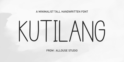 Proudly Present, Kutilang a Minimalist Tall Handwritten Font. Kutiling come along with Multi-Lingual Support to fulfill your need. We highly recommend using a program that supports OpenType features and Glyphs panels like many of Adobe apps and Corel Draw, so you can see and access all Glyph variations. Kutilang is perfect for any tittle, product packaging, branding project, megazine, social media, wedding, or just used to express words above the background. Enjoy the font, feel free to comment or feedback, send me PM or email. Thank You!
 - Caché by ArtyType,
$29.00 Caché is a stylish, condensed sans serif font family in 3 versatile weights (Light, Medium & Bold) with an extended Latin character set. The typeface features economical letterforms with distinctively sheared terminals and occasional stencil characteristics. Designed as a practical all-rounder, it really does live up to its name, providing legibility along with added panache to any heading or copy. In practice, its surprisingly adaptable to most projects; and as usual with ‘ArtyType’ fonts, there are several alternate characters available via the glyph palette, providing that extra dimension when personalising your design projects.
 - Catarina Devon by Allouse Studio,
$16.00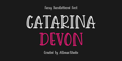 Proudly Presenting Catarina Devon a Fancy Handlettered Font. Catarina Devon come along with Multi-Lingual Support to fulfill your need. We highly recommend using a program that supports OpenType features and Glyphs panels like many of Adobe apps and Corel Draw, so you can see and access all Glyph variations. Catarina Devon is perfect for any tittle, logo, product packaging, branding project, megazine, social media, wedding, or just used to express words above the background. Enjoy the font, feel free to comment or feedback, send me PM or email.
 - Good Sunset by Allouse Studio,
$16.00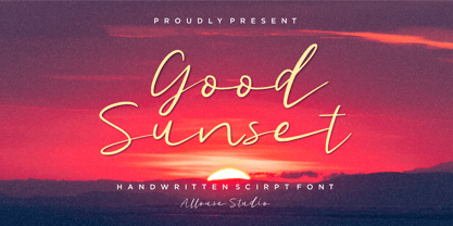 Good Sunset a Handwritten Script Font. Good Sunset come along with Multi-Lingual Support to fulfill your need. We highly recommend using a program that supports OpenType features and Glyphs panels like many of Adobe apps and Corel Draw, so you can see and access all Glyph variations. Good Sunset is perfect for any tittle, logo, product packaging, branding project, megazine, social media, wedding, or just used to express words above the background. Enjoy the font, feel free to comment or feedback, send me PM or email. Thank You!
 - Korb by JCFonts,
$30.00 Korb is a rounded sans serif family of four styles. It features a narrow geometric construction inspired by DIN letter shapes along with more unusual details like open counters and smooth connections between shoulders and stems. This makes the family suitable for a variety of applications, from corporate design to signalization. The fonts, provided in OpenType format, include diacritics for most European languages, a set of arrows and a variety of OpenType features like stylistic alternates, case-sensitive forms, tabular figures, etc. Check the pdf specimen in the gallery tab for more info.
 - Stenzilla by DarezD,
$13.00 Stenzilla is a stencil font based on a rounded sans serif, a careful design, with cuts on the same diagonal axis for the curved strokes and elegant slight curves on the oblique strokes. Useful for branding, highlighted paragraphs, signs, headlines, or reading text. The design incorporates characters from the Cyrillic alphabet, special characters, and characters with diacritical marks. It has the versatility of a sans serif that allows it to be used in a wide variety of designs and styles along with the cut-stroke grace of a stencil font.
 - SkinArt by Graffiti Fonts,
$14.99SkinArt has a hand-made appearance. The style is similar to vintage Tattoo lettering. The caps are in an outline style and the lowercase keys give you a flat, solid style, numbers, punctuation and flourishes are included in this typeface. This typeface includes 2 full tattoo style alphabets that can each be used alone or you can combine the 2 fonts to create fill and gradient effects. Add the included banner pieces or use this font along with your own banner and flag graphics to create realistic body art and classic tattoo style lettering. - HWT Catchwords by Hamilton Wood Type Collection,
$24.95 Catchwords have always been offered alongside standard alphabets in wood type catalogs and so often appear on posters as a decorative punch that they have become part of the wood type vernacular. Words like 'The', 'And', 'To', 'For', and less common abbreviations could be inserted into a design along with decorative ornaments or stars when space was tight or to add variety in the design. HWT Catchwords features over 80 words based directly on designs offered by Hamilton and other wood type manufacturers of the 19th and early 20th Century.
 - LTC Francis by Lanston Type Co.,
$24.95 Francis is a design previously offered by the Lanston Type Co. in the early 1990s. It is a revival of a 1955 Günther Gerhard Lange design, but with a heavier overall weight. Coming out of retirement, it has been fully reworked and refined with elegant curves and an expanded character set. This font works well at small sizes and larger display sizes for everything from wine labels to personal stationery. This type evokes the elegant sophistcation of the Jazz age and pairs well with a Martini and a fine selection of charcuterie.
 - Mikagi by Thinkdust,
$10.00 Mikagi is a textured form of the 2008 Miyagi typeface, giving the original creation a new personality along with its makeover. The rough texture is a different direction from the original, smooth line style of its predecessor, instead creating something that might be described as lean and tough. Worn and weary, Mikagi emphasises everything it says, taking care to slow itself down and not get caught up in the speed of its youth. Use Mikagi for a range of design work, to add a blend of smooth easiness and faded cynicism to your creation.
 - HWT Borders One by Hamilton Wood Type Collection,
$24.95 Wood Type Catalogs of the 19th century often offered tools and accessories alongside alphabets of wood type. Probably the most closely related was wood type borders and ornaments. Decorative Borders were often sold by the foot and accompanied by corner pieces that matched the designs. These borders could be assembled in almost any size dimensions as needed. The digital version uses the same principals of modular assembly to create the exact size border that is needed. Along with the borders, included in this font are a selection of "streamers". These banners would have been made to order with the font designs reversed out along a horizontal banner with decorative end caps. The digital version allows for a modular assembly by selecting choice of end caps and then typing the = as many times as needed to achieve the desired length. 10 styles of 9 piece borders can be created in any size variations as well as 8 styles of streamers in any desired length. Some of the designs can be mixed and matched for unusual contemporary design interpretations of these historic styles. It is recommended that the line height (leading) is set to the same size as the point size setting, this will visually lock all elements together.
 - Echo Soul by Set Sail Studios,
$14.00 Introducing Echo Soul; a free-flowing and carefree brush font duo, hand painted with love. Echo Soul speaks from the heart and doesn't hold back. With elongated brush strokes and a natural flow, it's the perfect choice for handwritten quotes, product packaging, and logo designs with a personal and affectionate touch. The Echo Soul family consists of; 1. Echo Soul • A handwritten script font containing upper & lowercase characters, numerals and a large range of punctuation. 2. Echo Soul Alt • This is a second version of Echo Soul, with a completely new set of lowercase characters. If you wanted to avoid letters looking the same each time to recreate a custom-made style, or try a different word shape, simply switch to this font for an additional layout option. 3. Echo Soul Sans • An all-caps font containing uppercase-only characters, perfect for supporting text to compliment the Echo Soul Script font. Also includes numerals and a large range of punctuation. Stylistic Alternates • Are also available for several lowercase characters - these have elongated tails and look great when placed at the end of a word. These can be used by turning on 'Stylistic Alternates' in OpenType capable software, or accessing via a Glyphs panel.
 - Sleeve Notes by Wing's Art Studio,
$12.00 Sleeve Notes: A font from the analogue age. Inspired by album covers and hand-written song lyrics. Sleeve Notes is an experimental script font and all-caps pair with a loose hand-written style that explores the golden-age of record stores, vinyl albums, cassettes and CDs. It imagines our teenage selves kicking back with a coke (oversized headphones on) discovering a new band and studying the notes on their latest album. Besides production credits, the best sleeves (otherwise known as liner notes) included photos, cool artwork and hand-written song lyrics that gave the listener a human connection to the mind of the artist. This font embraces it's subtle ink blotches and rough edges; all imperfections that build to create a sense of a hastily written lyric, set-list or just a fun little scribble. The package includes six fonts in total; the regular script with two complete sets of alternatives, then two sets of all-caps, and finally the special characters font that features a decorative alphabet plus symbols and underlines. For authentically retro, hand-made looking lettering, it's a great choice and offers the flexibility few other fonts can match. Check out all the visuals to see it action!
 - Romance Fatal Sans - Personal use only

- Holland Gothic by URW Type Foundry,
$39.99 Blackletter fonts are timelessly beautiful and still very popular. At some point, it seems that every type designer discovers the beauty of these forms and the great pleasure in creating blackletter characters. Like also Dutch designer Coen Hofmann who, after designing Caxtonian Gothic, has designed yet another Blackletter font: Holland Gothic. Holland Gothic reminds of the 18th century »Duytsch« typefaces of Joan Michael Fleischmann and Christoffel Van Dyck. But Hofmann was mainly inspired by the Dutch calligraphers from the 17th and 18th century. Holland Gothic develops its full charm and beauty at larger sizes because of the hairlines in the upper case characters. To enable users composing texts in the style of our ancestors, Coen Hofmann added a series of pre-composed ligatures, also in combination with the long s, plus an alternate form for the lower case r which was used in combination with letters b, d, g, o, p, v, and w.
 - Loxley by Canada Type,
$24.95 Drawn shortly before Jim Rimmer's passing in 2010, Loxley was designed to be used in a fine press edition of the folklore story of Robin Hood. It was named after the cited birthplace of the story's classic hero. Loxley's shapes were inspired the same early Roman faces (such as Subiaco from the late 1400s) that influenced Frederick Goudy's Aries, Franciscan and Goudry Thirty types. It exhibits the preculiarities of Jim's left-handed calligraphy, as well as his outside-the-box thinking with exit strokes and serif variations. Loxley was remastered for the latest technologies in 2013. Now it comes with a character set of over 450 glyphs, including plenty of stylistic alternates, a full compliment of f-ligatures, a Th-ligature, basic fractions, ordinals, a long s for historic setting, comprehensive class-based kerning, and extended Latin language support. 20% of this font's revenues will be donated to the Canada Type Scholarship Fund, supporting higher typography education in Canada.
 - HWT Arabesque by Hamilton Wood Type Collection,
$24.95 A long lost Art Nouveau wood type from the Hamilton Museum Collection evokes the excesses of Victorian design and the equally quirky 1960s Psychedelic era revival of the Victorian type styles. Free flowing organic designs that flourished with Art Nouveau in the late 1800s were directly referenced and further distorted with with phototype in the late 1960s. This design, known as Arabesque, was produced by the Morgans & Wilcox Co. and the Wm. Page Co. as almost identical designs. Both manufacturers were acquired by Hamilton and offered briefly by Hamilton as design #618. This curious wood type defies most of the basic tenets of type design and what comes to mind when one thinks "wood type". Many characters have a lively eccentricity that were all left true to the original design. Additional characters were designed to fill out the standard range of characters found in digital fonts. This font includes over 280 characters for full unicode support of Western and Central European Latin characters.
 - Blossomy by kapitza,
$99.00 Blossomy is a pictographic font consisting of 72 plant and flower illustrations, designed by kapitza. The font explores the beauty of shapes and structures in nature. The illustrations are based on photographs which have been traced by hand and are the result of a long term interest in the organic and erratic lines of naturally growing plants. The idea for Blossomy originated several years ago via a series of paintings exploring forms and structures in nature. The outlines for those paintings were traced in Illustrator and then transferred onto canvas. The outcome was so simple and beautiful that the designers decided to keep working on new illustrations and combine them in a font. Blossomy can be used as individual illustrations or to create patterns. The font covers a wide variety of flora and fauna, including pot flowers, a bonsai trees, leaves, blooms and grasses, and gives creatives a wide variety of shapes to get inspired by and use in their work.
 - Solitas Serif by insigne,
$- Say it softer with Solitas Serif. Perfect for the designer needing a serif without the stiffness, Solitas Serif will turn your reader’s eye with its slight serifs and rounded corners. This softer version of the curves found in Solitas and Solitas Slab gives your work a subtle yet noticeable charm. Solitas Serif’s 42 rich fonts live comfortably in print and on packaging as well as online. With its soft, pleasant appeal, your reader can move over the typeface with ease. Intermediate weights are available for long amounts of text, and the bold version makes a strong but gentle stance in headlines and subheadings. Altogether, Solitas Serif remains an unimposing and graceful font, despite its large selection of seven weights, three widths, and italic sets. Solitas Serif’s OpenType options include capitals, ligatures, ordinal numbers, fractions, denominators, superscripts and subscripts. Serif also supports Western European, Central European and Eastern European languages. For a sweet approach, charm your reader with simple and soft. Charm them with the subtle Solitas Serif.
 - Neutraface Display by House Industries,
$33.00 Although better known for his residential buildings, Richard Neutra’s commercial projects nevertheless resonate the same holistic ecology—unity with the surrounding landscape and uncompromising functionalism. His attention to detail even extended to the selection of signage for his buildings. It is no wonder that Neutra specified lettering that was open and unobtrusive, the same characteristics which typified his progressive architecture. House Industries brings the same linear geometry to Neutraface without sacrificing an unmistakably warm and human feel. FEATURES LIGATURES: This feature is on by default. It will substitute a long list of “f” and “t” ligatures. For example, open InDesign or Photoshop and type “ff” or “tt”. NEUTRAFACE DISPLAY ALTERNATES: Neutraface Display contains several stylistic alternate characters useful when a purely geometric setting is desired. Like all good subversives, House Industries hides in plain sight while amplifying the look, feel and style of the world’s most interesting brands, products and people. Based in Delaware, visually influencing the world.
 - Nosara by Never Better,
$9.00 Inspired by a trip to Costa Rica and named after its famous beach town, Nosara is a layered vector font that's perfect for projects that require a realistic, hand-painted desert-island look. It comes in three styles: Regular, Outline, and Fill. The styles can be layered to create authentic-looking hand-painted letters and icons—in vector! You can create outlines from this font in order to customize to your heart's desire. Millions of bespoke combinations are possible. This typeface was made by hand, meaning each letter was painted with real paint and digitized, not created on an iPad, which is why this font looks great and has a warm natural quality even at large sizes. Nosara is perfect for packaging, parties, signage, and even looks great in long-form text! Nosara Xtra is a set of pictograms, also in 3 styles that can be layered for the same effect, evoking the imagery and happy vibes of a sunny tropical vacation.
 - Leal by VP Creative Shop,
$14.00 Introducing Leal serif typeface - regular and italic fonts Leal is long and retro typeface loaded with 2 fonts, alternate glyphs and multilingual support. It's a very versatile font that works great in large and small sizes. This font is perfect for branding projects, home-ware designs, product packaging, magazine headers - or simply as a stylish text overlay to any background image. FEATURES Uppercase, lowercase, numeral, punctuation & Symbol regular italic alternate glyphs Multilingual support No special software is required to type out the standard characters of the Typeface. Canva friendly How to access alternate glyphs? To access alternate glyphs in Adobe InDesign or Illustrator, choose Window Type & Tables Glyphs In Photoshop, choose Window Glyphs. In the panel that opens, click the Show menu and choose Alternates for Selection. Double-click an alternate's thumbnail to swap them out. Feel free to contact me if you have any questions! Mock ups and backgrounds used are not included. Thank you! Enjoy!
 - Spiraltwists by Aah Yes,
$0.75Spiraltwists is a family of 2 fonts giving assorted spiral shapes. In each font they're grouped in fours - the same basic spiral in 4 different orientations (N S E W almost), and Spiraltwists has solid lines making up the spirals, Spiraltwists Antique has dotted lines making up the spirals, giving them an antique or rustic appearance. Spiraltwists has heavier spirals on Upper Case, lighter spirals on lower case; plus a group of spirals with a straightened outer end and connecting lines so you get two spiral scrolls joined together by a long line at the top or bottom. (inputting UVWXYZ into the text-box on this webpage will show it). The big example on the webpage shows it all more clearly than any explanation. A fuller description, plus the above example, are included in the zipfile. Please note: for the avoidance of doubt, the font does not contain any letters, the text in these 2 examples is not Spiraltwists but Luzaine. - ST Remona Neue by Skinny Type,
$18.00 ST Remona Neue is a confident serif. Designed to reflect nature, it creates a sense of softness and natural expression. We pushed the concept in a usability-focused direction, to work as a bold tool and a beautiful communicator. ST Remona Neue allows for fluid designs in 3 styles. Regular, Italic, Outline and Latin based main language. The right slant advances aesthetics, brings energy and makes it suitable for modern design. The type family blends organic curves and soft repetition into strong and harmonious types. At large dot sizes you can appreciate the shape of the letters, while the same control and focus creates an even texture for small dot sizes and long reads. Fonts extend their use by providing a variety of unique language and style supports. The ST Remona Neue character set combines additional symbols, style alternatives, unique binding, and case sensitive punctuation - resulting in a stable, hardworking family ready to tackle projects of any size. Happy Designing
 - Gandur New by Blackletra,
$50.00 Gandur is a display textura in three weights, split into two families: Alte — the German word for old — and New. Gandur was inspired by other geometric texturas, specially Max Bittrof’s Element (1933). The design began by adhering to a strict hexagonal grid, but during its development, slowly moved from a purely geometric to a more pen-based design (this is especially true in the heaviest weights). The differences between Alte and New are essentially morphological, with reflections in the character set and OpenType features. Gandur New has a more humanistic, contemporary structure and is more ‘romanized’ then Alte. Gandur New also features small capitals. Gandur Alte, on the other hand, remains truer to historical forms, most notably: S s X x Z z. Gandur Alte also features the long-s, which can be accessed via a Stylistic Set or the glyph palette. (As is historically accurate, a short-s will be used at the end of words automatically when the historical Stylistic Set has been activated).
 - Caslon #3 by Linotype,
$29.99The Englishman William Caslon (1672–1766) first cut his typeface Caslon in 1725. His major influences were the Dutch designers Christoffel van Dijcks and Dirck Voskens. The Caslon font was long known as the script of kings, although on the other side of the political spectrum, the Americans used it as well for their Declaration of Independence. The characteristics of the earlier Renaissance typefaces are only barely detectable. The serifs are finer and the axis of the curvature is almost or completely vertical. The overall impression which Caslon makes is serious, elegant and linear. Next to Baskerville, Caslon is known as the embodiment of the English Baroque-Antiqua and has gone through numerous new interpretations, meaning that every Caslon is slightly different. American Type Founders presented a Caslon in 1905 which is true to the forms of the original. This font is relatively wide and comes complete with small caps and old style figures. - Edit Serif Pro by Atlas Font Foundry,
$49.00 The Edit Collection is a brand new super family designed to create multi-platform brand and editorial typography. The Renaissance construction allows the typeface to handle long texts in small, medium and large sizes, balancing its astonishing and recognisable details with high legibility. The Edit Collection with its rational, clean aesthetics and great versatility is best suited for complex typography programs. Edit Serif Pro is a modern multilingual multi purpose typeface and the first release of Atlas’ next super family. Its humanist contrast combined with modern details makes Edit Serif Pro suitable for headlines and texts that need to distinguish themselves — while still expressing rational and clean aesthetics. Each style comes with 1.540 glyphs, many features and alternative character sets. As the well known Heimat Collection and Novel Collection already are, Edit will soon become a huge superfamily like all typefaces published by Atlas Font Foundry. Designed by Christoph Dunst for Atlas Font Foundry between 2012 and 2017.
 - Cinema Moderne by The Rivertown Inkery,
$5.00 Cinema Moderne is created to pay homage to he fabulous small town theaters from 1930's and 40's America. This unique font plays off of the Art Moderne and art deco style of the day. Art Moderne some times called Streamline Moderne design architecture emphasized curving forms, long horizontal lines, and sometimes nautical elements. Many of these masterpiece buildings have been lost forever. Some have managed to find new life with a new function. Cinema Moderne was created to preserve a small piece of that history forever. This font is to encourage the appreciation of the neighborhood theater culture as well as the grand style of the buildings. Comes in 9 different weights for one low price, or as individual fonts. Perfect for logo creation, or any art deco style project. Previous projects have included event flyers, Gatsby themed party invites and digital marketing content. Give your images a unique effect with this one of a kind font.
 - Geographica Script by Three Islands Press,
$39.00 Time-tested elegance is what you’ll get with Geographica Script, a handwritten typeface steeped in 18th century sophistication. Source materials include the maps of Emanuel Bowen (circa 1694–1767), Geographer to King George II, as well as English and American trade cards from the middle 1700s, including the work of artist and printmaker William Hogarth (1697–1764). A kindred font to our Geographica serif family, Geographica Script is a painstaking replication of the elegant roundhand cursive seen in engravings of the period. Geographica Script has more than 1,100 glyphs, including scores of standard and contextual ligatures, three full uppercase alphabets, historical forms, decorative flourishes, and full Latin support. It’s also got fifty evocative ornaments inspired by map and trade card illustrations, e.g., lion rampant, unicorn rampant, crowns, anchors, sailing ships, whale, dolphin, sun, moon, and many others. Note: To prevent Microsoft Word from cutting off Geographica Script’s extra-long descenders, set line spacing (Format —> Paragraph —> Spacing) to 1.5 lines.
 - Sella Sionisa by Gatype,
$12.00 Sella Sionisa is an elegant smooth script font. With bold contrasting strokes, a playful character with a bit of binder and alternatives. To give you extra creative work. This font is great for logo esigns, Social Media, Movie Titles, Book Titles, short text even long text fonts and is great for your secondary text fonts. Create stunning masterpieces with the Sella Sionisa font. contains a full set of lowercase and uppercase letters, a wide variety of punctuation marks, numbers, and multilingual support. Alternative characters are divided into several Open Type features such as ,Alternative Style. The Open Type feature can be accessed using intelligent Open Type programs such as Adobe Illustrator, Adobe InDesign, Adobe Photoshop version of Corel Draw X, and Microsoft Word. And this Font has provided PUA unicode (custom coded font). so that all alternative characters can be easily accessed in full by a craftsman or designer. Thank you for your purchase.
