4,531 search results
(0.015 seconds)
- Today Sans Now by Elsner+Flake,
$59.00 With the publication of the “Today Sans Now” Elsner+Flake extends its offering of the “Today Sans Serif” type family, developed in 1988 by Volker Küster for Scangraphic, by another cut so that the gradation of the stroke width can now be more finely calibrated. The type complement is available for 72 Latin-based languages as well as Cyrillic. Where available, small caps were integrated, and mathematical symbols as well as fractions were included. In order to make the symbols for text applications in regard to headlines more flexible, the insertions which were formerly added, for technical reasons in order to sharpen the corners, were eliminated, and the optical size adjustments of the vertical and diagonal stem endings (I, v, H, V) to the horizontal bars (z, Z) were scaled back. Already since the end of 1984, Volker Küster experimented with broad sticks of chalk and a broad felt pen in order to develop a new sans serif typeface which, in the interest of easy legibility, would be built on the basic structures and proportions of the Renaissance-Antiqua. Using a normal angle of writing, his experiments lead to the form structure of the characters: a small contrast between bold and light weights, serif-like beginning and end strokes in some of the lower-case characters, and the typical, left-leaning slant of all round lower-case letters and the typical left-leaning axis of all round letter forms. In this way, a rhythmization of a line of type was achieved which created a lively image without being “noisy”. With this concept, Volker Küster has enlarged the Sans Serif by a distinctive, trend-setting form variation.
 - Perron by Fontforecast,
$39.00 Meet the successor of our bestselling design kit 'Chameleon': Perron. The concept of designing multiple contrasting designs under the same name was first introduced by Fontforecast in TyfoonSans and TyfoonScript. Two font families that were designed to complement each other. And that's exactly what this new release does. With the three designs in Perron, which means 'platform' in dutch, you will be able to take your design projects where ever you want them to go. This flexible kit consists of 7 fonts in three basic designs, and when combined Perron No1, No2 and No3 reïnforce each others charm. This offers great potential for creating lively layouts for many different projects, e.g. invites, menu's, magazines, brochures, packaging, greeting cards, T-shirts, etc. Perron No1 is a serif display font with large and small Caps. This font requires an Opentype savvy application to reach its full potential. Turn on contextual alternates and beginning and ending characters are replaced by their alternative versions, as you type. Stylistic sets and swashes offer even more variations. Perron No1 comes in two versions: No1 and No1 Shade. They can be used separate or layered for a colorful or shaded effect (if your application allows you to stack text frames). Perron No2 is a charming handwritten font, with slightly rough contours, that was added for an extra personal touch. It comes in regular and Italic. Perron No3 is a clean, tall and very skinny font family. It has large and small Caps and comes in three weights: Light, Regular and Bold. Because of its clean appearance No3 adds a modern touch to the design kit.
 - Sleepy Bear by Missy Meyer,
$12.00 I've been learning to read Cyrillic and Greek letters lately, mainly because I've been playing the game GeoGuessr. (If you haven't played it, I highly recommend! It plops you down somewhere in the world in Google Street View, and you have to figure out where you are.) Cyrillic shows up in so many more places than Russia! You can see it in Bulgaria, Mongolia, Serbia, Montenegro, Kyrgyzstan, and more. Because of that, I made sure to include a fun double-uppercase version of those alphabet sets in Sleepy Bear. They're styled the same way as the Latin characters: all uppercase height, with some lowercase-styled letters thrown in at that same height for a fun look for all ages. I've also made two weights of Sleepy Bear: a plump and smooth regular weight, and a lighter weight that's built to stack on top of the regular (though you can use it on its own). Just type out a word in Sleepy Bear, copy it, and then change the copy to Sleepy Bear Light. You'll get a great outline look in seconds! All characters are extensively cleaned up, with smooth curves and rounded ends. Sleepy Bear is great for all print projects, and also cuts out of all materials like a dream. It's a cute and quirky monoline font family that's great for all of your family's designs. Each font contains over 850 glyphs, and includes: - Latin and extended Latin characters to support over 100 languages; - Cyrillic and Greek double-uppercase alphabet sets; - 18 fractions; - Punctuation galore; - 38 double-letter ligatures for variety (including international pairs like KK and II); - And a half-dozen alternates for even more variety!
 - Droid Sans is a contemporary sans-serif typeface family designed by Steve Matteson of Ascender Corporation. Introduced as part of Google's Android operating system, the primary intention behind the c...
- Margarine Pro by Stiggy & Sands,
$29.00 Our Margarine Pro draws its roots loosely from numerous inspirations, but its unique thick marker weight and deliberate carrying of rounds into regularly straightened letterforms allows this typeface to stand on its own. The lively letterforms are legible yet slightly offbeat, while the SmallCaps and extensive figure sets expand the range of usability and appeal. Opentype features include: - SmallCaps. - Full set of Inferiors and Superiors for limitless fractions. - Tabular, Proportional, and Oldstyle figure sets (along with SmallCaps versions of the figures). - Stylistic Alternates for Caps to SmallCaps conversion.
 - Streetcar JNL by Jeff Levine,
$29.00 An ebay purchase of a vintage Speedball lettering pen set yielded an extra bonus… numerous alphabets on paper rendered in both pen and ink and via pencil sketches. One such design in rough pencil layout is a classic serif typeface often found on many passenger and freight trains, trolley cars and busses. This “Railroad Roman” was scanned from the original sketches and then re-drawn digitally, all along retaining the charm and attractiveness often found in hand lettering. The end result is Streetcar JNL, which is available in both regular and oblique versions.
 - Baku Gym by Nirmana Visual,
$24.00 Introducing our cutting-edge Sporty Techno font, designed to add a futuristic and sleek aesthetic to your designs. With its sharp lines, geometric forms, and high-tech vibe, this font is perfect for projects that require a modern and forward-looking visual identity. Inspired by the sleek designs of technology and the digital age, this font captures the essence of innovation and progress. Its clean and precise letterforms, along with its distinct futuristic style, make it an excellent choice for technology-based branding, gaming graphics, sci-fi posters, and digital interfaces.
 - Talent Show JNL by Jeff Levine,
$29.00 A 1930s hand-lettered poster for the play "The Cradle Will Rock", put on by the WPA (Works Progress Administration) Federal Theater Project is the source material for Talent Show JNL; available in both regular and oblique versions. Originally, the "R" and "L" had fish hook bends, but those two letters were revised to be more traditional in structure. The obvious Art Deco influence, along with what sign painters refer to as "stovepipe lettering" (straight lines with curved [bent] corners) is a simple, clean approach to retro-influenced titling.
 - Bargain Shopping by Jeff Levine,
$29.00 F.W. Woolworth was once one of the giants of the variety store chains, along with the likes of Kress, S.S. Kresge, McCrory’s, Neisner Brothers, Ben Franklin and others. In 1960, the company brought out a new corporate logo with a type design harking back to the Art Deco style of the 1930s and 1940s. A photo of one of their old store fronts (despite having only eight letters to work with) inspired the digital interpretation of the signage as Bargain Shopping JNL, which is available in both regular and oblique versions.
 - Wanderer by FontMesa,
$25.00This font was inspired by the title logo of the TV show The Wild Wild West (season two). The font was named after the train in the TV show. Wanderer is a combination of my Classic Tuscan Rodeo Clown font and a Robust Slab Serif font. Wanderer is available as a stand alone font or with the optional fill fonts. Caution: Use of this font may cause the Wild Wild West theme song to play over and over in your head. Solution: Try temporarily using another FontMesa font such as Rough Riders. - Taler by Serebryakov,
$40.00 Taler is a serif typeface is represented by seven weights. It was conceived as a continuation of the sans-serif Nekst. In the process of design it became clear that it is a completely different typeface. The rectangular, slightly elongated serifs, the plastic stiffness, and the combination of different styles make Taler a true representative of contemporary. It's old-fashioned and modern, it's for a display titles and for plain text, it's rough and elegant — it's all present in design at the same time. The duality of it nature is it peculiarity.
 - Maiden Orange Pro by Stiggy & Sands,
$29.00 Our Maiden Orange Pro is a light and festive slab serif font inspired by custom hand lettered 1950's advertisements. Clean and legible, while also being offbeat and friendly, this font lends itself to a wide variety of uses. The SmallCaps and extensive figure sets offer a slightly more serious tone as well as a wider range of design use. Opentype features include: - SmallCaps. - Full set of Inferiors and Superiors for limitless fractions. - Tabular, Proportional, and Oldstyle figure sets (along with SmallCaps versions of the figures). - Stylistic Alternates for Caps to SmallCaps conversion.
 - Dirrrty by Hanoded,
$20.00 The Three Degrees had a song called 'Dirty Ol' Man'; Christina Aguilera danced around to the tune of 'Dirrrty' and my three kids leave everything that way after they have finished their meals, so I guess I really had no other option than to call this font: Dirrrty. Dirrrty is a brush font I painted in one go. It is quite dynamic, with some serious grunge in it. Dirrrty is all caps, but upper and lower case differ and can be interchanged. Comes with with a truly disgusting amount of diacritics.
 - Bernhard Fashion by Monotype,
$40.99The German-born designer Lucian Bernhard designed Bernhard Fashion in 1929. An American" typeface, Bernhard's original design was created for the American Type Founders (ATF). It bespeaks the spirit of the roaring 20s. The hairline-thin letters exhibit elongated ascenders (but not descenders), and many stylized elements. The capital letters also all descend visibly below the baseline. In text, the extra large capitals seem almost like drop caps. This typeface is best used sparingly in text. Largely set headlines will allow readers to enjoy the fashionable quality of Bernhard Fashion's design." - Paragraph Stretch by Paragraph,
$15.00 When merely “extended” just would not do, here is Paragraph Stretch™: a super extended or elongated geometric display typeface. It is a typeface with an unicase effect: the capitals and lower case fit the same height and a similar width, so they are interchangeable: fancy a round “W” in all caps? Use the lower case. Want a straight “x” in lower case? Use the cap. And so on. Designed for use at larger sizes for logotypes, short titles or headings. It supports Western plus Nordic, Eastern European and Turkish languages.
 - Englebert Pro by Stiggy & Sands,
$29.00 Our Englebert Pro draws inspiration from the title screen of the 1930's film entitled, "Der Blaue Engel", starring Marlene Dietrich. Playful but subdued, yet striking enough to catch the eye, this casual sans has a distinct signature look to it. The offbeat letterforms engage the reader, while the SmallCaps and extensive figure sets lend a wider versatility to the typeface. Opentype features include: - SmallCaps. - Full set of Inferiors and Superiors for limitless fractions. - Tabular, Proportional, and Oldstyle figure sets (along with SmallCaps versions of the figures). - Stylistic Alternates for Caps to SmallCaps conversion.
 - Frygia by Stawix,
$29.00 Frygia is inspired by the astonishing mythology along with a new method and approach of type design. As an example, the construction of the lowercase g; the line structure which is slightly curved helps to aid the optical illusion and the integration of Industrial San Serif style making Frygia extremely compatible and ready for every usage on the layout. Frygia Family consisted of 20 styles and 10 weights, ranging from the thinnest Hairline to the boldest Black and a Semi Rounded corner to suit the concept of the typeface.
 - Spicy Rice Pro by Stiggy & Sands,
$29.00 Our Spicy Rice Pro has a festive flair to it that works through winter holidays to summertime jams. Casual and exciting, the extra heavy letterforms are imbued with a little exotic flair and flavor to spice up the party. The SmallCaps and extensive figure sets only offer Spicy Rice Pro an even wider range of creative options. Opentype features include: - SmallCaps. - Full set of Inferiors and Superiors for limitless fractions. - Tabular, Proportional, and Oldstyle figure sets (along with SmallCaps versions of the figures). - Stylistic Alternates for Caps to SmallCaps conversion.
 - Ball Game JNL by Jeff Levine,
$29.00 What has become a rite of passage at baseball games got its start in 1908 when lyricist Jack Norworth and music composer Albert Von Tilzer wrote "Take Me Out to the Ball-Game" (which was published by Von Tilzer's York Music Company). The Art Nouveau hand lettered title on the cover of the sheet music was eccentric and attractive enough to warrant being turned into a digital type face, and in honor of its namesake song is called Ball Game JNL; available in both regular and oblique versions.
 - String Theory by Ampersand Type Foundry,
$20.00 String Theory has been a 10+ year project in the making which originated from a type workshop in Graduate School at Otis College of Art & Design. The workshop was hosted by Dutch designer Hansje Van Halem, and we were tasked to play with string to create letterforms. Thus String Theory was born, and slowly migrated from yarn, to an illustrator file, to what it is today as a type family. Each glyph has it’s own custom string set up, along with each weight. Experimental in nature, edgy, with subliminal angst and grittiness.
 - DuaSatu by Factory738,
$15.00 A casual and stylish serif and handwritten typeface called TwoOne is now available! Along with numbers, punctuation, and multilingual letters, it also contains distinct lowercase and uppercase letters, seems really at work among the vintage designs, logos, and brands. The Alternate and Ligature typefaces will be useful for anything you can think of! 2 Styles Basic Latin A-Z and a-z Numerals & Punctuation Stylistic Ligatures Multilingual Support for ä ö ü Ä Ö Ü ... OTF file format Free updates and feature additions Thanks for looking, and I hope you enjoy it.
 - College Nouveau JNL by Jeff Levine,
$29.00 By the late 1920s, lettering and design had already begun to feel the influences of what would become the Art Deco Movement. The sheet music for the 1927 song "Without You Sweetheart" had its title hand lettered in a block style letter with rounded corners – with the exception of the 'S' and 'R' in "Sweetheart"; reflecting design elements of both styles. For consistency, those letters were changed to fit the rest of the design, and the result is the digital font College Nouveau JNL, available in both regular and oblique versions.
 - Hello Sunshine by Romie Creative,
$13.00 Hello Sunshine - elegant Calligraphy font is a romantic and sweet calligraphy typeface with characters that dance along the baseline. It has a casual and yet elegant touch. It can be used for various purposes such as logos, wedding invitations, headings, t-shirts, letterhead, signage, lables, news, posters, badges etc. The fonts include OpenType features with stylistic alternates, ligatures and multiple language support. To enable the OpenType Stylistic alternates, you need a program that supports OpenType features such as Adobe Illustrator CS, Adobe Indesign & CorelDraw X6-X7, Microsoft Word 2010 or later versions
 - Galaxus by Sharkshock,
$115.00 Galaxus is an edgy display font defined by its tight spacing, sleekness, and short descenders. Curvature is limited throughout the character set with straightened lines dominating the interior. Traditional diagonals in capitals like M, N, W and Y are given the straight treatment to maintain vertical emphasis. This styling along with the contrast between thick and thin make for a unique look. Galaxus would work well in a logo, on sports apparel, or in a video game. This family is equipped with Basic Latin, Extended Latin, diacritics, punctuation, kerning, and comes in 4 versions.
 - Deco Eccentrique JNL by Jeff Levine,
$29.00 The inspiration for Deco Eccentrique JNL was initially hand drawn contoured lettering from a mid-1920s piece of sheet music; the style of the letters showing influences of the upcoming Art Deco movement. This was made into a digital font entitled Poster Contoured JNL. Once all of the excess parts of the previous design were stripped away to only the inner letters, the pre-Art Deco influences remained along with characters of varying stroke widths and shapes. This non-conformist type face is available in both regular and oblique versions.
 - Diola Gonel by Allouse Studio,
$16.00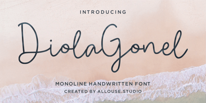 Proudly Presenting Diola Gonel a Monoline Handwritten Font. Diola Gonel come along with Multi-Lingual Support which will fulfill your need. We highly recommend using a program that supports OpenType features and Glyphs panels like many of Adobe apps and Corel Draw, so you can see and access all Glyph variations. Diola Gonel is perfect for any tittle, logo, product packaging, branding project, megazine, social media, wedding, or just used to express words above the background. Enjoy the font, feel free to comment or feedback, send me PM or email. Thank You!
 - Cavita by Underground,
$29.00 Cavita typeface is a mix between both grotesque and calligraphic models: regulars have a rough grotesque spirit; while the italics where inspired in calligraphic gestures. All of these details are reinforced with an inverted modulation (horizontals strokes are thicker than usual). The italics seem to move away from the traditional concept of type system, but work very well along side. This typeface has very particular shapes and rhythm, it's different and identifiable from the rest, making it a very good option to use on every piece of design.
 - Onigashima by Allouse Studio,
$16.00 Proudly Presenting, Onigashima a Japanese Brush Font. Onigashima come along with ton Stylistic Set and Multi-Lingual Support which will give you much choices to play around. We highly recommend using a program that supports OpenType features and Glyphs panels like many of Adobe apps and Corel Draw, so you can see and access all Glyph variations. Onigashima is perfect for any tittle, logo, product packaging, branding project, megazine, social media, wedding, or just used to express words above the background. Enjoy the font, feel free to comment or feedback, send me PM or email.
 - Madley by Kimmy Design,
$25.00 Madley is a contemporary slab serif typeface. Featuring monolinear stems, elongated block serifs and teardrop terminals, the type family goes from a delicate Hairline weight to a heavy Black weight. Because of its range in weights and extensive Opentype features, it’s a perfect font for both text and display text settings. Alternative features include a wide array of swashes assigned up to 11 for select characters, combining ligatures in capital unicase settings, and stylistic alternates for some letters. To see more, please check out the User Guide and Specimen booklet.
 - Plain Nouveau JNL by Jeff Levine,
$29.00 The Women's Suffrage Movement gained women the right to vote in 1920. Up until then there were many ways undertaken to rally sympathy for the cause. In 1916 Alice Paul formed the National Woman's Party. That same year a song with the [exhaustive] sixteen word title "She's Good Enough to be Your Baby's Mother (And She's Good Enough to Vote with You)" yielded a hand lettered Art Nouveau sans serif design in the main portion of the title. This became the basis for Plain Nouveau JNL, which is available in both regular and oblique versions.
 - Rough Riders Redux by FontMesa,
$35.00Rough Riders Redux along with our Rough Riders font, got its start from a small sample of letters used in the logo for the Beach Creek Railroad Co. dating back to the early 1860’s. I studied the design for one year before drawing the letters. Rough Riders and the Redux version are simply the most Wildest Western looking fonts you'll find. The Rough Riders fill font is not meant to be used as a stand alone black typeface, the fill font is designed to be layered behind the regular Rough Riders font. - Quiet Sickless by Allouse Studio,
$16.00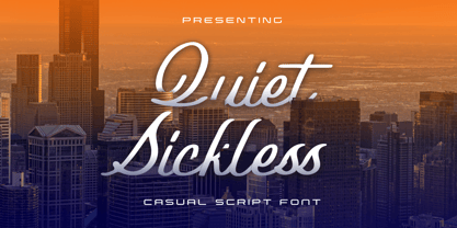 Proudly Present, Quiet Sickless a Casual Script Font that bring you an a casual handwriting impression. Quiet SIckless come along with Multi-Lingual Support. We highly recommend using a program that supports OpenType features and Glyphs panels like many of Adobe apps and Corel Draw, so you can see and access all Glyph variations. Quiet Sickless is perfect for product packaging, branding project, megazine, social media, wedding, or just used to express words above the background. Enjoy the font, feel free to comment or feedback, send me PM or email. Thank You!
 - Glee Laughter by Sohel Studio,
$14.00 Lodge Introducing our retro chunky serif font, a bold and nostalgic typeface that brings a classic and timeless design to your projects. With its thick, distinctive serifs and strong character set, this font is perfect for creating eye catching headlines, vintage posters, and stylish branding. Embrace the 1970s-inspired aesthetics with this unique typography that adds a touch of nostalgia to your designs. Whether you're working on print materials, display graphics, or editorial layouts, our retro chunky serif font will give your projects a bold and timeless appeal.
 - Mattiass by Haksen,
$14.00 "Mattiass" is a hand lettered font style that perfect for greeting cards, branding, stationery design, social media, packaging, magazine layouts, prints, logos and more! This unique font features complete lowercase alphabets and uppercase alphabets along with a few other ligatures and stylistic alternates to create a truly handwritten look and feel. Each of "Mattiass" has a variety of unique, the script with brush and rough textured and Serif with handwritten textured included coded features to create compelling, handmade outcomes. Multilingual support is included for Western European languages.and OTF is included for the full, "Mattias" font.
 - Ironbridge by Device,
$29.00 A cast iron plaque from Bristol Temple Meads Station serves as inspiration for this antique font. The plaque commemorates the design contribution of Isambard Kingdom Brunel, who in March 1833 at only 27 was appointed chief engineer of the Great Western Railway, the line that links London to Bristol. This helped establish Brunel as one of the world’s leading engineers. Impressive achievements along the route include viaducts at Hanwell and Chippenham, Maidenhead Bridge, Box Tunnel and Bristol Temple Meads Station. Ironbridge evokes industrial heritage, gothic spookiness or eroded heavy metal.
 - Faberge by Larin Type Co,
$18.00 FABERGE This is elegant logo serif font. It has a light weight and playing forms, the uppercase are more elongated and the lowercase are compressed but they have the same height as the uppercase, with this you can play with space and mix them, with this you will expand the boundaries of your ideas for your project. This font has 44 ligatures ( use uppercase to get them ), 124 alternatives for uppercase and 88 alternatives for lowercase, they will add a touch of playfulness and elegance and make your design unique.
 - Hello Billyday by Zane Studio,
$15.00 Hello Billyday Script is a soft and sweet calligraphic typeface, with the characters dancing along the baseline. It has a casual and elegant touch. It can be used for various purposes such as logos, wedding invitations, titles, t-shirts, letterheads, nameplates, labels, news, posters, badges etc. Features OpenType with stylistic alternatives, ligatures, and multiple language support. To enable the OpenType Stylistic alternative, you need a program that supports OpenType features such as Adobe Illustrator CS, Adobe Indesign & CorelDraw X6-X7, Microsoft Word 2010 or a later version. Thank you!
 - Grafro Techno by Nirmana Visual,
$29.00 Introducing our cutting-edge techno font, designed to add a futuristic and sleek aesthetic to your designs. With its sharp lines, geometric forms, and high-tech vibe, this font is perfect for projects that require a modern and forward-looking visual identity. Inspired by the sleek designs of technology and the digital age, this font captures the essence of innovation and progress. Its clean and precise letterforms, along with its distinct futuristic style, make it an excellent choice for technology-based branding, gaming graphics, sci-fi posters, and digital interfaces.
 - Manchester Condensed by Vástago Studio,
$23.90 Every day we are faced with designing on small screens and new formats; This is where condensed fonts have great potential, as they make the most of tight spaces in big headlines. Manchester Condensed is a typeface family designed by Vástago to be applied in large headlines in different formats, such as web, editorial or packaging. Just to mention a few. Different Manchester weights enhance performance at large type sizes, providing hierarchy and imposing style with its elongated shapes. Its use in capital letters is remarkable and fits perfectly into very precise diagramming spaces.
 - Emerald Cole by Allouse Studio,
$16.00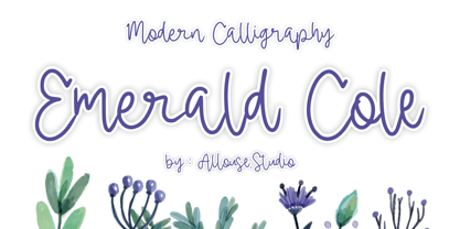 Proudly Presenting, Emerald Cole a Modern Calligraphy Font. Emerald Cole is perfect for any tittle, product packaging, branding project, megazine, social media, wedding, or just used to express words above the background. Emerald Cole also come along with Multilingual-Support to fulfill your need. We highly recommend using a program that supports OpenType features and Glyphs panels like many of Adobe apps and Corel Draw, so you can see and access all Glyph variations. Enjoy the font, feel free to comment or feedback, send me PM or email.