10,000 search results
(0.109 seconds)
- LumineSign - Unknown license

- DotLinDot by Pankabre,
$9.00 Accurate handwritten font with dots and lines. In small sizes it looks especially good in the texts of history books.
 - Kexman by Gleb Guralnyk,
$15.00 Hi! Introducing a calligraphic handmade script named "Kexman". It's a one line font with many OpenType features: ligatures, alternates, swashes.
 - KG All Things New by Kimberly Geswein,
$5.00 This font was born of a desire to play with super thin and super thick lines in a script font.
 - Catania by Intellecta Design,
$17.90Note: The Lined and Shadow styles are no longer available due their complexity and the resulting memory and performance issues. - MBF Typerisme by Moonbandit,
$16.00 Moonbandit proudly presents, Typerisme. The modern take on the typewriter font. This typeface is perfect for your old, retro, vintage distressed look without going overboard. Huge kerning to boost clarity. Use it for body text, headline, title, one liner, anything! this typeface is versatile.
 - Mother Hen AOE by Astigmatic,
$19.95 Mother Hen is an offbeat comic latin typestyle full of quirkiness and bounce. Inspired by the 1965 Looney Tunes cartoon titled “Highway Runnery”, this typeface has all of the spunk of its source. The end result, a lively tribute to its origin, easy to read and fun to look at, a perfect typeface for childrens' books, advertisements, and playful designs!
 - ND Form by NeueDeutsche,
$55.00 An innovative font merging the essence of schablonen lineal with modern design. Composed of carefully shaped rectangles and semi circles, this typeface encapsulates geometric precision and contemporary aesthetics. "ND Form" breathes life into your creations, infusing each character with a fusion of structure and creativity. Elevate your projects with the sleek, distinctive allure of "ND Form," where geometry meets artistic expression.
 - La Pejina ffp - Personal use only

- Sketchica - Personal use only

- Calligraphy Double Pencil - Personal use only

- Mia's Scribblings ~ - 100% free

- FS Untitled Variable by Fontsmith,
$319.99Developer-friendly The studio has developed a wide array of weights for FS Untitled – 12 in all, in roman and italic – with the intention of meeting every on-screen need. All recognisably part of a family, each weight brings a different edge or personality to headline or body copy. There’s more. Type on screen has a tendency to fill in or blow so for each weight, there’s the choice of two marginally different versions, allowing designers and developers to go up or down a touch in weight. They’re free to use the font at any size on any background colour without fear of causing optical obstacles. And to make life even easier for developers, the 12 weight pairs have each been designated with a number from 100 (Thin) to 750 (Bold), corresponding to the system used to denote font weight in CSS code. Selecting a weight is always light work. Easy on the pixels ‘It’s a digital-first world,’ says Jason Smith, ‘and I wanted to make something that was really functional for digital brands’. FS Untitled was made for modern screens. Its shapes and proportions, x-height and cap height were modelled around the pixel grids of even low-resolution displays. So there are no angles in the A, V and W, just gently curving strokes that fit, not fight, with the pixels, and reduce the dependency on font hinting. Forms are simplified and modular – there are no spurs on the r or d, for example – and the space between the dot of the i and its stem is larger than usual. The result is a clearer, more legible typeface – functional but with bags of character. Screen beginnings FS Untitled got its start on the box. Its roots lie in Fontsmith’s creation of the typeface for Channel 4’s rebrand in 2005: the classic, quirky, edgy C4 headline font, with its rounded square shapes (inspired by the classic cartoon TV shape of a squidgy rectangle), and a toned-down version for use in text, captions and content graphics. The studio has built on the characteristics that made the original face so pixel-friendly: its blend of almost-flat horizontals and verticals with just enough openness and curve at the corners to keep the font looking friendly. The curves of the o, c and e are classic Fontsmith – typical of the dedication its designers puts into sculpting letterforms. Look out for… FS Untitled wouldn’t be a Fontsmith typeface if it didn’t have its quirks, some warranted, some wanton. There’s the rounded junction at the base of the E, for example, and the strong, solid contours of the punctuation marks and numerals. Notice, too, the distinctive, open shape of the A, V, W, X and Y, created by strokes that start off straight before curving into their diagonal path. Some would call the look bow-legged; we’d call it big-hearted. - Prillwitz Pro by preussTYPE,
$49.00 Johann Carl Ludwig Prillwitz, the German punch cutter and type founder, cut the first classic Didot letters even earlier than Walbaum. The earliest proof of so-called Prillwitz letters is dated 12 April 1790. Inspired by the big discoveries of archaeology and through the translations of classical authors, the bourgeoisie was enthused about the Greek and Roman ideal of aesthetics. The enthusiasm for the Greek and Roman experienced a revival and was also shared by Goethe and contemporaries. »Seeking the country of Greece with one’s soul«. All Literates who are considered nowadays as German Classics of that time kept coming back to the Greek topics, thinking of Schiller and Wieland. The works of Wieland were published in Leipzig by Göschen. Göschen used typefaces which had been produced by until then unknown punch cutter. This punch cutter from Jena created with these typefaces master works of classicist German typography. They can stand without any exaggeration on the same level as that of Didot and Bodoni. This unknown gentleman was known as Johann Carl Ludwig Prillwitz. Prillwitz published his typefaces on 12th April 1790 for the first time. This date is significant because this happened ten years before Walbaum. Prillwitz was an owner of a very successful foundry. When the last of his 7 children died shortly before reaching adulthood his hope of his works was destroyed, Prillwitz lost his will to live. He died six months later. His wife followed him shortly after. The typeface Prillwitz as a digital font was created in three optical styles (Normal, Book and Display). The typeface Prillwitz Press was created especially for a printing in small sizes for newspapers. »Prillwitz Press« combines aesthetic and functional attributes which make written text highly readable. It was originally designed for a newspaper with medium contrast to withstand harsh printing conditions. Its structure is quite narrow which makes this typeface ideal for body text and headlines where space is at premium. For the Normal – even more for the Book – a soft and reader-friendly outline was created through a so-called »Schmitz« and optimized in numerous test prints. The arris character and the common maximal stroke width contrast of the known classicist typefaces (Didot/Bodoni) were edited by the study of the original prints. This was also done in order to reach a very good readability in small type sizes. This typeface is perfectly suited to scientific and belletristic works. Accordingly it has three styles: Regular, Bold and Italic as Highlighting (1). The typeface Prillwitz is a complete new interpretation and continuing development of the conservated originals from 1790. They have been kept in the German Library in Leipzig. It was always given the priority to keep the strong roughness and at the same time optimizing the readability of this striking font. The type family has all important characters for an efficient and typographic high quality work. ----------- (1) Accentuation of particular words or word orders (e.g. proper names, terms etc.). Typographic means for Highlighting could be Italic, SmallCaps or semi-bold.
 - FS Untitled by Fontsmith,
$80.00 Developer-friendly The studio has developed a wide array of weights for FS Untitled – 12 in all, in roman and italic – with the intention of meeting every on-screen need. All recognisably part of a family, each weight brings a different edge or personality to headline or body copy. There’s more. Type on screen has a tendency to fill in or blow so for each weight, there’s the choice of two marginally different versions, allowing designers and developers to go up or down a touch in weight. They’re free to use the font at any size on any background colour without fear of causing optical obstacles. And to make life even easier for developers, the 12 weight pairs have each been designated with a number from 100 (Thin) to 750 (Bold), corresponding to the system used to denote font weight in CSS code. Selecting a weight is always light work. Easy on the pixels ‘It’s a digital-first world,’ says Jason Smith, ‘and I wanted to make something that was really functional for digital brands’. FS Untitled was made for modern screens. Its shapes and proportions, x-height and cap height were modelled around the pixel grids of even low-resolution displays. So there are no angles in the A, V and W, just gently curving strokes that fit, not fight, with the pixels, and reduce the dependency on font hinting. Forms are simplified and modular – there are no spurs on the r or d, for example – and the space between the dot of the i and its stem is larger than usual. The result is a clearer, more legible typeface – functional but with bags of character. Screen beginnings FS Untitled got its start on the box. Its roots lie in Fontsmith’s creation of the typeface for Channel 4’s rebrand in 2005: the classic, quirky, edgy C4 headline font, with its rounded square shapes (inspired by the classic cartoon TV shape of a squidgy rectangle), and a toned-down version for use in text, captions and content graphics. The studio has built on the characteristics that made the original face so pixel-friendly: its blend of almost-flat horizontals and verticals with just enough openness and curve at the corners to keep the font looking friendly. The curves of the o, c and e are classic Fontsmith – typical of the dedication its designers puts into sculpting letterforms. Look out for… FS Untitled wouldn’t be a Fontsmith typeface if it didn’t have its quirks, some warranted, some wanton. There’s the rounded junction at the base of the E, for example, and the strong, solid contours of the punctuation marks and numerals. Notice, too, the distinctive, open shape of the A, V, W, X and Y, created by strokes that start off straight before curving into their diagonal path. Some would call the look bow-legged; we’d call it big-hearted.
 - Transat by Typetanic Fonts,
$29.00 Transat is a geometric sans serif typeface, with caps inspired by Art Deco signage — found inside the “Gare Maritime” (literally “sea station”) ocean liner terminals in both Le Havre and Cherbourg, France, in the early 1930s. The name “Transat” is the common shortening of “Compagnie Générale Transatlantique,” the company that operated majestic ocean liners like the SS Normandie out of Le Havre from 1862–1974. (Transat also has a more rational text-friendly companion font, " Transat Text ") Transat includes many OpenType features, such as ligatures (ff/ft/fft), small capitals, case sensitive forms, stylistic alternates, arbitrary fractions, and a full complement of proportional, tabular, and oldstyle figures. Transat is released in 5 weights plus including optically-corrected obliques.
 - Antique Unique JNL by Jeff Levine,
$29.00 A page from an 1880s type specimen book presented a unique "Barnum"-like design with top horizontal lines much thinner than the bottom ones. Titled "Ten Line Antique Compressed No. 7", the design transcends the years; for it's not only an antique wood type font, but is also reminiscent of the 1960s hippie counterculture movement. Antique Unique JNL is available in both regular and oblique versions.
 - F2F Allineato by Linotype,
$29.99Allineato was part of the Face2Face project, a fontlabel created with a couple of friend in order to stimulate new ideas and forms in the typographical landscape. Most of the Typefaces were used by Alexander Branczyk in his famous techno magazine "Frontpage". About Allineato: "Al" means "Alessio Leonardi" and Lineato "lined", but if you read it as an italian world means "conformed to a given line". - Planny by Kaer,
$19.00Planny is a blueprint font created for the reproduction of a technical drawing or engineering drawing. All characters were designed with construction lines. The blueprint process was characterized by white lines on a blue background, a negative of the original. What you will get: Regular style Uppercase and lowercase glyphs Multilingual support Numbers and symbols Please feel free to request to add characters you need: kaer.pro@gmail.com - FF Gothic by FontFont,
$41.99 British type designer Neville Brody created this display and sans FontFont in 1992. The family contains 2 weights: Regular and Condensed and is ideally suited for advertising and packaging, music and nightlife, poster and billboards, software and gaming as well as sports. FF Gothic provides advanced typographical support with features such as ligatures and stylistic alternates. It comes with tabular lining and proportional lining figures.
 - Peter Schlemihl by profonts,
$41.99 Adalbert von Chamisso wrote that wondrous story about the man who sold his shadow to the devil. Walter Thiemann recovered that shadow when he put a thin line and a shadow line around his Tiemann Fraktur. It is an embellished and delightful typeface, this Peter Schlemihl. It is probably one of the most beautiful typefaces among the outline, shadow and striped black letter fonts. (Albert Kapr)
 - Spring Season JNL by Jeff Levine,
$29.00 Spring Season JNL is a decorated and stylized Art Deco slab serif design from1935 which is based on the hand lettered title on the sheet music for “Paris in the Spring”. The characters are cut through with both a straight line and a wavy, spoked line which looks something like a thorny vine. Spring Season JNL is available in both regular and oblique versions.
 - Packaged Goods JNL by Jeff Levine,
$29.00 A vintage matchbook advertising the New York Liquor Mart – oddly enough, located in Chicago, Illinois – featured a pen and ink line drawing of the store’s exterior. The Art Deco lettering on the mansard was portrayed with a straight left shadow (as opposed to drop cast or extruded), making for an interesting multi-line typeface design. This is now digitally available as Packaged Goods JNL.
 - Tachyon by Galaxa,
$10.00 Tachyon font family combines design simplicity of modern sans serifs with a futuristic feel based on a condensed character concept. Its clean lines can bring unusual spark to logo designs, headlines, magazine designs, quotes, documentaries, advertisements or similar projects. This font will find its use also in larger text blocks where simplicity, clean lines and well applied kerning are a must. Create something spectacular with Tachyon.
 - FF Maverick by FontFont,
$41.99 German type designer Christoph Kalscheuer created this display FontFont in 1995. The family has 6 weights, ranging from Light to Bold (including italics) and is ideally suited for advertising and packaging, logo, branding and creative industries as well as sports. FF Maverick provides advanced typographical support with features such as alternate characters and case-sensitive forms. It comes with tabular lining and proportional lining figures.
 - SK Brushwood by Shriftovik,
$10.00 SK Brushwood is an experimental geometric font based on chaotic lines. It is inspired by the Greek stone script, but nevertheless it is modern. The main component of the letter shape is straight and sloping lines ending in straight corners, which makes it look like brushwood. This is why the font gets its name. SK Brushwood is perfect for headlines, posters, print work, and the Internet.
 - Rizado Script by Kostic,
$40.00 Rizado Script is a classy one-weight script typeface, made with “dolce vita” in mind. Its high contrast and pointy tone are recalling the fine nib handwriting of a meticulous and decisive person that hasn’t got free time to spare but surely knows how to enjoy his life. No quick and dry strokes, but rather wide, elegant and strong-minded temper that will bring a long-lasting touch to your packaging layouts. Sure, if you are looking for a good fit for some more ephemeral design such as a weekend high-class cocktail promotion, or a wedding invitation – this handy display typeface won’t let you down for a second. If you happen to go to Venice and enjoy their popular Aperitivo, you’ll be asked to choose between three types of bitter-reddish base drink. Rizado will bring you the same amount of pleasure, authority and uniqueness while you pick out one of the three ampersands or other alternate characters. According to the concept of Fellini’s lifestyle, “la dolce vita” is a luxury lifestyle full of cheerful worldly pleasure. But don’t let yourself be fooled by this moto, because Italians are famous for their modesty and sagacity as well. That’s why you’re always supposed to turn on the Contextual Alternates (to activate extra positional forms — isolated, initial and final) and keep your voice down and never set this typeface in all Capital letters. There are 391 total glyphs made to support West European, Central European and South East European languages.
 - Brightland by Pixesia Studio,
$23.00 Introducing Brightland - Condensed Sans Serif Font Brightland is a condensed sans serif font that comes in four distinct styles - solid, solid italic, line, and line italic. This versatile font is perfect for use in a wide range of design projects, including branding, advertising, and packaging. Its clean, modern aesthetic makes it suitable for use in a variety of settings, and its four different styles allow you to create a wide range of looks. The solid style of Brightland is straightforward and uncomplicated, making it perfect for use in headlines and titles. The solid italic style adds a touch of flair, while the line style is light and airy. And the line italic style is perfect for creating a more playful, imaginative look. FEATURES - All Caps - Numbering and Punctuations - Multilingual Support - Works on PC or Mac - Simple Installation - Support Adobe Illustrator, Adobe Photoshop, Adobe InDesign, also works on Microsoft Word Hope you Like it. Thanks.
 - Spiraltwists by Aah Yes,
$0.75Spiraltwists is a family of 2 fonts giving assorted spiral shapes. In each font they're grouped in fours - the same basic spiral in 4 different orientations (N S E W almost), and Spiraltwists has solid lines making up the spirals, Spiraltwists Antique has dotted lines making up the spirals, giving them an antique or rustic appearance. Spiraltwists has heavier spirals on Upper Case, lighter spirals on lower case; plus a group of spirals with a straightened outer end and connecting lines so you get two spiral scrolls joined together by a long line at the top or bottom. (inputting UVWXYZ into the text-box on this webpage will show it). The big example on the webpage shows it all more clearly than any explanation. A fuller description, plus the above example, are included in the zipfile. Please note: for the avoidance of doubt, the font does not contain any letters, the text in these 2 examples is not Spiraltwists but Luzaine. - Andyou by Sakha Design,
$12.00 Andyou is a lovely and delicate script font that exudes elegance and class. This font was particularly crafted for those who need a beautiful and refreshing look to their designs. Andyou is PUA encoded which means you can access all of the glyphs and swashes with ease!
 - Mistyca Brush by Letterena Studios,
$9.00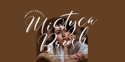 Mistyca Brush is a lovely and delicate script font that exudes elegance and class. This font was particularly crafted for those who need a beautiful and refreshing look to their designs. Mistyca Brush is PUA encoded which means you can access all glyphs and swashes with ease!
 - Farwell by Balevgraph Studio,
$14.00 Farwell is a stylish and light script font, that exudes elegance and class. This font was particularly crafted for those who need a beautiful and refreshing look to their designs. Included uppercase, lowercase, numerals, punctuations, ligature, alternate, works on PC & mac, simple installations, multilingual support, PUA encoded.
 - Bretanis by ahweproject,
$14.00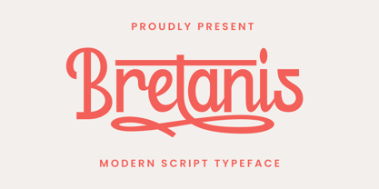 Bretanis a lovely and delicate script font that exudes elegance and class. This font was particularly crafted for those who need a beautiful and refreshing look to their designs. Bretanis is PUA encoded which means you can access all of the amazing glyphs and ligatures with ease!
 - Gerakona by Ws Studio,
$18.00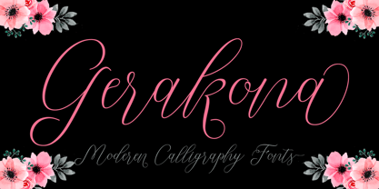 Gerakona is a lovely and delicate script font that exudes elegance and class. This font was particularly crafted for those who need a beautiful and refreshing look to their designs. Gerakona is PUA encoded which means you can access all of the glyphs and swashes with ease!
 - Dettina Girls by Letterena Studios,
$9.00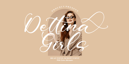 Dettina Girls is a lovely and delicate script font that exudes elegance and class. This font was particularly crafted for those who need a beautiful and refreshing look to their designs. Dettina Girls is PUA encoded which means you can access all glyphs and swashes with ease!
 - Justin Feryina by Letter Muray,
$16.00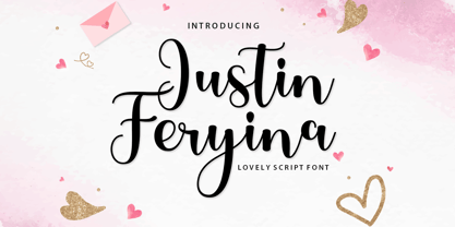 Justin Feryina is a lovely and delicate script font that exudes elegance and class. This font was particularly crafted for those who need a beautiful and refreshing look to their designs. Justin Feryina is PUA encoded which means you can access all glyphs and swashes with ease!
 - Demillina by AEN Creative Studio,
$12.00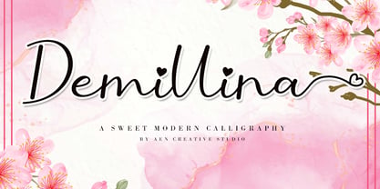 Demillina is a lovely and delicate script font that exudes elegance and class. This font was particularly crafted for those who need a beautiful and refreshing look to their designs. Demillina is PUA encoded which means you can access all of the glyphs and swashes with ease!
 - GoodCityModern Plain - Unknown license

- CEO Roman by BA Graphics,
$45.00A very clean conservative corporate look, very simple yet very dignified. Great for text and head lines, just about any application. - Type Vendor JNL by Jeff Levine,
$29.00 Type Vendor JNL gives a solid treatment to the dual-line Type Catalog JNL, and offers an oblique version as well.


