10,000 search results
(0.032 seconds)
- FF Sale by FontFont,
$41.99 British type designer Tony Booth created this script FontFont in 1996. The family contains 4 weights: Light Italic, Regular, Medium Italic, and Bold Italic and is ideally suited for advertising and packaging and poster and billboards. FF Sale provides advanced typographical support with features such as ligatures, alternate characters, and case-sensitive forms. It comes with proportional lining and tabular lining figures.
 - Oxford by profonts,
$41.99 profonts Oxford was originally designed by Christine Lord in 1960 and digitally re-mastered by profonts in 2009. The font contains lower case characters only. It is a multi-line display design with a continuous connecting horizontal line that combines all characters. This combination makes it special and very sporty. profonts Oxford is ideal for any design of sporting character.
 - GaoYah Display by Stones Design Lab,
$20.00 GaoYah Display Thin is a type in very thin line, GaoYah means Elegance in Mandarin, some characters build in unique shapes can make a good memory. This font is suitable for huge titles display, in which way the line and detail shows elegance. It will make good performance in dark background as well. Including Basic English and Western Europe languages.
 - FF Schulschrift by FontFont,
$131.99 Dutch type designer Just van Rossum created this script FontFont in 1991. The family has 20 weights and is ideally suited for advertising and packaging, book text, film and tv, editorial and publishing as well as logo, branding and creative industries. FF Schulschrift provides advanced typographical support with features such as alternate characters. It comes with tabular lining and proportional lining figures.
 - Big Ballpen by Simonkoba,
$18.00 Big Ballpen is a modern, slightly naive handwriting typeface, which has the feel of graffiti with its rough lines. The font lines are basically fat and the thickness is not regular from letter to letter. Some numbers are inspired from Tony Buzan concept of picture-number. For example, the number 2 resembles a swan. Some special characters like €$*#@&{Ç~• are available.
 - Barrage by RagamKata,
$14.00 Barrage Display Font Barrage presents a modern take on typeface design, merging cheerful boldness with artistic touches. Each letter is meticulously shaped, striking a balance between confidence and elegance. The box-like lines provide a sturdy foundation, while the subtle curves add a delightful creative flair. With its lively boldness and delicate lines, Barrage conveys courage and a positive personality.
 - WBP Ripples by Studio Jasper Nijssen,
$20.00 Stone skipping creates water ripples. This font expands by the same principle. A small, narrow base growing to the top, right, bottom and left until it reaches the shores. In this case: from the mean line to the baseline and caps height with a max. of three lines. WBP Ripples is a beautiful, friendly looking and playful display font for everyday use.
 - Meila Arabic by NamelaType,
$29.00 Meila Arabic is sibling of Meila with the addition of Arabic glyphs, for Arabic, Urdu, and Farsi. Still carrying a childish character with a cheerful font, visually featuring bold and cute characters. Meila has smooth lines on each side, especially on the outside, almost no sharp corners. On the inside there is only one line that functions as a counter space.
 - Deco Metro by Greater Albion Typefounders,
$20.00 Deco Metro is a 1920s and 30s inspired display family, ideal for posters, banners, book covers and other promotional work. Two weights, regular (with an incised centre line) and bold (without the centre line) are offered. The family has an extensive range of features including discretionary ligatures, old-style numerals, Swash Letter and numeral forms, small capitals, Roman numerals and fractions.
 - Springsteel by Paragraph,
$21.00 Introducing Springsteel, a new display sans serif with an unusual construction: curved lines on the outside with only a few straight lines on the inside. The resulting typeface shows a great deal of tension and dynamics. Preferably, it should be used at larger sizes, at smaller sizes only for special effects. It was spaced and kerned by Igino Marini/iKern.
 - Militarist by Vozzy,
$10.00 Introducing military label font named Militarist. This font has a cyrillic and multilungual characters support (check out all available characters on previews). The font family has eight styles: Regular, Stencil, Lines, Texture, Texture FX, Rough, Stencil Rough and Lines Rough. This font will look good on any military or serious styled designs like a poster, T-shirt, label, logo, etc.
 - Tecna Dark Up Triangle BNF by Descarflex,
$30.00 The Tecn@ Dark&Light Triangle Background Nomenclature Font family is differentiated by the direction of the triangle tip in the 4 cardinal points. The family were designed to head, enumerate, indicate or highlight writings or design plans, for this reason, the characters are available only in capital letters and some signs or symbols that can serve such purposes. A triangle or empty character is included so that the user can use it overlaying any character of his choice or to be used alone. What is Lorem Ipsum? Lorem Ipsum is simply dummy text of the printing and typesetting industry. Lorem Ipsum has been the industry's standard dummy text ever since the 1500s, when an unknown printer took a galley of type and scrambled it to make a type specimen book. It has survived not only five centuries, but also the leap into electronic typesetting, remaining essentially unchanged. It was popularised in the 1960s with the release of Letraset sheets containing Lorem Ipsum passages, and more recently with desktop publishing software like Aldus PageMaker including versions of Lorem Ipsum. Why do we use it? It is a long established fact that a reader will be distracted by the readable content of a page when looking at its layout. The point of using Lorem Ipsum is that it has a more-or-less normal distribution of letters, as opposed to using 'Content here, content here', making it look like readable English. Many desktop publishing packages and web page editors now use Lorem Ipsum as their default model text, and a search for 'lorem ipsum' will uncover many web sites still in their infancy. Various versions have evolved over the years, sometimes by accident, sometimes on purpose (injected humour and the like). Where does it come from? Contrary to popular belief, Lorem Ipsum is not simply random text. It has roots in a piece of classical Latin literature from 45 BC, making it over 2000 years old. Richard McClintock, a Latin professor at Hampden-Sydney College in Virginia, looked up one of the more obscure Latin words, consectetur, from a Lorem Ipsum passage, and going through the cites of the word in classical literature, discovered the undoubtable source. Lorem Ipsum comes from sections 1.10.32 and 1.10.33 of "de Finibus Bonorum et Malorum" (The Extremes of Good and Evil) by Cicero, written in 45 BC. This book is a treatise on the theory of ethics, very popular during the Renaissance. The first line of Lorem Ipsum, "Lorem ipsum dolor sit amet..", comes from a line in section 1.10.32. The standard chunk of Lorem Ipsum used since the 1500s is reproduced below for those interested. Sections 1.10.32 and 1.10.33 from "de Finibus Bonorum et Malorum" by Cicero are also reproduced in their exact original form, accompanied by English versions from the 1914 translation by H. Rackham. Where can I get some? There are many variations of passages of Lorem Ipsum available, but the majority have suffered alteration in some form, by injected humour, or randomised words which don't look even slightly believable. If you are going to use a passage of Lorem Ipsum, you need to be sure there isn't anything embarrassing hidden in the middle of text. All the Lorem Ipsum generators on the Internet tend to repeat predefined chunks as necessary, making this the first true generator on the Internet. It uses a dictionary of over 200 Latin words, combined with a handful of model sentence structures, to generate Lorem Ipsum which looks reasonable. The generated Lorem Ipsum is therefore always free from repetition, injected humour, or non-characteristic words etc.
 - Mecanic by Manolo Type,
$15.00 Their angular lines are strongly contrasted by sweeping curves, the result: one type with firm character and strong personality.
 - Advantage by Intellecta Design,
$14.95 Note: The Advantage Lined style is no longer available due its complexity and the resulting memory and performance issues.
 - Silent Seas by Dismantle Destroy,
$19.00 This font was inspired by music from the band Silverstein. The main characteristics are the incredibly thin, orgainic lines.
 - Vektori by Suomi,
$19.00 Vektori family comes from those Atari games that had those distinct vector graphics with thin and precise straight lines.
 - HeavyLOUDedge by TypoGraphicDesign,
$19.00 Headline Font / Display Font / Techno Fat Font HeavyLoundEdge with 4 styles (regular, bold, light, line) & 304 glyphs, including accents & €.
 - Ladylord by Stefani Letter,
$12.00 Ladylord is a beautiful professional handwritten font that exudes elegance and class which looks stunning. It will add a luxury spark to any design project! This font is PUA encoded which means you can access all of the amazing glyphs and ligatures with ease!
 - Adelyna by Letterena Studios,
$9.00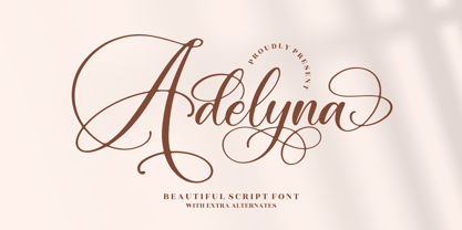 Adelyna is a ravishing and delicate script font that exudes elegance and class. This font was particularly crafted for those who need a beautiful and refreshing look to their designs. Adelyna is PUA encoded which means you can access all glyphs and swashes with ease!
 - Sodaster by WNGSTD,
$15.00 Sodaster is a lovely and delicate script font that exudes elegance and class. This font was particularly crafted for those who need a beautiful and refreshing look to their designs. Sodaster is PUA encoded which means you can access all glyphs and swashes with ease!
 - Qubo by Hoftype,
$49.00 Qubo, a new forcefully drawn monoline face. Its clear graphics create its appeal and give it distinctive characteristics. The slightly squared round elements make for an open and elegant look; subtle details refer to humanistic models. Qubo is a neutral, cool and very versatile typeface. It works superbly both in print and on the web. Qubo is well-equipped for ambitious typography. The Qubo family consists of 14 styles, comes in OpenType format with extended language support for more than 40 languages. All weights contain ligatures, proportional lining figures, tabular lining figures, proportional old style figures, lining old style figures, matching currency symbols, fraction- and scientific numerals.
 - Askan Slim by Hoftype,
$49.00 Askan Slim has the same design features as Askan , cap-height, x-height, descenders and ascenders. It is a moderately condensed version of Askan and works superbly as an addition to Askan or as independently for space saving applications. It is the perfect complement of the Askan family. Like Askan, Askan Slim consists of 18 styles and is well equipped for advanced typography. It comes in OpenType format with extended language support. All weights contain small caps, ligatures, superior characters, proportional lining figures, tabular lining figures, proportional old style figures, lining old style figures, matching currency symbols, fraction- and scientific numerals, matching arrows and alternate characters.
 - Meila by NamelaType,
$19.00 Meila is a cheerful font, visually featuring bold and cute characters. Meila has smooth lines on each side, especially on the outside, almost no sharp corners. On the inside there is only one line that functions as a counter space. We made as little sidebaring as possible on each letter character, so that each character letter would intersect and that made "Meila" look solid, fat but still soft and huggable. Meila consists of several style variants and thickness variants, namely; Lines, Strokes and Solids. Meila is very suitable for children's themed designs or others such as; T-Shirt Designs, Birthday invitations, Product packaging, Logos etc.
 - Adora Normal PRO by preussTYPE,
$53.90 German type designer Ingo Preuss created this sans Super-family between 2010 and 2015. The family has 84 weights, ranging from Light to Ultra in Normal, Compact, Condensed and Compressed (including italics). It comes in OpenType format with extended language support. All weights contain ligatures, superior characters, proportional lining figures, tabular lining figures, proportional old style figures, lining old style figures, matching currency symbols, fraction- and scientific numerals and matching arrows. The “Adora PRO family” is ideally suited for advertising and packaging, editorial and publishing, logo, branding and creative industries, poster and billboards, small text, wayfinding and signage as well as web and screen design.
 - Shandon Slab by Hoftype,
$49.00 Shandon Slab adds a new colour to the prominent family of serif-dominant typefaces. A distinctive look with its slightly flowing characteristics sets it apart from most members of the category. The contrasting italic styles add a vivid accent. Shandon Slab is predestined for editorials, headlines, and eye-catching text applications. The Shandon Slab family consists of 18 styles. It comes in OpenType format with extended language support for more than 40 languages. All weights contain standard and discretionary ligatures, proportional lining figures, tabular lining figures, proportional old style figures, lining old style figures, matching currency symbols, fraction- and scientific numerals, matching arrows and alternative characters.
 - Adora Compressed PRO by preussTYPE,
$53.90 German type designer Ingo Preuss created this sans Super-family between 2010 and 2015. The family has 84 weights, ranging from Light to Ultra in Normal, Compact, Condensed and Compressed (including italics). It comes in OpenType format with extended language support. All weights contain ligatures, superior characters, proportional lining figures, tabular lining figures, proportional old style figures, lining old style figures, matching currency symbols, fraction- and scientific numerals and matching arrows. The “Adora PRO family” is ideally suited for advertising and packaging, editorial and publishing, logo, branding and creative industries, poster and billboards, small text, wayfinding and signage as well as web and screen design.
 - FT Drobbs by Foxys Forest Foundry,
$9.00 FT Drobbs is inspired by the Didot font group, known for its neoclassical style reminiscent of the Age of Enlightenment. The font includes a combination of very narrow and very wide lines. FT Drobbs features increased contrast between wide and narrow lines and includes rich teardrop endings. I love to watch how the lines bend, how they move, expanding or going into the thickness of the hair. I love their graceful beauty. FT Drobbs is not alphabetic, but it contains numbers, a set of basic currency symbols, and a few typographic characters. It is suitable for use as accents in labels, posters and infographics.
 - Contane Text Cnd by Hoftype,
$49.00 Contane Text Condensed is the text optimized version of Contane Condensed. More solid, more robust, it embodies the power addition to the more delicate members of the Contane Condensed family. Stronger hairlines and stronger serifs also make it appropriate for smaller text size applications. Contane Text Condensed supports up to 80 languages and it’s OpenType format allows a wide range of typographic applications. 20 styles offer fine graduation of the weights. All weights contain small caps, ligatures, superior characters, proportional lining figures, tabular lining figures, proportional old style figures, lining old style figures, matching currency symbols, fraction- and scientific numerals, matching arrows and alternate characters.
 - Pop Cubism by K-Type,
$20.00 The Pop Cubism fonts are inspired by Roy Lichtenstein who combined the strong outlines and benday dots of Pop Art with the fragmented viewpoints and facet line divisions of Cubism. The bold letterforms are derived from a variety of styles, both serif and sans, angular and rounded. Pop Cubism is available in two packages: Pop Cubism Shaded is a single font which contains the lines and dot tones for use in a single color. The Pop Cubism Color Kit contains three matching fonts (Pop Cubism Outline, Pop Cubism Halftone Underlay and Pop Cubism Color Underlay) for overlaying different colors of lines, dot tones, and background color.
 - Madigan Text by Hoftype,
$49.00 Madigan Text is the text optimized version of the Madigan family. More solid, more robust, it repesents the more stabil version to the more delicate Contane family. Stronger hairlines, solid serifs, and slightly wider proportions make it appropriate for bold headlines, as well as for small text sizes. Madigan supports up to 80 languages and it’s OpenType format allows a wide range of typographic applications. 18 styles offer fine graduation of the weights. All weights contain small caps, ligatures, superior characters, proportional lining figures, tabular lining figures, proportional old style figures, lining old style figures, matching currency symbols, fraction- and scientific numerals, matching arrows and alternate characters.
 - Adora Compact PRO by preussTYPE,
$53.90 German type designer Ingo Preuss created this sans Super-family between 2010 and 2015. The family has 84 weights, ranging from Light to Ultra in Normal, Compact, Condensed and Compressed (including italics). It comes in OpenType format with extended language support. All weights contain ligatures, superior characters, proportional lining figures, tabular lining figures, proportional old style figures, lining old style figures, matching currency symbols, fraction- and scientific numerals and matching arrows. The “Adora PRO family” is ideally suited for advertising and packaging, editorial and publishing, logo, branding and creative industries, poster and billboards, small text, wayfinding and signage as well as web and screen design.
 - Capita by Hoftype,
$49.00 Capita, a serif-dominated face in a new style. Strong in appearance, with controlled motion of the contour, vivid and warm, with gentle flow – it avoids any harshness of many slab serifs. Well-balanced proportions make it qualified as reading type, yet with its puissant qualities ideal for headlines and subheads. Capita is well equipped for ambitious typography. The Capita family consists of 12 styles, comes in OpenType format with extended language support for more than 40 languages. All weights contain small caps, proportional lining figures, tabular lining figures, proportional old style figures, lining old style figures, matching currency symbols, fractions and scientific numerals.
 - Adora Condensed PRO by preussTYPE,
$53.90 German type designer Ingo Preuss created this sans Super-family between 2010 and 2015. The family has 84 weights, ranging from Light to Ultra in Normal, Compact, Condensed and Compressed (including italics). It comes in OpenType format with extended language support. All weights contain ligatures, superior characters, proportional lining figures, tabular lining figures, proportional old style figures, lining old style figures, matching currency symbols, fraction- and scientific numerals and matching arrows. The "Adora PRO family" is ideally suited for advertising and packaging, editorial and publishing, logo, branding and creative industries, poster and billboards, small text, wayfinding and signage as well as web and screen design.
 - Capistrano BF by Bomparte's Fonts,
$39.00 Capistrano BF is an all-connecting, monolinear handwritten script that exudes much verve and vigor. A number of Automatic Ligatures and Contextual Alternates, for beginning and ending (lowercase) letters are included in the font, along with Stylistic Alternates for uppercase letters A, F, and T. Enable these features in OpenType-savvy programs (such as InDesign CS+, Illustrator CS+ and QuarkXpress 7 and later) to enhance your typography. In line-upon-line settings, Capistrano benefits from generous line spacing. As with most scripts, it is not recommended that word settings be in all uppercase, but rather in settings of initial capitals together with lowercase letters.
 - CAL Bodoni Ferrara by California Type Foundry,
$47.00 Bodoni Ferrara™ Fashionable, Luxury Heritage: The Original Bodoni Ferrara Sculpted from hi-res photos and scans of Bodoni's original Ferrara Font—his 1818 Manuale Tipografico and 1768 specimens. It has never before been available. This cut of Bodoni specially selected by Dave Lawrence from rare book specimens. Part of the California Type Foundry Origin Series. 3 Display Fonts in One!! And 6+ style mixes. Bodoni's 1st Draft - Transitional Serif Bodoni was often inspired by French type designs. His first draft of Ferrara was inspired by Pierre Simon Fournier. But Bodoni added his own Italian sensibilities. Bododni’s first, transitional style can pair with humanist sans, and transitional fonts. Bodoni's Rework - Modern Serif Later, Bodoni reworked Ferrara to match the later neo-classic style or modern serif of Firmin Didot¹. Bodoni’s modern style can pair with geometric sans, grotesque sans, neo-grotesque sans, gothic sans, copperplate script, . Informal On™ - Informal Mode by CAL Type Foundry This can pair with “infant” fonts. Geometric sans, and other sans or serifs with one-storied a’s. + Bodoni’s Tivoli a for another option! Works great with Fournier¹ fonts and grotesques, since the terminals will match. Font Pairing Guide This font includes a 78 page Ferrara Pairing Guide. This book shows you 131 pairings with text fonts. 47 pairings with subheader fonts! We want to help you get more out of your font collection. Design Features • Subtle forward angle (0.5-1.5°) makes Ferrara more lively and engaging than most Bodoni or Didot fonts. • Round curves make this font feel letter-pressed. • Bodoni's original tall x-height and slightly condensed proportions: great for headlines, where space is at a premium. • Better uppercase. Uppercase punctuation for design apps. • Proportional oldstyle and lining figures, both modern style and transitional numbers. Every pair of numbers is kerned for display sizes: no unsightly gaps! • Multiple special symbols for whenever you need a design to pop, including 3 of Bodoni’s amazing ampersands. Language Features Latin standard for western European and other languages. +Advanced support for: German, French, Spanish, Portuguese, Italian, and French. Special, uppercase umlauts for titles! Compare to metal Bauer¹ Bodoni! Special context kerning for French, Spanish, Portuguese, Italian, and French, to allow better better words like L'Angelique & “¿Nosotros?”. This kerning gets rid of unsightly gaps between “¿ and other combinations. Can’t Find the Pairing Guide? Can't find the pairing guide? Google “California Type Foundry” and grab the pairing guide. Get another free pro font while you’re there! Ferrara: many sizes, styles, moods and situations. It's a classic, fashionable font for display, headlines, and titles. Grab Ferrara today! ----------- ¹Trademarks of their respective owners. Ferrara™ is a trademark of the California Type Foundry.
 - Typewriter Sans JNL by Jeff Levine,
$29.00 At first glance, Typewriter Sans JNL seems to look like the pantograph lettering of an engraved sign or the rounded-end lettering from an architect's templates. It might also be mistaken for plastic pin-back lettering used on some bulletin boards. In actuality, the design is based on examples of an electric typewriter ball element with a sans font named "Dual Gothic", suggested for use "in credit reports and other financial applications".
 - Delux by Barnbrook Fonts,
$30.00 Dynamic and urgent in style, Delux draws influence from '50s science fiction pulp magazines and hand-painted military letterforms. Delux evokes an era when the future was neo-plastic, solid-state, isotopic bright (and everything was better with fins and chromium plating). Both retro-futuristic and nostalgic, Delux embodies a time when there was no melancholic longing for the past, just a naive burning optimism that 'things to come' would be better.
 - Mamshooq by MAKYN,
$40.00 Mamshooq is a Bilingual Contemporary Typeface designed by Kholoud Khaled Essawy. It is classified as a script typeface, that is inspired by handwriting. It is characterized by having a monolinear stroke thickness, and the skeleton of the Arabic font is based on Naskhi calligraphic manuscripts. It is familiar, soft, heartfelt and romantic looking typeface that has an honest voice that brings trust to the words and makes it comfortable for continuous reading.
 - XAirebesk by Ingrimayne Type,
$14.95 I am not sure exactly how to classify these geometrical ornaments. They resemble the arabesque ornamentation of medieval Islamic art, but also have similarities to Celtic knots and to some Chinese and Korean ornamentation. The bolder of the two only works well at very large point sizes, while the thinner is designed for use at smaller point sizes. There are usually similar ornaments on the same characters of the two, but not always.
 - Ddt by Typodermic,
$11.95 Introducing DDT, the epitome of modern typography that exudes professionalism and authority in every stroke. With its unique superelliptical shape, DDT strikes the perfect balance between clarity and seriousness, drawing inspiration from the time-tested classics like Univers and Eurostile. Not one to compromise on functionality, DDT offers a wide range of numeric styles, including monospaced lining numerals, proportional lining numerals, and proportional old-style numerals. And that’s not all—DDT is equipped with OpenType fractions and numeric ordinals, making it an ideal choice for all your design needs. DDT is available in both condensed and regular widths, each boasting seven different weights and italics. So whether you’re looking to create an impactful heading or a sleek body text, DDT has got you covered. Elevate your design game with DDT—the ultimate neutral-sans typeface that blends form and function seamlessly, leaving a lasting impression on your audience. Most Latin-based European, Vietnamese, Greek, and most Cyrillic-based writing systems are supported, including the following languages. Afaan Oromo, Afar, Afrikaans, Albanian, Alsatian, Aromanian, Aymara, Azerbaijani, Bashkir, Bashkir (Latin), Basque, Belarusian, Belarusian (Latin), Bemba, Bikol, Bosnian, Breton, Bulgarian, Buryat, Cape Verdean, Creole, Catalan, Cebuano, Chamorro, Chavacano, Chichewa, Crimean Tatar (Latin), Croatian, Czech, Danish, Dawan, Dholuo, Dungan, Dutch, English, Estonian, Faroese, Fijian, Filipino, Finnish, French, Frisian, Friulian, Gagauz (Latin), Galician, Ganda, Genoese, German, Gikuyu, Greenlandic, Guadeloupean Creole, Haitian Creole, Hawaiian, Hiligaynon, Hungarian, Icelandic, Igbo, Ilocano, Indonesian, Irish, Italian, Jamaican, Kaingang, Khalkha, Kalmyk, Kanuri, Kaqchikel, Karakalpak (Latin), Kashubian, Kazakh, Kikongo, Kinyarwanda, Kirundi, Komi-Permyak, Kurdish, Kurdish (Latin), Kyrgyz, Latvian, Lithuanian, Lombard, Low Saxon, Luxembourgish, Maasai, Macedonian, Makhuwa, Malay, Maltese, Māori, Moldovan, Montenegrin, Nahuatl, Ndebele, Neapolitan, Norwegian, Novial, Occitan, Ossetian, Ossetian (Latin), Papiamento, Piedmontese, Polish, Portuguese, Quechua, Rarotongan, Romanian, Romansh, Russian, Rusyn, Sami, Sango, Saramaccan, Sardinian, Scottish Gaelic, Serbian, Serbian (Latin), Shona, Sicilian, Silesian, Slovak, Slovenian, Somali, Sorbian, Sotho, Spanish, Swahili, Swazi, Swedish, Tagalog, Tahitian, Tajik, Tatar, Tetum, Tongan, Tshiluba, Tsonga, Tswana, Tumbuka, Turkish, Turkmen (Latin), Tuvaluan, Ukrainian, Uzbek, Uzbek (Latin), Venda, Venetian, Vepsian, Vietnamese, Võro, Walloon, Waray-Waray, Wayuu, Welsh, Wolof, Xavante, Xhosa, Yapese, Zapotec, Zarma, Zazaki, Zulu and Zuni.