10,000 search results
(0.028 seconds)
- Linotype Syntax Lapidar Text by Linotype,
$29.99Modeled on the writings chiseled in stone in the second century B.C., Syntax™ Lapidar is an energetic, spirited typeface designed by Hans Eduard Meier in 2000. Linotype Syntax Lapidar Text and Linotype Syntax Lapidar Serif Text have five weights each, with both cap and lowercase letterforms. Lapidar Display and Lapidar Serif Display also have five weights each, with mostly all cap letterforms and many alternates. It's a terrifically fun and inventive family, and if you look closely, you can see the resemblance to the more modern and restrained Syntax™ relatives. Great for menus, artist books, travelogues, or advertising - and if used very sparingly, it could add just the right element of lapidary significance to corporate documents. - Linotype Facts of Life by Linotype,
$29.99 - Linotype Authentic Small Serif by Linotype,
$29.99 - 20 db - Personal use only

- Linea 72 by OLOF Type Foundry,
$25.00 Linea 72 is a typical seventies display typeface that was designed by Roland Hirter back in the phototypesetting days, when typefaces were really drawn by hand. In this static environment each work step took its time. With the decision to digitize this typeface his son Thomas Hirter also chose to develop it further with todays technical possibilities. That’s why the font now includes over 600 glyphs and ten stylistic sets, offering different stylistic alternates of several letters. Linea 72 comes in the two original styles Regular and Kontur.
 - 20 Kopeek by Letterhead Studio-YG,
$35.00 20 kopeek is sans serif font with a slight touch of a steampunk.
 - Data 70 by ITC,
$29.99Data Seventy is a high-tech style font, with the look of old computer lettering. Data Seventy gives any text a futuristic appearance. - Roaring 20s by Thomas Käding,
$5.00 This is a decorative font containing the letters A-Z, numbers 0-9, and enough punctuation to make invitations, playbills, posters, and the like. It is meant to have the feel of the theatre district early last century. "Roaring 20s" comes in three styles: regular/engraved, hollow/white, and black. Enjoy!
 - Logx 20 by Fontsphere,
$12.00 LOGX-20 is a geometric, all-caps display typeface. This is the brother of the LOGX-10 font. It obviously refers to the previous one, but considering the construction it is a different typeface. LOGX-20 is designed to create elements of visual identification, various creative projects and outstanding graphics. It looks great in arrangements with different text sizes, headers, sentences and longer texts. Both on websites, print or applications.
 - Andreas Sans Cnd - Unknown license

- Basic Sans Cnd by Latinotype,
$29.00 Basic Sans Cnd: A new sans. Designed by Daniel Hernández Basic Sans Cnd is a narrower version of Basic Sans. It is a family of Grotesque features with a functional, neutral and seeming clean style that looks to keep a neutral (or basic) appearance on paper, but including lots of details that give it a unique personality. Basic Sans Cnd is a sans-serif typeface well-suited for publishing projects, medium-sized text, branding, posters, headlines and more! This font family comes in 7 weights—ranging from Thin to Black—plus matching italics and it has a set of 416 characters that support 206 different languages.
 - Contane Text Cnd by Hoftype,
$49.00 Contane Text Condensed is the text optimized version of Contane Condensed. More solid, more robust, it embodies the power addition to the more delicate members of the Contane Condensed family. Stronger hairlines and stronger serifs also make it appropriate for smaller text size applications. Contane Text Condensed supports up to 80 languages and it’s OpenType format allows a wide range of typographic applications. 20 styles offer fine graduation of the weights. All weights contain small caps, ligatures, superior characters, proportional lining figures, tabular lining figures, proportional old style figures, lining old style figures, matching currency symbols, fraction- and scientific numerals, matching arrows and alternate characters.
 - Libertinas-co. - Personal use only

- Sedgwick Co - 100% free

- COS Elfish by Cosmope Type,
$17.00 COS Elfish is a typeface with stroke contrast and has a unique shape. It has a structure that is well suited for display purposes. It has small serifs throughout and features curvilinear elements in some letters. It is suitable for use in various media such as unique and individual graphic design or web design.
 - Omed Brush by Alit Design,
$22.00 Presenting the Omed Brush Signature Script font by alitdesign. The Omed Brush Signature Script font is inspired by spontaneous and dynamic signature strokes with an ink texture that makes the Omed Brush Signature Script look real. The Omed Brush Signature Script font looks unique and charming which makes designs using the Omed Brush Signature Script look more prominent and cool. The Omed Brush Signature Script font is perfect for a collection of new fonts on your computer, tablet and smartphone for making unique designs or lettering. The Omed Brush Signature Script font is perfect for magazine cover designs, brochures, flyers. Instagram ads, Canva Design and so on with unique and modern concepts. besides that this font is very easy to use both in design and non-design programs because everything changes and glyphs are supported by Unicode (PUA). The Omed Brush Signature Script contains 804 glyphs with many unique and interesting alternative options. Language Support : Latin, Basic, Western European, Central European, South European,Vietnamese. In order to use the beautiful swashes, you need a program that supports OpenType features such as Adobe Illustrator CS, Adobe Photoshop CC, Adobe Indesign and Corel Draw. but if your software doesn't have Glyphs panel, you can install additional swashes font files. Thank You Alit
 - England Co by Runsell Type,
$16.00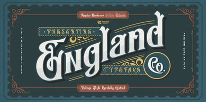 England Co font is perfect for many of your projects like logos & branding, photography, invitations, watermarks, advertisements, product designs, stationery, wedding designs, labels, product packaging, special events and much more.
 - Libertinas & co by deFharo,
$28.00 Libertinas & co. is a handwritten typeface, with a casual, elegant and sensual style, with many possibilities to compose different titles, flyers, publications or typographic posters for example. The font has an extra set of capital letters and another one of decorative lowercase for word end, also 3 stylistic set with more alternative letters and many other Open Type functions. Includes the Bitcoin symbol. The Commercial version includes - 734 glyphs. Latin Extended-A • OTF & TTF - Libertinas & co. can be used unlimited for both Commercial and Personal projects. - The download file includes a PDF with the specimen sheet of typography. - OpenType features compatible with: Photoshop, Illustrator, QuarkXpress, Indesign. - OpenType Functions: Scientific Inferiors, Swash, Terminal Forms, Titling alternates, Extended Fractions, Inferiors, All Alternates, Superiors, Contextual Ligatures, Denominators, Contextual Alternates, Contextual Swash, Discretionary Ligatures, Capital Spacing, Superscript, Additional languages, Superior letters, Oldstyle Figures, Historical Forms, Historical Ligatures, Kerning, Localized Forms, Numbers Small Caps, Numerators, Ordinals, Subscript, Ornaments, Slashed Zero, Standard Ligatures, Stylistic Alternates, Stylistic Set, Fractions. - Bitcoin symbol (ligatures): b#
 - Stocks and Bonds JNL by Jeff Levine,
$29.00 The hand lettered opening title for the 1935 movie “Thanks a Million” is rendered in a condensed, thick and thin Art Deco sans serif design. It is now available as the digital typeface Stocks and Bonds JNL – in both regular and oblique versions.
 - Le Monde Courrier Std by Typofonderie,
$59.00 A rounded slab in 4 styles In our age, since the arrival of microcomputing, the majority of professional letters have been composed in quality typefaces. Typewriters & the typestyles they used have become antiques. A letter set in Times or Helvetica & printed with a laser printer at 600 dpi or more are of such quality that one can no longer distinguish it with a document produced by offset printing. But letters composed in this way appear overly institutional when a bit of informality is needed. Le Monde Courrier, designed by Jean François Porchez, attempts to re-establish a style halfway between writing and printing. Informal neo-tech style This rounded slab serif returns the informal character of “typewritten” fonts to letters and suit well all bad conditions, from inkjet printed memos to webfonts use. With a unique typographic colour, it integrate itself with the rest of the Le Monde family with effective contrast. The verticals metrics and proportions of Le Monde Courrier are calibrated to match perfectly others Typofonderie families. Bukva:raz 2001 Type Directors Club .44 1998 European Design Awards 1998
 - Le Monde Journal Std by Typofonderie,
$59.00 A highly legible typeface in 4 series Le Monde Journal by definition is intended for newspaper use & at small sizes. It’s an economical and workshorse typeface adapted to any extrem condition of uses. Even though it has the same colour as Times, it appears more open. The reading flow has been made more fluent & less abrupt. The glyphs counters are bigger, as if they were “alluminating the interior.” The form, characterized by its serifs, remains embedded in our visual memory. Intermediate weights like Book can be considered as a grade supplement of the Regular. Italics accompany Le Monde Journal. With a more delicate design & a distinctive rhythm, they remain noticeable when used with the romans. Its companion, Le Monde Sans can extend your typographic palette. For beautiful page layout, use it in conjunction with Le Monde Livre for titling sizes. The verticals metrics and proportions of Le Monde Journal are calibrated to match perfectly others Typofonderie families. This family was designed in 1994 as bespoke typeface family for the French newspaper Le Monde. The family is not used any more by this newspaper from November 2005. Bukva:raz 2001 Type Directors Club .44 1998 European Design Awards 1998
 - MFC Haute Monde Monogram by Monogram Fonts Co.,
$19.95 The source of inspiration for Haute Monde Monogram is the 1934 "Book of American Types" by American Type Founders. Found in that specimen book was a wonderfully elegant traditional smallcap-Capital-smallcap monogram alphabet known as “Elite Monogram Initials”. This elegant typeface is now digitally remastered and updated for modern use with functionality beyond its original intentions. Download and view the MFC Haute Monde Guidebook if you would like to learn a little more. MFC Haute Monde Monogram comes complete with Pro format fonts. You will require with programs that can take advantage of OpenType features contained within the Pro fonts.
 - Le Monde Livre Std by Typofonderie,
$59.00 A text face in 4 styles Before the arrival of Phototypesetting, each font size had a specific design. Le Monde Livre, designed by Jean François Porchez, along with Le Monde Journal re-establishes this practice. When Le Monde Journal was developed specifically for use at small point sizes (below 10 points.) Le Monde Livre works beautifully for book typography, magazine settings. In comparison to the italics in Le Monde Journal, Le Monde Livre’s italics are of a totally different design, closer to the models of the Renaissance. The families match well together on the same page, Le Monde Journal for small sizes settings, Le Monde Livre for large settings. The verticals metrics and proportions of Le Monde Livre are calibrated to match perfectly others Typofonderie families.
 - Le Monde Sans Std by Typofonderie,
$59.00 Humanist sans in 8 styles Designed by Jean François Porchez, Le Monde Sans is a sanserif based on Le Monde Journal — a practice that become commonplace from early nineties. Designed originally in 1994 for the Le Monde newspapers, it was expended over the years to the large family we know today. Le Monde Sans features a “traditional g” in addition to the usual 1994’s g. Le Monde Sans is offered in numerous weights — in roman, italic to meet all kinds of situations. It will help designers to select the best weights depending their needs, from glossy paper printing to high resolution screen. Superfamily The design of Le Monde Sans continues the basic common structure found in the members of the Le Monde family: its proportions, a relatively narrow width, a fairly oblique axis, etc. The typographer can, at all times, switch between Sans & Journal or Courrier without any disruption in the composition. The verticals metrics and proportions of Le Monde Sans are calibrated to match perfectly others Typofonderie families. This family was designed in 1994 as bespoke typeface family for the French newspaper Le Monde. The family is not used any more by this newspaper from November 2005. Type Directors Club .44 1998 European Design Awards 1998
 - Big Fat Ugly Cow - Unknown license

- Cows In the U.S. - Unknown license

- Linotype Syntax Lapidar Serif Text by Linotype,
$29.99Modeled on the writings chiseled in stone in the second century B.C., Syntax™ Lapidar is an energetic, spirited typeface designed by Hans Eduard Meier in 2000. Linotype Syntax Lapidar Text and Linotype Syntax Lapidar Serif Text have five weights each, with both cap and lowercase letterforms. Lapidar Display and Lapidar Serif Display also have five weights each, with mostly all cap letterforms and many alternates. It's a terrifically fun and inventive family, and if you look closely, you can see the resemblance to the more modern and restrained Syntax™ relatives. Great for menus, artist books, travelogues, or advertising - and if used very sparingly, it could add just the right element of lapidary significance to corporate documents. - Linotype Syntax Lapidar Serif Display by Linotype,
$29.99Modeled on the writings chiseled in stone in the second century B.C., Syntax™ Lapidar is an energetic, spirited typeface designed by Hans Eduard Meier in 2000. Linotype Syntax Lapidar Text and Linotype Syntax Lapidar Serif Text have five weights each, with both cap and lowercase letterforms. Lapidar Display and Lapidar Serif Display also have five weights each, with mostly all cap letterforms and many alternates. It's a terrifically fun and inventive family, and if you look closely, you can see the resemblance to the more modern and restrained Syntax™ relatives. Great for menus, artist books, travelogues, or advertising - and if used very sparingly, it could add just the right element of lapidary significance to corporate documents. - GOCA LOGOTYPE BETA - Unknown license

- genotype S BRK - Unknown license

- genotype H BRK - Unknown license

- genotype RH BRK - Unknown license

- genotype RS BRK - Unknown license

- Monotype Baskerville eText by Monotype,
$103.99The eText fonts from the Monotype Baskerville have been specially tuned by our type design experts for a better on screen readability for instance in PDFs. - Monotype Script MT by Monotype,
$29.99 - Monotype Courier 12 by Monotype,
$29.99Designed as a typewriter face for IBM, Courier was redrawn by Adrian Frutiger for the IBM Selectric series. Courier is a typical fixed pitch design, monotone in weight and slab serif in concept. The Courier font is used to emulate typewriter output for reports, tabular work and technical documentation. - Monotype Modern MT by Monotype,
$29.99 Monotype Modern, the first typeface produced by Lanston Monotype, was released in 1896, the same year the company introduced its hot metal typeseting machine. It is a Victorian variation on the vertically stressed, high-contrast Bodoni model.
 - Monotype Modern Display by Monotype,
$29.99Cut by Monotype between 1900 and 1902, the Monotype Modern font family was based on Miller & Richards News 23 and 28; slightly condensed news text types of the 1890s. Monotype Modern is a lively typeface, with long, fine hairlines and well rounded letterforms, representing the best of nineteenth century modern face design. A classic text face, and typical of the moderns that were produced in the United Kingdom at that time, being less extreme in its rendering than some of the models of purer form being produced elsewhere. Monotype Modern is an excellent text face for magazines, newspapers and books, the heavier and more condensed versions are useful in headlines and display. - Monotype Lightline Gothic by Monotype,
$29.99Monotype Lightline Gothic is a thin sans serif face cut by American Type Founders to work with Franklin Gothic, which had been designed as a bold face. The rather condensed nature of the Monotype Lightline Gothic font has made it popular for advertising display and newspaper work. - Monotype News Gothic by Monotype,
$40.99 Similar in design to Franklin Gothic, News Gothic was one of a number of sans serif faces manufactured by American Type Founders in the early years of the twentieth century. Initially cut as a light sans, heavier versions were made in the 1940s and 50s along with some condensed weights. The News Gothic font family offers an uncomplicated design that is well suited for use in newspapers and magazines for headlines and in advertisements.


