4,868 search results
(0.037 seconds)
- Monotype Bernard by Monotype,
$40.99In the early years of the twentieth century a number of romans with a soft and slightly script like quality were evolved. Although they did not represent the future in terms of the major design influences that were to appear after the First World War, they were a break with the past, and were developed further in the nineteen twenties and thirties. Monotype Bernard Condensed is closely associated with this period, a condensed roman evoking an easy charm. The Monotype Bernard Condensed font offers many display applications where warmth and friendliness is required. - Logotype Frenzy by Decade Typefoundry,
$40.00 Logotype Frenzy is a display typographer’s guilty pleasure. It’s one of the very few fonts ever made that can take intense abuse and still look natural. It comes with over 1000 characters, including a lot of alternates and extended language support. In OpenType savvy applications, some letter combinations are automatically replaced with ligatures for a more natural look.
 - Monotype Ionic by Monotype,
$29.99 The earliest form of Ionic was brought out by Vincent Figgins in 1821 and was intended for display work. In 1863 a more refined version appeared which had more contrast between thick and thin strokes and the serifs were bracketed. Further developments were made, however the robustness of the Egyptian style was retained making the face suitable for newspaper text setting. With a large x-height and strong hairlines and serifs, the Ionic font family became widely used by the newspaper industry as a body type and provided a model for many twentieth century newspaper typefaces.
 - Monotype Sorts by Monotype,
$29.99Monotype Sorts is a collection of symbols for use with a wide range of contemporary typefaces. The Monotype Sorts font contains useful bullets, stars, arrows and figures in circles. - Monotype Grotesque by Monotype,
$40.99 This updating of Berthold’s Ideal Grotesque was supervised at Monotype in 1926 by F.H. Pierpont. With some of the eccentricities in the borrowed original reduced, this series retains enough character to have become one of the world’s great sanserifs.
 - Monotype Century by Monotype,
$29.99 - Linotype Syntax Lapidar Display by Linotype,
$29.99Modeled on the writings chiseled in stone in the second century B.C., Syntax™ Lapidar is an energetic, spirited typeface designed by Hans Eduard Meier in 2000. Linotype Syntax Lapidar Text and Linotype Syntax Lapidar Serif Text have five weights each, with both cap and lowercase letterforms. Lapidar Display and Lapidar Serif Display also have five weights each, with mostly all cap letterforms and many alternates. It's a terrifically fun and inventive family, and if you look closely, you can see the resemblance to the more modern and restrained Syntax™ relatives. Great for menus, artist books, travelogues, or advertising - and if used very sparingly, it could add just the right element of lapidary significance to corporate documents. - Linotype Syntax Lapidar Text by Linotype,
$29.99Modeled on the writings chiseled in stone in the second century B.C., Syntax™ Lapidar is an energetic, spirited typeface designed by Hans Eduard Meier in 2000. Linotype Syntax Lapidar Text and Linotype Syntax Lapidar Serif Text have five weights each, with both cap and lowercase letterforms. Lapidar Display and Lapidar Serif Display also have five weights each, with mostly all cap letterforms and many alternates. It's a terrifically fun and inventive family, and if you look closely, you can see the resemblance to the more modern and restrained Syntax™ relatives. Great for menus, artist books, travelogues, or advertising - and if used very sparingly, it could add just the right element of lapidary significance to corporate documents. - Linotype Facts of Life by Linotype,
$29.99 - Linotype Authentic Small Serif by Linotype,
$29.99 - Docteur Atomic - Personal use only

- Atomic Pasta - Unknown license

- Atomic Pasta - Unknown license

- Toma Sans by JAM Type Design,
$- Toma Sans is a sans serif type family of seven weights plus matching italics. Influenced by the geometric-style sans serif faces that were popular during the 1920s and 30s, the fonts are based on geometric forms that have been optically corrected for better legibility. Toma Sans has a functional look with a friendly open touch. While the ExtraLight and the black weights are great performers in display sizes the light, regular and medium weights are well suited to longer texts. The small x-height and the restrained forms lend it a distinctive elegance. The typeface has an extended character set to support most European languages.
 - Atomic Alice by Letterhead Studio-YG,
$46.00 Atomic Alice was designed by Yuri Gordon in 2018. This typeface is simple and clear, with strong character. Gives wide opportunity to create expressive texts with 877 glyphs. Atomic Alice has has some OpenType features including small caps, stylistic alternates and huge amount of ligatures.
 - Atomic Kittens by Maulana Creative,
$15.00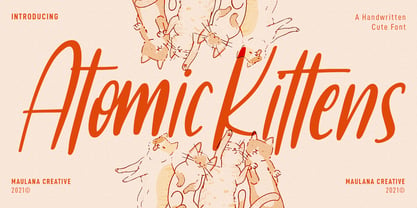 Atomic Kittens is a condensed handwritten display font. With regular mono-line stroke, fun character with some of ligatures. To give you an extra creative work. Atomic Kittens font support multilingual more than 100+ language. This font is good for logo design, Social media, Movie Titles, Books Titles, a short text even a long text letter and good for your secondary text font with sans or serif. Make a stunning work with Atomic Kittens font. Cheers, MaulanaCreative
 - Atomic Marker by Set Sail Studios,
$16.99 Inject some energy into your design with the ATOMIC Marker Font. This loud and proud all-caps font was hand-drawn with a real acrylic marker, maintaining the authentic high definition brush detail in each stroke. It’s an exhilarating font choice perfect for header text, poster designs, album covers, product designs, merchandise, logos & more. The Atomic Marker family includes 2 fonts; Atomic Marker • Includes 2 sets of uppercase characters, simply switch between upper & lowercase on your keyboard to access the 2 sets. Also included are 18 ligatures (double letter pairings), which can be accessed by turning on ‘Standard Ligatures’, and 6 Small Caps, which can be accessed by turning on Small Caps. (All characters can also be accessed via a Glyphs panel). Atomic Marker Extras • Includes 26 ‘doodles’ (see images), and 23 underlines, designed to perfectly pair with the Atomic Marker font letters. Simply install this as it’s own separate font, and type A-Z (doodles) or a-w (underlines) to access each design. Language Support; Atomic Marker supports the following languages; English, French, Italian, Spanish, Portuguese, German, Swedish, Norwegian, Danish, Dutch, Finnish, Indonesian, Malay, Hungarian, Polish, Croatian, Turkish, Romanian, Czech, Latvian, Lithuanian, Slovak, Slovenian
 - Toma Sunny by Letterena Studios,
$17.00 Toma Sunny is a modern and classic serif font with a unique style and bold look. This typeface is perfect for an elegant & luxury logo, book or movie title design, fashion brand, magazine, clothes, lettering, quotes, and so much more.
 - Atomic Wedgie by Comicraft,
$19.00 Tighten up your capes, pull those cowls over your eyes and hoist your underpants over your trousers as far as they will go! Silver Age super heroes know that Men of Action can never look foolish fighting crime in their pyjamas and neither will you with the help of our latest crack-kerning offering.
 - Linotype Syntax Lapidar Serif Text by Linotype,
$29.99Modeled on the writings chiseled in stone in the second century B.C., Syntax™ Lapidar is an energetic, spirited typeface designed by Hans Eduard Meier in 2000. Linotype Syntax Lapidar Text and Linotype Syntax Lapidar Serif Text have five weights each, with both cap and lowercase letterforms. Lapidar Display and Lapidar Serif Display also have five weights each, with mostly all cap letterforms and many alternates. It's a terrifically fun and inventive family, and if you look closely, you can see the resemblance to the more modern and restrained Syntax™ relatives. Great for menus, artist books, travelogues, or advertising - and if used very sparingly, it could add just the right element of lapidary significance to corporate documents. - Linotype Syntax Lapidar Serif Display by Linotype,
$29.99Modeled on the writings chiseled in stone in the second century B.C., Syntax™ Lapidar is an energetic, spirited typeface designed by Hans Eduard Meier in 2000. Linotype Syntax Lapidar Text and Linotype Syntax Lapidar Serif Text have five weights each, with both cap and lowercase letterforms. Lapidar Display and Lapidar Serif Display also have five weights each, with mostly all cap letterforms and many alternates. It's a terrifically fun and inventive family, and if you look closely, you can see the resemblance to the more modern and restrained Syntax™ relatives. Great for menus, artist books, travelogues, or advertising - and if used very sparingly, it could add just the right element of lapidary significance to corporate documents. - GOCA LOGOTYPE BETA - Unknown license

- genotype S BRK - Unknown license

- genotype H BRK - Unknown license

- genotype RH BRK - Unknown license

- genotype RS BRK - Unknown license

- Monotype Baskerville eText by Monotype,
$103.99The eText fonts from the Monotype Baskerville have been specially tuned by our type design experts for a better on screen readability for instance in PDFs. - Monotype Script MT by Monotype,
$29.99 - Monotype Courier 12 by Monotype,
$29.99Designed as a typewriter face for IBM, Courier was redrawn by Adrian Frutiger for the IBM Selectric series. Courier is a typical fixed pitch design, monotone in weight and slab serif in concept. The Courier font is used to emulate typewriter output for reports, tabular work and technical documentation. - Monotype Modern MT by Monotype,
$29.99 Monotype Modern, the first typeface produced by Lanston Monotype, was released in 1896, the same year the company introduced its hot metal typeseting machine. It is a Victorian variation on the vertically stressed, high-contrast Bodoni model.
 - Monotype Modern Display by Monotype,
$29.99Cut by Monotype between 1900 and 1902, the Monotype Modern font family was based on Miller & Richards News 23 and 28; slightly condensed news text types of the 1890s. Monotype Modern is a lively typeface, with long, fine hairlines and well rounded letterforms, representing the best of nineteenth century modern face design. A classic text face, and typical of the moderns that were produced in the United Kingdom at that time, being less extreme in its rendering than some of the models of purer form being produced elsewhere. Monotype Modern is an excellent text face for magazines, newspapers and books, the heavier and more condensed versions are useful in headlines and display. - Monotype Lightline Gothic by Monotype,
$29.99Monotype Lightline Gothic is a thin sans serif face cut by American Type Founders to work with Franklin Gothic, which had been designed as a bold face. The rather condensed nature of the Monotype Lightline Gothic font has made it popular for advertising display and newspaper work. - Monotype News Gothic by Monotype,
$40.99 Similar in design to Franklin Gothic, News Gothic was one of a number of sans serif faces manufactured by American Type Founders in the early years of the twentieth century. Initially cut as a light sans, heavier versions were made in the 1940s and 50s along with some condensed weights. The News Gothic font family offers an uncomplicated design that is well suited for use in newspapers and magazines for headlines and in advertisements.
 - Monotype New Clarendon by Monotype,
$29.99The first Clarendon was introduced in 1845 by R. Besley & Co, The Fan Street Foundry, as a general purpose bold for use in conjunction with other faces in works such as dictionaries. In some respects, Clarendon can be regarded as a refined version of the Egyptian style and as such can be used for text settings, although headline and display work is more usual. - Monotype Goudy Catalogue by Monotype,
$29.99Originally designed for American Type Founders, Goudy drew inspiration from the classical old style faces for Goudy Old Style. Round characters have a strong diagonal stress, ascenders are fairly long but descenders are very short. Goudy bold was introduced in 1920; this was designed by Morris Fuller Benton. This typeface has been particularly popular in America where it is extensively used in advertising, book jackets, for labels and packaging. - BlincType Letterpress Fontpak by Chank,
$99.00 Add some old fashioned charm to your designs with the distressed alphabets in the new BLINCtype Letterpress Fontpak, a brand new font collection containing 8 letterpress-inspired fonts from the creative minds at Blinc Publishing in St. Paul, MN. The BLINCtype Letterpress Fontpak contains a handy concise assortment of old-school display fonts. From the old Western "WANTED" poster look of Prospect Modern, to the no-nonsense all-caps classic Goshen and its lowercase companion Gideon, these fonts are inspired by wooden letterpress blocks and other archaic technologies. It's like having your own letterpress print studio! Except it's all instantly downloadable right now as easy-to-use fonts! Designers love working with the Cheltenham-esque Gomorrah and its grittier, grungier counterpart, Sodom. The bouncy Golgotha has a rough and tumble readiness that exudes a hand-made charm, while Hamilton Offset has a cryptic, experimental look and feel that gives the impression of double-vision. You also get the newest member of the Blinc font family, Player Piano, which was based on punch-cut stencil letters on an old player piano paper song roll. Purchase the BLINCtype Letterpress Fontpak today and you'll be able to download and start using these 8 great fonts right away! The BLINCtype Letterpress Fontpak contains the fonts: Gideon, Golgotha, Gomorrah, Goshen, Hamilton Offset, Player Piano, Prospect Modern and Sodom.
 - Monotype Clearface Gothic by Monotype,
$29.99Clearface Gothic first appeared in 1910, designed by Morris Fuller Benton, the world-famously prolific typeface artist. In addition to Clearface Gothic, Benton also designed classics like Franklin Gothic, Century Expanded, and many other types. Clearface Gothic is a sans serif face with light forms displaying the Zeitgeist of the turn of the 20th century. Distinguishing characteristics are the open forms of the a" and "c," the arched "k," and the upward-tilting horizontal stroke of the "e." The relatively narrow typeface, with its open inner white spaces, is extremely legible even in small point sizes. There is no accompanying italic." - Monotype Goudy Modern by Monotype,
$29.99First cut by Lanston Monotype, the Goudy Modern font family was based on designs used by French engravers during the eighteenth century. Although called a modern it possesses a number of old style characteristics. Capitals are much shorter than the ascenders, serifs are fully bracketed and round shapes have a slight stress. The overall weight of Monotype Goudy Modern is on the heavy side, giving good emphasis in display sizes but it is not too heavy for use in text. - Monotype Century Schoolbook by Monotype,
$40.99Monotype Century Schoolbook is another member of the Century family based on the Century Expanded typeface. The Monotype Century Schoolbook family was designed to fulfill the need for a solid, legible face for printing schoolbooks. It is wider and heavier than Century Expanded, there is also less contrast between thick and thin strokes. First cut by Monotype in 1934 and based on versions from ATF and Lanston Monotype, the sturdy nature of Monotype Century Schoolbook, coupled with its inherent legibility, has made it a popular choice for setting books, newspapers and magazines. - Genotype BRK Pro by CheapProFonts,
$10.00 A stylistic and square outline font suitable for headlines and logos. The original font contained no diacritics at all, so I have designed these to match. I also made the descenders on "g/j/p/q/y" a bit longer - so they would balance better with the letters with diacritics below the letter... I redesigned the "t", but have included the original "t" as an alternate, available via your programs' glyph palette or using the OpenType functions "Stylistic Alternates"/"ss01". Genotype S BRK Pro is the perfect companion for Genotype H BRK Pro (The H stands for Hollow and the S stands for Solid). Can be used as a fill for its companion (using layers), but is also quite a usable font on its own. ALL fonts from CheapProFonts have very extensive language support: They contain some unusual diacritic letters (some of which are contained in the Latin Extended-B Unicode block) supporting: Cornish, Filipino (Tagalog), Guarani, Luxembourgian, Malagasy, Romanian, Ulithian and Welsh. They also contain all glyphs in the Latin Extended-A Unicode block (which among others cover the Central European and Baltic areas) supporting: Afrikaans, Belarusian (Lacinka), Bosnian, Catalan, Chichewa, Croatian, Czech, Dutch, Esperanto, Greenlandic, Hungarian, Kashubian, Kurdish (Kurmanji), Latvian, Lithuanian, Maltese, Maori, Polish, Saami (Inari), Saami (North), Serbian (latin), Slovak(ian), Slovene, Sorbian (Lower), Sorbian (Upper), Turkish and Turkmen. And they of course contain all the usual "western" glyphs supporting: Albanian, Basque, Breton, Chamorro, Danish, Estonian, Faroese, Finnish, French, Frisian, Galican, German, Icelandic, Indonesian, Irish (Gaelic), Italian, Northern Sotho, Norwegian, Occitan, Portuguese, Rhaeto-Romance, Sami (Lule), Sami (South), Scots (Gaelic), Spanish, Swedish, Tswana, Walloon and Yapese.


