4,868 search results
(0.027 seconds)
- Fast Racer Italic by Sipanji21,
$16.00 Fast Racer is a sport display Font. The font is ready to be used for your racing sports or automotive related projects . Built to be perfect for headlines, jerseys, logos, branding, posters, packaging, advertising, and much more. If you Find some trouble with this font please chat me. thanks and have a nice day
 - Wilke by Linotype,
$29.99This font is a late work of the famous Berlin font artist Martin Wilke. Presented by Linotype AG in 1988, Wilke is a lively font with eccentric, playful forms. Wilke was influenced in part by the letters of the Irish handwriting in the Book of Kells, written in the late 8th century, while the pronounced contrast in strokes goes back to the styles of the 18th century. the font’s uniqueness is particularly emphasized when used in larger point sizes. - Freehand 471 by ParaType,
$30.00 Freehand 471 is the Bitstream version of Cascade Script by Matthew Carter. Released by Mergenthaler Linotype in 1965, this design is based on an earlier type by the Ludlow foundry. It's a dark, disconnected script with angular forms. It seems written by heavy marker and thus suitable for informal posters and signage and for advertising and display typography as well. Central European, Cyrillic, and Greek Monotonic characters were designed by Oleg Karpinsky. Released by ParaType in 2011.
 - Ruling Script by Linotype,
$29.99Prof. G. Pott’s Ruling Script first appeared in 1992 with Linotype-Hell. The font is a part of the package Calligraphie for Print, which also contains Sho and Wiesbaden Swing. Calligraphie for Print 2 completes the set. These packages offer modern calligraphy fonts particularly well-suited to use in posters, magazines and advertisements. Ruling Script looks like the zestful handwriting of a calligrapher but its legibility even in longer sentences set it apart from others of its type. - Amelia by Linotype,
$29.99American designer Stanley Davis created the font Amelia™ in 1965. What sets Linotype Amelia apart from all the rest are its unusual inner spaces. Their teardrop forms lead the readers eye through the line of text. These teardrop shapes can also be seen in the contours of the characters themselves, making the letters look rounded and flexible. Amelia speaks the language of the digital age. The flowing strokes and round forms give it an uncomplicated and lively look. - Gothic 13 by Linotype,
$29.99Gothic 13 is a bold condensed sans serif typeface. Originally designed in small sizes, Gothic 13 is very similar to Modern Gothic Condensed, which was a turn-of-the-20th-century modernization of a popular nineteenth century style. Until Linotype integrated it into their technology, it did not exist in sizes larger than 24 point. The design used for digitization was the 18-point. Gothic 13 is ideal for display work, especially where space is at a premium. - Horndon by ITC,
$29.99Horndon is a decorative revival of late art nouveau style typefaces. The robust, high waist forms of these letters lend a unique, early 20th Century feeling of optimism to text designed with them. The letterforms themselves have adapted a three dimensional appearance: they each sport an individual drop shadow. Horndon is an all caps typeface, which was originally designed in 1984 by Martin Wait for Letraset. A similar art nouveau typeface, Galadriel, is also available from Linotype." - Industria by Linotype,
$40.99Brody’s fonts borrow elements from both Art Deco and non-Western styles. His designs received international recognition for their innovative, computer-oriented style, reaching almost cult status. Four original Brody fonts are available from Linotype Library GmbH: Insignia, Industria-Solid, Industria Inline and Arcadia. For your convenience, we have gathered all four into one package. Industria is a font which speaks of mechanical exactness, cool and reserved. Industria Inline is a lighter version of Industria Solid. - Irish Stout BB by Blambot,
$20.00 Created by Blambot’s Nate Piekos for a party invitation, IRISH STOUT has a deep, dark aroma and a creamy, white head. Serve ice cold with a heaping plate of Shepherd's Pie! Comes with a six-pack of European characters.
 - Greeting Monotone by Monotype,
$29.99Based on Art Nouveau models, Greeting Monotype was created by M.F. Benton in 1927. The Greeting Monotone font works well for titling, packaging and greeting cards. - Neographik by Monotype,
$29.99Neographic is one of the first fototype fonts that had been designed by Robert Barbour and produced from the Monotype UK office for the Photolettering machine - Bronco Valley by Variatype,
$12.00 Bronco Valley is designed with vintage style or you can say “American Rodeo” for classic look branding, logotype, poster design, t-shirt design, and much more.
 - Rustic by WAP Type,
$15.00 Introducing Rustic modern script typeface, using style hand made with brushing. Rustic a beautiful for wedding card design, logotype, website header, fashion design and any more.
 - Cad by NicolassFonts,
$- CAD is brilliantly suited for graphic design and display use and perfect for logotypes, t-shirts, packaging, brand identity, books, magazines, newspapers, posters, billboards, and advertising.
 - Motena Golden by Suby Studio,
$15.00 Motena Golden is a elegant pair of script and sans serif font. It's suitable for any project purpose such as invitation, logotype, packaging, branding and more
 - Corporative Sans Round Condensed by Latinotype,
$26.00 Corporative Sans Rounded Condensed is the narrowed version of Corporative Sans Rounded that offers high performance when using for text, what makes it the perfect match for Andes Rounded. The font works well at both display and small sizes. Corporative Sans Rounded Condensed is the perfect choice for logotypes, posters, signs, branding, packaging and so on! Corporative Sans Rounded Condensed comes with Latinotype’s standard set of 350 characters, making it possible to use the font in 128 different languages. Corporative Sans Rounded Condensed provides users with a wide range of characters and weights for every project. By combining different variants, designers can achieve the best results. The family consists of 32 fonts: a basic family that includes 8 weights plus italics and an alternative family of 8 weights with matching italics as well. Corporative Sans Rounded Condensed was created by Latinotype Team and developed by Elizabeth Hernández and Rodrigo Fuenzalida, under the supervision of Luciano Vergara and Daniel Hernández.
 - Audrey by Fenotype,
$30.00 Audrey is an elegant monolinear Script and Sans font family. Audrey is great for designing headlines, packaging or as a logotype online or offline. Audrey has three weights of Script and Sans and a set of Ornaments. The weights go following: Regular is twice and Bold is three times as wide as Thin so if you want to have an Ornament example with same stroke width as Script you can set the Script in 36pt Regular and Ornament 72pt Thin -and they’ll have exactly the same width. Audrey Script is packed with OpenTtype features: Keep Standard Ligatures on for smooth connections and try Swash, Stylistic or Titling Alternas for more showier letters or seek for even more alternates from the Glyph Palette. Script also has Lining numerals as default and Old Style numerals as an OpenType alternates. Audrey is a close relative to widely popular Cosmopolitan released earlier by Fenotype. Compared to Cosmopolitan Audrey has more geometric forms and bigger lowercase characters with larger x-height.
 - Boston by Latinotype,
$29.00 Designed by Daniel Hernández and Paula Nazal with digital editing by Elizabeth Hernández. Corrections and review by Alfonso García and Rodrigo Fuenzalida. Boston is a slightly rounded-edged typeface, which is inspired by “Trenda”—a geometric sans serif based on the uppercase of “Trend”(a Latinotype font, released in 2013, that was very well received). This new typeface comes with a wider character set that offers a complete family of uppercase and lowercase in different weights. Boston is a versatile, easy-to-use, functional display font with a strong personality, especially its uppercase, which makes the designer’s work easier. Boston’s lightest and heaviest variants are ideal for display use while its middle weights work well with short and mid-length texts. This typeface has been designed especially for corporate projects, logotypes and publishing. Boston comes in 8 weights, ranging from Thin to Heavy, and includes matching italics as well as small caps and alternates. The family contains a 634-character set that supports 206 different languages.
 - Branding SF by Latinotype,
$29.00 Branding Super Family is an extension of the Branding project , including new variables that cater to a wide array of requirements, still maintaining its essence. It is a super family for modern needs! Additional to its particular design, different widths are included: now Branding Ultra Condensed is a reality. The project also considers a variety of alternate characters, making Branding Super Family a great tool for graphic designers and art directors. It is ideal for use in logotypes, isotypes, short texts, and others. Branding Super Family is a Sans Serif spurless font with medium-large x-height, straight curves and convex terminals. It has 7 weights and 4 widths that vary from thin to black, and from ultra condensed to medium, each with their matching italics. It also includes a set of 544 characters supporting 128 languages. OpenType characteristics include European accents, old style numbers and 4 sets of alternates.
 - Historical by Runsell Type,
$9.00 Introducing Historical - Hand Drawn Script Historical consists of clean and textured feature as well as an aesthetic for premium logotypes. The family includes various script styles. Every single letter contains beautiful alternates characters (ss01 - ss10) and features ligatures. Historical can be applied in designs such as logotypes, brand, packaging, branding, quotes, business cards and more custom design. It features uppercase, lowercase, numeral, punctuation & symbol, ligatures, stylistic alternates, multilingual support, PUA encoded (fully accessible without additional design software).
 - Neuzeit Office Soft Rounded by Linotype,
$29.99 Every year, more and more text is read directly on a computer screen in office applications, or from freshly printed sheets from a copier or laser printer. Clear, legible text faces are more imperative to office communication than ever before. Yet every worker desires a small bit of personality in the corporate world. Most office environments are only equipped with a few basic fonts that are truly optimized for use in text, with laser printers, and on screen. The Linotype Office Alliance fonts guarantee data clarity. All of the font weights within the individual family have the same character measurements; individual letters or words may have their styles changed without line wrap being affected! All numbers, mathematical signs, and currency symbols are tabular; they share the same set character width, ensuring that nothing stands in the way of clear graph, chart, and table design. In addition to being extremely open and legible, the characters in this collection's fonts also share the same capital letter height and the same x-height. The production and reading of financial reports is duly streamlined with the Linotype Office Alliance fonts. The Neuzeit Office family is designed after the model of the original sans serif family Neuzeit S, which was produced by D. Stempel AG and the Linotype Design Studio in 1966. Neuzeit S itself was a redesign of D. Stempel AG's DIN Neuzeit, created by Wilhelm Pischner between 1928 and 1939. Intended to represent its own time, DIN Neuzeit must have struck a harmonious chord. DIN Neuzeit is a constructed, geometric sans serif. It was born during the 1920s, a time of design experimentation and standardization, whose ethos has been made famous by the Bauhaus and De Stijl movements in art, architecture, and design. Upon its redesign as Neuzeit S in the 1960s, other developments in sans serif letter design were taken into account. Neuzeit S looks less geometric, and more gothic, or industrial. Separating it from typefaces like Futura, it has a double-storey a, instead of a less legible, single-storey variant. Unlike more popular grotesque sans serifs like Helvetica, Neuzeit S and especially the redesigned Neuzeit Office contain more open, legible letterforms. Neuzeit Office preserves the characteristic number forms that have been associated with its design for years. After four decades, Neuzeit has been retooled once again, and it is more a child of its age than ever before. Akira Kobayashi, Linotype's Type Director, created the revised and updated Neuzeit Office in 2006. His greatest change was to retool the design to make its performance in text far more optimal. Additionally, he created companion oblique to help emphasize text. The other three families in the Office Alliance system include Metro Office, Times Europa Office and Trump Mediaeval Office.Some weights of the Neuzeit Office are availabla as soft rounded versions. "
 - As of my last update in April 2023, Fenotype has designed a variety of innovative fonts, but a specific font named "11.20" does not have a widely recognized presence or known description in my curren...
- As of my last knowledge update in April 2023, "URAL 3d" by Fenotype appears to be a specific font design that, while not universally known in existing major font directories, may be part of a special...
- Data Control - Unknown license

- Kal08 by Solokarir,
$15.00 Kal08 is a Sans Serif Font, this font consists of Uppercase, Lowercase Letters & multilingual support. Kal08 is perfect for Logotype, Print Design, labels, Products, Text, and more.
 - Uertas by Sign Studio,
$15.00 Uertas font brings a modern calligraphy feel. It's perfect for freestyle urban typography, modern logotypes, product branding, or just a quote that you want to stand out.
 - Gastino by Ronin Design,
$15.00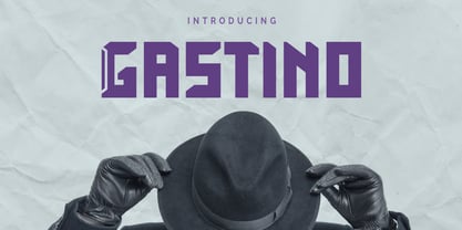 Gastino is an casual and unique display font. Gastino is designed for any project, this font is perfect for poster design, logotype design, advertising and many more.
 - Invader by Yeahllow,
$20.00 Invader is a display font designed specifically for display, headline, logotype and similar applications. It is not intended for text use or for use at small sizes.
 - tdBastard by Typewerk,
$39.00The tdBastard family is a modern caps-only display typeface with OpenType features. Bastard exists in four bold weights along with a monotype and a rounded version. - MB SIXTYTHREE by Ben Burford Fonts,
$20.00 A heavy black display face with lots of retro 'cool'. Modernist to the extreme MB SIXTYTHREE oozes 'mod' culture. Great for magazines & headlines, logotypes, posters, album artwork.
 - LTC Californian by Lanston Type Co.,
$24.95 Frederic Goudy designed Californian as a private commission for the University of California at Berkeley in 1939. The first Commercial release was by Lanston Monotype in 1958.
 - RTCO Fransworth by Roams Type Co,
$12.00 RTCO Fransworth Inspired by Vintage Horror Novel & Movies Poster Typograhphy This font is suitable for graphic designs such as logotypes, merchandise, printed stickers, and other branding needs.
 - Bros Rover by Blankids,
$27.00 Introducing a new font is Bros Rover Classic Sans Serif. Bros Rover good for logotype, poster, badge, wedding invitation, book cover, tshirt design, packaging and any more.
 - Metropolitan by Alias Collection,
$60.00 Originally developed as a logotype proposal for the Metropolitan Hotel in Park Lane, London. Available in upper case only, Metropolitan is a pure, streamlined, contemporary display typeface.
 - Univers Next by Linotype,
$53.99 Linotype Univers is a completely reworked version of the original Univers typeface family designed by Adrian Frutiger in 1957. After a long process of painstakingly detailed revision, Frutiger and the design staff at Linotype completed this large joint project in 1997. The result: a brilliant and cohesive font family of 63 weights and styles including the 4 monospaced typewriter weights. All the existing weights were completely redrawn, with careful attention paid to making the proportions more consistent with each other and improving fine details such as curves and thick-to-thin stroke ratios. The family was expanded from 27 to 63 weights, providing a much larger framework to graphic designers for choosing just the right style. The bold and condensed weights were reworked for improved legibility and on-screen application. The stroke weights were revised for consistency within each face as well as in relationship to the other weights. By following Frutiger's original designs, the humanist character of the sans serif Univers now comes through more distinctly. T he systemized numbering system has also been updated. With its sturdy, clean forms Univers can facilitate an expression of cool elegance and rational competence. In fact, the strong familial relationships between all the styles and weights make it a serviceable choice for large graphic design projects that require versatility with consistency. Frutiger was successful in staying true to his initial aims; the new Linotype Univers does indeed work in longer texts as well as for display settings. In 2010 the typeface family was extended and renamed into a more logical naming of "Univers Next" to fit better in the Platinum Collection naming. Univers Next Variable are font files which are featuring two axis and have a preset instance from Light to Heavy and Condensed to Extended. Univers® Next font field guide including best practices, font pairings and alternatives.
 - Originator by TEKNIKE,
$39.00 Originator is a display modular monospace font. The typeface has a distinct technical geometry using sharp angled corners. "Originator" name is derived from Latin and means 'one who first creates or initiates something into existence.' Originator is recommended for display work, branding, logos, technical writing, team sports, aerospace, aviation, automotive, racing, fashion, cinema, architecture, invitations, posters and headings.
 - Emeritus by District,
$30.00 Emeritus is born from the carved letters found on buildings and monuments in Washington, DC. Muscular and low contrast but with assymetrical flared serifs that soften its stately presence. Small caps, inline caps, chiseled characters, and multiple weights and numerals offer an array of typographic voices. Notably academia, military, monumental, automotive, logos, signage, and so on.
 - B Racing by WAP Type,
$15.00 Hi Everyone! Introducing our newest font : BRACING ! This is a new modern “racing speed car motor theme” display font. BRACING is a sophisticated cool font which will be perfect for branding, logo, sticker, decal, signage, flyer, brochure etc. There are many industries that is suitable for this font : car, racing, automotive, tournament, cup, futuristic startup, etc
 - Logika Nova by Designova,
$35.00 Logika Nova is a simple, clean typeface with a modern design and remarkable appearance. This is a perfect choice for creating logotypes, branding, headlines, corporate identities, and marketing materials for web, digital & print alike. The typeface will be a great option for branding, logo/logotype design projects, marketing graphics, banners, posters, signage, corporate identities, and editorial design. Adding extra letter spacing will make this font the perfect choice for minimal headlines and logotypes, as shown in the promo designs attached. Handcrafted and designed with powerful OpenType features in mind, each weight includes extended language support with Western European, Central European, and South Eastern European sets. A total of 280 glyphs are available. Logika Nova typeface includes 12 fonts, with six upright weights (Thin / Light / Book / Regular / Bold / Heavy) and Italic equivalents of all six weights.
 - Whiskey Sour by Fenotype,
$25.00 Whiskey Sour, a robust vintage serif that is as delightful as it is confident. With its soft and warm aesthetic, this typeface effortlessly captures the essence of approachable confidence, making it a tasteful choice for your typographic needs. Whiskey Sour is based on Tomato Ketchup, an earlier release of Fenotype. It has larger and taller uppercase and plenty of differences in lowercase characters, the most significant ones being letters a, h, m and n. Whiskey Sour is an excellent choice for modern graphic design, offering a distinctive touch of familiarity. Whether gracing logos, packaging, restaurant graphics, or any display application, this versatile typeface shines in headlines and shorter texts. Experiment with reduced tracking for a more compact visual impact, or, when using it in small sizes, add a touch of tracking to ensure legibility. Whiskey Sour is naturally equipped with lots of OpenType features: try spicing up your designs with Swash, Stylistic, or Titling Alternates or Discretionary Ligatures. In total Whiskey Sour has 134 Alternate glyphs that can be accessed from OpenType controls or Character Window. See the full selection of Alternates in the specimen posters.
