10,000 search results
(0.337 seconds)
- Linear Gothic by BA Graphics,
$45.00A great headline face very bold and graphic. Not recommended for small sizes! - Rahel MF by Masterfont,
$59.00 This bold and high contrast typeface is mainly used for extreme outstanding headlines.
 - Ringa by Melvastype,
$25.00 Ringa is extra bold slab serif typeface with a fun and sympathetic feel.
 - Geo by BA Graphics,
$45.00A Bold Powerful Geometric design. Great headline face; works well in many applications. - FG Nadja by YOFF,
$13.95FG Nadja is bold and beautiful - with a real artistic flair around her. - Kaine by The Northern Block,
$12.80 A bold slab-serif typeface influenced by Spagetti Western posters of the 1960s.
 - Supernational 264 by Fonts of Chaos,
$10.00 Grand brother of Super National in extra bold. Looks nice in all size.
 - Pigama MF by Masterfont,
$59.00 The bold presence is in every weight you choose - for packaging, signage etc.
 - Xaltid by Ingrimayne Type,
$9.95 Xaltid is a somewhat odd, decorative, calligraphic typeface in plain and bold weights.
 - Almighton by Uncurve,
$20.00 Almighton is an aesthetic vintage typography font, inspired from the past, elegant signage, gold leaf , sign painting and old label product. Almighton comes with tons of alternates characters to make more eye cacthy . It is suitable for authentic logos, headings, sign painting, posters, letterhead, branding, magazines, album covers, book covers, movies, apparel design, flyers, greeting cards, product packaging, and more.
 - Corporative Sans Round Condensed by Latinotype,
$26.00 Corporative Sans Rounded Condensed is the narrowed version of Corporative Sans Rounded that offers high performance when using for text, what makes it the perfect match for Andes Rounded. The font works well at both display and small sizes. Corporative Sans Rounded Condensed is the perfect choice for logotypes, posters, signs, branding, packaging and so on! Corporative Sans Rounded Condensed comes with Latinotype’s standard set of 350 characters, making it possible to use the font in 128 different languages. Corporative Sans Rounded Condensed provides users with a wide range of characters and weights for every project. By combining different variants, designers can achieve the best results. The family consists of 32 fonts: a basic family that includes 8 weights plus italics and an alternative family of 8 weights with matching italics as well. Corporative Sans Rounded Condensed was created by Latinotype Team and developed by Elizabeth Hernández and Rodrigo Fuenzalida, under the supervision of Luciano Vergara and Daniel Hernández.
 - Boston by Latinotype,
$29.00 Designed by Daniel Hernández and Paula Nazal with digital editing by Elizabeth Hernández. Corrections and review by Alfonso García and Rodrigo Fuenzalida. Boston is a slightly rounded-edged typeface, which is inspired by “Trenda”—a geometric sans serif based on the uppercase of “Trend”(a Latinotype font, released in 2013, that was very well received). This new typeface comes with a wider character set that offers a complete family of uppercase and lowercase in different weights. Boston is a versatile, easy-to-use, functional display font with a strong personality, especially its uppercase, which makes the designer’s work easier. Boston’s lightest and heaviest variants are ideal for display use while its middle weights work well with short and mid-length texts. This typeface has been designed especially for corporate projects, logotypes and publishing. Boston comes in 8 weights, ranging from Thin to Heavy, and includes matching italics as well as small caps and alternates. The family contains a 634-character set that supports 206 different languages.
 - Scriptuale by Linotype,
$29.00The Scriptuale family, which contains eight styles, is a contemporary upright calligraphic face. Designed by German designer Renate Weise in 2003, this family of typefaces speaks to the present, while at the same time reflecting on a lyrical past. The letterforms of the Scriptuale family are romanticized, they reference German calligraphic styles from the 19th and early 20th Centuries. For instance the design of Scriptuale's uppercase strays from the canon of classical proportion into romantic idealism. While the C and O are drawn according to the ancient quadratic proportions - almost twice as wide, optically, as the E or the L - the letter A is wider than would be expected, and the D narrower. These subtle differences introduce a different rhythm into text set in Scriptuale than Italic styles of calligraphy may offer. Scriptuale's Gs merit special notice: both the upper and lower case G lunge slightly forward, further enhancing the dynamic quality of the text. Also unique in Scriptuale's design is the lowercase width: the letterforms appear slightly condensed; they have large x-heights to compensate for this. In a delightful twist, the number 2's beak has been closed by drawing it full-circle, back into the stem: this references a style of letter design that was practiced, among other places, by artists from the old Klingspor foundry in Offenbach Germany. Typefaces constructed there easily captured the zeitgeist of the romantic period, but are less calligraphic than Scriptuale (e.g., Rudolf Koch's Koch Antiqua). A semi-serif face (like Prof. Hermann Zapf's Optima or Otl Aicher's Rotis Semi), some of Scriptuale's letters have serifs (D), and some do not (A). And although both the B and the E normally have the same "structure" on their left side, Weise has drawn them differently in Scriptuale. These strengthen the calligraphic-like quality of the family. Traces of the pen are easy to see in Scriptuale's design; it is a thoroughly calligraphic face. The eight typefaces in the Scriptuale family include Light, Regular, Semi Bold, and Bold weights. Each weight has a companion italic. Scriptuale is similar to one other contemporary calligraphic family in the Linotype portfolio, Anasdair , from British designer - Kuenstler 480 by ParaType,
$30.00 The Bitstream version of Trump Mediaeval of Linotype, 1954-60, by Georg Trump, a prolific German type designer. It seems to be his best typeface. It has a vigorous and assumed oldstyle roman and italic that is the sloped roman, except for the letters a, e, f. With its crisp angularity and wedge-shapes serifs, Trump Mediaeval appears carved in stone. It is a strong text typeface that is highly legible and especially useful for low-resolution output. It is useful in display work too. Cyrillic version developed for ParaType by Vladimir Yefimov and Isabella Chaeva and released in 2010. Cyrillic italics maintain the main feature of Trump Mediaeval to be the sloped roman, except for the letters г, д, и, й, n, т. There are old style figures, additional ligatures and fractions available at all styles and small caps at the Roman 55. Black style was added in 2011 by Vladimir Yefimov.
 - Historical by Runsell Type,
$9.00 Introducing Historical - Hand Drawn Script Historical consists of clean and textured feature as well as an aesthetic for premium logotypes. The family includes various script styles. Every single letter contains beautiful alternates characters (ss01 - ss10) and features ligatures. Historical can be applied in designs such as logotypes, brand, packaging, branding, quotes, business cards and more custom design. It features uppercase, lowercase, numeral, punctuation & symbol, ligatures, stylistic alternates, multilingual support, PUA encoded (fully accessible without additional design software).
 - Nomadic by Heyfonts,
$15.00 Nomadic Blackletter font, also known as Gothic or Old English font, is characterized by its bold, ornate and decorative style with thick vertical and thin horizontal strokes. They are highly ornamental and are distinguished by their black, high-contrasting nature. Features of Nomadic Font: Ornate and Decorative: Nomadic fonts are highly ornamental, artistic and decorative, making them ideal for titles, headlines, logos, and other design applications where a touch of sophistication, elegance, and class is required. Strong and Bold: Due to its bold strokes, Nomadic fonts exude strength and power, making them the perfect choice for logos and branding, especially in fields such as music, fashion and sporting industries. High Contrast: Nomadic font creates a high contrast between the thick and thin strokes, creating a unique visual appeal that is not found in other fonts. Gothic Style: Nomadic font originates from the Gothic period where it was commonly used in manuscripts and inscriptions. This style has persisted through the centuries and is still popular today. Use of Capitals: Nomadic fonts make use of stylized capital letters with exaggerated loops and curves, adding to the uniqueness of the font. In summary, They are excellent for logos and headlines, providing a touch of elegance and sophistication. However, their complexity limits their use in large amounts of text.
 - Oliver Serif by Lebbad Design,
$29.95 Oliver Serif, clean, contemporary and sophisticated. It is available in 3 distinctive weights-Regular, Bold and Ultra with matching italics. Oliver Serif is a fine choice for a variety of uses ranging from body text to bold dynamic headlines and branding applications. A perfect choice for both digital and print.
 - Dolmengi by Ask Foundry,
$30.00 Introducing [Dolmengi]—a sleek slab serif font with refined edges, balancing solidity and softness. From the elegant 'Thin' to the bold 'Extra Bold,' it offers 8 versatile weights for visual hierarchy. Designed for clarity, Dolmen features generous letter spacing, lowercase figures, and ligatures. Elevate your design with this comprehensive font family!
 - Cordia New by Microsoft Corporation,
$49.00Cordia™ New Bold is a Thai font designed by Unity Progress and offered under license from Microsoft. The Cordia New Bold Font includes the Thai code page 874 and Latin 1 character sets. You should be familiar with the use of Thai fonts and multilingual fonts before purchasing Cordia New. - Tufan by Samir Chajia,
$12.00 Tufan is a dynamic Arabic typeface abstracted from Kufi Arabic typescript, manifest a strong contrast between bold and thinner strokes, giving it a stylistic overview suitable for title and retro posters. Tufan is an Arabic word meaning flood or typhoon, it represents the boldness and the power of the font.
 - Nerve Brush by Create Big Supply,
$15.00 Invention is a sans serif brush font that has bold, strong, bold characters. This will add a very unique and powerful touch to your design. This font is PUA encoded which means you can access all the glyphs and sweeps easily Features: All Uppercase Numbers and punctuation Multilingual PUA Encoding
 - Wigwag by Parkinson,
$15.00 WigWag Bold and Wigwag Deluxe are bold, informal lettering styles inspired by mid-20th century Showcard Lettering. Especially by the work of Speedball lettering artist Ross George, and also the work of Cecil Wade and Samuel Welo. Designed around 2001 by Jim Parkinson, Wigwag has recently been refreshed and re-released.
 - American Wonders by Sarid Ezra,
$17.00 Introducing, American Wonders - Font Duo! American Wonders is a package of two fonts containing signature script and bold serif. This versatile fonts that you can use for any project. This bold serif is strong and powerful while the signature script is soft and authentic hand writing. This font also support language!
 - MC Megie Ceyal by Maulana Creative,
$14.00 Megie Ceyal bold script font. This font is good for logo design, Social media, Movie Titles, Books Titles, a short text even a long text letter and good for your secondary text font with signature or script typeface. Make a stunning work with Megie Ceyal bold script font. Cheers, Maulana Creative
 - Cooperative by Hafontia,
$99.00 Cooperative is a retro style poster font in Hebrew and Latin. Is based on a printed example of a vintage handmade wood type from the 1950's. This sans serif font is available in both regular and bold versions, with a dirty and grungy styles as well in regular and bold.
 - Flaming by Herlan Nawwi,
$16.00 Flaming is a bold and stylish font. Equipped with several alternative characters and ligatures, it will make your design look more attractive and unique. Although Flaming has bold letters and quite tightly spaced, it's clean and legible. All alternate characters are PUA encoded and accessible, although without additional design software.
 - Neuzeit Office Soft Rounded by Linotype,
$29.99 Every year, more and more text is read directly on a computer screen in office applications, or from freshly printed sheets from a copier or laser printer. Clear, legible text faces are more imperative to office communication than ever before. Yet every worker desires a small bit of personality in the corporate world. Most office environments are only equipped with a few basic fonts that are truly optimized for use in text, with laser printers, and on screen. The Linotype Office Alliance fonts guarantee data clarity. All of the font weights within the individual family have the same character measurements; individual letters or words may have their styles changed without line wrap being affected! All numbers, mathematical signs, and currency symbols are tabular; they share the same set character width, ensuring that nothing stands in the way of clear graph, chart, and table design. In addition to being extremely open and legible, the characters in this collection's fonts also share the same capital letter height and the same x-height. The production and reading of financial reports is duly streamlined with the Linotype Office Alliance fonts. The Neuzeit Office family is designed after the model of the original sans serif family Neuzeit S, which was produced by D. Stempel AG and the Linotype Design Studio in 1966. Neuzeit S itself was a redesign of D. Stempel AG's DIN Neuzeit, created by Wilhelm Pischner between 1928 and 1939. Intended to represent its own time, DIN Neuzeit must have struck a harmonious chord. DIN Neuzeit is a constructed, geometric sans serif. It was born during the 1920s, a time of design experimentation and standardization, whose ethos has been made famous by the Bauhaus and De Stijl movements in art, architecture, and design. Upon its redesign as Neuzeit S in the 1960s, other developments in sans serif letter design were taken into account. Neuzeit S looks less geometric, and more gothic, or industrial. Separating it from typefaces like Futura, it has a double-storey a, instead of a less legible, single-storey variant. Unlike more popular grotesque sans serifs like Helvetica, Neuzeit S and especially the redesigned Neuzeit Office contain more open, legible letterforms. Neuzeit Office preserves the characteristic number forms that have been associated with its design for years. After four decades, Neuzeit has been retooled once again, and it is more a child of its age than ever before. Akira Kobayashi, Linotype's Type Director, created the revised and updated Neuzeit Office in 2006. His greatest change was to retool the design to make its performance in text far more optimal. Additionally, he created companion oblique to help emphasize text. The other three families in the Office Alliance system include Metro Office, Times Europa Office and Trump Mediaeval Office.Some weights of the Neuzeit Office are availabla as soft rounded versions. "
 - As of my last update in April 2023, Fenotype has designed a variety of innovative fonts, but a specific font named "11.20" does not have a widely recognized presence or known description in my curren...
- As of my last knowledge update in April 2023, "URAL 3d" by Fenotype appears to be a specific font design that, while not universally known in existing major font directories, may be part of a special...
- ITC Blair by ITC,
$50.99 The ITC Blair™ typeface is a revival and reimaging of an early 20th century metal typeface of the same name. Even though only available as single weights of extended and condensed proportions, metal fonts of the face were sold well into the 1950s. In 1997, Jim Spiece resurrected the original extended design for digital imaging and, in the process, added two new weights. Almost 20 years later, he collaborated with Monotype type designers to extend the basic family again. The result was a new suite of three condensed designs and italic complements for all the roman weights. The family also benefits from a large set of alternative glyphs and many OpenType® features.
 - Century Gothic Paneuropean Variable by Monotype,
$209.99 Century Gothic™ is based on Monotype 20th Century, which was drawn by Sol Hess between 1936 and 1947. Century Gothic maintains the basic design of 20th Century but has an enlarged x-height and has been modified to ensure satisfactory output from modern digital systems. The design is influenced by the geometric style sans serif faces which were popular during the 1920s and 30s. The Century Gothic font family is useful for headlines and general display work and for small quantities of text, particularly in advertising. Century Gothic family has been extended to 14 weights in a Pan-European character set from Thin to Black and their corresponding Italics. The already existing 4 weights of Regular and Bold with their Italics are additionally still available in the STD character set. For international communication, the W1G versions offer the appropriate character set. They contain Latin, Greek and Cyrillic characters and thus support all languages and writing systems that are in official use in Western, Eastern and Central Europe. Century Gothic Variable is features two axes: Weight and Italic. The Weight axis has preset instances from Light to Black. The Italic axis is a switch between upright and italic. Looking for the perfect way to complete your project? Check out Aptifer™ Slab, ITC Berkeley Old Style®, FF Franziska™, Frutiger®, ITC Legacy® Square Serif or Plantin®.
 - Century Gothic Paneuropean by Monotype,
$50.99Century Gothic™ is based on Monotype 20th Century, which was drawn by Sol Hess between 1936 and 1947. Century Gothic maintains the basic design of 20th Century but has an enlarged x-height and has been modified to ensure satisfactory output from modern digital systems. The design is influenced by the geometric style sans serif faces which were popular during the 1920s and 30s. The Century Gothic font family is useful for headlines and general display work and for small quantities of text, particularly in advertising. Century Gothic family has been extended to 14 weights in a Pan-European character set from Thin to Black and their corresponding Italics. The already existing 4 weights of Regular and Bold with their Italics are additionally still available in the STD character set. For international communication, the W1G versions offer the appropriate character set. They contain Latin, Greek and Cyrillic characters and thus support all languages and writing systems that are in official use in Western, Eastern and Central Europe. Century Gothic Variable is features two axes: Weight and Italic. The Weight axis has preset instances from Light to Black. The Italic axis is a switch between upright and italic. Looking for the perfect way to complete your project? Check out Aptifer™ Slab, ITC Berkeley Old Style®, FF Franziska™, Frutiger®, ITC Legacy® Square Serif or Plantin®. - Data Control - Unknown license

- Kal08 by Solokarir,
$15.00 Kal08 is a Sans Serif Font, this font consists of Uppercase, Lowercase Letters & multilingual support. Kal08 is perfect for Logotype, Print Design, labels, Products, Text, and more.
 - Uertas by Sign Studio,
$15.00 Uertas font brings a modern calligraphy feel. It's perfect for freestyle urban typography, modern logotypes, product branding, or just a quote that you want to stand out.
 - Gastino by Ronin Design,
$15.00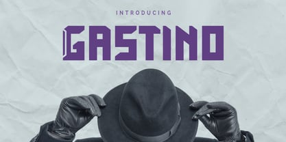 Gastino is an casual and unique display font. Gastino is designed for any project, this font is perfect for poster design, logotype design, advertising and many more.
 - Invader by Yeahllow,
$20.00 Invader is a display font designed specifically for display, headline, logotype and similar applications. It is not intended for text use or for use at small sizes.
 - MB SIXTYTHREE by Ben Burford Fonts,
$20.00 A heavy black display face with lots of retro 'cool'. Modernist to the extreme MB SIXTYTHREE oozes 'mod' culture. Great for magazines & headlines, logotypes, posters, album artwork.
 - LTC Californian by Lanston Type Co.,
$24.95 Frederic Goudy designed Californian as a private commission for the University of California at Berkeley in 1939. The first Commercial release was by Lanston Monotype in 1958.
 - RTCO Fransworth by Roams Type Co,
$12.00 RTCO Fransworth Inspired by Vintage Horror Novel & Movies Poster Typograhphy This font is suitable for graphic designs such as logotypes, merchandise, printed stickers, and other branding needs.
