10,000 search results
(0.033 seconds)
- BrushType Longhand by Brush Art Design Office,
$52.00My name is Teruyoshi Matsui. I live in Japan. I am a Brush Artist. I artistically write the letters of the alphabet with a Japanese brush. I have created the font “ BrushType Longhand”. It was originally named "BrushType Alternative". But I changed my mind before it was completed. At first I aimed at an alternative font. But while I was trying to make it alternative, I realized that it was not. Of course there are many alternative letters that you have never seen before among them, so you have to be careful using the font. If you are a progressive and defiant designer trying to discriminate against others' designs, you should own my font "BrushType Longhand". Be ambitious! This is the word I will give you. I am ambitious ,too. No one in the world creates brush fonts like me. I am the only one as a Brush Artist though no one knows. I will be a world artist some day. So you should buy the font that is one of my favorite works. Thank you. - Mommie by Hubert Jocham Type,
$59.90 In the early 1980s, at the start of my career, I had the opportunity to work in a print shop with classic lead setting. In those days I would study issues of U&lc magazine from ITC. What really caught my attention were scripts in the Spencerian style. I’ve been fascinated by this American penmanship tradition ever since. A few years ago I developed a font. Boris Bencic used it when he was redesigning L’Officiel magazine in Paris. I took these initial forms and developed them into the font Mommie when I started my own foundry. Although I usually design text typefaces, working on Mommie taught me how complex it can be to create a script headline font. The biggest challenge in this process has been to keep it alive and fresh. The Regular weight is only made for very big headlines. The thin lines with the bold drops are very elegant. For smaller sizes use the Medium and Small weight. It won the TDC 2008 award and was Judges Choice of Christian Schwartz.
 - Ultras Liberi - Unknown license

- Angelin Love by Letterara,
$12.00 Angelin Love is a gorgeous script font, beautiful and romantic. This font looks perfect for Valentine’s Day designs, or for other romantically inclined styles and projects. To stay up to date for my latest job, follow me and let’s be friends because there will be many promos.
 - Saphire by Yumna Type,
$16.00 Saphire is a elegant handwritten font with a natural and unique design will make your project more beautiful. The font is suitable for your branding project, printing, logos dan wedding. Included: Saphire (OTF) Features: Standard Ligatures Stylistic Sets Multilingual Support PUA encoded Numeral and Punctuation by Yumnatype
 - Nice Summer by Yoga Letter,
$16.00 "Nice Summer" is a display font with shading on each letter, making this font unique. Equipped with regular and italic letters, uppercase and lowercase numerals, punctuation, and multilingual support. This font can be used for summer moments, holidays, vacations, traveling, graduation, Father's Day, Christmas, and others.
 - Foolish Hand by Sipanji21,
$10.00 Foolish Hand is a handwritten font written in original handwriting, this font is good for various graphic designs, such as making children's drawings, coloring book covers, packaging, advertising, movie covers, posters and for any crafting. I hope this font is useful for you, have a nice day.
 - Goldmint by Fridaytype,
$17.00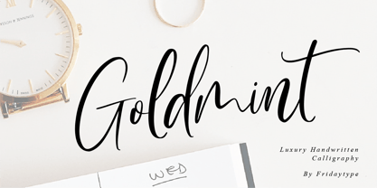 Golmint - Luxury Handwritten Calligraphy Golmint is a stylish modern calligraphy font with a calligraphy flair. This font a luxurious calligraphy font perfect for elegant logos, wedding stationery, photography branding, modern websites, and more! - Uppercase & Lowercase - Numbers & punctuation - Multilingual - Ligature - Swash Thanks and have a wonderful day Fridaytype
 - Horse Thief JNL by Jeff Levine,
$29.00 The 1957 French publication “La Letra Dans La Peinture et la Publicite” (“The Letter tn the Painting and Advertising”) had an illustration of split-serif letters and numbers with a decidedly Western feel. This is now available as Horse Thief JNL in both regular and oblique versions.
 - Sundowners by PintassilgoPrints,
$29.00 Sundowners is a smiley face. It is a simple and versatile font, with a pocketful of cool interlocking glyphs for those days of groovier moods. It also brings a handful of amusing initial and terminal forms and a couple of ornaments. That simple. And that nice.
 - Twitty Bird NF by Nick's Fonts,
$10.00Dan X. Solo's book of Showcard Alphabets featured the pattern for this devil-may-care face under the name "Conway". Not too pretty, not too proud, but a whole lotta fun. Both versions of the font include 1252 Latin, 1250 CE (with localization for Romanian and Moldovan). - Box Lunch JNL by Jeff Levine,
$29.00Just two capital letters from a sign inspired Box Lunch JNL from Jeff Levine. The restaurant - an early 1950s favorite in Miami Beach, Florida specialized in fried chicken meals and other delights of the day - long before the big corporate chains took over the local landscape. - Night Michy by Zeenesia Studio,
$16.00 Have a great day! My new font was present, Night Michy!! Night Michy is a Bold vintage style serif font with strong character and soft features. modern and classic serif font with a clear and bold look. It’s a very versatile font that works great in large.
 - Zagora by CastleType,
$19.00 Based on an art deco design, with alternate characters and numerals. Named for a little town in Morocco on the border of the Sahara desert, with a billboard at the edge of a great expanse of sand that points the way to Timbuktu (several days by camel).
 - Bitmax by ITC,
$29.00Bitmax is the work of British designer Alan Birch, who was inspired by the look of fax transmissions. He took Helvetica medium and used controlled distortions to create this commanding, high-tech style. Bitmax is best used in large display sizes for a limited number of words. - FF Network by FontFont,
$41.99 Dutch type designer Max Kisman created this display FontFont in 1991. The font is ideally suited for logo, branding and creative industries and music and nightlife. FF Network provides advanced typographical support with features such as ligatures and case-sensitive forms. It comes with proportional oldstyle figures.
 - Pinktart by Yumna Type,
$16.00 Pinktart is a lovely handwritten font with a natural and unique design will make your project more beautiful. The font is suitable for your branding project, printing, logos dan wedding. Included: Pinktart (OTF) Features: Beautiful Ligatures Alternate Multilingual Support PUA encoded Numeral and Punctuation by Yumnatype
 - Discotheque JNL by Jeff Levine,
$29.00 A 1930s casual Art Deco type style with as much influence in 1970s graphic design as in its day was found within the pages of the 1930s French publication L'Art du Tracé Rationnel de la Lettre. Discotheque JNL is available in both regular and oblique versions.
 - FF Screenstar by FontFont,
$41.99 German type designers Steffen Sauerteig, Kai Vermehr and Svend Smital created this display FontFont in 2003. The family has 5 weights, ranging from Regular to Bold and is ideally suited for logo, branding and creative industries, music and nightlife, small text, software and gaming as well as web and screen design. FF Screenstar provides advanced typographical support with features such as ligatures. It comes with tabular lining and proportional lining figures.
 - Collegeblock 2 by Sharkshock,
$115.00 The Collegeblock family is reminiscent of straight lined letter forms found on collegiate sweaters and in the sports world. This blocky display font features only angled lines with stubby serifs and available in 3 styles including 3D Extrude. The characters are more vertical in nature with a low contrast for high legibility. Many different languages are covered including Cyrillic. Use Collegeblock 2 for a t-shirt, logo, or web graphics.
 - Artistic Sigature by HKL Studio,
$19.00 Artistic Signature is a modern, handwritten font with a magical emphasis. This font is perfect for creating signature logos and watermarks for photography studios or wedding invitations, best for signatures or initial logo branding. Artistic Signature includes a full set of beautiful handwritten upper and lower case letters, numbers, various punctuation and binding. All lowercase letters including initial and final strokes, have 54 bindings that give a realistic handwriting style.
 - Krupkrop by Jipatype,
$25.00 Krupkrop is a font that uses straight lines as the main structure of the font design. Rotate a little bit vertical line, give a feeling Informal, hard, crisp, fun, lively, suitable for headlines on various media such as billboards, packages. There are 9 weights and italics of each weight total, 18 styles. - ฟอนต์ กรุบกรอบ แบบอักษรที่ใช้เส้นตรงเป็นหลักในการออกแบบโครงสร้างอักษร มีการเอียงเส้นแนวตั้งเล็กน้อย ให้ความรู้สึกไม่เป็นทางการ แข็งกรอบ สนุกสนาน มีชีวิตชีวา เหมาะกับผาดหัวบนสื่อต่างๆ เช่น ป้ายโฆษณา แพ็คเกจ มีทั้งหมด 9 น้ำหนัก และตัวเอียงของแต่ละน้ำหนัก รวม 18 สไตล์
 - Order Form JNL by Jeff Levine,
$29.00 In the MacKellar, Smiths & Jordan type specimen book of 1892 are examples of Lining Gothic Extended, a wide sans serif typeface. A lining font has the numerals aligned with the capital letter height, rather than following the “Old Style” method of smaller figures that could also descend below the baseline. Order Form JNL is the digital version of this design, and is available in both regular and oblique versions.
 - Geotica by exljbris,
$16.50 The idea behind Geotica was to build a font out of -more or less- simple geometrical line elements. The open wire frame could then be left open or (partially) filled. Geotica comes in four different grades or line thicknesses (One, Two, Three and Four) so it's suitable for a broad use. Each grade has four styles and is loaded with swashes, final forms, lots of ligatures and ornaments.
 - Murisa Ashley by Murisa Studio,
$10.00 Today we want to show you all a new, unique font, which includes dynamic and aesthetic lines. Murisa Ashley is our newest font. This font is so beautiful and so powerful in its retro feel. Things that can help you in making designs or product names with dynamic shapes. Murisa Ashley is made with the premise of the lines on each letter. Use this font, and have glorious success with you.
 - HT Espresso by Dharma Type,
$19.99 The biggest feature of HT Espresso is a mixture of straight line and curve.It is like a cup of espresso with a bite-sized piece of chocolate. You can connect all the letters with thin line and It would attract notice. Holiday Type Project offers retro hand drawing scripts. Inspired by retro script on shopfront lettering, wall paint advertisements in Italy around 1950s. Check out the script fonts from Holiday Type!
 - Lycian Monolith by Thomas Käding,
$- I know what you're thinking: Where can I find a Lycian font that looks good and is easy to use? Look no further! This font has the Lycian characters both in their unicode positions, and where you can find them on the keyboard. The glyphs in this font were based on those on a Kerei monument in Lycia. I am not an archaeologist, so your feedback would be most welcome.
 - Personlighed by Bogstav,
$16.00 Personlighed was originally a handdrawn font, but I decided to trace each glyph and make this super clean font instead. The idea of the font is about making a hybrid between the handdrawn lines and the “computerized” vector. If you look closely, I have some uneven lines here and there (not many, but are here and there!) I’ve also added some alternative versions of j, k, q, r and the ampersand
 - Angro by Linotype,
$29.99 The sans serif Angro was designed in the weights light and bold by Erwin Koch. The figures are based on the form of a rectangle which along with the high xheight and short ascenders and descenders gives the forms a static character. Lines of text in Angro are very compact and close set. Due to the reserved ascenders and descenders Angro can be set with very close line spacing.
 - Affair by Sudtipos,
$99.00 Type designers are crazy people. Not crazy in the sense that they think we are Napoleon, but in the sense that the sky can be falling, wars tearing the world apart, disasters splitting the very ground we walk on, plagues circling continents to pick victims randomly, yet we will still perform our ever optimistic task of making some little spot of the world more appealing to the human eye. We ought to be proud of ourselves, I believe. Optimism is hard to come by these days. Regardless of our own personal reasons for doing what we do, the very thing we do is in itself an act of optimism and belief in the inherent beauty that exists within humanity. As recently as ten years ago, I wouldn't have been able to choose the amazing obscure profession I now have, wouldn't have been able to be humbled by the history that falls into my hands and slides in front of my eyes every day, wouldn't have been able to live and work across previously impenetrable cultural lines as I do now, and wouldn't have been able to raise my glass of Malbeck wine to toast every type designer who was before me, is with me, and will be after me. As recently as ten years ago, I wouldn't have been able to mean these words as I wrote them: It’s a small world. Yes, it is a small world, and a wonderfully complex one too. With so much information drowning our senses by the minute, it has become difficult to find clear meaning in almost anything. Something throughout the day is bound to make us feel even smaller in this small world. Most of us find comfort in a routine. Some of us find extended families. But in the end we are all Eleanor Rigbys, lonely on the inside and waiting for a miracle to come. If a miracle can make the world small, another one can perhaps give us meaning. And sometimes a miracle happens for a split second, then gets buried until a crazy type designer finds it. I was on my honeymoon in New York City when I first stumbled upon the letters that eventually started this Affair. A simple, content tourist walking down the streets formerly unknown to me except through pop music and film references. Browsing the shops of the city that made Bob Dylan, Lou Reed, and a thousand other artists. Trying to chase away the tourist mentality, wondering what it would be like to actually live in the city of a billion tiny lights. Tourists don't go to libraries in foreign cities. So I walked into one. Two hours later I wasn't in New York anymore. I wasn't anywhere substantial. I was the crazy type designer at the apex of insanity. La La Land, alphabet heaven, curves and twirls and loops and swashes, ribbons and bows and naked letters. I'm probably not the very first person on this planet to be seduced into starting an Affair while on his honeymoon, but it is something to tease my better half about once in a while. To this day I can't decide if I actually found the worn book, or if the book itself called for me. Its spine was nothing special, sitting on a shelf, tightly flanked by similar spines on either side. Yet it was the only one I picked off that shelf. And I looked at only one page in it before walking to the photocopier and cheating it with an Argentine coin, since I didn't have the American quarter it wanted. That was the beginning. I am now writing this after the Affair is over. And it was an Affair to remember, to pull a phrase. Right now, long after I have drawn and digitized and tested this alphabet, and long after I saw what some of this generation’s type designers saw in it, I have the luxury to speculate on what Affair really is, what made me begin and finish it, what cultural expressions it has, and so on. But in all honesty it wasn't like that. Much like in my Ministry Script experience, I was a driven man, a lover walking the ledge, an infatuated student following the instructions of his teacher while seeing her as a perfect angel. I am not exaggerating when I say that the letters themselves told me how to extend them. I was exploited by an alphabet, and it felt great. Unlike my experience with Ministry Script, where the objective was to push the technology to its limits, this Affair felt like the most natural and casual sequence of processions in the world – my hand following the grid, the grid following what my hand had already done – a circle of creation contained in one square computer cell, then doing it all over again. By contrast, it was the lousiest feeling in the world when I finally reached the conclusion that the Affair was done. What would I do now? Would any commitment I make from now on constitute a betrayal of these past precious months? I'm largely over all that now, of course. I like to think I'm a better man now because of the experience. Affair is an enormous, intricately calligraphic OpenType font based on a 9x9 photocopy of a page from a 1950s lettering book. In any calligraphic font, the global parameters for developing the characters are usually quite volatile and hard to pin down, but in this case it was particularly difficult because the photocopy was too gray and the letters were of different sizes, very intertwined and scan-impossible. So finishing the first few characters in order to establish the global rhythm was quite a long process, after which the work became a unique soothing, numbing routine by which I will always remember this Affair. The result of all the work, at least to the eyes of this crazy designer, is 1950s American lettering with a very Argentine wrapper. My Affair is infused with the spirit of filete, dulce de leche, yerba mate, and Carlos Gardel. Upon finishing the font I was fortunate enough that a few of my colleagues, great type designers and probably much saner than I am, agreed to show me how they envision my Affair in action. The beauty they showed me makes me feel small and yearn for the world to be even smaller now – at least small enough so that my international colleagues and I can meet and exchange stories over a good parrilla. These people, whose kindness is very deserving of my gratitude, and whose beautiful art is very deserving of your appreciation, are in no particular order: Corey Holms, Mariano Lopez Hiriart, Xavier Dupré, Alejandro Ros, Rebecca Alaccari, Laura Meseguer, Neil Summerour, Eduardo Manso, and the Doma group. You can see how they envisioned using Affair in the section of this booklet entitled A Foreign Affair. The rest of this booklet contains all the obligatory technical details that should come with a font this massive. I hope this Affair can bring you as much peace and satisfaction as it brought me, and I hope it can help your imagination soar like mine did when I was doing my duty for beauty.
 - VLNL Melk by VetteLetters,
$29.99 At VetteLetters we like food but we also appreciate our drinks. Yes, of the non-alcoholic kind as well. Like milk. Contrary to what Arnold Schwartzenegger once said, Milk is not just for babies. It contains a whole lot of stuff that is genuinely good for you. Like proteins, carbohydrates, minerals (calcium a.o.) and many vitamins. One time visiting The Hague, Donald DBXL spotted a tile tableau on a brick wall, advertising a dairy factory called ‘De Sierkan’. Yellow sans serif letters on a bright blue background, dating back to the late 19th century, immediately grabbed DBXL’s attention. Especially because the tableau showed both regular and bold letters with some lovely peculiarities here and there. De Sierkan appeared to have been a milk factory solely operating in The Hague from 1879 until 1961. A number of these wall adverts are still to be seen in The Hague streets today. Photos were taken for later reference. Later is now, the lettering has been digitized, missing characters added, and VLNL Melk sees the light of day. VLNL Melk is an all-caps geometric display sans serif family of three weights, Regular, Bold and Black. The basic shape of the letters is a rectangle with rounded corners, leaving a sturdy no-nonsense look and feel. It has a distinct historic aura, but with both feet in this digital day and age. It can equally well be used for the logo of a hipster coffee place, as the cover of a historic novel. Actually, VLNL Melk kan be applied in a wide range of designs like logos, posters, flyers, book covers and magazine headlines.
 - Slicker - Unknown license

- Typist - Unknown license

- Wild West Shadow - Unknown license

- Wild West USA - Unknown license

- FuturistStencil - Unknown license

- Redstar - Unknown license

- WildWest - Unknown license

- Xpressive - Unknown license

- Cubist by Fly Fonts,
$15.00Cubist's clean straight lines work well in display sizes to create a stylish modern feel. Save money by buying the whole family together!


