10,000 search results
(0.052 seconds)
- Gilter by Shakira Studio,
$23.00 Start good day for new font! present to you, Gilter! Gilter is a font created specifically to give your designs a modern, stylish, and unique feel. With a combination of fun retro serif shapes and an elegant appearance, this font is the right choice for designs that want to display a creative impression and be different from the others. Gilter presents strong and tough-looking letter characters, but still maintains a friendly and welcoming impression. This makes this font very suitable for various types of projects, from branding, packaging, posters, to website design. What's you get? Gilter Regular Gilter Italic Unique letterforms Works on PC & Mac Simple Installations Accessible in the Adobe Illustrator, Adobe Photoshop, Microsoft Word even work on Canva! PUA Encoded Characters Fully accessible without additional design software. I really hope you'll get pleasure using Gilter font and it will be perfect addition to your font collection! If you have some questions, please write me a letter! Shakira Studio
 - Gaveto by Absonstype,
$19.00 Gaveto is the Geometric Sans Serif with 2 styles (Clean and Rough) with combine uppercase and lowercase looks and feel nice balanced. Provide with ligatures in Uppercase variant style make the design letter looks nice. Honestly it works perfectly for headlines, logos, posters, packaging, T-shirts and much more. Font Features : Regular version Rough version Character set A-Z in Uppercase and Lowercase Ligatures Numerals & Punctuation Accented Characters Multiple Languages Supported Recommended to use in Adobe Illustrator or Adobe Photoshop with opentype feature. Ligatures feature is default setting in Adobe Illustrator or Adobe Photoshop in Uppercase character. So when you want not to use the ligatures. Open glyphs panel : In Adobe Photoshop choose tool Window Character and then please click fi symbol In Adobe Illustrator choose tool Window Type Open Type and then please click fi symbol If you have questions, just send me a message and I’m glad to help. Have a great day, Absonstype
 - RF Dewi by Russian Fonts,
$32.00 Dewi is a modern neo-grotesque multi-typeface family with closed forms. It includes 4 versions: condensed, normal, extended, expanded. In each version there are 16 font styles: 8 regulars and 8 italics (64 styles in total). The family contains weights from thin to black. Everything is ready to solve absolutely any graphic tasks. Dewi helps to create a unique and vibrant design consonant with the spirit of our days. Сontours remains neutral in a small size but when you work with large sizes Dewi shows his strong and confident character. Ideally suited for web design, logos and branding, navigation, printing, advertising and packaging, infographic, poster design, music covers and so many more. This typeface will be a real workhorse for you. Opentype features: old-style figures, tabular and tabular old-style, slashed zero, ligatures, fractions and automatic frations, circuled numbers, arrows and stylistic alternates for arrows, superscript and subscript. Multilingual support: Latin, latin extended, cyrillic and cyrillic extended (more than 70+ languages)
 - Bleach by Ronny Studio,
$19.00 Bleach is a luxurious and beautiful serif font. It looks lovely on a variety of designs requiring a personalized style, such as wedding invitations, thank you cards, weddings, greeting cards, logos and so on. Calfine is PUA encoded which means you can access all glyphs and swashes with ease! It is suitable for branding, invitations and business cards, christmas cards, branding, logos, product packaging, invitations, t-shirts, poster labels etc. 2 Style Font : - Regular - Italic Bleach Features : - Uppercase - Lowercase - Numbers & Punctuation - Ligature - Alternative - Multilingual Support - Simple installation All of features and special characters of this font are included in one file. So it is easy to accessed by using program or software that support the opentype like Adobe Illustrator, Adobe Photosop, and Adobe Indesign). This font also very easy to use because compatible for all software even for non-opentype supported. Please comment us if you have any questions Thank you and have a nice day. thank you
 - Isabel by Letritas,
$30.00 Isabel was made out of necessity to create a new font for children and teenagers, that could be enough friendly and versatile for text in words or even easy-to- read long texts. The purpose of Isabel is to combine all the nice and friendly features of the simple letters that the teachers teach to the pupils at primary school, as they starting to learn to read, together with the normal editorial fonts we read every day. In this way it generates a very joyful serif font, or even friendly font, with some conservative aspects. In other words, Isabel is a font that, despite of being a “classic features” typography, is proud to show its innocent and ingenuous elements, this gives to the font a new point of view. The family is composed of 3 parts: the regular version, the italic version and the unicase version. Each one of them has 5 weights, 551 characters and is composed of 208 languages.
 - Magista by Ronny Studio,
$19.00 Magista is an elegant and chic serif font. This font is impressive and features elegant and professionally shaped fonts, and as a result, it will easily match a variety of creations that require a different touch. Add it confidently to your projects, and you will love the results. This font is PUA encoded which means you can access all of the glyphs and swashes with ease! 2 Style Font : - Regular - Italic Magista Features : - Uppercase - Lowercase - Numbers & Punctuation - Ligature - Alternative - Multilingual Support - Simple installation All of features and special characters of this font are included in one file. So it is easy to accessed by using program or software that support the opentype like Adobe Illustrator, Adobe Photosop, and Adobe Indesign). This font also very easy to use because compatible for all software even for non-opentype supported. Please comment us if you have any questions Thank you and have a nice day. thank you
 - Spillsbury by Greater Albion Typefounders,
$9.50 Spillsbury was inspired by some examples of 1920s signwriting (principally seen on the side of some vintage vans-good thing they were in a photograph and not on the move!). Spillsbury draws inspiration from these sources to provide a unique combination of legibility and flair, which echoes the charm of advertising and publicity material from the halcyon days of the 1920s. A basic range of four display faces os offered - Regular, Plain (not all that plain really!), Shaded and Shadowed. In a new departure for Greater Albion, three pairs of 'Duo' faces are also offered. These are designed to be used in pairs-and only sold on that basis for little more than the cost of a single face-to provide for two-coloured typographic design, enabling the recreation of those evokative two coloured blocked lettering styles that were used to such good effect in the past. Take a trip back to more colourful times today with Spillsbury!
 - Northy fifty by ryan creative,
$14.00 Creative greetings... Introducing the Northy fifty font which has a modern looking design. In this font there are additional arches at each foot of the letter so that it looks more elegant. Northy fifty has Alternate and Ligature that you can use in both modern and contemporary designs, and are suitable for use in a variety of fashion media, posters, modeling magazines, typography, promotions and other digital media. FEATURES; -Uppercase and lowercase letters. -Support Foreign, Numbers and Punctuation. -Alternative, Ligature -Regular & Italic. -Works on PC. -Simple installation. -Accessible in Adobe Illustrator, Adobe Photoshop. Adobe InDesign, it even works in Microsoft Word. -Fully accessible without additional design software. Northy fifty is coded with Unicode PUA, which allows full access to all additional characters without having to design any special software. Mac users can use the Font book, and Windows users can use the Character map to view and copy any extra characters to paste into your favorite text editor/app. Thanks for visiting, have a nice day ;)
 - Paradiso - Personal use only

- letters in the hands - Unknown license

- Chopin-Bold - Unknown license

- Ren & Stimpy - Unknown license

- Zuerbig - Unknown license

- Rundfunk - Unknown license

- ideoma MIAGUIII - Personal use only

- Abbey Medium Extended - Unknown license

- ideoma TECHNIT - Personal use only

- Alt Sku by ALT,
$15.00 Sku typeface is a elegant display font and comes in 2 styles: Regular & Italic.
 - Caslon 540 by Bitstream,
$29.99William Caslon’s design as made regular by ATF at the beginning of this century. - FF Angie by FontFont,
$65.99 FF Angie Regular won the Brattinga prize at the 1990 Morisawa awards in Japan.
 - LEMON MILK - Personal use only

- Dear Sans by Stiggy & Sands,
$24.00 The Dear Sans Collection is comprised of four widths ranging from Condensed, Regular, Expanded, and Wide; each of which are comprised of a three font family of weights: Book, Regular & Bold. Cleanly readable, with just a slight hint of silliness, the Dear Sans Collection brings adds the perfect level of lightheartedness to your designs. The Dear Sans Collection comes with: - Approx. 367 Character Glyph Set per font - including standard & punctuation, international language support, and basic “fi fl” ligatures per font. - 3 Weights per family including: Book, Regular, and Bold. - Loads of Personality for your designs.
 - Luwest Rounded by Elyas Beria,
$5.00 Soft, fun, confident, sophisticated, and versatile. Luwest Rounded is a modern rounded font family that comes in two weights and in italics. The chunky weight and buttery curves of Luwest Rounded Regular make it well suited as display type ideal for branding, logos, magazines, films, packaging, greeting cards, invitations, posters, slides, and presentations. Luwest Rounded Light adds contrast and even more flexibility. Luwest Rounded includes a generous selection of international characters to support a broad range of languages. Luwest Rounded includes: Caps and lowercase Regular and Light weights Regular and Italics Extensive international character support
 - A10 STAR Black by Mogtahid,
$90.00 As a former typographer / lino and calligrapher, Abdallah NASRI had recourse to the nature of the idea of an "INTERCHANGEABLE" collection for types who in reality offer a police collar parallel to the complex typeface of the variable. Our fashion is outlined by a simple calculation defined by superimposed geometric circles where we used only its ¼ to fill the need for the angles of each of our letters. Always with the idea of having in the same allocated space, the same letter nested as many times as fat example from Hairline to Ultrabold. It was in this way that I was able to obtain a large number of styles, with a very interesting kerning which prompted me to extend the font to other languages with +1000 characters and +600 glyphs. I have always been treasured by the all in "1". I assure you that I sought to obtain the maximum of Visibility for a use S / Titling TV, WEB Pages and Typography Typo; once the difficult thing was done, I was rewarded by a font that has countless typographic openings for the world of graphics with 10 styles of weights in hand, and again I am happy to have personalized the charm of each letter by new details; I do not regret the time spent on thinking about it so that it is useful and at the same time pleasant as a working tool, finally profitable in all sectors and more multilingual, without forgetting that it is a family of inter change c ' is to say: All the types occupy the same height of the body and it is their fats which differs in the same space width of each of the letters, therefore no interference in spacing. Here, an additional alternative, a participation of a septuagenarian in the service of the love of modern digital typography. • TEST: At 50% screen in a body of 12 pixels, the A10 STAR Alphabet subjected to a test, has a clear Readability / Visibility. • P.S: A10 STAR integrates Diacriticism in all its forms. Texte d'origine : Abdallah NASRI a eu recours en étant ancien typographe/lino et calligraphe à la nature de l'idée d'une collection "INTERCHANGEABLE" pour les types qui en réalité offre un collier de police parallèle à la fonte complexe du variable. Notre mode est esquissé par un calcul simple défini par des ronds géométrique superposés où on a utilisé seulement son ¼ pour garnir le besoin des angles de chacune de nos lettres. Toujours dans l’idée à avoir dans le même espacement alloué, la même lettre imbriquée autant de fois de graisse exemple du Hairline à Ultrabold. C’est de cette manière que j’ai pu obtenir un grand nombre de styles, avec un crénage très intéressant ce qui m’a incité à étendre la police à d’autres langues avec +1000 caractères et +600 glyphes. J’ai toujours été prisé par le tout en « 1 ». Je vous assure que j’ai cherché à obtenir le maximum de Visibilité pour une utilisation S/Titrage TV, Pages WEB et Maquette typo ; une fois le difficile fait, j’ai été récompensé par une police qui possède d’innombrable ouverture typographique pour le monde du Graphisme avec comme atout en main 10 styles de graisses, et encore je suis content pour avoir personnalisé le charme de chaque lettre par des détails nouveaux ; je ne regrette pas le temps passé dessus à réfléchir pour qu’il soit utile et à la fois agréable comme outil de travail, enfin profitable tous secteurs confondus et en plus multilingue, sans oublié que c’est une famille d’inter change c’est-à-dire : Tous les types occupent la même hauteur du corps et c'est leurs graisses qui diffère dans un même espace largeur de chacune des lettres, donc aucune interférence dans l’espacement. Voilà, une alternative supplémentaire, une participation d’un septuagénaire au service de l’amour de la typographie numérique moderne. • TEST : A 50% d'écran dans un corps de 12 pixels, l'Alphabet A10 STAR soumise a un test, présente une nette Lisibilité / Visibilité. • P.S : A10 STAR intégre la Diacritique dans toutes ses formes.
 - ITC Coventry by ITC,
$29.99ITC Coventry is the work of American designer Brian Sooy. ITC Coventry is what type would look like if you left a gothic font out in the rain. IF you look close, you'll see the roots of a handsome sans serif font buried under a layer of grime and rust, basically." The low-budget student flyers that Sooy saw in the Coventry section of Cleveland Heights, Ohio, inspired him to design this font and the result is a typeface which looks as though it has been faxed or photocopied many times. "While it looks very irregular in text, it's very carefully spaced to give that effect," says Sooy. ITC Coventry was designed to work just as well in text as in headlines or even on billboards." - Mashq by Arabetics,
$29.00 The Mashq script is the oldest documented Arabic Jazm calligraphy style. It was invented by the early Muslims in the Arabian cities of Mecca and Medina, exclusively for writing the Quran and other Islamic religious texts. The Mashq style employed complex ligature and multi-level baseline rules, and therefore it went through a continuous simplification process. Around the time period Mashq was developed, the early Arab Muslims experimented with another short-lived Mashq-like style with heavily slanted vertical stems, which closely resembled the common Ḥijazi style. This style is commonly referred to as the Ma’il (slanted) style. Eventually, the early complex Mashq style was replaced as the main Islamic Arabic script, by a more simplified Mashq-derived calligraphy style that was developed in the city of Kufa, modern day Iraq, which was commonly referred to as Kufi. The Kufic style became the official Arabic script style for centuries before it was replaced by the more developed Naskh, the modern Arabic script style used today. The Mashq font family by Arabetics includes three styles of Mashq. The first is Mashq regular, which closely follows the script style of Musḥaf ‘Uthman (currently displayed in the Topkapi Museum in Turkey) with only the initial and final Haa’ baselines shifting. The second is Mashq Maail, which emphasizes the features of the Ma’il style shared with Mashq. The third is Mashq Kufi, which closely follows the script style in an adequate sample from the Quran manuscripts of the Bergstraesser Archive. All three fonts include two styles, with and without Tashkeel (dots). The Mashq and Mashq Kufi fonts include two more styles, with and without Harakat (soft vowels), and Hamza. Only three soft vowels are implemented along with their Tanween (double) forms. The Sukoon vowel is the default shape before inserting a soft vowel. Hamza was treated as a vowel in the Mashq and early Kufi manuscripts. Kashida is a zero width character. In the Mashq fonts, inserting one Kashida before the final ‘Ayn glyph group will trigger alternative shapes. In the Mashq Kufi fonts, inserting one Kashida (or two) before the final Yaa’, ‘Ayn, and Ḥaa’ glyph groups will trigger alternative shapes. The Mashq font family by Arabetics was designed to be as compatible as possible with the Arabic keyboard and Unicode alphabet used in computers today. Calligraphic variations were implemented only when they marked significant and permanent script features.
 - Correntino Railway by Fabio Ares,
$- Correntino Railway is a product of argentine typographic archeology project called “Tipografía Histórica Ferroviaria” (Fabio Ares & Octavio Osores, since 2012). Is about the signboards of the stations of the line of the Argentine Correntino Economic Railway (1892-1969). The letter of this signboards can be described as display type, with elementary geometric shapes, vertical line modulation and slight contrast.
 - Magnel by Eimantas Paškonis,
$10.00 Magnel is designed for headlines, posters and big sizes. Besides most Latin alphabet languages, it packs dozens of (accented) ligatures and every single letter has a smart swash variant that when enabled in OT-aware application, conveniently occurs at the start/end of line. Other OT features include: lining/oldstyle numerals, ordinals, popular fractions, capital spacing, scientific superiors/inferiors.
 - Yasuragi by Hanoded,
$15.00 Yasuragi means ‘Peace of Mind’ or ‘Tranquility’ in Japanese. It is something I do not have a lot of since the corona lockdown…the ;-) Yasuragi is a handmade script font. It is quite neat, quite elegant and quite useful (in a tranquil, peace-of-mind kinda way). Yasuragi comes with double letter ligatures and all the diacritics you want.
 - Pasta Script by Just in Type,
$25.00 The Pasta Script Family is a delicious script typeface inspired by the Italian spaghetti movement. For display use on every kind of support, choose between Spaghetti or Spaghettini according to the size of your text, and if Fettucine is your choice – get pleased by it’s generous curves. The Cuccina Dingbats are free to use on any kind of work =)
 - FF Kipp by FontFont,
$47.99 0 Kipp "German type designer Claudia Kipp created this display and sans FontFont in 1993. The family has 7 weights, and is ideally suited for film and tv and music and nightlife. FF Kipp provides advanced typographical support with features such as ligatures and case-sensitive forms. It comes with proportional lining, tabular lining, and proportional oldstyle figures.
 - FF Jigger by FontFont,
$41.99 German type designer Steffen Sauerteig created this display and sans FontFont in 2000. The family has 6 weights, and is ideally suited for music and nightlife, poster and billboards as well as software and gaming. FF Jigger provides advanced typographical support with features such as alternate characters. It comes with tabular lining and proportional lining figures.
 - Mane by BaronWNM,
$14.00 Mane is a display font with a slant block shape. thick on the vertical line and thin on the horizontal line. have a firm and solid impression. Suitable for writing titles, posters, games, ad taglines, sports, space, etc. has an alternate start and end on each capital letter and several ligatures in order to add variations to each usage.
 - PR Valendoodle 01 by PR Fonts,
$14.00 This is a romantic set of ornaments inspired by Valentine’s Day. It includes calligraphic flourishes which include heart shapes, and many that can be combined to form heart shapes, as well as images of hearts, roses, and cupid’s arrows.
 - Summer Landscape by Selvia Design,
$15.00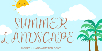 "Summer Landscape" is a beautiful and unique handwritten font. This font is equipped with uppercase, lowercase, numerals, punctuation, signatures, and multilingual support. It is suitable for summer, holidays, vacations, traveling, Father's Day, graduation, the 4th of July, and others.
 - Megalithic by IC Fonts,
$20.00 3D Chiseled Rock type font based on the ideas of Ancient Megalithic Structure and Stone Masonry. This Font comes in a Solid Bolder type or Outlined Type for that Chiseled Ice Block Look. Based on Hulkbusters by Dan Zadorozny.
 - Billetha by Yoga Letter,
$18.00 "Billetha" is a beautiful handwritten font decorated with love. This font is very suitable for Christmas, Valentine's Day, weddings, engagements, branding, and others. Equipped with uppercase letters, lowercase letters, numerals, punctuation, swash, titling, uppercase alternates, ligatures, and multilingual support
 - Simply Royal by Gleb Guralnyk,
$14.00 Introducing a vintage font Simply Royal. This typeface has a victorian medieval look. It's an all caps typeface with decorative classic style. Simply royal has three layer fonts for more conenient recoloring. Thank you and have a nice day!
 - Valentine Heart by Selvia Design,
$14.00 "Valentine Heart" is a very unique and beautiful script font. This font is equipped with upper- and lower-case letters, ligatures, numerals, punctuation, and multilingual support. Valentine's Day, a wedding, spring, an invitation, and other romantic occasions are ideal.
 - Contane Condensed by Hoftype,
$49.00 Contane Condensed is the slim complement to the Contane Family. Its economic proportions permit space saving applications, in particularly, eye catching headlines and subheads. Contane Condensed is high-contrasted, and the spiky wedge shaped serifs, still result in an elegant text flow. Contane supports up to 80 languages and it’s OpenType format allows a wide range of typographic applications. 20 styles offer fine graduation of the weights. All weights contain small caps, ligatures, superior characters, proportional lining figures, tabular lining figures, proportional old style figures, lining old style figures, matching currency symbols, fraction- and scientific numerals, matching arrows and alternate characters.


