10,000 search results
(0.058 seconds)
- Gorus by Smartfont,
$19.00 Gorus is a variable width sans serif type family that's been created to give a powerful but flexible tool to create strong headlines, posters, logos, and display text with tight spacing and maximum space coverage. A contemporary geometric family in 15 styles brings a modern and strong impression to your design.
 - KG Tribeca Stamp by Kimberly Geswein,
$5.00 A chunky stamped font with lots of texture. Best used at large sizes for detail. "This font is heavy to load and may freeze or crash in some programs. Windows Users: You should avoid previewing it before installing it (do not double-click on the font file, but right-click > Install)"
 - Ratatam by alphabeet.at,
$40.00 Ratatam is a variable egyptian font face. There are eight weights from thin to black, but a lot more opportunities with the variable font, and a decor style with inner elements. Useful open type features, which are optional as well as contextual alternates and positions, are defined, all small caps integrated.
 - Frakturus by MAC Rhino Fonts,
$49.00 A modern fraktur briefly based on the typeface Deutschmeister originally designed by Berthold Wolpe in 1934. With a lot of blackness and playful style it is well suited for posters, signage on windows or a book cover. Only one wight for now, but it may be expanded in the future.
 - Homeward Bound by Hanoded,
$15.00 Homeward Bound is a fat, grungy slab serif font - all handmade and inspired by a well known 1934 font. Together with sidekick Homeward Bound II, this baby will lighten up your day, bring you your newspaper and do your dishes to boot. Well, that may not be an accurate description of Homeward Bound’s abilities, but I am sure it will make your work stand out, giving it that ‘handmade eroded vintage’ look.
 - RNS Camelia - 100% free

- Bestowens by Letterara,
$12.00 Bestowens is the perfect handwritten font: Elegant, Sweet, innocent, light and charming, this one-of-a-kind typeface will add a unique charm to any design project! Bestowens was created to look as close to a natural handwritten script as possible by including 44 ligatures. With built in OpenType features, this script comes to life as if you are writing it yourself. You can see it in the pictures shown. A wide range of swashes (a-z) and alternates (A-Z, a-z) are included so that you can give your logo or name a custom, hand-calligraphy look. This font is available in 10 Styles in 1 typefaces: Thin, Light, Regular, Semi Bold, Bold, Thin Italic, Light Italic, Italic, Semi Bold Italic, Bold Italic and most importantly, Bestowens is perfect for you! don't wait anymore, put it in your shopping basket :) and follow me, because there will be many promos!
 - Heath Notted by YuliusParyadi,
$11.00 Heath Notted is suitable for display like poster, halloween, witch theme. We created it inpired by the night, because some times night is not always just dark, but sometimes it's beautiful. Heath Notted is includes: - full set uppercase and lowercase letter; - numerals; - large number of punctuations; - ligatures, and swash. Please add this font as your favorit, hit like button, or follow me. I'll very happy for that and aprreciated it. Thank you!
 - Mosse by Deltatype,
$49.00 Mosse is an extraordinary sans-serif typeface that designed for improve readability, formal but casual, with straight cut at terminal and reverse angled at spur and finial give a little bit sweet. Mosse is simple and identical, come with nine weights allowed you to use the right weight to the right proportions. Mosse also support many languages, thanks to extended latin glyphs. Mosse come with standard Adobe Latin 4 glyphs, world-ready and mark2mark support.
 - Arkitech Round - Personal use only

- Cannon by W Type Foundry,
$20.00 The Cannon family is the result of combining the clean aesthetics from a classic sans neo-grotesque with a touch of a geometric design. The result is a simple but dynamic typeface with retro and technological airs. Cannon is ideal for robust advertising, bold brand identities and packaging, also suitable for high impact headlines and short texts. This type family consists of 36 variants and 9 weights (thin, extra light, light, regular, book, medium, bold, extra bold, black), matching italics for all weights and widths, matching small caps for all weights and widths, alternate characters and extended language support. We are proud to introduce: Cannon.
 - Samarquand by BluHead Studio,
$29.00 Samarquand is a handwritten script design from Roy Preston. Based on the handwriting of a friend, Roy has expanded this friendly, semi-connecting script to include three weights, Light, Regular and Bold, opening up even more design possibilities. The Samarquand fonts support an extended character set, as well as some ligatures, inferior and superior numbers, and unlimited fractions. There are some really nice letterforms in these fonts, particularly that uppercase W! Peruse the posters to see. I'm kind of partial to the Light weight, which is really quite elegant in use, but that Bold can really make a strong statement! Samarquand. Check it out for yourself.
 - Bronzo by XO Type Co,
$39.00 This is a 2023 redesign of Bronzo, originally designed by Rick Valicenti and Mouli Marur in 1991. With this redesign, Bronzo now has 6 new weights, for a total of 9, and 587 more glyphs than it was able to in 1991. Bronzo appears to move forward, yet remain still, via a center stroke that only sticks out on the left, a tense curve that only happens on the right, and a width that sits uncomfortably between square and rectangle. Those three things, combined with a balanced light to dark ratio, are what makes Bronzo appear tense and ready. Bronzo accepts Modernist ideals of minimal, rational construction—but it also adopts luxuriant shapes over Modernism’s sandblasted neutrality. It’s almost an alternate reality, a “what if?” of Modernism. Modernism’s fun, interesting, cute reboot.
 - Treacherous by Comicraft,
$29.00 Midnight, Pacific Coast Highway. You're driving home alone at night and your battery's dying. Your headlights have dimmed and you can barely see the road or the signpost up ahead. But there's an eerie green light glimmering in your rear view mirror and that strange warning uttered by the pump attendant at the Devil's Elbow gas station has put the frighteners on you. Is that Satan's face glowering at you through the mist, or something far worse? The only way to handle this font is with one foot on the gas pedal and one foot on the brake. Originally designed by John Roshell for GAMBIT titles, this sharp font has appeared on vampire & rock magazine covers, Star Wars & Star Trek merch, and the logo for the INHUMANS comic & TV show!
 - Italia by ITC,
$29.00Italia is the work of Colin Brignall, a refreshingly different serif typeface. At first glance, Italia might seem comparable to any other square serif typeface, but it has a distinctive pattern all its own. Italia can be used as either a display or text typeface and will give any text a unique look. - Midnight Workers by Figuree Studio,
$18.00 Midnight Workers is a Modern Sans-serif typeface inspired by freelancers who work late into the night to make a living for their beloved families. The simple and dynamic shape makes it very suitable to be used as headlines, logos, or other design needs that require a formal touch but still seem dynamic.
 - Ashtanga by Hanoded,
$15.00 Ashtanga was named after a type of yoga. In Sanskrit it means "eight-limbed", which I find quite appropriate, give the amount of swirls and curls. The font is 'all-caps', but the upper and lower case glyphs differ completely. They are, of course, fully interchangeable. Ashtanga comes with multi language support.
 - Breaze by PizzaDude.dk,
$19.00 You may think cartoon or kids product, when you take a look at Breaze - and you may be right…but I did have retro grafitti in mind, when I drew the letters. Well, actually I may have mixed both cartoon and grafitti! Anyway, it’s a playful font and is suitable for many things!
 - Jilkyway by PizzaDude.dk,
$20.00Jilkyway is a truly weird font. Here and there you might spot some sanity in the weird font curves. But as you type, your text becomes more and more weird! The font is also suitable for text written in ALL CAPS! You will need to use OpenType supporting applications to use the autoligatures. - Vendor JNL by Jeff Levine,
$29.00Vendor JNL is Jeff Levine's take on the popular ribbon font of the Victorian Era, but using a vertical type (Trade Journal JNL) rather than skewed letters. End caps for the ribbon can be found on the left and right parenthesis, and a blank panel is on the hyphen key. Limited character set. - Bergamot by Emily Lime,
$20.00 Bergamot was inspired by vintage apothecary labels, but this font is actually quite modern in both style and effects. It features all caps plus 2 sets of alternates (so, 4 total variations for each letter). The coolest part… they intermingle randomly as you type! Ok, so it’s not exactly random, but that’s the easiest way to explain what you'll see. The letters are actually coded to rotate with their respective alternates. This effect is both useful or can be purely for fun! Let’s talk about the useful part for a sec… Repeating characters are often a dead giveaway that a font is being used. And sometimes we don't want that, right? We want to give the illusion that our design has been custom hand-lettered for a particular project… and can't be recreated by another. That’s exactly what this font aims to do. The randomizing effect is built into the Contextual Alternates feature and will likely be “on” automatically in your chosen program. Alas, even random doesn't guarantee that like characters won't appear in close proximity. So for those of you with access to the “Stylistic Alternates” feature, easily change repeated letters that are near each other simply by turning this feature “on”. Voila! Custom…hand…lettering. Bergamot also features separate files for Frames & Ornaments. Check them out below.
 - Cry Wolf by Hanoded,
$20.00 When I was a kid, I loved the story of The Boy Who Cried Wolf. I thought it was pretty stupid of the boy to trick the villagers into believing wolves are attacking his flock of sheep. But I also thought it was a bit sad that the sheep are eaten by a wolf in the end. I didn’t really feel sorry for the boy (he really was stupid), nor the wolf (he just does what he is supposed to do in life), but I did feel sorry for those poor sheep. I guess this is what disinformation leads to in the end. Cry Wolf is a bit of a scary font: it was made with a really old and battered brush, using Chinese ink and some quality French paper. It has a slight tilt to the right and I added some inky splatter for dramatic effect. Use Cry Wolf for your book covers, product packaging and headlines; use if to spice up you invitations and your halloween posters. Comes in a slightly tilted Regular style and an outright Italic style.
 - Milan In Paris by Mevstory Studio,
$25.00 Milan in Paris is a powerful and elegant display typeface, constructed to maximize use of horizontal space. Built from hand sketches drawn over several years, Milan in Paris eight weights span an elegant Thin to a vibrant Heavy, with accompanying obliques.Milan in Paris makes a strong impression in print, headlines, video, and social media – whether paired with a contrasting typeface or on its own.
 - FF Mutual by FontFont,
$50.99 FF Mutual is a friendly geometric sans serif full of subtle, unexpected details. Designer Luis Bandovas drew inspiration from an unlikely source—the credits from one of his favorite childhood shows, Space 1999—and turned that spark into a typeface that is warm and approachable, but contemporary. Bandovas built FF Mutual on a geometric skeleton, but the typeface has enough humanist touches to offset the rigidity usually found geometric designs. These touches are most apparent in the italics, where curved strokes on the “a” and “l” bring a softness to text. Generous spacing, angular details on letters like the “r” and “t,” and flared terminals on the “e,” “s,” and “c,” add further character to the design. FF Mutual’s bold shapes and retro-inspired warmth make it ideal for headlines, where the subtle details can really shine. The typeface is similarly well-suited for small blocks of text such as captions and call-outs, packaging design, and branding.
 - Mr Chips by The Ampersand Forest,
$35.00 Mr Chips is a love letter to modern text serif families like Century Schoolbook and Scotch Romans of all kinds. There's nothing precious about Mr Chips. He's built sturdily, but with a less upright stance than his forebears, with a lower, more relaxed x-height. Mr Chips is dependable and true, with recognizable shapes that make him a pleasure to read. He's a Clarendon, but without the bulkiness that makes Clarendons difficult in text. Mr Chips has character sets for Western Europe, Cyrillic, and monotonic Greek. He has a full set of true small caps for versatility and hierarchy, and some fun and functional ligatures. His alternate characters include a one-story a and g in the upright versions, straight and curly Ka's and Zhe's in Cyrillic, and two styles of ampersand. He's an all around usable, agreeable guy! Mr Chips is a companion typeface to Miss McGee, also from The Ampersand Forest!
 - Eixample Dip by Type-Ø-Tones,
$55.00 The Eixample project is inspired by modernist signage of various examples found in the Eixample neighbourhood in Barcelona. The name of each subfamily is related to its location or to specific elements of the original sign. Dip is the abbreviation for Carrer Diputació (Diputació Street), where the original sign spells Farmacia Específicos Diputación. The reference taken from the pharmacy sign is a curious model, where sans-serif lowercase letters coexist with script uppercase. This fundamentals create the system that we have introduced in Eixample Dip. The capitals are built with contained decoration to achieve maximum compatibility between letters. The script capitals are the default uppercase but we have also included alternative capitals, a slab style that can be combined with the scripts. The narrow influence of the original sign is correlated with the Narrow styles of the Dip family. But for more versatility, Eixample Dip explores normal widths and weights as well. Furthermore an Inline version was added to the suite.
 - Clarence by Protimient,
$35.00Clarence is a modern, original typeface that has been designed to have a warm and slightly antiquated feel. It is slightly too idiosyncratic for great lengths of continuous text but does work very well at both small and display sizes. The serif structure takes some inspiration from architectural buttresses (a structure built against a wall to provide support or reinforcement). The serifs only protrude a small way from the body of the letter, which serves to ground the letter and, because the serifs bracket (the curve) joins the vertical at a relatively great distance from the tip of the serif, it remains subtle. The italic variant draws on the roman but has a more pronounced and curvier serif structure, analogous to the cursive element expected of an italic. This serif structure is present throughout the italic, even extending into the uppercase, making it more of a true italic than the commonplace sloped roman. - Taca by Rúben R Dias,
$42.00 Taca is a typeface built around a shape that Portuguese designer Rúben R Dias calls a “squircle” — neither square nor circle. We usually associate the rounded, convex box with the television screens of the 1960s and Aldo Novarese’s classic typeface, Eurostile. But whereas Eurostile is cold and machined, Taca is warm and rugged, as if it was molded from clay or carved from stone. Taca’s organic nature is also derived from another unique feature: rounded crotches at the right angles where perpendicular strokes meet. This subtle finish, along with blunt stroke endings, softens the otherwise rigid skeleton. With such a strong conceptual vision, Taca could be relegated to the bin of experimental designs, severely limited in their application. But that fate is usually born of a less experienced maker. As a teacher, designer, and letterpress printer, Dias is a type user, keenly aware of the functional requirements of good type. Taca is therefore not a slave to its concept, but a working font family, effective in various sizes and environments. Its lettershapes break away from the base shape whenever it makes sense for legibility, while still maintaining the flavor of the design as a whole. That said, a set of squircle-shaped alternates give the user the flexibility to get more stylized if the situation calls for it. Fitting to its functional aims, Taca has many of the features one expects of a proper text font: upper and lowercase figures, case-sensitive punctuation, and Extended Latin language support. The simplicity, openness, and squareness of Taca’s forms also make it an ideal design for the pixel grid of screen displays.
 - Goatskin Brush by Mans Greback,
$59.00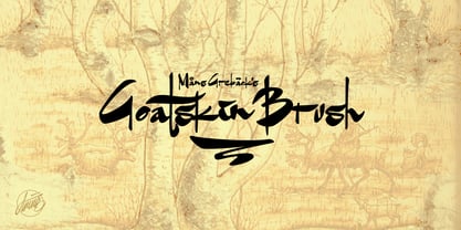 An untamed typeface built with contrasting brushstrokes.
 - Kendrick by Monotype,
$15.99 A heavy-set but lively font, Kendrick’s dense strokes were hand-painted using a thick wet brush. This all-caps set of letters is bold but brushy, textured and expressive; fun but very much meaning business. Kendrick is streetwise and no-nonsense, but with a big cheesy grin to boot.
 - Beauchef by Latinotype,
$26.00 Beauchef is a sans serif typeface originally created to meet the needs of Centro de Modelamiento Matemático de la Universidad de Chile (University of Chile Center for Mathematical Modeling). Beauchef is a typeface with rough strokes that features subtle optical compensation and does not strictly follow the laws of perception. This typeface might not be too cheerful, but shows a very particular idiosyncrasy of form. Beauchef is as tough as advanced mathematics; however, it is as legible and exact as numbers themselves. This is an avant-garde typeface that resembles the development of mathematics, but at the same time it is as conservative, calm and respectful as clients who require its services. Beauchef is so astonishing as mathematical formulas that mathematicians work with, but at the same time it is as humble as resulting figures.
 - Document by Aah Yes,
$11.00Document is an easy-to-read sans serif with large lower-case letters, but with one difference - it is slightly slanted to the right, but a lot less than a conventional italic angle. This is intended to give it a more informal and modern look than a perfectly upright font would be, and which also contributes extra dynamism while reading. It's a sort of in-between font, for situations where a boring old upright typeface is too formal and staid but where the italic version is too slanted and obvious. There are six weights, giving adequate representation for most jobs, from large bodies of text to headlines. The zip package contains both OTF and TTF versions - install either OTF or TTF, not both versions of a font on the same machine. - Sanchez by Latinotype,
$- CHECK OUT Sánchez Niu (new, nova, neue, next) Sánchez, designed by Daniel Hernández, is a serif typeface belonging to the classification slab serif, or Egyptian, that bears a strong resemblance to the iconic Rockwell, but with rounded edges— offering contrast and balance to the square structure. Sánchez & Sánchez Condensed comprises 12 variants, ranging from extra light to black, each of the same x-height. Regular and Italic variants are available for free. Download specimen pdf
 - Milica by PeGGO Fonts,
$18.00 Milica is a display font, inspired on action movies and urban Military culture, designed with straight verticals but slanted horizontals with no curves and sharped hard strokes, in 5 sizes, ExtraLight, Light, regular, Bold & ExtraBlack, plus italic version to each weight. Recommended for use in poster, Movies, video games, TV, Animation, letterhead, magazines titles, POP & Graphic culture, young stuff, hip-hop topics, urban, big sizes prints, Volumetric 3D shapes, labels, etc. Powered by OTF technology.
 - Angulosa M.8 by Ingo,
$38.00 At first glance, »Angulosa M.8« is one of those fonts that a technician or engineer would probably draw. And yet it differs fundamentally from typefaces constructed in this way. The right angle forms the basic element of the »Angulosa M.8«, but that's about it with the pure mathematics. Serif-like upstrokes and downstrokes on some letters improve readability, and carefully used slants makes the appearance a little friendlier. The proportions are not based on any mathematical principle, but are derived from freehand writing of the letterforms with a broad quill. In terms of style, »Angulosa M.8« belongs most closely to the modernist, constructivist typeface attempts, such as those undertaken at the Bauhaus in the 1930s. The styles of »Angulosa M.8« range from "Condensed" to "Expanded", from "Light" to "Black", plus the respective oblique form, which in this font is slanted to the left. All variants can be adjusted continuously in the variable font: the font width ranges from 50 to 150, font weight from 300 to 900, upright [0] and italic [1]. The »Angulosa M.8« supports all European languages including Eastern and Central European, Turkish, Greek and Cyrillic.
 - Silo Slab by TypeUnion,
$25.00 Designed and built in London by TypeUnion, Silo Slab is a fluid slab serif typeface embodying energetic curves and a clean, functional structure. The Silo Slab Family is made up of 6 weights, which range from a delicate Extra-Light, all the way through to a punchy, loud Extra-bold and each carry a versatility for multiple applications and uses. Each weight has a matching italic. Silo Slab features open type alternate characters, and extensive language support to provide a flexible, substantial user experience.
 - Realtime Text Rounded by Juri Zaech,
$30.00 Realtime Text Rounded is the proportional alternative to the monospaced Realtime type family. Nevertheless Realtime Text Rounded includes a monospaced design already built into the font. It is employable through OpenType by activating alternate characters. Realtime Text Rounded is a technical yet friendly design with details that serve function and visual impact alike and lends itself to tabular designs, sturdy columns and tidy layouts. It comes in five weights, from light to black, and with a character set that covers over 200 latin languages.
 - Gizmo - Unknown license

- Mosse Thai by Deltatype,
$59.00 Mosse Thai is an extraordinary sans-serif typeface that designed for improve readability, formal but casual, with straight cut at terminal and reverse angled at spur and finial give a little bit sweet. Mosse is simple and identical, come with nine weights allowed you to use the right weight to the right proportions. Mosse Thai also support many languages, thanks to extended latin glyphs. Mosse Thai come with standard Adobe Latin 4 glyphs, world-ready and mark2mark support.
 - Show Biz JNL by Jeff Levine,
$29.00 The lettering style of Show Biz JNL is a classic sanserif with Art Deco influences. Slight variations in some letter shapes set it off from similar releases. The basic inspiration for this font was a set of ceramic letters and numbers used for home movie titling, but a few touches were added to give the font its own style and flavor.


