10,000 search results
(0.015 seconds)
- Raslani Ancient Script - Unknown license

- boards - Unknown license

- KAVIVA - Unknown license

- Koch-Antiqua Zier - Personal use only

- Bold Ugly Sweater - 100% free

- Hyang Soo by Phoenix Group,
$9.00 Hyang soo type face is a collection of fonts with the theme of love and affection, this font is made like handwriting in everyday life, which makes this font close to our lives.
 - Raleigh by Bitstream,
$29.99Following the death of Carl Dair, David Anderson redrew Dair’s design, Cartier, for Typsettra, where it was renamed Raleigh. Adrian Williams at Fonts added three weights as a display series for Conways, while Robert Norton drew the text series. - Vonique 43 by Sharkshock,
$125.00 Vonique 43 is a stylish display font designed to stop passerby in their tracks. Curvaceous lowercase members define this font along with a consistently thin line weight throughout. Most are elegantly styled after circles featuring very short descenders and matching the cap height of capital letters. Vonique 43, like its predecessors, was not designed for everyday text, but eye catching logos. It's equipped with support for many different languages including Russian and Greek. Use it for a luxury brand, clothing line, or a company logo.
 - Collateral Damage by Chank,
$59.00Collateral Damage is a classic splatter font from the earlier days of the internet. A consistent fan favorite since its initial release in 1999, this ink-dripping font was inspired by the gonzo art of Ralph Steadman. It looks hand-painted, like graffiti. Or crazy scary, like splattered blood. It was made by designer Chris Hunt who lives in the Canadian North with the polar bears. After years as a Chank.com exclusive, it is now available at MyFonts for your personal or commercial use. - Firehell by Zamjump,
$21.00 Introducing Fire Hell – a fiery font inspired by the intensity of death metal. With flames dancing within each letter, this font is tailor-made for death metal, black metal, gothic, horror, and other heavy music genres. The sharp, angular design adds a touch of darkness, making it the perfect visual companion for bands seeking a fierce and impactful typographic identity. Unleash the power of Fire Hell to set your artwork ablaze and embody the relentless spirit of heavy music. Ignite the darkness with this visually striking font! Fire Hell features: Allcaps Beginning Uppercase alternate Ending Uppercase alternate Numbers and punctuation PUA Encoded Characters OpenType Features
 - Kaczun Oldstyle Bold by Type Innovations,
$39.00 There are many subtle and dramatic differences incorporated into this classic beauty. Many shapes have undergone a bold transformation, while others lines remain faithful to that classic period of time that we all know and love. Kaczun Oldstyle works great in headlines, but it works equally well in text at a wide range of point sizes. Use it instead of the old times because, after all, we live in new times.
 - ARB-187 Moderne Caps AUG-47 by The Fontry,
$25.00 Beginning in January, 1932, Becker, at the request of then-editor E. Thomas Kelly, supplied SIGNS of the Times magazine’s new Art and Design section with an alphabet a month, a project predicted to last only two years. Misjudging the popularity of the “series”, it instead ran for 27 years, ending finally two months before Becker’s death in 1959, for a grand total of 320 alphabets, a nearly perfect, uninterrupted run. In late 1941, almost ten years after the first alphabet was published, 100 of those alphabets were compiled and published in bookform under the title, “100 Alphabets”, by Alf R. Becker. And so, as published in August, 1937, The Fontry presents the truly "modern" version of Becker’s 187th alphabet, Moderne Caps, complete with OpenType features and Central European language support.
 - Pergamon by URW Type Foundry,
$39.99 The Pergamon series is a creation of Alfons Schneider (1890–1946) and was issued by the foundry of Ludwig Wagner in Leipzig in 1937/1940, though the website of the Klingspor-Museum says that several of the faces were probably produced after the death of Schneider. This digital version is extended with the necessary OT characters and signs, while also the “символы кириллицы” are added. Also, in addition to the members of the family designed by Schneider, regular, italic, bold and bold italic extended versions were produced. The specimens of Ludwig Wagner stated emphatically: “In allen Graden werden beide K K geliefert”, so these two forms are in all the faces, while the two condensed members also have k k, as the specimens said that this alternative character was also in these two faces.
 - Paper Cube by Pisto Casero,
$14.00 Paper Cube font family is the first font I've created. I unconciously started to draw letterforms with straight horizontal and vertical lines contained in a square. Soon this experiment became a 3d outlined display family of 3 weights, each one of them gaining depth and articulating into planes. Designed in Cuenca (Spain) in 2011.
 - D3 Labyrinthism katakana - Unknown license

- Chuck Noon Script by Fontdation,
$20.00 After long time no script, finally we released our new Chuck Noon Script. A clean and bold script fonts that offers you a natural hand-lettering experience. Handcrafted and digitally checked with high attention to the details, we're a sucker for clean lines and crispy edges too, just like you. Available in two styles; Script and Brush, their dynamic letterforms work like magic, whether you go all caps or using it normally as a script. Suits best for logotype, poster/t-shirt designs, food/beverage labels, hipster quotes, greeting cards, wedding invitations, and many more.
 - Saussa by Linotype,
$29.99Patricia Pothin-Roesch's Saussa typeface began life as brush-lettered artwork for fruit salad packaging in France. After the key letters had been painted, Patricia Pothin-Roesch switched to digital tools to create the final font. True to its roots, Saussa is a real advertising face, perfect for point-of-purchase displays. Even its name is consistent with its intended area of application: Saussa sounds a lot like the word “sauce.” Saussa is an informal script; its outstrokes function almost like serifs, and the capitals have a lowercase structure. The feelings this typeface conveys are due to the hand of its creator, Patricia Pothin-Roesch, an experienced brush-letterer. - Susan by ParaType,
$30.00 An original text and display type family was designed for ParaType in 2007 by Manvel Shmavonyan. The face was named after the designer’s wife. This is an open sans serif font with soft letterforms distinguished by rounded details resembling rudimentary serifs. The family contains true italics developed like in humanist sans serif fonts. Susan is well suited for short and middle range text composing as well as for use in advertising and display typography.
 - SoHo Nights BF by Bomparte's Fonts,
$40.00 Named after the trendy New York City locale, SoHo Nights BF features sensuous curves and tapering lines that combine to create a unique new look that’s a little bit art deco and a little bit art nouveau. The font also exhibits attributes that can be described as cartoon-like, and even “spooky” when seen in short blocks of large text. Use SoHo Nights BF when your projects require that certain "air of mystique".
 - Multistrokes - Unknown license

- Moliere by Eurotypo,
$44.00 The life of Molière is a story of struggle, hard work, domestic unhappiness, death and burial in obscurity and almost in shame. Molière left behind a body of work that not only changed the face of French classical comedy, but has also come to influence the work of other dramatists from around the world. Despite his own preference for tragedy, which he had tried to further with the Illustre Théâtre, Molière became famous for his farces, which were generally in one act and performed after the tragedy. Both the comic and the serious drama were powerfully affected by the work of Molière, not only in his own age and country but everywhere and up to the present time. Didot is a name given to a group of typefaces named after the famous French printing and type producing family. The classification is known as modern, or Didone. The typeface we know today was based on a collection of related types developed in the period 1784–1811. Firmin Didot cut the letters, and cast them as type in Paris. Along with Giambattista Bodoni of Italy, Firmin Didot is credited with establishing the use of the "Modern" classification of typefaces. The types that Didot used are characterized by extreme contrast in thick strokes and thin strokes, by the use of hairline serifs and by the vertical stress of the letters. As in the extreme contrasts of the literature of Molière, in Didione's typefaces, thick and thin strokes, straight and curved, are the most relevant characteristic for an era marked by the changes.
 - Celestina by Piñata,
$- Celestina is the lively spirit, just like drops of ink on a piece of paper or clouds in the sky. The same spirit is maintained by the rounded letters of the script and by the characters' small whorls. Celestina has come to life as a result of a peculiar game in which I tried to bring together the letters with different tempers with help of calligraphic instruments. I wanted to create a very light and playful font which would look like a quick inscription on a piece of paper, but would also be easy to read in a text array. As I was working on the font, my cat Celestina has been very interested in the brush painting process, and I had no other option but to name the font after her! Celestina works perfect for both Moomins stories and personal blogs, as well as for the design of hand-made things, and even just then when you want to put yourself into a good mood!
 - Cinnabar Brush by Hanoded,
$15.00 Cinnabar Brush is a font named after a mineral - mercury sulfide to be precise. I quite like the name and the color, so naming a font after it made sense. Cinnabar Brush is a very bold, very outspoken brush font. It is all caps, but upper and lower case glyphs differ and can be mixed. It is a bit on the heavy side, so I wouldn't set a text in it. Use Cinnabar Brush for posters, book covers, T-shirts and the like. Comes with a mother lode of diacritics.
 - Carla Pro by RMU,
$35.00 Carla Pro is a lively, legible, and partly joining broad-nib script font. I named it after a favourite colleague, in my hot-metal time, who set on the Linotype next to mine.
 - Anything Script by Aldedesign,
$16.00 Anything Script is a stylish script font that features a varying baseline, smooth line, modern and with a depth love. For those of you who are need a touch of love and modernity for your designs or branding, it can be used for various purposes such as headings, wedding, invitation, signature, logos, branding, t-shirt, letterhead, signage, lable, news, posters, badges etc.
 - Raregold Script by Aldedesign,
$19.00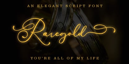 Raregold Script is a stylish script font that features a varying baseline, smooth line, modern and with a depth love. For those of you who are need a touch of love and modernity for your designs or branding, it can be used for various purposes such as headings, wedding, invitation, signature, logos, branding, t-shirt, letterhead, signage, lable, news, posters, badges etc.
 - Antea by Wiescher Design,
$39.50 Antea is named after "Antaeus" the giant of Libya in Greek mythology, son of Poseidon and Gaia (mother earth), whose wife was Tinjis. He was extremely strong if he stayed in contact with the earth, but once lifted into the air he became weak and liquid. So is this font, strong if grounded and weak if floating in the air. I will in due course add different weights for different purposes. Your designer of very mysterious fonts, Gert Wiescher
 - Greenling by Palmer Type Company,
$20.00 Styled after the monogram of the USS Greenling 213 emblem (a submarine that my grandpa proudly served on), I created this typeface in honor of his long and wonderful life. With both Regular and Rough styles, this typeface comes complete with multi-language support, special characters and symbols.
 - Juggernaut - Unknown license

- ITC Honda by ITC,
$29.99This simplified blackletter typeface shares some geometric characteristics with a line of typefaces popular that were especially popular in Germany during the 1920s and 30s. Their forms may have originally come about after a desire to mix the classical Fraktur" forms found in typefaces like Linotype Luthersche Fraktur or Fette Fraktur with more modern sans serif typefaces, like Basic Commercial or Futura. ITC Honda's letters are rather narrow and angular. The type can be used for a number of headlines or logo purposes, and is best legible when set large. A similar typeface in our library is Linotype Gotharda." - Micromoon by Neoglyph Studio,
$15.00 Inspired by futuristic vehicle print designs like seen in Star Trek, Blade Runner, Altered Carbon and the Alien franchise. The goal was a clean, abstract design where horizontal, vertical and diagonal 45 degree lines are the primary guidelines. Features : uppercase and lowercase numbers and punctuation multilingual Ideal for: Logo design Movie promotion Book & magazine print Package design Vehicle print designs Game design
 - Brouwerij by Hanoded,
$15.00 Brouwerij means Brewery in Dutch. I just liked the name and it seemed to fit the font quite well. As for me, believe it or not, I’m not a beer drinker! I can’t understand why people go nuts when the word beer is mentioned. Like it is something special (after all, it is the third most consumed beverage after water and tea). Like you are not a man when you don’t drink beer! Brouwerij is a pleasant all caps font that comes with interesting swashes for the upper class letters. You can (obviously) use it to promote your home made brew, but any other drink can use a bit of Brouwerij as well.
 - If This Be Doomsday by Comicraft,
$19.00 THE END IS NIGH! Judgment Day has come and this planet has been CONDEMNED! Do not conspire to hide what remains of your paltry world from my eyes! Know you not that NONE may thwart my will? Of what import are brief, nameless lives -- to DOOMSDAY?? Death is Certain! Apocalypse is UNAVOIDABLE. At last, my cosmic hunger will be sated, if only briefly! This planet shall SUSTAIN me until it has been drained of all elemental life! SO SPEAKS DOOMSDAY! But do not fret. Even if the Domesday Book has been closed on your planet... your utter destruction is being made available in Font form, I call it IF THIS BE DOOMSDAY, and I will deliver it to you via comicbookfonts.com in Regular, (Roach) Chew and Outline weights. Never let it be said that DOOMSDAY is without mercy. Features: Three weights (Regular, Chew & Outline) with small cap characters and Western & Central European international characters.
 - DZR MENTAL - Unknown license

- Madonna - Unknown license

- Kingthings Spike - 100% free

- Iso 2.0 - Personal use only

- nuixyber - Personal use only

- Once by Atlantic Fonts,
$26.00 Once upon a time there was a really adorable font. Expressive, hand-lettered, and storybook sweet in any language, Once has charm to spare. Enjoy the new set of double letter ligatures, and live happily ever after.
 - Garamond Premier by Adobe,
$35.00Claude Garamond (ca. 1480-1561) cut types for the Parisian scholar-printer Robert Estienne in the first part of the sixteenth century, basing his romans on the types cut by Francesco Griffo for Venetian printer Aldus Manutius in 1495. Garamond refined his romans in later versions, adding his own concepts as he developed his skills as a punchcutter. After his death in 1561, the Garamond punches made their way to the printing office of Christoph Plantin in Antwerp, where they were used by Plantin for many decades, and still exist in the Plantin-Moretus museum. Other Garamond punches went to the Frankfurt foundry of Egenolff-Berner, who issued a specimen in 1592 that became an important source of information about the Garamond types for later scholars and designers. In 1621, sixty years after Garamond's death, the French printer Jean Jannon (1580-1635) issued a specimen of typefaces that had some characteristics similar to the Garamond designs, though his letters were more asymmetrical and irregular in slope and axis. Jannon's types disappeared from use for about two hundred years, but were re-discovered in the French national printing office in 1825, when they were wrongly attributed to Claude Garamond. Their true origin was not to be revealed until the 1927 research of Beatrice Warde. In the early 1900s, Jannon's types were used to print a history of printing in France, which brought new attention to French typography and the Garamond" types. This sparked the beginning of modern revivals; some based on the mistaken model from Jannon's types, and others on the original Garamond types. Italics for Garamond fonts have sometimes been based on those cut by Robert Granjon (1513-1589), who worked for Plantin and whose types are also on the Egenolff-Berner specimen. Linotype has several versions of the Garamond typefaces. Though they vary in design and model of origin, they are all considered to be distinctive representations of French Renaissance style; easily recognizable by their elegance and readability. Garamond Pemiere Pro was designed by Robert Slimbach, and released in 2005."


