10,000 search results
(0.039 seconds)
- Dragonwick - Unknown license

- LoosieScript - Unknown license

- Waschkueche - 100% free

- CAC Pinafore - Unknown license

- Nymph - Unknown license

- Romantic Heart by Blankids,
$25.00 Introducing of our new product the name is Romantic Heart Script Font. Romantic Heart inspired by bouncy script style this font is a fun theme very good for display, tshirt design, craft, quote sign, logotype and etc FEATURES : Uppercase Lowercase Number Punctuation Multilingual PUA Encode Opentype
 - Wildstreet by Runsell Type,
$18.00 Wildstreet – Script Urban Street Style A natural script textured brush, matching for urban street themes. The features uppercase, lowercase, numeral, punctuation & symbol, ligatures, alternates, multilingual support, PUA encoded (fully accessible without additional design software). It inspires a handcrafted aesthetic that pairs so well with san serif display.
 - Monicallisa by Maulana Creative,
$12.00 Monicallisa Feminine Logo Script Font Monicallisa Feminine Logo Script Font is handwritten modern stylish fonts, combines from classic to modern typeface with a elegant baseline. Can be used for various purposes, such as headings, signature, logos, wedding invitation, t-shirt, letterhead, signage, lable, news, posters, badges etc.
 - Kaliesane Olstd by Olexstudio,
$19.00 Kaliesa - Handwritten Script Font will look gorgeous on all your designs, invitation, poster design, book design, branding materials, logo's, and all project design other. WHAT'S INCLUDED Kaliesa - Handwritten Script Font contains standard characters, Lowercase, Uppercase, Alternates, numbers, punctuation, ligatures and international glyphs. Thanks, enjoy designed olexstudio
 - Flinckstone by Maulana Creative,
$11.00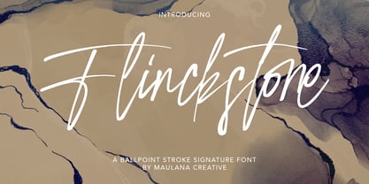 Flinckstone Ballpoint Stroke Signature Font Flinckstone Ballpoint Stroke Signature Font is beautiful script made by love. Flinckstone Script with natural handwriting touch is suitable for you who needs a typeface for Headline, Apparel, Invitation, Branding, Wedding, Logo Design, Lettering, Logotype, Clothing, Poster, Magazine and other design project.
 - Brayles by Blankids,
$20.00 Introducing a new layered bold script called Brayles. It is inspired by hand-lettering, bold script logotype and kids fonts. Brayles comes with OpenType features such stylistic alternates, contextual alternates, swash, ligatures good for logotype, poster, badge, book cover, t-shirt design, packaging and any more.
 - MC Sarling by Maulana Creative,
$14.00 Sarling monoline script font. This font is good for logo design, Social media, Movie Titles, Books Titles, a short text even a long text letter and good for your secondary text font with signature or script typeface. Make a stunning work with Sarling font. Cheers, Maulana Creative
 - Astoylist by Maulana Creative,
$14.00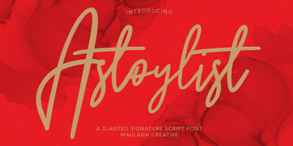 Astoylist Slanted Signature Script Font Give your designs an authentic handcrafted feel. Astoylist Slanted Signature Script Font is perfectly suited to logo, stationery, branding, typography quotes, magazine or book cover, website header, clothing, branding, packaging design, restaurant and more. Thanks for use this font. Maulana Creative
 - Letterhear by FallenGraphic,
$20.00 Letterhear a modern script with a feminimst calligraphy style, decorative characters . in this font script there are many alternative choices of characters Support Ligature, and Stylistic set. So beautiful on invitation like greeting cards, branding materials, business cards, quotes, posters,wedding invitations and more!! Thank you!
 - Fleurons Six by Wiescher Design,
$39.50 Fleurons are embellishments and this is my sixth and so far most beautiful round. I again found some nice old ones and made them completely new. These go well with many Copperplate scripts and especially with my scripts Nadine and Ellida. Your very elaborate, Gert Wiescher
 - Happy People by Blankids,
$23.00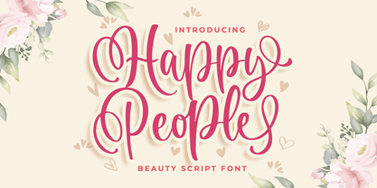 Introducing of our new product the name is Happy People Beauty Script Font. Happy People inspired by bouncy script style this font is a fun theme very good for display, tshirt design, craft, quote sign, logotype and etc. FEATURES : Uppercase Lowercase Number Punctuation Multilingual PUA Encode Opentype
 - Halland by Struggle Studio,
$16.00 Halland is an Lettering Script Font whose work is long enough, The design of the letters is quite beautiful, suitable for those of you who like the Classic & Elegant style, matching classic copper scripts with a modern touch, designed with high detail to open stylish elegance.
 - Oyster Lake by Olivetype,
$18.00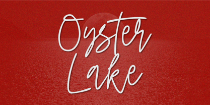 Oyster Lake is an elegant signature script font. This versatile script font has a wide spectrum of applications ranging from greeting cards, product branding to headlines and more. So what’s included : Basic Latin A-Z & a-z Numbers, symbols, and punctuations Ligatures Accented Characters : ÀÁÂÃÄÅÆÇÈÉÊËÌÍÎÏÑÒÓÔÕÖØŒŠÙÚÛÜŸÝŽàáâãäåæçèéêëìíîïñòóôõöøœšùúûüýÿžß Thank you
 - Wolf Paul by Olivetype,
$18.00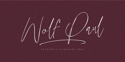 Wolf Paul is an elegant signature script font. This versatile script font has a wide spectrum of applications ranging from greeting cards, product branding to headlines and more. So what’s included : Basic Latin A-Z & a-z Numbers, symbols, and punctuations Ligatures Accented Characters : ÀÁÂÃÄÅÆÇÈÉÊËÌÍÎÏÑÒÓÔÕÖØŒŠÙÚÛÜŸÝŽàáâãäåæçèéêëìíîïñòóôõöøœšùúûüýÿžß Thank you
 - Author Think by Almarkha Type,
$35.00 Introducing Author Think - Authentic Signature Script is a Quality script that is written casually and quickly. Letters are made with Sign on paper. Then scanned and carefully drawn into vector format. Author Think is perfect for homeware designs,branding projects, Logo, design, Quotes, Product packaging, Photography, Watermark.
 - Bell Martellus by Chank,
$99.00 Full of texture and regal personality, Bell Martellus was derived from a book published in 1475 by Henricus Martellus entitled “Liber Insularum.” The writing style is based on the Carolingian Script created by the Emperor Charlemagne and his scribe, Alquin of York, in the 9th century A.D. This old world lettering comes with new world OpenType capabilities, including swash caps and small caps. The James Ford Bell Library at the University of Minnesota commissioned Bill Moran to develop this font as a means of introducing their amazing collection of rare books, maps and manuscripts to a wider audience. Once the historic script was fontified by Bill, it was forwarded to Chank Co, where we added some snazzy baubles for the discriminating typographer. Everybody can enjoy the antique genuine nature of Bell Martellus, but advanced OpenType users also get extra features in Adobe CS applications.
 - 799 Insular by GLC,
$38.00 This font was inspired from the so called "Insular Style" Latin script used in Celtic monasteries (Ireland, Scotland—with the well known Book of Kells—and England) from the late 6th to 9th, before the Carolingian "Caroline" (look at our 825 Karolus). It was a regular script, rounded, written slowly, used mainly for specially meticulous books, with a very few ligatures. The rarely-used capitals consisted of enlarged lowercases, but, on the other hand, there was numerous historical initials. The Titling style in this familly allows to two-color decorated letters to be created, using OTF Titling feature or copy and paste technique. We have created the font as to be adapted for contemporary users, differentiating between U and V, I and J, which has not any relevance for ancient Latin scribes, and naturally with Thorn, Oslash, Lslash, K,W... The specific Celtic "y" is added as an historical alternate.
 - Operandi by Tour De Force,
$30.00 Operandi is geometric sans family available in 6 weights inspired with vintage posters design from period between two great wars. Unpretentious family guided by simple design solutions – slightly wide by its character, decently recognizable, fully capable to lead any project – Operandi offers combination of functionality and visual balance that should be enough to recommend it as right choice. From Light to Black, packed in extended Latin character map, Operandi also contains a few OpenType features such as Ligatures, Fractions and 2x Stylistic Sets – one for complete uppercase alternatives and one for “a” and “g”.
 - Retra by Dima Pole,
$36.00 Retra is unusual serif high-contrast font family in Bodonian style. Some elements has not classical forms, so the font looks interesting and unusual. It is suitable for headlines and some texts. Font family Retra has as bright a display font style and a relaxed textual font styles, and sans-serif font styles. There are many OpenType features, also all the 104 European languages and all Slavic languages. Retra also has an alternative set of Slavic natural lowercase. Text, typed Retra, of course, attracts attention. Overall, Retra leaves a memorable and attractive experience.
 - Pain de Mie by PintassilgoPrints,
$24.00 Pain de Mie is a soft font, friendly and sweet, kinda creamy, kinda bubbly. It's an all caps font with 2 different glyphs for each letter: easily access these through the keyboard upper or lower cases keys. Make them cycle with OpenType Contextual Alternates. There's also a handful of drawings to add an extra charm here and there. Reach these via OpenType Ornaments or pick your choices through a glyphs palette. Like a fresh loaf of bread, Pain de Mie goes well in so many ways. Give it a try!
 - Dirrrty by Hanoded,
$20.00 The Three Degrees had a song called 'Dirty Ol' Man'; Christina Aguilera danced around to the tune of 'Dirrrty' and my three kids leave everything that way after they have finished their meals, so I guess I really had no other option than to call this font: Dirrrty. Dirrrty is a brush font I painted in one go. It is quite dynamic, with some serious grunge in it. Dirrrty is all caps, but upper and lower case differ and can be interchanged. Comes with with a truly disgusting amount of diacritics.
 - Woolen by Magpie Paper Works,
$32.00 Woolen is a hand-inked & italicized serif, based upon a 17th century type specimen by Jean Jannon. Many of the capital letters are decorated with subtle sprigs and leaves, while the lowercase letters remain classically styled, giving the font a warm and natural look with just the right amount of dignity. Woolen is perfect for logos and branding – she shines in retail identities, particularly for farms, markets, and restaurants. Even though the font is slanted, it reads beautifully as body text and display headlines. Multi-language support is included in the font.
 - InstaLove Smooth by Nicky Laatz,
$18.00 With smooth curves and a deliciously bold personality, InstaLove Smooth leaves good vibes wherever it goes. The InstaLove Smooth Brush font is loaded with opentype features including character alternates and a large selection of natural looking ligatures. Scroll through the previews to get a good feel for what it can do. Included in the glyphs are 8 super handy swashes , and a few extra doodles, to add some extra punch to your designs. Perfect for making a bold statement, and getting second glances - InstaLove won’t let you down.
 - ND Diktat by NeueDeutsche,
$15.00 Introducing a bold and uncompromising sans-serif font that refuses to bend or sway. Its angular curves and sharp corners give it an air of authority and strength, while its bold weight demands attention and respect. This font is perfect for designs that require an unyielding, no-nonsense attitude. With its right angles and minimal curves, it embodies a stark and severe aesthetic that leaves no room for ambiguity or indecision. Its austere personality is sure to make a lasting impression, making it the perfect choice for projects that demand an authoritative and uncompromising presence.
 - LeakorLeach by Ingrimayne Type,
$9.95 An early drawing tablet was largely responsible for the LeakorLeach typefaces. They resemble hand lettering using cake icing or done with an ink pen that leaves lots of ink blobs or ink blots. The family has two widths, plain and condensed, and in addition to each having an oblique style, each also has a leftward-inclined style. There may not be many uses for a leftward-inclined typeface, but for those needing one, the LeakorLeach family offers two. The LeakorLeach typefaces are unlike any other faces from IngrimayneType.
 - Bogue Slab by Melvastype,
$29.00 Bogue is a slab serif type family of 8 weights and matching italics. Bogue Slab comes with a lots of stylistic alternates that makes it very versatile in various uses like logos, editorial design, branding, web design, package design and much more. You can use it to create short powerful phrases and headlines and also use it in longer text like lead paragraphs and body texts. So if you are looking for a versatile slab serif font you have found it! Bogue Slab is a slab serif version of Bogue
 - Afish by Borutta Group,
$29.00 AFISH was born out of the need to create a variable serif display typeface – so that any headline on the poster would easily fit. The form of the letters comes naturally from Didone style typefaces, while many of the characters have an experimental form that will not leave the audience indifferent. AFISH will be ideal for posters and strong headline and branding use. The entire family consists of one weight and five widths. Karol Mularczyk and Małgorzata Bartosik worked on the project under the creative direction of Mateusz Machalski.
 - Maiden Orange Inline Pro by Stiggy & Sands,
$29.00 A festive spin off our Maiden Orange Pro typeface, Maiden Orange Inline Pro comes packed with all of the features of the original Maiden Orange Pro typeface, but adds a little more visual flavor with hand drawn inline cuts, leaning even more towards the custom hand lettered 1950’s advertisements that inspired the original. Clean and legible, while also being offbeat and friendly, this font lends itself to a wide variety of uses. The SmallCaps and extensive figure sets offer a slightly more serious tone as well as a wider range of design use.
 - F2F Whale Tree by Linotype,
$29.99Heavy techno music, a personal computer, a font creation program and some inspiration had been the sources to the Face 2 Face font series. Thomas Nagel and his friends had the demand to create new unusual faces that should be used in the leading german techno magazine Frontpage" Even typeset in 6 point to nearly unreadability it was a pleasure for the kids to read and decrypt the messages. WhaleTree is a hommage to Walbaum. The word is a gemanized translation where Wal means Whale and Baum means Tree. :-)" - Throws by Tomatstudio,
$10.00 This is not an ordinary fonts, this is how the real throw up graffiti come into fontype! if you want real throw ups style graffiti fonts, this is the answer! because this is pure from my real graffiti eperiences around the streets. Kerning, spacing i adjust more tight, similar with the real throw up in the streets. The intersection between letter also you can erase it or leave it collide, depends of whats your styles, see our tutorial in the picture slides. I hope you guys like it, cheers!
 - Wesker by SimpleType Studios,
$15.00 Introducing our Wesker - Sans Serif Display Font Collection—a stunning blend of style, versatility, and impact. With 15 fonts, 5 weights, and 3 widths to choose from, your designs will shine like never before. Each font is meticulously crafted to leave a lasting impression, offering unparalleled elegance and precision. Whether you're creating logos, packaging, or posters, our collection empowers you to make a bold statement. Don't settle for ordinary—unlock the power of extraordinary typography. Order our Sans Serif Display Font Collection today and elevate your designs to new heights.
 - Romford Stencil by Paula Minelgaite,
$30.79 Romford Stencil is a Brexit inspired typeface. It’s letterforms represent the idea of a union splitting apart and the stylistic differences between the upper and lower case symbolise the notion of being different from one another. Research for this typeface started off in Romford which is an area where the majority of UK voters wanted to leave the European Union, hence the name. Romford Stencil is designed to be readable for body copy and look impressive when used as a display typeface. However, the bigger it's size the better it looks, especially in all capitals.
 - Cobalt 27 by Lee Iley,
$29.00 A typeface based on early Constructivism Design and Early 20th Century Type form the Modernist Movement. Cap Height for the font has been extended to represent early 20th century typography more closely, while rounded shoulders add a contemporary, modern feel, allowing the design to bridge both centuries. Cobalt Bold works best for headers and titles, while Cobalt Medium and Regular lend themselves to body text. Cobalt Text has smaller Cap Heights, Ascenders, and Descenders, and has been designed where smaller leadings in a body of copy is needed.
 - Kosumi by Thinkdust,
$10.00 Kosumi is an experimental display typeface. Its juxtaposition of thick and thin catches that gleam in your eye, and leads you by the hand out of your comfort zone with such ease that you'll never look back. Kosumi is comfortable in any of a thousand different places, looking brilliant on posters, and reigning supreme within magazine spreads. All you need to do is let is whisk you away. The eye-catching differences between thick and thin lines serve to capitalise your attention, ensuring your nicely laid out headline is truly the star of the show!
 - Spekulatus by Bogstav,
$18.00 Spekulatus is a made up name, and that was what I needed for a font like this. I am not sure which category it fits in: grunge, square, handmade, rough or maybe even graffiti? Well, let's just say that it fits in all 5 - or perhaps even more? All letters are handdrawn, and messed up a bit with a thin fine white liner, leaving a gentle grungy and worn effect. I've added 5 different versions of each letter, which is quite nice - not having the same letters repeating all the time!


