7,639 search results
(1.468 seconds)
- Apothem Caps Med - Personal use only

- Geoplace SC - Personal use only

- Tighten - Personal use only

- Isabel Condensed by Letritas,
$30.00 Isabel Condensed and Isabel were made out of necessity to create a new font for children and teenagers, that could be enough friendly and versatile for text in words or even easy-to-read long texts. The purpose of Isabel is to combine all the nice and friendly features of the simple letters that the teachers teach to the pupils at primary school, as they starting to learn to read, together with the normal editorial fonts we read every day. In this way it generates a very joyful serif font, or even friendly font, with some conservative aspects. In other words, Isabel is a font that, despite of being a “classic features” typography, is proud to show its innocent and ingenuous elements, this gives to the font a new point of view. The family is composed of 3 parts: the regular version, the italic version and the unicase version. Each one of them has 5 weights. The italic version has 825 characters; the regular and unicase have 739 and are composed for 220 latin languages, plus cyrilic.
 - Ouido by Hanken Design Co.,
$30.00 The Ouido typeface has tastefully narrow characters with enough default spacing for comfortable reading at small sizes. Equipped with features like letter-spaced small caps and conservatively drawn italics for emphasizing words that maintain the reading speed—providing the reader a pleasant overall experience. Ouido (pronounced as “widow”) is derived from the Portuguese word OUVIR which means to hear or to listen. Ouido refers to the ability to play a song on any musical instrument after listening to it a couple of times and without reading the notes. The Ouido typeface is a modernized nostalgia for music enthusiasts, a whimsical revamp of the classic serif font. It bears resemblance with printed classical music scores, characterized by each letter’s rounded strokes like how one drew clefs with passion. Each dot is a twin of the quarter note minus the stem, so weaving sentences together could feel like composing a melody. Inspired by the astounding phenomenon of absolute pitch, the visual appeal of this typeface may hone your imaginative ability to embellish your creation without needing a reference.
 - Isabel SemiCondensed by Letritas,
$30.00 Isabel SemiCondensed, together with Isabel condensed and Isabel were made out of necessity to create a new font for children and teenagers, that could be enough friendly and versatile for text in words or even easy-to- read long texts. The purpose of Isabel is to combine all the nice and friendly features of the simple letters that the teachers teach to the pupils at primary school, as they starting to learn to read, together with the normal editorial fonts we read every day. In this way it generates a very joyful serif font, or even friendly font, with some conservative aspects. In other words, Isabel is a font that, despite of being a “classic features” typography, is proud to show its innocent and ingenuous elements, this gives to the font a new point of view. The family is composed of 3 parts: the regular version, the italic version and the unicase version. Each one of them has 5 weights. The italic version has 825 characters; the regular and unicase have 739 and are composed for 220 latin languages, plus cyrilic.
 - Operandi by Tour De Force,
$30.00 Operandi is geometric sans family available in 6 weights inspired with vintage posters design from period between two great wars. Unpretentious family guided by simple design solutions – slightly wide by its character, decently recognizable, fully capable to lead any project – Operandi offers combination of functionality and visual balance that should be enough to recommend it as right choice. From Light to Black, packed in extended Latin character map, Operandi also contains a few OpenType features such as Ligatures, Fractions and 2x Stylistic Sets – one for complete uppercase alternatives and one for “a” and “g”.
 - Bogue Slab by Melvastype,
$29.00 Bogue is a slab serif type family of 8 weights and matching italics. Bogue Slab comes with a lots of stylistic alternates that makes it very versatile in various uses like logos, editorial design, branding, web design, package design and much more. You can use it to create short powerful phrases and headlines and also use it in longer text like lead paragraphs and body texts. So if you are looking for a versatile slab serif font you have found it! Bogue Slab is a slab serif version of Bogue
 - Kosumi by Thinkdust,
$10.00 Kosumi is an experimental display typeface. Its juxtaposition of thick and thin catches that gleam in your eye, and leads you by the hand out of your comfort zone with such ease that you'll never look back. Kosumi is comfortable in any of a thousand different places, looking brilliant on posters, and reigning supreme within magazine spreads. All you need to do is let is whisk you away. The eye-catching differences between thick and thin lines serve to capitalise your attention, ensuring your nicely laid out headline is truly the star of the show!
 - Deco Design JNL by Jeff Levine,
$29.00 Hand lettering isn’t a perfect art form, and this is why it often has an appeal over formal typesetting. Individual interpretation can lead to variations in style, character shape and overall design concept. Case in point: The hand-drawn title for the1933 sheet music “Why Can’t This Night Go on Forever” is a simple Art Deco sans, however it mixes character widths and even angles the letter ‘C’ in a nonconventional way. Deco Design JNL is the digital version of this alphabet, which is available in both regular and oblique versions.
 - NorB Bop by NorFonts,
$30.00 NorB Bop was inspired from my old BopMusic Script I used for my jazz lead-sheets, a handwritten text font with it's unique west-coast music copyist lettering style. You can use this font with any word processing program for text and display use, print and web projects, apps and ePub, comic books, graphic identities, branding, editorial, advertising, scrapbooking, cards and invitations and any casual lettering purpose… or even just for fun! NorB Bop comes with 8 weights, each with their matching italics and in a Normal and Condensed version.
 - Racetrack by Type Innovations,
$39.00 Racetrack is the work of American type designer, Alex Kaczun, and was conceived as a result of developing a logo for a client. Alex was experimenting with a uniform grid pattern, outline and inline, connecting the dots which lead to this interesting typeface effect. Racetrack is a bold display font, which also works well at many point sizes. It has a futuristic appeal with straight lines and sharp corners. The uniform strokes, inline treatment and symmetry make for a powerful headline. The applications for this font design are endless.
 - NorB Pen by NorFonts,
$28.00 NorB Pen was inspired from Arial Round font, I use this font for my jazz lead-sheets. It's a handwritten text font emulating a round marker permanent pen. You can use this font with any word processing program for text and display use, print and web projects, apps and ePub, comic books, graphic identities, branding, editorial, advertising, scrapbooking, cards and invitations and any casual lettering purpose… or even just for fun! NorB Pen comes with 8 weights, each with their matching italics and in a Light, Normal, Bold and Heavy version.
 - Claudius by RMU,
$25.00 A blackletter font tending towards the gothic which was released by Klingspor, Offenbach am Main, in 1937. Claudius can be used for clerical as well as for secular purposes and shows a strong character of its own. The original esthetic atrocities of placing the dieresis within the letters A and O - due to former German industry standards - were abolished. Allow the font's beauty spread by giving it enough leading between the lines. This font contains various useful ligatures, and by activating the Ordinals feature and typing 'N', 'o' and period you get an oldstyle numbersign.
 - ITC Florinda by ITC,
$29.99 ITC Florinda was designed by Luis Siquot in 1997 and consists exclusively of capital letters. The basic forms were influenced by old favorites like Franklin Gothic, but Siquot ornamented the classic forms with symmetrical knobs which look like pieces of lead left over after pouring the forms. This gives the figures a playful, constructed look. When used in a text, the horizontal lines seem to come together to draw a fine line through the middle of the lines of text, giving it an ornamented character. ITC Florinda should be used exclusively for headlines or display.
 - Nd Tupa Nova by Notdef Type,
$29.00 Tupã is a Brazilian indigienous god of thunder. This typeface is a geometric Sans Serif based on vertical and diagonal strokes. The heavy weights are great for impact layouts and the light weights are perfect to make sutil and strong messages. Tupã has a wide character set, including Cyrillic, with Small Caps, Ligatures, regular and tabular numbers and a lot of alternates. This Font is great for tight leading, including when diacritics are involved, there are alternates and case sensitives symbols to make all blocked. And yes!, there's a Variable Font too.
 - Haverj by ParaType,
$30.00 An original typeface designed for ParaType in 2004 by Armenian designer Manvel Shmavonyan. Based on the lettering created in 1970s by outstanding Armenian type designer Henrik Mnatsakanyan (1923-2001) of the same name. In Armenian ‘Haverj’ means ‘Eternally’. The face resembles many regular text serif fonts but elements like serifs and terminals make it eccentric and a little bit funny. The shape of diagonal legs in capital K and R resembles book lettering of the 1950s—60s. Using it in text, advertising and display typography may lead to surprising effects.
 - Etrusco Now by Italiantype,
$39.00 Etrusco Now is the revival of a lead typeface originally cast in lead by Italian foundry Nebiolo in the early 1920s. Heavily inspired by the design of the Medium weight of Schelter & Giesecke's Grotesk, Etrusco was, like Cairoli, an early precursor of the modernist grotesque superfamilies: a solid, multi-purpose "work-horse" typeface family that could solve a wide range of design problems with its range of widths and weights. When designing the new incarnation of Nebiolo's Etrusco, the Italiantype team directed by Cosimo Lorenzo Pancini and Mario de Libero decided to extend the original weight and width range to keep this "superfamily" approach. Etrusco Now has twenty-one styles widths in three widths of seven weights each, with matching italics; the original weights for the typeface have been collected in the Etrusco Classic subfamily. Etrusco Now new widths allowed the team to include in the design many nods and homages to other vintage classics of Nebiolo. The lighter weights of the normal width have been heavily influenced by the modernist look of Recta, while the heavy condensed and compressed widths refer to the black vertical texture of Aldo Novarese's Metropol. This infuses the typeface with a slightly vintage mood, making Etrusco at the same time warmly familiar and unexpected to eyes accustomed to the formal and cold look of late modernist grotesques like Helvetica. Contemporary but rich in slight historical quirks, Etrusco Now is perfect for any editorial and branding project that aims to be different in a subtle way. Etrusco Now's deviations from the norm are small enough to give it personality without affecting readability, while its wide range of open type features (alternates, stylistic sets, positional numbers) and language coverage make it a problem solver for any situation. Like its cousin Cairoli, Etrusco is born out of love for lost letterforms and stands like its lead ancestor from a century ago, at the crossroads between artsy craftsmanship and industrial needs.
 - Motherboard JNL by Jeff Levine,
$29.00 Motherboard JNL is a retro throwback to the technology boom of the 1980s and simulates an LED readout display panel. Available in regular and oblique styles.
 - Casual Brush by Jonahfonts,
$40.00 Read John Downers' article in Typographica®: ‘Our Favorite Typefaces of 2007’ http://www.typographica.org/typeface-reviews/scriptonah-and-casual-brush/ Click the Gallery above for the .pdf. Suitable for posters, titles, book covers, greeting cards, signs, packaging, invitations, ads, headlines and captions.
 - Six Feet Over by Brad Mead,
$10.00 Six Feet Over is tall, cool and near impossible to read - what's not to love? This super condensed and trippy typeface was designed to be elusive and is perfect for those that love condensed, compressed - or any other word for squished - fonts.
 - Saissant by Magpie Paper Works,
$54.00 Edgy and modern, Saissant is a hand-drawn font that leaves an impression. Bold capitals and kinetic lowercase letters have been designed for emotional impact. Saissant includes multi-language support as well as contextual alternates and discretionary ligatures for a convincing calligraphic effect.
 - Big Heroes by Typefactory,
$14.00 Big Heroes is playful font which puts a smile on your projects and will inspire you to create something fun and memorable. It is perfect for headings, flyer, greeting cards, product packaging, book cover, printed quotes, logotype, apparel design, album covers, etc
 - Shire Script by Bean & Morris,
$35.00 Shire Script includes alternate characters and discretionary ligatures to help you create settings when informality is called for. Variety in the lowercase x heights and connectors give an overall effect of handwritten headings and text. However, by considered drawing, legibility is not compromised.
 - Alpha Juliet by Wiescher Design,
$39.50 Alpha Juliet is another font in my alpha-series, the experimental font series. It lends itself to modern designs in all forms. The font can be used together with Alpha Papa since it has the same origins. Your experimental designer, Gert Wiescher
 - Belle Allure by JBFoundry,
$10.00 Belle Allure is a font for schools. It is based on the continuity of movement and simple paths which let a fast and easy cursive writing. It respects the French habits and leans on a wide character set and on the OpenType properties.
 - Bushel And Peck by Make Media Co,
$12.00 Introducing Bushel and Peck - A flirty, bouncy, SMOOTH Script with over 50 alternates, a handy Sans Serif, and an adorable Dingbat style with loads of farmhouse charm. Use this sweet trio to make logos, greeting cards, signage, apparels, totes, mugs and more!
 - Crayon Crumble by Hanoded,
$15.00 Crayon Crumble is exactly what it reads on the package: it was made using cheap crayons, since the cheapies crumble a lot. It is a fun, kiddie font, with a grown-up look to it. Of course it comes with all the accents.
 - Roslyn Gothic LP by LetterPerfect,
$39.00 LetterPerfect's version of this distinctive sans serif design is both legible and approachable, and about as bold as a display font can be. Its friendly persona makes it an ideal choice for greeting cards and invitations, or for use with children's reading material.
 - VTG Juker by Voltage Ltd,
$35.00 Juker is a sturdy hand-drawn slab serif with proper country manners. Warm, hospitable, and just a little bit rough, Juker will lend its comfortable touch to a variety of projects. Activate the stylistic alternates feature to introduce slight variations in the letterforms.
 - Syntax by Linotype,
$29.99 Syntax was developed by Hans Eduard Meier in 1968 and presented by the font foundry D. Stempel AG. Its figures are based on Old Face characters but have a distinctive, modern design. The inclination to the right lends the font a dynamic feel.
 - Wulkie by Fargun Studio,
$12.00 Wulkie Font is handwritten stylish fonts, combines from copperplate to contemporary typeface with a dancing baseline, classic and elegant touch. Can be used for various purposes. such as headings, signature, logos, wedding invitation, t-shirt, letterhead, signage, lable, news, posters, badges etc.
 - 1312 Lamberet by Ezequiel Filoni,
$10.00 Lamberet is a geometric sans-serif typeface, all caps display font. Has a clean, sharp and emphatic form especially suitable for headlines, headings, branding, posters, packaging, titles, logos or whatever. It comes in its italics forms for regular sharp and soft versions. - Uppercase
 - Zamroot by Evo Studio,
$16.00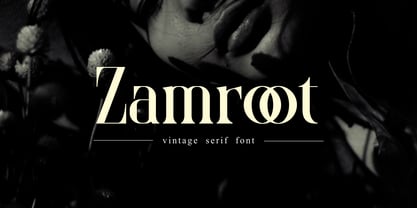 Zamroot a distinct and unique serif font. It feels playfully nostalgic and delivers an incredible vintage aesthetic. Zamroot will elevate a wide range of design projects to the highest level, be it branding, headings, wedding designs, invitations, signatures, logos, labels, and much more!
 - Ashura by Sipanji21,
$10.00 Ashura is a spectacular display font. A little bit quirky, this font looks incredibly adept on a wide variety of contexts, this font look incredible for any design, and suitable for heading, logotype, advertising, shirt design, packaging, cap design, and much more
 - Logx 10 by Fontsphere,
$12.00 LOGX-10 is a geometric minimalistic all-caps display typeface. Designed for strong headers, original graphic designs, visual identification and for many types of designs. It works not only in headings and subtitles but also in arrangements of various sizes and long text.
 - Yenda by Deniart Systems,
$20.00 Yenda is a bold angular font with just a bit of swoosh. Great for short text and headlines! Don't leave this one out of your next sci-fi or bold designs! This typeface includes all the special diacritics required for European languages.
 - Road Trip by Melissa Lapadula,
$19.95This font has wide letterforms and bends which echo the continuous roads traveled on when reaching distant holiday destinations. The typography aims to be clear and legible, as do helpful road signs. This font can function as headings, subheadings and body text. - Starslang Halo by MyAnvil,
$20.00 The "Starslang Halo" font is derived from the original Starslang Phat font. This typeface design features a halo that encompasses the glyph characters that creates a positive warm urban feel. It probably best suited to liven up parties, and makes reading more fun!
 - Milyuna by Suby Studio,
$10.00 Milyuna is classic and stylish serif with high contrast. We made two different styles Regular and Italic which is suitable any purpose, such as heading, bussines card, quotes, or invitations. Includes: Milyuna Reguler Milyuna Italic Features Lowercase & Uppercase Numerals & Punctuations Multilingual characters (ÀÁÂÃÄÅÆÇÐĐÈÉÊËÌÍÎÏŁÑÒÓÔÕÖØŒŠÙÚÛÜŸÝŽ)


