8,971 search results
(0.015 seconds)
- Queensytrix by Maulana Creative,
$15.00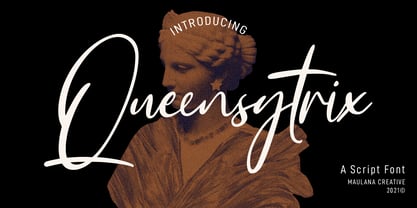 Queensytrix is a chic script font. With light contrast stroke, slanted and fun character with a rich of ligatures. To give you an extra creative work. Queensytrix font support multilingual more than 100+ language. This font is good for logo design, Social media, Movie Titles, Books Titles, a short text even a long text letter and good for your secondary text font with sans or serif. Make a stunning work with Queensytrix font. Cheers, MaulanaCreative
 - MTC Maglita by Martype co,
$59.00 MTC Maglita is a semi-slab serif font that comes with seven styles for display purposes to make it satisfying, also suitable for minimalist, chic, branding, packaging, and logotype design to boost your design exploration. Additional Information Comes with many iconic symbols and arrows (which can be accessed from glyphs in your Adobe software) Multilingual Support supports many different languages 20+ Seven styles to make it more versatile typefaces Thanks & Happy Designing! Umar
 - Wild Comedy JNL by Jeff Levine,
$29.00 John Sigvard ‘Ole’ Olsen and Harold Ogden ‘Chic’ Johnson were musicians-turned-comedians who rose to fame in the zany 1938 Broadway musical review “Hellzapoppin'”. They reprised their roles in the 1941 film adaptation of the show, and the opening title card of the film has “Hellzapoppin'” hand lettered in a tall, condensed sans serif design with an inline. This is now available as Wild Comedy JNL in both regular and oblique versions.
 - Colleen Doran by Comicraft,
$29.00 A DISTANT SOIL is a classic bold and beautiful science fiction/fantasy comic book series by creator, writer, artist AND letterer Colleen Doran! A DISTANT SOIL is being remastered and re-released by those awfully nice chaps at Image Comics and Colleen commissioned Comicraft to create the definitive bold and beautiful Colleen Doran font, based on her original pen lettering, so that she might re-letter the series without excessive eye strain or hand cramp.
 - Avengars by Mevstory Studio,
$20.00 Avengars is a modern and chic typeface, best used as a display for headings, logos, branding, magazines, product packaging and invitations. Avengarscome with clean lines and smooth curves give any project an extra touch of class. If there's anything else you are unsure of feel free to pop me a message :) That's it! Have fun using Avengars Typeface!!! Feel free to follow, like and share. Thanks so much for checking out my shop!
 - Dominica Calligraphy by Ride Studio,
$10.00 Dominica Calligraphy is a balanced, subtle, elegant and stylish handwritten font. It has beautiful character. This font comes with a matching Outline/Monoline version. Perfectly match the design of invitation cards, company logos, movie titles, movie names, business cards, book titles, brand names and various other designs. Dominica Calligraphy is a chic, refined script font that emanates sophistication and elegance. Its stylish alternates and ligatures make this font the perfect match for any project.
 - Yellow Cute by Sakha Design,
$10.00 Yellow Cute is a lovely and modern script font that exudes elegance and sophistication. Each letter is delicately crafted with fluid and graceful strokes, creating a timeless look that’s perfect for everything from wedding invitations to branding projects. Its sleek and chic style will add a touch of class to any design. Keep in mind that the font is PUA encoded, meaning that you can access all delightful glyphs and swashes effortlessly.
 - Svarga by Krismagraph,
$19.00 Introducing our new "Svarga", Elegant Fashionable Typeface with Unique, Classy and Stylish. Svarga Typeface is a classy and elegant serif typeface – This font is both modern and nostalgic and works great for logos, magazine, social media. Already matched up and ready to be used together for your next design! For those of you who are needing a touch of elegant, stylish, classy, chic and modernity for your designs, this font was created for you!
 - Skylines by Zamjump,
$19.00 Skylines- a chic modern serif with letters that seem to accentuate their character.Lots of ligatures for both uppercase and lowercase, as well as several alternates, to add typographical style to your designs.To access these OpenType features, you need software that supports Opentype such as: Word, Textedit, Photoshop, Sketch, Pages, Keynote, Numbers, iBooks Author, QuarkXPress, Indesign, and Illustrator. A wide variety of useful glyphs are included - see preview images of all glyphs. Thank you
 - Odalisque NF by Nick's Fonts,
$10.00Here’s a revised and updated version of one of my oldies, based on the typeface Chic, designed by Morris Fuller Benton. The addition of small caps, improved kerning, and an expanded character set make this one an excellent choice for projects that demand grace, elegance and a bit of mischievous fun. This font contains the complete Latin language character set (Unicode 1252) plus support for Central European (Unicode 1250) languages as well. - Resistance Is Lowered by Comicraft,
$19.00 Lower your shields and surrender your ships. You will talk to your central world authority in upper AND lower case, and order global surrender. Your culture will adapt to serve us in sentence case. You will not shout in UPPER CASE as before. You will be upgraded. You will become like us. Upgrading RESISTANCE IS FUTILE to RESISTANCE IS LOWERED is compulsory. There is no escape. Artwork from Monster Truck by Shaky Kane
 - Locker Room by Tour De Force,
$30.00 Locker Room is display font available in single weight. Stable, compact and distinctive by design, Locker Room contains decorative half serifs that gives the font specific charm. It is intended to be used primary as font for sport clubs – from jersey, indoor and outdoor graphic, social network materials to merchandise and video clips. It also fits nicely for beverage and food labels and packages. Locker Room contains extended Latin character set with standard Ligatures.
 - Georgica by Mevstory Studio,
$25.00 Georgica is a modern and chic typeface, best used as a display for headings, logos, branding, magazines, product packaging and invitations. Georgica come with clean lines and smooth curves give any project an extra touch of class. If there's anything else you are unsure of feel free to pop me a message :) That's it! Have fun using Georgica Typeface!!! Feel free to follow, like and share. Thanks so much for checking out my shop!
 - Hymers JNL by Jeff Levine,
$29.00 Born on May 8, 1892 in Reno Nevada, Lewis Franklin (“Lew” ) Hymers left an indelible mark as a caricaturist, cartoonist and graphic artist. At the age of twenty [in 1912] he worked for the San Francisco Chronicle. During World War I he worked for the Washington Post. He even was employed for a time by Walt Disney as an animator - but most of his life was spent in either Tujunga, California or his birthplace of Reno, Nevada as a self-employed illustrator. Hymers inked a feature for the Nevada State Journal called “Seen About Town”, which was published during the 1930s and 1940s. In this panel, he caricaturized many of the familiar faces around Reno. He also designed signs, logos, post cards and numerous other commercial illustrations for clients, but what has endeared him to a number of fans was his vast library of stock cuts (the predecessor to paper and electronic clip art) which feature his humorous characters in various professions and life situations. So popular is his work amongst those “in the know” that a clip art book collection of over seven hundred of his drawings that was issued by Dover Publications [but long out of print] commands asking prices ranging from just under $15 to well over $100 for a single copy. Lew Hymers passed away on February 5, 1953 just a few months shy of his 61st birthday. Although his artwork depicts the 1930s and 1940s lifestyles, equipment and conveniences, more than sixty years after his death they stand up amazingly well as cheerful pieces of nostalgia. The twenty-seven images (and some variants) in Hymers JNL were painstakingly re-drawn from scans of one of his catalogs and is but just a tiny fraction of the hundreds upon hundreds of illustrations from the pen of this prolific artist.
 - Reborn by Sensatype Studio,
$15.00 Reborn is a modern and chic font for brand and logo design with ligature that easy to use for beginner and ready to use on any software that support Opentype Feature. This is based on our experience as a font creator, so many users with dummy and never use Opentype feature before. So, we try to brainstorming and create this font to make the idea is going out. This is perfect for BRANDING and LOGO DESIGN. You will get chic, unique, and certainly font for graphic design. To make it look more unique, here we prepared some ligatures: KA KC KE KG KO KS KU KY RA RC RE RG RO RS RU RY QA QC QE QG QO QS QU QY LA LC LE LG LO LS LU LY Include Fancy Style in some Uppercase and Lowercase, Just try it!!! Reborn is also included full set of: uppercase and lowercase letters multilingual symbols numerals punctuation ligatures Wish you enjoy our font and if you have a question, don't hesitate to drop message & I'm happy to help :)
 - DeLouisville - 100% free

- Teen Light - Unknown license

- Sofachrome - Unknown license

- London Doodles by Outside the Line,
$19.00 London is always hip. With William and Kate and the 2012 Summer Olympics it made sense that London Doodles would be second in the City Series following Paris Doodles. 29 illustrations and a script word London. Kate’s ring, the Queen’s carriage, crown, skyline, cityscapes, cars, double-decker bus, castles, bridge, tea items, flag and more.
 - Night Empty by Ahmad Jamaludin,
$17.00 We're presenting our new italic seventies retro font, Night Empty! Night Empty - A Italic Seventies Retro that has both retro and soft bold italic. This font has smooth curves and clean lines to make your project more nostalgic feels. This font will make your project looks retro, chic, and presentable. Night Empty - Have 37 beautiful alternates and ligatures which consist of 4 stylistic sets. Comes with alternatives and ligatures, and helps to create stunning logos, quotes, posts, blog posts, branding projects, magazine imagery, wedding invitations, and much more. Super-versatile, have a scroll through all the previews to see how wide the range of uses that can be with Night Empty, it's so limitless! What you get : Letters, numbers, symbols, and punctuation Has 37 beautiful alternates and ligatures Use in many programs even in Canva Multilingual Support Language Support: Danish, English, Estonian, Filipino, Finnish, French, Friulian, Galician, German, Gusii, Indonesian, Irish, Italian, Luxembourgish, Norwegian Bokmål, Norwegian Nynorsk, Nyankole, Oromo, Portuguese, Romansh, Rombo, Spanish, Swedish, Swiss-German, Uzbek (Latin) Come and say hello over on Instagram! https://www.instagram.com/dharmas.studio/ Dharmas Studio
 - Mad Scientist by Comicraft,
$19.00 Working on The Lab late one night, evil comic book genius Scott Christian Sava realized there was something missing from his graphic experiment! No, not slugs and snails or puppydogs' tails, nor sugar, spice, everything nice and formula 'X'....No, what his nefarious scheme was missing were the actual numbers and letters with which he could complete his equation! BRILLIANT! What he needed was something antiseptically clean and readable, even at small sizes for megalomanical rambling as well as the 5 point type under the Bio-Hazard logo that nobody really reads, and yet also bouncy and energetic enough for the inevitable sound effects that might follow exclamations such as: "IT'S ALIVE!" or "IT JUST-MIGHT-WORK!" Thanks to those awfully nice chaps at Comicraft, MadScientist is now available to evil geniuses everywhere, and guaranteed Laboratory tested.* *On reanimated human beings reconstituted from bones and organic body parts and organs from local charnal houses. No animals or small children were hurt during the creation and use of this font. Well, not yet, anyway. Artwork by Lew Stringer
 - Trendy by Estudio Calderon,
$69.90 Welcome fashionistas, we have designed a type family based on fashion and current trends. Trendy, the new font of our studio follows the same design line that represents us, processes with brush lettering, variety of characters, OpenType programming and a special touch that reflects a boho chic style. The soul of Trendy is inspired in the logotype of one of the most influential type foundries around the world. Because of its great contribution in graphic design we have decided to pay tribute by expressing our gratitude for being an icon in the design world, the most recognized type designers of the last years have been part of that type foundry and for being source of inspiration for new designers. Trendy represents a fashion house, a place that breathes fashion, there are inside 5 determining variables for designing time: Regular, Bold, Black, Display & Stencil. Discover this new way to see the glamour world all include in a type family. To know more about our new project, Trendy, visit our web site www.estudiocalderon.co and our portafolio in Behance.
 - South Time by Mercurial,
$17.00 South time an enchanting handwritten script typeface with exquisite accents, casual-chic, perfect for you who want a perfect and fabulous font! Suitable for many design projects such as logo design, branding, packaging, blog graphics, stylizing quotes, wedding stationery, art prints, collateral design, packaging, social media, and so on. I’ve truly enjoyed the process of creating this font collection and hope that it will bring some magic into your projects! Whats Includes: Regular Script, Uppercase and lowercase, Numbers and punctuation, Ligatures, multilingual languages support, symbols and more. It's highly recommended to use it in opentype capable software - there are plenty out there nowadays as technology catches up with design. The Open Type features can be accessed by using Open Type savvy programs such as Adobe Illustrator, Adobe InDesign, Adobe Photoshop Corel Draw X version, And Microsoft Word. And this Font has given PUA unicode (specially coded fonts). so that all the alternate characters can easily be accessed in full by a craftsman or designer and also equipped with Multilingual support. So, let's get it! Thanks and enjoy your day ...!. :)
 - Pacific Clipper SG by Spiece Graphics,
$39.00 Pacific Clipper has its roots in an old 1930s showcard lettering style. An extra bold version of this sign painter’s relic is shown in Carl Holmes' wonderful book on lettering. It may be described as what happens when Rudolf Koch's Kabel Heavy meets ATF's Novel Gothic. Also known as Sam’s Tune, Pacific Clipper’s noteworthy features include wedged crossbars in the capital A, E, F, and H. Overcurving is present in the capital B, D, P, and R while vertical strokes in the lowercase b, d, h, k, l, and t are chopped off obliquely. Figures in Pacific Clipper are also refreshingly different, particularly the number 4. This lettering favorite turned retro typeface has been extended to include a variety of weights. Pacific Clipper is now available in the OpenType format. Some new characters have been added to this OpenType version as Stylistic Alternates and Historical Forms. These advanced features work in current versions of Adobe Creative Suite InDesign, Creative Suite Illustrator, and Quark XPress. Check for OpenType advanced feature support in other applications as it gradually becomes available with upgrades.
 - Bestigia by Ronny Studio,
$19.00 Bestigia is an elegant and chic Sans Serif font. This font is impressive and features an clean and elegant, professionally shaped font, and as a result, it will easily match a variety of creations that require a different touch. Add it with confidence to your projects, and you'll love the results. This typeface is perfect for elegant logos, branding, travel promotions, layout magazines, beauty products, product packaging, quotes, or simply as a stylish text overlay onto any background image. 4 Style Font : Regular Italic Bold Bold Italic Bestigia Features : Uppercase Lowercase Numbers & Punctuation Alternates Ligatures Multilingual Support Simple installation All of features and special characters of this font are included in one file. So it is easy to accessed by using program or software that support the opentype like Adobe Illustrator, Adobe Photosop, and Adobe Indesign). This font also very easy to use because compatible for all software even for non-opentype supported. Please comment us if you have any questions Thank you and have a nice day. thank you
 - Teen - Unknown license

- Strenuous - Unknown license

- Whitenights by Linotype,
$29.99Whitenights is a contemporary text family, which was developed by the prolific Swedish typographer Lars Bergquist in 2002. Containing five weights (11 different fonts total), this family contains every tool you need to set splendid text. The base font of the family is Whitenights Regular, a reliable face designed in the old style manner. It ships in OpenType format, with old style figures. Whitenights Ligatures Regular is a supplementary font, which contains many extra ligatures (e.g., ffb, ffk, tt, and fj) whose use will improve the color" of a page of text set in Whitenights Regular. Whitenights Regular may be accented by combination with Whitenights Small Caps, Whitenights Italic, Whitenights Bold, and/or Whitenights Bold Italic. The Whitenights Italic, Bold and Bold Italic styles all have supplementary Ligature fonts available for purchase, similar to the Whitenights Ligatures Regular face described above. For larger, headline text, the specially designed Whitenights Titling is quite useful. This titling font has been optically redrawn and respaced for use in large sizes. Naturally, it has its own supplementary Ligature font as well. In books, magazines, and newsletters this font is a great display companion to the rest of the Whitenights family. Its use in conjunction with the text faces will make your typographical compositions more sophisticated. Last but not least in the Whitenights family is Whitenights Math, which contains many additional mathematical and logical glyphs not found in a standard font's character set. Used together, the above 12 styles can set almost any text or math-based document. The entire family is included in the Take Type 5 collection from Linotype GmbH." - Misirlou - Unknown license

- You're Gone - Unknown license

- Teen - Unknown license

- Teen Light - Unknown license

- Teen - Unknown license

- TT Jenevers by TypeType,
$35.00 TT Jenevers useful links: Specimen | Graphic presentation | Customization options Please note! If you need OTF versions of the fonts, just email us at commercial@typetype.org About TT Jenevers: TT Jenevers is a modern serif with Dutch flavor. The font family features the characteristic details peculiar to Dutch serifs—these are the asymmetrical shape of serifs and an irregular slant of ovals. For example, in the letter “o” there is no slant, but it is present in p-q. In TT Jenevers, both lowercase and uppercase characters are of a large size, which makes it a rather display typeface. At the same time, the big half-ellipse of the lowercase characters does not allow the letters to stick, which allows the implementation of TT Jenevers in text arrays. The italics of the TT Jenevers are slightly narrower as compared to upright faces—this is done to ensure a greater density of the text array. The italics of the TT Jenevers are slightly narrower as compared to upright faces—this is done to ensure a greater density of the text array. TT Jenevers font family consists of 12 fonts (6 upright and 6 true Italics), each of which has more than 830 characters. The typefaces include small capitals for Cyrillic and Latin alphabets, 33 ligatures, standard and old-style figures, stylistic alternates, arrows, hands, and card suits. We have prepared two dissimilar stylistic sets, which allow changing the nature of TT Jenevers to a more hand-written one, or adding a futuristic touch to the typeface. FOLLOW US: Instagram | Facebook | Website TT Jenevers OpenType features: ordn, case, c2sc, smcp, frac, sups, sinf, numr, dnom, onum, tnum, pnum, lnum, liga, dlig, salt, ss01, ss02, zero. TT Jenevers language support: Acehnese, Afar, Albanian, Alsatian, Aragonese, Arumanian, Asu, Aymara, Azerbaijani, Banjar, Basque, Belarusian (cyr), Belarusian (lat), Bemba, Bena, Betawi, Bislama, Boholano, Bosnian (cyr), Bosnian (lat), Breton, Bulgarian (cyr), Cebuano, Chamorro, Chichewa, Chiga, Colognian, Cornish, Corsican, Cree, Croatian, Czech, Danish, Dutch, Embu, English, Erzya, Esperanto, Estonian, Faroese, Fijian, Filipino, Finnish, French, Frisian, Friulian, Gaelic, Gagauz (lat), Galician, Ganda, German, Gusii, Haitian Creole, Hawaiian, Hiri Motu, Hungarian, Icelandic, Ilocano, Indonesian, Innu-aimun, Interlingua, Irish, Italian, Javanese, Jola-Fonyi, Judaeo-Spanish, Judaeo-Spanish, Kalenjin, Karachay-Balkar (lat), Karaim (lat), Karakalpak (lat), Kashubian, Kazakh (lat), Khasi, Khvarshi, Kinyarwanda, Kirundi, Komi-Permyak, Komi-Zyrian, Kongo, Kumyk, Kurdish (lat), Ladin, Latvian, Laz, Leonese, Lithuanian, Luba-Kasai, Luganda, Luo, Luxembourgish, Luyia, Macedonian, Machame, Makhuwa-Meetto, Makonde, Malay, Maltese, Manx, Maori, Mauritian Creole, Minangkabau, Moldavian (lat), Montenegrin (lat), Mordvin-moksha, Morisyen, Nahuatl, Nauruan, Ndebele, Nias, Nogai, Norwegian, Nyankole, Occitan, Oromo, Palauan, Polish, Portuguese, Quechua, Rheto-Romance, Rohingya, Romanian, Romansh, Rombo, Rundi, Russian, Rusyn, Rwa, Salar, Samburu, Samoan, Sango, Sangu, Sasak, Scots, Sena, Serbian (cyr), Serbian (lat), Seychellois Creole, Shambala, Shona, Silesian, Slovak, Slovenian, Soga, Somali, Sorbian, Sotho, Spanish, Sundanese, Swahili, Swazi, Swedish, Swiss German, Tagalog, Tahitian, Taita, Talysh (lat), Tatar, Teso, Tetum, Tok Pisin, Tongan, Tsakhur (Azerbaijan), Tsonga, Tswana, Turkish, Turkmen (lat), Udmurt, Ukrainian, Uyghur, Vastese, Vepsian, Volapük, Võro, Vunjo, Welsh, Wolof, Xhosa, Zaza, Zulu.
 - FS Brabo Paneuropean by Fontsmith,
$90.00Worldly Even though it’s a new arrival, FS Brabo has seen the world. Designed by a Brazilian working in London and studying in Belgium under a Dutchman, it’s certainly well-travelled. And it was inspired by the extraordinary archive of early book typefaces at the world-renowned Plantin-Moretus Museum in Antwerp, while Fernando Mello was attending Frank Blokland’s Expert class Type Design course at the Plantin Institute of Typography. It was there that Fernando became engrossed in the collection of early metal type, matrices, punches and type samples by figures such as Garamond and Granjon. So much so that he took on the mighty task of developing ‘a beautiful, functional, serifed text font’ of his own. Heroic FS Brabo’s journey from sketch to font family took an epic three years, starting in Antwerp, continuing at Fontsmith in London, and reaching its conclusion back in Fernando’s home city of São Paulo. No wonder Fernando was reminded of another titanic face-off: that of Antwerp’s Roman hero of legend, Silvius Brabo, and the evil ogre, Antigoon. Brabo came to the town’s rescue after the tyrannical giant had been charging ships’ captains extortionate taxes and chopping off the hands of those who refused to pay up. Having finally downed Antigoon after a long and terrible duel, Brabo cut off the giant’s own hand and threw it into the river Scheldt, unwittingly giving the town its name: the Dutch for ‘hand-throw’ is hand werpen. What better way for Fernando to name his literary typeface than after the hero of Antwerp’s oldest tale? The garalde factor FS Brabo is not a revival, but a very much a contemporary, personal interpretation of a garalde – a class of typeface originating in the 16th century that includes Bembo, Garamond and Plantin, with characteristically rounded serifs and moderate contrast between strokes. Brabo’s ‘ct’ and ‘st’ ligatures, upper-case italic swashes and contextual ending ligatures – ‘as’, ‘is’, ‘us’ – all preserve the beauty and character of traditional typefaces, but its serifs are chunkier than a garalde. Their sharp cuts and squared edges give them a crispness at text sizes, helping to bring a beautifully bookish personality to hardworking modern applications. A workhorse with pedigree It may give the appearance of a simple, four-weight typeface, but FS Brabo has hidden depths beneath its simplicity and beauty. OpenType features such as cap italic swashes, contextual ending swashes – programmed only to appear at the end of words – and stylistic alternatives make this a complete and well-equipped typeface. Comprehensive testing was carried out at text and display sizes, too, to prevent counters from filling in. All of which makes FS Brabo a very modern take on a traditional workhorse serif typeface: colourful and versatile enough to adorn not just editorial projects but also signage, advertising and logotypes. - FS Brabo by Fontsmith,
$80.00 Worldly Even though it’s a new arrival, FS Brabo has seen the world. Designed by a Brazilian working in London and studying in Belgium under a Dutchman, it’s certainly well-travelled. And it was inspired by the extraordinary archive of early book typefaces at the world-renowned Plantin-Moretus Museum in Antwerp, while Fernando Mello was attending Frank Blokland’s Expert class Type Design course at the Plantin Institute of Typography. It was there that Fernando became engrossed in the collection of early metal type, matrices, punches and type samples by figures such as Garamond and Granjon. So much so that he took on the mighty task of developing ‘a beautiful, functional, serifed text font’ of his own. Heroic FS Brabo’s journey from sketch to font family took an epic three years, starting in Antwerp, continuing at Fontsmith in London, and reaching its conclusion back in Fernando’s home city of São Paulo. No wonder Fernando was reminded of another titanic face-off: that of Antwerp’s Roman hero of legend, Silvius Brabo, and the evil ogre, Antigoon. Brabo came to the town’s rescue after the tyrannical giant had been charging ships’ captains extortionate taxes and chopping off the hands of those who refused to pay up. Having finally downed Antigoon after a long and terrible duel, Brabo cut off the giant’s own hand and threw it into the river Scheldt, unwittingly giving the town its name: the Dutch for ‘hand-throw’ is hand werpen. What better way for Fernando to name his literary typeface than after the hero of Antwerp’s oldest tale? The garalde factor FS Brabo is not a revival, but a very much a contemporary, personal interpretation of a garalde – a class of typeface originating in the 16th century that includes Bembo, Garamond and Plantin, with characteristically rounded serifs and moderate contrast between strokes. Brabo’s ‘ct’ and ‘st’ ligatures, upper-case italic swashes and contextual ending ligatures – ‘as’, ‘is’, ‘us’ – all preserve the beauty and character of traditional typefaces, but its serifs are chunkier than a garalde. Their sharp cuts and squared edges give them a crispness at text sizes, helping to bring a beautifully bookish personality to hardworking modern applications. A workhorse with pedigree It may give the appearance of a simple, four-weight typeface, but FS Brabo has hidden depths beneath its simplicity and beauty. OpenType features such as cap italic swashes, contextual ending swashes – programmed only to appear at the end of words – and stylistic alternatives make this a complete and well-equipped typeface. Comprehensive testing was carried out at text and display sizes, too, to prevent counters from filling in. All of which makes FS Brabo a very modern take on a traditional workhorse serif typeface: colourful and versatile enough to adorn not just editorial projects but also signage, advertising and logotypes.
 - Mojacalo AH - Unknown license

- C-Nation by URW Type Foundry,
$39.99 Marit Otto about C-Nation: The building typeface. Although the 70ties were very liberating and progressive, still girls played mainly with dolls and sweet things and boys with all kinds of challenging stuff. They did all sorts of basic scientific experiments in mini labs and of course built cool things with Meccano building sets. As a girl I was perfectly happy with the toys I had access to. But at the same time I was very curious about all the adventure toys and discoveries my brother did. It also made me wonder why the grown up people thought that our world could be separated so easily by separating our toys in pink and blue sections. At this day of age Meccano is probably hopelessly old fashioned and far to manual. Children of today are fed by fast images and cool animations on screen, they learn, play, communicate and relax in the same space, the digital space. The special feature of Meccano was that even though it was very basic there was the promise you could create anything. It might even contribute to a logical mind. The typeface I designed refers to the Meccano feel. It is a creative typeface. A bit masculine and bold looking perhaps but after the first impression a subtle and refined female touch is revealed. It has links to architecture and associations with metal constructions like ‘The Eiffel Tower’ and (old railway) bridges. I am convinced that we all think of that as very charming man-made objects.
 - PykesPeakZero - 100% free

- Deportees - Unknown license


