10,000 search results
(0.033 seconds)
- Estz by Jadatype,
$10.00 Estz is an All-Caps Font with a Modern feel. suitable for branding, logotype, technology stuff, modern & futuristic vibe, social media, products, and so on. contains standard English letters, numbers, punctuation, ligature, Italic version, and several accents that support multilingualism. Thank you!.
 - Rocket Chicken by Letteralle,
$18.00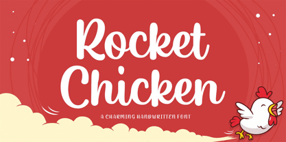 A smooth handwritten font with a personal charm and modern twist. Rocket Chicken come with multilingual support. This font is suitable for your design needs such as product packaging, merchandise, social media design, T-shirts, Logotype, and more. Enjoy Designing, Thank you.
 - Houston Journey by Timurtype,
$14.00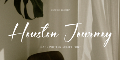 Introducing by Timur type Proudly Present, Houston Journey Houston JourneyA Handwritten Font Houston Journey is perfect for product packaging, branding project, megazine, social media, wedding, or just used to express words above the background. Houston Journey also multilingual support. Enjoy the font.Thank you!
 - Just Overthink by Sronstudio,
$18.00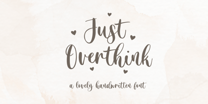 Just Overthink - Lovely Font - This font perfect for branding, invitation, stationery, wedding designs, social media posts, advertisements, product packaging, product designs, label, photography, watermark, special events, and more. Features: Uppercase and lowercase letters Multilingual, numerals, and punctuation Follow Instagram: @sronstudio Thank You!
 - Amelliz by Stringlabs Creative Studio,
$29.00 Amelliz is an exquisite handwritten font, created with the help of an elegant brush pen. Fall in love with its incredibly versatile style and use it to create gorgeous wedding invitations, beautiful stationary art, eye-catching social media posts, and much more!
 - Hamirez by Yoga Letter,
$15.00 "Hamirez" is a sans serif font that is unique, modern, and elegant. This font is equipped with upper- and lower-case letters, numerals, punctuation, and multilingual support. It is suitable for banners, branding, logos, posters, stickers, business branding, social media, and others.
 - Gyahegi by Hishand Studio,
$15.00 Gyahegi is modern serif font that look elegant and aesthetic with beautiful ligatures. It is good for Logo brand, advertisement, product packaging, social media post, clothing brand, magazine headers and many more complete with ligatures alternates regular italic icon kerning multilingual support
 - Stuart Collins by Goodigital13,
$20.00 It looks stunning on wedding invitations, thank you cards, quotes, greeting cards, logos, business cards and every other design which needs a handwritten touch. add an eye-catching appeal to your logo designs, brand imagery, handwritten quotes, product packaging, merchandise & social media posts
 - Atakana Script by Afkari Studio,
$15.00 Atakana Scipt is a New Handwriting Font script that make with love. This font is suitable for any branding of your design needs, wedding invitation, romantic project, studio brand, logo, invitations, social media posts, clothing, invitation, poster, cafe/resto sign and others.
 - Bellafela by Qwrtype Foundry,
$14.00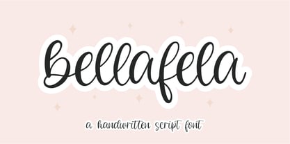 Proudly presenting: Bellafela Bellafela is a handwritten script font. Bellafela is perfect for product packaging, branding projects, magazines, social media, wedding invitations, or just used to express words above the background. Bellafela also comes with multillingual support. Enjoy the font, thank you!
 - Janji Cinta by Stringlabs Creative Studio,
$29.00 Janji Cinta is a lovely handwritten font, created with the help of a beautiful brush pen. Fall in love with its incredibly versatile style and use it to create gorgeous wedding invitations, beautiful stationary art, eye-catching social media posts, and much more!
 - Docherty by Good Java Studio,
$20.00 Docherty - Casual Handwritten Font is a modern signature font. Perfect for logo, invitation, stationery, wedding designs, social media posts, advertisements, product packaging, product designs, label, photography, watermark, special events or anything. This font include more than 50+ Ligatures, and also Multilingual support.
 - Meanshine by Qwrtype Foundry,
$14.00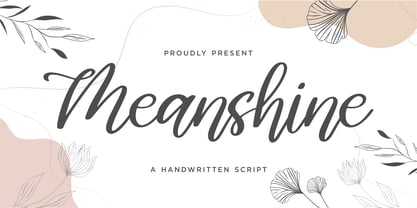 Proudly presenting: Meanshine Meanshine is a handwritten script font. Meanshine is perfect for product packaging, branding projects, magazines, social media, wedding invitations, or just used to express words above the background. Meanshine also comes with multillingual support. Enjoy the font, thank you!
 - Queasily by Ali Hamidi,
$10.00 Queasily is a superb single line font that will make your work stand out through its elegant and simple lines. It is perfect for product packaging, branding project, magazine covers, social media, wedding, or just used to express words above the background.
 - Beautiful Tonight by Fikryal,
$18.00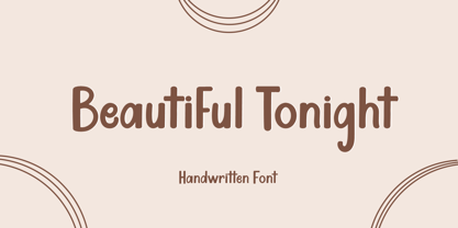 Beautiful Tonight is a fancy font perfect for crafting, branding, invitation, stationery, wedding designs, social media posts, advertisements, product packaging, product designs, label, photography, watermark, special events, or anything. Beautiful Tonight with a full set of uppercase letters, multilingual symbols, numerals, and punctuation.
 - Kinglead by Almarkha Type,
$23.00 Kinglead – Fun Display Playful Sans full of charm . It will take any DIY-project to the next level! Kinglead is perfect for Craft , product packaging, product designs, label, branding projects, logo, wedding designs, social media posts, advertisements, watermark, invitation, stationery and any projects
 - Sign Rathi by Lemonthe,
$15.00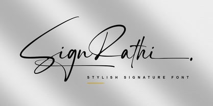 SignRathi is a perfect signature font, with a natural & stylish flow. SignRathi Font is perfect for many different project such as logos & branding, invitation, stationery, wedding designs, social media posts, advertisements, product packaging, product designs, label, photography, watermark, special events or anything.
 - Janelotus by Lemonthe,
$14.00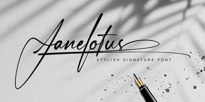 Janelotus is a perfect signature font, with a natural & stylish flow. Janelotus Font is perfect for many different project such as logos & branding, invitation, stationery, wedding designs, social media posts, advertisements, product packaging, product designs, label, photography, watermark, special events or anything.
 - Happy Cookies by Tlatous Type,
$19.00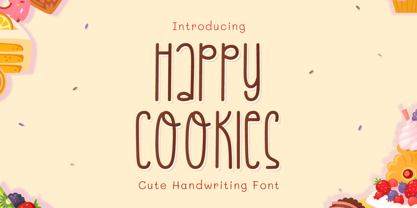 Introducing Happy Cookies Font by Tlatoustype Happy Cookies is a Modern Handwritten Font. Happy Cookies is perfect for book cover, product packaging, branding project, megazine, social media, wedding, or just used to express words above the background. This font also multilingual support.
 - Melvens by Ronny Studio,
$21.00 Melvens is an experimental combination font. includes 2 fonts that have very different styles and appearances, but make this font look unique. This font is perfect for your design needs such as poster design, logo design, branding, social media design, books, magazines, etc.
 - Silver Pearl by Aestherica Studio,
$12.00 Introducing the new fun handwritten dont by Aestherica Studio. Proudly presenting Silver Pearl. Silver Pearl is perfect for product packaging, branding project, magazines, social media, wedding, and more. Silver Pearl has also multilingual support. Enjoy the font, feel free to comment or feedback.
 - Winola by Typefactory,
$14.00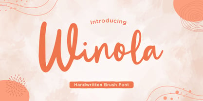 Winola is a brush script font. It has an authentic modern brush script look making it perfect for branding and digital designs. Use this font for logos, wedding decor, invitations, home decor, websites, blogs, instagram, business cards, branding, social media, and more!
 - Lemon Tea by Fikryal,
$18.00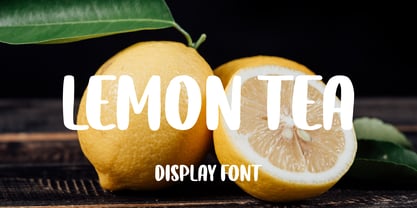 Lemon Tea is a fancy font perfect for crafting, branding, invitation, stationery, wedding designs, social media posts, advertisements, product packaging, product designs, label, photography, watermark, special events or anything. Lemon Tea with full set of uppercase letters, multilingual symbols, numerals and punctuation.
 - Radiohead by Cocodesign,
$10.00 The font is made with natural and elegant handwriting, suitable for the needs of those of you who want to use it for a variety of amazing purposes. Maybe you can use this in various media to make it look attractive and natural.
 - Smilemint by Qwrtype Foundry,
$14.00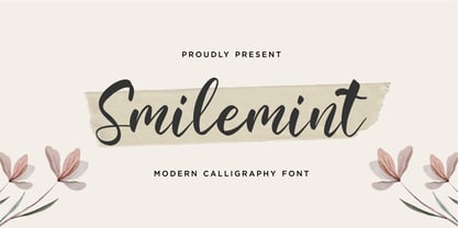 Proudly presenting: Smilemint Smilemint is a modern calligraphic font. Smilemint is perfect for product packaging, branding projects, magazines, social media, wedding invitations, or just used to express words above the background. Smilemint also comes with multillingual support. Enjoy the font, thank you!
 - Southern Beach by Sronstudio,
$18.00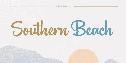 Southern Beach - Script Font, this font is perfect for branding, invitation, stationery, wedding designs, social media posts, advertisements, product packaging, product designs, label, photography, watermark, special events, and more. Features: Uppercase and lowercase letters Multilingual, numerals, and punctuation Follow Instagram: @sronstudio Thank You!
 - Heart & Salsa by Fikryal,
$15.00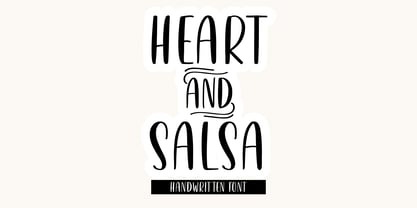 Heart & Salsa is a fancy font perfect for crafting, branding, invitation, stationery, wedding designs, social media posts, advertisements, product packaging, product designs, label, photography, watermark, special events, or anything. Heart & Salsa with a full set of uppercase letters, multilingual symbols, numerals, and punctuation.
 - Mandalykha by TSA Creative,
$12.00 Mandalykha is a very unique script font, inspired by a tourist spot located in Central Lombok Regency. Mandalykha a stylish script which is guaranteed to add an eye-catching appeal to your logo designs, brand imagery, quotes, product packaging, merchandise & social media posts
 - Creamy Sunset by Balpirick,
$15.00 Creamy Sunset is perfect for product packaging, branding project, megazine, social media, wedding, or just used to express words above the background. Creamy Sunset also multilingual support. Enjoy the font, feel free to comment or feedback, send me PM or email. Thank you!
 - Ailee Sofia by Tlatous Type,
$19.00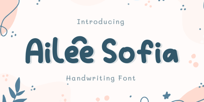 Introducing Ailee Sofia Font by Tlatoustype Ailee Sofia is a Playful Thick Display Font. Ailee Sofia is perfect for book cover, product packaging, branding project, megazine, social media, wedding, or just used to express words above the background.This font also multilingual support.
 - The Quincy by Essentials Studio,
$16.00 Quincy Is a Modern Script Font The Quincy is perfect for product packaging, branding project, magazine, social media, wedding, or just used to express words above the background. Enjoy the font, feel free to comment or feedback, send me PM or email
 - Elmimore by Qwrtype Foundry,
$14.00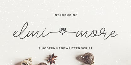 Introducing by Qwrtype Proudly Present, Elmimore Elmimore is a Monoline Script with Swash Elmimore is perfect for product packaging, branding project, megazine, social media, wedding, or just used to express words above the background. Elmimore also come with Multi-Lingual Support. Thank you!
 - Spearmint by Qwrtype Foundry,
$14.00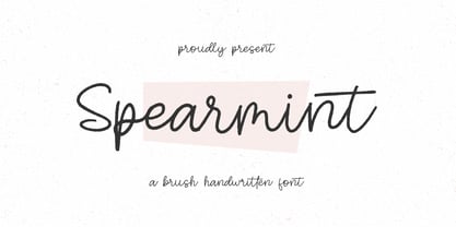 Introducing by Qwrtype Foundry Proudly Present, Spearmint Spearmint is a Brush Handwritten Font Spearmint is perfect for product packaging, branding project, megazine, social media, wedding, or just used to express words above the background. Spearmint also come with multilingual support. Thank you!
 - Dementor by Balpirick,
$15.00 Dementor is a flowing and elegant handwritten font, created with the help of a brush pen. Fall in love with its incredibly versatile style and use it to create gorgeous wedding invitations, beautiful stationary art, eye-catching social media posts, and much more!
 - Bruzh by Garisman Studio,
$20.00 BRUZH combines attractive and natural hand-brushed letters with swinging curves and fresh urban edges; delivering a stylish brush which is guaranteed to add an eye-catching appeal to your logo designs, brand imagery, handwritten quotes, product packaging, merchandise & social media posts.
 - Yournotes by Garisman Studio,
$18.00 Yournotes typeface born from original and natural handwritten in the paper with boldpoint and pen; delivering a stylish typeface which is guaranteed to add naturality styles and taste appeal to your logo designs, brand imagery, quotes, product packaging, merchandise & social media posts.
 - DJ Parade by ParaType,
$25.00 An original display typeface was designed in 2000 by Vladlen Erium for the series of international musical events. A wide Sans of distinctive letterforms with rounded corners is well used in advertising of teenage goods and modern technologies. Licensed by ParaType in 2003.
 - Techno Board by Putracetol,
$28.00 Technoboard - A Scifi Futuristic Display Font. This font is inspired by techno circuit boards, combined with the scifi font type. Technoboard is great for any kind of display purpose from logos, Tshirt, apparel, product packaging, tittle header, poster, merchandise, social media, labels, branding.
 - Berliman by ahweproject,
$11.00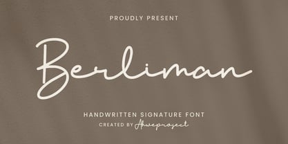 Berliman is a signature script typeface specially made with a natural handwritten style. It is perfect for branding projects, logos, wedding designs, social media posts, advertisements, product packaging, product designs, labels, photography, watermarks, invitations, stationery and any projects that need handwriting taste.
 - Monstera Garden by Timurtype,
$14.00 Introducing by Timur type Monstera Garden A Handwritten Font Monstera Garden is perfect for product packaging, branding projects, magazines, social media, wedding, or just used to express words above the background. Monstera Garden offers also multilingual support. Enjoy the font. Thank you!