10,000 search results
(0.035 seconds)
- Steinweiss Script by Alphabet Soup,
$59.00 Steinweiss Script began its journey towards daylight when Michael Doret was asked by Taschen Publishing to do cover lettering for the huge commemorative edition they were putting together on the work of Alex Steinweiss—“The Inventor of the Modern Album Cover”. The lettering was to be created to appear similar to the famous “Steinweiss Scrawl” the calligraphy that Steinweiss had used on countless album covers. While designing this piece of lettering, Michael realized that there was great potential for a font that was designed in the spirit of that famous “scrawl”. Through his contacts at Taschen Publishing, he was fortunate enough to be able to contact the Steinweiss family, and get the official Steinweiss approval to proceed with his “Steinweiss Script” project. Michael decided that in addition to giving the font his name as an homage, that he would donate a portion of the proceeds from the sale of this font to the man himself: Alex Steinweiss. Read more about the background of Steinweiss Script in Steven Heller’s article in Imprint. Steinweiss Script is a family of fonts in three weights: Light, Medium, and Bold. Additionally, within each weight there are three variations: Simple, Fancy, and Titling. These variations relate to the size/ratio of the caps to the lowercase, the complexity of those caps, and the size of the ascenders/descenders on the lowercase characters. These variations add usefulness to the font, making it accessible not just for headlines, but for longer passages of text as well. For a better understanding of its unique features please download The Steinweiss Script Users Guide from the Gallery section. PLEASE NOTE: the three Steinweiss Script fonts are cross-platform fonts which depend to some extent on certain advanced OpenType features, therefore they can be used to their full potential only with programs that support those features. When setting Steinweiss Script one should almost ALWAYS select the “Standard Ligatures" and “Contextual Alternates” buttons in your OpenType palette. See the “Read Me First!” file in the Gallery section.
 - Ombres by Typephases,
$25.00 Very close thematically and in style to the rest of our “whimbats” (the Absurdies, Bizarries, Illustries, Genteta and Whimsies series), the Ombres contain a number of peculiar silhouettes and illustrations of people that range from cute to scary, with everything in between. Ombres offers152 pictures in 3 files. These imaginary characters were produced with different techniques: quick pencil sketches, ink, watercolour, though once digitized and simplified to bring them into the font files there is little apparent difference. The silhouettes, rather than flat shadows are more dimensional in their look, because they have been digitized retaining the original brushwork or pencil strokes of their source drawings. Some of them remind of the venerable tradition of metal stock cuts from vintage type foundries. The digitized results are quite different, but the energetic nature of the subjects has been mantained. Their vectorial file format means you can use them at any size with no loss of quality. Every Ombres dingbat offers ready-made images for a variety of creative projects. They can be used as they come or easily customized in any graphics program. At small sizes they are ideal spot illustrations with a whimsical touch; at large sizes they can bring a whole page, a spread or even a big poster to live.
 - Sync by Peter Huschka,
$28.99 The Sync font family is a layered system for chromatic typesetting. With its stylistic variety it enables a wide range of eye-catching combinations with colors and patterns. The very first sketches were inspired by some hand-painted characters on a weathered beach sign at the French Côte d’Argent and currently the font family comes with a total of 28 single fonts. The primary font »Sync Base« is a powerful, condensed Sans Serif. Sharp cut edges, narrow wedge-shaped counters and low ascenders and descenders make the compact character of the typeface. In perfect sync with the primary font, the family includes the retro styles Lines, Engravings, Stripes and Shadows and the texture styles Invisible and Jungle. Each one of them with multiple fonts. As all Sync fonts have the same metrics, they can easily be layered in different colors to create the desired effects by using graphic applications that allow utilizing layers. Sync fonts work especially well in larger sizes and were designed for large display purposes, covers, branding, packaging, headlines, editorials, advertising, posters and the like. Check the gallery for examples. By the way, the graphics in some of the visuals come from the Linotype »Picture Yourself™« collection designed by Karin Huschka and Peter Huschka. Sync & enjoy!
 - Euroscript by profonts,
$41.99 Euroscript Pro is the handwriting of Ralph M. Unger, a very talented and hard-working German type designer. Unger has redesigned a large number of beautiful ancient typefaces during the last few years. Peter Rosenfeld of profonts persuaded him to try and produce his own very beautiful handwriting. Kind of hesitant at the beginning of the design process, Unger's joy and excitement about the project was continuously growing during the design process. He designed not only the standard character complement West, but added all of the Eastern European Latin glyphs and, on top of that, even the complete Cyrillic characters. Born and grown up in Th�ringen, former East Germany, Unger has a fair knowledge of Polish and also Russian (Cyrillic). Euroscript Pro is a very beautiful, casual, informal and modern handwriting of a contemporary type designer. Even though a digitized handwriting, it keeps a very natural and pleasant look, at the same time being generous and well-readable. The individual characters combine quite easily and perfectly with no need for extra variants.Euroscript Pro is well-suited for plenty of applications, e.g. personal correspondence, invitations, greeting cards, headlines etc.Euroscript Pro is supplied in the complete Latin character set (West + East) plus Cyrillic.
 - Pollen by TypeTogether,
$49.00 This typeface finds a perfect balance between technical excellence, careful design of letter forms for extended reading, and a measured dose of charm and personality. Its informal feel allows for successfully typesetting a wide range of applications, from magazines and fiction books to advertising and websites. Calligraphy, be it done with the broad-edge pen, brush, or other tools, has been fundamental in the development of Pollen. Its influence is clearly visible in the construction of the top serifs contrasting the curved bottom serifs and the fluid aspect of terminals and tails, such as on “g” and “r”. The shapes of the diagonal letters are based on a less formal calligraphic model, but still uses the broad edge pen. The letters were then subject to a further process of pencil drawing and digital re-interpretation, which gave them the final shape. The designs of “e” and “c” are derived from drawings made with only one continuous line, with the pencil always touching the paper. The letters “g” and “y” express the intention to bring informal elements to a typeface intended for long text reading, usually characteristic of casual writing. Pollen consists of 3 basic styles with an extended OpenType Pro character set and large language support, perfectly serving the most common typographic needs.
 - Two Sugars by Set Sail Studios,
$16.00 Introducing the Two Sugars Script Font! Two Sugars is a playful yet striking clean monoline script font, available in 2 weights and includes bonus extra stars & underlines. It's chunky, hand-drawn letterforms are guaranteed to stand out whether that be on light hearted merchandise designs or more impactful quote designs. The Two Sugars family consists of; Two Sugars Regular • A clean, connecting script font containing upper & lowercase characters, numerals, and a large range of punctuation. Two Sugars Extras • A set of 26 hand-drawn stars & underlines designed to compliment your Two Sugars script fonts. Simply install this as it's own separate font, and type any A-Z character to generate one of the extras. Two Sugars Bold & Two Sugars Extras Bold • If you're looking for a chunkier version of the Two Sugars & Two Sugars Extras fonts, simply switch to the bold versions! Alternates • Are available for lowercase descenders g, j, z, & y. These have elongated tails to add some extra flair to your text, and are accessible by switching on 'Stylistic Alternates' or via a Glyphs panel. Language Support • Two Sugars supports the following languages; English, French, Italian, Spanish, Portuguese, German, Swedish, Norwegian, Danish, Dutch, Finnish, Indonesian, Malay, Hungarian, Polish, Croatian, Turkish, Romanian, Czech, Latvian, Lithuanian, Slovak, Slovenian
 - OBO Classic by Juri Zaech,
$19.00 OBO Classic is the second installment of the OBO series, a type collection based on a square. Every character is mapped on a 1x1 ratio which allows for horizontal and vertical settings alike. Or mixed, like crosswords. OBO Classic is a display interpretation of a traditional Old-style Serif. The “distortion” which maps each character to a square creates unusual proportions to what we are used to from classic serif typefaces. The result is a monospaced font. While each individual letter feels conventional on its own, when brought together in words the result feels contemporary. Thanks to the square base vertical and horizontal – and mixed – settings are possible and easy to apply. There are a few exceptions for certain punctuation and special characters that are half the width for better spacing; and the word space’s width can easily be adjusted through OpenType stylistic sets. Talking about spacing, for strictly horizontal typesetting there is the option to turn on kerning for a number of characters to create a cleaner texture across words and phrases. OBO Classic is best set in large sizes and is most comfortable in editorial and display settings. A series of icons complete the character set. A selection comes as pixel graphics which adds further contrast to the traditional legacy of the typeface.
 - Rougon by VanderKeur,
$30.00 The reason for Nicolien van der Keur to design the Rougon font was the translation of twenty novels written by Emile Zola, a French writer, and translated by Martine Delfos. It follows the lives of the members of the two titular branches of a fictional family living during the Second French Empire (1852–1870) and is one of the most prominent works of the French naturalism literary movement. This series deserved a font with French roots and corresponded to the period in which Zola’s books were written and published, the period between 1870 and 1893, the end of the nineteenth century. Extensive research into French historical typefaces has led to a type specimen from the French type foundry Deberny et Cie in Paris around 1907. It turned out to be good and helpful source as it contained a sample of a typeface that reflected the content and style of the novels, but also represented the period in which the books were written in France. A large part of the novels are about the generations of Rougon, so it seemed a natural choice to give the font that name. It is available in one weight and contains stylized portraits of Emile Zola and the French Marianne. This font also contains various ornaments.
 - Magiona Display by Dora Typefoundry,
$20.00 Magiona Display - A modern classic serif font, perfect for creating bold & beautiful designs. Magiona Display is classic and sophisticated typography with 2 weights to captivate your next project. A very versatile font that works in both large and small sizes. This font is suitable for a wide variety of projects such as: headlines, logos, labels, branding projects, magazines, homeware designs, product packaging, mugs, quotes, posters, and more. It can also be more expressive and fun, thanks to the many alternatives and binders that combine harmoniously in this font and make it more interesting and versatile. Try to change alternatives, binders and you will get many options for your project which will make it bold & beautiful. Features: • Full set of uppercase, lowercase letters • 55 Ligatures • 245 Alternates • Big range of numbers, symbols & punctuation • Characters with accents • Supports Multiple Languages • PUA Encoded WHAT’S INCLUDED: • Magiona Display – Regular • Magiona Display – Outline This type of family has become a work of true love, making it as easy and enjoyable as possible. I really hope you enjoy it! I can't wait to see what you do with Magiona Display! Feel free to use the #Dora Typefoundry tag and # Magiona Display font to show what you've done visit my Instagram : https://www.instagram.com/doratypefoundry/ Thank You!
 - Duwal Pro by Volcano Type,
$76.00 The careful balance between the emotional swings and shapes set in strong contrast such as the burly serifs, or generally vertical and orderly appearance within the Duwal Pro determine the special look of this Antiqua typeface. All characters of the Duwal Pro are designed to be open and accessible. The lowercase letters are designed with a large x-height, which is why they are ideal for small font sizes. Many striking details give Duwal Pro a defined and firmer appearance with increasing font size so it is also suitable for use in headlines and work marks. The deliberately constructed and emphasized design of the serifs give the font a strong position and at the same time force the reading direction. Using Duwal Pro in Bold weight, the serifs look clearly striking, the design language is concise and the typeface receives an additional sympathetic force. The Italic weight draws on the expressive but not intrusive design of the Regular, but appears sharper and is ideal for text passages. The font family contains italics, small caps, lots of ligatures, swashes, another format set, contextual alternatives and special characters as well as other open-type features which allow the use of Duwal Pro in 48 languages.
 - Rhein by BeJota,
$21.00 Rhein is named after the German river that runs through the western border valley. Rhein is a sans-serif typeface family for titles, editorials and graphic design pieces with high impact needs. Rhein was not only conceived as a font design with rounded corners, but its intersection points have been also smoothed. In addition, the wide range of 8 weights that vary from Thin to Black allow relatively long continuous reading (Regular, Medium, Semibold), and short reading designs (Black, Bold, Thin). On the other hand, the "Inline" variant is extremely provocative to fit into any branding project. To add dynamism and to expand the typeface range of use, it was designed as a family of alternatives. Together, the 18 styles of "Rhein" provide a range of options that adjust to the needs and current design and advertising trends.
 - M Ling Wai F HK by Monotype HK,
$523.99 M Ling Wai is a humanistic script based on a real handwritten style. It has a feminine, urban and lively character filled with literate finesse. M Ling Wai was written with a thin ball pen by a young woman in a unique, personal, running writing style, such that it is real, natural and feminine. Contrast of strokes is low and the text is visible and eye-catching. Its light to medium stems (豎) make it suitable for small text and subheading with little conglutination. All strokes are highly irregular, inconsistent, irregularly oriented and tightly coupled or connected. Spatial distribution, positioning, size and relative proportion of radicals fully reflect a natural and personal favor. It is one of the first proportional width font in a full scale. It is best suited for casual lively text, illustrations, set upright (non-slanted), non-condensed.
 - Sybilla by Karandash,
$19.95 Sybilla is a robust, but friendly, humanist slab serif well suitable for broad range of design projects. A true workhorse and superb text type family, Sybilla was especially designed with legibility in mind. Its soft almost cursive shapes and generous internal spaces define a slab serif that is easier on the reader’s eye and help establish a feeling of warmth and friendliness. The type family consists of eight weights with complimentary italics. While the Light, Book, Regular and Medium weights are great performers for body text, the Thin, Bold and Heavy weights make an excellent choice for headlines. Also there is the specially designed Ultra weight if extra punch is needed. Sybilla has extensive multilingual support and specially designed Cyrillic that works harmoniously with its Latin counterparts - a perfect choice for design projects that need both writing systems running side by side.
 - Hollywood Deco SG by Spiece Graphics,
$39.00 This is yet another Willard T. Sniffin deco-inspired original. Created for the American Type Foundry, Hollywood Deco remains a classic that is still as contemporary today as when it first appeared in 1932. Use this novelty gothic typeface on announcements and stationery. It is also well-suited for many advertising situations where a stylish retro look is desired. A useful set of alternate characters (including the illustrious “Overlapping O's”) is included with this version. Hollywood Deco Medium with Alternates is also available as an OpenType font. This version now contains small caps, lining and oldstyle figures, prebuilt fractions, stylistic alternates, word buttons and a wide assortment of f-ligatures. These advanced features currently work in Adobe Creative Suite InDesign, Creative Suite Illustrator, and Quark XPress 7. Check for OpenType advanced feature support in other applications as it gradually becomes available with upgrades.
 - M Ling Wai P HK by Monotype HK,
$523.99 M Ling Wai is a humanistic script based on a real handwritten style. It has a feminine, urban and lively character filled with literate finesse. M Ling Wai was written with a thin ball pen by a young woman in a unique, personal, running writing style, such that it is real, natural and feminine. Contrast of strokes is low and the text is visible and eye-catching. Its light to medium stems (豎) make it suitable for small text and subheading with little conglutination. All strokes are highly irregular, inconsistent, irregularly oriented and tightly coupled or connected. Spatial distribution, positioning, size and relative proportion of radicals fully reflect a natural and personal favor. It is one of the first proportional width font in a full scale. It is best suited for casual lively text, illustrations, set upright (non-slanted), non-condensed.
 - Arkais by Logitype,
$25.00 Introducing Arkais, a glyphic serif typeface inspired by the rhythmic construction of Gothic architecture. This unique typeface is characterized by slightly broken shoulder and bowl shapes, offering a fresh and classic feel. With contrasting brackets, consistent barb, and beak shapes, Arkais brings a touch of elegance to any project. Arkais features five weight variants—light, regular, medium, bold, and extra—as well as three width options: condensed, normal, and expanded. Each font family also includes italic styles, providing even greater versatility. Equipped with OpenType features, Arkais offers multiple character alternatives, ligatures, small caps, and more, ensuring a tailored look for your designs. Designed as an alternative to current trends, Arkais is perfect for creating strong headers or captivating display text. The typeface supports over 500 basic Latin glyphs, making it suitable for a wide range of projects.
 - Valenteena by Ingrimayne Type,
$9.95 Valenteena is in the spirit of the 19th century, but there are no other typefaces quite like it. It is geometric, using distorted hearts to form the letters. The lower-case letters are smaller versions of the upper-case letters. The overlay variant is derived by breaking ValentinaContour into its parts: the inner letter, the white inner border, and the black outer border. To use them one must have a program that allows layers of letters. Type in and format the inside variant to get the message you want. Also select the color you want this layer to have. Copy this layer twice, formatting one to the medium and and the other to outside. Color each of them in the colors you want and them combine the three layers, placing them so the letters exactly align. You will get letters with three colors.
 - Orca Pro by (v) design,
$49.00 Orca Pro is a modern sans-serif font family. Its lowercase letters are inspired by the well known OCR-A font, however every single glyph has been more or less revised. Capitals, numerals and all other characters and punctuation marks are entirely new. Feel free to download the PDF Specimen for detailed info and examples. The Orca Pro family consists of 10 fonts – light, regular, medium, bold and heavy weights including real italics. It supports many OpenType features like automatic fractions, ordinals, proportional/tabular figures, numerators, denominators, superiors, inferiors or case sensitive forms and offers great multilingual support for most of Latin-based languages (including CE). Orca Pro contains a number of standard and discretionary ligatures, numerals as well as 62 bullets, symbols and arrows. Orca reveals its soft, rounded character in bigger sizes while it remains distinct and legible in small sizes.
 - Geogrotesque Slab by Emtype Foundry,
$69.00 Geogrotesque Slab is the ideal companion of the popular Geogrotesque. The challenge was to achieve a fully recognizable font that works as part of the existing family, for that reason the Slab version conveys the same message in a different way. The new font remains clean and tech with a human touch yet provides a new security, confidence and firmness thanks to the serifs. This new addition, combined with Geogrotesque, Geogrotesque Stencil and Geogrotesque Condensed Series provides even more design options and now there’s a Geogrotesque for every need. The type family consist of 14 styles 7 weights (Thin, UltraLight, Light, Regular, Medium, SemiBold and Bold) plus italics. It is available for desktop and WebFont and includes ligatures, tabular figures, fractions, numerators, denominators, superiors and inferiors with support for Central and Eastern European languages. For more details see the PDF.
 - Ginder by Craft Supply Co,
$20.00 Ginder – Bold Serif Font: Striking and Versatile Bold and Commanding Presence: Ginder – Bold Serif Font stands out with its strong, bold character. It’s perfect for titles and posters needing a powerful impact. This font captures attention effortlessly. Ideal for Titles and Posters: With its robust design, Ginder excels in creating striking titles and posters. It enhances visibility and readability. This font is a top choice for impactful visual designs. Adaptable Across Mediums: Despite its boldness, Ginder is surprisingly adaptable. It works well in both digital and print formats. This versatility makes it a valuable tool for various design projects. User-Friendly for Designers: Ginder is designed for ease of use, suitable for all skill levels. Its compatibility with multiple design platforms adds to its appeal. It’s a favorite among graphic designers for its simplicity and impact.
 - Bremer Presse by Schraube,
$29.00 As most successful German private press, «Bremer Presse» has strongly influenced German book art. It was founded 1911 in Bremen to print and produce books in perfection. The role model of the press’ typeface was the english Doves Press. Willy Wiegand drew three versions of the «Bremer Presse» antiqua font, starting with the regular weight in 16 pt and adding later the regular weights in 11 and 12 pt. The revival of this beautiful font is based on the 12 pt weight. During the design process, the focus was laid on finding the elegance and strength of original prints. As it was designed to print books, the typeface is optimally used for texts. And with the revival’s new weights «medium» and «bold» and OpenType features like ligatures or old style figures, you can design sophisticatedly typographical compositions.
 - Jetlab by Swell Type,
$15.00 Jetlab is a typographic time machine that drops you squarely into the techno-futuristic optimism of the 1960s, 1970s and 1980s! While certain weights may conjure familiar space race-era logos from the sci-fi movies, board games, sports teams, new wave bands and sneaker brands of the late 20th century, the complete 45-weight Jetlab font family is loaded with modern features to power your retro-futuristic designs with near-infinite versatility. Features: 45 weights provide widths from squeezed to stretched and weights from light to heavy, plus reverse-stress (that's thick horizontal strokes with thin verticals) high, medium and low crossbar options upper and lowercase letters provide two distinct styles a four-axis variable font provides precise control of width, vertical & horizontal weight, and crossbar height 500 glyphs support 223 languages, including Western & Central Europe and Vietnamese
 - Sellia by Scoothtype,
$9.00 "Sellia," a delightful handwritten font meticulously crafted with love and attention to detail. This font encapsulates the essence of joy and brings a touch of whimsy to your design projects. "Sellia" embodies the playful nature of handwritten script, with its charming curves and natural stroke variations. Every letter reflects the genuine warmth and sincerity of my handwriting, infusing your designs with a sense of individuality and happiness. With its elegant yet cheerful style, "Sellia" is versatile and perfect for a wide range of creative applications. Whether you're designing logos, branding materials, invitations, greeting cards, or any project that calls for a lighthearted touch, this font will add a touch of enchantment. The meticulously designed letterforms of "Sellia" ensure both legibility and artistic appeal. Its balanced proportions and thoughtfully crafted characters make it a pleasure to work with, whether on digital or printed mediums.
 - Brandon Grotesque by HVD Fonts,
$40.00 Brandon Grotesque is a sans serif type family of six weights plus matching italics. It was designed by Hannes von Döhren in 2009/10. Influenced by the geometric-style sans serif faces that were popular during the 1920s and 30s, the fonts are based on geometric forms that have been optically corrected for better legibility. Brandon Grotesque has a functional look with a warm touch. While the thin and the black weights are great performers in display sizes the light, regular and medium weights are well suited to longer texts. The small x-height and the restrained forms lend it a distinctive elegance. Brandon Grotesque is equipped for complex, professional typography. The OpenType fonts have an extended character set to support Central and Eastern European as well as Western European languages. Brandon Grotesque won the TDC2 Award, 2011.
 - Luzern by Gumpita Rahayu,
$- Inspired by the most common grotesque heights and boxed sans serif typefaces, Luzern Typefaces was built with low-mid contrast sans serif and was designed in quite tall caps height and lower x-height which represents the flavor of the dynamic typefaces and is subtle for the display typefaces. The typefaces comes with five weights, from light to extra bold, plus matching italics in each weights. And Luzern Typefaces is loaded with OpenType features such as some stylistic alternates in uppercase, case-sensitive forms, fractions, and another numerals features such as super and subscript characters, tabular figures, numerator-denominator, etc. It’s highly usable for display text titles such as editorial magazine headline, websites heading, poster, advertising, logo, also it works well for medium body text. It comes with more 400+ glyph support including more latin european diacritics language.
 - SK Seren by Salih Kizilkaya,
$9.99 SK Seren is a clean, double weight and semi-serif font family. This font family, which you can use in long texts or headlines, logos and posters you will design without hesitation, manages to stand out even in the most crowded environments. As you can easily use in print and web design, this is the only font you need in every medium. This family consists of 10 different fonts and 5890 glyphs. In this way, it contains all the typographic materials you will need in your design and offers full support to the Latin alphabet. This font family is a new version of the first font I designed while studying college in 2018. This version includes many new glyphs that were not available in the first version, and all bugs found in the first version were fixed and kerning settings were reconfigured.
 - Waite Park JNL by Jeff Levine,
$29.00Waite Park JNL is based on the smallest of the die-cut letters and numbers contained in the Webway Sign Cabinet - once manufactured by the Holes-Webway Company of Minneapolis, Minnesota. The largest of the set's sizes (2 inch) was the model for Sign Kit JNL, the medium size (1-1/8 inch) was used to make Sign Production JNL and this font is a version from the 3/4 inch size. Each size of alphabet and numerals have their own unique characteristics, although they all follow the same basic font style, which is reminiscent of classic Art Deco-era sanserif typefaces. The name Waite Park JNL was derived from a division of Holes-Webway that (for some reason lost to time) distributed their sign kits under the name Waite Park Sign Company, located in the Minnesota city of the same name. - Geon Soft by cretype,
$20.00 Geon Soft is the rounded version of Geon. Geon Soft Family is a modern sans-serif typeface that is clean, simple, soft and highly readable. Letters in this type family are designed with geometric shapes without any decorative distractions. The spaces between individual letter forms are precisely adjusted to create the perfect typesetting. Geon Soft is a versatile type family of 54 fonts. Geon Soft family consists of 9 weights (Thin, ExtraLight, Light, Regular, Medium, Bold, ExtraBold, Heavy & Black) & 3 widths (Condensed, Normal & Expanded)with their corresponding italics. The Open Type fonts contain complete Latin 1252, Cyrillic, Central European 1250, Turkish 1254 character sets. Each font includes proportional figures, tabular figures, numerators, denominators, superscript, scientific inferiors, subscript, fractions and case features. We highly recommend it for use in books, web pages, screen displays, and so on.
 - Eighty Starlight by Godbless Studio,
$17.00 Sneak a peak Eighty Starlight, a font with a futuristic and experimental concept created with a strong and charismatic character. following the current trend design style. Eighty Starlight is made experimentally following a futuristic style recipe with alternate characters made with inktrap and display that makes this font more stylish and varied. Eighty Starlight is a variable font that has 9 weights from thin to black. also includes alternates that are more varied with variables. Eighty Starlight is a versatile font system, designed primarily for display uses with a need of visual impact. Variable : Thin & Italic Light & Italic ExtraLight & Italic Regular & Italic Medium & Italic SemiBold & Italic Bold & Italic ExtraBold & Italic Black & Italic Feature : Alternate Character Ligature Discretionary Ligature Multilingual Support Numeral & Puctuation etc Wish you enjoy our font and if you have a question, don't hesitate to drop message & I'm happy to help.
 - Primal Signature by Lemonthe,
$14.00 Primal Signature is a perfect signature font, with a natural & stylish flow. Primal Signature Font is perfect for many different project such as logos & branding, invitation, stationery, wedding designs, social media posts, advertisements, product packaging, product designs, label, photography, special events or anything.
 - Visaka by Putracetol,
$14.00 Introducing Visaka, a Vintage Display Typeface. Classic, Elegant , Unique and Luxury merged into one. Visaka is great for any kind of display purpose from logos, T-shirts, apparel, quotes, handwritten quotes, product packaging, tittle header, posters, merchandising, social media, labels, branding & greeting cards.
 - Ametrine by Tanincreate,
$16.00 Ametrine is a beautiful super-casual style font with an authentic handcrafted feel. It is great for signature logos, posters, social media, wedding invitations, blog posts, headlines and more. Ametrine includes 2 styles (Regular & Italic), 203 glyphs with numbers, punctuation, ligatures, multilingual support.
 - Franklin Notes by Letteralle,
$19.00 Introducing Franklin Notes Font! Franklin Notes is a quirky handwritten font display. This font is suitable for handwriting logos, T-shirts, merchandise, quotes, social media posts, advertising, and a lot more! Franklin Notes comes with an accent language and ligatures. Thank You!
 - Roley Poley by Rometheme,
$18.00 Roley Poley font is a playful font. It fits for cartoon, kids, and is cute and bold. It’s a great font for fashion, apparel projects, signatures, album covers, logos, branding, magazines, social media, and advertisements, but also works great for other projects.
 - Teaberry Essence by Gassstype,
$22.00 Teaberry Essence is Sweetness Playful Font,elegant. This versatile has a wide range of applications ranging from greeting cards to kids’ crafts, and is guaranteed to add a sweet touch to your next design.social media posts,advertisements,watermark,invitation,stationery and any projects.
 - Delvey Modern Serif Font by BeckMcCormick,
$16.00 Delvey is best for: – logos + branding, especially cosmetics, fashion, & clothing brands – website design + website accents – think travel blogs, fashion blogs, & more – clean print design, like magazines + flyers – header elements that need a clean, modern look – quote graphics for social media – chic graphic tees
 - Tropical Country by Sronstudio,
$18.00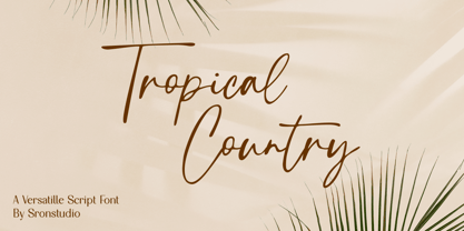 Tropical Country - Handwritten Font, this font perfect for branding, invitation, stationery, wedding designs, social media posts, advertisements, product packaging, product designs, label, photography, watermark, special events, and more. Features: Uppercase and lowercase letters Multilingual, numerals, and punctuation Follow Instagram: @sronstudio Thank You!
 - Rafailla Brush Script by Mindtype Co.,
$18.00 Introducing my new font Rafailla is another elegant modern calligraphy typefaces, which is combining the style of brush calligraphy with an modern style and sophisticated flows. So beautiful on invitation like greeting cards, branding materials, wedding designs, social media posts, advertisements & product designs.
 - Cherry Lime by Fikryal,
$15.00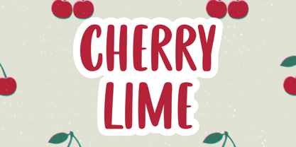 Cherry Lime is a fancy font perfect for crafting, branding, invitation, stationery, wedding designs, social media posts, advertisements, product packaging, product designs, label, photography, watermark, special events or anything. Cherry Lime with full set of uppercase letters, multilingual symbols, numerals and punctuation.
 - Pear Amigo by Qwrtype Foundry,
$14.00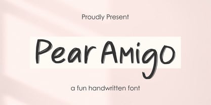 Proudly Present, Pear Amigo Pear Amigo is a Fun Handwritten Font Pear Amigo is perfect for product packaging, branding project, megazine, social media, wedding, or just used to express words above the background. Pear Amigo also come with Multi-Lingual Support. Thank you!