344 search results
(0.017 seconds)
- PL Davison by Monotype,
$29.99PL Davidson Americana is an all-capital typeface based on woodcut designs from the nineteenth century. The PL Davidson Americana font was designed by M. Davison in 1965, during the revival of American headline faces. - PL Davison Zip by Monotype,
$29.99PL Davidson Americana is an all-capital typeface based on woodcut designs from the nineteenth century. The PL Davidson Americana font was designed by M. Davison in 1965, during the revival of American headline faces. - 1845 Mistress by GLC,
$38.00 This font was inspired by Spencer’s patterns, particularly the elegant varieties called “Ladies' Hand” in some handbooks. Intelligent OTF ligatures and alternates (about 160) are included in the font, giving a closer appearance to realistic handwriting.
 - Halibu by Sensatype Studio,
$15.00 Malibu font is a well-balanced contemporary font with a fancy, playful, unique, and versatile vintage serif with 165+ alternates that you can combine to get curves and beautiful shapes easily just in seconds. It is a display font with moderate contrast that perfect for branding projects, logo, wedding designs, social media posts, advertisements, product packaging, product designs, label, photography, watermark, invitation, stationery, and any projects, it makes with a high level of legibility. What's Included: Character set A-Z Uppercase & Lowercase Numerals & Punctuation Accented Characters (West Europe) Ligature & Huge Stylistic alternate Works on PC & Mac Recommended using Adobe Illustrator or Adobe Photoshop. Wish you enjoy our font. :)
 - Alice in Wonderland - Unknown license

- Groovy Tuesday JNL by Jeff Levine,
$29.00 Hand lettering from the 1965 movie poster for “The Loved One” – a classic 1960s spurred serif design with added curly-tailed terminals was the working model for Groovy Tuesday JNL – available in both regular and oblique versions.
 - Brass by HiH,
$8.00 The Brass Family has a lineage that extends into English history. About five hundred years ago a devout, but anonymous Englishman gave glory to the God he worshipped by designing the capital letters and decorations of these two fonts. Originally recorded in The History Of Mediaeval Alphabets And Devices by Henry Shaw (London 1853), they are described by Alexander Nesbitt in his Decorative Alphabets And Initials (Mineola, NY 1959) as “Initials and stop ornaments from brasses in Westminster Abbey.” I wish I could say I remember seeing them when I was there, but that was forty-two years ago and all I remember was seeing the tomb of Edward the Confessor. One definition of “stop” as a noun is a point of punctuation. I have heard people from the British Isles speak of a “full stop” when referring to a period. Some may remember a 19th century form of communication called a telegram being read aloud in an old movie, with the use of the word “stop” to indicate the end of a sentence or fragment. A full dozen of these stop ornaments are provided. They occupy positions 060, 062, 094, 123, 125, 126, 135, 137, 167, 172, 177 & 190. The Brass Family consists of two fonts: Brass and Brass Too. Both fonts have an identical upper case and ornaments, but paired with different lower cases. Although the typefaces from which the lower cases were drawn are both of modern design, both are interpretations of the textura style of blackletter in use in England when the upper case and ornaments were fashioned for the Abbey. Brass is paired with Morris Gothic, which matches the color of the upper case quite well. Brass Too is paired with Wedding Regular, which is distinctly lighter than the upper case. I find it very interesting how each connects differently. The resulting fonts are unusual and most useful for evoking an historic atmosphere.
 - Maassslicer - Unknown license

- Rasoav by Fo Da,
$12.00 Rasoav is a Display “ALL CAPs” font, derivative from Glyphic Serif consisting of a single weight. It supports English, Spanish, German, French, Extended Latin and more … Main Features: • Perfect for headlines • 265 glyphs • 78 ligatures • Support many languages
 - Impact by Microsoft Corporation,
$89.00Geoffrey Lee designed Impact font for the Stephenson Blake foundry in 1965. The sans serif display typeface is very heavy and condensed in the grotesque style, similar to Helvetica Inserat. Use Impact font in display situations requiring a strong statement. - Impact by Monotype,
$40.99 Geoffrey Lee designed Impact font for the Stephenson Blake foundry in 1965. The sans serif display typeface is very heavy and condensed in the grotesque style, similar to Helvetica Inserat. Use Impact font in display situations requiring a strong statement.
 - Anantason Reno by Jipatype,
$17.00 Anantason Reno is a versatile sans-serif typeface that offers a range of 162 styles, spanning from thin to black in weight and ultra-condensed to ultra-expanded in width. Its adaptability makes it well-suited for a variety of purposes.
 - Seta Reta NF by Nick's Fonts,
$10.00Here's our interpretation of the classic typeface Arrow, designed by Walter Diethelm for Visual Graphics Corporation in 1965. It's clean, crisp, understated and elegant. Both versions of the font contain the complete Unicode Latin 1252 and Central European 1250 character sets. - Monticello by Linotype,
$40.99 Linotype Monticello was designed by C.H. Griffith in 1946. Its design is based on James Ronaldsons Roman No.1 and Oxford Typefaces from American Type Founders and was revised by Matthew Carter while he was working at Linotype between 1965 -1981.
 - Office Work JNL by Jeff Levine,
$29.00 The 1965 film “Mirage” had its titles and credits hand lettered in a simple, thin sans serif with rounded corners and an overall square design. This is now available digitally as Office Work JNL, in both regular and oblique versions.
 - Compliment by profonts,
$39.99Compliment is a script design which is obviously based on H. Matheis' typeface designed for Ludwig & Mayer in 1965.Ralph M. Unger redrew and digitized this font in 2004. His work is based on artwork taken from old East German font catalogues. - Kursk 205 by Talbot Type,
$19.50 A text and display font with square proportions, inspired by the type styles of soviet-era Russia. Very shallow ascenders and descenders and a large relative x-height, exaggerate the compact and geometric look. Related to Kursk 105 , its squarer-edged cousin.
 - Petit Lisa by Design23,
$38.00 This font was drawn by the artist, Lisa Congdon. Design23 and Lisa Congdon have formed an amazing type partnership... Lisa draws her beautiful fonts for her series, 365 Days of Hand Lettering and Design23 programs and edits the series, bringing it to life!
 - Stempel Garamond LT by Linotype,
$29.99 Opinion varies regarding the role of Claude Garamond (ca. 1480–1561) in the development of the Old Face font Garamond. What is accepted is the influence this font had on other typeface developments from the time of its creation to the present. Garamond, or Garamont, is related to the alphabet of Claude Garamond (1480–1561) as well as to the work of Jean Jannon (1580–1635 or 1658), much of which was attributed to Garamond. In comparison to the earlier Italian font forms, Garamond has finer serif and a generally more elegant image. The Garamond of Jean Jannon was introduced at the Paris World’s Fair in 1900 as Original Garamond, whereafter many font foundries began to cast similar types. The famous Stempel Garamond interpretation of the 1920s remains true to the original Garamond font with its typical Old Face characteristics. The bold italic was a modern addition at the end of the 1920s and the small caps provided an alternative to the standard capital letters. In the mid 1980s, a light version was added to Stempel Garamond. Since its appearance, Stempel Garamond has been one of the most frequently used text fonts.
 - Local Printer JNL by Jeff Levine,
$29.00 Based on William Page’s Skeleton Antique wood type (circa 1865), Local Printer JNL is available in both regular and oblique versions. Primarily used for text passages, the type design also works well in headlines and sub-headlines needing less emphasis and a touch of subtlety.
 - MarkusLow by The Northern Block,
$16.70 This typeface is named after Markus Low, the designer of the 1965 award-winning font Basilea. The design pays close attention to the original work combining romanesque styling with clean lines and functionality. Details include a complete character set, manually edited kerning and Euro symbol.
 - LoveHearts by Karandash,
$20.00 A lovely valentine inspired set of calligraphic ornaments and frames including seamless borders and patterns. With more than 160 hand drawn unique designs LoveHearts is the perfect choice for designing romantic greeting cards and beautiful wedding invitations as well as letter signatures and anniversary accessories.
 - Kaleko 205 by Talbot Type,
$19.50 Kaleko 205 is inspired by the classic, geometric sans-serifs such as Gill Sans, but has shallower ascenders and descenders for a more compact look. It’s a well-balanced, versatile, modern sans, highly legible as a text font and with a clean, elegant look as a display font at larger sizes. It includes old style non-aligning (lower case) numbers, both proportional and tabular as well as accented characters for Central European languages. The Kaleko 205 family comprises of six weights, and is closely related to Kaleko 105. The most notable differences between the two variations, are the two-storey lower case a and g in Kaleko 205, where they are single-storey in Kaleko 105.
 - Nimbo TTW by Talavera,
$10.00 This is a playful collection of 135 diagrams based on letterforms from different styles. You can use this symbols as bullets, ornaments, but also to make your own mandala-like exercises and release some stress out! Nimbo, by the way, is the word for "halo" in spanish.
 - Bixbite Stone by Lemonthe,
$17.00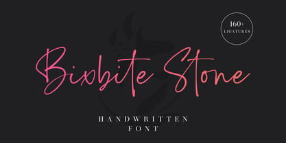 Bixbite Stone is a elegant and flowing handwritten font. 160+ ligatures are included in this font. It is the best choice for creating eye catching logos, branding, wedding design, product packaging and quotes. Every letter has a unique and beautiful touch, which will make your design come alive!
 - Sepulcra - Personal use only

- Kamerik 205 by Talbot Type,
$19.50 Kamerik 205 is inspired by the classic, geometric sans-serifs such as Futura and Avant Garde, but has shallower ascenders and descenders for a more compact look, and features a traditional double-storey lower case a and g. It's a versatile, modern sans, highly legible as a text font and with a clean, elegant look as a display font at larger sizes. It includes old style non-aligning (lower case) numbers, both proportional and tabular as well as accented characters for Central European languages. The Kamerik 205 family comprises of six weights, and is closely related to Kamerik 105. The most notable differences between the two variations, are the two-storey lower case a and g in Kamerik 205, where they are single-storey in Kamerik 105.
 - Screwball - Unknown license

- Bestiario by Intellecta Design,
$27.50 John Seddon (1644-1700), was a famous english writing master, the leading calligrapher of his time, and master of Sir John Johnson’s Free Writing School in Priest’s Court, Foster Lane. His portrait was drawn by William Faithorne and was engraved by John Sturt as the frontispiece for his copy-books, such as ‘The Ingenious youth’s companion’ of c.1690 and 'The pen-man’s paradise' of c.1695. These were engraved after his work by others. Your extra-rare book - "The Pen-mans Paradise Both pleasent & Profitable OR Examples of all ye usuall hands of this Kingdome. Adorn'd with variety of ffigures an Flourishes done by Command of hand. Each ffigure being one continued & entire Track of the pen most where of may be struck as well Reverse (or to answer bothwayes) as Forward", London (1965). - YES (that is the title of the book) was the starting point to these new extra accurated works of Iza W, a series of revivals of the penmanship Seddon’s artworks, animal and human kingdon inspired penmanship forms in the Bestiario font. On the other hand, his highly ornamented animal kingdon inspired capitals and alphabets in the Seddon Penmans Paradise Capitals typeface. The “SeddonsFleurons” completes the collection. Fantastic choice to elaborated barocque/renaissance inspired and historical accurated layouts.
 - Moscovium by Throndsen,
$29.99 Moscovium is a radioactive, synthetic element about which little is known. It is classified as a metal and is expected to be solid at room temperature. It decays quickly into other elements, including nihonium. The element had previously been designated ununpentium, a placeholder name that means one-one-five in Latin. Element 115
 - P22 Zebra by IHOF,
$24.95Zebra was originally designed by Karlgeorg Hoefer in 1965 for the Stempel foundry in Germany. This unique font was designed as a two-color script face and is now available digitally for the first time. The P22/IHOF release presents six separate fonts based on the original painted drawings and Stempel proofs. - PT Medievil by Paupe Type,
$10.00 PT MEDIEVIL is a new display font inspired by artefacts of the dark middle-ages with a contemporary twist. It contains 195+ meticulously crafted glyphs characterized by: -Upper part indented inward to be true to imperfect handwritten medieval typography -Smooth curve shapes -Rounded intersections between shape sections -Rounded serif Easily create headlines, display titles, subheadings, body copy.
 - Simple Ornaments by Gerald Gallo,
$20.00 Simple Ornaments is a collection of ornaments composed of squares, circles, and rectangles. They are ideal for use where a simple ornament is desired as an accent to a type element, such as a title, label, contact information, etc.; or to separate type elements; or for use as bullets. There is an assortment of 168 ornaments.
 - Kandel 205 by Talbot Type,
$19.50 Kandel 205 is a geometric, tri-line, display and headline font available in a family of three weights. Its bold, graphic styling gives it great stand-out qualities and a highly individual look. It’s particularly well suited to bringing energy to designs, or for designs with a sporting theme. It’s also available with character variations as Kandel 105 .
 - Brenda Script by Seniors Studio,
$23.00 Brenda Script is a beautiful formal script, contemporary typeface with classic roots and an elegant touch. It can be used for various purposes.such as logos, wedding invitations, headings, t-shirts, letterhead, signage, lable, news, posters, badges etc. Brenda Script features 405+ glyphs and 160 alternate characters. including initial and terminal letters, swashes, alternates, ligatures and multiple language support.
 - Rush Twist by madeDeduk,
$14.00 Rust Twist is a font duo signature and sans display. Signature includes more than 145 ligatures to make everything look natural handmade signature and sans display come out with a lot alternative and ligature so you can be much creative with your designs. Feature Uppercase & Lowercase Number & Symbol International Glyphs Multilingual support Alternative Ligature Hope you enjoy it.
 - MPI French Clarendon by mpressInteractive,
$5.00 French Clarendon was an extremely popular wood type font. Characters are heavy and condensed with bracketed serifs, which measure approximately 1/4 to 1/3 the height of the letter. Dozens of decorative wood type designs have been created based on French Clarendon. It was marketed as a wood letter by William H. Page & Company in 1865.
 - Seddon Penmans Paradise Capitals by Intellecta Design,
$29.50 John Seddon (1644-1700), was a famous English writing master, the leading calligrapher of his time, and master of Sir John Johnson’s Free Writing School in Priest’s Court, Foster Lane. His portrait was drawn by William Faithorne and was engraved by John Sturt as the frontispiece for his copy-books, such as ‘The Ingenious youth’s companion’ of c.1690 and 'The pen-man’s paradise' of c.1695. These were engraved after his work by others. Your extra-rare book - "The Pen-mans Paradise Both pleasent & Profitable OR Examples of all ye usuall hands of this Kingdome. Adorn'd with variety of ffigures an Flourishes done by Command of hand. Each ffigure being one continued & entire Track of the pen most where of may be struck as well Reverse (or to answer bothwayes) as Forward", London (1965). - (YES, that is the title of the book!) was the starting point to these new extra accurated works of Iza W, a series of revivals of the penmanship Seddon’s artworks, like this highly ornamented animal kingdom inspired capitals and alphabets: the Seddon Penmans Paradise Capitals typeface. And, on the other hand, you can get the animal and human kingdon inspired penmanship forms in the Bestiario font. The “SeddonsFleurons” will complete the collection. Fantastic choice to elaborated barocque/renaissance inspired and historical accurated layouts.
 - Baker Signet by ParaType,
$25.00 Bitsream version of Baker Signet typeface designed by well-known calligrapher Arthur Baker in 1965 for Visual Graphic Corporation (VGC). A design on classical lines with subtle but effective calligraphic touches and flare stroke terminals. For use in advertising and display typography as well as for headlines and small texts. Cyrillic version was developed by Eugene Sadko and released by ParaType in 2008.
 - Sub Comp by Ech000,
$10.00 SubComp is a carefully constructed font made with over 160+ individual glyphs for English and some Latin based languages. This font is inspired by old fashioned computer and programming fonts with a unique twist to the lettering. Features characters or glyphs for Basic Latin, Some Extended Latin Characters, Some Greek, Some Coptic. Created for web, poster, graphic design, social media and branding.


