8,001 search results
(0.024 seconds)
- Gilgongo Doro - Unknown license

- Kirsty Ink - Unknown license

- SF Square Root Extended - Unknown license

- SF Chrome Fenders Condensed - Unknown license

- Futurex Alienated - Unknown license

- SF Pale Bottom Extended - Unknown license

- SF Buttacup - Unknown license

- SF Shai Fontai Distressed - Unknown license

- SF Minced Meat Shaded - Unknown license

- Bumpy Road - Unknown license

- SF Shai Fontai Extended - Unknown license

- SF Intoxicated Blues - Unknown license

- Futurex Punched - Unknown license

- SF Square Root - Unknown license

- Screenwriter JNL by Jeff Levine,
$29.00
- Roman Nouveau JNL by Jeff Levine,
$29.00
- Wood Clarendon JNL by Jeff Levine,
$29.00
- Alonquin by Studio K,
$45.00
- Gusset by Pesotsky Victor,
$10.00
- Drab by Pesotsky Victor,
$12.00
- Sprint by Linotype,
$29.99 - Morningside Heights JNL by Jeff Levine,
$29.00
- Bixbite Stone by Lemonthe,
$17.00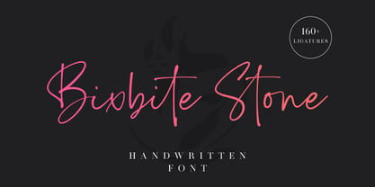
- Luxart by Fontiko,
$14.00
- RM Scrapheap by Ray Meadows,
$19.00
- El Paso Pro by Red Rooster Collection,
$60.00
- Candymore by Epiclinez,
$18.00
- Novelo by AcidType,
$60.00
- PiS Penny Serenade by PiS,
$38.00
- Showpiece JNL by Jeff Levine,
$29.00
- Retail Stencil JNL by Jeff Levine,
$29.00
- PL Barnum Block by Monotype,
$29.99
- Piano Lesson JNL by Jeff Levine,
$29.00
- Wes Wilson by K-Type,
$20.00
- Varmint PB by Pink Broccoli,
$14.00
- PL Benguiat Frisky by Monotype,
$29.99 - Merlo Round by Typoforge Studio,
$25.00
- Viareggio by Hanoded,
$15.00
- Azuree ND by Neufville Digital,
$45.25
- Enviro by ITC,
$29.00


