504 search results
(0.027 seconds)
- Byte 205 by Talbot Type,
$15.00 Byte 205 is a modular font, resulting from experiments in creating a practical, legible font from a minimum set of geometric components on a uniform grid. It has full upper and lower case character sets and includes all accented characters for Western and Central European languages. It's available in three styles – 105, 205 and 305. Each style has different corners, 105 is square, 205 is bevelled and 305 is round. Each style is available in three weights, Light, Medium and Bold.
 - Byte 305 by Talbot Type,
$15.00 Byte 305 is a modular font, resulting from experiments in creating a practical, legible font from a minimum set of geometric components on a uniform grid. It has full upper and lower case character sets and includes all accented characters for Western and Central European languages. It's available in three styles – 105, 205 and 305. Each style has different corners, 105 is square, 205 is bevelled and 305 is round. Each style is available in three weights, Light, Medium and Bold.
 - Usenet - Alternates - Unknown license

- Poster Gothic by GroupType,
$19.00 Poster Gothic was inspired by showcard lettering samples featured in the book,""Commercial Art of Show Card Lettering"" by James Eisenberg, published by D. Van Nostrand Company in 1945.
 - Urania Czech - Personal use only

- Klamp 205 Mono by Talbot Type,
$19.50 Talbot Type Klamp 205 Mono is a monospaced variation of Talbot Type Klamp 205. The clean and pure geometry of Klamp 205 makes it highly suitable for adaptation to this monospaced variant. It has an even look and retains its legibility at very small sizes. Klamp 205 Mono is available in a family of four weights and features an extended character set to include accents for Central European languages. Klamp 105 Mono, with some character variations, is also available as a monospaced variant of Klamp 105.
 - So Narrow - Unknown license

- ITC Caribbean by ITC,
$29.99ITC Caribbean is the work of California designer Jill Bell, earthy yet exotic. In her typeface experiment, Bell combined unusual angles and curves to produce tall, thin letters whose stroke style completes the suggestion of palm trees which this typeface brings to mind. The typeface contains capitals and small caps. The natural look of ITC Caribbean lends any work a human touch. - Kaldi by Hemphill Type,
$18.99 Kaldi is a tall condensed typeface that has gone through a natural process of handcraft and refinement to produce a speciality blend. On consumption expect light and dense notes with an earthy undertone. This font family was inspired by the legend of Kaldi – the goat herder who discovered the coffee plant after his goats started dancing after eating the coffee cherries.
 - Kaleko 205 Round by Talbot Type,
$19.50 Kaleko 205 Round is a rounded variation of Talbot Type font Kaleko 205. It's a well-balanced, versatile, modern sans, highly legible as a text font and with a clean, elegant look as a display font at larger sizes. The rounded terminals give it a friendly, approachable look. The Kaleko 205 Round family comprises of six weights and is closely related to Kaleko 105 Round. The most notable differences between the two variations are the two-storey lower case a and g in Kaleko 205 Round, where they are single-storey in Kaleko 105 Round.
 - Karben 205 by Talbot Type,
$19.50 Karben 205 is inspired by the classic, no nonsense DIN, and has a form that follows its highly legible function. Based on a lozenge, it has a clean and pure geometry with even stroke weights. Karben 205 is available in a family of five weights, and is also available with character variations as Karben 105. There are also monospaced variants of both Karben 105 and Karben 205 and a stencil version. All of the Karben fonts feature an extended character set, including accented characters for Central European languages.
 - Tactical by Positype,
$25.00 Tactical is nothing more than a testosterone-laced typeface. Rigid, mechanical and unforgiving. Originally conceived in 2007 while I was working through the early sketches of Ginza, Tactical features hard 45-degree angles and the presence of a curve for curve’s sake is just not there. Complimenting the original is a Stencil variant (inspired by the military, marathon video game, explosion-influenced name) and matching Obliques—altogether creating a sharply coordinating family.
 - So Shady - Unknown license

- So Extended - Unknown license

- So Normal - Unknown license

- So Bad - Unknown license

- So Condensed - Unknown license

- So Wide - Unknown license

- Gradl Highstep by HiH,
$8.00 Gradl Highstep is an archetypical Art Nouveau face by the prolific and mysterious Max Joseph Gradl. It epitomizes the visual language of elegance and sophistication. It seems strange that so little information is available today about Max Gradl: He seems to have been well known in his day. In addition to his jewelry design, he did advertising work for customers in Naples, London and New York in addition to customers in cities all over Germany. Gradl Highstep is an all-cap font with a wide range of ligatures: 094=SA, 123=CH, 125=CK, 126=TS, 167=FA, 172=PA, 177=TA, 188=WA and 190=YA. In addtion, 137=Gradl’s dated monogram “MJG 1903,” 175=LLC abbreviation, 181=alternate S. This is a subtle font with thin, variable strokes. It is best used at 28 points and larger to give it the presence it needs to be be appreciated. Gradl Highstep Initials is a companion font, incorporating a deft line drawing of a fashionable woman of the period who is every bit as elegant as the underlying font.
 - DIN Next Rounded by Monotype,
$56.99 The name DIN refers to the Deutsches Institut für Normung (in English, the German Institute for Standardization). The typeface began life as the DIN Institute's standard no. DIN 1451, published in 1931. It contained several models of standard alphabets for mechanically engraved lettering, hand-lettering, lettering stencils and printing types. These were to be used in the areas of signage, traffic signs, wayfinding, lettering on technical drawings and technical documentation. Rooted in earlier designs for Germany's railway companies, the alphabets were based on geometric shapes in order to be easily reproducible using compass and ruler. In post-1945 West Germany, the DIN alphabets were widely used, for instance on most road signs. They became available as fonts that were appreciated by designers for their industrial, somewhat quirky and “non-typographic” look and feel. From the 1990s onwards, more refined versions became available for use in book and magazine typography. DIN Next is a typographically corrected and expanded version of this quintessential 20th-century design. DIN Next Rounded is its softer, friendlier version.
 - Cooper Poster by GroupType,
$15.00 Cooper Poster was inspired by showcard lettering samples featured in the book, Commercial Art Of Show Card Lettering, published in 1945. Although named ""Western"", the design was modeled after Ozwald Cooper's 1921 original Cooper Black.
 - Chekhovskoy - 100% free

- Yacqui by Jonahfonts,
$45.00 In designing a font that had a Mayan or Aztec quality to it without the usual "Mariachi" look, I decided to make it single weight with some open ends and offbeat rounded serifs to give it a more serious feel which will lend itself to other non ethnic uses. I have added a few discretionary ligatures, which also contain old-style numerals, titling caps and small caps. Usage recommendations: Captions, packaging, cards, posters, ads, book jackets, manuals, and menus.
 - British Cinema JNL by Jeff Levine,
$29.00 The hand lettered titles and credits from the 1945 British film “The Way to the Stars” were the working model for the aptly-titled British Cinema JNL, which is available in both regular and oblique versions.
 - Cortland JNL by Jeff Levine,
$29.00Cortland JNL was modeled [in part] from lettering spotted in the opening credits of Columbia Pictures 1945 Batman® serial. The classic clean lines of the Art Deco lettering used were perfect for translating into digital format. - Maassslicer - Unknown license

- PiS LIETZ Parilon by PiS,
$38.00 PiS Lietz Parilon invites you to the austrian countryside for an amazing ski-tour on snowy mountains back then when skilifts were sparse and mustaches were far from ironic. Use this heavy fraktur for retro tourism posters, your classic beer or schnaps brand or anything that needs a good swig of tradition! Heat up the Jagatee and enjoy the earthy taste of PiS Lietz Parilon, it will warm your heart!
 - Dutchly by Good Java Studio,
$20.00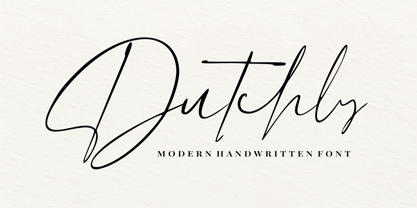 Dutchly is a modern, handwritten, signature font. It is perfect for logos, invitations, stationery, wedding designs, social media posts, advertisements, product packaging, product designs, labels, photography, watermarks, special events and more. Dutchly includes 140+ Ligatures and multi-lingual support.
 - C&lc Uncial Pro by Hackberry Font Foundry,
$24.95 This is a radically modernized uncial with many OpenType features and 415 characters: Caps, lower case, small caps, numerators, denominators, accents characters and so on. There are 21 ligatures. It is an experimental look at medieval writing for the 21st century.
 - Anele Pro by Ole Sondergaard,
$14.28 Anele is a classic grotesque in the bedt sense of the word in 5 weights and Italic that communicates in 140 languages. The font is created by the danish designer Ole Sondergaard who is also behind the award-winning FF Signa super family.
 - Cikal by Beary,
$14.00 Cikal is an elegant serif font with captivating alternate characters. With a total of 245 glyphs, this font offers a wide range of design possibilities. Its timeless elegance makes it a perfect choice for various design needs. Don't wait, get it now!
 - Kursk 205 by Talbot Type,
$19.50 A text and display font with square proportions, inspired by the type styles of soviet-era Russia. Very shallow ascenders and descenders and a large relative x-height, exaggerate the compact and geometric look. Related to Kursk 105 , its squarer-edged cousin.
 - PR Swirlies 05 by PR Fonts,
$10.50 Suitable for separating paragraphs, or framing text, this set of swirlies ornaments is drawn with a pointed brush, for a higher contrast appearance than swirlies 1 , 2, and 4. It also has a companion member, with a rough finish, called “Sand Drift”, suitable for natural, earthy subject matter. “Sand Drift” combines well with the following PR Fonts Items: Bramble Wood 2, Bramble Wood 1, Cauldron, Swirlies 1 Sand Drift, Hallow Doodles 1, Hallow Doodles 2.
 - Initials Gothic C by Alter Littera,
$15.00 A comprehensive set of initials (usually referred to as Uncials, Lombardic Initials, or Lombards) of the Germanic variety, designed after Henric Pieterszoon’s “Gothise Monnikke Letteren” as appearing in Enschedé, J. (1768), Proef van Letteren, Haarlem (p. 120); also mentioned as “Great Primer Uncials” and "2-line Brevier Uncials" in Vervliet, H.D.L. (1968), Sixteenth-Century Printing Types of the Low Countries, Amsterdam: Hertzberger (pp. 54-55, and 212-213). The font contains over one hundred glyphs, including as a bonus six layered plus two plain ornamental initials adapted from the Gutenberg Bible (Mainz, ca. 1455) and the Mainz Psalter (Mainz, 1457). Suitable to accompany most Gothic (especially Textura and Rotunda) typefaces, or to be displayed as drop caps or in full titles and headings. Specimen, detailed character map, OpenType features, and font samples available at Alter Littera’s The Initials “Gothic C” Font Page. Note: Several uncial initials in The Oldtype “Psalterium” Font have been derived from corresponding characters in The Initials “Gothic C” Font, adjusting them to cope with the special (large) x-height and letter spacing of the Psalterium font (so the two sets of initials are not directly interchangeable).
 - Handmade Headline JNL by Jeff Levine,
$29.00 Hand lettered titling on the 1945 sheet music for “Don’t Forget To-Night, To-Morrow” is in a simple, condensed sans serif style with a slight hint of Art Deco influence. This is now available as Handmade Headline JNL, in both regular and oblique versions.
 - Barn Dance JNL by Jeff Levine,
$29.00 The hand lettered title on the 1945 sheet music for the song "Louisiana Hayride" is an Art Deco design with a nod to the preceding Art Nouveau era. It is now available as Barn Dance JNL, which is available in both regular and oblique versions.
 - Chinese Song JNL by Jeff Levine,
$29.00 The unusual hand lettering found on the 1945 sheet music for “Chinese Song” provided not only the design inspiration but the font’s name as well. A hybrid of Asian and Art Deco influences, Chinese Song JNL is available in both regular and oblique versions.
 - Clarendon Jordan by Wooden Type Fonts,
$25.00 Clarendon is the name of a slab-serif typeface that was released in 1845 by Thorowgood and Co. (or Thorowgood and Besley) of London, a letter foundry often known as the Fann Street Foundry. This current design is a somewhat condensed version of the font.
 - Kaleko 205 by Talbot Type,
$19.50 Kaleko 205 is inspired by the classic, geometric sans-serifs such as Gill Sans, but has shallower ascenders and descenders for a more compact look. It’s a well-balanced, versatile, modern sans, highly legible as a text font and with a clean, elegant look as a display font at larger sizes. It includes old style non-aligning (lower case) numbers, both proportional and tabular as well as accented characters for Central European languages. The Kaleko 205 family comprises of six weights, and is closely related to Kaleko 105. The most notable differences between the two variations, are the two-storey lower case a and g in Kaleko 205, where they are single-storey in Kaleko 105.
 - Kijs Display by MMarch NY,
$24.00 Great for branding and headlines, Kijs is a serif type with a twist. Kijs is a “nature font” that communicates earthiness with a free spirit and personality. Kijs has slightly overfilled joints and corners for a natural print look, rounded terminals, and many alternate letters for design variation and for creating a truly organic feel. The thinner font weights speak to natural elegance and sophistication, and bolder weights reveal a concept of flow and organic matter.


