504 search results
(0.124 seconds)
- Kandel 105 by Talbot Type,
$19.50 Kandel 105 is a geometric, tri-line, display and headline font available in a family of three weights. Its bold, graphic styling gives it great stand-out qualities and a highly individual look. It’s particularly well suited to bringing energy to designs, or for designs with a sporting theme. It’s also available with character variations as Kandel 205 .
 - Klamp 105 by Talbot Type,
$19.50 Talbot Type Klamp 105 is an elegant and streamlined, geometric sans-serif. A legible text font, its narrow proportions mean it’s economical with space; while at larger sizes it makes a confident, modern display face. Klamp 105 is available in a comprehensive family of seven weights, featuring an extended character set to include old style numerals, as well as accented characters for Central European languages. It is also available with some character variations as Klamp 205, most notably featuring a traditional, double-storey lower case a and g.
 - 1845 Mistress by GLC,
$38.00 This font was inspired by Spencer’s patterns, particularly the elegant varieties called “Ladies' Hand” in some handbooks. Intelligent OTF ligatures and alternates (about 160) are included in the font, giving a closer appearance to realistic handwriting.
 - Sign Rathi by Lemonthe,
$15.00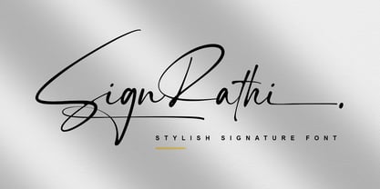 SignRathi is a perfect signature font, with a natural & stylish flow. SignRathi Font is perfect for many different project such as logos & branding, invitation, stationery, wedding designs, social media posts, advertisements, product packaging, product designs, label, photography, watermark, special events or anything.
 - Marat Sans by Ludwig Type,
$45.00 Marat Sans is a clean and lively sans serif typeface designed by Ludwig Übele. It is characterized by excellent legibility and suits a wide range of typography. The entire family contains 27 styles & weights and includes many OpenType features: various numerals, alternate glyphs, fractions, superiors and inferiors, language features, arrows, case sensitive forms and many more. Marat Sans is the perfect companion for Marat, a soft and elegant serif typeface.
 - Basim Marah by Hiba Studio,
$59.00 Basim Marah is an Arabic display typeface and is useful for titles and graphic projects. The font is based on the simple lines of free style calligraphy. A collaborative effort, Basim Marah was designed and drawn by Basim Salem Al Mahdi from Iraq and then digitalized as a typeface by Hasan Abu Afash from Palestine. In November, 2008, Basim Marah was upgraded by working with Mirjam Somers an award-winning Arabic type designer to the DecoType font format for use in WinSoft Tasmeem which is now bundled with InDesign CS4.
 - Dancing Marathon JNL by Jeff Levine,
$29.00 The hand lettered title found on the cover of the 1932 sheet music for “Dancing Marathon” inspired the digital revival of this unusual lettering as well as the font’s name. This eccentric Art Deco design (with a slight bit of Art Nouveau mixed in) is a thin, monoline typeface. Dancing Marathon JNL is available in both regular and oblique versions. Dance marathons got their start during the Great Depression as people desperate to earn a few dollars would enter into contests that went on for hours until the last couple remained standing on the dance floor.
 - TELETYPE 1945-1985 - Unknown license

- 1475 Bastarde Manual by GLC,
$38.00 This script font was inspired by the type called “Bastarde Flamande”, a much appreciated one in the Duke of Burgundy’s court at the end of 1400s for handwritten books. A book titled Histoire Romaine (Roman history), from Roman author Tite Live, translated in French by Pierre Bersuire, circa 1475, was our main source for drawing the lower case characters and many of the upper case. Each character was written by hand with a quill pen on rough paper so as to look like the originals as much as possible. This font includes “long s”, naturally, as typically medieval , also a few ligatures, final and initial characters but there aren't any abbreviations because the text was written in French rather than Latin. Instructions for use are enclosed in the file and identify how to keyboard these special characters. This font can be used for web-site titles, posters, fliers, ancient looking texts, greeting cards, indeed for many types of presentations as it is a very decorative, elegant and luxurious font. Large type size shows this font at its best.
 - K haus 105 by Talbot Type,
$19.50 K-haus 105 is inspired by the work of graphic designer and typographer, Herbert Bayer, during his time at the Bauhaus around 100 years ago — work that kick-started graphic design as we know it, to this day. It owes something to the simple geometry of Bayer’s hand-drawn, ‘universal typeface’, updated and expanded to deliver a clean, balanced, geometric sans for today. Also available as K-haus 205 , featuring a few, more 'daring' characters here and there, chiefly in the lower case set. Both variations include an extended character set, featuring accented characters for Central European languages.
 - Kaleko 105 Text by Talbot Type,
$19.50 Kaleko 105 Text is the text specific variation of stablemate, Kaleko 105 . With a shallower x-height and longer ascenders and descenders, its more traditional proportions make it more economical with space and better suited to continuous text. It's a well-balanced, versatile, modern sans, highly legible as a text font and with a clean, elegant look as a display font at larger sizes. The Kaleko 105 Text family comprises of four weights and includes old style non-aligning (lower case) numbers, both proportional and tabular as well as accented characters for Central European languages. It is closely related to Kaleko 205 Text , which offers variations in some characters, most notably a two-storey lower case a and g.
 - LTC Bodoni 175 by Lanston Type Co.,
$39.95 Giambattista Bodoni created this modern typeface in 1790 which served as the structural model for Sol Hess’s faithful rendition. Hess made necessary adjustments for mechanical typesetting on Lanston’s Monotype composition system. Remastered in 2006 by Paul Hunt.
 - Kessel 105 Text by Talbot Type,
$19.50 Kessel 105 Text is the text specific variation of stablemate, Kessel 105 . With a narrower x-height and longer ascenders and descenders, its more traditional proportions make it more economical with space and better suited to continuous text. It's a versatile, modern sans, highly legible as a text font and with a clean, elegant look as a display font at larger sizes. It has an art deco flavour with sharp points at the apex of many characters. The Kessel 105 Text family comprises of four weights and includes old style non-aligning (lower case) numbers, both proportional and tabular as well as accented characters for Central European languages.
 - 1495 Bastarde Lyon by GLC,
$38.00 Font designed from this who was used by an unknown printer in Lyon (France) to print the “Conte de Griseldis ” (Griseldis' tale), from Petrarque, inspired by Boccace, in 1495. The original font has a relatively small number of special characters and ligature, for the time. This font includes “long s”, naturally, as typicaly medieval but numerous letters - as accented ones - were added for this version. A render sheet, enclosed with the file, helps to identify them on keyboard. It is used variously in web-site titles, posters and fliers design, editing ancient texts or greeting cards as a very decorative and fine font... This font works at a small size like 9, remaining clear and easy to read on screen, but always better when printed.
 - DIN 1451 Mittelschrift by URW Type Foundry,
$35.99
- Neue Frutiger 1450 by Linotype,
$71.99 During planning for the new Roissy Charles de Gaulle airport in Paris at the beginning of the 1970s, it was determined that the airport's signage system had to include the clearest and most legible lettering possible. The development of all signage was put into the hands of Adrian Frutiger and his studio. The team carried out their task so effectively that a huge demand for their typeface soon arose from customers who wanted to employ it in other signage systems, and in printed materials as well. The Frutiger® typeface not only established new standards for signage, but also for a range of other areas in which a clear and legible design would be required, especially for small point sizes and bread-and-butter type. The typeface family that which emerged as a result of this demand was added into the Linotype library as "Frutiger" in 1977. Frutiger Next, created in 1999, is a further development of Frutiger, not necessarily a rethinking of the design itself. It was based on a new concept, the most obvious visual characteristics of which is the larger x-height, as well as a more pronounced ascender height and descender depth for lower case letters in relation to capitals. This new design created a balanced image and included considerably narrower letterspacing. Frutiger Next meets the demand for a space-saving, modern humanist sans. 2009's Neue Frutiger is a rethink of the 1977 Frutiger family, now revised and improved by Akira Kobayashi in close collaboration with Adrian Frutiger. Despite the various changes, this "New Frutiger" still fits perfectly with the original Frutiger family, and serves to harmoniously enhance the weights and styles already in existence. The perfect mix, guaranteed Neue Frutiger has the same character height as Frutiger. As a result of this, already existing Frutiger styles can be mixed with Neue Frutiger where necessary. Likewise, Neue Frutiger is perfect for use alongside Frutiger Serif. Newly added are the "Neue Frutiger 1450" weights. Especially for the requirements of the newly released German DIN 1450 norm we have built together with Adrian Frutiger specific weights of the Neue Frutiger. The lowercase l" is curved at the baseline to better differentiate between the cap "I", additionally the number "0" has a dot inside to better differentiate between the cap "O", and the number "1" is now a serifed 1. The font contains additionally the origin letterforms from the regular Neue Frutiger font which can be accessed through an Opentype feature."
 - DIN 1451 Engschrift by URW Type Foundry,
$35.99 - Kaleko 105 Round by Talbot Type,
$19.50 Kaleko 105 Round is a rounded variation of Talbot Type font Kaleko 105. It's a well-balanced, versatile, modern sans, highly legible as a text font and with a clean, elegant look as a display font at larger sizes. The rounded terminals give it a friendly, approachable look. The Kaleko 105 Round family comprises of six weights and is closely related to Kaleko 205 Round. The most notable differences between the two variations are the single-storey lower case a and g in Kaleko 105 Round, where they are two-storey in Kaleko 205 Round.
 - Karben 105 Stencil by Talbot Type,
$19.50 Karben 105 Stencil is a contemporary stencil font. The stencil breaks in the letters are applied in a way that is sensitive to the forms of the character in pursuit of a more elegant stencil. Karben 105 Stencil is available in a family of three weights. Karben 105 Stencil is closely related to Karben 105 and Karben 205 . All of the Karben fonts feature an extended character set, including accented characters for Central European languages.
 - Kuenstler 165 BT by Bitstream,
$29.99 - Karben 105 Mono by Talbot Type,
$19.50 Karben 105 Mono is a monospaced variation of Karben 105. The clean and pure geometry of Karben 105 makes it highly suitable for adaptation to this monospaced variant. It has an even look and retains its legibility at very small sizes. Karben 105 Mono is available in a family of five weights and includes an extended character set to include accents for Central European languages. Karben 205 Mono is also available as a monospaced variant of Karben 205. There is also a stencil version of Karben 105 available.
 - Kessel 105 Remix by Talbot Type,
$19.50 A remixed variation, available in three weights, of the popular Talbot Type geometric sans Kessel 105 . The addition of occasional flourishes at the intersections of strokes, in both upper and lower case, adds character charm, making the font a perfect titling font to accompany Kessel 105, or a display font in its own right. Kessel 105 Remix features a comprehensive glyph set including a number of discretionary ligatures and accented characters for central European languages.
 - Klamp 105 Mono by Talbot Type,
$19.50 Talbot Type Klamp 105 Mono is a monospaced variation of Talbot Type Klamp 105. The clean and pure geometry of Klamp 105 makes it highly suitable for adaptation to this monospaced variant. It has an even look and retains its legibility at very small sizes. Klamp 105 Mono is available in a family of four weights and features an extended character set to include accents for Central European languages. Klamp 205 Mono, with some character variations, is also available as a monospaced variant of Klamp 205.
 - EF DIN 1451 by Elsner+Flake,
$35.00 - Kaleko 105 Remix by Talbot Type,
$19.50 A remixed variation, available in three weights, of the popular Talbot Type geometric sans Kaleko 105 . The addition of occasional flourishes at the intersections of strokes, in both upper and lower case, adds character charm, making the font a perfect titling font to accompany Kaleko 105, or a display font in its own right. Kaleko 105 Remix features a comprehensive glyph set including accented characters for central European languages.
 - DIN 1451 Paneuropean by Linotype,
$92.99 - Kamerik 105 Text by Talbot Type,
$19.50 Kamerik 105 Text is the text specific variation of stablemate, Kamerik 105. With a shallower x-height and longer ascenders and descenders, its more traditional proportions make it more economical with space and better suited to continuous text. It's a well-balanced, versatile, modern sans, highly legible as a text font and with a clean, elegant look as a display font at larger sizes. The Kamerik 105 Text family comprises of four weights and includes old style non-aligning (lower case) numbers, both proportional and tabular as well as accented characters for Central European languages. It is closely related to Kamerik 205 Text, which offers variations in some characters, most notably a two-storey lower case a and g.
 - Kamerik 105 Cyrillic by Talbot Type,
$19.50 Based on the popular Talbot Type Kamerik 105 , this Cyrillic variation is now available for the first time. Kamerik 105 is inspired by the classic, geometric sans-serifs such as Futura and Avant Garde, but has shallower ascenders and descenders for a more compact look. It's a versatile, modern sans, highly legible as a text font and with a clean, elegant look as a display font at larger sizes. The Kamerik 105 Cyrillic family comprises of five weights.
 - Broken 15 - 100% free

- 14 minutes - Unknown license

- 45 Degrees by Identikal Collection,
$23.00 - Kaleko 105 Round Remix by Talbot Type,
$19.50 A remixed variation, available in three weights, of the popular Talbot Type geometric sans Kaleko 105 Round . The addition of occasional flourishes at the intersections of strokes, in both upper and lower case, adds character charm, making the font a perfect titling font to accompany Kaleko 105 and/or Kaleko 105 Round , or a display font in its own right. Kaleko 105 Round Remix features a comprehensive glyph set including accented characters for central European languages.
 - 1456 Gutenberg B42 Pro by GLC,
$42.00 Is it necessary to tell the Gutenberg story? 1456 Gutenberg Pro is the second Gutenberg typeface produced by GLC foundry (look at our 1456 Gutenberg). This font was created from the so called "B42" character set used for the two Gutenberg Latin Bibles (42 and 36 lines), but with a better and finer design than in our first version, more faithful to the finest original printed books appearance. We offer also now a larger choice of the original ligatures and Latin abbreviations, as complete as possible to be usable with OTF specifications. The complete basic alphabet (with "long s" naturally)is strictly looking like the real one (including the curious twisted "X"). We have only recreated the capitals W and J, who was not existing in the time. The numerals, no more existing in the original type set, were inspired from those in use a few years later by early following printers, but matching with the Gutenberg font's pattern. The font includes West (including Celtic), East, Central European, Baltic and Turkish glyphs.
 - News No. 14 by Monotype,
$39.00 - Axion RX-14 by Type Innovations,
$39.00 Axion RX-14 is an original design by Alex Kaczun. It is but one of several alternate designs based on his original Axion family of fonts. Alternate design elements, specifically on capitals like 'A' , 'V' and terminals of 'C' and 'G', along with contrasting sharp and rounded corners, create a tension within this modern grotesque and add a class of destinction and interest. This display font is not intended for text use. It was designed specifically for display headlines, logotype, branding and similar applications. The entire font has an original look which is strong, dynamic, machine generated and can be widely used in publications and advertising. Axion RX-14 is a futuristic, techno-looking and expressive typeface with an apperance of machined parts with sharp and rounded edges. This attractive display comes in roman with lower case and lining figures. The large Pro font character set supports most Central European and many Eastern European languages.
 - Black is 45 by Fonts of Chaos,
$10.00 A real urban style font, inspired by the city. A total of 203 characters: UPPERCASE, lowercase, numerals and Punctuation.
 - Headliner No. 45 by KC Fonts,
$34.00 Headliner No. 45 is an ode to the 1940’s-era news headline. The Headliner No. 45 Family is simply two fonts: Regular & Italic. Headliner No. 45 has a very classic look to its features; worn out by a touch of grunge. This font will work with any of your design needs! For a customized look, switch between uppercase and lowercase for a change of erosion on the letters.
 - Alte DIN 1451 Mittelschrift gepraegt - 100% free

- DIN 1451 fette Breitschrift 1936 - 100% free

- 14 Segment LED Display by Matthias Luh,
$12.00 '14 Segment LED Display' is a detailed and extensive reproduction of an 14 segment LED Display which is especially used in electrical devices like automobile radios and hi-fi systems. Even though these electrical devices mostly use capital letters and numbers only, '14 Segment Display' also includes lower case letters, a lot of punctation and special characters and even Greek letters. This font is also available in Bold and Italic.


