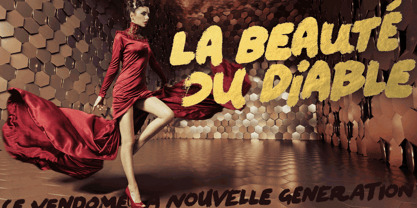
"A Charming Font" is a distinctive and captivating typeface designed by Graham Meade under the GemFonts foundry. As its name suggests, this font possesses a bewitching allure that sets it apart from ...
Street Humouresque is a distinctive font design by GemFonts | Graham Meade, embodying a perfect blend of playfulness and artistry. This font captures the essence of street art aesthetics, echoing the...
The "WalrusGumbo" font by Nick Curtis is an intriguing blend of playful whimsy and vintage charm that instantly captures the imagination. Inspired by the eclectic spirit of early 20th-century typogra...
Bubble Gum is a juicy multi-dimensional gob of goodness that’s bursting at the seams with loads of alphabetic appeal. Its well-padded figure transforms the ample letterforms found in classic comic strip word balloons into a warm and casual display font with a little extra kick. Cooked up by Dave West for Photo-Lettering, Inc. between the late 1960s and early 70s, Bubble Gum was finally digitized by Jess Collins in 2011. Please note that the shaded version of the typeface is composed by layering the Regular font and a separate Drop Shadow font. Some assembly required. Like all good subversives, House Industries hides in plain sight while amplifying the look, feel and style of the world’s most interesting brands, products and people. Based in Delaware, visually influencing the world. Featured in: Best Fonts for Logos
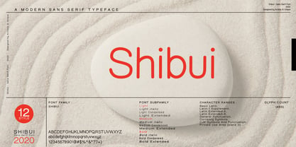
Shibui by Artisticandunique, $38.00 Shibui is a Japanese word that expresses a certain aesthetic of simple, subtle and inconspicuous beauty. Shibui - Sans serif font, character structure is simple alphabet style. It has an elegant appearance with rounded folds. It offers the best solutions in your digital projects with this font which is highly readable in the smallest dimensions. With its modern minimalist stance, this font can meet your needs in all modern or classic creative projects. Absolutely perfect for titles, websites, magazines, books, invitations, logos, packaging design, branding and more! Character Ranges: Basic Latin, Latin-1 Supplement, Latin Extended-A, Latin Extended-B, General Punctuation, Currency Symbols, CJK Symbols And Punctuation, Private Use Area (plane 0), Glyph Count: 463 With this font you can create your unique designs. If you have a question, please contact me. Have a good time.
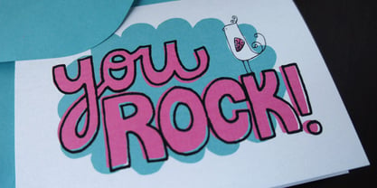
Card-O-Mat is an inspiring font family that makes it easy to design awesome greeting cards for many occasions. Each font is packed with an impressive number of items, check out the glyphs map and get surprised! Card-O-Mat Messages font counts more than 170 unique lettering designs, with a great assortment of messages. From an effusive ‘Happy Birthday’ to a sensible ‘Thank You’, you'll find charming choices for many situations. Card-O-Mat BuddyBirds brings more than 180 picture elements, comprising a pocketful of birds and handy adornments such as flowers, leaves, stars, clouds, speech bubbles and so on. Beyond making a perfect pair with Card-O-Mat Messages, it also goes brilliantly well with our hand-crafted fonts, like Populaire, Oyster, Berimbau, Amarelinha and many others. Pick the ones that fit you better and happy card making!
"You Wish You Were a Shirley" is a font that, even by its title, imparts a sense of whimsy and nostalgia. This font is inspired by the mid-20th century hand lettering that could be found in quaint to...
Colchester by Dieter Steffmann is a font that seems to capture the essence of historical depth and artistic elegance, marrying them into a cohesive typeface that's both visually intriguing and laden ...

Redfighter is an attention-grabbing display font with a games theme, featuring large letters and a rectangular shape with sharp corners. This font shows large letters that demand attention and make a statement. The generous size of each character ensures maximum visibility and impactful design elements. This design choice allows this font to stand out and grab the viewer's attention with its imposing presence. The rectangular shape with sharp corners in Redfighter adds a sense of structure and strength to the font. The clean lines and defined angles create a visually bold and striking appearance. This unique feature evokes a sense of power and precision, reflecting the intensity and competitiveness found in the gaming world. For the best legibility you can use it in the bigger text. Enjoy the available features here. Features: Stylistic Sets Multilingual Supports PUA Encoded Numerals and Punctuations Redfighter fits in headlines, logos, posters, titles, branding materials, print media, editorial layouts, website headers, and any other projects that aim to create a strong visual impact. Find out more ways to use this font by taking a look at the font preview. Thanks for purchasing our fonts. Hopefully, you have a great time using our font. Feel free to contact us anytime for further information or when you have trouble with the font. Thanks a lot and happy designing.

Fibra One looks like a “soft” version of the Fibra font, but it is actually more than that—the second part of its name suggests that it is a reinterpretation of the original typeface. While this new version maintains the overall structure of Fibra and influence of the Avant Garde font, its shapes are different from those found in its predecessor—Fibra One features both soft corners and smooth transition between curved and straight sections. This gives the font a more dynamic and playful personality. Fibra One keeps the original contrast between curves and straight lines in glyphs such as ’n’ and ‘h’ (not found in rounded glyphs such as ‘a’ and ‘d’); details of display characters (e.g. three upper terminals in ‘W’ and projection off the stem in ‘A’); and exaggerated terminal in ‘R’. All these features give Fibra One a strong personality—a typeface that ‘gives you the chills’. Fibra One was specially designed for display use. The font has a very generous x-height that allows for use in corporate text, thanks to its good readability. Fibra One comes with 2 subfamilies—a more ’normal’ Basic family, with a smaller amount of stylistic features, for use in subheadings or any other type of text that requires formality, and an Alt family that shows off the true potential of the font, making it the perfect choice for magazine headlines, posters and logotypes.
Once upon a time in the whimsical world of typography, where letters dance and serifs flirt with space, there was a font named Slicker. Crafted lovingly by the artisan wizards at WSI-Fonts, Slicker w...
"KG Mercy in the Morning" is a distinctive font that carries the unique touch of Kimberly Geswein, a noted typeface designer known for creating fonts with a personal feel. This particular font is no ...
Gamegirl Classic is a charming and nostalgia-infused font that seems to teletransport its audience back to the bygone era of handheld gaming, reminiscent of the iconic Nintendo Game Boy that dominate...
Song Publisher JNL features a design based on the 1945 Art Deco-era hand lettered sheet music title "When the Old Gang's back on the Corner (Singin' Sweet Adeline Again)". It's a good thing sheet music wasn't sold by the word count found in song titles, because this twelve word example would have been more costly than titles such as "Nola", "Tenderly" or "Ciribiribin".
Ah, "Derail," the font that decided to be the life of the graphic design party, where it loudly proclaims, "Who needs the straight and narrow path?". Imagine if a typeface had a rebellious teenage ph...
Ah, Lelim 200, a typographic enigma birthed from the creative chambers of Stefan Motzigemba's mind! If fonts were people, Lelim 200 would be that effortlessly cool friend who knows all the best coffe...
Ah, SF Espresso Shack by ShyFoundry, the font that sounds like it was brewed in the cozy, eclectic coffee shop tucked away in the artsy part of town. Picture this: a font that packs all the warmth of...
Cue the sultry saxophone soundtrack and dim the lights, because the world of typography just flirted with the extraordinary—please welcome to the stage, SexyRexy. If fonts were people, SexyRexy would...

Oita might be a carefully crafted typeface family, created by a meat-bag human. Or, it might have been made by a supremely clever sentient robot. Found in the dark recesses of a top secret spy agency’s quantum computer, this font came with this somewhat unusual description, which is presented without comment. "To conquer, we cannot simply overcome. Success is found in supremacy--in the dominance of Oita. While looking for the right tool for this success, our research has led us to the finely executed forms found of military domination throughout history. In our labs, we've used our specialized machines to harness these forms' power and refined their impact through elements of contemporary and computer design. The structure proves to be robotic and squared on its edges. However, the chutzpah of this technical face still allows it to pass as if created by human hands. Our resulting payload, Oita, is modern and sturdy. While based on a practical, octagonal structure, make no mistake; this new instrument will drive forward the energy you want to push through your projects. Oita has 42 cuts certain to encompass your designs on world domination. Each font contains the glyphs to support over 52 languages. The font also includes tabular and lining figures, numerous ligatures, and selected advanced Opentype options, including stencil and experimental options to bring out the dynamic characteristics that have already been crafted into Oita. Early tests have found that the new instrument is easily scalable to smaller dimensions without reducing its impact. The font remains highly readable across a variety of applications. We speculate from our findings that it will be successful for sporting and technical applications. So for you who venture to use Oita, use it boldly. Don't just overcome. Dominate. Go and conquer mightily with Oita. We'll be watching." We may never know whether Oita hails from mind or mechanism. What we do know is that, should you choose to take on Oita, you'll be acquiring a dynamic poster and packaging face, a minigun-toting bad robot of a font that exudes pace and power.
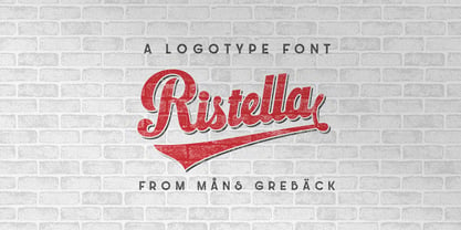
Ristella - a logotype script font. This high-quality typeface is created by Måns Grebäck. Its style is bold and has large, attention-grabbing uppercase letters. Ristella contains alternate and stylistic alternates, as well as multiple ligatures. With its hundreds of glyphs it also has support for a wide range of languages. How do you make a swash? Combine an ending and a tail to make a swash. Endings are found in the following symbols: [ ] { } Tails are found in the following symbols: < > § _ ¤ Example: Ristella}> With ligatures activated, write multiple tail symbols to make a longer swash. Example: Tailextender]¤¤¤
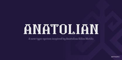
Anatolian typeface was designed with inspiration from the traditional Anatolian kilim motifs and symbols that characterize Turkish culture. Motifs and design elements that has been used for centuries on carpets now found place in a typeface as serifs. It was exciting to see how these old design elements would turn into a modern font that would be applicable for modern designs.
Here's a new take on an old dry-transfer standard from the 70s named Barrio. This unicase version features several handy ligatures not found in the original typeface, which will substitute in OpenType-savvy applications when the lowercase combos are typed. This font contains the complete Latin language character set (Unicode 1252) plus support for Central European (Unicode 1250) languages as well.
Signs of Yesterday JNL brings another twenty-six vintage signs inspired by a series of decals once made by the Duro Decal Company (now Duro Art Industries) of Chicago. This font complements the original twenty-six designs found in Too Much Information JNL. There are two blank sign panels on the parenthesis keys for use in creating custom retro signage.
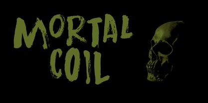
I was playing around with an old brush I found in our kitchen: it had fallen under the stove and it had probably been hiding there for quite some time! I dusted it off, got my Chinese ink and set to work. The result is a scary-ish font. Mortal Coil comes with discretionary ligatures for double lower case letter combinations.
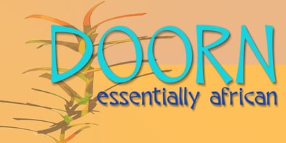
Doorn by Scholtz Fonts, $12.00 In its loose, angular forms, it is reminiscent of thorn bushes dotting the immense Kalahari desert. Spiky and freeform, Doorn calls to mind the irregular hand-drawn lettering found on wooden signs outside small shops in tiny African villages. The font contains all upper and lower case characters, punctuation, numerals and mathematical operators, as well as all accented characters used in European languages.
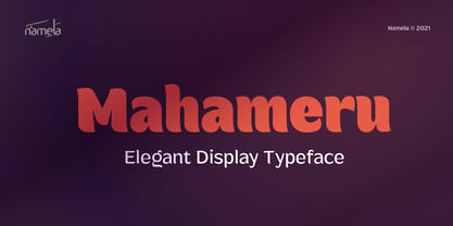
Mahameru is the name of the peak of Mount Semeru, mean "The Great Mountain" in Sanskrit. This font gives a firm and soft character, with the terminal point on straight and curved strokes. The family has 9 weights ranging from Thin to Black and offers a lot of features flexibility that will help you find the best typographic color for your project.
An extremely low midline marks this offering, based on an “elegant” alphabet found in Samuel Welo’s chapbook, Lettering: Modern and Foreign, published in 1930 by Frederick J. Drake and Company. Definitely different, and Deco at its most debonair. All versions of this font include the Unicode 1250 Central European character set in addition to the standard Unicode 1252 Latin set.
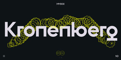
Moooorrrttyyyy, stop drooling over Jessica, the ND Kronenberg is a font family based on the connection found in the letter ю and extrapolated across a whole geometric sans serif, beeerp. A mutant freak futura of some kind. Excuse me. You can find these artifacts all over 3 scripts (Latin, Greek, and Cyrillic). That and set of various additional glyphs. Enjoy.
This elegant stencil face is based on an alphabet found in one of the innumerable Dover Books volumes edited by Dan X. Solo. Intended for headline use, it can also be employed effectively for short blocks of body copy. This font contains the complete Latin language character set (Unicode 1252) plus support for Central European (Unicode 1250) languages as well.
Conjur by chrismetcalfe, $30.00 This work is inspired by creatures that I have drawn for my six year old boy. The monsters can be found at chrismetcalfe.com. I wanted to take their hair/fur and translate the fun attitude to type. To be honest I think this font is used best as display type. However the fun attitude lends to many usages without structure.
A set of rounded Art Deco initials set inside circular borders was found amongst the pages of the vintage French lettering book "Modèles de Lettres Modernes par Georges Léculier”. Now made into a digital font called Deco Spot Initials JNL, these classic letter forms are available in both the original white-on-black version and as a black-on-white alternate design.
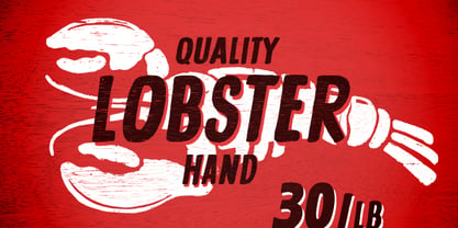
Lobster Hand is a great hand painted face. Inspired by found signage this true type font has a vintage hand painted feel and is effortlessly original. Featuring two options for every letter you can create a huge combination of typographic alternates. Lobster Hand would be great for signage, drop caps, numerals, titles, logos, packaging, menus, etc. Available in Italic and Regular.
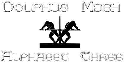
The Dollfus Mieg Company was founded in 1800 by Daniel Dollfus (1769-1818) and Anne-Marie Mieg (1770-1852). In the 1890s and again in 1901 it published Monograms and Alphabets for Combination, a book with alphabets and monograms for cross-stitching. This book served as example for several digital fonts by Paulo W. Here you can get one of them,
Counting four variations for each letter and two for the numbers, Felt Noisy delivers a cool organic feel with a strong and spontaneous attitude. The typeface was drawn with a bad felt tip pen and resulted in two rather nice fonts that will stylishly fit many visual projects out there that don't look for any transparency at all. Give it a go!
Cast Shadow JNL uses the same wood type as found in Trade Printer JNL and adds to it a cast shadow in right or left versions for a bold and unique look. Both fonts have limited character sets and should be used in point sizes larger than normally chosen to compensate for the visual discrepancy due to the cast shadow's effects.
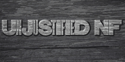
No secret here: this typeface was inspired by the opening credits for the television series "Justified." Alternate upper and lowercase letter to achieve the effect, or—in OpenType-savvy programs—activate the Contextual Alternates (calt) feature. Thin numbers can be found in these positions: ~^{}[]|\<>. Both versions of this font support the Latin 1262, Central European 1250, Turkish 1254 and Baltic 1257 codepages.
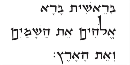
This font contains every variant found in the Hebrew Bible such as the “mutilated” Waw in Numbers 25: verse 12, the small Heh in Genesis 2: verse 4 and the Nun Inversum before Numbers 10: verse 35 and after verse 36 and elsewhere as well as certain oversized consonants such as the Shin with hireq from the beginning of the Song of Songs.
ITC Kokoa is the work of German graphic designer Jochen Schuss. Schuss found the seeds of inspiration on a trip to Ghana and expanded and experimented with the idea on the computer. It includes an array of symbols and borders to complement its stylized letters. ITC Kokoa retains a touch of its African roots but is overall a modern, funky font.

