10,000 search results
(0.234 seconds)
- Rad Zad - Unknown license

- Courier 10 Pitch by Bitstream,
$29.99Another in the series of competent IBM serifed typewriter faces, this one from Howard Kettler in Lexington in 1956. - Courier by ParaType,
$30.00Designed at ParaType in 1990 by Tagir Safayev. Based on Courier typewriter face of International Business Machines, 1956, by Howard Kettler. The decorative styles were added in 1997 by Alexander Tarbeev. - Kruti Dev 010 - Unknown license

- Milky Fruty by Omotu,
$19.00 Milky Fruty! A monoline script font. Comes with two styles, regular and rounded. Milky Fruty font is suitable for branding, logotype, apparel, T-shirt, Hoodie, product packaging, quotes, flyer, poster, book cover, advertising, etc. Whats Include? Opentype support Multilingual support PUA encoded Features: Uppercase, lowercase, numerals, punctuations, extrudes, and ligatures Thanks for looking, and I hope you enjoy it! Please don't hesitate to drop me a message if you have any issues or queries.
 - Krusty craft by Abo Daniel,
$13.00 introducing Krusty Craft - condensed handwritten font - What's included? - Uppercase - Lowercase - Numeral and Punctuations - Ligatures - Multilingual Support - PUA Encoded This font is great for branding, packaging, quotes, logo, and anything your craft project the combination of uppercase and lowercase is great, unique, and very fun. let's play with this awesome font! thank you Abo Daniel Studio
 - Courier 10 Pitch WGL by Bitstream,
$49.00Another in the series of competent IBM serifed typewriter faces, this one from Howard Kettler in Lexington in 1956. - 150 by hgo,
$15.00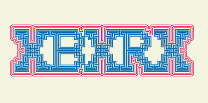
- 360 by Wilton Foundry,
$29.00Distorted fonts are great but are mostly not very practical - 360 is an attempt to create a simple distorted font that can be used far beyond a few logos or headlines. Each 360 character averages roughly half the number of sharp angles of a regular sans serif. This gives it an unusually fresh and timeless appeal and creates a dynamic presence across body text that is very legible and compact without looking overly condensed. 360 was chosen as a name because it can be used as an everyday font, all year round, and because 360 has so many unusual angles that don't conform to normal font conventions. 360 also happens to be a cool number: 360 makes a highly composite number. 360 is also a superior highly composite number and a colossally abundant number. A circle is divided into 360 degrees for the purpose of angular measurement. 360° is also called round angle. 360 is a convenient standard since, 360 being highly composite, it allows a circle to be divided into equal segments with each segment measured in integer degrees rather than fractional degrees. 360 is the sum of a twin prime (179 + 181). A year is roughly calculated as 360 days. - Powderfinger Pad - Unknown license

- Scratch Pad by Bedoodle,
$9.00 - Courier Now - Unknown license

- Courier M by URW Type Foundry,
$89.99 - Courier PS by Monotype,
$29.99 - Courier Coco by Okaycat,
$19.50 Courier Coco is simple, legible, and unmistakably unique. This full flavored font family brings an elegant yet subtle spirit to any design. Check it out! Courier Coco is extended, containing West European diacritics & ligatures, making it suitable for multilingual environments & publications.
 - Courier Ragged by TypeArt Foundry,
$45.00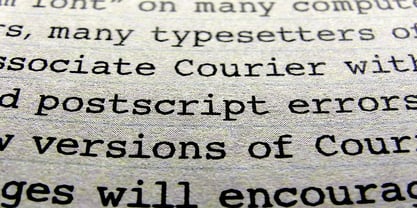
- Courier EF by Elsner+Flake,
$35.00 - Courier SB by Scangraphic Digital Type Collection,
$26.00Since the release of these fonts most typefaces in the Scangraphic Type Collection appear in two versions. One is designed specifically for headline typesetting (SH: Scangraphic Headline Types) and one specifically for text typesetting (SB Scangraphic Bodytypes). The most obvious differentiation can be found in the spacing. That of the Bodytypes is adjusted for readability. That of the Headline Types is decidedly more narrow in order to do justice to the requirements of headline typesetting. The kerning tables, as well, have been individualized for each of these type varieties. In addition to the adjustment of spacing, there are also adjustments in the design. For the Bodytypes, fine spaces were created which prevented the smear effect on acute angles in small typesizes. For a number of Bodytypes, hairlines and serifs were thickened or the whole typeface was adjusted to meet the optical requirements for setting type in small sizes. For the German lower-case diacritical marks, all Headline Types complements contain alternative integrated accents which allow the compact setting of lower-case headlines. - Koerier by Hanoded,
$15.00 Koerier means 'Courier' in Dutch and is a reference to the classic font it was modeled on. Each glyph was hand drawn, giving the font a unique look and feel, making it an ideal typeface for ads, posters and packaging. Comes with a full range of diacritics.
 - Cougher by Context,
$10.00 A big fat quirky face for big bold weird uses. Inspired by E. McKnight Kauffer and vintage travel posters, both styles have support for multiple languages.
 - Skurier by GRIN3 (Nowak),
$20.00 Skurier is a hand-drawn font inspired by monospaced fonts like Courier. Language support includes Western, Central and Eastern European character sets, as well as Baltic and Turkish languages.
 - Coupler by District,
$25.00 Coupler is a sturdy text face with low contrast, airy counters, and a strong baseline for smaller sizes and extended reading. Lightly bracketed serifs and pleasantly conspicuous italics temper Coupler’s formal demeanor—well suited for financial reports, news magazines, catalogs, academic journals, and any instructional setting. Four weights with italics and advanced typographical support provide design flexibility in any layout.
 - Fournier by Monotype,
$29.99 Fournier was made by Monotype in 1924. The design is based on types cut by Pierre Simon Fournier circa 1742, some of the most influential designs of the eighteenth century. Fournier's types were among the earliest of the transitional" style of typeface and were a stepping stone to the more severe "modern" style made popular by Bodoni later in the century. They had more vertical emphasis than the old style types, greater contrast between thick and thin strokes and little or no bracketing on the serifs. Fournier has a light, clean look on the page, provides good economy in text and retains an even colour.
 - Bad - Unknown license

- WAD - Unknown license

- Pod by Device,
$29.00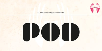
- Sadness by Floodfonts,
$29.00 Sadness is based on some experiments during Felix Braden’s stay at the Trier College of Design: "I played around with Fontographer’s blendfonts-feature (a type design tool to interpolate fonts and to minimize effort and expenditure of large families) with some files from a close designer. Since the basic elements derived from extremely varied fonts without any similarities, the concluding shapes first turned out to be rather fragmentary. From those fragments I chose the most characteristic elements and drew a whole new font." For a detailed type specimen have a look at: http://on.be.net/1CdAZlC
 - Pais by Latinotype,
$39.00 "País" is a contemporary and modern grotesque sans serif, inspired by the grotesques of the early 20th century, but more geometric and with a wider x-height than its referents; making it ideal for the current times. "País" comes in 2 versions, each with 9 weights, from thin to black, and matching italics, for a total of 36 fonts. The standard sans serif version is fresh, clean, and more ideally neutral. It's a perfect choice for editorial design, branding, headlines, or any other piece of graphic design. The "País Alt" version has more expressive and modern characters, with some giving it a much more playful image. It is ideal for logos, packaging, web and television use. País contains a total of 682 characters that make it possible to write in more than 200 Latin languages and basic Cyrillic.
 - Rad by Adobe,
$29.00 - Paz by Sudtipos,
$29.00 Paz, a squarish 4-weight industrial family, ranging from extreme hairline to black. It is ideal for editorial headlines where type plays a major role in the overall design. The fonts were designed by Ariel Di Lisio and digitized by Alejandro Paul.
 - Pax by Linotype,
$29.99Pax is clearly a didone, using Vox classification. The contrast between the thin lines and the thicker ones is noticeable, as you would expect from a didone. The basic form is relatively narrow, therefore I designed another Pax, slightly wider and darker, and called it Pax #2. Otherwise they are more or less identical. Pax is Latin for peace, on everyone's want list in 1995 - as well as every single year before and after that. Pax was released in 1995. - Pod by kapitza,
$49.00 Pod™ is a cute foliage font consisting of 62 illustrations. It is entirely hand drawn and each character is unique. When combined it is easy to create fantasy forests and magical meadows.
 - Cad by NicolassFonts,
$- CAD is brilliantly suited for graphic design and display use and perfect for logotypes, t-shirts, packaging, brand identity, books, magazines, newspapers, posters, billboards, and advertising.
 - Cornering - Unknown license

- Cornered by SoftMaker,
$5.99
- Corner by URW Type Foundry,
$35.99 A unique kind of type by Michael Herold: The 14 cuts of Corner are equally distributed to the two style variants A and B. From Thin to Extra Bold, variant A comes with technical and pure forms while B appears with a soft, more personal character. In combination, the two variants add up to a highly versatile family which is very well suited for branding purposes, thanks to its diverse forms of expression. Eine besondere Schriftfamilie von Michael Herold: Die 14 Schnitte der Corner sind auf die beiden Stilvarianten A und B verteilt. Von Thin bis Extra Bold kommt die Corner im Stil A mit technischen, reinen Formen und im Stil B mit weichem, persönlicherem Charakter. Als Kombination ergibt sich eine sehr vielfältige Familie, die sich mit ihren verschiedenen Ausdrucksformen besonders fürs Branding eignet.
 - CUKIER by Borutta Group,
$29.00 After my previous typefaces inspired by the flavour of local typography (Massimo, Picadilly & Zigfrid), I'd like to present new one, called CUKIER. This family was designed mainly for branding purposes - visual identity of CUKIER.WORKS Agency. Cukier is a sans serif, geometric typeface, inspired by the vernacular typography from Zanzibar (Tanzania). A lot of letters have intentionally made mistakes in a drawing, and this it what makes the whole font unusual. Family consist 10 styles – 5 weights with italics.
 - Curser by Morganismi,
$12.00 Curser is an oldish-looking typewriter font, decayed and scary. The special characters give an expression that they have been made using the common keys and moving the paper. Curser supports West and Central European languages as well as Baltic, Turkish and Romanian.
 - Courier New OS by Monotype,
$50.99 Designed as a typewriter face for IBM, Courier New was re drawn by Adrian Frutiger for IBM Selectric series. A typical fixed pitch design, monotone in weight and slab serif in concept.
 - Monotype Courier 12 by Monotype,
$29.99Designed as a typewriter face for IBM, Courier was redrawn by Adrian Frutiger for the IBM Selectric series. Courier is a typical fixed pitch design, monotone in weight and slab serif in concept. The Courier font is used to emulate typewriter output for reports, tabular work and technical documentation.


Page 1 of 250Next page