10,000 search results
(0.027 seconds)
- Malibu Heights by BA Graphics,
$45.00A beautiful new sans serif great for magazines, ad work, text or headlines works for all your needs. - PF DIN Serif by Parachute,
$36.00 DIN Serif: Specimen Manual PDF The DIN Type System: A Comparison Table This is the first ever release of a true serif companion for the popular DIN typeface. DIN Serif originated in a custom project for a watchmaking journal which required a modern serif to work in unison and match the inherent simplicity of DIN. As a result, a solid, confident and well-balanced typeface was developed which is simple and neutral enough when set at small sizes, but sturdy and powerful when set at heavier weights and bigger sizes. It utilizes the skeleton of the original DIN and retains its basic proportions such as x-height, caps height and descenders, whereas ascenders were slightly increased. DIN Serif makes no attempt to impress with ephemeral nifty details on individual letters, but instead it concentrates on a few modern, functional and everlasting novelties which express an overall distinct quality on the page and set it apart from most classic romans. This is a low contrast typeface with vertical axis and squarish form which brings out a balance between simplicity and legibility. Its narrow proportions offer economy of space which is critical for newspaper body text and headlines. At small sizes the text has an even texture, it is comfortable and highly readable. The serifs are narrow at heavy weights and when tight typesetting is applied at large sizes, the heavier weights become ideal for headlines. DIN Serif was inspired by late 19th century Egyptian and earlier transitional roman faces. Bracketed serifs were placed on the upper part of the letterforms (this is where we mostly concentrate our attention when we read) whereas small clean square serifs were placed on and under the baseline to simplify the letterforms. In order to reduce visual tension at the joins and make reading smooth and comfortable, a slight hint of bracketed serif was added at the joins in the form of a subtle angular tapered serif, which softens the harsh angularity. These angular tapered serifs tend to disappear at smaller sizes (or smooth out the joins) but stand out at bigger sizes exuding a strong, modern and energetic personality. What started out as a custom 2 weight family, it has developed into a full scale superfamily with 10 styles from Regular to ExtraBlack along with their italics. Additional features were added such as small caps, alternate letters and numbers as well as numerous symbols for branding, signage and publishing. All weights were meticulously hinted for excellent display performance on the web. Finally, DIN Serif supports more that 100 languages such as those based on the Latin, Greek and Cyrillic alphabet.
 - Plinc Bubble Gum by House Industries,
$33.00 Bubble Gum is a juicy multi-dimensional gob of goodness that’s bursting at the seams with loads of alphabetic appeal. Its well-padded figure transforms the ample letterforms found in classic comic strip word balloons into a warm and casual display font with a little extra kick. Cooked up by Dave West for Photo-Lettering, Inc. between the late 1960s and early 70s, Bubble Gum was finally digitized by Jess Collins in 2011. Please note that the shaded version of the typeface is composed by layering the Regular font and a separate Drop Shadow font. Some assembly required. Like all good subversives, House Industries hides in plain sight while amplifying the look, feel and style of the world’s most interesting brands, products and people. Based in Delaware, visually influencing the world. Featured in: Best Fonts for Logos
 - Flat10 Holy by Dharma Type,
$14.99 Super decorative wood type looking pixel font which has mysterious, elegant and gorgeous impressions. This 8-bit pixel font is designed with respect for 80s game designers and the pixel font pioneers in middle 90s. Use at size 10 pixels or multiples of 10 and anti-alias off is recommended. List of our Pixel Font Project. ·Flat10 Antique ·Flat10 Artdeco ·Flat10 Arts&Crafts ·Flat10 fraktur ·Flat10 Holy ·Flat10 Holly ·Flat10 Segments ·Flat10 Stencil ·Flat20 Gothic ·Flat20 Headline ·Flat20 Hippies ·Flat20 Streamer ·Behrensmeyer Vigesimals ·Civilite Vigesimals
 - Flat10 Fraktur by Dharma Type,
$14.99 The pixelated blackletter which called Fraktur, the most famous calligraphic letter in Germany. This 8-bit pixel font is designed with respect for 80s game designers and the pixel font pioneers in middle 90s. Use at size 10 pixels or multiples of 10 and anti-alias off is recommended. List of our Pixel Font Project. ·Flat10 Antique ·Flat10 Artdeco ·Flat10 Arts&Crafts ·Flat10 fraktur ·Flat10 Holy ·Flat10 Holly ·Flat10 Segments ·Flat10 Stencil ·Flat20 Gothic ·Flat20 Headline ·Flat20 Hippies ·Flat20 Streamer ·Behrensmeyer Vigesimals ·Civilite Vigesimals
 - Flat10 Holly by Dharma Type,
$14.99 Very decorative pixel font which has organic and soft impressions. The best pixel font for Christmas. This 8-bit pixel font is designed with respect for 80s game designers and the pixel font pioneers in middle 90s. Use at size 10 pixels or multiples of 10 and anti-alias off is recommended. List of our Pixel Font Project. ·Flat10 Antique ·Flat10 Artdeco ·Flat10 Arts&Crafts ·Flat10 fraktur ·Flat10 Holy ·Flat10 Holly ·Flat10 Segments ·Flat10 Stencil ·Flat20 Gothic ·Flat20 Headline ·Flat20 Hippies ·Flat20 Streamer ·Behrensmeyer Vigesimals ·Civilite Vigesimals
 - Pseudonym by Monotype,
$20.99 Pseudonym is a low-contrast, subtly-flared serif available in four weights across three styles in both roman and italic. As with all of my typeface designs, I am creating fonts that I would use myself for branding purposes—typefaces with style and purpose that are intended for use in creating logos and distinctive branding typography. I wanted to create a typeface that had incisive flared serifs combined with the strength and solidity of modern grotesque faces. The result is Pseudonym, which I feel has great presence, style and legibility. Although I must admit, I had to tone down the flared serifs during the design process in order to achieve that :) I’m sure you will have great fun playing with some of the Open Type features that I’ve added to Pseudonym. There’s a full set of true small caps with their corresponding diacritics and figures. There are also a number of discretionary ligatures, these are chosen from the glyphs palette in your layout app to replace pairs of standard characters. You’ll also enjoy making use of the catchwords – these have been created to harmonise with each style, again, giving you more flexibility and scope to create some innovative typography. Finally, there are some alternate characters for /C/D/O/. You may wish to use these when creating logos that include standard contractions for limited, number, incorporated, etc. Key features: • Pseudonym is a low-contrast, subtly-flared serif that has great presence, style and legibility • 3 styles – Narrow, Regular and Wide • 4 weights in roman and italic: • Light | Regular | Medium | Bold • Full set of small caps with diacritics and figures • 30+ discretionary ligatures, catchwords and alternate characters • Full European character set • 600 glyphs per font
 - Classica Pro by URW Type Foundry,
$35.99 Classica Pro by Bernd Möllenstädt A real alternative for letterpress printing A masterpiece It was only after many years, shortly before the end of his life, Bernd Möllenstädt brought out these early drafts of his Classica Light and Light Italic from his drawer, and asked me to produce for him on the computer a Bold and Bold Italic, from which we later wanted to interpolate further cuts like Regular and so on. The boldening of letters with an oblique axis and with hairlines which should not grow to the same extent as the general line widths, is hard to cope with perfectly, even for the smartest computer program, and even more so, when it concerns an as complicated set of data as those conceived by Bernd. The automatically generated result could therefore only be a first step that had to be improved manually later. This was about the stage that we had reached when Bernd died in March 2013, leaving me behind with comprehensive corrections on proofs of this automatically generated Bold. Although I was aware that it would mean a lot of work to complete the project, I did not want to leave it unfinished and decided to finalize and publish the Classica, also in Bernd‘s honor. In the course of the two years that I worked on this font family it somewhat naturally became also my own. New details were added and some of the existing changed. A book typeface requires the supreme and forgives rarely, it represents a true masterpiece. My intention and my ambition were to create a real alternative for letterpress printing, with a font family that contains all the typographic options for an excellent typesetting, and is better readable and has a better appearance than other existing typefaces. Whether this was achieved, the reader may decide. Volker Schnebel, Hamburg, december 2014
 - Film Event JNL by Jeff Levine,
$29.00 The August 11, 1929 issue of “The Film Daily” carried an ad for Tiffany-Stahl Productions’ presentation of a special film release featuring a wrestling match between “Strangler” Lewis and Gus Sonnenburg. The hand lettering for the ad was rendered in an Art Deco sans serif style, and is now available digitally as Film Event JNL in both regular and oblique versions.
 - Munchy Funk by Bogstav,
$13.00 Say hello to my munchy and funky font - better known as "Munchy Funk" Munchy Funk has its roots in basic sans fonts, but with a handmade and bouncy approach. I've added 3 different layers, that works well together - either as individual fonts, or as layered graphics. Furthermore, I have added 3 slightly different versions of each lowercase letter and multilingual support!
 - Trade Paper JNL by Jeff Levine,
$29.00 In the March 16, 1936 edition of “The Film Daily” (a trade publication for the film industry) the magazine ran an ad for its Year Book. The ad was set in a slab serif typeface similar to popular designs such as Karnak, Stymie, Beton and the like. Redrawn digitally as Trade Paper JNL, it is available in both regular and oblique versions.
 - Ongunkan France Glozel Runic by Runic World Tamgacı,
$100.00 In March 2010, Émile Fradin, a modest peasant farmer from central France, died at the age of 103. To his grave he took the secret behind one of the most controversial archaeological discoveries of the 20th century. A discovery which put into question the very origins of the written word and the paternity of European culture. It was the uncovering of peculiar artefacts would come to be known as the Glozel runes. The discovery of the Glozel runes On the first day of March 1924, a not yet 18-year-old Fradin was ploughing his family’s field in the hamlet of Glozel, when his cow stumbled into a hole. When he and his grandfather, Claude, looked closer, they discovered a mass of broken stone, under which lay an underground chamber. Within, they discovered pottery fragments, carved bones, and a peculiar clay tablet covered in bizarre characters that neither of the two could decipher. The family requested a subsidy for excavation works to be carried out, but were refused by the regional authority. With that disappointment, it seemed as though the discovery would fade into obscurity. However, the following year, news of Fradin’s unusual clay tablet reached the ears of the physician and amateur archeologist, Antonin Morlet. By the end of May 1925, Morlet began the first of his excavations.4 Within the first two years alone, he had amassed some 3,000 finds.
 - Pricetag - Personal use only

- LaPointe's Road¼ - Personal use only

- OldStyle 1 - Unknown license

- Retroheavyfuture - Unknown license

- New Land Contour - Unknown license

- KR Valentine Heart - Unknown license

- LE Genoss by Attype Studio,
$18.00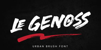 le Genoss is urban brush font inspired by real brush calligraphy with real texture. What's included: - le Genoss.otf - 10 Swashes - Ligatures - Multilingual Support --- Hope you enjoy with our font! Attype Studio
 - Ninfa Serif by dooType,
$22.00 Using the genetic inheritance of semi-serif typeface Ninfa, designed in 2008, Ninfa Serif has 10 styles and designed to fulfill all needs in the design of text - books and magazines.
 - Marlita by Abo Daniel,
$13.00 Marlita is a carefully made script, great for quotes, branding, packaging, wedding card, advertising, and more. It comes with 10 variations of ampersands as well as various titling and ending swashes.
 - Rothenburg Decorative - Personal use only

- Marketing Script - Personal use only

- Prince Valiant - Personal use only

- Beckett-Kanzlei - Personal use only

- Chatter by Jonahfonts,
$25.00 A free style specifically designed for Packaging but still works well for Greeting cards, Magazines, Posters and Advertising Ads.
 - PN Froogfright by Illustration Ink,
$3.00 This hand-written, whimsical font features a cute hand-written print with no descenders and added ooze dripping throughout.
 - Meridia Script by Jonahfonts,
$19.95 Legible connected-script. Applications include captions, fashion headlines, packaging, invitations, cards, posters, ads, greeting cards, book jackets, and covers.
 - Brougham by Jonahfonts,
$25.00 Brougham keeps its legibility with a strong presence. Usage recommendations: Captions, packaging, cards, posters, ads, book jackets and manuals.
 - Reklamefraktur by RMU,
$25.00 Reklamefraktur is a stout, eye-catching blackletter font for labels, product branding, posters, ads, the internet and much more.
 - Bolchray by Nilson Art Design,
$30.00 Bolchray is a script font useful for flashy headlines, ads, logos, printed quotes, invitations, cards, product packaging and headers.
 - Letterpress Cuts JNL by Jeff Levine,
$29.00 Here's another fun assortment of vintage cartoons, embellishments, ad cuts and topical illustrations; all contained within Letterpress Cuts JNL.
 - Button by Scholtz Fonts,
$21.00Button is a solid, chunky, font, with a bold symmetry that makes it a must for products aimed at the younger set. Its unusual letter shapes all point to “NEW TREND!” It is the perfect choice for marketing companies targeting: ⁃ web-design and the creation of stylish buttons and menus ⁃ the music scene: CD covers, posters, music videos ⁃ the movie scene: posters, ads, movie titles ⁃ the theatre scene: posters, programs, ads, promotions ⁃ the fashion scene: swingtags, posters, brochures, signage, ads It has been carefully letterspaced and kerned. It contains a full character set: all upper and lower case characters, punctuation, numerals and accented characters are present. - IRON MATHBOOK - Personal use only

- Lemonheads - Unknown license

- Zahariel Demo - Unknown license

- Skizzed DSG - Unknown license

- rhino dino - Unknown license

- Collins OE Demo - Unknown license

- Flores - Unknown license


