10,000 search results
(0.032 seconds)
- Scripta Pro by John Moore Type Foundry,
$54.00 Scripta is a family of typefaces that leads "Scripta Pro", a commercial script writing similar to those used in ads advertising the decades 40 and 50, with fine lettering combinations of that time, Scripta Pro is ideal for composing headlines and subheads and this is supplied in two weights. This system is complemented by a Roman Sans "Scripta Gothic" an artdeco style typeface to harmonize with the style of that fonts. To add style to set fonts, created "Scripta Icons", one dingbats font based on a series of graphs that help recreate the ornamental fantasies of a postwar generation, a society in transition between the classical world and ornament and promises of a cosmic and atomic world. For those wishing to use words made was created "Scripta Catchwords". "Scripta Pro" is a script typeface inspired by the style works of the american typeface designer LH Copeland.
 - Lomo by Linotype,
$29.99Lomo, PLC is a Russian optical manufacturer, whose cameras have built up an international cult following since 1992. Swiss designer Fidel Peugeot recently tapped into this phenomenon, creating an astounding series of pixel fonts for use in a variety of applications-from websites to mobile phone displays. Now available as a single family from Linotype, Lomo's versatility extends itself across 37 various faces. Whether on screen or online, Lomo's different weights deliver great legibility at low resolutions. Additionally, the amazing breadth of this family allows these pixilated faces to crossover into print, bringing a contemporary technology feeling to your more traditional pieces, too. Worth experimenting with is the Lomo Wall series, of which 14 of the Lomo family's 37 fonts belong to. In graphics applications like Adobe's PhotoShop of Illustrator, the Lomo Wall fonts may be layered over top of one another in various combinations. For example, Lomo Wall Chart 50 could be colored red, and layered behind Lomo Wall Pixel 50. The text in Lomo Wall Pixel 50 would then looked like it had been painted over top of a brick wall. With 14 fonts, and millions of colors in your application's color palette to choose from, the combination possibilities for this layering technique are endless! (If you really like this layering feature, check out what Karin Huschka, another Linotype designer, did with her Chineze Dragon family.) Convinced? Give the unlimited possibilities of Lomo a spin today! The entire Lomo family is part of the Take Type 5 collection, from Linotype." - Alpine Mtn by Wooden Type Fonts,
$15.00 Sans serif, bold, display font, useful for brochures and display advertising.
 - Wilhelm Klingspor Schrift by Alter Littera,
$25.00 A comprehensive and faithful rendition of one of the finest metal typefaces of the 20th century. Rudolf Koch designed Wilhelm Klingspor Schrift (initially conceived as “Missal Schrift”, and later referred to also as “Wilhelm Klingspor Gotisch”) between 1919 and 1925 for the Gebr. Klingspor Type Foundry in Offenbach am Main. It is an impressive textura typeface, being sharp, elegant, spiky, sensitive and noble at the same time. Some of its most notable features have to do with the delicate decorations, the thin but subtly swelling lines that parallel or bridge strokes in the capitals, the hairline endings that terminate each stroke in both the capitals and the lowercase letters, the subtle joining of hairlines to thicker strokes, and the tension of some of the transitional curves. Koch’s original design included two sets of capitals (normal and condensed); alternates for a, d, e, r, s and z, plus long s; short and long flourished finial forms for f and t; thirty-five ligatures; and eighteen decorative pieces (Zierstücke). All of these features, plus several additional ones for modern use (including the usual standard characters for typesetting in modern Western languages, additional alternates and ligatures, plus carefully coded Opentype features), have been thoroughly implemented to the highest and most lively level of detail in the present font, in the hope that the past greatness of Wilhelm Klingspor Schrift will finally step into the modern OpenType realm. The main sources used during the font design process were several pages from a specimen book issued by the Gebr. Klingspor Type Foundry in 1927. Other sources were as follows: Bain, P., and Shaw, P. (Eds.) (1998), Blackletter: Type and National Identity, New York: Princeton Architectural Press (p. 43); Hendlmeier, W. (1994), Kunstwerke der Schrift, Hannover: Bund für Deutsche Schrift und Sprache (pp. 56-7); Kapr, A. (1983), Schriftkunst, Dresden: VEB Verlag der Kunst (p. 453); Kapr, A. (1993), Fraktur - Form und Geschichte der gebrochenen Schriften, Mainz: Verlag Hermann Schmidt (pp. 124-5); and Klingspor, K. (1949), Über Schönheit von Schrift und Druck, Frankfurt am Main: Georg Kurt Schauer (pp. 136-7). Some public and private comments by renowned designer and design historian Paul Shaw have also influenced both the design and the description of the present font. Specimen, detailed character map, OpenType features, and font samples available at Alter Littera’s The Oldtype “Wilhelm Klingspor Schrift” Font Page.
 - JSL Ancient - Unknown license

- Toit - Unknown license

- Lettering1 Weird - Unknown license

- Bitwise Alpha - Unknown license

- JSL Blackletter - Unknown license

- Eroika Slab by Eclectotype,
$40.00 Eroika Slab is a robust, display serif, intended to be set large. While for most serifs, display means high contrast, Eroika's "displayness" stems from its wide stance, tight spacing, equal cap and ascender heights, flared stems and large x-height. The italics in particular are quite unorthodox, with their vertical serif cut-offs and foot serifs where most fear to tread ('scuse the pun). All fonts feature a useful array of stylistic sets, oldstyle figures, automatic fractions and case sensitive forms. All ligatures are in the discretionary section, as it's my belief that this typeface looks better without them, but I like to offer the choice. Perfect for book covers, craft beer logos, boxing paraphernalia and tattoo magazine pull quotes. And probably a whole lot more besides!
 - Christmas Deer by Arttype7,
$15.00 We just launched a new product font. charming fonts with a pretty christmas look, named "cristmas deer font". This font is inspired by deer antlers. has 3 beautiful swash variations. and also has more than 650 glyphs. This font also has a stylistic alternative for multilingual support. Perfect for logos, Christmas greeting cards, wedding invitations, web, t-shirts, souvenirs, quotes, graphic watermarks. thank you regards
 - Bageton by Nk Studio,
$20.00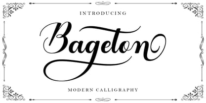 Bageton is a beautiful Calligraphy font with many alternative styles, it looks natural, elegant and perfect for extraordinary projects. This font has 350+ glyphs. Bageton is suitable for various products such as invitations, product packaging, offers, product design, crafters, labels, photography, watermarks, logos & branding. Everything can be accessed using software that supports Opentype, such as Adobe Indesign, Adobe CS Illustrator, Adobe Photoshop CC, and Corel Draw.
 - Nektar by More Etc,
$18.00 Nektar is a soft & smooth sans serif typeface with spirit, personality and distinction. This bold, semi-condensed and human sans serif is inspired by the "perfect imperfection" of old prints. The typeface is lively and eye-catching, ideal for where and when you want to make a positive and human impression. The font has over 650 glyphs. It has Multilingual support (including Cyrillic script).
 - Arethusa by AVP,
$14.99 Arethusa is a versatile font after the 'transitional' style – a style that has been evolving for 250 years. The balanced design of familiar letter forms blends form with function to create highly readable text. Twelve fonts organised in three sub-families provide a range of weights and styles. The standard character set covers many roman-based languages. For extended language support, see Arethusa Pro.
 - Lanetta by RVM Creative,
$9.00 Lanetta is the perfect mixture between a blackletter and serif font. It's narrow characters give it stylistic appeal that you just can't get anywhere else. It's the perfect font for the fall/winter seasons, too. Perfect for use in letters and documents, branding and logos, websites, book and album design, themed projects, and anything else that could use edgy elegance. Glyph count: 440. Supports most western languages.
 - Savile by The Northern Block,
$19.30 A modern san serif typeface with a humanistic influence. The intention was to create a clean, functional design that would also have an elegant appearance. Careful attention has been paid to proportions and purity of form to help improve readability across text layouts. Details include 8 weights with italics, 540 characters with old style and tabular numerals, stylistic alternatives, manually edited kerning and Opentype features.
 - Hedgehog Lake by Tom Simons,
$10.00 “Can you write this card? You have the best handwriting.” Was commonly heard question by Karin that inspired the creation of this font. Now anyone is able to write in her unique style. Hedgehog Lake includes over 400 glyphs for languages based on the latin alphabet and comes in two weights. Perfect for designs that need a human touch like invitations, titles, and more.
 - Cherry Bell by Good Java Studio,
$20.00 Cherry Bell is the perfect font for all your fun designs. The main font file is equipped with ordinary characters, as well as more than 350 glyphs to support most Latin-based languages. It is suitable for you to use in making t-shirt designs, quotes, labels, packaging, logo types, or long writing because we have compiled kerning and matrices that are tailored to your needs.
 - Molekyl by Typiskt,
$9.00 Designed in 2020 Molekyl is a modern neo grotesque family that consists of 6 weights. Rooted in simplicity Molekyl is workhorse typeface that suits many applications. The geometric details and subtleties also makes it a great fit for a clean, sharp and technical impression. The typeface has 420 glyphs (supporting many languages), arrows and opentype features such as kerning, f-ligatures, stylistic alternatives and tabular figures.
 - Animals - Unknown license

- Bulge - Personal use only

- Volume by Cubo Fonts,
$29.00 Volume is a 3D font, with interlocked characters, inspired by vintage wooden block capitals! Superimposed weights bring light and shadow on the structure and allows many coloured combinations. Cubo est une fonte en volume dont les lettres s'imbriquent, inspirée d'anciens caractère d'imprimerie en bois. Les diiférentes graisses se superposent, créant des effets d'ombre et de lumière, et facilitant la colorisation des caractères.
 - MT Bleu Feelin Mono by MametosType,
$20.00 MT Bleu Feelin — is a display font with a monospace typographic feel. Please pay attention to Small Caps, Oldstyle Figures, and Alternates. Good for music album covers, posters and magazines. Inspired by the electronic band from Bandung, Bleu House, which has a light and edgy electronic pop experimental music character, the idea emerged to create a font that changes from sound to visual language, namely font. The use of the design for this font is for Display, and while it is issued one regular weight, in the future will develop multiple masters and other experiments. The design concept of the MT Bleu Feelin Mono Regular font is to take a 45 degree diagonal and geometric cut technique. also every corner is rounded which gives a dynamic impression like electronic music. I created this font design because I like visual experiments, and applied it to the character of the font. By using monospaced font characters have an even width. This is a unique feature in that most fonts are 'proportionally' spaced with characters varying in width. While monospace is perfect in certain ways, it is a proportional font that reigns supreme. Proportional fonts are faster to read. however, the MT Bleu Feelin Mono Regular font is intended for display fonts. MT Bleu Feelin Mono Regular supports language settings - Western Europe - Central Europe - Southeastern Europe - South American - Oceania - Esperanto
 - Crop©Bats AOE - Unknown license

- MadAve - Unknown license

- School Age by Jeff Levine,
$29.00 The “Trixy Toy Educator” was a 1930s-era set of letters and numbers (along with a few animal shapes) for teaching children, and was manufactured by the Durrel Company of Gardner, Massachusetts. Die cut from thick cardboard, the 40 piece set also included a rack to display the characters, presumably for little ones to practice the correct order of the alphabet and basic numerals or to spell simple words like ‘dog’ or ‘cat’. Whomever came up with the idea, they used the most rudimentary and unusual ‘type design’ shapes in the A-Z and 0-9, but they were just odd enough to inspire a digital type version of them. School Age JNL is available in both regular and oblique versions.
 - Calsera by Ironbird Creative,
$15.00 Calsera is a vintage display font duo. Inspired by 50s-60s signages, this font made to bring back the good ol' days. This type of font perfectly made to be applied especially in logo, headline, signage and the other various formal forms such as invitations, labels, logos, magazines, books, greeting cards, packaging, fashion, make up, stationery, novels, labels or any type of advertising purpose. ADDITIONAL INFORMATION : For upgrading license please contact me. Upgraded licenses are required for apps, books, television, commercial exhibition, film, gaming, print on demand products, etc. simply email me to : ironbirdcreative@gmail.com We hope you enjoy the font, please feel free to comment if you have any thoughts or feedback. Thanks for purchasing and have fun! Regards, Ironbird Creative
 - Cherry Rush by D&K Project,
$15.00 Cherry Rush - It's fun, it's cute, it's smooth, and it's mighty splash. A mixed-case font (Uppercase and lowercase) with lots of combination possibilities, make greats fun display! It's good to make a logotype, sticker, fun kids sign, and other lettering project. This fun is perfect combination uppercase and lowercase. This font contains all uppercase, lowercase, numbers and basic punctuation also a fun 40 ligatures. (If you're having trouble finding the basic punctuation, you can access it in the Glyphs panel) Please let me know in the comments what you think or if you have any issues or queries , If you have any questions about licensing, need help with a typeface, or would like to request a new feature, drop me a message.
 - Cell by Type Minds,
$7.50 Cell is a sturdy, geometric typeface with many potential applications. Though it is best suited to display sizes, its construction is simple enough for use in smaller settings. Its octagonal, almost mechanical design is softened by rounded corners. The face is characterized by a single thick stroke in each letter, lending it a unique appearance. It also features an oblique counterpart with several italic-style glyphs. Both members of the family also include small capitals mapped to the Private Use Area. Cell was designed to be at once simple and unique. Its grid-based structure is enhanced by slight adjustments for optical consistency. Glyphs which are normally round instead have 45-degree angles at the corners, sticking to the grid system without losing legibility.
 - Newspeak by Barnbrook Fonts,
$30.00 Newspeak is a display typeface based upon Soviet architectural forms from the Stalinist period (spanning the 1930s—'50s). Stalinist architecture is now considered unsightly and without aesthetic merit, yet it has a strange beauty, hinting at an unrealised utopia (while its function was to buttress a brutal dictatorship). Inspiration was also drawn from the Cyrillic alphabet which, to kids growing up in Western Europe in the '70s and '80s, was a cipher for an alternative way of living – Cyrillic letterforms represented the exotic, familiarity-twice-removed universe of Eastern Bloc states. When you visited a communist country you were confronted with unfamiliar typography that reinforced your sense of alienation and unease that there existed a real, if imperfect, working alternative to consumerism.
 - KS Foo by Kreuk Type Foundry,
$12.00 KS Foo is Display typeface with countless possibilities. Sub-culture inspired display with sharp & striking form display. From Gigs posters to skateboard to clothing industries. Ideally suited for headline, logo, branding, posters etc.
 - PT Banana Split - Unknown license

- Coupon Clipper JNL by Jeff Levine,
$29.00Coupon Clipper JNL is a fun, playful, casual sans serif font that evokes some of the lighthearted typography of the late 50s and early 60s. - Architec by Monotype,
$29.99This caps only hand lettering could have come from an architect. Speedy written on a 45 degree slope with a bold felt pen or brush. - Tilden Sans by Delve Fonts,
$29.00 Thoroughly contemporary, clean, and ready for work, Tilden Sans was designed by Delve Withrington to be no-nonsense but still stylish and friendly. Tilden Sans is square-ish with low contrast and a generous x-height. Curvilinear strokes like those in the capitals C or S, and many lowercase letters feature incised terminals offering a measure of distinction from other sans serifs, without sacrificing legibility. All of those features work in unison to make this typeface a pleasure to use and read. The Tilden Sans family has seven useful weights ranging from Light to Black and features a glyph repertoire of over 900 glyphs with language support for 225 languages. This versatile typeface performs brilliantly in a host of sizes. The Regular and Medium weights can be used at text sizes, while the Light and Black weights are great for display size settings.
 - Ceciliany by Brenners Template,
$19.00 Ceciliany is a classy font family that adds calligraphic touches to the basic structure of the display serif. Italic styles share a language set and OpenType Features compared to static styles, but have a completely different metrics In addition, an elaborate and detailed kerning system is also operated separately. 9 weights and 18 unique styles offer designers the amazing creativity of the serif font family. It offers a variety of options for editorial design as well as typography work for various channels. Features 9weights, 18styles Optimized Kernings Stylistic Set Fractions Oldstyle Figures Discretionary Ligatures : AM, AR, BA, BR, CA, CH, CR, DE, EA, El, FR, GA, GH, HR, IL, IM, JA, KA, KR, Ki, LA, LE, LO, MA, Ma, Me, NA, NE, NT, Nu, PS, RA, RE, RO, Ro, SA, ST, TH, UB, Ze, Zo, ft, li. Standard Ligatures : ff, fi, fl. * In particular, ligatures displayed in preview images can be easily applied to Adobe apps. Check out the ligature features of the software you are using.
 - XingXungXang by Thinkdust,
$10.00 XingXangXung is a display font designed by Diogo Pisoeiro. Although it only has a limited number of characters, this display face with a unique style will work well for graphic design and display work.
 - Omega by Thinkdust,
$10.00 Omega is a display font designed by Diogo Pisoeiro. Although Omega only has a limited number of characters, this display face with a unique style will work well for graphic design and display work.
 - Manoer by Craft Supply Co,
$20.00 Manoer – Display Serif Font: Uniquely Eye-Catching Funky and Fresh Design: Manoer – Display Serif is a font that brings a funky twist to traditional serif. It’s perfect for unique, eye-catching displays. This font adds a playful charm to any project. Ideal for Creative Displays: With its unique flair, Manoer excels in creative display needs. It captures attention in advertising, posters, and more. This font is a top choice for making a bold statement.
 - Equines by Attractype,
$12.00 Equines Display is a versatile font family designed specifically for display purposes. Its modern, thick and strong appearance is perfect for branding, logos, banners and any lettering that requires bold and clear letters. To add an artistic image rather than just the thickness of the shape, Equines Display adds a rounding feature to the corners of the letters with a cross system, which makes the word display dynamic, strong and elegant. Until this description was published, Equines Display had 14 styles including condesed, expanded, outline and shaded in hopes of meeting the display font needs of designers and everyone at large. Enjoy working with the Equines Display font family. Best regards, Saefulloh - Attractype Foundry.


