10,000 search results
(0.025 seconds)
- FAXADA - Unknown license

- Chibrush - Unknown license

- Protofo by Lafontype,
$19.00 Protofo is a modern-humanist sans-serif with characters that features various geometric shapes — from square, round and triangle. Protofo comes in 16 styles — upright and italic — from thin to black with each equipped with features such as localized, ligature, fraction, ordinal, superscript, numerator, nominator, subscript, proportional and tabular numerals. Protofo is also equipped with extended latin letters which can represent multi languages so making it perfect for any kind of project (display, editorial, web, interface, app, etc).
 - FF Scuba by FontFont,
$62.99 German type designer Felix Braden created this sans FontFont in 2012. The family has 16 weights, ranging from Thin to Black (including italics) and is ideally suited for advertising and packaging, editorial and publishing, logo, branding and creative industries, poster and billboards, wayfinding and signage as well as web and screen design. FF Scuba provides advanced typographical support with features such as ligatures, alternate characters, case-sensitive forms, fractions, super- and subscript characters, and stylistic alternates. It comes with a complete range of figure set options – oldstyle and lining figures, each in tabular and proportional widths.In 2013, FF Scuba received the CommArts award and was also selected as one of Typographica’s favorite typefaces of 2012.
 - FF Sero by FontFont,
$83.99 German type designer Jörg Hemker created this sans FontFont in 2011. The family has 16 weights, ranging from Extra Thin to Black (including italics) and is ideally suited for advertising and packaging, editorial and publishing, logo, branding, wayfinding and signage as well as web and screen design. FF Sero provides advanced typographical support with features such as ligatures, small capitals, alternate characters, case-sensitive forms, fractions, and super- and subscript characters. It comes with a complete range of figure set options – oldstyle and lining figures, each in tabular and proportional widths. As well as Latin-based languages, the typeface family also supports the Cyrillic and Greek writing systems. In 2011, FF Sero received the CommArts award.
 - Swanstone by Zetafonts,
$51.00 Mario De Libero designed Swanstone while investigating XIX Century Old Style typefaces. Designs like Theophile Beaudoire’s Romana (1860) or Miller & Richard’s Modernized Old Style, that re-imagined the classical “Venetian” letterforms adding flared serifs and early Art Nouveau influences. In Italy, one of these fonts was Raffaello Bertieri’s Raffaello, which De Libero used as the starting point of his research in a contemporary retelling of these exuberant and sexily unsettling letterforms.
 - Parnas by Larin Type Co,
$20.00 Parnas is an amazing font that can be used in a classic style or in a more expressive and elegant with alternative and ligatures, of which there are many. Set the style and mood of your design, because just a few touches can absolutely change it. With it, you can easily realize all your ideas. Parnas family includes a serif and sans serif font Classical forms, smooth lines, sharp serifs, weightless style, various weaves, long tails, all this and much more will give you many options for creating your project and will not leave indifferent even the most demanding. This font is easy to use, has OpenType features. This font has 900 glyphs and includes: - 190 Alternates for Uppercase - 168 Alternates for Lowercase - 74 Ligatures for Uppercase - 70 Ligatures for Lowercase - 10 illustrations - Multilingual support
 - Divina Proportione by Intellecta Design,
$29.00 Divina Proportione is based from the original studies from Luca Pacioli. Luca Pacioli was born in 1446 or 1447 in Sansepolcro (Tuscany) where he received an abbaco education. Luca Pacioli was born in 1446 or 1447 in Sansepolcro (Tuscany) where he received an abbaco education. [This was education in the vernacular (i.e. the local tongue) rather than Latin and focused on the knowledge required of merchants.] He moved to Venice around 1464 where he continued his own education while working as a tutor to the three sons of a merchant. It was during this period that he wrote his first book -- a treatise on arithmetic for the three boys he was tutoring. Between 1472 and 1475, he became a Franciscan friar. In 1475, he started teaching in Perugia and wrote a comprehensive abbaco textbook in the vernacular for his students during 1477 and 1478. It is thought that he then started teaching university mathematics (rather than abbaco) and he did so in a number of Italian universities, including Perugia, holding the first chair in mathematics in two of them. He also continued to work as a private abbaco tutor of mathematics and was, in fact, instructed to stop teaching at this level in Sansepolcro in 1491. In 1494, his first book to be printed, Summa de arithmetica, geometria, proportioni et proportionalita, was published in Venice. In 1497, he accepted an invitation from Lodovico Sforza ("Il Moro") to work in Milan. There he met, collaborated with, lived with, and taught mathematics to Leonardo da Vinci. In 1499, Pacioli and Leonardo were forced to flee Milan when Louis XII of France seized the city and drove their patron out. Their paths appear to have finally separated around 1506. Pacioli died aged 70 in 1517, most likely in Sansepolcro where it is thought he had spent much of his final years. De divina proportione (written in Milan in 1496–98, published in Venice in 1509). Two versions of the original manuscript are extant, one in the Biblioteca Ambrosiana in Milan, the other in the Bibliothèque Publique et Universitaire in Geneva. The subject was mathematical and artistic proportion, especially the mathematics of the golden ratio and its application in architecture. Leonardo da Vinci drew the illustrations of the regular solids in De divina proportione while he lived with and took mathematics lessons from Pacioli. Leonardo's drawings are probably the first illustrations of skeletonic solids, an easy distinction between front and back. The work also discusses the use of perspective by painters such as Piero della Francesca, Melozzo da Forlì, and Marco Palmezzano. As a side note, the "M" logo used by the Metropolitan Museum of Art in New York City is taken from De divina proportione. “ The Ancients, having taken into consideration the rigorous construction of the human body, elaborated all their works, as especially their holy temples, according to these proportions; for they found here the two principal figures without which no project is possible: the perfection of the circle, the principle of all regular bodies, and the equilateral square. ” —De divina proportione
 - Hudson NY by Andrew Footit,
$12.00 Hudson NY is a display font that gives you strong and bold typography with three different styles that make up the family, a regular, serif and slab serif. Hudson NY is an adaptation and progression of Roper Font, and like Roper font it comes in regular and a press versions, giving the user some cool options when creating artwork. The golden thread that ties this family together is its American sports and college styling, it gives Hudson NY an authentic look but at the same time there is a modern approach to the character set. I would like to thank the talented Kurt Dee for allowing me to use his awesome pictures of New York City to create this the overall theme for this project, please go check out his instagram @kurtdee.
 - KR Lil Note - Unknown license

- Redstar - Unknown license

- Dupree - Unknown license

- Konanur - Unknown license

- Bilibin - Unknown license

- Fiesta Win95 - Unknown license

- Hooteroll - Unknown license

- NewForum - Personal use only

- Especial Kay - Unknown license

- Kilroy Was Here - Unknown license

- Faqro Extended Wide Trial - Personal use only

- P22 Parrish by P22 Type Foundry,
$24.95 Maxfield Parrish (1870-1966), whose career spanned nearly ninety years, holds a unique place in American art and culture. He was enormously accomplished and successful in both fine art and commercial endeavors. Parrish's hand-drawn letters were a significant part of his works, which bridged the familiar with a startling otherworldliness. P22 has created the Parrish font set in cooperation with the National Museum of American Illustration.
 - Fauna Pro by Pasternak,
$12.00 Fauna Pro is the second generation of its previous version. Now it is more futuristic with a strange sci-fi spirit. Fauna Pro has more solid contours and thick letters. It compares with futuristic thematic, including such elements like robots, spaceships, electronics, cosmos, planets, nature, and modern architecture. Font family includes 6 font styles: extra light, light, regular, medium, semibold and bold. Every style contains 266 glyphs.
 - Serifa by Bitstream,
$29.99 Developed by Adrian Frutiger for Bauer in 1966, Serifa is a slabserif based on the principles that led to the success of Frutiger’s 1956 sanserif, Univers. Glypha, designed by Frutiger for Stempel in 1979, is a version of Serifa with a moderately larger x-height; Stempel has paid royalties on Glypha to Neufville since 1984. Serifa® font field guide including best practices, font pairings and alternatives.
 - Pepper Sans by VIDI Visual Design Studio,
$17.99 The core design of Pepper family, designed by VIDI Visual Design Studio, is the fingertip handwriting style inspired by children’s writings on windows. This distinctive low-contrast typeface combines characteristics from neo-grotesque and organic models. Warmer than most Helvetica inspired typefaces, Pepper has organic shapes, playful strokes, rounded endings, and a generous x-height which makes Pepper easy to read. This family could be used well for food packagings, content aimed for children, book covers, branding, high-impact titles and small body texts, advertising, editorial design and more. What makes Pepper Sans Vol.1 competent and more spicy then some other fonts is that it contains a set of more than 900 characters for each of 5 weights that support many Latin-based languages, Greek and Cyrillic. As the weight decreases, the typeface gains impact with becoming elegant, giving titles in (Hair, Thin or Light) a breath of fresh air. We derived a typeface family consisting of Hair, Thin, Light, Regular, Semi Bold in this Vol.1 edition. Typeface features: • 5 weights: Hair, Thin, Light, Regular, Semi Bold • Latin, Greek & Cyrillic multilingual support • More than 900 characters for each of 5 weights Font Specs: • Created: August 2020 • Files type: .ttf
 - Poesie_Noire_DEMO - Unknown license

- Agafia by ParaType,
$25.00 Agafia handwriting script is based on the hand of Agafia Karpovna Lykova - the last member of the Old Believer family lived like an hermit in the Khakass taiga. The face is developed for the new book on the history of Lykov's family by Lev Cherepanov. It's built in OpenType format with a contextual substitution of letterforms and specific ligatures. Designer - Gennady Fridman. Released by ParaType in 2009.
 - Poynter Old Style by Font Bureau,
$40.00 In the 1670s, Christopher Plantin was the largest publisher of his day. Hendrik van den Keere cut for him an astounding series of romans. As Stanley Morison once observed, such types adopted features of Flemish blackletter to strengthen elegant French romans. Large on the body, strong in color, economical in fit, widely (if anonymously) distributed, they established effective standards for all that followed; FB 1997–2000
 - Bodoni FB by Font Bureau,
$40.00 Working at American Type Founders from a Bruce Foundry recutting, Morris Fuller Benton worked out the dramatics of the English Fat Face, and in 1928 produced Ultra Bodoni, a headline spectacular. Using Benton’s 1933 Ultra Bodoni Extra Condensed, Richard Lipton digitized Bodoni FB Bold Condensed, then took compression even further and designed Bodoni FB Bold Compressed, a real technical tour de force; FB 1992
 - Boriel by Olivetype,
$18.00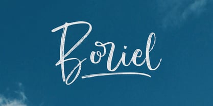 Boriel is a chic, refined script font that emanates sophistication and elegance. Its stylish alternates and ligatures make this font the perfect match for any project Features : Basic Latin A-Z & a-z. Numbers, symbols, and punctuations Swashes & Ligatures Boriel is supporting 66 Languages: from Afrikaans Albanian Catalan Danish to Dutch English Spanish Swedish Zulu. Accented Characters : ÀÁÂÃÄÅÆÇÈÉÊËÌÍÎÏÑÒÓÔÕÖØŒŠÙÚÛÜŸÝŽàáâãäåæçèéêëìíîïñòóôõöøœšùúûüýÿžß Thank you
 - Sub Train by Olivetype,
$18.00 Inspired by the punk and metal scene in the ’80s, this one-of-a-kind brush typeface is suitable for apparel, YouTube thumbnails, movies, album cover and so much more. Features : Basic Latin A-Z, a-z, numbers, symbols, and punctuations Sub Train is supporting 66 Languages: from Afrikaans Albanian Catalan Danish to Dutch English Spanish Swedish Zulu. Accented Characters : ÀÁÂÃÄÅÆÇÈÉÊËÌÍÎÏÑÒÓÔÕÖØŒŠÙÚÛÜŸÝŽàáâãäåæçèéêëìíîïñòóôõöøœšùúûüýÿžß Thank you
 - Chili Chips by Epiclinez,
$18.00 Chili Chips is a playful handwritten font. Looks great on a children's craft, teaching material, quotes, or any other design that needs a splash of cuteness! This font is supporting 66 languages, from English to Zulu. It is also PUA encoded and has open-type features such as ligatures to help you create that authentic handwritten look. Thanks, hope you enjoy our fonts.
 - Le chant des Albatros by Octotype is a typeface that seems to gracefully dance between modern flair and timeless elegance. The name itself, French for "The Song of the Albatross," evokes an image of ...
- Lorraine Braille by Echopraxium,
$9.50 This is a decorative and steganographic Braille font based on Lorraine Cross pattern. As the Lorraine cross splits space into six areas, it may be used to represent Braille glyphs. Provided Glyphs * Lowercase letters (a..z): a White cross and Black square dots * Uppercasecase letters (A..Z): a Black cross and White square dots * Special characters (e.g. !#$%*+<>{}()[]...) * Decorative glyphs (provided in black and white as well) Glyph code intervals - Codes 48..57: Bullets (0..9 digits) - Codes 130..150: 'White Stars' - Codes 192..233: 'Black Stars', Black border glyphs and other black patterns. - Codes 214..233: Border/Decorative glyphs (Black) - Codes 235..255: Border/Decorative glyphs (White) - Codes for Cross w/o dots: Black (192), White (235) - Codes for Cross and 6 dots: Black (191), White (234) - Code for 'Half-width space' (166) Posters 1. Logo: illustrates usage of border glyphs 2. Meta: Two big Lorraine Braille glyphs drawn with pattern glyphs 3. Stars: illustrates usage of 'Star' and pattern glyphs 4. Bullets: illustrates usage of bullet glyphs (0..9) 5. Human rights - Article 1 NB: - Encoding is: Windows Latin ("ANSI") - Published in two versions: Commercial and Free for personal use
 - Mottek - Personal use only

- TallDeco - Unknown license

- Jump Start - Personal use only

- JoeLouis - Personal use only

- Prince - Unknown license

- Pisan - Personal use only

- Fresh Bionik SE - Personal use only


