6,449 search results
(0.012 seconds)
- Arbeit Pro by Studio Few,
$24.00 A remaster of Neo Grotesk family - Arbeit. It employs improved letterform balance and contrast throughout. All weights feature a set of new alternates under the style 'Contrast'.
 - Decolot by Ryzhychenko Olga,
$6.00 Decolot font was created being impressed by the art deco era. It is built on simple geometric forms. The font is ideal for posters design, invitations, headlines.
 - Party Invite JNL by Jeff Levine,
$29.00 Party Invite JNL is a thin, condensed Art Deco sans based on lettering from a letterpress holiday stock cut (the predecessor to clip art) from the 1940s.
 - Syage by Nirmana Visual,
$19.00 Syage a classy, contemporary of Serif font, inspired by Art Deco Era. Ideally suited for advertising and packaging, festive occasions, editorial and publishing, creative industries and posters.
 - Terrace JNL by Jeff Levine,
$29.00 Terrace JNL is a bold, sturdy Art Deco titling face based on hand lettering found on the cover of some 1940s-vintage sheet music for the organ.
 - BLT Balfour by Black Lab Type,
$12.00 BLT Balfour : Art Deco Revival Font Balfour is a modern Art Deco typeface revival. Built from historic references in architecture during this time period, Balfour exudes class and elegance, yet still honors the style with unapologetic bold geometric forms. Pay close attention to the letterforms B and R, and how their extreme x-heights play off of the elongated strokes of C, D and G. Unique features throughout the character set make it less predictable and more unique than any Art Deco typeface before it. The geometry of this typeface plays from one letter to the next. Fill and Outline styles work well in headlines, logos and large type. The Line style is effective at all sizes and can be used in combination with other styles to achieve visual hierarchy.
 - Sista Planteria by Invasi Studio,
$15.00 Meet the delightful duo that brings an organic twist to your designs! Introducing Sista Planteria, the charming pairing of an all-caps serif and a playful script font. Whether diving into illustrative creations, crafting whimsical greetings, adding charm to book covers, designing delightful quotes, or creating enchanting packaging, Sista Planteria is your go-to choice for an organic touch. With its alternates and ligatures, this font duo offers a signature handwriting style that adds a hint of natural elegance to your projects. And don't worry about language barriers – Sista Planteria supports multilingual Latin characters, ensuring your creativity knows no bounds. Get ready to infuse your designs with a dash of organic taste that will captivate hearts and bring smiles. Elevate your creations with the Sista Planteria font duo and let your imagination bloom!
 - Rigoletto by Sabrcreative,
$15.00 Introducing Rigoletto Font Duo, a stunning combination of a monoline script and Sans Serif fonts. This font duo offers a neat and clean monoline style, complemented by the versatility of the Sans Serif fonts, resulting in designs that are sophisticated, expensive, and elegant. With 70 alternates included, Rigoletto allows you to add decorative elements to your designs effortlessly. It supports a wide range of languages, including English, Danish, Dutch, Estonian, Faroese, Filipino, Finnish, French, German, Hungarian, Icelandic, Irish, Italian, Norwegian, Polish, Portuguese, Spanish, Swedish, and more. Unleash your creativity with Rigoletto Font Duo! It is perfect for various applications such as logotypes, wedding invitations, vintage labels, romantic cards, and much more. Its unique combination of monoline script and Sans Serif fonts adds a touch of elegance to any project.
 - Megatropolis by Just My Type,
$35.00 Introducing Megatropolis : intellectual, architectural, urban and urbane. What started as an idea where the counters would be letters (3 scribbled glyphs on a piece of scrap paper), has grown into a mighty font family of eight stackable fonts. First came Megatropolis itself, a Deco font within a Deco font; Double Deco, you might say. In Illustrator, you can deconstruct it to make solid letters, outline letters or just the inset letters on their own, and you can stack them how you wish. Or you can get the whole Megatropolis family with Black , Outline , Inset , Smog , Shade and Shade with Inset and keep them all separate stackable, editable fonts. In addition, there’s Megatropolis Benday (available in TT only), with its fabulous stackable comic dots. Megatropolis is a typographer’s playground.
 - DT Decopolis Hotel by Dragon Tongue Foundry,
$9.00 DT Decopolis Hotel is a sharply stylised Sans Serif Art Deco font, crafted with a wide oval, dissected and contrasted against precision straight edges and pixel sharp corners. The Capitals have a raised centre line, aligning with the tall lowercase height. A nostalgic looking Art Deco font referencing the 1920's to 1940's during the Golden age of Hollywood, Art Moderne and the rise of luxury items from 100 years ago. Totally geometric with great variations in glyph widths designed to attract attention and create Headlines. DT Decopolis Hotel is a display font with clean simple lines, intended to create a sleek elegance that displays the sophistication of a by-gone era. With both upper and lower-case, this font is Great for Logotypes, Headlines, Strap-lines and smaller descriptive text to give that authentic Art Deco look and feel. Evoking the Art Deco Era of the Great Gatsby, glamorous Hotels and Movie Theatres of the period. Packed with over 500 glyphs, you will enjoy the uniqueness of this typeface! Inspired by 1920's Art Deco, Artisual Deco is a 2020's celebration dedicated to the hundred-year-old history of geometric design. This retro typeface will be the perfect fit for your logo designs or graphic project. DT Decopolis Hotel is a perfect choice for designs with a luxurious but minimalist look and feel. Useful in headlines, logos or product packaging it will match perfectly against sloped script fonts. The typeface works perfectly in both All-Caps or full Upper and lower case. Use with Contextual/Standard Ligatures turned on when possible. to allow the letters to match their neighbours. This will also enable larger Caps for the first letter of a new sentence.
 - Halogen by Positype,
$29.00 Who doesn't want or need an expansive contemporary extended sans that has a sense of style and swagger… what if it had a lowercase, small caps and various numeral options… how could you say no? This was the foundational argument I made for myself when I drew the initial alphabet on my birthday last year (something I do each year, draw a new font, kind of a fun OCD thing). I wanted to see a wide, utilitarian sans that had more to it than just a basic character set and didn't resemble standard geometric models. As I continued sketching, the letterforms were being influenced more by my 'lettering tendencies' than the normal mechanical trappings of drawing flat, wide letters. The letters have retained aspects of letters created by hand — stresses, modulation, naturally ending terminals. Truncation and quick clipping of strokes became antithetical to the letterforms I drew, so I continued this once I brought the design into the computer. I kept it precise and dependable, but made every attempt to keep a conscientiously crafted typeface and not let it devolve into a grid-based drone. As such, it works just as well looking back in time as much as it does assuming a lead role in a sci-fi movie. Halogen does deliver and opts not to take a short cut and provide an anemic offering of glyphs — a modern typeface offered today must provide more than just the basics and this one does — lowercase, smallcaps, old style numerals, tabular forms, stylistic and titling alternates, fractions, case-sensitive features, and even an alternate uppercase ordinal set is included. So go make cool print and digital things with it, now.
 - "Japan Deko" is a typeface that embodies a fascinating blend of traditional Japanese aesthetics and the Art Deco movement, which was a dominant style in the 1920s and 1930s, known for its bold geomet...
- Page Rules Promo - Unknown license

- Beauty Salon by Thomas Käding,
$10.00 Inspired by the sign outside a beauty salon, it is an art-deco all-caps font. This font will NOT make you more attractive to the opposite sex.
 - Cirflex by Greater Albion Typefounders,
$10.00 Cirflex was inspired by a 1930s shop sign, and makes an ideal typeface for Streamline Era and Art Deco design. Cirflex is offered in regular and bold weights.
 - Cigarette by Dharma Type,
$14.99 Experimental typography meets Art deco retro style. Odd contrast gives your work a curious impression.By using 'liga' and 'dlig' feature of OpenType format, you can access advanced typography.
 - FS Koopman Variable by Fontsmith,
$299.99New York to London via Europe The hardworking FS Koopman is a crossbred workhorse which draws inspiration from Swiss and Germanic grotesks, American gothics and early British grotesques, but refuses to fit neatly into any of these categories. Its neither one nor the other, but all of the above. Fontsmith designers Andy Lethbridge and Stuart de Rozario decided to take the characteristics they admired from each category and distill them down into one functional family. Neo meets Neue FS Koopman aims to swim against the tide of Helvetica-ish derivatives by bringing some personality and soul to a genre that all too often ends up feeling bland and sterile. FS Koopman subtly embraces the quirkiness and charm often seen in early twentieth century designs but pairs this with the functionality of later pioneers of the genre. It’s a grotesque isn’t it? The term grotesque surfaced around the early 1800s and refers to the early sans serif designs that many initially believed were strange or ‘grotesque’ due to their lack of elegant serifs. Later variations became known as neo-grotesques and this moniker stuck around even after they gained mass popularity. Some American variants became known as gothics. FS Koopman takes cues from all three categories and blends them into one cohesive design. - Claudius - Unknown license

- Kettering 205 by Talbot Type,
$12.99 Kettering 205 is a geometric slab-serif with Art Deco influences, such as lowered crossbars on many characters, and a crossed W. It includes old style non-aligning (lower case) numbers, both proportional and tabular as well as accented characters for Central European languages. It’s a highly individual looking font, but retains good legibility coupled with striking looks as a display font. The Kettering 205 family comprises of six weights and is closely related to Kettering 105, its less Deco flavoured cousin.
 - Emblema Headline by Corradine Fonts,
$15.00 Based on Corradine Fonts font Emblema 65, Emblema Headline is a powerful tool for modern designers who need a vintage art deco style font with personality and high quality. The Emblema Headline family has four layers, each one with three or four different looks, for a total of thirteen different variations. Non-OT-users can select a font from these thirteen variations, also with specific flavors: Basic, Deco, Swash or Extraswash. Explore the great possibilities of Emblema Headline in your next project.
 - Bungehuis by Hanoded,
$15.00 Bungehuis font was modeled on the lettering found on an Amsterdam art deco building from 1931. This building on the Spuistraat, also called "Het Bungehuis", used to house offices, but is now part of the University of Amsterdam. In 2015 it had its brief moment of fame, when students, demanding more democracy at the University, occupied it. Bungehuis is a heavy art deco font and would look great on posters and in headlines. It comes with a rather democratic range of diacritics.
 - Grasond by Just Font You,
$19.00 A new reopening of an Art-Deco gate. Different vibes of the Gatsbyesque era, sculpted with the touch of lavish modernism for an everywhere and every timeline of the multiverse purpose. Inspired by the purpose above, here's an attempt to resurrect the great from the past. Please welcome, GRASOND. A vintage art-deco display sans serif fonts. Perfectly fit for your luxury branding, logo, vintage design, beer labels, signage, anytime you need a massive throwback, please, be my guest, oldsport.
 - Praxis by Linotype,
$29.99 Praxis™ was designed in 1976 by Gerard Unger for the German technology corporation Dr.-Ing Rudolf Hell. Praxis is the sans serif counterpart to Demos, another early digital type designed by Unger, who is an accomplished Dutch typographer and teacher. Praxis and Demos share important characteristics, such as open counters, a tall x-height, and blunt stroke terminations. Both faces have very little thick/thin variation, which facilitates smooth linear enlargement and reduction. And like Demos, Praxis is a flexible and legible typeface that works well in small point sizes and on low-quality paper (office documents, newsletters, newspapers, etc.). The word "Praxis" comes from Greek, and means "a practical application." In the late 1990s, Demos and Praxis, along with Univers 57, were selected as the official typefaces of the German Government. More info. In 1990, Linotype AG merged with Dr.-Ing Rudolf Hell GmbH, forming the Linotype-Hell AG (today Linotype GmbH). Since then, Linotype has been the official source of all fonts that were originally designed for the Hell Corporation. Linotype has also improved the typefaces using new technologies, including OpenType."
 - Black Cow - Unknown license

- Philco by Monotype,
$29.99The Philco font is a capitals only design inspired by the Art Deco period. Available in plain and decorated form, Philco is suitable for use in advertising, flyers etc. - Venzel by Etewut,
$15.00 Introducing new font family Venzel. It's an interesting experimental deco all caps typeface. • 5 fonts with different wide • OTF and TTF version • alternative letters and numbers • multi-language support
 - Direkta JNL by Jeff Levine,
$29.00Direkta JNL take the classic Art Deco influenced lettering of the 30s and 40s and adds a diagonal triangular cut into the letters, creating an air of forward movement. - Classy Diner by Haiku Monkey,
$10.00Handwritten with care, and made bold and consistent with an art deco flair. If I owned a classy diner, this is how I'd like my chalkboard menus to look. - French Flair by PeachCreme,
$14.00 "French Flair" is our latest font pair! With a graceful decorative serif and contrasting light and crisp italic, French Flair duo can be handy in any trending design project.
 - Mano Danielli by Kate Brankin,
$32.00 Mama, are you doing letters? I want to do letters too! Mano Danielli is based on the writing of a 6 year old child. Great for anything that has to do with children - even the inner ones.
 - A10 STAR Black by Mogtahid,
$90.00 As a former typographer / lino and calligrapher, Abdallah NASRI had recourse to the nature of the idea of an "INTERCHANGEABLE" collection for types who in reality offer a police collar parallel to the complex typeface of the variable. Our fashion is outlined by a simple calculation defined by superimposed geometric circles where we used only its ¼ to fill the need for the angles of each of our letters. Always with the idea of having in the same allocated space, the same letter nested as many times as fat example from Hairline to Ultrabold. It was in this way that I was able to obtain a large number of styles, with a very interesting kerning which prompted me to extend the font to other languages with +1000 characters and +600 glyphs. I have always been treasured by the all in "1". I assure you that I sought to obtain the maximum of Visibility for a use S / Titling TV, WEB Pages and Typography Typo; once the difficult thing was done, I was rewarded by a font that has countless typographic openings for the world of graphics with 10 styles of weights in hand, and again I am happy to have personalized the charm of each letter by new details; I do not regret the time spent on thinking about it so that it is useful and at the same time pleasant as a working tool, finally profitable in all sectors and more multilingual, without forgetting that it is a family of inter change c ' is to say: All the types occupy the same height of the body and it is their fats which differs in the same space width of each of the letters, therefore no interference in spacing. Here, an additional alternative, a participation of a septuagenarian in the service of the love of modern digital typography. • TEST: At 50% screen in a body of 12 pixels, the A10 STAR Alphabet subjected to a test, has a clear Readability / Visibility. • P.S: A10 STAR integrates Diacriticism in all its forms. Texte d'origine : Abdallah NASRI a eu recours en étant ancien typographe/lino et calligraphe à la nature de l'idée d'une collection "INTERCHANGEABLE" pour les types qui en réalité offre un collier de police parallèle à la fonte complexe du variable. Notre mode est esquissé par un calcul simple défini par des ronds géométrique superposés où on a utilisé seulement son ¼ pour garnir le besoin des angles de chacune de nos lettres. Toujours dans l’idée à avoir dans le même espacement alloué, la même lettre imbriquée autant de fois de graisse exemple du Hairline à Ultrabold. C’est de cette manière que j’ai pu obtenir un grand nombre de styles, avec un crénage très intéressant ce qui m’a incité à étendre la police à d’autres langues avec +1000 caractères et +600 glyphes. J’ai toujours été prisé par le tout en « 1 ». Je vous assure que j’ai cherché à obtenir le maximum de Visibilité pour une utilisation S/Titrage TV, Pages WEB et Maquette typo ; une fois le difficile fait, j’ai été récompensé par une police qui possède d’innombrable ouverture typographique pour le monde du Graphisme avec comme atout en main 10 styles de graisses, et encore je suis content pour avoir personnalisé le charme de chaque lettre par des détails nouveaux ; je ne regrette pas le temps passé dessus à réfléchir pour qu’il soit utile et à la fois agréable comme outil de travail, enfin profitable tous secteurs confondus et en plus multilingue, sans oublié que c’est une famille d’inter change c’est-à-dire : Tous les types occupent la même hauteur du corps et c'est leurs graisses qui diffère dans un même espace largeur de chacune des lettres, donc aucune interférence dans l’espacement. Voilà, une alternative supplémentaire, une participation d’un septuagénaire au service de l’amour de la typographie numérique moderne. • TEST : A 50% d'écran dans un corps de 12 pixels, l'Alphabet A10 STAR soumise a un test, présente une nette Lisibilité / Visibilité. • P.S : A10 STAR intégre la Diacritique dans toutes ses formes.
 - abc - Unknown license

- Pep O Mint Normal - Unknown license

- Bratislava by Hanoded,
$15.00 Bratislava is a rounded and elongated art deco typeface, based on several posters from the 1920's. Bratislava is slender and elegant and would look good on packaging and posters.
 - Wonderful JNL by Jeff Levine,
$29.00 A little bit of thick-and-thin Art Deco hand lettering is offered up in Wonderful JNL, based on some promotional text found on an old piece of sheet music.
 - Emeralde Chamerions by Almarkha Type,
$29.00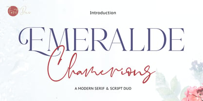 Introducing Emeralde Chamerions - Stylish Font Duo , Display Serif And Signature Stylish Script inspired by famous logo perfect for the purposes of designing templates, brochures, videos, advertising branding, logos and more.
 - Alleyway JNL by Jeff Levine,
$29.00 Alleyway JNL is an original typeface by Jeff Levine drawing heavily on Art Deco influences. It's elegant, condensed design is perfect for anything from invitations to letterheads to ad copy.
 - Stationery Department JNL by Jeff Levine,
$29.00 A 1940s-era package of "Herald Square" carbon paper sold by the F.W. Woolworth 5 & 10 cent stores offered up the hand lettered Art Deco design of Stationery Department JNL.
 - Quiet Night by PizzaDude.dk,
$20.00 Quiet Night is my scribbled art deco font. Despite it's slightly jumpy and rough apperance, the font is super legible - even at smaller sizes. Comes with ligatures for double letters.
 - Trafalgar Stencil JNL by Jeff Levine,
$29.00Trafalgar Stencil JNL gets its inspiration from a set of lettering stencils manufactured by Reese and Sons in Great Britain during the 1950s as does its counterpart, British Stencil JNL.


